How to Build a Brand Store Screen in Flutter (Full Code + Preview)
Marketplaces win repeat purchases when a brand gets a home of its own instead of a filtered search result. This tutorial builds StyleCart's brand storefront in Flutter: a collapsing cover-photo hero with frosted circle buttons, a painted monogram overlapping the photo edge, a verified identity row, a followers / rating / products stats strip, a horizontal Collections rail with gradient-darkened cover cards, and a two-up Popular grid whose cards compute their own discount badges. A pinned bottom bar toggles Follow into Following and opens the full catalog, all in one self-contained widget with callbacks for every tap.
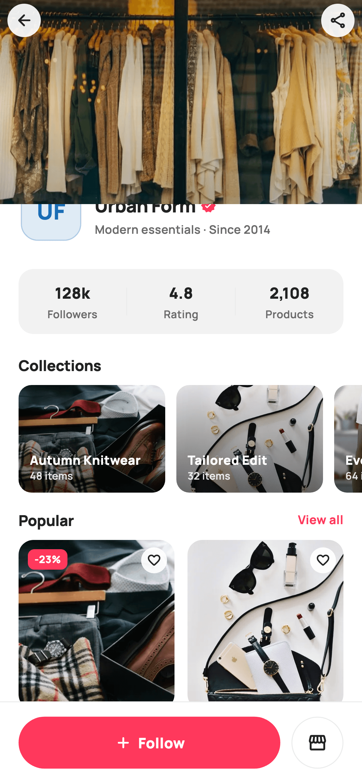
What you'll build
- ✓A collapsing 220px cover-photo hero built as a SliverAppBar with a double-ended dark gradient scrim
- ✓A brand identity row where a CustomPaint monogram overlaps the hero by 28px, ringed in white
- ✓A followers / rating / products stats strip with hairline dividers inside one rounded surface
- ✓A horizontal Collections rail of 158px cover cards with bottom-weighted gradient overlays
- ✓A two-column product grid whose discount badges are computed from price vs. original at build time
- ✓A Follow button that swaps fill, border, icon and label from a single bool in setState
Step-by-step build
Create the file
Add a new file at lib/ecom_brand_store/ecom_brand_store_screen.dart in your Flutter project.
Register the bundled fonts
No external packages — this is pure Flutter. It does bundle its design font (Manrope), so drop the font file into fonts/ and declare it in pubspec.yaml:
flutter:
  fonts:
    - family: Manrope
      fonts:
- asset: fonts/Manrope-Regular.ttfBuild it, piece by piece
Here's how the screen goes together. Each block below is a real slice of the code with a plain-English explanation — paste them in order, or grab the whole file from the next section.
One widget, four callbacks, and the catalog as const data
import 'dart:math' as math;

import 'package:flutter/material.dart';

/// StyleCart — Brand store.
///
/// A single brand's in-app storefront: a collapsing cover-photo hero with a
/// painted monogram + follow button, a stats strip (followers / rating /
/// products), a horizontal collections rail (cover webp), and a "Popular"
/// product grid (photo cards with painted rating + price). A pinned bottom
/// bar follows / visits the full catalog.
///
/// Self-contained per CONVENTIONS.md: pure Flutter, bundled Manrope, inline
/// Airbnb-style tokens, own light theme + SafeArea. Painter-only graphics
/// (monogram, rating stars). Reused bundled webp. Exposes callbacks only.
class EcomBrandStoreScreen extends StatefulWidget {
  const EcomBrandStoreScreen({
    super.key,
    this.onBack,
    this.onProduct,
    this.onCollection,
    this.onViewAll,
  });

  final VoidCallback? onBack;
  final ValueChanged<String>? onProduct;
  final ValueChanged<String>? onCollection;
  final VoidCallback? onViewAll;

  @override
  State<EcomBrandStoreScreen> createState() => _EcomBrandStoreScreenState();
}

class _EcomBrandStoreScreenState extends State<EcomBrandStoreScreen> {
  static const String _font = 'Manrope';
  static const Color _canvas = Color(0xFFFFFFFF);
  static const Color _ink = Color(0xFF222222);
  static const Color _muted = Color(0xFF6A6A6A);
  static const Color _brand = Color(0xFFFF385C);
  static const Color _surface = Color(0xFFF2F2F2);
  static const Color _hairline = Color(0xFFEBEBEB);

  static const String _dir = 'lib/screens/ecommerce/ecom_brand_store/images';

  static const List<_Collection> _collections = <_Collection>[
    _Collection('Autumn Knitwear', '$_dir/p11.webp', '48 items'),
    _Collection('Tailored Edit', '$_dir/p13.webp', '32 items'),
    _Collection('Everyday Basics', '$_dir/p16.webp', '64 items'),
  ];

  static const List<_Product> _products = <_Product>[
    _Product('Merino Wrap Coat', '$_dir/p11.webp', 248, 320, 4.8, 214),
    _Product('Oxford Brogue', '$_dir/p13.webp', 189, null, 4.6, 88),
    _Product('Cotton Crew Tee', '$_dir/p16.webp', 39, 52, 4.9, 512),
    _Product('Cable Knit Poncho', '$_dir/p01.webp', 96, null, 4.7, 143),
    _Product('Court Sneaker', '$_dir/p04.webp', 129, 160, 4.5, 367),
  ];

  bool _following = false;
`EcomBrandStoreScreen` exposes exactly four callbacks — `onBack`, `onProduct`, `onCollection`, `onViewAll` — with the two list taps typed `ValueChanged<String>` so the host learns which item was chosen without the screen knowing anything about routing. The Airbnb-flavoured palette pairs `_ink` near-black with the Rausch red `_brand` `0xFFFF385C`, and every asset path is assembled from one `_dir` constant so relocating the image folder is a one-line change. Both `_collections` and `_products` are `static const` lists of tiny value classes; `_Product` carries an `int? original` precisely so a null can mean 'not on sale' later. The only mutable state in the whole file is `bool _following`.
Slivers above, a pinned bar below
  @override
  Widget build(BuildContext context) {
    return Theme(
      data: ThemeData.light(useMaterial3: true),
      child: Scaffold(
        backgroundColor: _canvas,
        body: SafeArea(
          top: false,
          child: Column(
            children: <Widget>[
              Expanded(
                child: CustomScrollView(
                  slivers: <Widget>[
                    _heroSliver(),
                    SliverToBoxAdapter(child: _identity()),
                    SliverToBoxAdapter(child: _stats()),
                    SliverToBoxAdapter(child: _collectionsRail()),
                    SliverToBoxAdapter(child: _popularHeader()),
                    _productGrid(),
                    const SliverToBoxAdapter(child: SizedBox(height: 16)),
                  ],
                ),
              ),
              _bottomBar(),
            ],
          ),
        ),
      ),
    );
  }
`build` wraps everything in `Theme(data: ThemeData.light(useMaterial3: true))` so the screen carries its own light theme regardless of the host app. The layout is a `Column` whose `Expanded` child holds a `CustomScrollView`, with `_bottomBar()` as a plain sibling underneath — so the Follow bar never scrolls, without needing `bottomNavigationBar` or a Stack. `SafeArea(top: false)` is deliberate: the cover photo must run under the status bar, and the hero positions its own buttons below the top padding instead. Sections that don't need lazy building are simply wrapped in `SliverToBoxAdapter`.
The collapsing cover hero and its frosted buttons
  Widget _heroSliver() {
    return SliverAppBar(
      pinned: false,
      expandedHeight: 220,
      backgroundColor: _canvas,
      automaticallyImplyLeading: false,
      flexibleSpace: FlexibleSpaceBar(
        background: Stack(
          fit: StackFit.expand,
          children: <Widget>[
            Image.asset('$_dir/p03.webp', fit: BoxFit.cover),
            Positioned.fill(
              child: DecoratedBox(
                decoration: BoxDecoration(
                  gradient: LinearGradient(
                    begin: Alignment.topCenter,
                    end: Alignment.bottomCenter,
                    colors: <Color>[
                      Colors.black.withValues(alpha: 0.28),
                      Colors.transparent,
                      Colors.black.withValues(alpha: 0.18),
                    ],
                  ),
                ),
              ),
            ),
            Positioned(
              top: MediaQuery.of(context).padding.top + 4,
              left: 8,
              child: _circleButton(Icons.arrow_back_rounded, widget.onBack),
            ),
            Positioned(
              top: MediaQuery.of(context).padding.top + 4,
              right: 8,
              child: _circleButton(Icons.share_outlined, () {}),
            ),
          ],
        ),
      ),
    );
  }

  Widget _circleButton(IconData icon, VoidCallback? onTap) {
    return Material(
      color: Colors.white.withValues(alpha: 0.92),
      shape: const CircleBorder(),
      child: InkWell(
        customBorder: const CircleBorder(),
        onTap: onTap,
        child: Padding(
          padding: const EdgeInsets.all(8),
          child: Icon(icon, size: 20, color: _ink),
        ),
      ),
    );
  }
The hero is a `SliverAppBar` with `expandedHeight: 220` and `pinned: false`, so the cover photo scrolls fully away rather than leaving a toolbar stub — this is a storefront, not a navigation page. Over the photo sits a vertical gradient that darkens both ends (`alpha: 0.28` at top, transparent in the middle, `0.18` at bottom): the top scrim keeps status-bar icons legible, the bottom one softens the seam where the monogram will overlap. `_circleButton` is `Material` in white at `alpha: 0.92` with a `CircleBorder` and an `InkWell` sharing the same `customBorder`, which keeps the ripple round; both buttons anchor at `MediaQuery.of(context).padding.top + 4` because the SafeArea above excluded the top.
Identity row that overlaps the photo
  Widget _identity() {
    return Transform.translate(
      offset: const Offset(0, -28),
      child: Padding(
        padding: const EdgeInsets.fromLTRB(20, 0, 20, 0),
        child: Row(
          crossAxisAlignment: CrossAxisAlignment.end,
          children: <Widget>[
            Container(
              padding: const EdgeInsets.all(3),
              decoration: const BoxDecoration(
                color: _canvas,
                shape: BoxShape.circle,
              ),
              child: CustomPaint(
                size: const Size(64, 64),
                painter: _MonogramPainter('UF', Color(0xFF1A6DB5)),
              ),
            ),
            const SizedBox(width: 12),
            Expanded(
              child: Padding(
                padding: const EdgeInsets.only(bottom: 6),
                child: Column(
                  crossAxisAlignment: CrossAxisAlignment.start,
                  children: <Widget>[
                    Row(
                      children: const <Widget>[
                        Flexible(
                          child: Text(
                            'Urban Form',
                            maxLines: 1,
                            overflow: TextOverflow.ellipsis,
                            style: TextStyle(
                              fontFamily: _font,
                              fontSize: 20,
                              fontWeight: FontWeight.w800,
                              letterSpacing: -0.4,
                              color: _ink,
                            ),
                          ),
                        ),
                        SizedBox(width: 5),
                        Icon(Icons.verified_rounded,
                            size: 17, color: _brand),
                      ],
                    ),
                    const SizedBox(height: 2),
                    const Text(
                      'Modern essentials · Since 2014',
                      style: TextStyle(
                        fontFamily: _font,
                        fontSize: 12.5,
                        fontWeight: FontWeight.w600,
                        color: _muted,
                      ),
                    ),
                  ],
                ),
              ),
            ),
          ],
        ),
      ),
    );
  }

  Widget _stats() {
    return Padding(
      padding: const EdgeInsets.fromLTRB(20, 0, 20, 6),
      child: Container(
        padding: const EdgeInsets.symmetric(vertical: 14),
        decoration: BoxDecoration(
          color: _surface,
          borderRadius: BorderRadius.circular(16),
        ),
        child: Row(
          children: <Widget>[
            _statCell('128k', 'Followers'),
            _divider(),
            _statCell('4.8', 'Rating'),
            _divider(),
            _statCell('2,108', 'Products'),
          ],
        ),
      ),
    );
  }

  Widget _statCell(String value, String label) {
    return Expanded(
      child: Column(
        children: <Widget>[
          Text(
            value,
            style: const TextStyle(
              fontFamily: _font,
              fontSize: 16.5,
              fontWeight: FontWeight.w800,
              color: _ink,
            ),
          ),
          const SizedBox(height: 2),
          Text(
            label,
            style: const TextStyle(
              fontFamily: _font,
              fontSize: 11.5,
              fontWeight: FontWeight.w600,
              color: _muted,
            ),
          ),
        ],
      ),
    );
  }

  Widget _divider() => Container(width: 1, height: 30, color: _hairline);
`_identity()` uses `Transform.translate(offset: Offset(0, -28))` to pull the whole row 28px up over the hero — the classic profile-page overlap without any Stack bookkeeping. The monogram is a `CustomPaint` at 64x64 wrapped in a 3px white circular `Container`, which reads as a cutout ring against the photo. The name row puts 'Urban Form' in a `Flexible` with `TextOverflow.ellipsis` so a long brand name truncates instead of shoving the `Icons.verified_rounded` badge off-screen. `_stats()` then packs three `_statCell` widgets, each `Expanded` for equal thirds, into one `_surface` container with 1x30 `_hairline` dividers between them — one rounded panel, not three separate chips.
The Collections rail and the Popular header
  Widget _collectionsRail() {
    return Column(
      crossAxisAlignment: CrossAxisAlignment.start,
      children: <Widget>[
        const Padding(
          padding: EdgeInsets.fromLTRB(20, 16, 20, 10),
          child: Text(
            'Collections',
            style: TextStyle(
              fontFamily: _font,
              fontSize: 16,
              fontWeight: FontWeight.w800,
              letterSpacing: -0.2,
              color: _ink,
            ),
          ),
        ),
        SizedBox(
          height: 116,
          child: ListView.separated(
            scrollDirection: Axis.horizontal,
            padding: const EdgeInsets.symmetric(horizontal: 20),
            itemCount: _collections.length,
            separatorBuilder: (BuildContext _, int i) =>
                const SizedBox(width: 12),
            itemBuilder: (BuildContext _, int i) {
              final _Collection c = _collections[i];
              return GestureDetector(
                onTap: () => widget.onCollection?.call(c.name),
                child: SizedBox(
                  width: 158,
                  child: ClipRRect(
                    borderRadius: BorderRadius.circular(14),
                    child: Stack(
                      fit: StackFit.expand,
                      children: <Widget>[
                        Image.asset(c.cover, fit: BoxFit.cover),
                        Positioned.fill(
                          child: DecoratedBox(
                            decoration: BoxDecoration(
                              gradient: LinearGradient(
                                begin: Alignment.topCenter,
                                end: Alignment.bottomCenter,
                                colors: <Color>[
                                  Colors.transparent,
                                  Colors.black.withValues(alpha: 0.55),
                                ],
                              ),
                            ),
                          ),
                        ),
                        Positioned(
                          left: 12,
                          right: 12,
                          bottom: 10,
                          child: Column(
                            crossAxisAlignment: CrossAxisAlignment.start,
                            children: <Widget>[
                              Text(
                                c.name,
                                maxLines: 1,
                                overflow: TextOverflow.ellipsis,
                                style: const TextStyle(
                                  fontFamily: _font,
                                  fontSize: 13.5,
                                  fontWeight: FontWeight.w800,
                                  color: Colors.white,
                                ),
                              ),
                              Text(
                                c.count,
                                style: TextStyle(
                                  fontFamily: _font,
                                  fontSize: 11,
                                  fontWeight: FontWeight.w600,
                                  color: Colors.white.withValues(alpha: 0.85),
                                ),
                              ),
                            ],
                          ),
                        ),
                      ],
                    ),
                  ),
                ),
              );
            },
          ),
        ),
      ],
    );
  }

  Widget _popularHeader() {
    return Padding(
      padding: const EdgeInsets.fromLTRB(20, 18, 20, 10),
      child: Row(
        children: <Widget>[
          const Text(
            'Popular',
            style: TextStyle(
              fontFamily: _font,
              fontSize: 16,
              fontWeight: FontWeight.w800,
              letterSpacing: -0.2,
              color: _ink,
            ),
          ),
          const Spacer(),
          GestureDetector(
            onTap: widget.onViewAll,
            child: const Text(
              'View all',
              style: TextStyle(
                fontFamily: _font,
                fontSize: 13,
                fontWeight: FontWeight.w700,
                color: _brand,
              ),
            ),
          ),
        ],
      ),
    );
  }
The rail is a 116px-tall horizontal `ListView.separated` with 20px edge padding and 12px separators, each card a fixed 158px wide `ClipRRect`. Legibility over an arbitrary photo comes from a bottom-weighted gradient — transparent down to black at `alpha: 0.55` — with the collection name and its '48 items' count positioned in the darkened band; the count drops to white at `alpha: 0.85` to rank below the name. Tapping a card calls `widget.onCollection?.call(c.name)`. `_popularHeader()` is just the 'Popular' title, a `Spacer`, and a brand-red 'View all' `GestureDetector` wired to `onViewAll`.
Product cards that compute their own discount
  Widget _productGrid() {
    return SliverPadding(
      padding: const EdgeInsets.symmetric(horizontal: 20),
      sliver: SliverGrid(
        gridDelegate: const SliverGridDelegateWithFixedCrossAxisCount(
          crossAxisCount: 2,
          mainAxisSpacing: 16,
          crossAxisSpacing: 14,
          childAspectRatio: 0.66,
        ),
        delegate: SliverChildBuilderDelegate(
          (BuildContext _, int i) => _productCard(_products[i]),
          childCount: _products.length,
        ),
      ),
    );
  }

  Widget _productCard(_Product p) {
    return GestureDetector(
      onTap: () => widget.onProduct?.call(p.name),
      child: Column(
        crossAxisAlignment: CrossAxisAlignment.start,
        children: <Widget>[
          Expanded(
            child: ClipRRect(
              borderRadius: BorderRadius.circular(16),
              child: Stack(
                fit: StackFit.expand,
                children: <Widget>[
                  Image.asset(p.image, fit: BoxFit.cover),
                  if (p.original != null)
                    Positioned(
                      left: 10,
                      top: 10,
                      child: Container(
                        padding: const EdgeInsets.symmetric(
                            horizontal: 7, vertical: 3),
                        decoration: BoxDecoration(
                          color: _brand,
                          borderRadius: BorderRadius.circular(7),
                        ),
                        child: Text(
                          '-${(100 * (p.original! - p.price) / p.original!).round()}%',
                          style: const TextStyle(
                            fontFamily: _font,
                            fontSize: 11,
                            fontWeight: FontWeight.w800,
                            color: Colors.white,
                          ),
                        ),
                      ),
                    ),
                  Positioned(
                    right: 8,
                    top: 8,
                    child: Container(
                      padding: const EdgeInsets.all(6),
                      decoration: BoxDecoration(
                        color: Colors.white.withValues(alpha: 0.92),
                        shape: BoxShape.circle,
                      ),
                      child: const Icon(Icons.favorite_border_rounded,
                          size: 16, color: _ink),
                    ),
                  ),
                ],
              ),
            ),
          ),
          const SizedBox(height: 8),
          Text(
            p.name,
            maxLines: 1,
            overflow: TextOverflow.ellipsis,
            style: const TextStyle(
              fontFamily: _font,
              fontSize: 13.5,
              fontWeight: FontWeight.w700,
              color: _ink,
            ),
          ),
          const SizedBox(height: 4),
          Row(
            children: <Widget>[
              CustomPaint(
                size: const Size(11, 11),
                painter: _StarPainter(),
              ),
              const SizedBox(width: 3),
              Text(
                '${p.rating} (${p.reviews})',
                style: const TextStyle(
                  fontFamily: _font,
                  fontSize: 11.5,
                  fontWeight: FontWeight.w600,
                  color: _muted,
                ),
              ),
            ],
          ),
          const SizedBox(height: 4),
          Row(
            crossAxisAlignment: CrossAxisAlignment.end,
            children: <Widget>[
              Text(
                '\$${p.price}',
                style: const TextStyle(
                  fontFamily: _font,
                  fontSize: 15,
                  fontWeight: FontWeight.w800,
                  color: _ink,
                ),
              ),
              if (p.original != null) ...<Widget>[
                const SizedBox(width: 6),
                Text(
                  '\$${p.original}',
                  style: const TextStyle(
                    fontFamily: _font,
                    fontSize: 12,
                    fontWeight: FontWeight.w600,
                    decoration: TextDecoration.lineThrough,
                    color: _muted,
                  ),
                ),
              ],
            ],
          ),
        ],
      ),
    );
  }
`_productGrid` is a `SliverGrid` with `crossAxisCount: 2` and `childAspectRatio: 0.66`, tall enough for a photo plus three text rows. Inside `_productCard`, the photo `Expanded`s to absorb whatever height the ratio grants, and the badge is guarded by `if (p.original != null)` — its label `'-${(100 * (p.original! - p.price) / p.original!).round()}%'` derives the percentage from the two prices, so the data can never contradict the badge. A wishlist heart sits opposite in the same `alpha: 0.92` white circle used by the hero buttons. Below, an 11px `_StarPainter` leads the '4.8 (214)' rating line, and the price row bottom-aligns the bold current price with a struck-through `lineThrough` original that only renders for discounted items.
Follow / Following in one bool, plus the data classes
  Widget _bottomBar() {
    return Container(
      height: 88,
      decoration: const BoxDecoration(
        color: _canvas,
        border: Border(top: BorderSide(color: _hairline)),
      ),
      padding: const EdgeInsets.fromLTRB(20, 12, 20, 12),
      child: Row(
        children: <Widget>[
          Expanded(
            child: GestureDetector(
              onTap: () => setState(() => _following = !_following),
              child: Container(
                height: 56,
                alignment: Alignment.center,
                decoration: BoxDecoration(
                  color: _following ? _surface : _brand,
                  borderRadius: BorderRadius.circular(9999),
                  border: _following ? Border.all(color: _hairline) : null,
                ),
                child: Row(
                  mainAxisAlignment: MainAxisAlignment.center,
                  children: <Widget>[
                    Icon(
                      _following
                          ? Icons.check_rounded
                          : Icons.add_rounded,
                      size: 20,
                      color: _following ? _ink : Colors.white,
                    ),
                    const SizedBox(width: 6),
                    Text(
                      _following ? 'Following' : 'Follow',
                      style: TextStyle(
                        fontFamily: _font,
                        fontSize: 15.5,
                        fontWeight: FontWeight.w800,
                        color: _following ? _ink : Colors.white,
                      ),
                    ),
                  ],
                ),
              ),
            ),
          ),
          const SizedBox(width: 12),
          GestureDetector(
            onTap: widget.onViewAll,
            child: Container(
              height: 56,
              width: 56,
              alignment: Alignment.center,
              decoration: BoxDecoration(
                borderRadius: BorderRadius.circular(9999),
                border: Border.all(color: _hairline),
              ),
              child: const Icon(Icons.storefront_outlined,
                  size: 22, color: _ink),
            ),
          ),
        ],
      ),
    );
  }
}

class _Collection {
  const _Collection(this.name, this.cover, this.count);
  final String name;
  final String cover;
  final String count;
}

class _Product {
  const _Product(
      this.name, this.image, this.price, this.original, this.rating, this.reviews);
  final String name;
  final String image;
  final int price;
  final int? original;
  final double rating;
  final int reviews;
}
`_bottomBar` is an 88px `Container` with a `_hairline` top border. The Follow button flips `_following` in `setState`, and that single bool drives four properties at once: `_brand` fill with white text and `Icons.add_rounded` when not following, versus `_surface` fill, a hairline border, `_ink` text and `Icons.check_rounded` once followed — the followed state deliberately recedes because the action is done. `borderRadius.circular(9999)` makes both the button and the 56x56 storefront square fully pill/circular. `_Collection` and `_Product` are minimal const holder classes; note `count` is a preformatted string ('48 items'), while prices stay `int`s because the card does arithmetic on them.
Painting the monogram and the star
/// A painted rounded-square brand monogram (tinted fill + initials).
class _MonogramPainter extends CustomPainter {
  _MonogramPainter(this.initials, this.tint);
  final String initials;
  final Color tint;

  @override
  void paint(Canvas canvas, Size size) {
    final RRect box = RRect.fromRectAndRadius(
      Offset.zero & size,
      Radius.circular(size.width * 0.28),
    );
    canvas.drawRRect(box, Paint()..color = tint.withValues(alpha: 0.14));
    canvas.drawRRect(
      box,
      Paint()
        ..style = PaintingStyle.stroke
        ..strokeWidth = 1.2
        ..color = tint.withValues(alpha: 0.30),
    );
    final TextPainter tp = TextPainter(
      text: TextSpan(
        text: initials,
        style: TextStyle(
          fontFamily: 'Manrope',
          fontSize: size.width * 0.38,
          fontWeight: FontWeight.w800,
          letterSpacing: 0.3,
          color: tint,
        ),
      ),
      textDirection: TextDirection.ltr,
    )..layout();
    tp.paint(
      canvas,
      Offset((size.width - tp.width) / 2, (size.height - tp.height) / 2),
    );
  }

  @override
  bool shouldRepaint(_MonogramPainter old) =>
      old.initials != initials || old.tint != tint;
}

/// A single filled rating star (Rausch-red), painted with a 5-point path.
class _StarPainter extends CustomPainter {
  const _StarPainter();

  @override
  void paint(Canvas canvas, Size size) {
    final double cx = size.width / 2;
    final double cy = size.height / 2;
    final double outer = size.width / 2;
    final double inner = size.width / 4.4;
    final Path p = Path();
    const int points = 5;
    const double step = math.pi / points;
    double rot = -math.pi / 2;
    for (int i = 0; i < points; i++) {
      p.lineTo(cx + outer * math.cos(rot), cy + outer * math.sin(rot));
      rot += step;
      p.lineTo(cx + inner * math.cos(rot), cy + inner * math.sin(rot));
      rot += step;
    }
    p.close();
    canvas.drawPath(p, Paint()..color = const Color(0xFFFF385C));
  }

  @override
  bool shouldRepaint(_StarPainter old) => false;
}
`_MonogramPainter` draws a rounded square (corner radius `size.width * 0.28`, the squircle-ish app-icon ratio) filled with the tint at `alpha: 0.14` and stroked at `0.30`, then lays out the 'UF' initials with a `TextPainter` at `size.width * 0.38` and centres them by subtracting the painted text's own width and height — no logo asset needed. `_StarPainter` builds a five-point star as one `Path`: starting at `rot = -math.pi / 2` so a point faces up, it alternates outer radius (`width / 2`) and inner radius (`width / 4.4`) vertices while advancing `math.pi / 5` per step, closes the path, and fills it Rausch red. Its `shouldRepaint` returns `false` because the star has no parameters at all.
Full code
The complete, ready-to-paste source. Free to use in your projects — one click copies it all.
import 'dart:math' as math;
import 'package:flutter/material.dart';
/// StyleCart — Brand store.
///
/// A single brand's in-app storefront: a collapsing cover-photo hero with a
/// painted monogram + follow button, a stats strip (followers / rating /
/// products), a horizontal collections rail (cover webp), and a "Popular"
/// product grid (photo cards with painted rating + price). A pinned bottom
/// bar follows / visits the full catalog.
///
/// Self-contained per CONVENTIONS.md: pure Flutter, bundled Manrope, inline
/// Airbnb-style tokens, own light theme + SafeArea. Painter-only graphics
/// (monogram, rating stars). Reused bundled webp. Exposes callbacks only.
class EcomBrandStoreScreen extends StatefulWidget {
const EcomBrandStoreScreen({
super.key,
this.onBack,
this.onProduct,
this.onCollection,
this.onViewAll,
});
final VoidCallback? onBack;
final ValueChanged<String>? onProduct;
final ValueChanged<String>? onCollection;
final VoidCallback? onViewAll;
@override
State<EcomBrandStoreScreen> createState() => _EcomBrandStoreScreenState();
}
class _EcomBrandStoreScreenState extends State<EcomBrandStoreScreen> {
static const String _font = 'Manrope';
static const Color _canvas = Color(0xFFFFFFFF);
static const Color _ink = Color(0xFF222222);
static const Color _muted = Color(0xFF6A6A6A);
static const Color _brand = Color(0xFFFF385C);
static const Color _surface = Color(0xFFF2F2F2);
static const Color _hairline = Color(0xFFEBEBEB);
static const String _dir = 'lib/screens/ecommerce/ecom_brand_store/images';
static const List<_Collection> _collections = <_Collection>[
_Collection('Autumn Knitwear', '$_dir/p11.webp', '48 items'),
_Collection('Tailored Edit', '$_dir/p13.webp', '32 items'),
_Collection('Everyday Basics', '$_dir/p16.webp', '64 items'),
];
static const List<_Product> _products = <_Product>[
_Product('Merino Wrap Coat', '$_dir/p11.webp', 248, 320, 4.8, 214),
_Product('Oxford Brogue', '$_dir/p13.webp', 189, null, 4.6, 88),
_Product('Cotton Crew Tee', '$_dir/p16.webp', 39, 52, 4.9, 512),
_Product('Cable Knit Poncho', '$_dir/p01.webp', 96, null, 4.7, 143),
_Product('Court Sneaker', '$_dir/p04.webp', 129, 160, 4.5, 367),
];
bool _following = false;
@override
Widget build(BuildContext context) {
return Theme(
data: ThemeData.light(useMaterial3: true),
child: Scaffold(
backgroundColor: _canvas,
body: SafeArea(
top: false,
child: Column(
children: <Widget>[
Expanded(
child: CustomScrollView(
slivers: <Widget>[
_heroSliver(),
SliverToBoxAdapter(child: _identity()),
SliverToBoxAdapter(child: _stats()),
SliverToBoxAdapter(child: _collectionsRail()),
SliverToBoxAdapter(child: _popularHeader()),
_productGrid(),
const SliverToBoxAdapter(child: SizedBox(height: 16)),
],
),
),
_bottomBar(),
],
),
),
),
);
}
Widget _heroSliver() {
return SliverAppBar(
pinned: false,
expandedHeight: 220,
backgroundColor: _canvas,
automaticallyImplyLeading: false,
flexibleSpace: FlexibleSpaceBar(
background: Stack(
fit: StackFit.expand,
children: <Widget>[
Image.asset('$_dir/p03.webp', fit: BoxFit.cover),
Positioned.fill(
child: DecoratedBox(
decoration: BoxDecoration(
gradient: LinearGradient(
begin: Alignment.topCenter,
end: Alignment.bottomCenter,
colors: <Color>[
Colors.black.withValues(alpha: 0.28),
Colors.transparent,
Colors.black.withValues(alpha: 0.18),
],
),
),
),
),
Positioned(
top: MediaQuery.of(context).padding.top + 4,
left: 8,
child: _circleButton(Icons.arrow_back_rounded, widget.onBack),
),
Positioned(
top: MediaQuery.of(context).padding.top + 4,
right: 8,
child: _circleButton(Icons.share_outlined, () {}),
),
],
),
),
);
}
Widget _circleButton(IconData icon, VoidCallback? onTap) {
return Material(
color: Colors.white.withValues(alpha: 0.92),
shape: const CircleBorder(),
child: InkWell(
customBorder: const CircleBorder(),
onTap: onTap,
child: Padding(
padding: const EdgeInsets.all(8),
child: Icon(icon, size: 20, color: _ink),
),
),
);
}
Widget _identity() {
return Transform.translate(
offset: const Offset(0, -28),
child: Padding(
padding: const EdgeInsets.fromLTRB(20, 0, 20, 0),
child: Row(
crossAxisAlignment: CrossAxisAlignment.end,
children: <Widget>[
Container(
padding: const EdgeInsets.all(3),
decoration: const BoxDecoration(
color: _canvas,
shape: BoxShape.circle,
),
child: CustomPaint(
size: const Size(64, 64),
painter: _MonogramPainter('UF', Color(0xFF1A6DB5)),
),
),
const SizedBox(width: 12),
Expanded(
child: Padding(
padding: const EdgeInsets.only(bottom: 6),
child: Column(
crossAxisAlignment: CrossAxisAlignment.start,
children: <Widget>[
Row(
children: const <Widget>[
Flexible(
child: Text(
'Urban Form',
maxLines: 1,
overflow: TextOverflow.ellipsis,
style: TextStyle(
fontFamily: _font,
fontSize: 20,
fontWeight: FontWeight.w800,
letterSpacing: -0.4,
color: _ink,
),
),
),
SizedBox(width: 5),
Icon(Icons.verified_rounded,
size: 17, color: _brand),
],
),
const SizedBox(height: 2),
const Text(
'Modern essentials · Since 2014',
style: TextStyle(
fontFamily: _font,
fontSize: 12.5,
fontWeight: FontWeight.w600,
color: _muted,
),
),
],
),
),
),
],
),
),
);
}
Widget _stats() {
return Padding(
padding: const EdgeInsets.fromLTRB(20, 0, 20, 6),
child: Container(
padding: const EdgeInsets.symmetric(vertical: 14),
decoration: BoxDecoration(
color: _surface,
borderRadius: BorderRadius.circular(16),
),
child: Row(
children: <Widget>[
_statCell('128k', 'Followers'),
_divider(),
_statCell('4.8', 'Rating'),
_divider(),
_statCell('2,108', 'Products'),
],
),
),
);
}
Widget _statCell(String value, String label) {
return Expanded(
child: Column(
children: <Widget>[
Text(
value,
style: const TextStyle(
fontFamily: _font,
fontSize: 16.5,
fontWeight: FontWeight.w800,
color: _ink,
),
),
const SizedBox(height: 2),
Text(
label,
style: const TextStyle(
fontFamily: _font,
fontSize: 11.5,
fontWeight: FontWeight.w600,
color: _muted,
),
),
],
),
);
}
Widget _divider() => Container(width: 1, height: 30, color: _hairline);
Widget _collectionsRail() {
return Column(
crossAxisAlignment: CrossAxisAlignment.start,
children: <Widget>[
const Padding(
padding: EdgeInsets.fromLTRB(20, 16, 20, 10),
child: Text(
'Collections',
style: TextStyle(
fontFamily: _font,
fontSize: 16,
fontWeight: FontWeight.w800,
letterSpacing: -0.2,
color: _ink,
),
),
),
SizedBox(
height: 116,
child: ListView.separated(
scrollDirection: Axis.horizontal,
padding: const EdgeInsets.symmetric(horizontal: 20),
itemCount: _collections.length,
separatorBuilder: (BuildContext _, int i) =>
const SizedBox(width: 12),
itemBuilder: (BuildContext _, int i) {
final _Collection c = _collections[i];
return GestureDetector(
onTap: () => widget.onCollection?.call(c.name),
child: SizedBox(
width: 158,
child: ClipRRect(
borderRadius: BorderRadius.circular(14),
child: Stack(
fit: StackFit.expand,
children: <Widget>[
Image.asset(c.cover, fit: BoxFit.cover),
Positioned.fill(
child: DecoratedBox(
decoration: BoxDecoration(
gradient: LinearGradient(
begin: Alignment.topCenter,
end: Alignment.bottomCenter,
colors: <Color>[
Colors.transparent,
Colors.black.withValues(alpha: 0.55),
],
),
),
),
),
Positioned(
left: 12,
right: 12,
bottom: 10,
child: Column(
crossAxisAlignment: CrossAxisAlignment.start,
children: <Widget>[
Text(
c.name,
maxLines: 1,
overflow: TextOverflow.ellipsis,
style: const TextStyle(
fontFamily: _font,
fontSize: 13.5,
fontWeight: FontWeight.w800,
color: Colors.white,
),
),
Text(
c.count,
style: TextStyle(
fontFamily: _font,
fontSize: 11,
fontWeight: FontWeight.w600,
color: Colors.white.withValues(alpha: 0.85),
),
),
],
),
),
],
),
),
),
);
},
),
),
],
);
}
Widget _popularHeader() {
return Padding(
padding: const EdgeInsets.fromLTRB(20, 18, 20, 10),
child: Row(
children: <Widget>[
const Text(
'Popular',
style: TextStyle(
fontFamily: _font,
fontSize: 16,
fontWeight: FontWeight.w800,
letterSpacing: -0.2,
color: _ink,
),
),
const Spacer(),
GestureDetector(
onTap: widget.onViewAll,
child: const Text(
'View all',
style: TextStyle(
fontFamily: _font,
fontSize: 13,
fontWeight: FontWeight.w700,
color: _brand,
),
),
),
],
),
);
}
Widget _productGrid() {
return SliverPadding(
padding: const EdgeInsets.symmetric(horizontal: 20),
sliver: SliverGrid(
gridDelegate: const SliverGridDelegateWithFixedCrossAxisCount(
crossAxisCount: 2,
mainAxisSpacing: 16,
crossAxisSpacing: 14,
childAspectRatio: 0.66,
),
delegate: SliverChildBuilderDelegate(
(BuildContext _, int i) => _productCard(_products[i]),
childCount: _products.length,
),
),
);
}
Widget _productCard(_Product p) {
return GestureDetector(
onTap: () => widget.onProduct?.call(p.name),
child: Column(
crossAxisAlignment: CrossAxisAlignment.start,
children: <Widget>[
Expanded(
child: ClipRRect(
borderRadius: BorderRadius.circular(16),
child: Stack(
fit: StackFit.expand,
children: <Widget>[
Image.asset(p.image, fit: BoxFit.cover),
if (p.original != null)
Positioned(
left: 10,
top: 10,
child: Container(
padding: const EdgeInsets.symmetric(
horizontal: 7, vertical: 3),
decoration: BoxDecoration(
color: _brand,
borderRadius: BorderRadius.circular(7),
),
child: Text(
'-${(100 * (p.original! - p.price) / p.original!).round()}%',
style: const TextStyle(
fontFamily: _font,
fontSize: 11,
fontWeight: FontWeight.w800,
color: Colors.white,
),
),
),
),
Positioned(
right: 8,
top: 8,
child: Container(
padding: const EdgeInsets.all(6),
decoration: BoxDecoration(
color: Colors.white.withValues(alpha: 0.92),
shape: BoxShape.circle,
),
child: const Icon(Icons.favorite_border_rounded,
size: 16, color: _ink),
),
),
],
),
),
),
const SizedBox(height: 8),
Text(
p.name,
maxLines: 1,
overflow: TextOverflow.ellipsis,
style: const TextStyle(
fontFamily: _font,
fontSize: 13.5,
fontWeight: FontWeight.w700,
color: _ink,
),
),
const SizedBox(height: 4),
Row(
children: <Widget>[
CustomPaint(
size: const Size(11, 11),
painter: _StarPainter(),
),
const SizedBox(width: 3),
Text(
'${p.rating} (${p.reviews})',
style: const TextStyle(
fontFamily: _font,
fontSize: 11.5,
fontWeight: FontWeight.w600,
color: _muted,
),
),
],
),
const SizedBox(height: 4),
Row(
crossAxisAlignment: CrossAxisAlignment.end,
children: <Widget>[
Text(
'\$${p.price}',
style: const TextStyle(
fontFamily: _font,
fontSize: 15,
fontWeight: FontWeight.w800,
color: _ink,
),
),
if (p.original != null) ...<Widget>[
const SizedBox(width: 6),
Text(
'\$${p.original}',
style: const TextStyle(
fontFamily: _font,
fontSize: 12,
fontWeight: FontWeight.w600,
decoration: TextDecoration.lineThrough,
color: _muted,
),
),
],
],
),
],
),
);
}
Widget _bottomBar() {
return Container(
height: 88,
decoration: const BoxDecoration(
color: _canvas,
border: Border(top: BorderSide(color: _hairline)),
),
padding: const EdgeInsets.fromLTRB(20, 12, 20, 12),
child: Row(
children: <Widget>[
Expanded(
child: GestureDetector(
onTap: () => setState(() => _following = !_following),
child: Container(
height: 56,
alignment: Alignment.center,
decoration: BoxDecoration(
color: _following ? _surface : _brand,
borderRadius: BorderRadius.circular(9999),
border: _following ? Border.all(color: _hairline) : null,
),
child: Row(
mainAxisAlignment: MainAxisAlignment.center,
children: <Widget>[
Icon(
_following
? Icons.check_rounded
: Icons.add_rounded,
size: 20,
color: _following ? _ink : Colors.white,
),
const SizedBox(width: 6),
Text(
_following ? 'Following' : 'Follow',
style: TextStyle(
fontFamily: _font,
fontSize: 15.5,
fontWeight: FontWeight.w800,
color: _following ? _ink : Colors.white,
),
),
],
),
),
),
),
const SizedBox(width: 12),
GestureDetector(
onTap: widget.onViewAll,
child: Container(
height: 56,
width: 56,
alignment: Alignment.center,
decoration: BoxDecoration(
borderRadius: BorderRadius.circular(9999),
border: Border.all(color: _hairline),
),
child: const Icon(Icons.storefront_outlined,
size: 22, color: _ink),
),
),
],
),
);
}
}
class _Collection {
const _Collection(this.name, this.cover, this.count);
final String name;
final String cover;
final String count;
}
class _Product {
const _Product(
this.name, this.image, this.price, this.original, this.rating, this.reviews);
final String name;
final String image;
final int price;
final int? original;
final double rating;
final int reviews;
}
/// A painted rounded-square brand monogram (tinted fill + initials).
class _MonogramPainter extends CustomPainter {
_MonogramPainter(this.initials, this.tint);
final String initials;
final Color tint;
@override
void paint(Canvas canvas, Size size) {
final RRect box = RRect.fromRectAndRadius(
Offset.zero & size,
Radius.circular(size.width * 0.28),
);
canvas.drawRRect(box, Paint()..color = tint.withValues(alpha: 0.14));
canvas.drawRRect(
box,
Paint()
..style = PaintingStyle.stroke
..strokeWidth = 1.2
..color = tint.withValues(alpha: 0.30),
);
final TextPainter tp = TextPainter(
text: TextSpan(
text: initials,
style: TextStyle(
fontFamily: 'Manrope',
fontSize: size.width * 0.38,
fontWeight: FontWeight.w800,
letterSpacing: 0.3,
color: tint,
),
),
textDirection: TextDirection.ltr,
)..layout();
tp.paint(
canvas,
Offset((size.width - tp.width) / 2, (size.height - tp.height) / 2),
);
}
@override
bool shouldRepaint(_MonogramPainter old) =>
old.initials != initials || old.tint != tint;
}
/// A single filled rating star (Rausch-red), painted with a 5-point path.
class _StarPainter extends CustomPainter {
const _StarPainter();
@override
void paint(Canvas canvas, Size size) {
final double cx = size.width / 2;
final double cy = size.height / 2;
final double outer = size.width / 2;
final double inner = size.width / 4.4;
final Path p = Path();
const int points = 5;
const double step = math.pi / points;
double rot = -math.pi / 2;
for (int i = 0; i < points; i++) {
p.lineTo(cx + outer * math.cos(rot), cy + outer * math.sin(rot));
rot += step;
p.lineTo(cx + inner * math.cos(rot), cy + inner * math.sin(rot));
rot += step;
}
p.close();
canvas.drawPath(p, Paint()..color = const Color(0xFFFF385C));
}
@override
bool shouldRepaint(_StarPainter old) => false;
}
Plus bundled 11 binary assets (fonts/images). The CLI and MCP install those for you automatically.
Two faster ways to add it
Copy-paste works, but you can skip it entirely.
1. FlutterKit CLI
One command drops this screen — and its fonts — straight into your project.
$ flutterkit add ecom-brand-store2. AI agent (MCP)
Connect FlutterKit's MCP server in Claude or Cursor and just ask your agent to install ecom-brand-store — it fetches and writes the files for you.
FAQ
Can I use this brand store screen in a commercial app?
Yes. FlutterKit screens are free to use, including commercially. You can ship this storefront in a client marketplace or your own shop app, rebrand the monogram initials and Rausch-red accent, and swap the sample Urban Form catalog for your real one with no attribution required.
What packages and fonts does this screen need?
No third-party packages — the only imports are `dart:math` (for the star path's trigonometry) and `package:flutter/material.dart`. Typography is the bundled Manrope family referenced via a `_font` constant; declare Manrope's font files in your `pubspec.yaml` (or substitute any family by changing that one constant). The product and cover photos are local `.webp` assets under the `_dir` path.
Which Flutter version does this code require?
Flutter 3.27 or newer, because the scrims, frosted buttons and painter tints all use `Color.withValues(alpha: ...)`. On an older SDK, replace each call with `withOpacity` — for example `Colors.black.withOpacity(0.55)` in the collection-card gradient. The `super.key` constructor parameter additionally assumes Dart 2.17 / Flutter 3.0+.
How do I replace the painted monogram with a real brand logo?
Swap the `CustomPaint` inside `_identity()` for a `ClipRRect` (radius about 18 to match the painter's 0.28 corner ratio) wrapping `Image.asset` or `Image.network` at 64x64, and keep the surrounding 3px white circular `Container` — that ring is what makes the mark read cleanly against the cover photo. If you serve many brands, keep `_MonogramPainter` as the fallback for brands without logo art: it already takes the initials and tint as constructor parameters.
How do I feed this screen real products instead of the const lists?
Promote `_collections` and `_products` from `static const` fields to constructor parameters (`final List<_Product> products`) and make `_Collection` / `_Product` public, or map your API models into them. Nothing else changes: the grid reads `_products.length`, the rail reads `_collections.length`, and the discount badge computes itself from `price` and `original` — pass `original: null` for items not on sale and both the badge and the struck-through price disappear via their `if (p.original != null)` guards.


