How to Build a Clearance Sale Screen in Flutter (Full Code + Preview)
Clearance pages earn their keep by making the discount the hero, not the product photo. This tutorial builds StyleCart's clearance screen in Flutter: a header with a live item count, a horizontal pill bar for three sort options, a tinted savings banner announcing up to 75% off, and a two-column sliver grid of product cards — each with a custom-painted pointed '% OFF' corner flag, a red sale price beside the struck original, and a 'Final sale' warning on cuts of 70% or more.
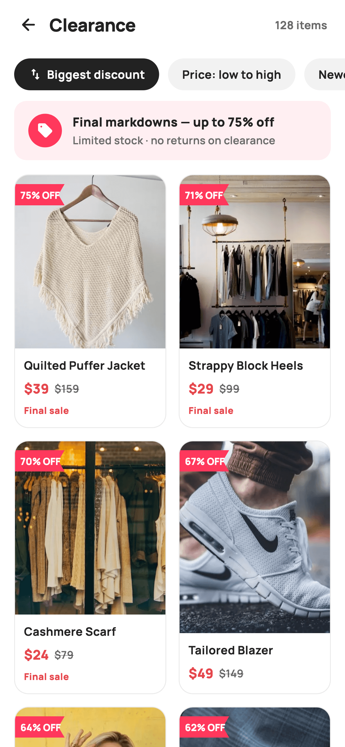
What you'll build
- ✓A pinned header and horizontal pill sort bar that stay put while only the grid scrolls
- ✓A savings banner tinted with the brand coral at 8% alpha, with a solid circular sell-icon badge
- ✓A two-column SliverGrid of clearance cards at a 0.60 aspect ratio, built lazily from an item list
- ✓A CustomPainter corner flag with a notched tail that draws its own '% OFF' text
- ✓Pricing rows that pair a red sale price with a struck-through original, plus a conditional 'Final sale' badge at 70%+ discounts
Step-by-step build
Create the file
Add a new file at lib/ecom_deals_clearance/ecom_deals_clearance_screen.dart in your Flutter project.
Register the bundled fonts
No external packages — this is pure Flutter. It does bundle its design font (Manrope), so drop the font file into fonts/ and declare it in pubspec.yaml:
flutter:
  fonts:
    - family: Manrope
      fonts:
- asset: fonts/Manrope-Regular.ttfBuild it, piece by piece
Here's how the screen goes together. Each block below is a real slice of the code with a plain-English explanation — paste them in order, or grab the whole file from the next section.
Tokens, sort labels and the markdown data
import 'package:flutter/material.dart';

/// StyleCart — Clearance / Sale.
///
/// Final-markdown grid sorted by biggest discount: a sticky sort/chip bar, a
/// savings banner, then two-column cards with a painted "% OFF" corner flag,
/// struck original pricing and a "Final sale" hint on the deepest cuts.
///
/// Self-contained per CONVENTIONS.md: pure Flutter, bundled Manrope, inline
/// Airbnb-style tokens, own light theme + SafeArea. Painter flag tags; bundled
/// product webp. Expanded-image grid cards (web-overflow-proof). Callbacks only.
class EcomDealsClearanceScreen extends StatefulWidget {
  const EcomDealsClearanceScreen({
    super.key,
    this.onBack,
    this.onProduct,
  });

  final VoidCallback? onBack;
  final ValueChanged<int>? onProduct;

  @override
  State<EcomDealsClearanceScreen> createState() =>
      _EcomDealsClearanceScreenState();
}

class _EcomDealsClearanceScreenState extends State<EcomDealsClearanceScreen> {
  static const String _dir =
      'lib/screens/ecommerce/ecom_deals_clearance/images';
  static const String _font = 'Manrope';
  static const Color _canvas = Color(0xFFFFFFFF);
  static const Color _ink = Color(0xFF222222);
  static const Color _muted = Color(0xFF6A6A6A);
  static const Color _brand = Color(0xFFFF385C);
  static const Color _surface = Color(0xFFF2F2F2);
  static const Color _imageBg = Color(0xFFF5F5F5);
  static const Color _danger = Color(0xFFE5484D);
  static const Color _hairline = Color(0xFFEBEBEB);

  static const List<String> _sorts = <String>[
    'Biggest discount',
    'Price: low to high',
    'Newest',
  ];

  // pre-sorted by biggest discount
  static const List<_Item> _items = <_Item>[
    _Item('p01', 'Quilted Puffer Jacket', 39, 159, 75),
    _Item('p02', 'Strappy Block Heels', 29, 99, 71),
    _Item('p03', 'Cashmere Scarf', 24, 79, 70),
    _Item('p04', 'Tailored Blazer', 49, 149, 67),
    _Item('p05', 'Pleated Trousers', 27, 75, 64),
    _Item('p06', 'Canvas Sneakers', 25, 65, 62),
    _Item('p07', 'Floral Wrap Dress', 35, 89, 61),
    _Item('p08', 'Structured Handbag', 59, 145, 59),
  ];

  int _sort = 0;
The widget takes only two callbacks — `onBack` and `onProduct` (a `ValueChanged<int>` carrying the tapped index) — so the screen plugs into any backend or router without edits. The palette keeps two reds on purpose: `_brand` `#FF385C` is the promotional coral used for the banner and flags, while `_danger` `#E5484D` is reserved for prices, so 'this is a deal' and 'this price dropped' read as different signals. The eight `_Item` entries are declared already sorted by `pct` descending — the comment says so — which matches the default sort chip, and `int _sort = 0` is the only piece of mutable state on the screen.
Fixed chrome above a sliver scroll region
  @override
  Widget build(BuildContext context) {
    return Theme(
      data: ThemeData.light(useMaterial3: true),
      child: Scaffold(
        backgroundColor: _canvas,
        body: SafeArea(
          child: Column(
            children: <Widget>[
              _header(),
              _sortBar(),
              Expanded(
                child: CustomScrollView(
                  slivers: <Widget>[
                    SliverToBoxAdapter(child: _savingsBanner()),
                    SliverPadding(
                      padding: const EdgeInsets.fromLTRB(16, 4, 16, 28),
                      sliver: SliverGrid(
                        gridDelegate:
                            const SliverGridDelegateWithFixedCrossAxisCount(
                          crossAxisCount: 2,
                          mainAxisSpacing: 14,
                          crossAxisSpacing: 14,
                          childAspectRatio: 0.60,
                        ),
                        delegate: SliverChildBuilderDelegate(
                          (BuildContext _, int i) => _card(_items[i], i),
                          childCount: _items.length,
                        ),
                      ),
                    ),
                  ],
                ),
              ),
            ],
          ),
        ),
      ),
    );
  }
`build` wraps everything in `Theme(data: ThemeData.light(useMaterial3: true))` so the screen carries its own light theme regardless of the host app. The layout is a `Column` where `_header()` and `_sortBar()` sit as plain children — effectively sticky, since only the `Expanded` `CustomScrollView` below them scrolls. Inside it, the savings banner rides in a `SliverToBoxAdapter` so it scrolls away with the grid, and the grid itself is a `SliverGrid` with `crossAxisCount: 2`, 14px gaps and `childAspectRatio: 0.60` — tall cells that leave the image most of the card. `SliverChildBuilderDelegate` builds cards lazily by index, which is the pattern you keep when the list grows past eight items.
A header with a live item count
  Widget _header() {
    return Padding(
      padding: const EdgeInsets.fromLTRB(8, 4, 20, 6),
      child: Row(
        children: <Widget>[
          IconButton(
            onPressed: widget.onBack,
            icon: const Icon(Icons.arrow_back_rounded, size: 22, color: _ink),
          ),
          const Expanded(
            child: Text(
              'Clearance',
              style: TextStyle(
                fontFamily: _font,
                fontSize: 20,
                fontWeight: FontWeight.w800,
                letterSpacing: -0.3,
                color: _ink,
              ),
            ),
          ),
          const Text(
            '128 items',
            style: TextStyle(
              fontFamily: _font,
              fontSize: 12.5,
              fontWeight: FontWeight.w700,
              color: _muted,
            ),
          ),
        ],
      ),
    );
  }
The header row is asymmetric padding — `fromLTRB(8, 4, 20, 6)` — because the `IconButton` brings its own touch-target whitespace on the left while the '128 items' label needs a real 20px inset on the right. The 'Clearance' title takes 20px `w800` Manrope with `letterSpacing: -0.3` inside an `Expanded`, which shoves the count to the trailing edge. Putting the count in the header rather than above the grid means it stays visible while scrolling, and at 12.5px `_muted` it reads as metadata rather than competing with the title.
The pill sort bar
  Widget _sortBar() {
    return SizedBox(
      height: 52,
      child: ListView(
        scrollDirection: Axis.horizontal,
        padding: const EdgeInsets.fromLTRB(16, 8, 16, 8),
        children: <Widget>[
          for (int i = 0; i < _sorts.length; i++)
            Padding(
              padding: const EdgeInsets.only(right: 10),
              child: GestureDetector(
                onTap: () => setState(() => _sort = i),
                child: Container(
                  padding:
                      const EdgeInsets.symmetric(horizontal: 16, vertical: 9),
                  decoration: BoxDecoration(
                    color: _sort == i ? _ink : _surface,
                    borderRadius: BorderRadius.circular(9999),
                  ),
                  child: Row(
                    children: <Widget>[
                      if (i == 0)
                        Padding(
                          padding: const EdgeInsets.only(right: 5),
                          child: Icon(
                            Icons.swap_vert_rounded,
                            size: 16,
                            color: _sort == i ? _canvas : _ink,
                          ),
                        ),
                      Text(
                        _sorts[i],
                        style: TextStyle(
                          fontFamily: _font,
                          fontSize: 13,
                          fontWeight: FontWeight.w700,
                          color: _sort == i ? _canvas : _ink,
                        ),
                      ),
                    ],
                  ),
                ),
              ),
            ),
        ],
      ),
    );
  }
The bar is a fixed 52px `SizedBox` holding a horizontal `ListView`, so extra sort options overflow into a scroll instead of wrapping. A collection-for builds one `GestureDetector` pill per label; tapping runs `setState(() => _sort = i)`, and the selected pill flips from `_surface` grey to solid `_ink` with its text inverting to `_canvas` white — a stronger active state than a border or underline. `BorderRadius.circular(9999)` is the lazy-but-safe way to guarantee a full pill at any height, and only the first chip ('Biggest discount') gets the `Icons.swap_vert_rounded` glyph, marking it as the sort axis rather than a filter.
The savings banner
  Widget _savingsBanner() {
    return Container(
      margin: const EdgeInsets.fromLTRB(16, 4, 16, 12),
      padding: const EdgeInsets.symmetric(horizontal: 16, vertical: 14),
      decoration: BoxDecoration(
        color: _brand.withValues(alpha: 0.08),
        borderRadius: BorderRadius.circular(14),
      ),
      child: Row(
        children: <Widget>[
          Container(
            width: 38,
            height: 38,
            alignment: Alignment.center,
            decoration: const BoxDecoration(
              color: _brand,
              shape: BoxShape.circle,
            ),
            child: const Icon(Icons.sell_rounded, size: 19, color: _canvas),
          ),
          const SizedBox(width: 12),
          const Expanded(
            child: Column(
              crossAxisAlignment: CrossAxisAlignment.start,
              children: <Widget>[
                Text(
                  'Final markdowns — up to 75% off',
                  style: TextStyle(
                    fontFamily: _font,
                    fontSize: 14,
                    fontWeight: FontWeight.w800,
                    color: _ink,
                  ),
                ),
                SizedBox(height: 2),
                Text(
                  'Limited stock · no returns on clearance',
                  style: TextStyle(
                    fontFamily: _font,
                    fontSize: 12,
                    fontWeight: FontWeight.w600,
                    color: _muted,
                  ),
                ),
              ],
            ),
          ),
        ],
      ),
    );
  }
The banner's ground is `_brand.withValues(alpha: 0.08)` — the coral knocked back to a wash — while the 38px circular badge holding `Icons.sell_rounded` uses the coral at full strength, so one hue does both the container and its focal point. The copy is two stacked lines inside an `Expanded` column: the headline 'Final markdowns — up to 75% off' at 14px `w800` in `_ink`, and a 12px `_muted` subline carrying the urgency terms ('Limited stock · no returns on clearance'). Selling the ceiling discount here, before any card is seen, frames every price below it.
Product cards: image stack, flag, pricing
  Widget _card(_Item it, int i) {
    return GestureDetector(
      onTap: () => widget.onProduct?.call(i),
      child: Container(
        decoration: BoxDecoration(
          color: _canvas,
          borderRadius: BorderRadius.circular(16),
          border: Border.all(color: _hairline),
        ),
        child: Column(
          crossAxisAlignment: CrossAxisAlignment.start,
          children: <Widget>[
            Expanded(
              child: ClipRRect(
                borderRadius:
                    const BorderRadius.vertical(top: Radius.circular(15)),
                child: Stack(
                  fit: StackFit.expand,
                  children: <Widget>[
                    Container(
                      color: _imageBg,
                      child: Image.asset('$_dir/${it.img}.webp',
                          fit: BoxFit.cover),
                    ),
                    Positioned(
                      left: 0,
                      top: 10,
                      child: CustomPaint(
                        size: const Size(56, 24),
                        painter: _FlagPainter('${it.pct}% OFF'),
                      ),
                    ),
                  ],
                ),
              ),
            ),
            Padding(
              padding: const EdgeInsets.fromLTRB(10, 10, 10, 12),
              child: Column(
                crossAxisAlignment: CrossAxisAlignment.start,
                children: <Widget>[
                  Text(
                    it.title,
                    maxLines: 1,
                    overflow: TextOverflow.ellipsis,
                    style: const TextStyle(
                      fontFamily: _font,
                      fontSize: 13,
                      fontWeight: FontWeight.w700,
                      color: _ink,
                    ),
                  ),
                  const SizedBox(height: 6),
                  Row(
                    children: <Widget>[
                      Text(
                        '\$${it.price}',
                        style: const TextStyle(
                          fontFamily: _font,
                          fontSize: 15,
                          fontWeight: FontWeight.w800,
                          color: _danger,
                        ),
                      ),
                      const SizedBox(width: 6),
                      Text(
                        '\$${it.was}',
                        style: const TextStyle(
                          fontFamily: _font,
                          fontSize: 12,
                          fontWeight: FontWeight.w600,
                          decoration: TextDecoration.lineThrough,
                          color: _muted,
                        ),
                      ),
                    ],
                  ),
                  if (it.pct >= 70) ...<Widget>[
                    const SizedBox(height: 6),
                    const Text(
                      'Final sale',
                      style: TextStyle(
                        fontFamily: _font,
                        fontSize: 10.5,
                        fontWeight: FontWeight.w800,
                        letterSpacing: 0.3,
                        color: _danger,
                      ),
                    ),
                  ],
                ],
              ),
            ),
          ],
        ),
      ),
    );
  }
Each card is a hairline-bordered 16px-radius `Container` whose image area is `Expanded` — it absorbs whatever height the 0.60 aspect ratio leaves after the text block, which is what makes the grid web-overflow-proof. The image sits in a `Stack` under a `ClipRRect` rounded to 15 (one less than the card, so the border stays visible), with the `CustomPaint` flag `Positioned` at `left: 0, top: 10` in a fixed 56×24 box. The pricing row leads with the sale price at 15px `w800` in `_danger`, then the original at only 12px with `TextDecoration.lineThrough` in `_muted` — size, weight and colour all rank the two numbers, not just the strike. The kicker is `if (it.pct >= 70) ...[...]`: a spread-in 'Final sale' label in 10.5px `_danger` caps that appears only on the three deepest cuts, echoing the banner's no-returns warning exactly where it applies.
The item model and the flag painter
class _Item {
  const _Item(this.img, this.title, this.price, this.was, this.pct);
  final String img;
  final String title;
  final int price;
  final int was;
  final int pct;
}

/// A pointed corner flag (banner with a notched tail) carrying the discount %.
class _FlagPainter extends CustomPainter {
  _FlagPainter(this.label);
  final String label;

  static const Color _brand = Color(0xFFFF385C);

  @override
  void paint(Canvas canvas, Size size) {
    final Path flag = Path()
      ..moveTo(0, 0)
      ..lineTo(size.width, 0)
      ..lineTo(size.width - 7, size.height / 2)
      ..lineTo(size.width, size.height)
      ..lineTo(0, size.height)
      ..close();
    canvas.drawPath(flag, Paint()..color = _brand);

    final TextPainter tp = TextPainter(
      text: TextSpan(
        text: label,
        style: const TextStyle(
          fontFamily: 'Manrope',
          fontSize: 11,
          fontWeight: FontWeight.w800,
          color: Colors.white,
        ),
      ),
      textDirection: TextDirection.ltr,
    )..layout(maxWidth: size.width - 8);
    tp.paint(
      canvas,
      Offset(6, (size.height - tp.height) / 2),
    );
  }

  @override
  bool shouldRepaint(_FlagPainter old) => old.label != label;
}
`_Item` is a five-field const value class — image key, title, sale price, original price and discount percentage — with prices as `int`s since clearance tags round to whole dollars. `_FlagPainter` draws the banner as a single closed `Path`: across the top, then `lineTo(size.width - 7, size.height / 2)` cuts 7px inward at mid-height before returning to the bottom-right corner, which is what produces the notched swallow-tail on the right edge. The label is rendered by the painter itself via `TextPainter` at 11px `w800` white Manrope, laid out with `maxWidth: size.width - 8` and painted at `Offset(6, ...)` to centre vertically — no child widget needed. `shouldRepaint` compares labels, so the eight flags never repaint unless their text changes.
Full code
The complete, ready-to-paste source. Free to use in your projects — one click copies it all.
import 'package:flutter/material.dart';

/// StyleCart — Clearance / Sale.
///
/// Final-markdown grid sorted by biggest discount: a sticky sort/chip bar, a
/// savings banner, then two-column cards with a painted "% OFF" corner flag,
/// struck original pricing and a "Final sale" hint on the deepest cuts.
///
/// Self-contained per CONVENTIONS.md: pure Flutter, bundled Manrope, inline
/// Airbnb-style tokens, own light theme + SafeArea. Painter flag tags; bundled
/// product webp. Expanded-image grid cards (web-overflow-proof). Callbacks only.
class EcomDealsClearanceScreen extends StatefulWidget {
  const EcomDealsClearanceScreen({
    super.key,
    this.onBack,
    this.onProduct,
  });

  final VoidCallback? onBack;
  final ValueChanged<int>? onProduct;

  @override
  State<EcomDealsClearanceScreen> createState() =>
      _EcomDealsClearanceScreenState();
}

class _EcomDealsClearanceScreenState extends State<EcomDealsClearanceScreen> {
  static const String _dir =
      'lib/screens/ecommerce/ecom_deals_clearance/images';
  static const String _font = 'Manrope';
  static const Color _canvas = Color(0xFFFFFFFF);
  static const Color _ink = Color(0xFF222222);
  static const Color _muted = Color(0xFF6A6A6A);
  static const Color _brand = Color(0xFFFF385C);
  static const Color _surface = Color(0xFFF2F2F2);
  static const Color _imageBg = Color(0xFFF5F5F5);
  static const Color _danger = Color(0xFFE5484D);
  static const Color _hairline = Color(0xFFEBEBEB);

  static const List<String> _sorts = <String>[
    'Biggest discount',
    'Price: low to high',
    'Newest',
  ];

  // pre-sorted by biggest discount
  static const List<_Item> _items = <_Item>[
    _Item('p01', 'Quilted Puffer Jacket', 39, 159, 75),
    _Item('p02', 'Strappy Block Heels', 29, 99, 71),
    _Item('p03', 'Cashmere Scarf', 24, 79, 70),
    _Item('p04', 'Tailored Blazer', 49, 149, 67),
    _Item('p05', 'Pleated Trousers', 27, 75, 64),
    _Item('p06', 'Canvas Sneakers', 25, 65, 62),
    _Item('p07', 'Floral Wrap Dress', 35, 89, 61),
    _Item('p08', 'Structured Handbag', 59, 145, 59),
  ];

  int _sort = 0;

  @override
  Widget build(BuildContext context) {
    return Theme(
      data: ThemeData.light(useMaterial3: true),
      child: Scaffold(
        backgroundColor: _canvas,
        body: SafeArea(
          child: Column(
            children: <Widget>[
              _header(),
              _sortBar(),
              Expanded(
                child: CustomScrollView(
                  slivers: <Widget>[
                    SliverToBoxAdapter(child: _savingsBanner()),
                    SliverPadding(
                      padding: const EdgeInsets.fromLTRB(16, 4, 16, 28),
                      sliver: SliverGrid(
                        gridDelegate:
                            const SliverGridDelegateWithFixedCrossAxisCount(
                          crossAxisCount: 2,
                          mainAxisSpacing: 14,
                          crossAxisSpacing: 14,
                          childAspectRatio: 0.60,
                        ),
                        delegate: SliverChildBuilderDelegate(
                          (BuildContext _, int i) => _card(_items[i], i),
                          childCount: _items.length,
                        ),
                      ),
                    ),
                  ],
                ),
              ),
            ],
          ),
        ),
      ),
    );
  }

  Widget _header() {
    return Padding(
      padding: const EdgeInsets.fromLTRB(8, 4, 20, 6),
      child: Row(
        children: <Widget>[
          IconButton(
            onPressed: widget.onBack,
            icon: const Icon(Icons.arrow_back_rounded, size: 22, color: _ink),
          ),
          const Expanded(
            child: Text(
              'Clearance',
              style: TextStyle(
                fontFamily: _font,
                fontSize: 20,
                fontWeight: FontWeight.w800,
                letterSpacing: -0.3,
                color: _ink,
              ),
            ),
          ),
          const Text(
            '128 items',
            style: TextStyle(
              fontFamily: _font,
              fontSize: 12.5,
              fontWeight: FontWeight.w700,
              color: _muted,
            ),
          ),
        ],
      ),
    );
  }

  Widget _sortBar() {
    return SizedBox(
      height: 52,
      child: ListView(
        scrollDirection: Axis.horizontal,
        padding: const EdgeInsets.fromLTRB(16, 8, 16, 8),
        children: <Widget>[
          for (int i = 0; i < _sorts.length; i++)
            Padding(
              padding: const EdgeInsets.only(right: 10),
              child: GestureDetector(
                onTap: () => setState(() => _sort = i),
                child: Container(
                  padding:
                      const EdgeInsets.symmetric(horizontal: 16, vertical: 9),
                  decoration: BoxDecoration(
                    color: _sort == i ? _ink : _surface,
                    borderRadius: BorderRadius.circular(9999),
                  ),
                  child: Row(
                    children: <Widget>[
                      if (i == 0)
                        Padding(
                          padding: const EdgeInsets.only(right: 5),
                          child: Icon(
                            Icons.swap_vert_rounded,
                            size: 16,
                            color: _sort == i ? _canvas : _ink,
                          ),
                        ),
                      Text(
                        _sorts[i],
                        style: TextStyle(
                          fontFamily: _font,
                          fontSize: 13,
                          fontWeight: FontWeight.w700,
                          color: _sort == i ? _canvas : _ink,
                        ),
                      ),
                    ],
                  ),
                ),
              ),
            ),
        ],
      ),
    );
  }

  Widget _savingsBanner() {
    return Container(
      margin: const EdgeInsets.fromLTRB(16, 4, 16, 12),
      padding: const EdgeInsets.symmetric(horizontal: 16, vertical: 14),
      decoration: BoxDecoration(
        color: _brand.withValues(alpha: 0.08),
        borderRadius: BorderRadius.circular(14),
      ),
      child: Row(
        children: <Widget>[
          Container(
            width: 38,
            height: 38,
            alignment: Alignment.center,
            decoration: const BoxDecoration(
              color: _brand,
              shape: BoxShape.circle,
            ),
            child: const Icon(Icons.sell_rounded, size: 19, color: _canvas),
          ),
          const SizedBox(width: 12),
          const Expanded(
            child: Column(
              crossAxisAlignment: CrossAxisAlignment.start,
              children: <Widget>[
                Text(
                  'Final markdowns — up to 75% off',
                  style: TextStyle(
                    fontFamily: _font,
                    fontSize: 14,
                    fontWeight: FontWeight.w800,
                    color: _ink,
                  ),
                ),
                SizedBox(height: 2),
                Text(
                  'Limited stock · no returns on clearance',
                  style: TextStyle(
                    fontFamily: _font,
                    fontSize: 12,
                    fontWeight: FontWeight.w600,
                    color: _muted,
                  ),
                ),
              ],
            ),
          ),
        ],
      ),
    );
  }

  Widget _card(_Item it, int i) {
    return GestureDetector(
      onTap: () => widget.onProduct?.call(i),
      child: Container(
        decoration: BoxDecoration(
          color: _canvas,
          borderRadius: BorderRadius.circular(16),
          border: Border.all(color: _hairline),
        ),
        child: Column(
          crossAxisAlignment: CrossAxisAlignment.start,
          children: <Widget>[
            Expanded(
              child: ClipRRect(
                borderRadius:
                    const BorderRadius.vertical(top: Radius.circular(15)),
                child: Stack(
                  fit: StackFit.expand,
                  children: <Widget>[
                    Container(
                      color: _imageBg,
                      child: Image.asset('$_dir/${it.img}.webp',
                          fit: BoxFit.cover),
                    ),
                    Positioned(
                      left: 0,
                      top: 10,
                      child: CustomPaint(
                        size: const Size(56, 24),
                        painter: _FlagPainter('${it.pct}% OFF'),
                      ),
                    ),
                  ],
                ),
              ),
            ),
            Padding(
              padding: const EdgeInsets.fromLTRB(10, 10, 10, 12),
              child: Column(
                crossAxisAlignment: CrossAxisAlignment.start,
                children: <Widget>[
                  Text(
                    it.title,
                    maxLines: 1,
                    overflow: TextOverflow.ellipsis,
                    style: const TextStyle(
                      fontFamily: _font,
                      fontSize: 13,
                      fontWeight: FontWeight.w700,
                      color: _ink,
                    ),
                  ),
                  const SizedBox(height: 6),
                  Row(
                    children: <Widget>[
                      Text(
                        '\$${it.price}',
                        style: const TextStyle(
                          fontFamily: _font,
                          fontSize: 15,
                          fontWeight: FontWeight.w800,
                          color: _danger,
                        ),
                      ),
                      const SizedBox(width: 6),
                      Text(
                        '\$${it.was}',
                        style: const TextStyle(
                          fontFamily: _font,
                          fontSize: 12,
                          fontWeight: FontWeight.w600,
                          decoration: TextDecoration.lineThrough,
                          color: _muted,
                        ),
                      ),
                    ],
                  ),
                  if (it.pct >= 70) ...<Widget>[
                    const SizedBox(height: 6),
                    const Text(
                      'Final sale',
                      style: TextStyle(
                        fontFamily: _font,
                        fontSize: 10.5,
                        fontWeight: FontWeight.w800,
                        letterSpacing: 0.3,
                        color: _danger,
                      ),
                    ),
                  ],
                ],
              ),
            ),
          ],
        ),
      ),
    );
  }
}

class _Item {
  const _Item(this.img, this.title, this.price, this.was, this.pct);
  final String img;
  final String title;
  final int price;
  final int was;
  final int pct;
}

/// A pointed corner flag (banner with a notched tail) carrying the discount %.
class _FlagPainter extends CustomPainter {
  _FlagPainter(this.label);
  final String label;

  static const Color _brand = Color(0xFFFF385C);

  @override
  void paint(Canvas canvas, Size size) {
    final Path flag = Path()
      ..moveTo(0, 0)
      ..lineTo(size.width, 0)
      ..lineTo(size.width - 7, size.height / 2)
      ..lineTo(size.width, size.height)
      ..lineTo(0, size.height)
      ..close();
    canvas.drawPath(flag, Paint()..color = _brand);

    final TextPainter tp = TextPainter(
      text: TextSpan(
        text: label,
        style: const TextStyle(
          fontFamily: 'Manrope',
          fontSize: 11,
          fontWeight: FontWeight.w800,
          color: Colors.white,
        ),
      ),
      textDirection: TextDirection.ltr,
    )..layout(maxWidth: size.width - 8);
    tp.paint(
      canvas,
      Offset(6, (size.height - tp.height) / 2),
    );
  }

  @override
  bool shouldRepaint(_FlagPainter old) => old.label != label;
}
Plus bundled 13 binary assets (fonts/images). The CLI and MCP install those for you automatically.
Two faster ways to add it
Copy-paste works, but you can skip it entirely.
1. FlutterKit CLI
One command drops this screen — and its fonts — straight into your project.
$ flutterkit add ecom-deals-clearance2. AI agent (MCP)
Connect FlutterKit's MCP server in Claude or Cursor and just ask your agent to install ecom-deals-clearance — it fetches and writes the files for you.
FAQ
Is this clearance screen free to use in a commercial app?
Yes. FlutterKit screens are free to use, commercially included — ship this grid in a paid retail or marketplace app as-is or restyled. No attribution or sign-up is required.
What packages or fonts does this screen depend on?
No pub packages at all — the imports stop at `package:flutter/material.dart`, and the corner flag is a hand-rolled `CustomPainter` rather than an SVG library. The only assets are the bundled Manrope font (referenced by `fontFamily: 'Manrope'`, so declare it in `pubspec.yaml`) and the product `.webp` images loaded from the `_dir` path.
Which Flutter version does this need?
Flutter 3.27 or newer, because the savings banner tints its background with `_brand.withValues(alpha: 0.08)`. On an older SDK, replace that call with `withOpacity(0.08)`; the constructor also uses `super.key`, which needs Dart 2.17+ (Flutter 3.0+).
The sort pills change state — why doesn't the grid re-order?
The demo data is a `static const` list pre-sorted by biggest discount, so `_sort` only drives the chip styling. To make it real, keep `_items` as the source, derive a sorted copy in `build` — switch on `_sort` and compare `pct` descending, `price` ascending, or your added date field — and hand that list to the `SliverChildBuilderDelegate`. `setState` in the pill's `onTap` already triggers the rebuild.
How do I plug in real products instead of the eight sample items?
Replace the `_Item` list with your API models — you need a title, sale price, original price, discount percent and an image reference. Swap `Image.asset('$_dir/${it.img}.webp')` for `Image.network` (keep the `_imageBg` container behind it as a loading ground), and compute `pct` from the two prices so the flag and the 70% 'Final sale' threshold stay honest.


