How to Build a Flash Sale Screen in Flutter (Full Code + Preview)
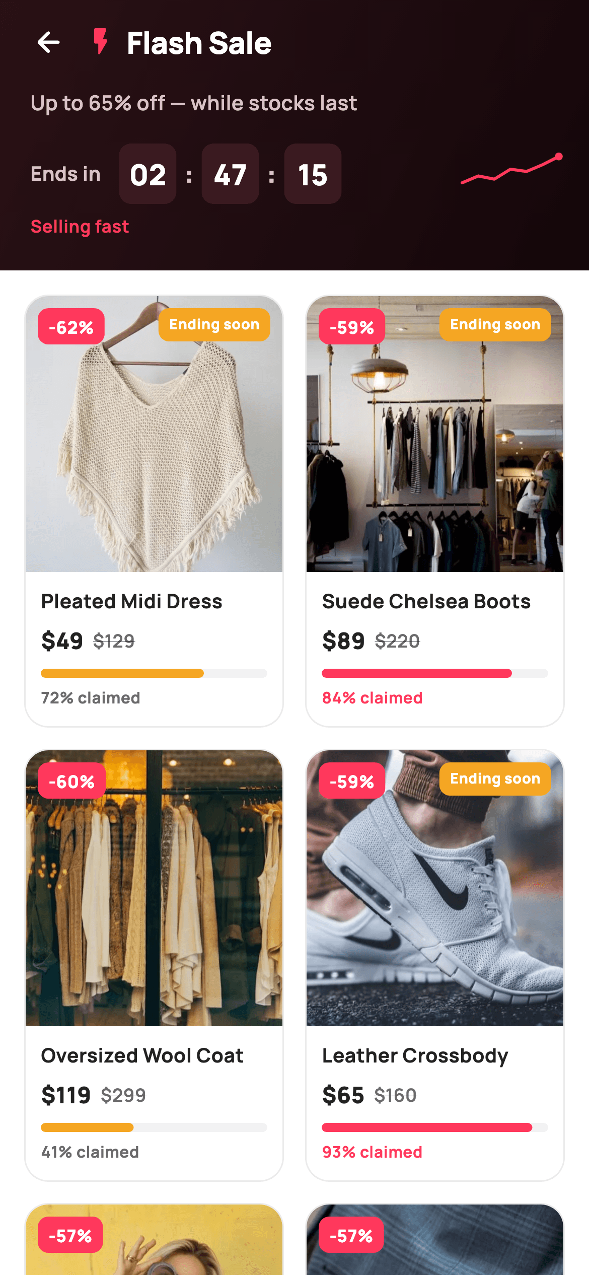
Flash sales live or die on urgency: if the shopper cannot feel time and stock running out, the discount is just a price. This tutorial builds StyleCart's flash-sale screen in Flutter — a dark gradient hero with painted HH:MM:SS countdown boxes and a momentum sparkline, above a two-column deal grid where every card carries a discount badge, struck-through pricing and a painted sold-stock bar that changes colour past 80% claimed. It is a single stateless widget with two callbacks, no packages, and every graphic drawn with CustomPainter.
What you'll build
- ✓A dark gradient sale hero with an HH:MM:SS countdown built from painted time boxes
- ✓A hand-drawn momentum sparkline with an end dot, backing a 'Selling fast' cue
- ✓A two-column SliverGrid of deal cards with corner '-62%' badges and amber 'Ending soon' flags
- ✓Struck-through was-pricing next to the sale price on every card
- ✓A CustomPainter stock bar and '% claimed' label that switch from amber to brand coral at 80% sold
Step-by-step build
Create the file
Add a new file at lib/ecom_flash_sale/ecom_flash_sale_screen.dart in your Flutter project.
Register the bundled fonts
No external packages — this is pure Flutter. It does bundle its design font (Manrope), so drop the font file into fonts/ and declare it in pubspec.yaml:
flutter:
  fonts:
    - family: Manrope
      fonts:
- asset: fonts/Manrope-Regular.ttfBuild it, piece by piece
Here's how the screen goes together. Each block below is a real slice of the code with a plain-English explanation — paste them in order, or grab the whole file from the next section.
Six deals as const data, and a coral-on-dark palette
import 'package:flutter/material.dart';

/// StyleCart — Flash Sale.
///
/// A live-countdown sale: a dark hero with a painted HH:MM:SS timer and a
/// momentum sparkline, then a two-column deal grid where each card carries a
/// discount badge, an "ending soon" flag, struck pricing and a painted
/// "sold %" stock bar.
///
/// Self-contained per CONVENTIONS.md: pure Flutter, bundled Manrope, inline
/// Airbnb-style tokens, own light theme + SafeArea. Painters for timer boxes,
/// sparkline and sold bars; bundled product webp. Exposes callbacks only.
class EcomFlashSaleScreen extends StatelessWidget {
  const EcomFlashSaleScreen({
    super.key,
    this.onBack,
    this.onProduct,
  });

  final VoidCallback? onBack;
  final ValueChanged<int>? onProduct;

  static const String _dir = 'lib/screens/ecommerce/ecom_flash_sale/images';
  static const String _font = 'Manrope';
  static const Color _canvas = Color(0xFFFFFFFF);
  static const Color _ink = Color(0xFF222222);
  static const Color _muted = Color(0xFF6A6A6A);
  static const Color _brand = Color(0xFFFF385C);
  static const Color _imageBg = Color(0xFFF5F5F5);
  static const Color _warn = Color(0xFFF5A623);

  static const List<_Deal> _deals = <_Deal>[
    _Deal('p01', 'Pleated Midi Dress', 49, 129, 62, 72, true),
    _Deal('p02', 'Suede Chelsea Boots', 89, 220, 59, 84, true),
    _Deal('p03', 'Oversized Wool Coat', 119, 299, 60, 41, false),
    _Deal('p04', 'Leather Crossbody', 65, 160, 59, 93, true),
    _Deal('p05', 'Ribbed Knit Sweater', 34, 79, 57, 38, false),
    _Deal('p06', 'High-Rise Slim Jeans', 42, 98, 57, 66, false),
  ];
`EcomFlashSaleScreen` is a `StatelessWidget` exposing just `onBack` and `onProduct` (a `ValueChanged<int>` carrying the tapped card's index), so the host app decides what a product tap means. The palette pairs `_brand` `#FF385C` — the Airbnb-style coral that marks everything urgent — with `_warn` amber `#F5A623` for secondary pressure cues. The six products live in a `static const List<_Deal>` where each record packs image id, title, sale price, original price, discount percent, percent sold and an `endingSoon` flag; positional const constructors keep the whole dataset compile-time and trivially swappable for API data.
A sliver scaffold: hero above a two-column grid
  @override
  Widget build(BuildContext context) {
    return Theme(
      data: ThemeData.light(useMaterial3: true),
      child: Scaffold(
        backgroundColor: _canvas,
        body: SafeArea(
          child: CustomScrollView(
            slivers: <Widget>[
              SliverToBoxAdapter(child: _hero()),
              SliverPadding(
                padding: const EdgeInsets.fromLTRB(16, 16, 16, 28),
                sliver: SliverGrid(
                  gridDelegate:
                      const SliverGridDelegateWithFixedCrossAxisCount(
                    crossAxisCount: 2,
                    mainAxisSpacing: 14,
                    crossAxisSpacing: 14,
                    childAspectRatio: 0.60,
                  ),
                  delegate: SliverChildBuilderDelegate(
                    (BuildContext _, int i) => _card(_deals[i], i),
                    childCount: _deals.length,
                  ),
                ),
              ),
            ],
          ),
        ),
      ),
    );
  }
The body is a `CustomScrollView` so the dark hero (a `SliverToBoxAdapter`) and the deal grid scroll as one surface instead of the hero staying pinned. `SliverGridDelegateWithFixedCrossAxisCount` fixes two columns with 14px gaps, and the unusual `childAspectRatio: 0.60` makes each cell almost twice as tall as it is wide — room for a portrait product photo plus title, prices and the stock bar. Wrapping everything in `Theme(data: ThemeData.light(useMaterial3: true))` keeps the screen self-contained regardless of the host app's theme.
The dark countdown hero
  Widget _hero() {
    return Container(
      decoration: const BoxDecoration(
        gradient: LinearGradient(
          begin: Alignment.topLeft,
          end: Alignment.bottomRight,
          colors: <Color>[Color(0xFF2A1116), Color(0xFF14070A)],
        ),
      ),
      padding: const EdgeInsets.fromLTRB(8, 4, 20, 22),
      child: Column(
        crossAxisAlignment: CrossAxisAlignment.start,
        children: <Widget>[
          Row(
            children: <Widget>[
              IconButton(
                onPressed: onBack,
                icon: const Icon(Icons.arrow_back_rounded,
                    size: 22, color: _canvas),
              ),
              const Icon(Icons.flash_on_rounded, size: 22, color: _brand),
              const SizedBox(width: 6),
              const Text(
                'Flash Sale',
                style: TextStyle(
                  fontFamily: _font,
                  fontSize: 20,
                  fontWeight: FontWeight.w800,
                  letterSpacing: -0.3,
                  color: _canvas,
                ),
              ),
            ],
          ),
          const SizedBox(height: 6),
          const Padding(
            padding: EdgeInsets.only(left: 12),
            child: Text(
              'Up to 65% off — while stocks last',
              style: TextStyle(
                fontFamily: _font,
                fontSize: 13.5,
                fontWeight: FontWeight.w600,
                color: Color(0xFFD9C2C7),
              ),
            ),
          ),
          const SizedBox(height: 18),
          Padding(
            padding: const EdgeInsets.only(left: 12),
            child: Row(
              children: <Widget>[
                const Text(
                  'Ends in',
                  style: TextStyle(
                    fontFamily: _font,
                    fontSize: 13,
                    fontWeight: FontWeight.w700,
                    color: Color(0xFFD9C2C7),
                  ),
                ),
                const SizedBox(width: 12),
                _timeBox('02'),
                _colon(),
                _timeBox('47'),
                _colon(),
                _timeBox('15'),
                const Spacer(),
                SizedBox(
                  width: 64,
                  height: 30,
                  child: CustomPaint(painter: _SparkPainter()),
                ),
              ],
            ),
          ),
          const Padding(
            padding: EdgeInsets.only(left: 12, top: 6),
            child: Text(
              'Selling fast',
              style: TextStyle(
                fontFamily: _font,
                fontSize: 11.5,
                fontWeight: FontWeight.w700,
                color: _brand,
              ),
            ),
          ),
        ],
      ),
    );
  }
The hero's `LinearGradient` runs top-left to bottom-right between two near-black maroons (`#2A1116` → `#14070A`), so the coral flash icon and white 'Flash Sale' title get maximum contrast while staying on-brand. Supporting copy uses `#D9C2C7`, a desaturated pink that reads as 'muted' against the maroon the way grey would on white. The countdown row lays `_timeBox('02')`, `_colon()`, `_timeBox('47')`, `_colon()`, `_timeBox('15')` after an 'Ends in' label, then a `Spacer()` pushes a 64×30 `CustomPaint(painter: _SparkPainter())` to the right edge; the tiny coral 'Selling fast' line beneath ties the sparkline to its meaning.
Painted-look time boxes and colons
  Widget _timeBox(String v) {
    return Container(
      width: 38,
      height: 40,
      alignment: Alignment.center,
      decoration: BoxDecoration(
        color: const Color(0xFF3A1A20),
        borderRadius: BorderRadius.circular(8),
      ),
      child: Text(
        v,
        style: const TextStyle(
          fontFamily: _font,
          fontSize: 19,
          fontWeight: FontWeight.w800,
          color: _canvas,
        ),
      ),
    );
  }

  Widget _colon() {
    return const Padding(
      padding: EdgeInsets.symmetric(horizontal: 5),
      child: Text(
        ':',
        style: TextStyle(
          fontFamily: _font,
          fontSize: 18,
          fontWeight: FontWeight.w800,
          color: Color(0xFFD9C2C7),
        ),
      ),
    );
  }
Each `_timeBox` is a fixed 38×40 `Container` filled `#3A1A20` — one step lighter than the gradient — with an 8px corner radius, centring a 19px `w800` digit pair. Fixing the width matters: digits vary in advance width, so an intrinsic-width box would make the timer jitter as seconds change. The `_colon` separators sit outside the boxes in the muted pink at 18px, so the rhythm reads box-colon-box-colon-box like a real digital clock rather than one long string.
Deal card, part one: image stack and urgency badges
  Widget _card(_Deal d, int i) {
    return GestureDetector(
      onTap: () => onProduct?.call(i),
      child: Container(
        decoration: BoxDecoration(
          color: _canvas,
          borderRadius: BorderRadius.circular(16),
          border: Border.all(color: const Color(0xFFEBEBEB)),
        ),
        child: Column(
          crossAxisAlignment: CrossAxisAlignment.start,
          children: <Widget>[
            Expanded(
              child: ClipRRect(
                borderRadius: const BorderRadius.vertical(
                  top: Radius.circular(15),
                ),
                child: Stack(
                  fit: StackFit.expand,
                  children: <Widget>[
                    Container(
                      color: _imageBg,
                      child: Image.asset('$_dir/${d.img}.webp',
                          fit: BoxFit.cover),
                    ),
                    Positioned(
                      left: 8,
                      top: 8,
                      child: Container(
                        padding: const EdgeInsets.symmetric(
                            horizontal: 7, vertical: 4),
                        decoration: BoxDecoration(
                          color: _brand,
                          borderRadius: BorderRadius.circular(7),
                        ),
                        child: Text(
                          '-${d.pct}%',
                          style: const TextStyle(
                            fontFamily: _font,
                            fontSize: 11.5,
                            fontWeight: FontWeight.w800,
                            color: _canvas,
                          ),
                        ),
                      ),
                    ),
                    if (d.endingSoon)
                      Positioned(
                        right: 8,
                        top: 8,
                        child: Container(
                          padding: const EdgeInsets.symmetric(
                              horizontal: 7, vertical: 4),
                          decoration: BoxDecoration(
                            color: _warn,
                            borderRadius: BorderRadius.circular(7),
                          ),
                          child: const Text(
                            'Ending soon',
                            style: TextStyle(
                              fontFamily: _font,
                              fontSize: 9.5,
                              fontWeight: FontWeight.w800,
                              color: _canvas,
                            ),
                          ),
                        ),
                      ),
                  ],
                ),
              ),
            ),
Each card is a `GestureDetector` calling `onProduct?.call(i)` around a white container with a 16px radius and a faint `#EBEBEB` border. The image area is an `Expanded` `ClipRRect` (top corners only, at 15px — one less than the card so the border stays visible) holding a `Stack` with `StackFit.expand`: an `Image.asset` webp over the `#F5F5F5` placeholder colour, a coral `-${d.pct}%` pill `Positioned` top-left, and — only `if (d.endingSoon)` — an amber 'Ending soon' pill top-right at a smaller 9.5px. Splitting the two flags across opposite corners lets a card carry both without them competing.
Deal card, part two: pricing and the stock bar
            Padding(
              padding: const EdgeInsets.fromLTRB(10, 10, 10, 12),
              child: Column(
                crossAxisAlignment: CrossAxisAlignment.start,
                children: <Widget>[
                  Text(
                    d.title,
                    maxLines: 1,
                    overflow: TextOverflow.ellipsis,
                    style: const TextStyle(
                      fontFamily: _font,
                      fontSize: 13,
                      fontWeight: FontWeight.w700,
                      color: _ink,
                    ),
                  ),
                  const SizedBox(height: 6),
                  Row(
                    children: <Widget>[
                      Text(
                        '\$${d.price}',
                        style: const TextStyle(
                          fontFamily: _font,
                          fontSize: 15,
                          fontWeight: FontWeight.w800,
                          color: _ink,
                        ),
                      ),
                      const SizedBox(width: 6),
                      Text(
                        '\$${d.was}',
                        style: const TextStyle(
                          fontFamily: _font,
                          fontSize: 12,
                          fontWeight: FontWeight.w600,
                          decoration: TextDecoration.lineThrough,
                          color: _muted,
                        ),
                      ),
                    ],
                  ),
                  const SizedBox(height: 8),
                  SizedBox(
                    height: 6,
                    child: CustomPaint(
                      painter: _SoldBarPainter(d.sold / 100),
                      size: const Size(double.infinity, 6),
                    ),
                  ),
                  const SizedBox(height: 5),
                  Text(
                    '${d.sold}% claimed',
                    style: TextStyle(
                      fontFamily: _font,
                      fontSize: 10.5,
                      fontWeight: FontWeight.w700,
                      color: d.sold >= 80 ? _brand : _muted,
                    ),
                  ),
                ],
              ),
            ),
          ],
        ),
      ),
    );
  }
}
The footer stacks a one-line ellipsised title, then a price row where `\$${d.price}` at 15px `w800` ink sits beside `\$${d.was}` at 12px with `TextDecoration.lineThrough` in muted grey — size, weight and the strike all rank the sale price without a single extra widget. Below, a 6px-tall `CustomPaint` runs `_SoldBarPainter(d.sold / 100)` full width via `Size(double.infinity, 6)`. The `'${d.sold}% claimed'` caption mirrors the bar's logic in text colour: `d.sold >= 80 ? _brand : _muted`, so a nearly-gone item gets a coral label that agrees with its coral bar.
The _Deal record and the sold-bar painter
class _Deal {
  const _Deal(this.img, this.title, this.price, this.was, this.pct, this.sold,
      this.endingSoon);
  final String img;
  final String title;
  final int price;
  final int was;
  final int pct;
  final int sold;
  final bool endingSoon;
}

/// Horizontal stock "sold %" bar — brand fill on a faint track, warns red when
/// nearly gone.
class _SoldBarPainter extends CustomPainter {
  _SoldBarPainter(this.frac);
  final double frac;

  static const Color _brand = Color(0xFFFF385C);
  static const Color _warn = Color(0xFFF5A623);
  static const Color _track = Color(0xFFF2F2F2);

  @override
  void paint(Canvas canvas, Size size) {
    final RRect track = RRect.fromRectAndRadius(
      Offset.zero & size,
      const Radius.circular(3),
    );
    canvas.drawRRect(track, Paint()..color = _track);
    final double w = (size.width * frac).clamp(4.0, size.width);
    final RRect fill = RRect.fromRectAndRadius(
      Rect.fromLTWH(0, 0, w, size.height),
      const Radius.circular(3),
    );
    canvas.drawRRect(fill, Paint()..color = frac >= 0.8 ? _brand : _warn);
  }

  @override
  bool shouldRepaint(_SoldBarPainter old) => old.frac != frac;
}
`_Deal` is a plain const value class — no methods, just seven finals — which is all a static showcase needs. `_SoldBarPainter` draws two rounded rects: a full-width `#F2F2F2` track, then a fill whose width is `(size.width * frac).clamp(4.0, size.width)` — the 4px floor guarantees even a 1%-sold item shows a visible nub instead of a broken sliver. The fill colour flips at the threshold: coral `_brand` when `frac >= 0.8`, amber `_warn` below it, escalating the cue as stock nears zero. `shouldRepaint` compares `old.frac != frac`, so bars only repaint when their data actually changes.
The momentum sparkline
/// Small upward momentum sparkline for the "selling fast" hero strip.
class _SparkPainter extends CustomPainter {
  const _SparkPainter();

  static const Color _brand = Color(0xFFFF385C);

  @override
  void paint(Canvas canvas, Size size) {
    const List<double> pts = <double>[0.7, 0.55, 0.62, 0.4, 0.45, 0.3, 0.12];
    final Path path = Path();
    for (int i = 0; i < pts.length; i++) {
      final double x = size.width * i / (pts.length - 1);
      final double y = size.height * pts[i];
      if (i == 0) {
        path.moveTo(x, y);
      } else {
        path.lineTo(x, y);
      }
    }
    canvas.drawPath(
      path,
      Paint()
        ..style = PaintingStyle.stroke
        ..strokeWidth = 2
        ..strokeCap = StrokeCap.round
        ..strokeJoin = StrokeJoin.round
        ..color = _brand,
    );
    // end dot
    canvas.drawCircle(
      Offset(size.width, size.height * pts.last),
      2.6,
      Paint()..color = _brand,
    );
  }

  @override
  bool shouldRepaint(_SparkPainter old) => false;
}
`_SparkPainter` hard-codes seven normalised points — `[0.7, 0.55, 0.62, 0.4, 0.45, 0.3, 0.12]` — where smaller y means higher on screen, so the jagged descent paints as a rising trend with one believable dip. The loop maps index `i` to `size.width * i / (pts.length - 1)`, spreading points evenly across whatever box the widget gets. The stroke is 2px coral with `StrokeCap.round` and `StrokeJoin.round` so the vertices stay soft at this tiny 64×30 size, and a 2.6px filled circle at the last point gives the line a 'live' terminal dot. It is const data, so `shouldRepaint` returns `false`.
Full code
The complete, ready-to-paste source. Free to use in your projects — one click copies it all.
import 'package:flutter/material.dart';

/// StyleCart — Flash Sale.
///
/// A live-countdown sale: a dark hero with a painted HH:MM:SS timer and a
/// momentum sparkline, then a two-column deal grid where each card carries a
/// discount badge, an "ending soon" flag, struck pricing and a painted
/// "sold %" stock bar.
///
/// Self-contained per CONVENTIONS.md: pure Flutter, bundled Manrope, inline
/// Airbnb-style tokens, own light theme + SafeArea. Painters for timer boxes,
/// sparkline and sold bars; bundled product webp. Exposes callbacks only.
class EcomFlashSaleScreen extends StatelessWidget {
  const EcomFlashSaleScreen({
    super.key,
    this.onBack,
    this.onProduct,
  });

  final VoidCallback? onBack;
  final ValueChanged<int>? onProduct;

  static const String _dir = 'lib/screens/ecommerce/ecom_flash_sale/images';
  static const String _font = 'Manrope';
  static const Color _canvas = Color(0xFFFFFFFF);
  static const Color _ink = Color(0xFF222222);
  static const Color _muted = Color(0xFF6A6A6A);
  static const Color _brand = Color(0xFFFF385C);
  static const Color _imageBg = Color(0xFFF5F5F5);
  static const Color _warn = Color(0xFFF5A623);

  static const List<_Deal> _deals = <_Deal>[
    _Deal('p01', 'Pleated Midi Dress', 49, 129, 62, 72, true),
    _Deal('p02', 'Suede Chelsea Boots', 89, 220, 59, 84, true),
    _Deal('p03', 'Oversized Wool Coat', 119, 299, 60, 41, false),
    _Deal('p04', 'Leather Crossbody', 65, 160, 59, 93, true),
    _Deal('p05', 'Ribbed Knit Sweater', 34, 79, 57, 38, false),
    _Deal('p06', 'High-Rise Slim Jeans', 42, 98, 57, 66, false),
  ];

  @override
  Widget build(BuildContext context) {
    return Theme(
      data: ThemeData.light(useMaterial3: true),
      child: Scaffold(
        backgroundColor: _canvas,
        body: SafeArea(
          child: CustomScrollView(
            slivers: <Widget>[
              SliverToBoxAdapter(child: _hero()),
              SliverPadding(
                padding: const EdgeInsets.fromLTRB(16, 16, 16, 28),
                sliver: SliverGrid(
                  gridDelegate:
                      const SliverGridDelegateWithFixedCrossAxisCount(
                    crossAxisCount: 2,
                    mainAxisSpacing: 14,
                    crossAxisSpacing: 14,
                    childAspectRatio: 0.60,
                  ),
                  delegate: SliverChildBuilderDelegate(
                    (BuildContext _, int i) => _card(_deals[i], i),
                    childCount: _deals.length,
                  ),
                ),
              ),
            ],
          ),
        ),
      ),
    );
  }

  Widget _hero() {
    return Container(
      decoration: const BoxDecoration(
        gradient: LinearGradient(
          begin: Alignment.topLeft,
          end: Alignment.bottomRight,
          colors: <Color>[Color(0xFF2A1116), Color(0xFF14070A)],
        ),
      ),
      padding: const EdgeInsets.fromLTRB(8, 4, 20, 22),
      child: Column(
        crossAxisAlignment: CrossAxisAlignment.start,
        children: <Widget>[
          Row(
            children: <Widget>[
              IconButton(
                onPressed: onBack,
                icon: const Icon(Icons.arrow_back_rounded,
                    size: 22, color: _canvas),
              ),
              const Icon(Icons.flash_on_rounded, size: 22, color: _brand),
              const SizedBox(width: 6),
              const Text(
                'Flash Sale',
                style: TextStyle(
                  fontFamily: _font,
                  fontSize: 20,
                  fontWeight: FontWeight.w800,
                  letterSpacing: -0.3,
                  color: _canvas,
                ),
              ),
            ],
          ),
          const SizedBox(height: 6),
          const Padding(
            padding: EdgeInsets.only(left: 12),
            child: Text(
              'Up to 65% off — while stocks last',
              style: TextStyle(
                fontFamily: _font,
                fontSize: 13.5,
                fontWeight: FontWeight.w600,
                color: Color(0xFFD9C2C7),
              ),
            ),
          ),
          const SizedBox(height: 18),
          Padding(
            padding: const EdgeInsets.only(left: 12),
            child: Row(
              children: <Widget>[
                const Text(
                  'Ends in',
                  style: TextStyle(
                    fontFamily: _font,
                    fontSize: 13,
                    fontWeight: FontWeight.w700,
                    color: Color(0xFFD9C2C7),
                  ),
                ),
                const SizedBox(width: 12),
                _timeBox('02'),
                _colon(),
                _timeBox('47'),
                _colon(),
                _timeBox('15'),
                const Spacer(),
                SizedBox(
                  width: 64,
                  height: 30,
                  child: CustomPaint(painter: _SparkPainter()),
                ),
              ],
            ),
          ),
          const Padding(
            padding: EdgeInsets.only(left: 12, top: 6),
            child: Text(
              'Selling fast',
              style: TextStyle(
                fontFamily: _font,
                fontSize: 11.5,
                fontWeight: FontWeight.w700,
                color: _brand,
              ),
            ),
          ),
        ],
      ),
    );
  }

  Widget _timeBox(String v) {
    return Container(
      width: 38,
      height: 40,
      alignment: Alignment.center,
      decoration: BoxDecoration(
        color: const Color(0xFF3A1A20),
        borderRadius: BorderRadius.circular(8),
      ),
      child: Text(
        v,
        style: const TextStyle(
          fontFamily: _font,
          fontSize: 19,
          fontWeight: FontWeight.w800,
          color: _canvas,
        ),
      ),
    );
  }

  Widget _colon() {
    return const Padding(
      padding: EdgeInsets.symmetric(horizontal: 5),
      child: Text(
        ':',
        style: TextStyle(
          fontFamily: _font,
          fontSize: 18,
          fontWeight: FontWeight.w800,
          color: Color(0xFFD9C2C7),
        ),
      ),
    );
  }

  Widget _card(_Deal d, int i) {
    return GestureDetector(
      onTap: () => onProduct?.call(i),
      child: Container(
        decoration: BoxDecoration(
          color: _canvas,
          borderRadius: BorderRadius.circular(16),
          border: Border.all(color: const Color(0xFFEBEBEB)),
        ),
        child: Column(
          crossAxisAlignment: CrossAxisAlignment.start,
          children: <Widget>[
            Expanded(
              child: ClipRRect(
                borderRadius: const BorderRadius.vertical(
                  top: Radius.circular(15),
                ),
                child: Stack(
                  fit: StackFit.expand,
                  children: <Widget>[
                    Container(
                      color: _imageBg,
                      child: Image.asset('$_dir/${d.img}.webp',
                          fit: BoxFit.cover),
                    ),
                    Positioned(
                      left: 8,
                      top: 8,
                      child: Container(
                        padding: const EdgeInsets.symmetric(
                            horizontal: 7, vertical: 4),
                        decoration: BoxDecoration(
                          color: _brand,
                          borderRadius: BorderRadius.circular(7),
                        ),
                        child: Text(
                          '-${d.pct}%',
                          style: const TextStyle(
                            fontFamily: _font,
                            fontSize: 11.5,
                            fontWeight: FontWeight.w800,
                            color: _canvas,
                          ),
                        ),
                      ),
                    ),
                    if (d.endingSoon)
                      Positioned(
                        right: 8,
                        top: 8,
                        child: Container(
                          padding: const EdgeInsets.symmetric(
                              horizontal: 7, vertical: 4),
                          decoration: BoxDecoration(
                            color: _warn,
                            borderRadius: BorderRadius.circular(7),
                          ),
                          child: const Text(
                            'Ending soon',
                            style: TextStyle(
                              fontFamily: _font,
                              fontSize: 9.5,
                              fontWeight: FontWeight.w800,
                              color: _canvas,
                            ),
                          ),
                        ),
                      ),
                  ],
                ),
              ),
            ),
            Padding(
              padding: const EdgeInsets.fromLTRB(10, 10, 10, 12),
              child: Column(
                crossAxisAlignment: CrossAxisAlignment.start,
                children: <Widget>[
                  Text(
                    d.title,
                    maxLines: 1,
                    overflow: TextOverflow.ellipsis,
                    style: const TextStyle(
                      fontFamily: _font,
                      fontSize: 13,
                      fontWeight: FontWeight.w700,
                      color: _ink,
                    ),
                  ),
                  const SizedBox(height: 6),
                  Row(
                    children: <Widget>[
                      Text(
                        '\$${d.price}',
                        style: const TextStyle(
                          fontFamily: _font,
                          fontSize: 15,
                          fontWeight: FontWeight.w800,
                          color: _ink,
                        ),
                      ),
                      const SizedBox(width: 6),
                      Text(
                        '\$${d.was}',
                        style: const TextStyle(
                          fontFamily: _font,
                          fontSize: 12,
                          fontWeight: FontWeight.w600,
                          decoration: TextDecoration.lineThrough,
                          color: _muted,
                        ),
                      ),
                    ],
                  ),
                  const SizedBox(height: 8),
                  SizedBox(
                    height: 6,
                    child: CustomPaint(
                      painter: _SoldBarPainter(d.sold / 100),
                      size: const Size(double.infinity, 6),
                    ),
                  ),
                  const SizedBox(height: 5),
                  Text(
                    '${d.sold}% claimed',
                    style: TextStyle(
                      fontFamily: _font,
                      fontSize: 10.5,
                      fontWeight: FontWeight.w700,
                      color: d.sold >= 80 ? _brand : _muted,
                    ),
                  ),
                ],
              ),
            ),
          ],
        ),
      ),
    );
  }
}

class _Deal {
  const _Deal(this.img, this.title, this.price, this.was, this.pct, this.sold,
      this.endingSoon);
  final String img;
  final String title;
  final int price;
  final int was;
  final int pct;
  final int sold;
  final bool endingSoon;
}

/// Horizontal stock "sold %" bar — brand fill on a faint track, warns red when
/// nearly gone.
class _SoldBarPainter extends CustomPainter {
  _SoldBarPainter(this.frac);
  final double frac;

  static const Color _brand = Color(0xFFFF385C);
  static const Color _warn = Color(0xFFF5A623);
  static const Color _track = Color(0xFFF2F2F2);

  @override
  void paint(Canvas canvas, Size size) {
    final RRect track = RRect.fromRectAndRadius(
      Offset.zero & size,
      const Radius.circular(3),
    );
    canvas.drawRRect(track, Paint()..color = _track);
    final double w = (size.width * frac).clamp(4.0, size.width);
    final RRect fill = RRect.fromRectAndRadius(
      Rect.fromLTWH(0, 0, w, size.height),
      const Radius.circular(3),
    );
    canvas.drawRRect(fill, Paint()..color = frac >= 0.8 ? _brand : _warn);
  }

  @override
  bool shouldRepaint(_SoldBarPainter old) => old.frac != frac;
}

/// Small upward momentum sparkline for the "selling fast" hero strip.
class _SparkPainter extends CustomPainter {
  const _SparkPainter();

  static const Color _brand = Color(0xFFFF385C);

  @override
  void paint(Canvas canvas, Size size) {
    const List<double> pts = <double>[0.7, 0.55, 0.62, 0.4, 0.45, 0.3, 0.12];
    final Path path = Path();
    for (int i = 0; i < pts.length; i++) {
      final double x = size.width * i / (pts.length - 1);
      final double y = size.height * pts[i];
      if (i == 0) {
        path.moveTo(x, y);
      } else {
        path.lineTo(x, y);
      }
    }
    canvas.drawPath(
      path,
      Paint()
        ..style = PaintingStyle.stroke
        ..strokeWidth = 2
        ..strokeCap = StrokeCap.round
        ..strokeJoin = StrokeJoin.round
        ..color = _brand,
    );
    // end dot
    canvas.drawCircle(
      Offset(size.width, size.height * pts.last),
      2.6,
      Paint()..color = _brand,
    );
  }

  @override
  bool shouldRepaint(_SparkPainter old) => false;
}
Plus bundled 11 binary assets (fonts/images). The CLI and MCP install those for you automatically.
Two faster ways to add it
Copy-paste works, but you can skip it entirely.
1. FlutterKit CLI
One command drops this screen — and its fonts — straight into your project.
$ flutterkit add ecom-flash-sale2. AI agent (MCP)
Connect FlutterKit's MCP server in Claude or Cursor and just ask your agent to install ecom-flash-sale — it fetches and writes the files for you.
FAQ
Is this Flutter flash sale screen free to use in a commercial app?
Yes. FlutterKit screens are free, commercial use included — you can ship this countdown hero and deal grid in a store app you sell or monetise. Copy the code from this page or install it via the CLI; no attribution or licence fee.
What packages and fonts does this screen need?
No pub packages at all — the countdown boxes, sparkline and stock bars are plain `CustomPainter` and core widgets. The code references the bundled Manrope font family via a `_font` constant and loads six bundled product `.webp` images with `Image.asset`; add the font and images to your `pubspec.yaml` assets, or point `_dir` and `_font` at your own.
Which Flutter version does this code require?
Flutter 3.0 or newer (Dart 2.17+), because the constructor uses the `super.key` super parameter. There is no `Color.withValues` here, so it also compiles on SDKs older than 3.22; on pre-3.0 Flutter, rewrite the constructor as `{Key? key, ...} : super(key: key)`.
How do I make the countdown actually tick down?
The shipped hero renders static strings — `_timeBox('02')`, `('47')`, `('15')` — because the screen is stateless. Wrap it in a `StatefulWidget` holding a sale-end `DateTime`, start a `Timer.periodic(const Duration(seconds: 1), ...)` that calls `setState`, derive the remaining `Duration`, and format each unit with `.toString().padLeft(2, '0')` before passing it into `_timeBox`. Cancel the timer in `dispose`.
Why is the stock bar amber for most items but coral on some?
`_SoldBarPainter` picks its fill with `frac >= 0.8 ? _brand : _warn`: below 80% sold the bar is amber, a background-level pressure cue, and at 80% or above it switches to the coral brand red — the same colour as the discount badge — to escalate 'nearly gone' items. The `% claimed` caption applies the identical `d.sold >= 80` test so text and bar always agree.


