How to Build an E-commerce Notification Detail Screen in Flutter (Full Code + Preview)
Order notifications usually dead-end in a cramped list row, forcing the shopper back out to the orders tab to learn anything useful. This tutorial builds StyleCart's notification detail screen in Flutter: a tinted shipping-icon header with title and timestamp, the full message body, a tappable order context card with item count and total, a CustomPainter delivery stepper that marks Confirmed through Delivered with checked, ringed and pending nodes, and a pinned bottom bar pairing a Track order pill with a receipt icon button.
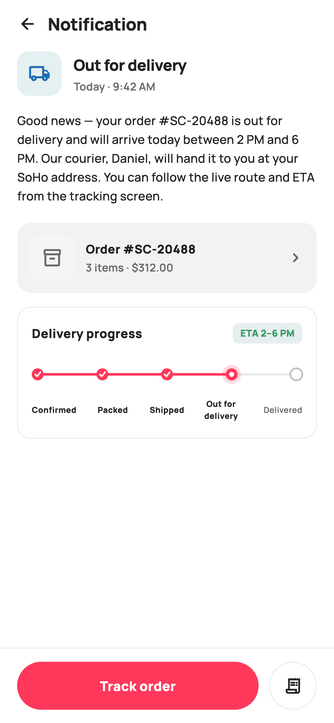
What you'll build
- ✓A typed notification header: a shipping glyph in a blue-tinted 52px tile beside the title and a 'Today · 9:42 AM' timestamp
- ✓An order context card showing a thumbnail box, 'Order #SC-20488' and '3 items · $312.00' with a chevron tap target
- ✓A five-stage delivery stepper painted on a canvas — filled check nodes, a haloed active node, stroked pending nodes — with an ETA pill
- ✓A stage-label row whose alignment and font weight track the painter's active index
- ✓A pinned action bar ranking a coral Track order pill above a circular receipt icon button
Step-by-step build
Create the file
Add a new file at lib/ecom_notification_detail/ecom_notification_detail_screen.dart in your Flutter project.
Register the bundled fonts
No external packages — this is pure Flutter. It does bundle its design font (Manrope), so drop the font file into fonts/ and declare it in pubspec.yaml:
flutter:
  fonts:
    - family: Manrope
      fonts:
- asset: fonts/Manrope-Regular.ttfBuild it, piece by piece
Here's how the screen goes together. Each block below is a real slice of the code with a plain-English explanation — paste them in order, or grab the whole file from the next section.
Callbacks, tokens, and the stepper's data
import 'package:flutter/material.dart';

/// StyleCart — Notification detail.
///
/// The expanded view of a single order notification: a typed icon header,
/// title + timestamp, the full message body, an order context card (thumbnail
/// painted box, items + total), a painted mini delivery stepper, and a primary
/// related action (Track order) plus a secondary (View order). Pinned action
/// bar at the bottom.
///
/// Self-contained per CONVENTIONS.md: pure Flutter, bundled Manrope, inline
/// Airbnb-style tokens, own light theme + SafeArea. Painter-only graphics
/// (delivery stepper). Exposes callbacks only.
class EcomNotificationDetailScreen extends StatelessWidget {
  const EcomNotificationDetailScreen({
    super.key,
    this.onBack,
    this.onPrimary,
    this.onSecondary,
  });

  final VoidCallback? onBack;
  final VoidCallback? onPrimary;
  final VoidCallback? onSecondary;

  static const String _font = 'Manrope';
  static const Color _canvas = Color(0xFFFFFFFF);
  static const Color _ink = Color(0xFF222222);
  static const Color _muted = Color(0xFF6A6A6A);
  static const Color _brand = Color(0xFFFF385C);
  static const Color _surface = Color(0xFFF2F2F2);
  static const Color _hairline = Color(0xFFEBEBEB);
  static const Color _success = Color(0xFF2E9E5B);

  static const List<String> _steps = <String>[
    'Confirmed',
    'Packed',
    'Shipped',
    'Out for delivery',
    'Delivered',
  ];
  static const int _activeStep = 3;
The screen is a `StatelessWidget` exposing three optional callbacks — `onBack`, `onPrimary`, `onSecondary` — because a notification detail only displays a stored message and offers routes out of it. The token block keeps `_brand` coral `#FF385C` for the one true action and reserves `_success` green for the ETA pill, so status and action never share a colour. Most interesting is the data at the bottom: `_steps` is a `const` list of five stage labels and `_activeStep = 3` points at 'Out for delivery' — that single index later drives both the painter's node states and the label row's font weights, so the two can never disagree.
Scaffold: scrolling middle, pinned edges
  @override
  Widget build(BuildContext context) {
    return Theme(
      data: ThemeData.light(useMaterial3: true),
      child: Scaffold(
        backgroundColor: _canvas,
        body: SafeArea(
          child: Column(
            children: <Widget>[
              _header(),
              Expanded(
                child: ListView(
                  padding: const EdgeInsets.fromLTRB(20, 4, 20, 20),
                  children: <Widget>[
                    _typeHeader(),
                    const SizedBox(height: 18),
                    _body(),
                    const SizedBox(height: 20),
                    _orderCard(),
                    const SizedBox(height: 16),
                    _stepperCard(),
                  ],
                ),
              ),
              _bottomBar(),
            ],
          ),
        ),
      ),
    );
  }

  Widget _header() {
    return Padding(
      padding: const EdgeInsets.fromLTRB(8, 4, 20, 4),
      child: Row(
        children: <Widget>[
          IconButton(
            onPressed: onBack,
            icon: const Icon(Icons.arrow_back_rounded, size: 22, color: _ink),
          ),
          const Text(
            'Notification',
            style: TextStyle(
              fontFamily: _font,
              fontSize: 20,
              fontWeight: FontWeight.w800,
              letterSpacing: -0.3,
              color: _ink,
            ),
          ),
        ],
      ),
    );
  }
`build` wraps everything in `ThemeData.light(useMaterial3: true)` so the screen carries its own theme into any host app, then lays out a `Column` of `_header()`, an `Expanded` `ListView`, and `_bottomBar()` — the app bar and action bar stay put while only the message content scrolls. The `ListView` padding of `fromLTRB(20, 4, 20, 20)` sets the screen's 20px gutter. In `_header`, the outer padding starts at just 8 on the left because the `IconButton`'s built-in touch padding supplies the rest, letting the back arrow's glyph line up with the 20px w800 'Notification' title rather than floating inside a double margin.
The typed icon header and message body
  Widget _typeHeader() {
    return Row(
      children: <Widget>[
        Container(
          width: 52,
          height: 52,
          decoration: BoxDecoration(
            color: const Color(0xFF1A6DB5).withValues(alpha: 0.12),
            borderRadius: BorderRadius.circular(14),
          ),
          child: const Icon(Icons.local_shipping_outlined,
              size: 26, color: Color(0xFF1A6DB5)),
        ),
        const SizedBox(width: 14),
        const Expanded(
          child: Column(
            crossAxisAlignment: CrossAxisAlignment.start,
            children: <Widget>[
              Text(
                'Out for delivery',
                style: TextStyle(
                  fontFamily: _font,
                  fontSize: 18,
                  fontWeight: FontWeight.w800,
                  letterSpacing: -0.3,
                  color: _ink,
                ),
              ),
              SizedBox(height: 3),
              Text(
                'Today · 9:42 AM',
                style: TextStyle(
                  fontFamily: _font,
                  fontSize: 12.5,
                  fontWeight: FontWeight.w600,
                  color: _muted,
                ),
              ),
            ],
          ),
        ),
      ],
    );
  }

  Widget _body() {
    return const Text(
      'Good news — your order #SC-20488 is out for delivery and will arrive '
      'today between 2 PM and 6 PM. Our courier, Daniel, will hand it to you '
      'at your SoHo address. You can follow the live route and ETA from the '
      'tracking screen.',
      style: TextStyle(
        fontFamily: _font,
        fontSize: 14,
        fontWeight: FontWeight.w500,
        height: 1.55,
        color: _ink,
      ),
    );
  }
`_typeHeader` renders the notification's type as a 52px rounded tile: `Icons.local_shipping_outlined` in `#1A6DB5`, sitting on that same blue at `withValues(alpha: 0.12)`. The blue is deliberately outside the brand palette — it identifies the notification's category, the way an inbox tints shipping, promo and payment alerts differently. Beside it, an `Expanded` column stacks the 18px w800 title over a 12.5px muted timestamp. `_body` is one `Text` with `height: 1.55` for paragraph-comfortable line spacing, and the copy does real work: it names order `#SC-20488`, the 2–6 PM window, the courier and the address, so the shopper rarely needs to tap further at all.
The order context card
  Widget _orderCard() {
    return Container(
      padding: const EdgeInsets.all(14),
      decoration: BoxDecoration(
        color: _surface,
        borderRadius: BorderRadius.circular(16),
      ),
      child: Row(
        children: <Widget>[
          Container(
            width: 54,
            height: 54,
            decoration: BoxDecoration(
              color: const Color(0xFFF5F5F5),
              borderRadius: BorderRadius.circular(12),
            ),
            child: const Icon(Icons.inventory_2_outlined,
                size: 24, color: _muted),
          ),
          const SizedBox(width: 12),
          const Expanded(
            child: Column(
              crossAxisAlignment: CrossAxisAlignment.start,
              children: <Widget>[
                Text(
                  'Order #SC-20488',
                  style: TextStyle(
                    fontFamily: _font,
                    fontSize: 14,
                    fontWeight: FontWeight.w800,
                    color: _ink,
                  ),
                ),
                SizedBox(height: 2),
                Text(
                  '3 items · \$312.00',
                  style: TextStyle(
                    fontFamily: _font,
                    fontSize: 12.5,
                    fontWeight: FontWeight.w600,
                    color: _muted,
                  ),
                ),
              ],
            ),
          ),
          GestureDetector(
            onTap: onSecondary,
            child: const Icon(Icons.chevron_right_rounded,
                size: 22, color: _muted),
          ),
        ],
      ),
    );
  }
`_orderCard` grounds the message in the actual order: a `_surface` grey container at radius 16 holds a 54px placeholder thumbnail box, then an `Expanded` column with 'Order #SC-20488' at 14px w800 over a muted '3 items · $312.00' meta line. The trailing `Icons.chevron_right_rounded` is wrapped in its own `GestureDetector` wired to `onSecondary` — the same callback as the bottom bar's receipt button — so both affordances lead to the one order page instead of the card inventing a second destination. Keeping the thumbnail as a tinted box with an `inventory_2_outlined` icon means the screen ships with zero image assets.
The delivery progress card
  Widget _stepperCard() {
    return Container(
      padding: const EdgeInsets.fromLTRB(16, 18, 16, 18),
      decoration: BoxDecoration(
        color: _canvas,
        borderRadius: BorderRadius.circular(16),
        border: Border.all(color: _hairline),
      ),
      child: Column(
        crossAxisAlignment: CrossAxisAlignment.start,
        children: <Widget>[
          Row(
            children: <Widget>[
              const Text(
                'Delivery progress',
                style: TextStyle(
                  fontFamily: _font,
                  fontSize: 14.5,
                  fontWeight: FontWeight.w800,
                  color: _ink,
                ),
              ),
              const Spacer(),
              Container(
                padding:
                    const EdgeInsets.symmetric(horizontal: 9, vertical: 4),
                decoration: BoxDecoration(
                  color: _success.withValues(alpha: 0.12),
                  borderRadius: BorderRadius.circular(7),
                ),
                child: const Text(
                  'ETA 2–6 PM',
                  style: TextStyle(
                    fontFamily: _font,
                    fontSize: 11,
                    fontWeight: FontWeight.w800,
                    color: _success,
                  ),
                ),
              ),
            ],
          ),
          const SizedBox(height: 16),
          LayoutBuilder(
            builder: (BuildContext _, BoxConstraints c) => CustomPaint(
              size: Size(c.maxWidth, 40),
              painter: _StepperPainter(_steps.length, _activeStep),
            ),
          ),
          const SizedBox(height: 8),
          Row(
            children: <Widget>[
              for (int i = 0; i < _steps.length; i++)
                Expanded(
                  child: Text(
                    _steps[i],
                    textAlign: i == 0
                        ? TextAlign.left
                        : (i == _steps.length - 1
                            ? TextAlign.right
                            : TextAlign.center),
                    style: TextStyle(
                      fontFamily: _font,
                      fontSize: 9.5,
                      fontWeight:
                          i <= _activeStep ? FontWeight.w800 : FontWeight.w600,
                      color: i <= _activeStep ? _ink : _muted,
                    ),
                  ),
                ),
            ],
          ),
        ],
      ),
    );
  }
Unlike the order card, `_stepperCard` is white with a `_hairline` border — the outline treatment marks it as the screen's centrepiece rather than another grey panel. Its header row uses a `Spacer` to push an 'ETA 2–6 PM' pill (success green on a 0.12-alpha tint) to the right edge. The stepper itself is a `LayoutBuilder` handing `c.maxWidth` to `CustomPaint(size: Size(c.maxWidth, 40))`, so the painter always spans exactly the card's inner width. Below it, a collection-for emits one `Expanded` label per step with position-aware alignment — first left, last right, middle centred — which parks each label under its node, and `i <= _activeStep` flips both weight (w800 vs w600) and colour so completed stages read as done in text too.
The pinned action bar
  Widget _bottomBar() {
    return Container(
      height: 88,
      decoration: const BoxDecoration(
        color: _canvas,
        border: Border(top: BorderSide(color: _hairline)),
      ),
      padding: const EdgeInsets.fromLTRB(20, 12, 20, 12),
      child: Row(
        children: <Widget>[
          Expanded(
            child: GestureDetector(
              onTap: onPrimary,
              child: Container(
                height: 56,
                alignment: Alignment.center,
                decoration: BoxDecoration(
                  color: _brand,
                  borderRadius: BorderRadius.circular(9999),
                ),
                child: const Text(
                  'Track order',
                  style: TextStyle(
                    fontFamily: _font,
                    fontSize: 15.5,
                    fontWeight: FontWeight.w800,
                    color: Colors.white,
                  ),
                ),
              ),
            ),
          ),
          const SizedBox(width: 12),
          GestureDetector(
            onTap: onSecondary,
            child: Container(
              height: 56,
              width: 56,
              alignment: Alignment.center,
              decoration: BoxDecoration(
                borderRadius: BorderRadius.circular(9999),
                border: Border.all(color: _hairline),
              ),
              child: const Icon(Icons.receipt_long_outlined,
                  size: 22, color: _ink),
            ),
          ),
        ],
      ),
    );
  }
}
`_bottomBar` is an 88px container separated by a top hairline, holding two deliberately unequal actions. 'Track order' takes the `Expanded` slot: a 56px-tall coral pill with `BorderRadius.circular(9999)` and white 15.5px w800 text, because live tracking is the entire reason this notification exists. The secondary action is a fixed 56×56 outlined circle carrying `Icons.receipt_long_outlined` — present for shoppers who want the order page, but visually a footnote. Both are plain `GestureDetector` + `Container` pairs rather than Material buttons, which keeps the pill geometry exact and the styling fully token-driven.
Painting the stepper's track and nodes
/// A horizontal order-tracking stepper: connector line with filled / active /
/// pending nodes.
class _StepperPainter extends CustomPainter {
  _StepperPainter(this.count, this.active);
  final int count;
  final int active;

  static const Color _brand = Color(0xFFFF385C);
  static const Color _faint = Color(0xFFC1C1C1);
  static const Color _hairline = Color(0xFFEBEBEB);

  @override
  void paint(Canvas canvas, Size size) {
    final double y = size.height / 2;
    final double r = 7;
    final double left = r;
    final double right = size.width - r;
    final double span = right - left;

    Offset nodeAt(int i) =>
        Offset(left + span * (i / (count - 1)), y);

    // Base track.
    canvas.drawLine(
      Offset(left, y),
      Offset(right, y),
      Paint()
        ..strokeWidth = 3
        ..color = _hairline,
    );
    // Filled track up to active.
    canvas.drawLine(
      Offset(left, y),
      nodeAt(active),
      Paint()
        ..strokeWidth = 3
        ..strokeCap = StrokeCap.round
        ..color = _brand,
    );

    for (int i = 0; i < count; i++) {
      final Offset c = nodeAt(i);
      if (i < active) {
        canvas.drawCircle(c, r, Paint()..color = _brand);
        _check(canvas, c);
      } else if (i == active) {
        canvas.drawCircle(
            c, r + 4, Paint()..color = _brand.withValues(alpha: 0.18));
        canvas.drawCircle(c, r, Paint()..color = _brand);
        canvas.drawCircle(c, r * 0.42, Paint()..color = Colors.white);
      } else {
        canvas.drawCircle(c, r, Paint()..color = Colors.white);
        canvas.drawCircle(
          c,
          r,
          Paint()
            ..style = PaintingStyle.stroke
            ..strokeWidth = 2
            ..color = _faint,
        );
      }
    }
  }

  void _check(Canvas canvas, Offset c) {
    final Paint p = Paint()
      ..style = PaintingStyle.stroke
      ..strokeWidth = 1.8
      ..strokeCap = StrokeCap.round
      ..strokeJoin = StrokeJoin.round
      ..color = Colors.white;
    final Path path = Path()
      ..moveTo(c.dx - 3, c.dy)
      ..lineTo(c.dx - 0.6, c.dy + 2.4)
      ..lineTo(c.dx + 3.2, c.dy - 2.6);
    canvas.drawPath(path, p);
  }

  @override
  bool shouldRepaint(_StepperPainter old) =>
      old.count != count || old.active != active;
}
`_StepperPainter` positions nodes with a `nodeAt` closure — `left + span * (i / (count - 1))` — after insetting `left` and `right` by the 7px node radius so the end circles never clip the canvas. It draws a full-width `_hairline` base track, then overdraws a coral line from the start to `nodeAt(active)` with `StrokeCap.round`, giving progress for free. Each node then takes one of three treatments: completed nodes are solid coral with a white tick drawn by `_check` as a two-segment `Path` (down-stroke then up-stroke, rounded caps); the active node gets a halo circle at `r + 4` in 0.18-alpha coral, a solid disc, and a white inner dot at `r * 0.42` to read as 'here now'; pending nodes are white discs with a 2px `_faint` stroke. `shouldRepaint` compares `count` and `active`, so a status change repaints but idle rebuilds don't.
Full code
The complete, ready-to-paste source. Free to use in your projects — one click copies it all.
import 'package:flutter/material.dart';

/// StyleCart — Notification detail.
///
/// The expanded view of a single order notification: a typed icon header,
/// title + timestamp, the full message body, an order context card (thumbnail
/// painted box, items + total), a painted mini delivery stepper, and a primary
/// related action (Track order) plus a secondary (View order). Pinned action
/// bar at the bottom.
///
/// Self-contained per CONVENTIONS.md: pure Flutter, bundled Manrope, inline
/// Airbnb-style tokens, own light theme + SafeArea. Painter-only graphics
/// (delivery stepper). Exposes callbacks only.
class EcomNotificationDetailScreen extends StatelessWidget {
  const EcomNotificationDetailScreen({
    super.key,
    this.onBack,
    this.onPrimary,
    this.onSecondary,
  });

  final VoidCallback? onBack;
  final VoidCallback? onPrimary;
  final VoidCallback? onSecondary;

  static const String _font = 'Manrope';
  static const Color _canvas = Color(0xFFFFFFFF);
  static const Color _ink = Color(0xFF222222);
  static const Color _muted = Color(0xFF6A6A6A);
  static const Color _brand = Color(0xFFFF385C);
  static const Color _surface = Color(0xFFF2F2F2);
  static const Color _hairline = Color(0xFFEBEBEB);
  static const Color _success = Color(0xFF2E9E5B);

  static const List<String> _steps = <String>[
    'Confirmed',
    'Packed',
    'Shipped',
    'Out for delivery',
    'Delivered',
  ];
  static const int _activeStep = 3;

  @override
  Widget build(BuildContext context) {
    return Theme(
      data: ThemeData.light(useMaterial3: true),
      child: Scaffold(
        backgroundColor: _canvas,
        body: SafeArea(
          child: Column(
            children: <Widget>[
              _header(),
              Expanded(
                child: ListView(
                  padding: const EdgeInsets.fromLTRB(20, 4, 20, 20),
                  children: <Widget>[
                    _typeHeader(),
                    const SizedBox(height: 18),
                    _body(),
                    const SizedBox(height: 20),
                    _orderCard(),
                    const SizedBox(height: 16),
                    _stepperCard(),
                  ],
                ),
              ),
              _bottomBar(),
            ],
          ),
        ),
      ),
    );
  }

  Widget _header() {
    return Padding(
      padding: const EdgeInsets.fromLTRB(8, 4, 20, 4),
      child: Row(
        children: <Widget>[
          IconButton(
            onPressed: onBack,
            icon: const Icon(Icons.arrow_back_rounded, size: 22, color: _ink),
          ),
          const Text(
            'Notification',
            style: TextStyle(
              fontFamily: _font,
              fontSize: 20,
              fontWeight: FontWeight.w800,
              letterSpacing: -0.3,
              color: _ink,
            ),
          ),
        ],
      ),
    );
  }

  Widget _typeHeader() {
    return Row(
      children: <Widget>[
        Container(
          width: 52,
          height: 52,
          decoration: BoxDecoration(
            color: const Color(0xFF1A6DB5).withValues(alpha: 0.12),
            borderRadius: BorderRadius.circular(14),
          ),
          child: const Icon(Icons.local_shipping_outlined,
              size: 26, color: Color(0xFF1A6DB5)),
        ),
        const SizedBox(width: 14),
        const Expanded(
          child: Column(
            crossAxisAlignment: CrossAxisAlignment.start,
            children: <Widget>[
              Text(
                'Out for delivery',
                style: TextStyle(
                  fontFamily: _font,
                  fontSize: 18,
                  fontWeight: FontWeight.w800,
                  letterSpacing: -0.3,
                  color: _ink,
                ),
              ),
              SizedBox(height: 3),
              Text(
                'Today · 9:42 AM',
                style: TextStyle(
                  fontFamily: _font,
                  fontSize: 12.5,
                  fontWeight: FontWeight.w600,
                  color: _muted,
                ),
              ),
            ],
          ),
        ),
      ],
    );
  }

  Widget _body() {
    return const Text(
      'Good news — your order #SC-20488 is out for delivery and will arrive '
      'today between 2 PM and 6 PM. Our courier, Daniel, will hand it to you '
      'at your SoHo address. You can follow the live route and ETA from the '
      'tracking screen.',
      style: TextStyle(
        fontFamily: _font,
        fontSize: 14,
        fontWeight: FontWeight.w500,
        height: 1.55,
        color: _ink,
      ),
    );
  }

  Widget _orderCard() {
    return Container(
      padding: const EdgeInsets.all(14),
      decoration: BoxDecoration(
        color: _surface,
        borderRadius: BorderRadius.circular(16),
      ),
      child: Row(
        children: <Widget>[
          Container(
            width: 54,
            height: 54,
            decoration: BoxDecoration(
              color: const Color(0xFFF5F5F5),
              borderRadius: BorderRadius.circular(12),
            ),
            child: const Icon(Icons.inventory_2_outlined,
                size: 24, color: _muted),
          ),
          const SizedBox(width: 12),
          const Expanded(
            child: Column(
              crossAxisAlignment: CrossAxisAlignment.start,
              children: <Widget>[
                Text(
                  'Order #SC-20488',
                  style: TextStyle(
                    fontFamily: _font,
                    fontSize: 14,
                    fontWeight: FontWeight.w800,
                    color: _ink,
                  ),
                ),
                SizedBox(height: 2),
                Text(
                  '3 items · \$312.00',
                  style: TextStyle(
                    fontFamily: _font,
                    fontSize: 12.5,
                    fontWeight: FontWeight.w600,
                    color: _muted,
                  ),
                ),
              ],
            ),
          ),
          GestureDetector(
            onTap: onSecondary,
            child: const Icon(Icons.chevron_right_rounded,
                size: 22, color: _muted),
          ),
        ],
      ),
    );
  }

  Widget _stepperCard() {
    return Container(
      padding: const EdgeInsets.fromLTRB(16, 18, 16, 18),
      decoration: BoxDecoration(
        color: _canvas,
        borderRadius: BorderRadius.circular(16),
        border: Border.all(color: _hairline),
      ),
      child: Column(
        crossAxisAlignment: CrossAxisAlignment.start,
        children: <Widget>[
          Row(
            children: <Widget>[
              const Text(
                'Delivery progress',
                style: TextStyle(
                  fontFamily: _font,
                  fontSize: 14.5,
                  fontWeight: FontWeight.w800,
                  color: _ink,
                ),
              ),
              const Spacer(),
              Container(
                padding:
                    const EdgeInsets.symmetric(horizontal: 9, vertical: 4),
                decoration: BoxDecoration(
                  color: _success.withValues(alpha: 0.12),
                  borderRadius: BorderRadius.circular(7),
                ),
                child: const Text(
                  'ETA 2–6 PM',
                  style: TextStyle(
                    fontFamily: _font,
                    fontSize: 11,
                    fontWeight: FontWeight.w800,
                    color: _success,
                  ),
                ),
              ),
            ],
          ),
          const SizedBox(height: 16),
          LayoutBuilder(
            builder: (BuildContext _, BoxConstraints c) => CustomPaint(
              size: Size(c.maxWidth, 40),
              painter: _StepperPainter(_steps.length, _activeStep),
            ),
          ),
          const SizedBox(height: 8),
          Row(
            children: <Widget>[
              for (int i = 0; i < _steps.length; i++)
                Expanded(
                  child: Text(
                    _steps[i],
                    textAlign: i == 0
                        ? TextAlign.left
                        : (i == _steps.length - 1
                            ? TextAlign.right
                            : TextAlign.center),
                    style: TextStyle(
                      fontFamily: _font,
                      fontSize: 9.5,
                      fontWeight:
                          i <= _activeStep ? FontWeight.w800 : FontWeight.w600,
                      color: i <= _activeStep ? _ink : _muted,
                    ),
                  ),
                ),
            ],
          ),
        ],
      ),
    );
  }

  Widget _bottomBar() {
    return Container(
      height: 88,
      decoration: const BoxDecoration(
        color: _canvas,
        border: Border(top: BorderSide(color: _hairline)),
      ),
      padding: const EdgeInsets.fromLTRB(20, 12, 20, 12),
      child: Row(
        children: <Widget>[
          Expanded(
            child: GestureDetector(
              onTap: onPrimary,
              child: Container(
                height: 56,
                alignment: Alignment.center,
                decoration: BoxDecoration(
                  color: _brand,
                  borderRadius: BorderRadius.circular(9999),
                ),
                child: const Text(
                  'Track order',
                  style: TextStyle(
                    fontFamily: _font,
                    fontSize: 15.5,
                    fontWeight: FontWeight.w800,
                    color: Colors.white,
                  ),
                ),
              ),
            ),
          ),
          const SizedBox(width: 12),
          GestureDetector(
            onTap: onSecondary,
            child: Container(
              height: 56,
              width: 56,
              alignment: Alignment.center,
              decoration: BoxDecoration(
                borderRadius: BorderRadius.circular(9999),
                border: Border.all(color: _hairline),
              ),
              child: const Icon(Icons.receipt_long_outlined,
                  size: 22, color: _ink),
            ),
          ),
        ],
      ),
    );
  }
}

/// A horizontal order-tracking stepper: connector line with filled / active /
/// pending nodes.
class _StepperPainter extends CustomPainter {
  _StepperPainter(this.count, this.active);
  final int count;
  final int active;

  static const Color _brand = Color(0xFFFF385C);
  static const Color _faint = Color(0xFFC1C1C1);
  static const Color _hairline = Color(0xFFEBEBEB);

  @override
  void paint(Canvas canvas, Size size) {
    final double y = size.height / 2;
    final double r = 7;
    final double left = r;
    final double right = size.width - r;
    final double span = right - left;

    Offset nodeAt(int i) =>
        Offset(left + span * (i / (count - 1)), y);

    // Base track.
    canvas.drawLine(
      Offset(left, y),
      Offset(right, y),
      Paint()
        ..strokeWidth = 3
        ..color = _hairline,
    );
    // Filled track up to active.
    canvas.drawLine(
      Offset(left, y),
      nodeAt(active),
      Paint()
        ..strokeWidth = 3
        ..strokeCap = StrokeCap.round
        ..color = _brand,
    );

    for (int i = 0; i < count; i++) {
      final Offset c = nodeAt(i);
      if (i < active) {
        canvas.drawCircle(c, r, Paint()..color = _brand);
        _check(canvas, c);
      } else if (i == active) {
        canvas.drawCircle(
            c, r + 4, Paint()..color = _brand.withValues(alpha: 0.18));
        canvas.drawCircle(c, r, Paint()..color = _brand);
        canvas.drawCircle(c, r * 0.42, Paint()..color = Colors.white);
      } else {
        canvas.drawCircle(c, r, Paint()..color = Colors.white);
        canvas.drawCircle(
          c,
          r,
          Paint()
            ..style = PaintingStyle.stroke
            ..strokeWidth = 2
            ..color = _faint,
        );
      }
    }
  }

  void _check(Canvas canvas, Offset c) {
    final Paint p = Paint()
      ..style = PaintingStyle.stroke
      ..strokeWidth = 1.8
      ..strokeCap = StrokeCap.round
      ..strokeJoin = StrokeJoin.round
      ..color = Colors.white;
    final Path path = Path()
      ..moveTo(c.dx - 3, c.dy)
      ..lineTo(c.dx - 0.6, c.dy + 2.4)
      ..lineTo(c.dx + 3.2, c.dy - 2.6);
    canvas.drawPath(path, p);
  }

  @override
  bool shouldRepaint(_StepperPainter old) =>
      old.count != count || old.active != active;
}
Plus bundled 5 binary assets (fonts/images). The CLI and MCP install those for you automatically.
Two faster ways to add it
Copy-paste works, but you can skip it entirely.
1. FlutterKit CLI
One command drops this screen — and its fonts — straight into your project.
$ flutterkit add ecom-notification-detail2. AI agent (MCP)
Connect FlutterKit's MCP server in Claude or Cursor and just ask your agent to install ecom-notification-detail — it fetches and writes the files for you.
FAQ
Can I use this notification detail screen in a commercial app?
Yes. FlutterKit screens are free to use, commercial projects included. Copy the code from this page or install it with the CLI command, drop it into your shopping or delivery app, and ship it — no attribution or sign-up required.
What packages or fonts does this screen need?
No pub packages at all — the stepper is a hand-written CustomPainter and every icon is a built-in Material icon. The only asset is the Manrope font, referenced via `fontFamily: 'Manrope'`, so add Manrope's font files to your pubspec (or swap `_font` for a family you already bundle).
Which Flutter version does this code require?
Flutter 3.27 or newer, since the icon tile, ETA pill and active-node halo all use `Color.withValues(alpha: ...)`. On an older SDK, replace each `withValues(alpha: x)` with `withOpacity(x)`; the `super.key` constructor parameter needs Flutter 3.0 / Dart 2.17, which any current project already has.
How do I drive the stepper from a real order status?
Promote `_steps` and `_activeStep` from static consts to constructor parameters and map your backend's status enum to an index. `_StepperPainter` already accepts `count` and `active`, and the label row derives alignment and weight from the same values, so nothing else changes — pass `activeStep: 4` and the screen renders fully delivered.
Why is the stepper a CustomPainter instead of a Row of widgets?
Because the connector line has to run continuously underneath the nodes, with a coral-filled segment ending exactly at the active node's centre. Doing that with widgets means fighting per-segment sizing and overlap; on a canvas it is two `drawLine` calls plus circles at computed offsets. The text labels stay as ordinary widgets in the row below, where Flutter's layout handles wrapping and alignment better than canvas text would.


