How to Build a Refund Status Tracker Screen in Flutter (Full Code + Preview)
After a return is posted, the shopper checks one thing every day: has the money come back yet? This tutorial builds StyleCart's refund-status screen in Flutter, where a dark gradient card shows the `$214.00` amount, an 'In progress' pill and the Visa it returns to, an `IntrinsicHeight` stepper walks Requested, Approved, Processed and Credited with a `_NodePainter` drawing each node, and a three-item FAQ accordion driven by a single `_openFaq` int answers the follow-up questions before support has to.
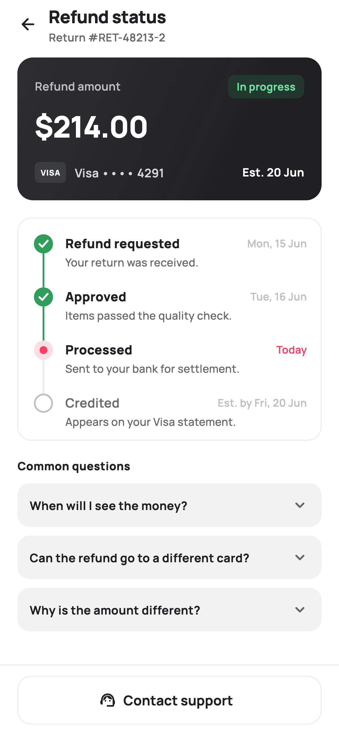
What you'll build
- ✓A dark two-stop gradient amount card (#2E2E33 to #1A1A1E) with a translucent green 'In progress' pill and a painted-in-text VISA badge
- ✓An `IntrinsicHeight` vertical stepper where a 26px `CustomPaint` column stretches to match each step's text height
- ✓A `_NodePainter` that draws a green tick disc, a coral halo dot, or a hollow grey ring depending on `_StepState`
- ✓A single-open FAQ accordion driven by one `int _openFaq` and a collection-for in the `ListView`
- ✓A pinned footer with an outlined 'Contact support' button wired to an `onHelp` callback
Step-by-step build
Create the file
Add a new file at lib/ecom_orders_refund_status/ecom_orders_refund_status_screen.dart in your Flutter project.
Register the bundled fonts
No external packages — this is pure Flutter. It does bundle its design font (Manrope), so drop the font file into fonts/ and declare it in pubspec.yaml:
flutter:
  fonts:
    - family: Manrope
      fonts:
- asset: fonts/Manrope-Regular.ttfBuild it, piece by piece
Here's how the screen goes together. Each block below is a real slice of the code with a plain-English explanation — paste them in order, or grab the whole file from the next section.
Steps and FAQs as const data, one int of state
import 'package:flutter/material.dart';

/// StyleCart — Refund Status.
///
/// Tracks a refund through Requested → Approved → Processed → Credited with the
/// IntrinsicHeight stepper, a prominent amount + method card, a progress hint,
/// and an expandable FAQ row. A help link sits in the pinned footer.
///
/// Self-contained per CONVENTIONS.md: pure Flutter, bundled Manrope, inline
/// Airbnb-style tokens, own light theme + SafeArea. Painter-only graphics.
/// Exposes callbacks only.
class EcomOrdersRefundStatusScreen extends StatefulWidget {
  const EcomOrdersRefundStatusScreen({
    super.key,
    this.onBack,
    this.onHelp,
  });

  final VoidCallback? onBack;
  final VoidCallback? onHelp;

  @override
  State<EcomOrdersRefundStatusScreen> createState() =>
      _EcomOrdersRefundStatusScreenState();
}

class _EcomOrdersRefundStatusScreenState
    extends State<EcomOrdersRefundStatusScreen> {
  static const String _font = 'Manrope';
  static const Color _canvas = Color(0xFFFFFFFF);
  static const Color _ink = Color(0xFF222222);
  static const Color _muted = Color(0xFF6A6A6A);
  static const Color _faint = Color(0xFFC1C1C1);
  static const Color _brand = Color(0xFFFF385C);
  static const Color _surface = Color(0xFFF2F2F2);
  static const Color _success = Color(0xFF2E9E5B);
  static const Color _hairline = Color(0xFFEBEBEB);

  static const List<_Step> _steps = <_Step>[
    _Step('Refund requested', 'Mon, 15 Jun', 'Your return was received.',
        _StepState.done),
    _Step('Approved', 'Tue, 16 Jun', 'Items passed the quality check.',
        _StepState.done),
    _Step('Processed', 'Today', 'Sent to your bank for settlement.',
        _StepState.active),
    _Step('Credited', 'Est. by Fri, 20 Jun',
        'Appears on your Visa statement.', _StepState.todo),
  ];

  static const List<_Faq> _faqs = <_Faq>[
    _Faq('When will I see the money?',
        'Once processed, banks usually post the credit within 3–5 business '
            'days. Timing depends on your card issuer.'),
    _Faq('Can the refund go to a different card?',
        'Refunds always return to the original payment method for security. '
            'Contact support if that card is closed.'),
    _Faq('Why is the amount different?',
        'Promo discounts are refunded proportionally, and any non-returnable '
            'items are excluded from the total.'),
  ];

  int _openFaq = -1;
The screen exposes exactly two callbacks, `onBack` and `onHelp`, because a refund tracker is read-only for the shopper — there is nothing to submit. Palette tokens are Airbnb-style: `_brand` coral `#FF385C` for the active step, `_success` green `#2E9E5B` for completed ones, `_faint` `#C1C1C1` for what has not happened yet, and `_hairline` `#EBEBEB` for borders. The four stages live in a `static const List<_Step>`, each carrying a label, a human date string like 'Est. by Fri, 20 Jun', a one-line detail, and a `_StepState`. The third step is `active` and the last is `todo`, which is what the painter later turns into a coral dot and a hollow ring. Three `_Faq` records sit alongside, and the only mutable state in the whole file is `int _openFaq = -1` — the index of the expanded question, with -1 meaning all closed.
Forced light theme and a scrolling body between two fixed bars
  @override
  Widget build(BuildContext context) {
    return Theme(
      data: ThemeData.light(useMaterial3: true),
      child: Scaffold(
        backgroundColor: _canvas,
        body: SafeArea(
          child: Column(
            children: <Widget>[
              _header(),
              Expanded(
                child: ListView(
                  padding: const EdgeInsets.fromLTRB(20, 8, 20, 24),
                  children: <Widget>[
                    _amountCard(),
                    const SizedBox(height: 20),
                    _timeline(),
                    const SizedBox(height: 20),
                    _sectionTitle('Common questions'),
                    const SizedBox(height: 10),
                    for (int i = 0; i < _faqs.length; i++) _faqRow(i),
                  ],
                ),
              ),
              _footer(),
            ],
          ),
        ),
      ),
    );
  }
`build` wraps everything in `Theme(data: ThemeData.light(useMaterial3: true))` so the screen looks identical even if the host app is in dark mode — the amount card is already dark by design, and inverting the rest would break its contrast. Inside `SafeArea`, a `Column` stacks `_header()`, an `Expanded` `ListView`, and `_footer()`. Only the middle scrolls, so the back button and the support button are always reachable. The `ListView` padding is `fromLTRB(20, 8, 20, 24)`: 8px on top because the header already carries its own bottom spacing, 24px at the bottom so the last FAQ does not butt against the footer hairline. The FAQ rows are emitted with `for (int i = 0; i < _faqs.length; i++) _faqRow(i)` directly in the children list, passing the index rather than the record so each row can compare itself to `_openFaq`.
Header with the return reference
  Widget _header() {
    return Padding(
      padding: const EdgeInsets.fromLTRB(8, 4, 20, 6),
      child: Row(
        children: <Widget>[
          IconButton(
            onPressed: widget.onBack,
            icon: const Icon(Icons.arrow_back_rounded, size: 22, color: _ink),
          ),
          const Expanded(
            child: Column(
              crossAxisAlignment: CrossAxisAlignment.start,
              children: <Widget>[
                Text(
                  'Refund status',
                  style: TextStyle(
                    fontFamily: _font,
                    fontSize: 20,
                    fontWeight: FontWeight.w800,
                    letterSpacing: -0.3,
                    color: _ink,
                  ),
                ),
                Text(
                  'Return #RET-48213-2',
                  style: TextStyle(
                    fontFamily: _font,
                    fontSize: 12.5,
                    fontWeight: FontWeight.w600,
                    color: _muted,
                  ),
                ),
              ],
            ),
          ),
        ],
      ),
    );
  }
The header is a `Row` of an `IconButton` (rounded back arrow, 22px, `_ink`) and an `Expanded` two-line `Column`. Padding is `fromLTRB(8, 4, 20, 6)` — only 8px on the left because the `IconButton` has its own 48px touch target, so the arrow's visual edge lands roughly in line with the 20px content margin below. The title 'Refund status' is 20px `w800` with `letterSpacing: -0.3`, and beneath it 'Return #RET-48213-2' at 12.5px `w600` in `_muted`. Putting the reference number in the header rather than the card means it is visible at the top of any screenshot the shopper sends to support, which is the practical reason it is here. The whole column is `const` because nothing in it depends on state.
The dark amount card
  Widget _amountCard() {
    return Container(
      padding: const EdgeInsets.all(20),
      decoration: BoxDecoration(
        gradient: const LinearGradient(
          begin: Alignment.topLeft,
          end: Alignment.bottomRight,
          colors: <Color>[Color(0xFF2E2E33), Color(0xFF1A1A1E)],
        ),
        borderRadius: BorderRadius.circular(18),
      ),
      child: Column(
        crossAxisAlignment: CrossAxisAlignment.start,
        children: <Widget>[
          Row(
            children: <Widget>[
              const Text(
                'Refund amount',
                style: TextStyle(
                  fontFamily: _font,
                  fontSize: 13,
                  fontWeight: FontWeight.w600,
                  color: Color(0xFFB9B9C0),
                ),
              ),
              const Spacer(),
              Container(
                padding:
                    const EdgeInsets.symmetric(horizontal: 10, vertical: 5),
                decoration: BoxDecoration(
                  color: _success.withValues(alpha: 0.18),
                  borderRadius: BorderRadius.circular(8),
                ),
                child: const Text(
                  'In progress',
                  style: TextStyle(
                    fontFamily: _font,
                    fontSize: 12,
                    fontWeight: FontWeight.w700,
                    color: Color(0xFF6FE0A0),
                  ),
                ),
              ),
            ],
          ),
          const SizedBox(height: 8),
          const Text(
            '\$214.00',
            style: TextStyle(
              fontFamily: _font,
              fontSize: 34,
              fontWeight: FontWeight.w800,
              letterSpacing: -0.6,
              color: Color(0xFFFFFFFF),
            ),
          ),
          const SizedBox(height: 16),
          Row(
            children: <Widget>[
              Container(
                width: 36,
                height: 24,
                alignment: Alignment.center,
                decoration: BoxDecoration(
                  color: const Color(0xFF3A3A40),
                  borderRadius: BorderRadius.circular(5),
                ),
                child: const Text(
                  'VISA',
                  style: TextStyle(
                    fontFamily: _font,
                    fontSize: 9,
                    fontWeight: FontWeight.w800,
                    letterSpacing: 0.5,
                    color: Color(0xFFFFFFFF),
                  ),
                ),
              ),
              const SizedBox(width: 10),
              const Text(
                'Visa •••• 4291',
                style: TextStyle(
                  fontFamily: _font,
                  fontSize: 13.5,
                  fontWeight: FontWeight.w600,
                  color: Color(0xFFD6D6DC),
                ),
              ),
              const Spacer(),
              const Text(
                'Est. 20 Jun',
                style: TextStyle(
                  fontFamily: _font,
                  fontSize: 13,
                  fontWeight: FontWeight.w700,
                  color: Color(0xFFFFFFFF),
                ),
              ),
            ],
          ),
        ],
      ),
    );
  }
`_amountCard` is the one dark element on a white page, which is why the eye lands on it first. The `Container` uses a `LinearGradient` from `#2E2E33` top-left to `#1A1A1E` bottom-right with an 18px radius. The top row pairs a muted 'Refund amount' label (`#B9B9C0`) with a `Spacer` and an 'In progress' pill whose background is `_success.withValues(alpha: 0.18)` and text `#6FE0A0` — a lighter green than `_success` so it stays legible on the dark fill. The amount `\$214.00` is 34px `w800` with `letterSpacing: -0.6` in pure white. The bottom row draws a VISA badge as a 36×24 `Container` in `#3A3A40` with 9px `w800` text and `letterSpacing: 0.5`, rather than loading a logo asset, followed by 'Visa •••• 4291' at 13.5px in `#D6D6DC`, a `Spacer`, and the bold white 'Est. 20 Jun'. The card therefore answers how much, where, and when in a single glance.
IntrinsicHeight stepper tiles
  Widget _timeline() {
    return Container(
      padding: const EdgeInsets.fromLTRB(16, 18, 16, 6),
      decoration: BoxDecoration(
        color: _canvas,
        borderRadius: BorderRadius.circular(16),
        border: Border.all(color: _hairline),
      ),
      child: Column(
        crossAxisAlignment: CrossAxisAlignment.start,
        children: <Widget>[
          for (int i = 0; i < _steps.length; i++)
            _stepTile(_steps[i], i == _steps.length - 1),
        ],
      ),
    );
  }

  Widget _stepTile(_Step s, bool last) {
    return IntrinsicHeight(
      child: Row(
        crossAxisAlignment: CrossAxisAlignment.stretch,
        children: <Widget>[
          SizedBox(
            width: 26,
            child: CustomPaint(painter: _NodePainter(s.state, last)),
          ),
          Expanded(
            child: Padding(
              padding: EdgeInsets.only(left: 12, bottom: last ? 6 : 20),
              child: Column(
                crossAxisAlignment: CrossAxisAlignment.start,
                children: <Widget>[
                  Row(
                    children: <Widget>[
                      Expanded(
                        child: Text(
                          s.label,
                          style: TextStyle(
                            fontFamily: _font,
                            fontSize: 14.5,
                            fontWeight: s.state == _StepState.todo
                                ? FontWeight.w600
                                : FontWeight.w800,
                            color:
                                s.state == _StepState.todo ? _muted : _ink,
                          ),
                        ),
                      ),
                      Text(
                        s.time,
                        style: TextStyle(
                          fontFamily: _font,
                          fontSize: 12,
                          fontWeight: FontWeight.w600,
                          color:
                              s.state == _StepState.active ? _brand : _faint,
                        ),
                      ),
                    ],
                  ),
                  const SizedBox(height: 3),
                  Text(
                    s.detail,
                    style: const TextStyle(
                      fontFamily: _font,
                      fontSize: 12.5,
                      fontWeight: FontWeight.w500,
                      height: 1.35,
                      color: _muted,
                    ),
                  ),
                ],
              ),
            ),
          ),
        ],
      ),
    );
  }
`_timeline` is a white card with a hairline border and `fromLTRB(16, 18, 16, 6)` padding — only 6px at the bottom because the last tile adds its own 6px. Each `_stepTile` is wrapped in `IntrinsicHeight` with `crossAxisAlignment: CrossAxisAlignment.stretch`, which is the trick that makes the stepper work: the 26px-wide `SizedBox` holding the `CustomPaint` is stretched to the exact height of the text column beside it, so `_NodePainter` knows how tall the connector line has to be. Text padding is `EdgeInsets.only(left: 12, bottom: last ? 6 : 20)`, and that 20px gap is also painted through by the connector. The label switches weight and colour by state — `todo` steps are `w600` in `_muted`, done and active are `w800` in `_ink` — while the timestamp is coral only for the `active` step and `_faint` otherwise, so 'Today' is the single red word in the list.
The single-open FAQ accordion
  Widget _sectionTitle(String text) {
    return Text(
      text,
      style: const TextStyle(
        fontFamily: _font,
        fontSize: 13,
        fontWeight: FontWeight.w800,
        letterSpacing: 0.3,
        color: _ink,
      ),
    );
  }

  Widget _faqRow(int i) {
    final _Faq f = _faqs[i];
    final bool open = _openFaq == i;
    return Container(
      margin: const EdgeInsets.only(bottom: 10),
      decoration: BoxDecoration(
        color: _surface,
        borderRadius: BorderRadius.circular(14),
      ),
      child: Column(
        children: <Widget>[
          GestureDetector(
            onTap: () => setState(() => _openFaq = open ? -1 : i),
            child: Container(
              color: Colors.transparent,
              padding: const EdgeInsets.fromLTRB(14, 14, 14, 14),
              child: Row(
                children: <Widget>[
                  Expanded(
                    child: Text(
                      f.q,
                      style: const TextStyle(
                        fontFamily: _font,
                        fontSize: 13.5,
                        fontWeight: FontWeight.w700,
                        color: _ink,
                      ),
                    ),
                  ),
                  const SizedBox(width: 10),
                  Icon(
                    open
                        ? Icons.keyboard_arrow_up_rounded
                        : Icons.keyboard_arrow_down_rounded,
                    size: 22,
                    color: _muted,
                  ),
                ],
              ),
            ),
          ),
          if (open)
            Padding(
              padding: const EdgeInsets.fromLTRB(14, 0, 14, 14),
              child: Align(
                alignment: Alignment.centerLeft,
                child: Text(
                  f.a,
                  style: const TextStyle(
                    fontFamily: _font,
                    fontSize: 12.5,
                    fontWeight: FontWeight.w500,
                    height: 1.45,
                    color: _muted,
                  ),
                ),
              ),
            ),
        ],
      ),
    );
  }
`_sectionTitle` is a 13px `w800` label with `letterSpacing: 0.3`. `_faqRow(i)` computes `final bool open = _openFaq == i` and builds a `_surface` (`#F2F2F2`) container with a 14px radius and 10px bottom margin. The question row is a `GestureDetector` whose `onTap` calls `setState(() => _openFaq = open ? -1 : i)` — tapping the open row closes it, tapping another row swaps the index, so at most one answer is ever visible without any list of booleans. The inner `Container` has `color: Colors.transparent` so the whole 14px-padded row is hittable, not just the text. The chevron flips between `keyboard_arrow_up_rounded` and `keyboard_arrow_down_rounded`. The answer is added with `if (open)` as a `Padding` of `fromLTRB(14, 0, 14, 14)` inside an `Align(centerLeft)`, 12.5px `w500` with `height: 1.45` for the two-line explanations.
Pinned support footer and the data models
  Widget _footer() {
    return Container(
      decoration: const BoxDecoration(
        color: _canvas,
        border: Border(top: BorderSide(color: _hairline)),
      ),
      child: SafeArea(
        top: false,
        child: Padding(
          padding: const EdgeInsets.fromLTRB(20, 12, 20, 12),
          child: SizedBox(
            height: 56,
            child: OutlinedButton.icon(
              onPressed: widget.onHelp,
              style: OutlinedButton.styleFrom(
                foregroundColor: _ink,
                side: const BorderSide(color: _hairline),
                minimumSize: const Size.fromHeight(56),
                shape: RoundedRectangleBorder(
                  borderRadius: BorderRadius.circular(16),
                ),
              ),
              icon: const Icon(Icons.support_agent_outlined, size: 20),
              label: const Text(
                'Contact support',
                style: TextStyle(
                  fontFamily: _font,
                  fontSize: 15.5,
                  fontWeight: FontWeight.w700,
                ),
              ),
            ),
          ),
        ),
      ),
    );
  }
}

enum _StepState { done, active, todo }

class _Step {
  const _Step(this.label, this.time, this.detail, this.state);
  final String label;
  final String time;
  final String detail;
  final _StepState state;
}

class _Faq {
  const _Faq(this.q, this.a);
  final String q;
  final String a;
}
`_footer` is a `Container` with a top `_hairline` border wrapping `SafeArea(top: false)`, so the white background runs underneath the home indicator while the button sits above it. The button is an `OutlinedButton.icon` with `Icons.support_agent_outlined`, 'Contact support' at 15.5px `w700`, a 16px-radius `RoundedRectangleBorder`, and a `_hairline` side — outlined rather than filled because contacting support is the escape hatch, not the expected next action; a coral button here would suggest something has gone wrong. `minimumSize: Size.fromHeight(56)` pairs with the 56px `SizedBox` to guarantee full width. Below the state class, `enum _StepState { done, active, todo }` and the two immutable records `_Step` and `_Faq` are plain const classes so the lists at the top can be compile-time constants.
Painting the timeline nodes
/// Timeline node + connector (shared family with the order steppers).
class _NodePainter extends CustomPainter {
  _NodePainter(this.state, this.last);
  final _StepState state;
  final bool last;

  static const Color _brand = Color(0xFFFF385C);
  static const Color _success = Color(0xFF2E9E5B);
  static const Color _faint = Color(0xFFC1C1C1);
  static const Color _hairline = Color(0xFFEBEBEB);

  @override
  void paint(Canvas canvas, Size size) {
    final double cx = size.width / 2;
    const double cy = 11;
    const double r = 11;

    if (!last) {
      canvas.drawLine(
        Offset(cx, cy + r),
        Offset(cx, size.height),
        Paint()
          ..color = state == _StepState.done ? _success : _hairline
          ..strokeWidth = 2,
      );
    }

    switch (state) {
      case _StepState.done:
        canvas.drawCircle(Offset(cx, cy), r, Paint()..color = _success);
        final Path check = Path()
          ..moveTo(cx - 4.6, cy + 0.3)
          ..lineTo(cx - 1.4, cy + 3.4)
          ..lineTo(cx + 4.8, cy - 3.6);
        canvas.drawPath(
          check,
          Paint()
            ..style = PaintingStyle.stroke
            ..strokeWidth = 2.2
            ..strokeCap = StrokeCap.round
            ..strokeJoin = StrokeJoin.round
            ..color = const Color(0xFFFFFFFF),
        );
      case _StepState.active:
        canvas.drawCircle(
          Offset(cx, cy),
          r,
          Paint()..color = _brand.withValues(alpha: 0.16),
        );
        canvas.drawCircle(Offset(cx, cy), 4.5, Paint()..color = _brand);
      case _StepState.todo:
        canvas.drawCircle(
          Offset(cx, cy),
          r - 1,
          Paint()
            ..style = PaintingStyle.stroke
            ..strokeWidth = 2
            ..color = _faint,
        );
    }
  }

  @override
  bool shouldRepaint(_NodePainter old) =>
      old.state != state || old.last != last;
}
`_NodePainter` gets the step's state and a `last` flag. It anchors every node at `cy = 11` with radius 11, so the circle's top touches the painted area's top edge and aligns with the first line of the label. When `last` is false it draws a 2px connector from `cy + r` down to `size.height` — the full stretched height from `IntrinsicHeight` — coloured `_success` if the step is done, else `_hairline`, which means the green line only extends as far as progress has actually reached. The `switch` then paints one of three glyphs: `done` is a solid green disc with a white tick built from three `Path` points and a 2.2px round-capped stroke; `active` is a coral halo at `withValues(alpha: 0.16)` with a solid 4.5px coral dot in the centre; `todo` is a hollow ring at `r - 1` stroked 2px in `_faint`. `shouldRepaint` compares `state` and `last`, so nodes never redraw while the FAQ toggles.
Full code
The complete, ready-to-paste source. Free to use in your projects — one click copies it all.
import 'package:flutter/material.dart';
/// StyleCart — Refund Status.
///
/// Tracks a refund through Requested → Approved → Processed → Credited with the
/// IntrinsicHeight stepper, a prominent amount + method card, a progress hint,
/// and an expandable FAQ row. A help link sits in the pinned footer.
///
/// Self-contained per CONVENTIONS.md: pure Flutter, bundled Manrope, inline
/// Airbnb-style tokens, own light theme + SafeArea. Painter-only graphics.
/// Exposes callbacks only.
class EcomOrdersRefundStatusScreen extends StatefulWidget {
const EcomOrdersRefundStatusScreen({
super.key,
this.onBack,
this.onHelp,
});
final VoidCallback? onBack;
final VoidCallback? onHelp;
@override
State<EcomOrdersRefundStatusScreen> createState() =>
_EcomOrdersRefundStatusScreenState();
}
class _EcomOrdersRefundStatusScreenState
extends State<EcomOrdersRefundStatusScreen> {
static const String _font = 'Manrope';
static const Color _canvas = Color(0xFFFFFFFF);
static const Color _ink = Color(0xFF222222);
static const Color _muted = Color(0xFF6A6A6A);
static const Color _faint = Color(0xFFC1C1C1);
static const Color _brand = Color(0xFFFF385C);
static const Color _surface = Color(0xFFF2F2F2);
static const Color _success = Color(0xFF2E9E5B);
static const Color _hairline = Color(0xFFEBEBEB);
static const List<_Step> _steps = <_Step>[
_Step('Refund requested', 'Mon, 15 Jun', 'Your return was received.',
_StepState.done),
_Step('Approved', 'Tue, 16 Jun', 'Items passed the quality check.',
_StepState.done),
_Step('Processed', 'Today', 'Sent to your bank for settlement.',
_StepState.active),
_Step('Credited', 'Est. by Fri, 20 Jun',
'Appears on your Visa statement.', _StepState.todo),
];
static const List<_Faq> _faqs = <_Faq>[
_Faq('When will I see the money?',
'Once processed, banks usually post the credit within 3–5 business '
'days. Timing depends on your card issuer.'),
_Faq('Can the refund go to a different card?',
'Refunds always return to the original payment method for security. '
'Contact support if that card is closed.'),
_Faq('Why is the amount different?',
'Promo discounts are refunded proportionally, and any non-returnable '
'items are excluded from the total.'),
];
int _openFaq = -1;
@override
Widget build(BuildContext context) {
return Theme(
data: ThemeData.light(useMaterial3: true),
child: Scaffold(
backgroundColor: _canvas,
body: SafeArea(
child: Column(
children: <Widget>[
_header(),
Expanded(
child: ListView(
padding: const EdgeInsets.fromLTRB(20, 8, 20, 24),
children: <Widget>[
_amountCard(),
const SizedBox(height: 20),
_timeline(),
const SizedBox(height: 20),
_sectionTitle('Common questions'),
const SizedBox(height: 10),
for (int i = 0; i < _faqs.length; i++) _faqRow(i),
],
),
),
_footer(),
],
),
),
),
);
}
Widget _header() {
return Padding(
padding: const EdgeInsets.fromLTRB(8, 4, 20, 6),
child: Row(
children: <Widget>[
IconButton(
onPressed: widget.onBack,
icon: const Icon(Icons.arrow_back_rounded, size: 22, color: _ink),
),
const Expanded(
child: Column(
crossAxisAlignment: CrossAxisAlignment.start,
children: <Widget>[
Text(
'Refund status',
style: TextStyle(
fontFamily: _font,
fontSize: 20,
fontWeight: FontWeight.w800,
letterSpacing: -0.3,
color: _ink,
),
),
Text(
'Return #RET-48213-2',
style: TextStyle(
fontFamily: _font,
fontSize: 12.5,
fontWeight: FontWeight.w600,
color: _muted,
),
),
],
),
),
],
),
);
}
Widget _amountCard() {
return Container(
padding: const EdgeInsets.all(20),
decoration: BoxDecoration(
gradient: const LinearGradient(
begin: Alignment.topLeft,
end: Alignment.bottomRight,
colors: <Color>[Color(0xFF2E2E33), Color(0xFF1A1A1E)],
),
borderRadius: BorderRadius.circular(18),
),
child: Column(
crossAxisAlignment: CrossAxisAlignment.start,
children: <Widget>[
Row(
children: <Widget>[
const Text(
'Refund amount',
style: TextStyle(
fontFamily: _font,
fontSize: 13,
fontWeight: FontWeight.w600,
color: Color(0xFFB9B9C0),
),
),
const Spacer(),
Container(
padding:
const EdgeInsets.symmetric(horizontal: 10, vertical: 5),
decoration: BoxDecoration(
color: _success.withValues(alpha: 0.18),
borderRadius: BorderRadius.circular(8),
),
child: const Text(
'In progress',
style: TextStyle(
fontFamily: _font,
fontSize: 12,
fontWeight: FontWeight.w700,
color: Color(0xFF6FE0A0),
),
),
),
],
),
const SizedBox(height: 8),
const Text(
'\$214.00',
style: TextStyle(
fontFamily: _font,
fontSize: 34,
fontWeight: FontWeight.w800,
letterSpacing: -0.6,
color: Color(0xFFFFFFFF),
),
),
const SizedBox(height: 16),
Row(
children: <Widget>[
Container(
width: 36,
height: 24,
alignment: Alignment.center,
decoration: BoxDecoration(
color: const Color(0xFF3A3A40),
borderRadius: BorderRadius.circular(5),
),
child: const Text(
'VISA',
style: TextStyle(
fontFamily: _font,
fontSize: 9,
fontWeight: FontWeight.w800,
letterSpacing: 0.5,
color: Color(0xFFFFFFFF),
),
),
),
const SizedBox(width: 10),
const Text(
'Visa •••• 4291',
style: TextStyle(
fontFamily: _font,
fontSize: 13.5,
fontWeight: FontWeight.w600,
color: Color(0xFFD6D6DC),
),
),
const Spacer(),
const Text(
'Est. 20 Jun',
style: TextStyle(
fontFamily: _font,
fontSize: 13,
fontWeight: FontWeight.w700,
color: Color(0xFFFFFFFF),
),
),
],
),
],
),
);
}
Widget _timeline() {
return Container(
padding: const EdgeInsets.fromLTRB(16, 18, 16, 6),
decoration: BoxDecoration(
color: _canvas,
borderRadius: BorderRadius.circular(16),
border: Border.all(color: _hairline),
),
child: Column(
crossAxisAlignment: CrossAxisAlignment.start,
children: <Widget>[
for (int i = 0; i < _steps.length; i++)
_stepTile(_steps[i], i == _steps.length - 1),
],
),
);
}
Widget _stepTile(_Step s, bool last) {
return IntrinsicHeight(
child: Row(
crossAxisAlignment: CrossAxisAlignment.stretch,
children: <Widget>[
SizedBox(
width: 26,
child: CustomPaint(painter: _NodePainter(s.state, last)),
),
Expanded(
child: Padding(
padding: EdgeInsets.only(left: 12, bottom: last ? 6 : 20),
child: Column(
crossAxisAlignment: CrossAxisAlignment.start,
children: <Widget>[
Row(
children: <Widget>[
Expanded(
child: Text(
s.label,
style: TextStyle(
fontFamily: _font,
fontSize: 14.5,
fontWeight: s.state == _StepState.todo
? FontWeight.w600
: FontWeight.w800,
color:
s.state == _StepState.todo ? _muted : _ink,
),
),
),
Text(
s.time,
style: TextStyle(
fontFamily: _font,
fontSize: 12,
fontWeight: FontWeight.w600,
color:
s.state == _StepState.active ? _brand : _faint,
),
),
],
),
const SizedBox(height: 3),
Text(
s.detail,
style: const TextStyle(
fontFamily: _font,
fontSize: 12.5,
fontWeight: FontWeight.w500,
height: 1.35,
color: _muted,
),
),
],
),
),
),
],
),
);
}
Widget _sectionTitle(String text) {
return Text(
text,
style: const TextStyle(
fontFamily: _font,
fontSize: 13,
fontWeight: FontWeight.w800,
letterSpacing: 0.3,
color: _ink,
),
);
}
Widget _faqRow(int i) {
final _Faq f = _faqs[i];
final bool open = _openFaq == i;
return Container(
margin: const EdgeInsets.only(bottom: 10),
decoration: BoxDecoration(
color: _surface,
borderRadius: BorderRadius.circular(14),
),
child: Column(
children: <Widget>[
GestureDetector(
onTap: () => setState(() => _openFaq = open ? -1 : i),
child: Container(
color: Colors.transparent,
padding: const EdgeInsets.fromLTRB(14, 14, 14, 14),
child: Row(
children: <Widget>[
Expanded(
child: Text(
f.q,
style: const TextStyle(
fontFamily: _font,
fontSize: 13.5,
fontWeight: FontWeight.w700,
color: _ink,
),
),
),
const SizedBox(width: 10),
Icon(
open
? Icons.keyboard_arrow_up_rounded
: Icons.keyboard_arrow_down_rounded,
size: 22,
color: _muted,
),
],
),
),
),
if (open)
Padding(
padding: const EdgeInsets.fromLTRB(14, 0, 14, 14),
child: Align(
alignment: Alignment.centerLeft,
child: Text(
f.a,
style: const TextStyle(
fontFamily: _font,
fontSize: 12.5,
fontWeight: FontWeight.w500,
height: 1.45,
color: _muted,
),
),
),
),
],
),
);
}
Widget _footer() {
return Container(
decoration: const BoxDecoration(
color: _canvas,
border: Border(top: BorderSide(color: _hairline)),
),
child: SafeArea(
top: false,
child: Padding(
padding: const EdgeInsets.fromLTRB(20, 12, 20, 12),
child: SizedBox(
height: 56,
child: OutlinedButton.icon(
onPressed: widget.onHelp,
style: OutlinedButton.styleFrom(
foregroundColor: _ink,
side: const BorderSide(color: _hairline),
minimumSize: const Size.fromHeight(56),
shape: RoundedRectangleBorder(
borderRadius: BorderRadius.circular(16),
),
),
icon: const Icon(Icons.support_agent_outlined, size: 20),
label: const Text(
'Contact support',
style: TextStyle(
fontFamily: _font,
fontSize: 15.5,
fontWeight: FontWeight.w700,
),
),
),
),
),
),
);
}
}
enum _StepState { done, active, todo }
class _Step {
const _Step(this.label, this.time, this.detail, this.state);
final String label;
final String time;
final String detail;
final _StepState state;
}
class _Faq {
const _Faq(this.q, this.a);
final String q;
final String a;
}
/// Timeline node + connector (shared family with the order steppers).
class _NodePainter extends CustomPainter {
_NodePainter(this.state, this.last);
final _StepState state;
final bool last;
static const Color _brand = Color(0xFFFF385C);
static const Color _success = Color(0xFF2E9E5B);
static const Color _faint = Color(0xFFC1C1C1);
static const Color _hairline = Color(0xFFEBEBEB);
@override
void paint(Canvas canvas, Size size) {
final double cx = size.width / 2;
const double cy = 11;
const double r = 11;
if (!last) {
canvas.drawLine(
Offset(cx, cy + r),
Offset(cx, size.height),
Paint()
..color = state == _StepState.done ? _success : _hairline
..strokeWidth = 2,
);
}
switch (state) {
case _StepState.done:
canvas.drawCircle(Offset(cx, cy), r, Paint()..color = _success);
final Path check = Path()
..moveTo(cx - 4.6, cy + 0.3)
..lineTo(cx - 1.4, cy + 3.4)
..lineTo(cx + 4.8, cy - 3.6);
canvas.drawPath(
check,
Paint()
..style = PaintingStyle.stroke
..strokeWidth = 2.2
..strokeCap = StrokeCap.round
..strokeJoin = StrokeJoin.round
..color = const Color(0xFFFFFFFF),
);
case _StepState.active:
canvas.drawCircle(
Offset(cx, cy),
r,
Paint()..color = _brand.withValues(alpha: 0.16),
);
canvas.drawCircle(Offset(cx, cy), 4.5, Paint()..color = _brand);
case _StepState.todo:
canvas.drawCircle(
Offset(cx, cy),
r - 1,
Paint()
..style = PaintingStyle.stroke
..strokeWidth = 2
..color = _faint,
);
}
}
@override
bool shouldRepaint(_NodePainter old) =>
old.state != state || old.last != last;
}
Plus bundled 5 binary assets (fonts/images). The CLI and MCP install those for you automatically.
Two faster ways to add it
Copy-paste works, but you can skip it entirely.
1. FlutterKit CLI
One command drops this screen — and its fonts — straight into your project.
$ flutterkit add ecom-orders-refund-status2. AI agent (MCP)
Connect FlutterKit's MCP server in Claude or Cursor and just ask your agent to install ecom-orders-refund-status — it fetches and writes the files for you.
FAQ
Can I ship this refund status screen in a commercial app for free?
Yes. FlutterKit screens are free under an MIT-style licence for personal and commercial projects alike. There is no licence key and no attribution requirement — copy the file from this page or run `flutterkit add ecom-orders-refund-status` and it is yours.
Does it need any pub packages or fonts?
No packages — the file imports only `package:flutter/material.dart`, and the timeline nodes and VISA badge are drawn in code. It does use the Manrope font, which the CLI bundles and registers in `pubspec.yaml` when you run `flutterkit add ecom-orders-refund-status`. If you paste the code by hand, add Manrope yourself or drop the `fontFamily` lines.
Which Flutter version does it require?
Flutter 3.22 or newer, because the status pill and the active node halo use `Color.withValues(alpha: ...)` and the constructor uses `super.key`. On an older 3.x SDK, replace `withValues(alpha: x)` with `withOpacity(x)` and change the constructor to `{Key? key, ...}) : super(key: key)`.
How do I drive the stepper from my backend's refund state?
Replace the `static const List<_Step> _steps` with a list built from your API response: map your status enum to `_StepState` so every stage before the current one is `done`, the current one is `active`, and the rest are `todo`. Because `_stepTile` and `_NodePainter` read only `s.state` and `last`, nothing else changes — the green connector automatically stops at the last completed step.
Why is the FAQ accordion a single int instead of a list of booleans?
`_openFaq` stores the index of the open question, or -1 for none. Each row compares `_openFaq == i`, and tapping sets it to `-1` if that row was open or to `i` otherwise. That guarantees at most one answer is expanded at a time with a single `setState`, and adding a fourth `_Faq` needs no extra state bookkeeping.


