How to Build a Return Requested Confirmation Screen in Flutter (Full Code + Preview)
The moment after a shopper submits a return is where support tickets are born: they want to know the request went through, what to hand the courier, and when the money comes back. This tutorial builds StyleCart's return-requested screen in Flutter: an 88px `_CheckPainter` success disc, a return-label card with a deterministic 21×21 `_QrPainter` and the `RET-48213-2` ID, a four-step `IntrinsicHeight` timeline driven by a `_StepState` enum, a soft-green refund note, and a Save label / View status footer. Pure Flutter, no images, callbacks only.
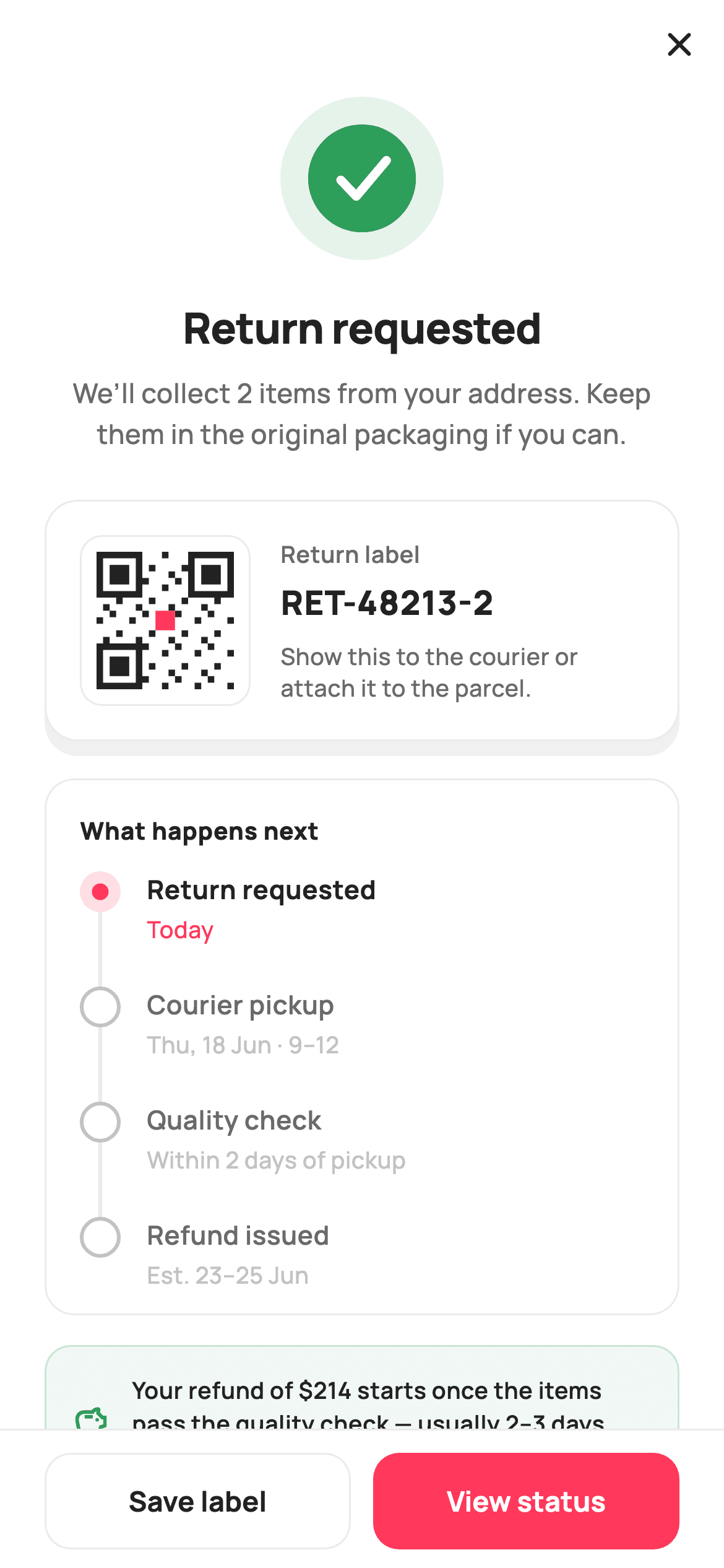
What you'll build
- ✓A success check painted by `_CheckPainter` as two green discs and a stroked tick, with every coordinate a fraction of the radius
- ✓A return-label card whose QR graphic is generated by `_QrPainter` from an integer formula and three finder patterns — no package, no asset
- ✓A 'What happens next' timeline where `_NodePainter` draws a done / active / todo node plus its connector from a `_StepState` enum
- ✓A refund-ETA note tinted with `_success.withValues(alpha: 0.07)` and a hairline-bordered footer that ranks View status above Save label
Step-by-step build
Create the file
Add a new file at lib/ecom_orders_return_confirmed/ecom_orders_return_confirmed_screen.dart in your Flutter project.
Register the bundled fonts
No external packages — this is pure Flutter. It does bundle its design font (Manrope), so drop the font file into fonts/ and declare it in pubspec.yaml:
flutter:
  fonts:
    - family: Manrope
      fonts:
- asset: fonts/Manrope-Regular.ttfBuild it, piece by piece
Here's how the screen goes together. Each block below is a real slice of the code with a plain-English explanation — paste them in order, or grab the whole file from the next section.
Callbacks, tokens, and the timeline as data
import 'package:flutter/material.dart';

/// StyleCart — Return Requested.
///
/// Confirms a return request: a painted success check, the return ID, a painted
/// QR return-label card (no network, no glyph), a short status timeline built
/// with the IntrinsicHeight stepper, and a refund-ETA note. CTAs save the label
/// and view the return status.
///
/// Self-contained per CONVENTIONS.md: pure Flutter, bundled Manrope, inline
/// Airbnb-style tokens, own light theme + SafeArea. Painter-only graphics.
/// Exposes callbacks only.
class EcomOrdersReturnConfirmedScreen extends StatelessWidget {
  const EcomOrdersReturnConfirmedScreen({
    super.key,
    this.onClose,
    this.onSaveLabel,
    this.onViewStatus,
  });

  final VoidCallback? onClose;
  final VoidCallback? onSaveLabel;
  final VoidCallback? onViewStatus;

  static const String _font = 'Manrope';
  static const Color _canvas = Color(0xFFFFFFFF);
  static const Color _ink = Color(0xFF222222);
  static const Color _muted = Color(0xFF6A6A6A);
  static const Color _faint = Color(0xFFC1C1C1);
  static const Color _brand = Color(0xFFFF385C);
  static const Color _success = Color(0xFF2E9E5B);
  static const Color _hairline = Color(0xFFEBEBEB);

  static const List<_Step> _steps = <_Step>[
    _Step('Return requested', 'Today', _StepState.active),
    _Step('Courier pickup', 'Thu, 18 Jun · 9–12', _StepState.todo),
    _Step('Quality check', 'Within 2 days of pickup', _StepState.todo),
    _Step('Refund issued', 'Est. 23–25 Jun', _StepState.todo),
  ];
`EcomOrdersReturnConfirmedScreen` is a `StatelessWidget` with three optional callbacks — `onClose`, `onSaveLabel`, `onViewStatus` — and no state at all, because a confirmation page only reports a result and offers exits. The palette is Airbnb-flavoured: `_brand` coral `#FF385C` for the primary action and the active step, `_success` green `#2E9E5B` reserved for the check and the refund note, and three greys (`_ink` `#222222`, `_muted` `#6A6A6A`, `_faint` `#C1C1C1`) that grade text by importance. The interesting bit is `_steps`: a `static const List<_Step>` of four label/time/state triples. Only the first is `_StepState.active`; the rest are `todo`. Keeping the timeline as data means swapping in server statuses later is a one-list change rather than a widget rewrite.
Forced light theme, close button, and the scrolling body
  @override
  Widget build(BuildContext context) {
    return Theme(
      data: ThemeData.light(useMaterial3: true),
      child: Scaffold(
        backgroundColor: _canvas,
        body: SafeArea(
          child: Column(
            children: <Widget>[
              Align(
                alignment: Alignment.centerRight,
                child: IconButton(
                  onPressed: onClose,
                  icon: const Icon(Icons.close_rounded, size: 22, color: _ink),
                ),
              ),
              Expanded(
                child: ListView(
                  padding: const EdgeInsets.fromLTRB(24, 4, 24, 24),
                  children: <Widget>[
                    Center(
                      child: SizedBox(
                        width: 88,
                        height: 88,
                        child: CustomPaint(painter: _CheckPainter()),
                      ),
                    ),
                    const SizedBox(height: 20),
                    const Text(
                      'Return requested',
                      textAlign: TextAlign.center,
                      style: TextStyle(
                        fontFamily: _font,
                        fontSize: 23,
                        fontWeight: FontWeight.w800,
                        letterSpacing: -0.4,
                        color: _ink,
                      ),
                    ),
                    const SizedBox(height: 8),
                    const Text(
                      'We’ll collect 2 items from your address. Keep them in '
                      'the original packaging if you can.',
                      textAlign: TextAlign.center,
                      style: TextStyle(
                        fontFamily: _font,
                        fontSize: 14.5,
                        fontWeight: FontWeight.w500,
                        height: 1.5,
                        color: _muted,
                      ),
                    ),
                    const SizedBox(height: 24),
                    _labelCard(),
                    const SizedBox(height: 20),
                    _timeline(),
                    const SizedBox(height: 16),
                    _refundNote(),
                  ],
                ),
              ),
              _footer(),
            ],
          ),
        ),
      ),
    );
  }
`build` wraps everything in `Theme(data: ThemeData.light(useMaterial3: true))` so the screen looks identical inside a dark-themed host app — the white `_canvas` and dark `_ink` are hard-coded, so inheriting a dark theme would break contrast. Inside `SafeArea`, a `Column` holds three parts: an `Align(centerRight)` close `IconButton` (a close glyph, not a back arrow, because this screen ends the return flow), an `Expanded` `ListView` for the content, and the `_footer()` pinned beneath. The `ListView` starts with an 88×88 `CustomPaint(painter: _CheckPainter())` centred, then the 23px `w800` headline with `letterSpacing: -0.4`, then body copy at 14.5px with `height: 1.5` telling the shopper two items will be collected. Using a `ListView` rather than a `Column` means the label card, timeline and refund note still fit on a small phone by scrolling.
The return-label card with a painted QR
  Widget _labelCard() {
    return Container(
      padding: const EdgeInsets.all(18),
      decoration: BoxDecoration(
        color: _canvas,
        borderRadius: BorderRadius.circular(18),
        border: Border.all(color: _hairline),
        boxShadow: const <BoxShadow>[
          BoxShadow(
            color: Color(0x0F000000),
            blurRadius: 18,
            offset: Offset(0, 8),
          ),
        ],
      ),
      child: Row(
        children: <Widget>[
          Container(
            width: 92,
            height: 92,
            padding: const EdgeInsets.all(8),
            decoration: BoxDecoration(
              color: _canvas,
              borderRadius: BorderRadius.circular(12),
              border: Border.all(color: _hairline),
            ),
            child: CustomPaint(painter: _QrPainter()),
          ),
          const SizedBox(width: 16),
          Expanded(
            child: Column(
              crossAxisAlignment: CrossAxisAlignment.start,
              children: <Widget>[
                const Text(
                  'Return label',
                  style: TextStyle(
                    fontFamily: _font,
                    fontSize: 12.5,
                    fontWeight: FontWeight.w600,
                    color: _muted,
                  ),
                ),
                const SizedBox(height: 4),
                const Text(
                  'RET-48213-2',
                  style: TextStyle(
                    fontFamily: _font,
                    fontSize: 18,
                    fontWeight: FontWeight.w800,
                    letterSpacing: 0.5,
                    color: _ink,
                  ),
                ),
                const SizedBox(height: 8),
                Text(
                  'Show this to the courier or attach it to the parcel.',
                  style: const TextStyle(
                    fontFamily: _font,
                    fontSize: 12.5,
                    fontWeight: FontWeight.w500,
                    height: 1.35,
                    color: _muted,
                  ),
                ),
              ],
            ),
          ),
        ],
      ),
    );
  }
`_labelCard` is a white `Container` with an 18px radius, a `_hairline` `#EBEBEB` border and a single soft shadow (`Color(0x0F000000)`, `blurRadius: 18`, offset 8px down) — the only elevated surface on the page, which is what makes it read as the thing you would show a courier. Inside, a `Row` puts a 92×92 bordered box on the left with 8px padding and `CustomPaint(painter: _QrPainter())`; the padding is what stops the QR's finder squares from touching the border. The `Expanded` column on the right stacks a 12.5px muted 'Return label' eyebrow, the ID `RET-48213-2` at 18px `w800` with `letterSpacing: 0.5` (wider tracking makes an alphanumeric code easier to read aloud), and a one-line instruction at `height: 1.35`. Nothing here is tappable; the footer's Save label button owns that action.
The IntrinsicHeight step timeline
  Widget _timeline() {
    return Container(
      padding: const EdgeInsets.fromLTRB(16, 18, 16, 6),
      decoration: BoxDecoration(
        color: _canvas,
        borderRadius: BorderRadius.circular(16),
        border: Border.all(color: _hairline),
      ),
      child: Column(
        crossAxisAlignment: CrossAxisAlignment.start,
        children: <Widget>[
          const Padding(
            padding: EdgeInsets.only(left: 2, bottom: 12),
            child: Text(
              'What happens next',
              style: TextStyle(
                fontFamily: _font,
                fontSize: 13,
                fontWeight: FontWeight.w800,
                letterSpacing: 0.3,
                color: _ink,
              ),
            ),
          ),
          for (int i = 0; i < _steps.length; i++)
            _stepTile(_steps[i], i == _steps.length - 1),
        ],
      ),
    );
  }

  Widget _stepTile(_Step s, bool last) {
    return IntrinsicHeight(
      child: Row(
        crossAxisAlignment: CrossAxisAlignment.stretch,
        children: <Widget>[
          SizedBox(
            width: 26,
            child: CustomPaint(painter: _NodePainter(s.state, last)),
          ),
          Expanded(
            child: Padding(
              padding: EdgeInsets.only(left: 12, bottom: last ? 6 : 22),
              child: Column(
                crossAxisAlignment: CrossAxisAlignment.start,
                children: <Widget>[
                  Text(
                    s.label,
                    style: TextStyle(
                      fontFamily: _font,
                      fontSize: 14,
                      fontWeight: s.state == _StepState.todo
                          ? FontWeight.w600
                          : FontWeight.w700,
                      color: s.state == _StepState.todo ? _muted : _ink,
                    ),
                  ),
                  const SizedBox(height: 2),
                  Text(
                    s.time,
                    style: TextStyle(
                      fontFamily: _font,
                      fontSize: 12.5,
                      fontWeight: FontWeight.w500,
                      color: s.state == _StepState.active ? _brand : _faint,
                    ),
                  ),
                ],
              ),
            ),
          ),
        ],
      ),
    );
  }
`_timeline` is a bordered panel headed 'What happens next' and then a collection-for that calls `_stepTile(_steps[i], i == _steps.length - 1)` so the last tile knows to skip its connector. Each tile is wrapped in `IntrinsicHeight` with `crossAxisAlignment: CrossAxisAlignment.stretch`: that forces the 26px-wide `CustomPaint` column on the left to be exactly as tall as the text column on the right, which is how `_NodePainter` can draw a connector to `size.height` and have it meet the next node regardless of how many lines the label wraps to. The text column's bottom padding is `last ? 6 : 22`, so the spacing lives inside the painted area and the connector spans it. Typography follows state: a `todo` step's label drops from `w700` `_ink` to `w600` `_muted`, and the time line is `_brand` coral only for the `active` step, `_faint` otherwise — so 'Today' is the single coloured word in the panel.
Refund note and the two-button footer
  Widget _refundNote() {
    return Container(
      padding: const EdgeInsets.all(14),
      decoration: BoxDecoration(
        color: _success.withValues(alpha: 0.07),
        borderRadius: BorderRadius.circular(14),
        border: Border.all(color: _success.withValues(alpha: 0.2)),
      ),
      child: Row(
        children: const <Widget>[
          Icon(Icons.savings_outlined, size: 20, color: _success),
          SizedBox(width: 12),
          Expanded(
            child: Text(
              'Your refund of \$214 starts once the items pass the quality '
              'check — usually 2–3 days after pickup.',
              style: TextStyle(
                fontFamily: _font,
                fontSize: 12.5,
                fontWeight: FontWeight.w600,
                height: 1.4,
                color: _ink,
              ),
            ),
          ),
        ],
      ),
    );
  }

  Widget _footer() {
    return Container(
      decoration: const BoxDecoration(
        color: _canvas,
        border: Border(top: BorderSide(color: _hairline)),
      ),
      child: SafeArea(
        top: false,
        child: Padding(
          padding: const EdgeInsets.fromLTRB(24, 12, 24, 10),
          child: Row(
            children: <Widget>[
              Expanded(
                child: SizedBox(
                  height: 52,
                  child: OutlinedButton(
                    onPressed: onSaveLabel,
                    style: OutlinedButton.styleFrom(
                      foregroundColor: _ink,
                      side: const BorderSide(color: _hairline),
                      shape: RoundedRectangleBorder(
                        borderRadius: BorderRadius.circular(14),
                      ),
                    ),
                    child: const Text(
                      'Save label',
                      style: TextStyle(
                        fontFamily: _font,
                        fontSize: 15,
                        fontWeight: FontWeight.w700,
                      ),
                    ),
                  ),
                ),
              ),
              const SizedBox(width: 12),
              Expanded(
                child: SizedBox(
                  height: 52,
                  child: FilledButton(
                    onPressed: onViewStatus,
                    style: FilledButton.styleFrom(
                      backgroundColor: _brand,
                      foregroundColor: _canvas,
                      shape: RoundedRectangleBorder(
                        borderRadius: BorderRadius.circular(14),
                      ),
                    ),
                    child: const Text(
                      'View status',
                      style: TextStyle(
                        fontFamily: _font,
                        fontSize: 15,
                        fontWeight: FontWeight.w700,
                      ),
                    ),
                  ),
                ),
              ),
            ],
          ),
        ),
      ),
    );
  }
}
`_refundNote` is the one green surface: `_success.withValues(alpha: 0.07)` fill, a `0.2`-alpha green border, a `savings_outlined` icon, and 12.5px `w600` copy stating the `$214` refund starts after the quality check. The whole `Row` is `const`, so it costs nothing to rebuild. `_footer` is a `Container` with a top `_hairline` border wrapping `SafeArea(top: false)` — the border sits outside the safe area, so the white background runs under the home indicator while the buttons stay above it. Two `Expanded` 52px buttons share the row: an `OutlinedButton` 'Save label' with `_ink` foreground and a hairline side, and a `FilledButton` 'View status' in `_brand` coral. They are deliberately unequal — viewing status is the thing most people do next, and saving the label is a one-off. Both use a 14px `RoundedRectangleBorder` to match the cards above.
The step model and _NodePainter
enum _StepState { done, active, todo }

class _Step {
  const _Step(this.label, this.time, this.state);
  final String label;
  final String time;
  final _StepState state;
}

/// Timeline node + connector (same family as the other order steppers).
class _NodePainter extends CustomPainter {
  _NodePainter(this.state, this.last);
  final _StepState state;
  final bool last;

  static const Color _brand = Color(0xFFFF385C);
  static const Color _success = Color(0xFF2E9E5B);
  static const Color _faint = Color(0xFFC1C1C1);
  static const Color _hairline = Color(0xFFEBEBEB);

  @override
  void paint(Canvas canvas, Size size) {
    final double cx = size.width / 2;
    const double cy = 11;
    const double r = 11;

    if (!last) {
      canvas.drawLine(
        Offset(cx, cy + r),
        Offset(cx, size.height),
        Paint()
          ..color = state == _StepState.done ? _success : _hairline
          ..strokeWidth = 2,
      );
    }

    switch (state) {
      case _StepState.done:
        canvas.drawCircle(Offset(cx, cy), r, Paint()..color = _success);
        final Path check = Path()
          ..moveTo(cx - 4.6, cy + 0.3)
          ..lineTo(cx - 1.4, cy + 3.4)
          ..lineTo(cx + 4.8, cy - 3.6);
        canvas.drawPath(
          check,
          Paint()
            ..style = PaintingStyle.stroke
            ..strokeWidth = 2.2
            ..strokeCap = StrokeCap.round
            ..strokeJoin = StrokeJoin.round
            ..color = const Color(0xFFFFFFFF),
        );
      case _StepState.active:
        canvas.drawCircle(
          Offset(cx, cy),
          r,
          Paint()..color = _brand.withValues(alpha: 0.16),
        );
        canvas.drawCircle(Offset(cx, cy), 4.5, Paint()..color = _brand);
      case _StepState.todo:
        canvas.drawCircle(
          Offset(cx, cy),
          r - 1,
          Paint()
            ..style = PaintingStyle.stroke
            ..strokeWidth = 2
            ..color = _faint,
        );
    }
  }

  @override
  bool shouldRepaint(_NodePainter old) =>
      old.state != state || old.last != last;
}
`_StepState { done, active, todo }` and the tiny `_Step` value class are the entire data model. `_NodePainter` takes a state and a `last` flag. It first draws the connector — a 2px line from `cy + r` (just below the node) to `size.height`, green if the step is `done`, hairline grey otherwise — and skips it when `last` is true. Then a `switch` on state with Dart 3's no-`break` syntax: `done` fills an 11px-radius `_success` circle and strokes a three-point white tick with `StrokeCap.round`; `active` paints a 16%-alpha coral halo at full radius with a solid 4.5px coral dot inside; `todo` strokes an `r - 1` ring in `_faint` so the 2px stroke stays inside the same 22px footprint. `cy` is a constant 11, which lines the node up with the first line of the 14px label. `shouldRepaint` compares `state` and `last`, so a status update repaints only the tiles that changed.
Painting the success check
/// A clean success check on a soft green disc — no emoji glyph.
class _CheckPainter extends CustomPainter {
  const _CheckPainter();

  static const Color _success = Color(0xFF2E9E5B);

  @override
  void paint(Canvas canvas, Size size) {
    final Offset c = Offset(size.width / 2, size.height / 2);
    final double r = size.width / 2;
    canvas.drawCircle(
        c, r, Paint()..color = _success.withValues(alpha: 0.12));
    canvas.drawCircle(c, r * 0.66, Paint()..color = _success);
    final Path check = Path()
      ..moveTo(c.dx - r * 0.26, c.dy + r * 0.02)
      ..lineTo(c.dx - r * 0.07, c.dy + r * 0.22)
      ..lineTo(c.dx + r * 0.30, c.dy - r * 0.22);
    canvas.drawPath(
      check,
      Paint()
        ..style = PaintingStyle.stroke
        ..strokeWidth = r * 0.11
        ..strokeCap = StrokeCap.round
        ..strokeJoin = StrokeJoin.round
        ..color = const Color(0xFFFFFFFF),
    );
  }

  @override
  bool shouldRepaint(_CheckPainter old) => false;
}
`_CheckPainter` is a `const` painter with no inputs, so `shouldRepaint` simply returns `false`. It draws three things from a centre `c` and radius `r = size.width / 2`: a full-size disc at `_success.withValues(alpha: 0.12)` for a soft halo, a solid `_success` disc at `r * 0.66`, and a tick `Path` whose three points are offsets like `c.dx - r * 0.26` and `c.dy + r * 0.22`. Because every coordinate and the `strokeWidth` (`r * 0.11`) are fractions of `r`, the same painter renders crisply in the 88px box used here or in a 40px list badge. `StrokeCap.round` and `StrokeJoin.round` give the tick soft ends and a soft elbow, which is what keeps it from looking like a font glyph — the file comment specifically calls out 'no emoji glyph'.
A deterministic QR-style label painter
/// A deterministic painted QR-style label (21×21 modules, three finder
/// patterns, brand centre) — recognisable as a scan label, no network/asset.
class _QrPainter extends CustomPainter {
  const _QrPainter();

  static const Color _ink = Color(0xFF222222);
  static const Color _brand = Color(0xFFFF385C);

  bool _inFinder(int x, int y) =>
      _finder(x, y) || _finder(x - 14, y) || _finder(x, y - 14);

  bool _finder(int x, int y) => x >= 0 && x < 7 && y >= 0 && y < 7;

  @override
  void paint(Canvas canvas, Size size) {
    const int n = 21;
    final double cell = size.width / n;
    final Paint p = Paint()..color = _ink;

    for (int y = 0; y < n; y++) {
      for (int x = 0; x < n; x++) {
        if (_inFinder(x, y)) continue;
        final bool on = ((x * 7 + y * 13 + x * y * 3) % 5) == 0;
        if (on) {
          canvas.drawRect(
            Rect.fromLTWH(x * cell, y * cell, cell, cell),
            p,
          );
        }
      }
    }

    // Finder patterns.
    void finderAt(double gx, double gy) {
      final Rect outer = Rect.fromLTWH(gx, gy, cell * 7, cell * 7);
      canvas.drawRect(outer, p);
      canvas.drawRect(
        Rect.fromLTWH(gx + cell, gy + cell, cell * 5, cell * 5),
        Paint()..color = const Color(0xFFFFFFFF),
      );
      canvas.drawRect(
        Rect.fromLTWH(gx + cell * 2, gy + cell * 2, cell * 3, cell * 3),
        p,
      );
    }

    finderAt(0, 0);
    finderAt(cell * 14, 0);
    finderAt(0, cell * 14);

    // Brand centre module.
    canvas.drawRect(
      Rect.fromLTWH(cell * 9, cell * 9, cell * 3, cell * 3),
      Paint()..color = _brand,
    );
  }

  @override
  bool shouldRepaint(_QrPainter old) => false;
}
`_QrPainter` produces something that scans as 'a QR code' to the eye without any encoding library. It divides the square into `n = 21` cells, then loops every cell and fills it when `((x * 7 + y * 13 + x * y * 3) % 5) == 0` — a fixed arithmetic hash, so the pattern is identical on every frame and every device, and the painter can stay `const` with `shouldRepaint => false`. `_inFinder` masks out the three 7×7 corners (`x, y`, `x - 14`, `y - 14`) so the random modules never collide with them; the local `finderAt` closure then draws each finder as ink 7×7, white 5×5, ink 3×3 — the real QR finder structure. Finally a 3×3 `_brand` coral block at cell 9 stamps the centre, echoing the brand mark that real branded QR codes carry. Swap this painter for a `qr_flutter` widget when you have a real label payload; the 92px box and 8px quiet zone already fit it.
Full code
The complete, ready-to-paste source. Free to use in your projects — one click copies it all.
import 'package:flutter/material.dart';
/// StyleCart — Return Requested.
///
/// Confirms a return request: a painted success check, the return ID, a painted
/// QR return-label card (no network, no glyph), a short status timeline built
/// with the IntrinsicHeight stepper, and a refund-ETA note. CTAs save the label
/// and view the return status.
///
/// Self-contained per CONVENTIONS.md: pure Flutter, bundled Manrope, inline
/// Airbnb-style tokens, own light theme + SafeArea. Painter-only graphics.
/// Exposes callbacks only.
class EcomOrdersReturnConfirmedScreen extends StatelessWidget {
const EcomOrdersReturnConfirmedScreen({
super.key,
this.onClose,
this.onSaveLabel,
this.onViewStatus,
});
final VoidCallback? onClose;
final VoidCallback? onSaveLabel;
final VoidCallback? onViewStatus;
static const String _font = 'Manrope';
static const Color _canvas = Color(0xFFFFFFFF);
static const Color _ink = Color(0xFF222222);
static const Color _muted = Color(0xFF6A6A6A);
static const Color _faint = Color(0xFFC1C1C1);
static const Color _brand = Color(0xFFFF385C);
static const Color _success = Color(0xFF2E9E5B);
static const Color _hairline = Color(0xFFEBEBEB);
static const List<_Step> _steps = <_Step>[
_Step('Return requested', 'Today', _StepState.active),
_Step('Courier pickup', 'Thu, 18 Jun · 9–12', _StepState.todo),
_Step('Quality check', 'Within 2 days of pickup', _StepState.todo),
_Step('Refund issued', 'Est. 23–25 Jun', _StepState.todo),
];
@override
Widget build(BuildContext context) {
return Theme(
data: ThemeData.light(useMaterial3: true),
child: Scaffold(
backgroundColor: _canvas,
body: SafeArea(
child: Column(
children: <Widget>[
Align(
alignment: Alignment.centerRight,
child: IconButton(
onPressed: onClose,
icon: const Icon(Icons.close_rounded, size: 22, color: _ink),
),
),
Expanded(
child: ListView(
padding: const EdgeInsets.fromLTRB(24, 4, 24, 24),
children: <Widget>[
Center(
child: SizedBox(
width: 88,
height: 88,
child: CustomPaint(painter: _CheckPainter()),
),
),
const SizedBox(height: 20),
const Text(
'Return requested',
textAlign: TextAlign.center,
style: TextStyle(
fontFamily: _font,
fontSize: 23,
fontWeight: FontWeight.w800,
letterSpacing: -0.4,
color: _ink,
),
),
const SizedBox(height: 8),
const Text(
'We’ll collect 2 items from your address. Keep them in '
'the original packaging if you can.',
textAlign: TextAlign.center,
style: TextStyle(
fontFamily: _font,
fontSize: 14.5,
fontWeight: FontWeight.w500,
height: 1.5,
color: _muted,
),
),
const SizedBox(height: 24),
_labelCard(),
const SizedBox(height: 20),
_timeline(),
const SizedBox(height: 16),
_refundNote(),
],
),
),
_footer(),
],
),
),
),
);
}
Widget _labelCard() {
return Container(
padding: const EdgeInsets.all(18),
decoration: BoxDecoration(
color: _canvas,
borderRadius: BorderRadius.circular(18),
border: Border.all(color: _hairline),
boxShadow: const <BoxShadow>[
BoxShadow(
color: Color(0x0F000000),
blurRadius: 18,
offset: Offset(0, 8),
),
],
),
child: Row(
children: <Widget>[
Container(
width: 92,
height: 92,
padding: const EdgeInsets.all(8),
decoration: BoxDecoration(
color: _canvas,
borderRadius: BorderRadius.circular(12),
border: Border.all(color: _hairline),
),
child: CustomPaint(painter: _QrPainter()),
),
const SizedBox(width: 16),
Expanded(
child: Column(
crossAxisAlignment: CrossAxisAlignment.start,
children: <Widget>[
const Text(
'Return label',
style: TextStyle(
fontFamily: _font,
fontSize: 12.5,
fontWeight: FontWeight.w600,
color: _muted,
),
),
const SizedBox(height: 4),
const Text(
'RET-48213-2',
style: TextStyle(
fontFamily: _font,
fontSize: 18,
fontWeight: FontWeight.w800,
letterSpacing: 0.5,
color: _ink,
),
),
const SizedBox(height: 8),
Text(
'Show this to the courier or attach it to the parcel.',
style: const TextStyle(
fontFamily: _font,
fontSize: 12.5,
fontWeight: FontWeight.w500,
height: 1.35,
color: _muted,
),
),
],
),
),
],
),
);
}
Widget _timeline() {
return Container(
padding: const EdgeInsets.fromLTRB(16, 18, 16, 6),
decoration: BoxDecoration(
color: _canvas,
borderRadius: BorderRadius.circular(16),
border: Border.all(color: _hairline),
),
child: Column(
crossAxisAlignment: CrossAxisAlignment.start,
children: <Widget>[
const Padding(
padding: EdgeInsets.only(left: 2, bottom: 12),
child: Text(
'What happens next',
style: TextStyle(
fontFamily: _font,
fontSize: 13,
fontWeight: FontWeight.w800,
letterSpacing: 0.3,
color: _ink,
),
),
),
for (int i = 0; i < _steps.length; i++)
_stepTile(_steps[i], i == _steps.length - 1),
],
),
);
}
Widget _stepTile(_Step s, bool last) {
return IntrinsicHeight(
child: Row(
crossAxisAlignment: CrossAxisAlignment.stretch,
children: <Widget>[
SizedBox(
width: 26,
child: CustomPaint(painter: _NodePainter(s.state, last)),
),
Expanded(
child: Padding(
padding: EdgeInsets.only(left: 12, bottom: last ? 6 : 22),
child: Column(
crossAxisAlignment: CrossAxisAlignment.start,
children: <Widget>[
Text(
s.label,
style: TextStyle(
fontFamily: _font,
fontSize: 14,
fontWeight: s.state == _StepState.todo
? FontWeight.w600
: FontWeight.w700,
color: s.state == _StepState.todo ? _muted : _ink,
),
),
const SizedBox(height: 2),
Text(
s.time,
style: TextStyle(
fontFamily: _font,
fontSize: 12.5,
fontWeight: FontWeight.w500,
color: s.state == _StepState.active ? _brand : _faint,
),
),
],
),
),
),
],
),
);
}
Widget _refundNote() {
return Container(
padding: const EdgeInsets.all(14),
decoration: BoxDecoration(
color: _success.withValues(alpha: 0.07),
borderRadius: BorderRadius.circular(14),
border: Border.all(color: _success.withValues(alpha: 0.2)),
),
child: Row(
children: const <Widget>[
Icon(Icons.savings_outlined, size: 20, color: _success),
SizedBox(width: 12),
Expanded(
child: Text(
'Your refund of \$214 starts once the items pass the quality '
'check — usually 2–3 days after pickup.',
style: TextStyle(
fontFamily: _font,
fontSize: 12.5,
fontWeight: FontWeight.w600,
height: 1.4,
color: _ink,
),
),
),
],
),
);
}
Widget _footer() {
return Container(
decoration: const BoxDecoration(
color: _canvas,
border: Border(top: BorderSide(color: _hairline)),
),
child: SafeArea(
top: false,
child: Padding(
padding: const EdgeInsets.fromLTRB(24, 12, 24, 10),
child: Row(
children: <Widget>[
Expanded(
child: SizedBox(
height: 52,
child: OutlinedButton(
onPressed: onSaveLabel,
style: OutlinedButton.styleFrom(
foregroundColor: _ink,
side: const BorderSide(color: _hairline),
shape: RoundedRectangleBorder(
borderRadius: BorderRadius.circular(14),
),
),
child: const Text(
'Save label',
style: TextStyle(
fontFamily: _font,
fontSize: 15,
fontWeight: FontWeight.w700,
),
),
),
),
),
const SizedBox(width: 12),
Expanded(
child: SizedBox(
height: 52,
child: FilledButton(
onPressed: onViewStatus,
style: FilledButton.styleFrom(
backgroundColor: _brand,
foregroundColor: _canvas,
shape: RoundedRectangleBorder(
borderRadius: BorderRadius.circular(14),
),
),
child: const Text(
'View status',
style: TextStyle(
fontFamily: _font,
fontSize: 15,
fontWeight: FontWeight.w700,
),
),
),
),
),
],
),
),
),
);
}
}
enum _StepState { done, active, todo }
class _Step {
const _Step(this.label, this.time, this.state);
final String label;
final String time;
final _StepState state;
}
/// Timeline node + connector (same family as the other order steppers).
class _NodePainter extends CustomPainter {
_NodePainter(this.state, this.last);
final _StepState state;
final bool last;
static const Color _brand = Color(0xFFFF385C);
static const Color _success = Color(0xFF2E9E5B);
static const Color _faint = Color(0xFFC1C1C1);
static const Color _hairline = Color(0xFFEBEBEB);
@override
void paint(Canvas canvas, Size size) {
final double cx = size.width / 2;
const double cy = 11;
const double r = 11;
if (!last) {
canvas.drawLine(
Offset(cx, cy + r),
Offset(cx, size.height),
Paint()
..color = state == _StepState.done ? _success : _hairline
..strokeWidth = 2,
);
}
switch (state) {
case _StepState.done:
canvas.drawCircle(Offset(cx, cy), r, Paint()..color = _success);
final Path check = Path()
..moveTo(cx - 4.6, cy + 0.3)
..lineTo(cx - 1.4, cy + 3.4)
..lineTo(cx + 4.8, cy - 3.6);
canvas.drawPath(
check,
Paint()
..style = PaintingStyle.stroke
..strokeWidth = 2.2
..strokeCap = StrokeCap.round
..strokeJoin = StrokeJoin.round
..color = const Color(0xFFFFFFFF),
);
case _StepState.active:
canvas.drawCircle(
Offset(cx, cy),
r,
Paint()..color = _brand.withValues(alpha: 0.16),
);
canvas.drawCircle(Offset(cx, cy), 4.5, Paint()..color = _brand);
case _StepState.todo:
canvas.drawCircle(
Offset(cx, cy),
r - 1,
Paint()
..style = PaintingStyle.stroke
..strokeWidth = 2
..color = _faint,
);
}
}
@override
bool shouldRepaint(_NodePainter old) =>
old.state != state || old.last != last;
}
/// A clean success check on a soft green disc — no emoji glyph.
class _CheckPainter extends CustomPainter {
const _CheckPainter();
static const Color _success = Color(0xFF2E9E5B);
@override
void paint(Canvas canvas, Size size) {
final Offset c = Offset(size.width / 2, size.height / 2);
final double r = size.width / 2;
canvas.drawCircle(
c, r, Paint()..color = _success.withValues(alpha: 0.12));
canvas.drawCircle(c, r * 0.66, Paint()..color = _success);
final Path check = Path()
..moveTo(c.dx - r * 0.26, c.dy + r * 0.02)
..lineTo(c.dx - r * 0.07, c.dy + r * 0.22)
..lineTo(c.dx + r * 0.30, c.dy - r * 0.22);
canvas.drawPath(
check,
Paint()
..style = PaintingStyle.stroke
..strokeWidth = r * 0.11
..strokeCap = StrokeCap.round
..strokeJoin = StrokeJoin.round
..color = const Color(0xFFFFFFFF),
);
}
@override
bool shouldRepaint(_CheckPainter old) => false;
}
/// A deterministic painted QR-style label (21×21 modules, three finder
/// patterns, brand centre) — recognisable as a scan label, no network/asset.
class _QrPainter extends CustomPainter {
const _QrPainter();
static const Color _ink = Color(0xFF222222);
static const Color _brand = Color(0xFFFF385C);
bool _inFinder(int x, int y) =>
_finder(x, y) || _finder(x - 14, y) || _finder(x, y - 14);
bool _finder(int x, int y) => x >= 0 && x < 7 && y >= 0 && y < 7;
@override
void paint(Canvas canvas, Size size) {
const int n = 21;
final double cell = size.width / n;
final Paint p = Paint()..color = _ink;
for (int y = 0; y < n; y++) {
for (int x = 0; x < n; x++) {
if (_inFinder(x, y)) continue;
final bool on = ((x * 7 + y * 13 + x * y * 3) % 5) == 0;
if (on) {
canvas.drawRect(
Rect.fromLTWH(x * cell, y * cell, cell, cell),
p,
);
}
}
}
// Finder patterns.
void finderAt(double gx, double gy) {
final Rect outer = Rect.fromLTWH(gx, gy, cell * 7, cell * 7);
canvas.drawRect(outer, p);
canvas.drawRect(
Rect.fromLTWH(gx + cell, gy + cell, cell * 5, cell * 5),
Paint()..color = const Color(0xFFFFFFFF),
);
canvas.drawRect(
Rect.fromLTWH(gx + cell * 2, gy + cell * 2, cell * 3, cell * 3),
p,
);
}
finderAt(0, 0);
finderAt(cell * 14, 0);
finderAt(0, cell * 14);
// Brand centre module.
canvas.drawRect(
Rect.fromLTWH(cell * 9, cell * 9, cell * 3, cell * 3),
Paint()..color = _brand,
);
}
@override
bool shouldRepaint(_QrPainter old) => false;
}
Plus bundled 5 binary assets (fonts/images). The CLI and MCP install those for you automatically.
Two faster ways to add it
Copy-paste works, but you can skip it entirely.
1. FlutterKit CLI
One command drops this screen — and its fonts — straight into your project.
$ flutterkit add ecom-orders-return-confirmed2. AI agent (MCP)
Connect FlutterKit's MCP server in Claude or Cursor and just ask your agent to install ecom-orders-return-confirmed — it fetches and writes the files for you.
FAQ
Can I use this return-confirmation screen in a commercial app?
Yes. FlutterKit screens are free for personal and commercial projects under an MIT-style licence — no key, no attribution, no sign-up. Copy the code from this page or run `flutterkit add ecom-orders-return-confirmed` and ship it in your store app.
Does the screen need any pub packages or fonts?
No packages — it is pure `package:flutter/material.dart`. The QR, the success check and the timeline nodes are all `CustomPainter`s. The only external asset is the Manrope font, which `flutterkit add ecom-orders-return-confirmed` bundles and registers in `pubspec.yaml` for you.
How do I feed real return statuses into the timeline?
Replace the `static const List<_Step> _steps` with a constructor parameter (say `List<_Step> steps`) and build it from your API — each item needs a label, a time string and a `_StepState`. Mark completed stages `done`, the current one `active`, the rest `todo`; `_NodePainter` already draws the green connector for `done` steps and `shouldRepaint` only redraws tiles whose state changed.
Is the QR code real? Will a courier scan it?
No — `_QrPainter` is a deterministic placeholder: a modulo formula decides which of the 21×21 cells are filled, plus three hand-drawn finder patterns. It looks right in a design and needs no dependency. For a scannable label, drop a `qr_flutter` `QrImageView` (with your return ID as data) into the same 92×92 box in `_labelCard`.
Which Flutter version does this need?
Flutter 3.22 or newer: the refund note, the active node halo and the check disc use `Color.withValues(alpha: x)`, and the constructor uses `super.key`. On an older SDK change each `withValues(alpha: x)` to `withOpacity(x)` and write the constructor as `{Key? key, ...} : super(key: key)`.


