How to Build a Fashion Size Guide Screen in Flutter (Full Code + Preview)
Most apparel returns happen because the shopper guessed a size, and a size chart buried in a product description does not stop the guess. This tutorial builds StyleCart's size-guide screen in Flutter: a segmented Centimetres / Inches toggle driven by a single `_cmUnit` boolean, a six-row `Table` from XS to XXL whose cells convert through one `_v()` helper, a gradient 'Find my size' card wired to `onFindMySize`, and a 'How to measure' list generated from a nested string list. Pure Flutter, no packages, no images.
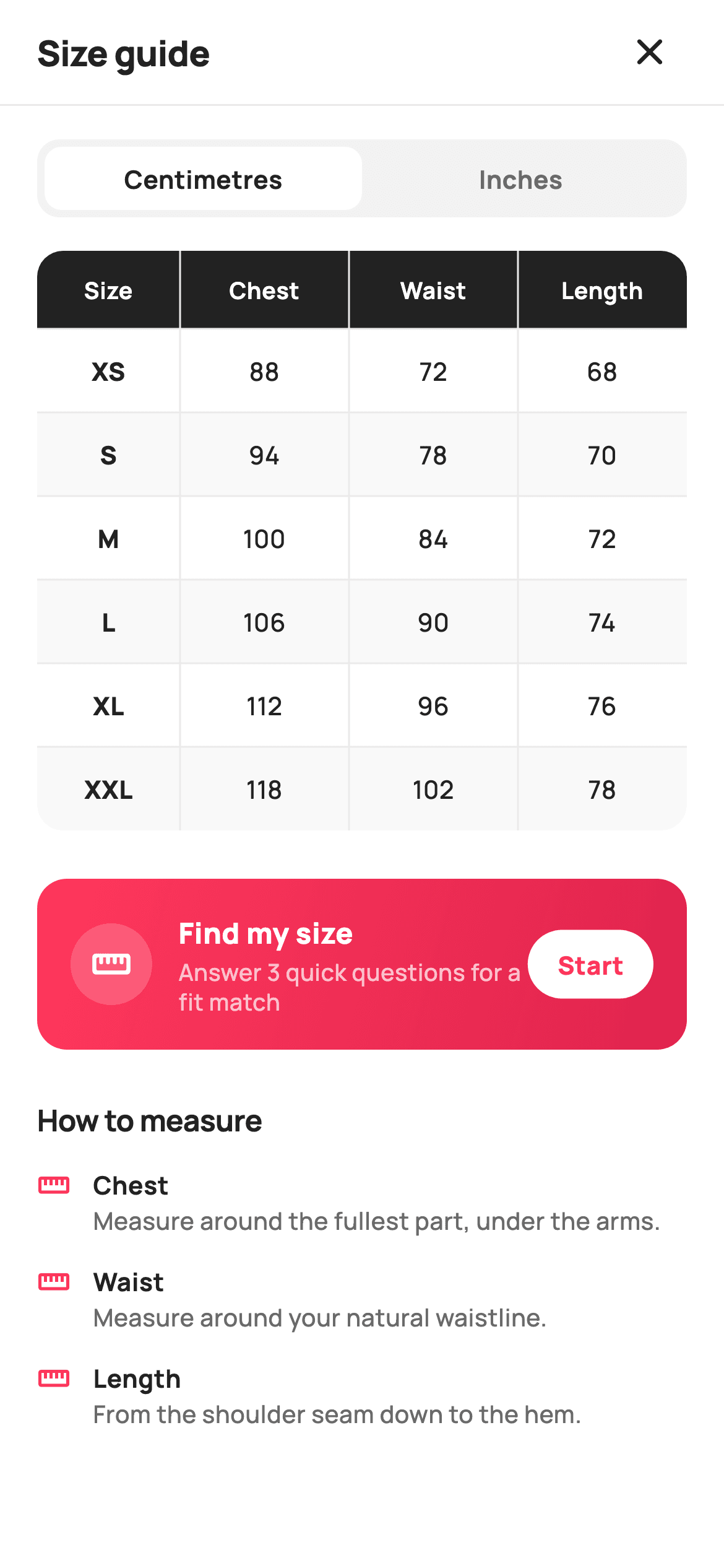
What you'll build
- ✓A cm/inch segmented control whose selected tab is a white pill on a `_surface` track, flipped by one `bool _cmUnit`
- ✓A `_v(int cm)` formatter that keeps centimetres as integers and renders inches to one decimal place
- ✓A `ClipRRect`-rounded `Table` with a `_ink` header row, `FlexColumnWidth` ratios and zebra rows generated from a `List<List<int>>`
- ✓A coral `LinearGradient` 'Find my size' card with a translucent ruler badge and a white 'Start' pill bound to `onFindMySize`
- ✓A 'How to measure' section that maps a `const List<List<String>>` into icon-led tip rows
Step-by-step build
Create the file
Add a new file at lib/ecom_product_size_guide/ecom_product_size_guide_screen.dart in your Flutter project.
Register the bundled fonts
No external packages — this is pure Flutter. It does bundle its design font (Manrope), so drop the font file into fonts/ and declare it in pubspec.yaml:
flutter:
  fonts:
    - family: Manrope
      fonts:
- asset: fonts/Manrope-Regular.ttfBuild it, piece by piece
Here's how the screen goes together. Each block below is a real slice of the code with a plain-English explanation — paste them in order, or grab the whole file from the next section.
A stateful screen with two exits
import 'package:flutter/material.dart';

/// StyleCart — Size Guide.
///
/// A measurements reference: a unit toggle (cm / in), a size-chart table with
/// crisp rules, body-measuring tips and a "find my size" helper that suggests a
/// size from height + weight.
///
/// Self-contained per CONVENTIONS.md: pure Flutter, bundled Manrope, inline
/// Airbnb-style tokens, own light theme + SafeArea, no images (table + icons).
/// Exposes callbacks only; the registry wires navigation.
class EcomProductSizeGuideScreen extends StatefulWidget {
  const EcomProductSizeGuideScreen({
    super.key,
    this.onClose,
    this.onFindMySize,
  });

  final VoidCallback? onClose;
  final VoidCallback? onFindMySize;

  @override
  State<EcomProductSizeGuideScreen> createState() =>
      _EcomProductSizeGuideScreenState();
}
Unlike most reference screens, this one is a `StatefulWidget`, and the reason is small but real: the unit toggle changes every number in the chart, so something has to hold which unit is selected. The widget itself stays thin — two optional callbacks, `onClose` and `onFindMySize`, and nothing else. There is no size parameter and no data parameter because the chart is a static reference for the shop's own garments; the registry only needs to wire where the close icon and the Start button go. The doc comment spells out the self-contained contract: pure Flutter, the bundled Manrope font, inline tokens, its own light theme and `SafeArea`, and no images, since a table and two icons are all the screen needs.
Tokens, the measurement matrix and the unit formatter
class _EcomProductSizeGuideScreenState
    extends State<EcomProductSizeGuideScreen> {
  static const String _font = 'Manrope';
  static const Color _canvas = Color(0xFFFFFFFF);
  static const Color _ink = Color(0xFF222222);
  static const Color _muted = Color(0xFF6A6A6A);
  static const Color _brand = Color(0xFFFF385C);
  static const Color _surface = Color(0xFFF2F2F2);
  static const Color _hairline = Color(0xFFEBEBEB);

  // Measurements in cm: [chest, waist, length].
  static const List<String> _sizes = <String>['XS', 'S', 'M', 'L', 'XL', 'XXL'];
  static const List<List<int>> _cm = <List<int>>[
    <int>[88, 72, 68],
    <int>[94, 78, 70],
    <int>[100, 84, 72],
    <int>[106, 90, 74],
    <int>[112, 96, 76],
    <int>[118, 102, 78],
  ];

  bool _cmUnit = true;

  String _v(int cm) =>
      _cmUnit ? '$cm' : (cm / 2.54).toStringAsFixed(1);
The palette is Airbnb-flavoured: `_brand` `#FF385C` coral, `_ink` `#222222`, `_muted` `#6A6A6A`, a `_surface` `#F2F2F2` for the toggle track and a `_hairline` `#EBEBEB` for rules. The chart data is a `List<List<int>> _cm` — six rows of `[chest, waist, length]` in centimetres — paired with a parallel `_sizes` list from XS to XXL, so adding a size means appending one entry to each. The only mutable state is `bool _cmUnit = true`. Everything flows through `_v(int cm)`: with centimetres selected it returns the integer as-is, otherwise it divides by 2.54 and calls `toStringAsFixed(1)`, so 88 cm becomes '34.6' rather than a long decimal tail. Storing metric only and converting at render time keeps a single source of truth and makes the toggle a pure display concern.
Forcing a light theme and stacking the page
  @override
  Widget build(BuildContext context) {
    return Theme(
      data: ThemeData.light(useMaterial3: true),
      child: Scaffold(
        backgroundColor: _canvas,
        body: SafeArea(
          child: Column(
            children: <Widget>[
              _header(),
              const Divider(height: 1, color: _hairline),
              Expanded(
                child: ListView(
                  padding: const EdgeInsets.fromLTRB(20, 18, 20, 28),
                  children: <Widget>[
                    _unitToggle(),
                    const SizedBox(height: 18),
                    _table(),
                    const SizedBox(height: 26),
                    _findMySize(),
                    const SizedBox(height: 26),
                    _tips(),
                  ],
                ),
              ),
            ],
          ),
        ),
      ),
    );
  }
`build` wraps the `Scaffold` in `Theme(data: ThemeData.light(useMaterial3: true))`, so the screen looks identical even if the host app runs a dark theme — a size chart with inverted zebra stripes would be hard to read. Inside `SafeArea`, a `Column` places `_header()` and a one-pixel `Divider` in `_hairline` above an `Expanded` `ListView`. The list carries the four sections in reading order — `_unitToggle()`, `_table()`, `_findMySize()`, `_tips()` — separated by 18px and 26px `SizedBox` gaps, with padding of `fromLTRB(20, 18, 20, 28)` so the last tip clears the home indicator. Using `ListView` rather than `SingleChildScrollView` means the whole body scrolls as one and the header stays pinned.
The close-only header
  Widget _header() {
    return Padding(
      padding: const EdgeInsets.fromLTRB(8, 4, 16, 4),
      child: Row(
        children: <Widget>[
          const Expanded(
            child: Padding(
              padding: EdgeInsets.only(left: 12),
              child: Text(
                'Size guide',
                style: TextStyle(
                  fontFamily: _font,
                  fontSize: 19,
                  fontWeight: FontWeight.w800,
                  letterSpacing: -0.3,
                  color: _ink,
                ),
              ),
            ),
          ),
          IconButton(
            onPressed: widget.onClose,
            icon: const Icon(Icons.close_rounded, size: 24, color: _ink),
          ),
        ],
      ),
    );
  }
The header is a `Row` with an `Expanded` title and a trailing `IconButton`. The title 'Size guide' is 19px Manrope `w800` with `letterSpacing: -0.3` and is nudged 12px right by an inner `Padding`, while the row's own padding is `fromLTRB(8, 4, 16, 4)` — the asymmetric left inset compensates for the fact that there is no leading icon on this side. The trailing icon is `Icons.close_rounded` rather than a back arrow, because this screen opens as a sheet or modal from a product page and closing it returns to that product; a back arrow would imply it sits inside a longer flow. Its `onPressed` is `widget.onClose`, left null-safe so the screen still renders in a preview with no navigation attached.
The segmented Centimetres / Inches toggle
  Widget _unitToggle() {
    return Container(
      height: 42,
      padding: const EdgeInsets.all(4),
      decoration: BoxDecoration(
        color: _surface,
        borderRadius: BorderRadius.circular(12),
      ),
      child: Row(
        children: <Widget>[
          _unitTab('Centimetres', _cmUnit, () => setState(() => _cmUnit = true)),
          _unitTab('Inches', !_cmUnit, () => setState(() => _cmUnit = false)),
        ],
      ),
    );
  }

  Widget _unitTab(String t, bool on, VoidCallback onTap) {
    return Expanded(
      child: GestureDetector(
        onTap: onTap,
        child: Container(
          alignment: Alignment.center,
          decoration: BoxDecoration(
            color: on ? _canvas : Colors.transparent,
            borderRadius: BorderRadius.circular(9),
          ),
          child: Text(
            t,
            style: TextStyle(
              fontFamily: _font,
              fontSize: 13.5,
              fontWeight: FontWeight.w700,
              color: on ? _ink : _muted,
            ),
          ),
        ),
      ),
    );
  }
`_unitToggle` is a 42px `Container` in `_surface` with 12px corners and 4px inner padding, holding two `_unitTab` widgets in a `Row`. Each tab is `Expanded`, so both halves are equal width, and is wrapped in a `GestureDetector` whose `onTap` runs `setState(() => _cmUnit = true)` or `false`. The selected tab paints a `_canvas` white pill with 9px corners — 3px less than the track, so the inner and outer radii stay concentric — while the unselected one is `Colors.transparent`. Text is 13.5px `w700`, `_ink` when on and `_muted` when off. Because the whole screen rebuilds on `setState`, the table below recomputes every cell through `_v()` in the same frame; there is no separate conversion step or cached inch list.
The size-chart table with dark header and zebra rows
  Widget _table() {
    return ClipRRect(
      borderRadius: BorderRadius.circular(14),
      child: Table(
        border: TableBorder.symmetric(
          inside: const BorderSide(color: _hairline),
        ),
        columnWidths: const <int, TableColumnWidth>{
          0: FlexColumnWidth(1.1),
          1: FlexColumnWidth(1.3),
          2: FlexColumnWidth(1.3),
          3: FlexColumnWidth(1.3),
        },
        children: <TableRow>[
          TableRow(
            decoration: const BoxDecoration(color: _ink),
            children: <Widget>[
              _th('Size'),
              _th('Chest'),
              _th('Waist'),
              _th('Length'),
            ],
          ),
          ...List<TableRow>.generate(_sizes.length, (int i) {
            return TableRow(
              decoration: BoxDecoration(
                color: i.isEven ? _canvas : _surface.withValues(alpha: 0.5),
              ),
              children: <Widget>[
                _td(_sizes[i], bold: true),
                _td(_v(_cm[i][0])),
                _td(_v(_cm[i][1])),
                _td(_v(_cm[i][2])),
              ],
            );
          }),
        ],
      ),
    );
  }

  Widget _th(String t) {
    return Padding(
      padding: const EdgeInsets.symmetric(vertical: 12, horizontal: 8),
      child: Text(
        t,
        textAlign: TextAlign.center,
        style: const TextStyle(
          fontFamily: _font,
          fontSize: 12.5,
          fontWeight: FontWeight.w700,
          color: _canvas,
        ),
      ),
    );
  }

  Widget _td(String t, {bool bold = false}) {
    return Padding(
      padding: const EdgeInsets.symmetric(vertical: 13, horizontal: 8),
      child: Text(
        t,
        textAlign: TextAlign.center,
        style: TextStyle(
          fontFamily: _font,
          fontSize: 13.5,
          fontWeight: bold ? FontWeight.w800 : FontWeight.w500,
          color: _ink,
        ),
      ),
    );
  }
`_table` uses Flutter's `Table` widget rather than a column of rows, so the four columns align exactly regardless of text width. `ClipRRect` with a 14px radius rounds the corners because `Table` cannot round itself. `TableBorder.symmetric(inside: BorderSide(color: _hairline))` draws rules only between cells, leaving the outside clean. `columnWidths` gives the Size column `FlexColumnWidth(1.1)` against `1.3` for the three measurements, so the short labels take slightly less room. The header `TableRow` is solid `_ink` with white 12.5px `w700` `_th` cells. Body rows come from `List.generate(_sizes.length, ...)`: even rows are `_canvas`, odd rows `_surface.withValues(alpha: 0.5)` for a soft zebra, and each row calls `_td` once for the bold size label and three times through `_v(_cm[i][n])` for chest, waist and length. `_td` uses 13px vertical padding versus 12px in `_th`, giving body rows a touch more breathing room than the header.
The gradient 'Find my size' card
  Widget _findMySize() {
    return Container(
      padding: const EdgeInsets.all(18),
      decoration: BoxDecoration(
        borderRadius: BorderRadius.circular(16),
        gradient: const LinearGradient(
          colors: <Color>[Color(0xFFFF385C), Color(0xFFE0244E)],
          begin: Alignment.topLeft,
          end: Alignment.bottomRight,
        ),
      ),
      child: Row(
        children: <Widget>[
          Container(
            width: 44,
            height: 44,
            alignment: Alignment.center,
            decoration: BoxDecoration(
              color: Colors.white.withValues(alpha: 0.18),
              shape: BoxShape.circle,
            ),
            child: const Icon(Icons.straighten_rounded,
                size: 22, color: Colors.white),
          ),
          const SizedBox(width: 14),
          const Expanded(
            child: Column(
              crossAxisAlignment: CrossAxisAlignment.start,
              children: <Widget>[
                Text(
                  'Find my size',
                  style: TextStyle(
                    fontFamily: _font,
                    fontSize: 15.5,
                    fontWeight: FontWeight.w800,
                    color: Colors.white,
                  ),
                ),
                SizedBox(height: 2),
                Text(
                  'Answer 3 quick questions for a fit match',
                  style: TextStyle(
                    fontFamily: _font,
                    fontSize: 12.5,
                    fontWeight: FontWeight.w500,
                    height: 1.3,
                    color: Colors.white70,
                  ),
                ),
              ],
            ),
          ),
          GestureDetector(
            onTap: widget.onFindMySize,
            child: Container(
              padding:
                  const EdgeInsets.symmetric(horizontal: 16, vertical: 9),
              decoration: BoxDecoration(
                color: Colors.white,
                borderRadius: BorderRadius.circular(20),
              ),
              child: const Text(
                'Start',
                style: TextStyle(
                  fontFamily: _font,
                  fontSize: 13.5,
                  fontWeight: FontWeight.w800,
                  color: _brand,
                ),
              ),
            ),
          ),
        ],
      ),
    );
  }
The fit helper is the only saturated block on the page, so it pulls the eye after the table. It is a `Container` with 16px corners and a `LinearGradient` from `#FF385C` to a darker `#E0244E` running top-left to bottom-right — the two coral stops give it depth without a shadow. On the left, a 44px circle at `Colors.white.withValues(alpha: 0.18)` holds a white `Icons.straighten_rounded` ruler. The `Expanded` middle stacks 'Find my size' at 15.5px `w800` over 'Answer 3 quick questions for a fit match' at 12.5px in `Colors.white70`, with `height: 1.3` for a tidy wrap. The trailing 'Start' button is a plain `GestureDetector` around a white 20px-radius pill with the label in `_brand` — a colour inversion that reads as the primary action against the gradient. It fires `widget.onFindMySize`; the screen itself has no quiz, so the host app decides where that flow lives.
How-to-measure tips from a nested list
  Widget _tips() {
    const List<List<String>> tips = <List<String>>[
      <String>['Chest', 'Measure around the fullest part, under the arms.'],
      <String>['Waist', 'Measure around your natural waistline.'],
      <String>['Length', 'From the shoulder seam down to the hem.'],
    ];
    return Column(
      crossAxisAlignment: CrossAxisAlignment.start,
      children: <Widget>[
        const Text(
          'How to measure',
          style: TextStyle(
            fontFamily: _font,
            fontSize: 16,
            fontWeight: FontWeight.w700,
            letterSpacing: -0.2,
            color: _ink,
          ),
        ),
        const SizedBox(height: 14),
        ...tips.map(
          (List<String> t) => Padding(
            padding: const EdgeInsets.only(bottom: 14),
            child: Row(
              crossAxisAlignment: CrossAxisAlignment.start,
              children: <Widget>[
                const Padding(
                  padding: EdgeInsets.only(top: 1),
                  child: Icon(Icons.straighten_outlined,
                      size: 18, color: _brand),
                ),
                const SizedBox(width: 12),
                Expanded(
                  child: Column(
                    crossAxisAlignment: CrossAxisAlignment.start,
                    children: <Widget>[
                      Text(
                        t[0],
                        style: const TextStyle(
                          fontFamily: _font,
                          fontSize: 13.5,
                          fontWeight: FontWeight.w700,
                          color: _ink,
                        ),
                      ),
                      const SizedBox(height: 1),
                      Text(
                        t[1],
                        style: const TextStyle(
                          fontFamily: _font,
                          fontSize: 13,
                          fontWeight: FontWeight.w500,
                          height: 1.35,
                          color: _muted,
                        ),
                      ),
                    ],
                  ),
                ),
              ],
            ),
          ),
        ),
      ],
    );
  }
`_tips` declares its copy as a local `const List<List<String>>` — three `[title, body]` pairs for Chest, Waist and Length, matching the three chart columns in the same order. A 16px `w700` heading 'How to measure' with `letterSpacing: -0.2` sits above, and the rows are produced with `...tips.map(...)` spread into the `Column`. Each row is `crossAxisAlignment: CrossAxisAlignment.start` with a `_brand` `Icons.straighten_outlined` at 18px, pushed down 1px so it lines up with the title's cap height, then a 12px gap and an `Expanded` text column. The title is 13.5px `w700` `_ink`, the instruction 13px `w500` `_muted` with `height: 1.35` so a two-line sentence stays readable. Every row carries `bottom: 14` padding, so the last item's spacing is absorbed by the list's 28px bottom padding rather than a dedicated trailing gap.
Full code
The complete, ready-to-paste source. Free to use in your projects — one click copies it all.
import 'package:flutter/material.dart';

/// StyleCart — Size Guide.
///
/// A measurements reference: a unit toggle (cm / in), a size-chart table with
/// crisp rules, body-measuring tips and a "find my size" helper that suggests a
/// size from height + weight.
///
/// Self-contained per CONVENTIONS.md: pure Flutter, bundled Manrope, inline
/// Airbnb-style tokens, own light theme + SafeArea, no images (table + icons).
/// Exposes callbacks only; the registry wires navigation.
class EcomProductSizeGuideScreen extends StatefulWidget {
  const EcomProductSizeGuideScreen({
    super.key,
    this.onClose,
    this.onFindMySize,
  });

  final VoidCallback? onClose;
  final VoidCallback? onFindMySize;

  @override
  State<EcomProductSizeGuideScreen> createState() =>
      _EcomProductSizeGuideScreenState();
}

class _EcomProductSizeGuideScreenState
    extends State<EcomProductSizeGuideScreen> {
  static const String _font = 'Manrope';
  static const Color _canvas = Color(0xFFFFFFFF);
  static const Color _ink = Color(0xFF222222);
  static const Color _muted = Color(0xFF6A6A6A);
  static const Color _brand = Color(0xFFFF385C);
  static const Color _surface = Color(0xFFF2F2F2);
  static const Color _hairline = Color(0xFFEBEBEB);

  // Measurements in cm: [chest, waist, length].
  static const List<String> _sizes = <String>['XS', 'S', 'M', 'L', 'XL', 'XXL'];
  static const List<List<int>> _cm = <List<int>>[
    <int>[88, 72, 68],
    <int>[94, 78, 70],
    <int>[100, 84, 72],
    <int>[106, 90, 74],
    <int>[112, 96, 76],
    <int>[118, 102, 78],
  ];

  bool _cmUnit = true;

  String _v(int cm) =>
      _cmUnit ? '$cm' : (cm / 2.54).toStringAsFixed(1);

  @override
  Widget build(BuildContext context) {
    return Theme(
      data: ThemeData.light(useMaterial3: true),
      child: Scaffold(
        backgroundColor: _canvas,
        body: SafeArea(
          child: Column(
            children: <Widget>[
              _header(),
              const Divider(height: 1, color: _hairline),
              Expanded(
                child: ListView(
                  padding: const EdgeInsets.fromLTRB(20, 18, 20, 28),
                  children: <Widget>[
                    _unitToggle(),
                    const SizedBox(height: 18),
                    _table(),
                    const SizedBox(height: 26),
                    _findMySize(),
                    const SizedBox(height: 26),
                    _tips(),
                  ],
                ),
              ),
            ],
          ),
        ),
      ),
    );
  }

  Widget _header() {
    return Padding(
      padding: const EdgeInsets.fromLTRB(8, 4, 16, 4),
      child: Row(
        children: <Widget>[
          const Expanded(
            child: Padding(
              padding: EdgeInsets.only(left: 12),
              child: Text(
                'Size guide',
                style: TextStyle(
                  fontFamily: _font,
                  fontSize: 19,
                  fontWeight: FontWeight.w800,
                  letterSpacing: -0.3,
                  color: _ink,
                ),
              ),
            ),
          ),
          IconButton(
            onPressed: widget.onClose,
            icon: const Icon(Icons.close_rounded, size: 24, color: _ink),
          ),
        ],
      ),
    );
  }

  Widget _unitToggle() {
    return Container(
      height: 42,
      padding: const EdgeInsets.all(4),
      decoration: BoxDecoration(
        color: _surface,
        borderRadius: BorderRadius.circular(12),
      ),
      child: Row(
        children: <Widget>[
          _unitTab('Centimetres', _cmUnit, () => setState(() => _cmUnit = true)),
          _unitTab('Inches', !_cmUnit, () => setState(() => _cmUnit = false)),
        ],
      ),
    );
  }

  Widget _unitTab(String t, bool on, VoidCallback onTap) {
    return Expanded(
      child: GestureDetector(
        onTap: onTap,
        child: Container(
          alignment: Alignment.center,
          decoration: BoxDecoration(
            color: on ? _canvas : Colors.transparent,
            borderRadius: BorderRadius.circular(9),
          ),
          child: Text(
            t,
            style: TextStyle(
              fontFamily: _font,
              fontSize: 13.5,
              fontWeight: FontWeight.w700,
              color: on ? _ink : _muted,
            ),
          ),
        ),
      ),
    );
  }

  Widget _table() {
    return ClipRRect(
      borderRadius: BorderRadius.circular(14),
      child: Table(
        border: TableBorder.symmetric(
          inside: const BorderSide(color: _hairline),
        ),
        columnWidths: const <int, TableColumnWidth>{
          0: FlexColumnWidth(1.1),
          1: FlexColumnWidth(1.3),
          2: FlexColumnWidth(1.3),
          3: FlexColumnWidth(1.3),
        },
        children: <TableRow>[
          TableRow(
            decoration: const BoxDecoration(color: _ink),
            children: <Widget>[
              _th('Size'),
              _th('Chest'),
              _th('Waist'),
              _th('Length'),
            ],
          ),
          ...List<TableRow>.generate(_sizes.length, (int i) {
            return TableRow(
              decoration: BoxDecoration(
                color: i.isEven ? _canvas : _surface.withValues(alpha: 0.5),
              ),
              children: <Widget>[
                _td(_sizes[i], bold: true),
                _td(_v(_cm[i][0])),
                _td(_v(_cm[i][1])),
                _td(_v(_cm[i][2])),
              ],
            );
          }),
        ],
      ),
    );
  }

  Widget _th(String t) {
    return Padding(
      padding: const EdgeInsets.symmetric(vertical: 12, horizontal: 8),
      child: Text(
        t,
        textAlign: TextAlign.center,
        style: const TextStyle(
          fontFamily: _font,
          fontSize: 12.5,
          fontWeight: FontWeight.w700,
          color: _canvas,
        ),
      ),
    );
  }

  Widget _td(String t, {bool bold = false}) {
    return Padding(
      padding: const EdgeInsets.symmetric(vertical: 13, horizontal: 8),
      child: Text(
        t,
        textAlign: TextAlign.center,
        style: TextStyle(
          fontFamily: _font,
          fontSize: 13.5,
          fontWeight: bold ? FontWeight.w800 : FontWeight.w500,
          color: _ink,
        ),
      ),
    );
  }

  Widget _findMySize() {
    return Container(
      padding: const EdgeInsets.all(18),
      decoration: BoxDecoration(
        borderRadius: BorderRadius.circular(16),
        gradient: const LinearGradient(
          colors: <Color>[Color(0xFFFF385C), Color(0xFFE0244E)],
          begin: Alignment.topLeft,
          end: Alignment.bottomRight,
        ),
      ),
      child: Row(
        children: <Widget>[
          Container(
            width: 44,
            height: 44,
            alignment: Alignment.center,
            decoration: BoxDecoration(
              color: Colors.white.withValues(alpha: 0.18),
              shape: BoxShape.circle,
            ),
            child: const Icon(Icons.straighten_rounded,
                size: 22, color: Colors.white),
          ),
          const SizedBox(width: 14),
          const Expanded(
            child: Column(
              crossAxisAlignment: CrossAxisAlignment.start,
              children: <Widget>[
                Text(
                  'Find my size',
                  style: TextStyle(
                    fontFamily: _font,
                    fontSize: 15.5,
                    fontWeight: FontWeight.w800,
                    color: Colors.white,
                  ),
                ),
                SizedBox(height: 2),
                Text(
                  'Answer 3 quick questions for a fit match',
                  style: TextStyle(
                    fontFamily: _font,
                    fontSize: 12.5,
                    fontWeight: FontWeight.w500,
                    height: 1.3,
                    color: Colors.white70,
                  ),
                ),
              ],
            ),
          ),
          GestureDetector(
            onTap: widget.onFindMySize,
            child: Container(
              padding:
                  const EdgeInsets.symmetric(horizontal: 16, vertical: 9),
              decoration: BoxDecoration(
                color: Colors.white,
                borderRadius: BorderRadius.circular(20),
              ),
              child: const Text(
                'Start',
                style: TextStyle(
                  fontFamily: _font,
                  fontSize: 13.5,
                  fontWeight: FontWeight.w800,
                  color: _brand,
                ),
              ),
            ),
          ),
        ],
      ),
    );
  }

  Widget _tips() {
    const List<List<String>> tips = <List<String>>[
      <String>['Chest', 'Measure around the fullest part, under the arms.'],
      <String>['Waist', 'Measure around your natural waistline.'],
      <String>['Length', 'From the shoulder seam down to the hem.'],
    ];
    return Column(
      crossAxisAlignment: CrossAxisAlignment.start,
      children: <Widget>[
        const Text(
          'How to measure',
          style: TextStyle(
            fontFamily: _font,
            fontSize: 16,
            fontWeight: FontWeight.w700,
            letterSpacing: -0.2,
            color: _ink,
          ),
        ),
        const SizedBox(height: 14),
        ...tips.map(
          (List<String> t) => Padding(
            padding: const EdgeInsets.only(bottom: 14),
            child: Row(
              crossAxisAlignment: CrossAxisAlignment.start,
              children: <Widget>[
                const Padding(
                  padding: EdgeInsets.only(top: 1),
                  child: Icon(Icons.straighten_outlined,
                      size: 18, color: _brand),
                ),
                const SizedBox(width: 12),
                Expanded(
                  child: Column(
                    crossAxisAlignment: CrossAxisAlignment.start,
                    children: <Widget>[
                      Text(
                        t[0],
                        style: const TextStyle(
                          fontFamily: _font,
                          fontSize: 13.5,
                          fontWeight: FontWeight.w700,
                          color: _ink,
                        ),
                      ),
                      const SizedBox(height: 1),
                      Text(
                        t[1],
                        style: const TextStyle(
                          fontFamily: _font,
                          fontSize: 13,
                          fontWeight: FontWeight.w500,
                          height: 1.35,
                          color: _muted,
                        ),
                      ),
                    ],
                  ),
                ),
              ],
            ),
          ),
        ),
      ],
    );
  }
}
Plus bundled 5 binary assets (fonts/images). The CLI and MCP install those for you automatically.
Two faster ways to add it
Copy-paste works, but you can skip it entirely.
1. FlutterKit CLI
One command drops this screen — and its fonts — straight into your project.
$ flutterkit add ecom-product-size-guide2. AI agent (MCP)
Connect FlutterKit's MCP server in Claude or Cursor and just ask your agent to install ecom-product-size-guide — it fetches and writes the files for you.
FAQ
Can I ship this size guide in a commercial app?
Yes. FlutterKit screens are free under MIT-style terms for personal and commercial projects alike — there is no key to enter and no attribution required. Copy the code from this page or run `flutterkit add ecom-product-size-guide` and use it in your storefront.
How do I load the chart from my own product data?
Replace the static `_sizes` and `_cm` lists with constructor parameters — for example `List<String> sizes` and `List<List<int>> measurementsCm` — and keep everything in centimetres. `_v()` already handles the inch conversion at render time, so the toggle keeps working with no further change. If a product has different columns (say, hip instead of length), pass the header labels too and generate the `_th` cells from them.
Why does the inch value show one decimal but centimetres none?
Garment charts are published as whole centimetres, so `_v()` returns the integer unchanged when `_cmUnit` is true. Dividing by 2.54 produces values like 34.645..., which would clutter the table, so the inch branch calls `toStringAsFixed(1)`. If your brand rounds to the nearest half inch, swap that line for a small rounding helper.
Does it need any pub packages or extra fonts?
No packages — it is pure Flutter using `Table`, `ClipRRect`, `LinearGradient` and Material icons. The only asset is the Manrope font family, which `flutterkit add ecom-product-size-guide` bundles and registers in your pubspec for you.
Which Flutter version does this need?
Flutter 3.22 or newer, because the zebra rows and the ruler badge use `Color.withValues(alpha: ...)` and the constructor uses `super.key`. On an older SDK change those calls to `withOpacity(0.5)` and `withOpacity(0.18)`, and write the constructor as `{Key? key, ...} : super(key: key)`.


