How to Build a Loyalty Points History Screen in Flutter (Full Code + Preview)
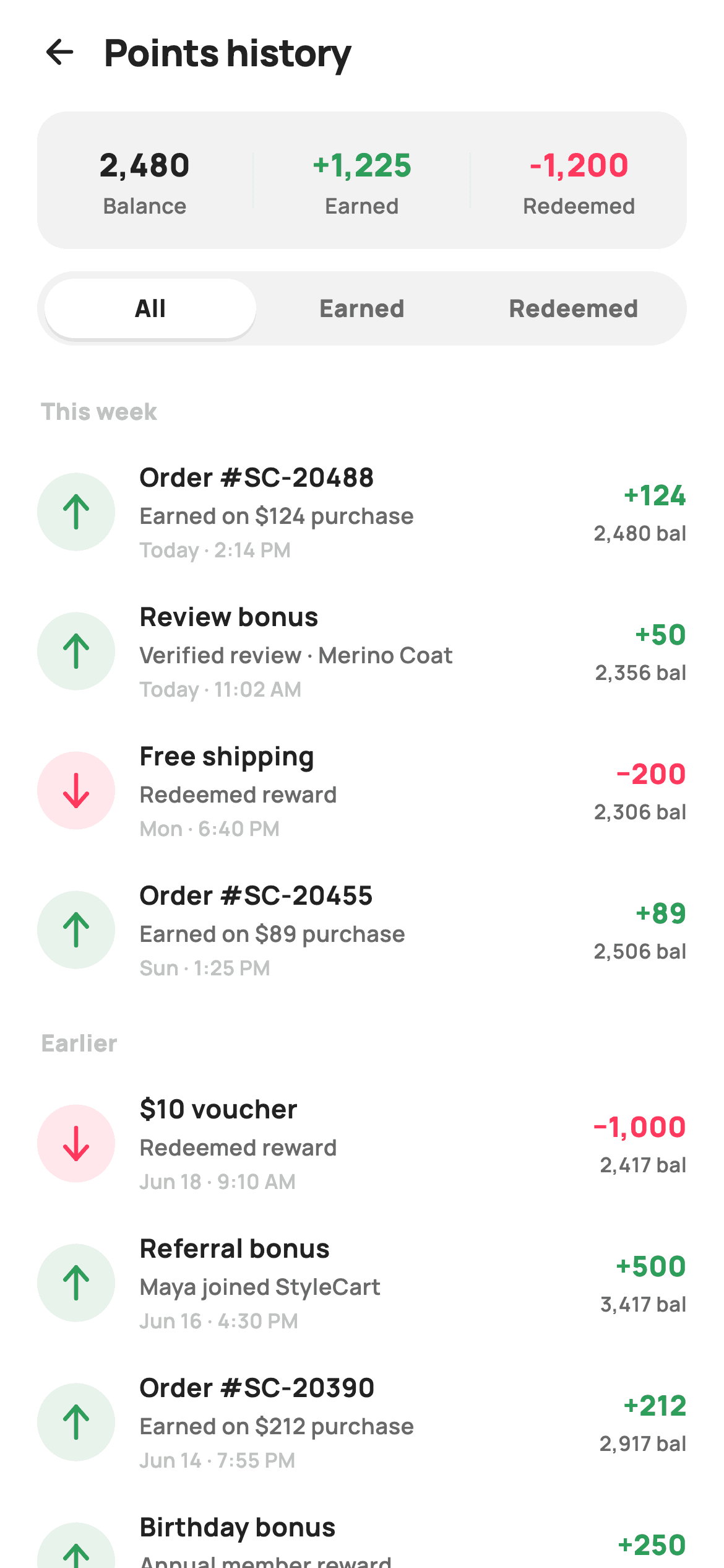
A loyalty program lives or dies on whether members trust the numbers, and the points-history screen is where that trust is earned: every credit and redemption, with the balance after each one. This tutorial builds StyleCart's points ledger in Flutter — a three-cell balance summary, sliding All / Earned / Redeemed tabs, and a date-grouped transaction list where each row carries a painter-drawn arrow badge, a signed delta and the running balance. One Dart file, no packages, callbacks only.
What you'll build
- ✓A three-cell summary pill splitting the 2,480 balance from green earned and coral redeemed totals
- ✓Segmented All / Earned / Redeemed tabs where the active pill floats on a soft shadow
- ✓A ledger that filters by sign and regrows its This week / Earlier group headers on every tap
- ✓A CustomPainter badge that draws a tinted circle and an up or down arrow from raw Paths
- ✓A ten-line thousands formatter so 2480 renders as 2,480 without importing intl
Step-by-step build
Create the file
Add a new file at lib/ecom_rewards_history/ecom_rewards_history_screen.dart in your Flutter project.
Register the bundled fonts
No external packages — this is pure Flutter. It does bundle its design font (Manrope), so drop the font file into fonts/ and declare it in pubspec.yaml:
flutter:
  fonts:
    - family: Manrope
      fonts:
- asset: fonts/Manrope-Regular.ttfBuild it, piece by piece
Here's how the screen goes together. Each block below is a real slice of the code with a plain-English explanation — paste them in order, or grab the whole file from the next section.
A stateful shell and an Airbnb-flavoured palette
import 'package:flutter/material.dart';

/// StyleCart — Points history.
///
/// The loyalty ledger: a balance summary header (earned / redeemed totals),
/// All / Earned / Redeemed segmented tabs, and a date-grouped list of
/// transactions. Each row pairs a painted +/- type badge with a description,
/// timestamp, signed point delta and running balance.
///
/// Self-contained per CONVENTIONS.md: pure Flutter, bundled Manrope, inline
/// Airbnb-style tokens, own light theme + SafeArea. Painter-only graphics
/// (type badge). Exposes callbacks only.
class EcomRewardsHistoryScreen extends StatefulWidget {
  const EcomRewardsHistoryScreen({super.key, this.onBack});

  final VoidCallback? onBack;

  @override
  State<EcomRewardsHistoryScreen> createState() =>
      _EcomRewardsHistoryScreenState();
}

class _EcomRewardsHistoryScreenState extends State<EcomRewardsHistoryScreen> {
  static const String _font = 'Manrope';
  static const Color _canvas = Color(0xFFFFFFFF);
  static const Color _ink = Color(0xFF222222);
  static const Color _muted = Color(0xFF6A6A6A);
  static const Color _faint = Color(0xFFC1C1C1);
  static const Color _brand = Color(0xFFFF385C);
  static const Color _surface = Color(0xFFF2F2F2);
  static const Color _hairline = Color(0xFFEBEBEB);
  static const Color _success = Color(0xFF2E9E5B);
Unlike a confirmation page, a filterable ledger has real state, so `EcomRewardsHistoryScreen` is a `StatefulWidget` whose only constructor input is an optional `onBack` callback — the screen owns its filtering and delegates navigation. The state class opens with nine `static const` tokens: `_ink` #222222 on a pure white `_canvas`, the #FF385C `_brand` coral, and a `_success` green #2E9E5B. That last pairing does the semantic work of the whole screen — green is reserved for points coming in, coral for points going out — while `_faint` #C1C1C1 handles the third tier of text like timestamps and group labels.
The ledger as data: eight entries with pre-computed balances
  static const List<_Entry> _entries = <_Entry>[
    _Entry('Order #SC-20488', 'Earned on \$124 purchase', 'Today · 2:14 PM',
        124, 2480, 'This week'),
    _Entry('Review bonus', 'Verified review · Merino Coat', 'Today · 11:02 AM',
        50, 2356, 'This week'),
    _Entry('Free shipping', 'Redeemed reward', 'Mon · 6:40 PM', -200, 2306,
        'This week'),
    _Entry('Order #SC-20455', 'Earned on \$89 purchase', 'Sun · 1:25 PM', 89,
        2506, 'This week'),
    _Entry('\$10 voucher', 'Redeemed reward', 'Jun 18 · 9:10 AM', -1000, 2417,
        'Earlier'),
    _Entry('Referral bonus', 'Maya joined StyleCart', 'Jun 16 · 4:30 PM', 500,
        3417, 'Earlier'),
    _Entry('Order #SC-20390', 'Earned on \$212 purchase', 'Jun 14 · 7:55 PM',
        212, 2917, 'Earlier'),
    _Entry('Birthday bonus', 'Annual member reward', 'Jun 12 · 12:00 AM', 250,
        2705, 'Earlier'),
  ];

  static const List<String> _tabs = <String>['All', 'Earned', 'Redeemed'];
  int _tab = 0;
All eight transactions live in a `static const List<_Entry>`, each carrying a title, a reason line, a timestamp, a signed `delta`, the `balance` after the transaction, and a `group` string ('This week' or 'Earlier'). Redemptions are simply negative deltas — the -1000 for the '$10 voucher' needs no separate type flag, because sign is the type. Storing the running balance on each entry rather than computing it in the UI mirrors how a real ledger API responds, and it keeps the balance column honest when the tabs later filter rows out. `_tab = 0` is the only mutable field in the file.
build(): filter by sign, then flatten groups into one list
  @override
  Widget build(BuildContext context) {
    final List<_Entry> visible = _entries.where((_Entry e) {
      if (_tab == 1) return e.delta > 0;
      if (_tab == 2) return e.delta < 0;
      return true;
    }).toList();

    // Build a flat list with group headers.
    final List<Widget> rows = <Widget>[];
    String? group;
    for (final _Entry e in visible) {
      if (e.group != group) {
        group = e.group;
        rows.add(_groupHeader(group));
      }
      rows.add(_entryRow(e));
    }

    return Theme(
      data: ThemeData.light(useMaterial3: true),
      child: Scaffold(
        backgroundColor: _canvas,
        body: SafeArea(
          child: Column(
            children: <Widget>[
              _header(),
              _summary(),
              _tabsBar(),
              Expanded(
                child: ListView(
                  padding: const EdgeInsets.fromLTRB(20, 4, 20, 24),
                  children: rows,
                ),
              ),
            ],
          ),
        ),
      ),
    );
  }
The build method derives `visible` with a one-line `where`: tab 1 keeps `e.delta > 0`, tab 2 keeps `e.delta < 0`, tab 0 keeps everything — no stored filtered list to keep in sync. Then a small loop walks `visible` tracking the previous `group` string and inserts a `_groupHeader` only when it changes, flattening headers and rows into a single `rows` list. That flat list feeds one scrolling `ListView` inside `Expanded`, while `_header()`, `_summary()` and `_tabsBar()` sit above it as fixed `Column` children — so the summary and tabs stay pinned while only the ledger scrolls. `Theme(data: ThemeData.light(useMaterial3: true))` keeps the screen self-contained in any host app.
Title row and the three-cell summary card
  Widget _header() {
    return Padding(
      padding: const EdgeInsets.fromLTRB(8, 4, 20, 4),
      child: Row(
        children: <Widget>[
          IconButton(
            onPressed: widget.onBack,
            icon: const Icon(Icons.arrow_back_rounded, size: 22, color: _ink),
          ),
          const Text(
            'Points history',
            style: TextStyle(
              fontFamily: _font,
              fontSize: 20,
              fontWeight: FontWeight.w800,
              letterSpacing: -0.3,
              color: _ink,
            ),
          ),
        ],
      ),
    );
  }

  Widget _summary() {
    return Container(
      margin: const EdgeInsets.fromLTRB(20, 4, 20, 12),
      padding: const EdgeInsets.symmetric(vertical: 16),
      decoration: BoxDecoration(
        color: _surface,
        borderRadius: BorderRadius.circular(16),
      ),
      child: Row(
        children: <Widget>[
          _summaryCell('2,480', 'Balance', _ink),
          _divider(),
          _summaryCell('+1,225', 'Earned', _success),
          _divider(),
          _summaryCell('-1,200', 'Redeemed', _brand),
        ],
      ),
    );
  }

  Widget _summaryCell(String value, String label, Color color) {
    return Expanded(
      child: Column(
        children: <Widget>[
          Text(
            value,
            style: TextStyle(
              fontFamily: _font,
              fontSize: 17,
              fontWeight: FontWeight.w800,
              color: color,
            ),
          ),
          const SizedBox(height: 2),
          Text(
            label,
            style: const TextStyle(
              fontFamily: _font,
              fontSize: 11.5,
              fontWeight: FontWeight.w600,
              color: _muted,
            ),
          ),
        ],
      ),
    );
  }

  Widget _divider() => Container(width: 1, height: 30, color: _hairline);
The header is just a back `IconButton` wired to `widget.onBack` beside a 20px `w800` 'Points history' title with `letterSpacing: -0.3` — no actions, because this screen is read-only. `_summary()` is a `_surface`-grey rounded-16 container holding three `_summaryCell` calls separated by 1×30 hairline dividers from the one-line `_divider()` helper. Each cell is `Expanded` so the trio splits the width evenly, and the value colour is a parameter: ink for the 2,480 balance, `_success` for '+1,225' earned, `_brand` for '-1,200' redeemed — the same sign-to-colour code the rows use, taught once at the top of the screen.
Segmented tabs with a floating active pill
  Widget _tabsBar() {
    return Padding(
      padding: const EdgeInsets.fromLTRB(20, 0, 20, 8),
      child: Container(
        height: 40,
        padding: const EdgeInsets.all(4),
        decoration: BoxDecoration(
          color: _surface,
          borderRadius: BorderRadius.circular(9999),
        ),
        child: Row(
          children: <Widget>[
            for (int i = 0; i < _tabs.length; i++)
              Expanded(
                child: GestureDetector(
                  onTap: () => setState(() => _tab = i),
                  child: Container(
                    alignment: Alignment.center,
                    decoration: BoxDecoration(
                      color: _tab == i ? _canvas : Colors.transparent,
                      borderRadius: BorderRadius.circular(9999),
                      boxShadow: _tab == i
                          ? <BoxShadow>[
                              BoxShadow(
                                color: Colors.black.withValues(alpha: 0.06),
                                blurRadius: 6,
                                offset: const Offset(0, 2),
                              ),
                            ]
                          : null,
                    ),
                    child: Text(
                      _tabs[i],
                      style: TextStyle(
                        fontFamily: _font,
                        fontSize: 13,
                        fontWeight: FontWeight.w800,
                        color: _tab == i ? _ink : _muted,
                      ),
                    ),
                  ),
                ),
              ),
          ],
        ),
      ),
    );
  }
The tab bar is a 40px `_surface` track with `borderRadius.circular(9999)` and 4px inner padding, filled by a collection-for that emits one `Expanded` `GestureDetector` per label so the three targets share the width equally. The selected segment paints itself `_canvas` white with a `Colors.black.withValues(alpha: 0.06)` shadow at `blurRadius: 6, offset: (0, 2)` — that faint drop shadow is what makes the active pill read as physically lifted off the grey track, iOS-segmented-control style. Unselected tabs stay `Colors.transparent` with `_muted` text, and a tap is just `setState(() => _tab = i)`; the `where` clause in build does the rest.
Group headers and the ledger row
  Widget _groupHeader(String label) {
    return Padding(
      padding: const EdgeInsets.fromLTRB(2, 14, 0, 8),
      child: Text(
        label,
        style: const TextStyle(
          fontFamily: _font,
          fontSize: 12.5,
          fontWeight: FontWeight.w800,
          letterSpacing: 0.2,
          color: _faint,
        ),
      ),
    );
  }

  Widget _entryRow(_Entry e) {
    final bool earned = e.delta > 0;
    return Padding(
      padding: const EdgeInsets.symmetric(vertical: 9),
      child: Row(
        children: <Widget>[
          CustomPaint(
            size: const Size(42, 42),
            painter: _BadgePainter(earned),
          ),
          const SizedBox(width: 13),
          Expanded(
            child: Column(
              crossAxisAlignment: CrossAxisAlignment.start,
              children: <Widget>[
                Text(
                  e.title,
                  style: const TextStyle(
                    fontFamily: _font,
                    fontSize: 14,
                    fontWeight: FontWeight.w700,
                    color: _ink,
                  ),
                ),
                const SizedBox(height: 2),
                Text(
                  e.subtitle,
                  style: const TextStyle(
                    fontFamily: _font,
                    fontSize: 12,
                    fontWeight: FontWeight.w600,
                    color: _muted,
                  ),
                ),
                const SizedBox(height: 2),
                Text(
                  e.time,
                  style: const TextStyle(
                    fontFamily: _font,
                    fontSize: 11,
                    fontWeight: FontWeight.w600,
                    color: _faint,
                  ),
                ),
              ],
            ),
          ),
          const SizedBox(width: 10),
          Column(
            crossAxisAlignment: CrossAxisAlignment.end,
            children: <Widget>[
              Text(
                '${earned ? '+' : '−'}${_fmt(e.delta.abs())}',
                style: TextStyle(
                  fontFamily: _font,
                  fontSize: 15,
                  fontWeight: FontWeight.w800,
                  color: earned ? _success : _brand,
                ),
              ),
              const SizedBox(height: 2),
              Text(
                '${_fmt(e.balance)} bal',
                style: const TextStyle(
                  fontFamily: _font,
                  fontSize: 11,
                  fontWeight: FontWeight.w600,
                  color: _muted,
                ),
              ),
            ],
          ),
        ],
      ),
    );
  }
`_groupHeader` sets its label in 12.5px `w800` `_faint` grey — bold but pale, so 'This week' organises without competing with row titles. `_entryRow` derives one boolean, `earned = e.delta > 0`, and lets it drive everything: the 42×42 `CustomPaint` badge, the sign glyph, and the delta colour. The middle `Expanded` column stacks title, subtitle and timestamp in descending size and fading colour (14/12/11px, ink → muted → faint), while the trailing column right-aligns the delta over a small '2,480 bal' line. Note the delta uses a true minus sign `−` rather than a hyphen — `'${earned ? '+' : '−'}'` — so plus and minus render at matching width.
The _fmt thousands separator and the _Entry model
  static String _fmt(int n) {
    final String s = n.toString();
    final StringBuffer out = StringBuffer();
    for (int i = 0; i < s.length; i++) {
      if (i > 0 && (s.length - i) % 3 == 0) out.write(',');
      out.write(s[i]);
    }
    return out.toString();
  }
}

class _Entry {
  const _Entry(this.title, this.subtitle, this.time, this.delta, this.balance,
      this.group);
  final String title;
  final String subtitle;
  final String time;
  final int delta;
  final int balance;
  final String group;
}
`_fmt` walks the digit string and writes a comma whenever the remaining length `(s.length - i) % 3 == 0` — ten lines that turn 2480 into '2,480' with no `intl` dependency, which is exactly why the file needs zero packages. It expects the non-negative values it gets, since callers pass `e.delta.abs()` and balances. `_Entry` below it is a plain six-field const class, not a widget: keeping the model separate is what let the demo data at the top read as a table.
_BadgePainter: a tinted disc with a hand-built arrow
/// A painted circular type badge: green tint + up-arrow for earned points,
/// red tint + down-arrow for redeemed.
class _BadgePainter extends CustomPainter {
  _BadgePainter(this.earned);
  final bool earned;

  static const Color _success = Color(0xFF2E9E5B);
  static const Color _brand = Color(0xFFFF385C);

  @override
  void paint(Canvas canvas, Size size) {
    final Offset c = size.center(Offset.zero);
    final double r = size.width / 2;
    final Color tint = earned ? _success : _brand;
    canvas.drawCircle(c, r, Paint()..color = tint.withValues(alpha: 0.12));

    // Arrow glyph (painted, not a font).
    final Paint stroke = Paint()
      ..style = PaintingStyle.stroke
      ..strokeWidth = 2.2
      ..strokeCap = StrokeCap.round
      ..strokeJoin = StrokeJoin.round
      ..color = tint;
    final double cx = c.dx;
    final double cy = c.dy;
    final double h = size.height * 0.20;
    if (earned) {
      // Up arrow.
      canvas.drawLine(Offset(cx, cy + h), Offset(cx, cy - h), stroke);
      final Path head = Path()
        ..moveTo(cx - h * 0.7, cy - h * 0.2)
        ..lineTo(cx, cy - h)
        ..lineTo(cx + h * 0.7, cy - h * 0.2);
      canvas.drawPath(head, stroke);
    } else {
      // Down arrow.
      canvas.drawLine(Offset(cx, cy - h), Offset(cx, cy + h), stroke);
      final Path head = Path()
        ..moveTo(cx - h * 0.7, cy + h * 0.2)
        ..lineTo(cx, cy + h)
        ..lineTo(cx + h * 0.7, cy + h * 0.2);
      canvas.drawPath(head, stroke);
    }
  }

  @override
  bool shouldRepaint(_BadgePainter old) => old.earned != earned;
}
`_BadgePainter` takes one boolean and picks its tint from it — the same green/coral pair, redeclared locally so the painter stays copy-paste portable. It fills the circle at `tint.withValues(alpha: 0.12)`, a 12% wash that keeps the badge soft while the full-strength arrow pops on top. The arrow is a 2.2px round-capped `drawLine` shaft plus a `Path` chevron head whose points sit at `±h * 0.7` horizontally and `h * 0.2` short of the tip, with `h = size.height * 0.20` — every coordinate a fraction of the size, so the glyph scales with the box. Earned points up, redeemed points down, and `shouldRepaint` only fires when `earned` changes.
Full code
The complete, ready-to-paste source. Free to use in your projects — one click copies it all.
import 'package:flutter/material.dart';

/// StyleCart — Points history.
///
/// The loyalty ledger: a balance summary header (earned / redeemed totals),
/// All / Earned / Redeemed segmented tabs, and a date-grouped list of
/// transactions. Each row pairs a painted +/- type badge with a description,
/// timestamp, signed point delta and running balance.
///
/// Self-contained per CONVENTIONS.md: pure Flutter, bundled Manrope, inline
/// Airbnb-style tokens, own light theme + SafeArea. Painter-only graphics
/// (type badge). Exposes callbacks only.
class EcomRewardsHistoryScreen extends StatefulWidget {
  const EcomRewardsHistoryScreen({super.key, this.onBack});

  final VoidCallback? onBack;

  @override
  State<EcomRewardsHistoryScreen> createState() =>
      _EcomRewardsHistoryScreenState();
}

class _EcomRewardsHistoryScreenState extends State<EcomRewardsHistoryScreen> {
  static const String _font = 'Manrope';
  static const Color _canvas = Color(0xFFFFFFFF);
  static const Color _ink = Color(0xFF222222);
  static const Color _muted = Color(0xFF6A6A6A);
  static const Color _faint = Color(0xFFC1C1C1);
  static const Color _brand = Color(0xFFFF385C);
  static const Color _surface = Color(0xFFF2F2F2);
  static const Color _hairline = Color(0xFFEBEBEB);
  static const Color _success = Color(0xFF2E9E5B);

  static const List<_Entry> _entries = <_Entry>[
    _Entry('Order #SC-20488', 'Earned on \$124 purchase', 'Today · 2:14 PM',
        124, 2480, 'This week'),
    _Entry('Review bonus', 'Verified review · Merino Coat', 'Today · 11:02 AM',
        50, 2356, 'This week'),
    _Entry('Free shipping', 'Redeemed reward', 'Mon · 6:40 PM', -200, 2306,
        'This week'),
    _Entry('Order #SC-20455', 'Earned on \$89 purchase', 'Sun · 1:25 PM', 89,
        2506, 'This week'),
    _Entry('\$10 voucher', 'Redeemed reward', 'Jun 18 · 9:10 AM', -1000, 2417,
        'Earlier'),
    _Entry('Referral bonus', 'Maya joined StyleCart', 'Jun 16 · 4:30 PM', 500,
        3417, 'Earlier'),
    _Entry('Order #SC-20390', 'Earned on \$212 purchase', 'Jun 14 · 7:55 PM',
        212, 2917, 'Earlier'),
    _Entry('Birthday bonus', 'Annual member reward', 'Jun 12 · 12:00 AM', 250,
        2705, 'Earlier'),
  ];

  static const List<String> _tabs = <String>['All', 'Earned', 'Redeemed'];
  int _tab = 0;

  @override
  Widget build(BuildContext context) {
    final List<_Entry> visible = _entries.where((_Entry e) {
      if (_tab == 1) return e.delta > 0;
      if (_tab == 2) return e.delta < 0;
      return true;
    }).toList();

    // Build a flat list with group headers.
    final List<Widget> rows = <Widget>[];
    String? group;
    for (final _Entry e in visible) {
      if (e.group != group) {
        group = e.group;
        rows.add(_groupHeader(group));
      }
      rows.add(_entryRow(e));
    }

    return Theme(
      data: ThemeData.light(useMaterial3: true),
      child: Scaffold(
        backgroundColor: _canvas,
        body: SafeArea(
          child: Column(
            children: <Widget>[
              _header(),
              _summary(),
              _tabsBar(),
              Expanded(
                child: ListView(
                  padding: const EdgeInsets.fromLTRB(20, 4, 20, 24),
                  children: rows,
                ),
              ),
            ],
          ),
        ),
      ),
    );
  }

  Widget _header() {
    return Padding(
      padding: const EdgeInsets.fromLTRB(8, 4, 20, 4),
      child: Row(
        children: <Widget>[
          IconButton(
            onPressed: widget.onBack,
            icon: const Icon(Icons.arrow_back_rounded, size: 22, color: _ink),
          ),
          const Text(
            'Points history',
            style: TextStyle(
              fontFamily: _font,
              fontSize: 20,
              fontWeight: FontWeight.w800,
              letterSpacing: -0.3,
              color: _ink,
            ),
          ),
        ],
      ),
    );
  }

  Widget _summary() {
    return Container(
      margin: const EdgeInsets.fromLTRB(20, 4, 20, 12),
      padding: const EdgeInsets.symmetric(vertical: 16),
      decoration: BoxDecoration(
        color: _surface,
        borderRadius: BorderRadius.circular(16),
      ),
      child: Row(
        children: <Widget>[
          _summaryCell('2,480', 'Balance', _ink),
          _divider(),
          _summaryCell('+1,225', 'Earned', _success),
          _divider(),
          _summaryCell('-1,200', 'Redeemed', _brand),
        ],
      ),
    );
  }

  Widget _summaryCell(String value, String label, Color color) {
    return Expanded(
      child: Column(
        children: <Widget>[
          Text(
            value,
            style: TextStyle(
              fontFamily: _font,
              fontSize: 17,
              fontWeight: FontWeight.w800,
              color: color,
            ),
          ),
          const SizedBox(height: 2),
          Text(
            label,
            style: const TextStyle(
              fontFamily: _font,
              fontSize: 11.5,
              fontWeight: FontWeight.w600,
              color: _muted,
            ),
          ),
        ],
      ),
    );
  }

  Widget _divider() => Container(width: 1, height: 30, color: _hairline);

  Widget _tabsBar() {
    return Padding(
      padding: const EdgeInsets.fromLTRB(20, 0, 20, 8),
      child: Container(
        height: 40,
        padding: const EdgeInsets.all(4),
        decoration: BoxDecoration(
          color: _surface,
          borderRadius: BorderRadius.circular(9999),
        ),
        child: Row(
          children: <Widget>[
            for (int i = 0; i < _tabs.length; i++)
              Expanded(
                child: GestureDetector(
                  onTap: () => setState(() => _tab = i),
                  child: Container(
                    alignment: Alignment.center,
                    decoration: BoxDecoration(
                      color: _tab == i ? _canvas : Colors.transparent,
                      borderRadius: BorderRadius.circular(9999),
                      boxShadow: _tab == i
                          ? <BoxShadow>[
                              BoxShadow(
                                color: Colors.black.withValues(alpha: 0.06),
                                blurRadius: 6,
                                offset: const Offset(0, 2),
                              ),
                            ]
                          : null,
                    ),
                    child: Text(
                      _tabs[i],
                      style: TextStyle(
                        fontFamily: _font,
                        fontSize: 13,
                        fontWeight: FontWeight.w800,
                        color: _tab == i ? _ink : _muted,
                      ),
                    ),
                  ),
                ),
              ),
          ],
        ),
      ),
    );
  }

  Widget _groupHeader(String label) {
    return Padding(
      padding: const EdgeInsets.fromLTRB(2, 14, 0, 8),
      child: Text(
        label,
        style: const TextStyle(
          fontFamily: _font,
          fontSize: 12.5,
          fontWeight: FontWeight.w800,
          letterSpacing: 0.2,
          color: _faint,
        ),
      ),
    );
  }

  Widget _entryRow(_Entry e) {
    final bool earned = e.delta > 0;
    return Padding(
      padding: const EdgeInsets.symmetric(vertical: 9),
      child: Row(
        children: <Widget>[
          CustomPaint(
            size: const Size(42, 42),
            painter: _BadgePainter(earned),
          ),
          const SizedBox(width: 13),
          Expanded(
            child: Column(
              crossAxisAlignment: CrossAxisAlignment.start,
              children: <Widget>[
                Text(
                  e.title,
                  style: const TextStyle(
                    fontFamily: _font,
                    fontSize: 14,
                    fontWeight: FontWeight.w700,
                    color: _ink,
                  ),
                ),
                const SizedBox(height: 2),
                Text(
                  e.subtitle,
                  style: const TextStyle(
                    fontFamily: _font,
                    fontSize: 12,
                    fontWeight: FontWeight.w600,
                    color: _muted,
                  ),
                ),
                const SizedBox(height: 2),
                Text(
                  e.time,
                  style: const TextStyle(
                    fontFamily: _font,
                    fontSize: 11,
                    fontWeight: FontWeight.w600,
                    color: _faint,
                  ),
                ),
              ],
            ),
          ),
          const SizedBox(width: 10),
          Column(
            crossAxisAlignment: CrossAxisAlignment.end,
            children: <Widget>[
              Text(
                '${earned ? '+' : '−'}${_fmt(e.delta.abs())}',
                style: TextStyle(
                  fontFamily: _font,
                  fontSize: 15,
                  fontWeight: FontWeight.w800,
                  color: earned ? _success : _brand,
                ),
              ),
              const SizedBox(height: 2),
              Text(
                '${_fmt(e.balance)} bal',
                style: const TextStyle(
                  fontFamily: _font,
                  fontSize: 11,
                  fontWeight: FontWeight.w600,
                  color: _muted,
                ),
              ),
            ],
          ),
        ],
      ),
    );
  }

  static String _fmt(int n) {
    final String s = n.toString();
    final StringBuffer out = StringBuffer();
    for (int i = 0; i < s.length; i++) {
      if (i > 0 && (s.length - i) % 3 == 0) out.write(',');
      out.write(s[i]);
    }
    return out.toString();
  }
}

class _Entry {
  const _Entry(this.title, this.subtitle, this.time, this.delta, this.balance,
      this.group);
  final String title;
  final String subtitle;
  final String time;
  final int delta;
  final int balance;
  final String group;
}

/// A painted circular type badge: green tint + up-arrow for earned points,
/// red tint + down-arrow for redeemed.
class _BadgePainter extends CustomPainter {
  _BadgePainter(this.earned);
  final bool earned;

  static const Color _success = Color(0xFF2E9E5B);
  static const Color _brand = Color(0xFFFF385C);

  @override
  void paint(Canvas canvas, Size size) {
    final Offset c = size.center(Offset.zero);
    final double r = size.width / 2;
    final Color tint = earned ? _success : _brand;
    canvas.drawCircle(c, r, Paint()..color = tint.withValues(alpha: 0.12));

    // Arrow glyph (painted, not a font).
    final Paint stroke = Paint()
      ..style = PaintingStyle.stroke
      ..strokeWidth = 2.2
      ..strokeCap = StrokeCap.round
      ..strokeJoin = StrokeJoin.round
      ..color = tint;
    final double cx = c.dx;
    final double cy = c.dy;
    final double h = size.height * 0.20;
    if (earned) {
      // Up arrow.
      canvas.drawLine(Offset(cx, cy + h), Offset(cx, cy - h), stroke);
      final Path head = Path()
        ..moveTo(cx - h * 0.7, cy - h * 0.2)
        ..lineTo(cx, cy - h)
        ..lineTo(cx + h * 0.7, cy - h * 0.2);
      canvas.drawPath(head, stroke);
    } else {
      // Down arrow.
      canvas.drawLine(Offset(cx, cy - h), Offset(cx, cy + h), stroke);
      final Path head = Path()
        ..moveTo(cx - h * 0.7, cy + h * 0.2)
        ..lineTo(cx, cy + h)
        ..lineTo(cx + h * 0.7, cy + h * 0.2);
      canvas.drawPath(head, stroke);
    }
  }

  @override
  bool shouldRepaint(_BadgePainter old) => old.earned != earned;
}
Plus bundled 5 binary assets (fonts/images). The CLI and MCP install those for you automatically.
Two faster ways to add it
Copy-paste works, but you can skip it entirely.
1. FlutterKit CLI
One command drops this screen — and its fonts — straight into your project.
$ flutterkit add ecom-rewards-history2. AI agent (MCP)
Connect FlutterKit's MCP server in Claude or Cursor and just ask your agent to install ecom-rewards-history — it fetches and writes the files for you.
FAQ
Is this points history screen free to use commercially?
Yes. FlutterKit screens are free, including for commercial products — drop this ledger into a shipping loyalty or cashback app with no licence fee, sign-up or attribution required. Copy the code from this page or install it with the CLI command shown above.
Does this screen need any packages or font setup?
No packages at all — the imports stop at `package:flutter/material.dart`, and even the thousands formatting is done by the local `_fmt` helper instead of `intl`. The only asset is the Manrope font family, which every text style references via `fontFamily: 'Manrope'`; bundle it in your `pubspec.yaml` fonts section (or swap the `_font` constant for a family you already ship).
Which Flutter version does this need?
Flutter 3.27 or newer, because the tab shadow and the badge tint both use `Color.withValues(alpha: ...)`. On an older SDK, replace those two calls with `withOpacity(0.06)` and `withOpacity(0.12)`; the `super.key` constructor also assumes Dart 2.17+, which any recent Flutter includes.
How do I replace the demo entries with real transactions from my backend?
Swap the `static const _entries` list for a field passed into the widget (or a value from your state management), mapping your API rows into `_Entry` objects — title, subtitle, display timestamp, signed delta, post-transaction balance and a group label. Compute the group string ('This week' / 'Earlier', or month names) from each transaction's date before building the list; the header-insertion loop in `build` only needs consecutive rows to share the same group string.
Why does each entry store its own running balance instead of computing it?
Two reasons visible in the code. First, when the Earned or Redeemed tab filters rows out, a computed running total would be wrong — the stored `balance` stays truthful because it reflects the full ledger, not the filtered view. Second, it matches real loyalty APIs, which return the balance after each transaction so the client never has to replay history.


