How to Build a Wishlist Grid and List Screen in Flutter (Full Code + Preview)
A wishlist is where shoppers park intent, and the screen earns its place by showing what changed since they saved. This tutorial builds StyleCart's Wishlist tab in Flutter: a single `_grid` bool flips six saved products between a two-column `GridView.builder` and a `ListView.separated`, a `_DropFlagPainter` draws a notched red ribbon reading the money saved on any item whose `was` price is set, and every card carries a floating heart plus an outlined Move to bag button. Pure Flutter, one file, callbacks only.
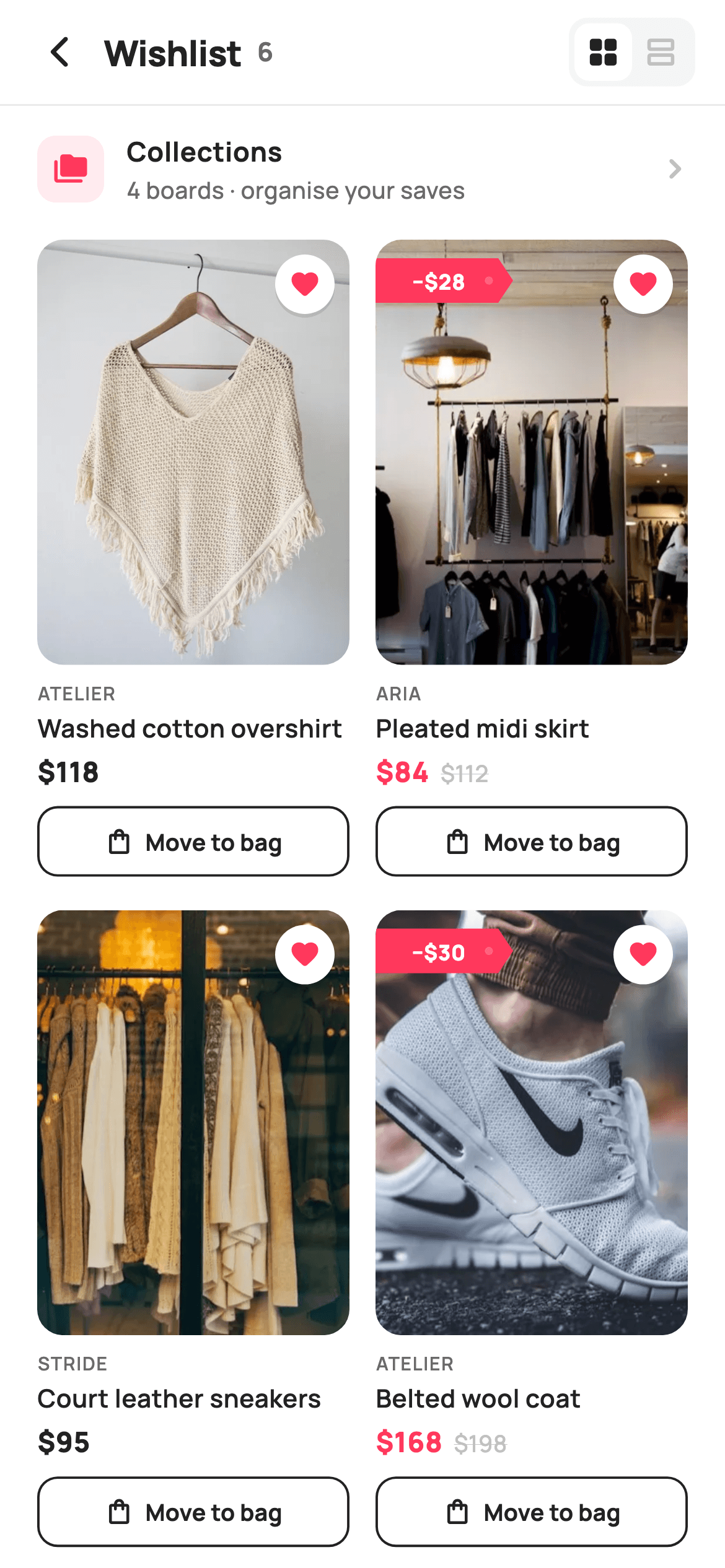
What you'll build
- ✓A header segmented toggle where `_grid` swaps a `GridView.builder` for a `ListView.separated` under the same `Expanded`
- ✓A `_Fav` model whose nullable `was` field drives both the red price colour and the painted price-drop flag
- ✓A `_DropFlagPainter` that paths a notched tag shape and punches a translucent hole so it reads as a hanging price tag
- ✓A `_priceRow` that struck-through the original price in `_faint` only when a drop exists
- ✓A live saved count in the header that reads `_items.length` so it never drifts from the list
Step-by-step build
Create the file
Add a new file at lib/ecom_wishlist_main/ecom_wishlist_main_screen.dart in your Flutter project.
Register the bundled fonts
No external packages — this is pure Flutter. It does bundle its design font (Manrope), so drop the font file into fonts/ and declare it in pubspec.yaml:
flutter:
  fonts:
    - family: Manrope
      fonts:
- asset: fonts/Manrope-Regular.ttfBuild it, piece by piece
Here's how the screen goes together. Each block below is a real slice of the code with a plain-English explanation — paste them in order, or grab the whole file from the next section.
Callbacks, Airbnb-style tokens and the saved-items model
import 'package:flutter/material.dart';

/// StyleCart — Wishlist (the Wishlist tab).
///
/// The shopper's saved products as a two-column grid (or a comfortable list),
/// each with a filled wishlist heart to un-save, a painted price-drop flag for
/// items that fell in price, and a move-to-bag action. A header toggle flips
/// between grid and list density.
///
/// Self-contained per CONVENTIONS.md: pure Flutter, bundled Manrope, inline
/// Airbnb-style tokens, own light theme + SafeArea, bundled webp. The price-drop
/// flag is a CustomPainter (no emoji glyph). Exposes callbacks only.
class EcomWishlistMainScreen extends StatefulWidget {
  const EcomWishlistMainScreen({
    super.key,
    this.onBack,
    this.onProduct,
    this.onMoveToBag,
    this.onCollections,
  });

  final VoidCallback? onBack;
  final ValueChanged<String>? onProduct;
  final ValueChanged<String>? onMoveToBag;
  final VoidCallback? onCollections;

  @override
  State<EcomWishlistMainScreen> createState() => _EcomWishlistMainScreenState();
}

class _EcomWishlistMainScreenState extends State<EcomWishlistMainScreen> {
  static const String _font = 'Manrope';
  static const Color _canvas = Color(0xFFFFFFFF);
  static const Color _ink = Color(0xFF222222);
  static const Color _muted = Color(0xFF6A6A6A);
  static const Color _faint = Color(0xFFC1C1C1);
  static const Color _brand = Color(0xFFFF385C);
  static const Color _imageBg = Color(0xFFF5F5F5);
  static const Color _hairline = Color(0xFFEBEBEB);

  static const String _dir = 'lib/screens/ecommerce/ecom_wishlist_main/images';

  final List<_Fav> _items = <_Fav>[
    const _Fav('Washed cotton overshirt', 'Atelier', 118, null, 'Sand · M',
        'p01.webp'),
    const _Fav('Pleated midi skirt', 'Aria', 84, 112, 'Olive · S', 'p02.webp'),
    const _Fav('Court leather sneakers', 'Stride', 95, null, 'White · 42',
        'p03.webp'),
    const _Fav('Belted wool coat', 'Atelier', 168, 198, 'Camel · M',
        'p04.webp'),
    const _Fav('Silk slip dress', 'Aria', 138, null, 'Blush · S', 'p05.webp'),
    const _Fav('Boxy denim jacket', 'Stride', 109, 134, 'Indigo · L',
        'p06.webp'),
  ];

  bool _grid = true;
`EcomWishlistMainScreen` is a `StatefulWidget` because one piece of UI state lives here: `bool _grid = true`, the density toggle. It exposes four callbacks and nothing else — `onBack`, `onProduct` and `onMoveToBag` (both `ValueChanged<String>` carrying the product title), and `onCollections` — so persistence stays in the host app. The palette is deliberately Airbnb-flavoured: `_ink` `0xFF222222` for text, `_brand` `0xFFFF385C` coral for hearts and drops, `_faint` `0xFFC1C1C1` for struck prices and inactive icons, and `_imageBg` `0xFFF5F5F5` sitting behind every image so a slow-loading webp never flashes white. The six `_Fav` entries hold `price` and a nullable `was`; three of them (`112`, `198`, `134`) set `was`, and that single null check is what later decides whether a card shows the drop flag and red price. `_dir` points at the bundled webp folder.
Build tree and a header with a live count
  @override
  Widget build(BuildContext context) {
    return Theme(
      data: ThemeData.light(useMaterial3: true),
      child: Scaffold(
        backgroundColor: _canvas,
        body: SafeArea(
          child: Column(
            children: <Widget>[
              _header(),
              const Divider(height: 1, color: _hairline),
              _collectionsRow(),
              Expanded(
                child: _grid ? _gridView() : _listView(),
              ),
            ],
          ),
        ),
      ),
    );
  }

  Widget _header() {
    return Padding(
      padding: const EdgeInsets.fromLTRB(8, 4, 12, 4),
      child: Row(
        children: <Widget>[
          IconButton(
            onPressed: widget.onBack,
            icon: const Icon(Icons.arrow_back_ios_new_rounded,
                size: 20, color: _ink),
          ),
          Expanded(
            child: Row(
              children: <Widget>[
                const Text(
                  'Wishlist',
                  style: TextStyle(
                    fontFamily: _font,
                    fontSize: 19,
                    fontWeight: FontWeight.w800,
                    letterSpacing: -0.3,
                    color: _ink,
                  ),
                ),
                const SizedBox(width: 8),
                Text(
                  '${_items.length}',
                  style: const TextStyle(
                    fontFamily: _font,
                    fontSize: 14,
                    fontWeight: FontWeight.w700,
                    color: _muted,
                  ),
                ),
              ],
            ),
          ),
          _toggle(),
        ],
      ),
    );
  }
`build` wraps everything in `Theme(data: ThemeData.light(useMaterial3: true))` so the screen ignores whatever dark theme the host app runs, then a `Scaffold` on `_canvas` white and a `SafeArea` `Column`: header, a one-pixel `Divider` in `_hairline` `0xFFEBEBEB`, the Collections row, and an `Expanded` whose child is the ternary `_grid ? _gridView() : _listView()`. That ternary is the whole toggle mechanism — no `PageView`, no animation, just a rebuild swapping one scrolling widget for another. `_header` uses asymmetric padding `fromLTRB(8, 4, 12, 4)` because the `IconButton` on the left has its own 48px hit area. The title row prints `'Wishlist'` at 19px w800 with `-0.3` letter spacing, then `'${_items.length}'` in `_muted` 14px — a count derived from the list, so removing an item can never leave a stale number. `_toggle()` sits at the trailing end.
The segmented grid/list toggle
  Widget _toggle() {
    return Container(
      margin: const EdgeInsets.only(right: 4),
      padding: const EdgeInsets.all(3),
      decoration: BoxDecoration(
        color: _imageBg,
        borderRadius: BorderRadius.circular(10),
      ),
      child: Row(
        children: <Widget>[
          _toggleBtn(Icons.grid_view_rounded, _grid, () {
            setState(() => _grid = true);
          }),
          _toggleBtn(Icons.view_agenda_outlined, !_grid, () {
            setState(() => _grid = false);
          }),
        ],
      ),
    );
  }

  Widget _toggleBtn(IconData icon, bool active, VoidCallback onTap) {
    return GestureDetector(
      onTap: onTap,
      child: Container(
        padding: const EdgeInsets.all(6),
        decoration: BoxDecoration(
          color: active ? _canvas : Colors.transparent,
          borderRadius: BorderRadius.circular(8),
        ),
        child: Icon(icon, size: 19, color: active ? _ink : _faint),
      ),
    );
  }
The toggle is a hand-built segmented control rather than a `SegmentedButton`: an outer `Container` in `_imageBg` with radius 10 and 3px padding, holding two `_toggleBtn` calls. Each button is a `GestureDetector` around a 6px-padded `Container` whose `color` is `_canvas` white when `active` and transparent otherwise, with radius 8 — two pixels tighter than the outer 10 so the inner pill sits concentrically inside the 3px gutter. The icon flips colour with the same bool, `_ink` for active and `_faint` for idle, so the selected state is expressed twice (background plus icon) and reads even in a screenshot. The two callbacks simply `setState(() => _grid = true)` and `false`; passing `_grid` and `!_grid` as the `active` argument means both pills can never be lit at once. Icons are `grid_view_rounded` and `view_agenda_outlined`.
The tappable Collections row
  Widget _collectionsRow() {
    return GestureDetector(
      onTap: widget.onCollections,
      behavior: HitTestBehavior.opaque,
      child: Padding(
        padding: const EdgeInsets.fromLTRB(20, 14, 16, 14),
        child: Row(
          children: <Widget>[
            Container(
              width: 36,
              height: 36,
              decoration: BoxDecoration(
                color: _brand.withValues(alpha: 0.10),
                borderRadius: BorderRadius.circular(10),
              ),
              child: const Icon(Icons.folder_copy_rounded,
                  size: 19, color: _brand),
            ),
            const SizedBox(width: 12),
            const Expanded(
              child: Column(
                crossAxisAlignment: CrossAxisAlignment.start,
                children: <Widget>[
                  Text(
                    'Collections',
                    style: TextStyle(
                      fontFamily: _font,
                      fontSize: 14.5,
                      fontWeight: FontWeight.w700,
                      color: _ink,
                    ),
                  ),
                  SizedBox(height: 1),
                  Text(
                    '4 boards · organise your saves',
                    style: TextStyle(
                      fontFamily: _font,
                      fontSize: 12.5,
                      fontWeight: FontWeight.w500,
                      color: _muted,
                    ),
                  ),
                ],
              ),
            ),
            const Icon(Icons.chevron_right_rounded, size: 22, color: _faint),
          ],
        ),
      ),
    );
  }
Between the header and the product list sits a single-row shortcut to saved boards. The `GestureDetector` sets `behavior: HitTestBehavior.opaque` — without it, taps on the empty padding between the icon and the chevron would fall through, because a bare `Row` with transparent gaps doesn't register hits. The leading tile is a 36×36 `Container` tinted with `_brand.withValues(alpha: 0.10)` behind a solid `_brand` `folder_copy_rounded` icon, the same two-layer treatment the store uses for accents elsewhere. Text is a `const Expanded(Column(...))` with `'Collections'` at 14.5px w700 and the subtitle `'4 boards · organise your saves'` at 12.5px `_muted`; the `SizedBox(height: 1)` between them is intentionally tiny so the pair reads as one label. A `_faint` `chevron_right_rounded` at 22px signals navigation, and the whole thing fires `widget.onCollections`.
Two-column grid and the tall product card
  Widget _gridView() {
    return GridView.builder(
      padding: const EdgeInsets.fromLTRB(20, 4, 20, 24),
      gridDelegate: const SliverGridDelegateWithFixedCrossAxisCount(
        crossAxisCount: 2,
        crossAxisSpacing: 14,
        mainAxisSpacing: 18,
        childAspectRatio: 0.49,
      ),
      itemCount: _items.length,
      itemBuilder: (BuildContext context, int i) => _gridCard(_items[i]),
    );
  }

  Widget _gridCard(_Fav f) {
    return GestureDetector(
      onTap: () => widget.onProduct?.call(f.title),
      child: Column(
        crossAxisAlignment: CrossAxisAlignment.start,
        children: <Widget>[
          Expanded(
            child: ClipRRect(
              borderRadius: BorderRadius.circular(14),
              child: Stack(
                fit: StackFit.expand,
                children: <Widget>[
                  Container(color: _imageBg),
                  Image.asset('$_dir/${f.asset}', fit: BoxFit.cover),
                  Positioned(top: 8, right: 8, child: _heart()),
                  if (f.was != null)
                    Positioned(
                      top: 10,
                      left: 0,
                      child: _dropFlag(f.was! - f.price),
                    ),
                ],
              ),
            ),
          ),
          const SizedBox(height: 8),
          Text(
            f.brand.toUpperCase(),
            style: const TextStyle(
              fontFamily: _font,
              fontSize: 10,
              fontWeight: FontWeight.w600,
              letterSpacing: 0.6,
              color: _muted,
            ),
          ),
          const SizedBox(height: 2),
          Text(
            f.title,
            maxLines: 1,
            overflow: TextOverflow.ellipsis,
            style: const TextStyle(
              fontFamily: _font,
              fontSize: 13.5,
              fontWeight: FontWeight.w600,
              color: _ink,
            ),
          ),
          const SizedBox(height: 4),
          _priceRow(f),
          const SizedBox(height: 8),
          _moveBtn(f, full: true),
        ],
      ),
    );
  }
`_gridView` is a `GridView.builder` with `SliverGridDelegateWithFixedCrossAxisCount(crossAxisCount: 2, crossAxisSpacing: 14, mainAxisSpacing: 18, childAspectRatio: 0.49)`. That 0.49 ratio makes each cell roughly twice as tall as it is wide, which is what leaves room under the image for brand, title, price and a 38px button. `_gridCard` puts the image in an `Expanded` so it absorbs whatever height the ratio grants, then clips it with `ClipRRect` radius 14. Inside, a `Stack` with `StackFit.expand` layers `_imageBg`, the `Image.asset` at `BoxFit.cover`, a `_heart()` positioned `top: 8, right: 8`, and — only `if (f.was != null)` — a `_dropFlag(f.was! - f.price)` at `top: 10, left: 0`, flush against the left edge so the painted tag looks stuck onto the photo. Below: the brand uppercased at 10px with 0.6 letter spacing, a one-line ellipsised title, `_priceRow`, then `_moveBtn(f, full: true)` stretching the button to the column width.
The comfortable list and its row layout
  Widget _listView() {
    return ListView.separated(
      padding: const EdgeInsets.fromLTRB(20, 4, 20, 24),
      itemCount: _items.length,
      separatorBuilder: (_, _) =>
          const Divider(height: 28, color: _hairline),
      itemBuilder: (BuildContext context, int i) => _listRow(_items[i]),
    );
  }

  Widget _listRow(_Fav f) {
    return GestureDetector(
      onTap: () => widget.onProduct?.call(f.title),
      behavior: HitTestBehavior.opaque,
      child: Row(
        crossAxisAlignment: CrossAxisAlignment.start,
        children: <Widget>[
          ClipRRect(
            borderRadius: BorderRadius.circular(12),
            child: Stack(
              children: <Widget>[
                Container(
                  width: 92,
                  height: 116,
                  color: _imageBg,
                  child: Image.asset('$_dir/${f.asset}', fit: BoxFit.cover),
                ),
                if (f.was != null)
                  Positioned(top: 8, left: 0, child: _dropFlag(f.was! - f.price)),
              ],
            ),
          ),
          const SizedBox(width: 14),
          Expanded(
            child: Column(
              crossAxisAlignment: CrossAxisAlignment.start,
              children: <Widget>[
                const SizedBox(height: 2),
                Text(
                  f.brand.toUpperCase(),
                  style: const TextStyle(
                    fontFamily: _font,
                    fontSize: 10,
                    fontWeight: FontWeight.w600,
                    letterSpacing: 0.6,
                    color: _muted,
                  ),
                ),
                const SizedBox(height: 3),
                Text(
                  f.title,
                  maxLines: 1,
                  overflow: TextOverflow.ellipsis,
                  style: const TextStyle(
                    fontFamily: _font,
                    fontSize: 15,
                    fontWeight: FontWeight.w700,
                    color: _ink,
                  ),
                ),
                const SizedBox(height: 3),
                Text(
                  f.variant,
                  style: const TextStyle(
                    fontFamily: _font,
                    fontSize: 12.5,
                    fontWeight: FontWeight.w500,
                    color: _muted,
                  ),
                ),
                const SizedBox(height: 6),
                _priceRow(f),
                const SizedBox(height: 10),
                Row(
                  children: <Widget>[
                    Expanded(child: _moveBtn(f, full: true)),
                    const SizedBox(width: 10),
                    _heart(),
                  ],
                ),
              ],
            ),
          ),
        ],
      ),
    );
  }
`_listView` swaps the grid for a `ListView.separated` with the same `fromLTRB(20, 4, 20, 24)` padding, so toggling density doesn't shift the content edge. The separator is a `Divider(height: 28)` in `_hairline` — 28 logical pixels of breathing room with a hairline in the middle. `_listRow` is a top-aligned `Row`: a fixed 92×116 `Container` (a 4:5 portrait, matching the grid images) holding the webp, clipped at radius 12 and stacked with the same conditional `_dropFlag`. The text column now has room for a third line, so it adds `f.variant` (e.g. `'Olive · S'`) in `_muted` 12.5px between the 15px w700 title and the price row — information the grid card omits for space. The bottom `Row` places `_moveBtn` in an `Expanded` with the `_heart()` beside it, because there's no image overlay to host the heart at this density. Both densities call `widget.onProduct?.call(f.title)` on tap, and the row uses `HitTestBehavior.opaque` for the same reason as the Collections row.
Price row, Move to bag button and the floating heart
  Widget _priceRow(_Fav f) {
    return Row(
      crossAxisAlignment: CrossAxisAlignment.end,
      children: <Widget>[
        Text(
          '\$${f.price}',
          style: TextStyle(
            fontFamily: _font,
            fontSize: 15,
            fontWeight: FontWeight.w800,
            color: f.was != null ? _brand : _ink,
          ),
        ),
        if (f.was != null) ...<Widget>[
          const SizedBox(width: 6),
          Padding(
            padding: const EdgeInsets.only(bottom: 1),
            child: Text(
              '\$${f.was}',
              style: const TextStyle(
                fontFamily: _font,
                fontSize: 12.5,
                fontWeight: FontWeight.w500,
                decoration: TextDecoration.lineThrough,
                decorationColor: _faint,
                color: _faint,
              ),
            ),
          ),
        ],
      ],
    );
  }

  Widget _moveBtn(_Fav f, {bool full = false}) {
    return SizedBox(
      height: 38,
      width: full ? double.infinity : null,
      child: OutlinedButton(
        onPressed: () => widget.onMoveToBag?.call(f.title),
        style: OutlinedButton.styleFrom(
          foregroundColor: _ink,
          side: const BorderSide(color: _ink, width: 1.3),
          padding: const EdgeInsets.symmetric(horizontal: 12),
          shape:
              RoundedRectangleBorder(borderRadius: BorderRadius.circular(11)),
        ),
        child: const Row(
          mainAxisAlignment: MainAxisAlignment.center,
          children: <Widget>[
            Icon(Icons.shopping_bag_outlined, size: 16, color: _ink),
            SizedBox(width: 6),
            Text(
              'Move to bag',
              style: TextStyle(
                fontFamily: _font,
                fontSize: 12.5,
                fontWeight: FontWeight.w700,
              ),
            ),
          ],
        ),
      ),
    );
  }

  Widget _heart() {
    return Container(
      width: 32,
      height: 32,
      decoration: const BoxDecoration(
        color: _canvas,
        shape: BoxShape.circle,
        boxShadow: <BoxShadow>[
          BoxShadow(
            color: Color(0x1A000000),
            blurRadius: 6,
            offset: Offset(0, 2),
          ),
        ],
      ),
      child: const Icon(Icons.favorite_rounded, size: 17, color: _brand),
    );
  }
`_priceRow` aligns its children to `CrossAxisAlignment.end` so the smaller struck price sits on the baseline of the big one. The current price is 15px w800 and its colour is `f.was != null ? _brand : _ink` — coral only when there is a drop, which makes discounted items pop in a grid of black prices. The original price is added with a spread `...<Widget>[]` inside the `if`, rendered at 12.5px with `TextDecoration.lineThrough` and a matching `decorationColor: _faint` (set explicitly so the strike isn't drawn in the theme text colour). `_moveBtn` is a 38px `OutlinedButton` with a 1.3px `_ink` border, radius 11, and a `shopping_bag_outlined` icon plus `'Move to bag'` at 12.5px w700; `width: full ? double.infinity : null` lets the caller stretch it. `_heart` is a 32px white circle with a `0x1A000000` shadow (blur 6, offset 0,2) holding a filled `favorite_rounded` in `_brand` — filled because the item is already saved.
The price-drop flag and its CustomPainter
  Widget _dropFlag(int saved) {
    return SizedBox(
      width: 74,
      height: 24,
      child: CustomPaint(
        painter: _DropFlagPainter(),
        child: Center(
          child: Padding(
            padding: const EdgeInsets.only(right: 6),
            child: Text(
              '−\$$saved',
              style: const TextStyle(
                fontFamily: _font,
                fontSize: 11.5,
                fontWeight: FontWeight.w800,
                color: _canvas,
              ),
            ),
          ),
        ),
      ),
    );
  }
}

class _Fav {
  const _Fav(this.title, this.brand, this.price, this.was, this.variant,
      this.asset);
  final String title;
  final String brand;
  final int price;
  final int? was;
  final String variant;
  final String asset;
}

/// Paints a price-drop ribbon flag: a rounded-left tag with a notched right
/// tail, filled brand red, sitting flush against the image edge.
class _DropFlagPainter extends CustomPainter {
  @override
  void paint(Canvas canvas, Size size) {
    final double w = size.width;
    final double h = size.height;
    const double notch = 8;

    final Path tag = Path()
      ..moveTo(0, 0)
      ..lineTo(w - notch, 0)
      ..lineTo(w, h / 2)
      ..lineTo(w - notch, h)
      ..lineTo(0, h)
      ..close();

    canvas.drawPath(tag, Paint()..color = const Color(0xFFFF385C));

    // Punch-hole on the tail to read as a hanging price tag.
    canvas.drawCircle(
      Offset(w - notch - 5, h / 2),
      2.2,
      Paint()..color = const Color(0x33FFFFFF),
    );
  }

  @override
  bool shouldRepaint(_DropFlagPainter oldDelegate) => false;
}
`_dropFlag(int saved)` is a 74×24 `SizedBox` around a `CustomPaint` whose `child` is the label `'−\$$saved'` — a real minus sign — in 11.5px w800 white, padded 6px on the right so it doesn't run into the notch. `_DropFlagPainter.paint` builds a `Path` in five moves: from the top-left corner to `w - notch`, out to the tip at `(w, h / 2)`, back to `w - notch` at the bottom, along the bottom edge and close. With `notch = 8` that gives a rectangle whose right edge is a pointed arrow tip, filled with `0xFFFF385C`. Then a 2.2-radius circle at `(w - notch - 5, h / 2)` in `0x33FFFFFF` — 20% white — is drawn just inside the tip, reading as the punch hole of a hanging price tag. `shouldRepaint` returns `false` because the painter has no fields; the amount lives in the child `Text`, not the painter. `_Fav` above it is a plain six-field const value type.
Full code
The complete, ready-to-paste source. Free to use in your projects — one click copies it all.
import 'package:flutter/material.dart';

/// StyleCart — Wishlist (the Wishlist tab).
///
/// The shopper's saved products as a two-column grid (or a comfortable list),
/// each with a filled wishlist heart to un-save, a painted price-drop flag for
/// items that fell in price, and a move-to-bag action. A header toggle flips
/// between grid and list density.
///
/// Self-contained per CONVENTIONS.md: pure Flutter, bundled Manrope, inline
/// Airbnb-style tokens, own light theme + SafeArea, bundled webp. The price-drop
/// flag is a CustomPainter (no emoji glyph). Exposes callbacks only.
class EcomWishlistMainScreen extends StatefulWidget {
  const EcomWishlistMainScreen({
    super.key,
    this.onBack,
    this.onProduct,
    this.onMoveToBag,
    this.onCollections,
  });

  final VoidCallback? onBack;
  final ValueChanged<String>? onProduct;
  final ValueChanged<String>? onMoveToBag;
  final VoidCallback? onCollections;

  @override
  State<EcomWishlistMainScreen> createState() => _EcomWishlistMainScreenState();
}

class _EcomWishlistMainScreenState extends State<EcomWishlistMainScreen> {
  static const String _font = 'Manrope';
  static const Color _canvas = Color(0xFFFFFFFF);
  static const Color _ink = Color(0xFF222222);
  static const Color _muted = Color(0xFF6A6A6A);
  static const Color _faint = Color(0xFFC1C1C1);
  static const Color _brand = Color(0xFFFF385C);
  static const Color _imageBg = Color(0xFFF5F5F5);
  static const Color _hairline = Color(0xFFEBEBEB);

  static const String _dir = 'lib/screens/ecommerce/ecom_wishlist_main/images';

  final List<_Fav> _items = <_Fav>[
    const _Fav('Washed cotton overshirt', 'Atelier', 118, null, 'Sand · M',
        'p01.webp'),
    const _Fav('Pleated midi skirt', 'Aria', 84, 112, 'Olive · S', 'p02.webp'),
    const _Fav('Court leather sneakers', 'Stride', 95, null, 'White · 42',
        'p03.webp'),
    const _Fav('Belted wool coat', 'Atelier', 168, 198, 'Camel · M',
        'p04.webp'),
    const _Fav('Silk slip dress', 'Aria', 138, null, 'Blush · S', 'p05.webp'),
    const _Fav('Boxy denim jacket', 'Stride', 109, 134, 'Indigo · L',
        'p06.webp'),
  ];

  bool _grid = true;

  @override
  Widget build(BuildContext context) {
    return Theme(
      data: ThemeData.light(useMaterial3: true),
      child: Scaffold(
        backgroundColor: _canvas,
        body: SafeArea(
          child: Column(
            children: <Widget>[
              _header(),
              const Divider(height: 1, color: _hairline),
              _collectionsRow(),
              Expanded(
                child: _grid ? _gridView() : _listView(),
              ),
            ],
          ),
        ),
      ),
    );
  }

  Widget _header() {
    return Padding(
      padding: const EdgeInsets.fromLTRB(8, 4, 12, 4),
      child: Row(
        children: <Widget>[
          IconButton(
            onPressed: widget.onBack,
            icon: const Icon(Icons.arrow_back_ios_new_rounded,
                size: 20, color: _ink),
          ),
          Expanded(
            child: Row(
              children: <Widget>[
                const Text(
                  'Wishlist',
                  style: TextStyle(
                    fontFamily: _font,
                    fontSize: 19,
                    fontWeight: FontWeight.w800,
                    letterSpacing: -0.3,
                    color: _ink,
                  ),
                ),
                const SizedBox(width: 8),
                Text(
                  '${_items.length}',
                  style: const TextStyle(
                    fontFamily: _font,
                    fontSize: 14,
                    fontWeight: FontWeight.w700,
                    color: _muted,
                  ),
                ),
              ],
            ),
          ),
          _toggle(),
        ],
      ),
    );
  }

  Widget _toggle() {
    return Container(
      margin: const EdgeInsets.only(right: 4),
      padding: const EdgeInsets.all(3),
      decoration: BoxDecoration(
        color: _imageBg,
        borderRadius: BorderRadius.circular(10),
      ),
      child: Row(
        children: <Widget>[
          _toggleBtn(Icons.grid_view_rounded, _grid, () {
            setState(() => _grid = true);
          }),
          _toggleBtn(Icons.view_agenda_outlined, !_grid, () {
            setState(() => _grid = false);
          }),
        ],
      ),
    );
  }

  Widget _toggleBtn(IconData icon, bool active, VoidCallback onTap) {
    return GestureDetector(
      onTap: onTap,
      child: Container(
        padding: const EdgeInsets.all(6),
        decoration: BoxDecoration(
          color: active ? _canvas : Colors.transparent,
          borderRadius: BorderRadius.circular(8),
        ),
        child: Icon(icon, size: 19, color: active ? _ink : _faint),
      ),
    );
  }

  Widget _collectionsRow() {
    return GestureDetector(
      onTap: widget.onCollections,
      behavior: HitTestBehavior.opaque,
      child: Padding(
        padding: const EdgeInsets.fromLTRB(20, 14, 16, 14),
        child: Row(
          children: <Widget>[
            Container(
              width: 36,
              height: 36,
              decoration: BoxDecoration(
                color: _brand.withValues(alpha: 0.10),
                borderRadius: BorderRadius.circular(10),
              ),
              child: const Icon(Icons.folder_copy_rounded,
                  size: 19, color: _brand),
            ),
            const SizedBox(width: 12),
            const Expanded(
              child: Column(
                crossAxisAlignment: CrossAxisAlignment.start,
                children: <Widget>[
                  Text(
                    'Collections',
                    style: TextStyle(
                      fontFamily: _font,
                      fontSize: 14.5,
                      fontWeight: FontWeight.w700,
                      color: _ink,
                    ),
                  ),
                  SizedBox(height: 1),
                  Text(
                    '4 boards · organise your saves',
                    style: TextStyle(
                      fontFamily: _font,
                      fontSize: 12.5,
                      fontWeight: FontWeight.w500,
                      color: _muted,
                    ),
                  ),
                ],
              ),
            ),
            const Icon(Icons.chevron_right_rounded, size: 22, color: _faint),
          ],
        ),
      ),
    );
  }

  Widget _gridView() {
    return GridView.builder(
      padding: const EdgeInsets.fromLTRB(20, 4, 20, 24),
      gridDelegate: const SliverGridDelegateWithFixedCrossAxisCount(
        crossAxisCount: 2,
        crossAxisSpacing: 14,
        mainAxisSpacing: 18,
        childAspectRatio: 0.49,
      ),
      itemCount: _items.length,
      itemBuilder: (BuildContext context, int i) => _gridCard(_items[i]),
    );
  }

  Widget _gridCard(_Fav f) {
    return GestureDetector(
      onTap: () => widget.onProduct?.call(f.title),
      child: Column(
        crossAxisAlignment: CrossAxisAlignment.start,
        children: <Widget>[
          Expanded(
            child: ClipRRect(
              borderRadius: BorderRadius.circular(14),
              child: Stack(
                fit: StackFit.expand,
                children: <Widget>[
                  Container(color: _imageBg),
                  Image.asset('$_dir/${f.asset}', fit: BoxFit.cover),
                  Positioned(top: 8, right: 8, child: _heart()),
                  if (f.was != null)
                    Positioned(
                      top: 10,
                      left: 0,
                      child: _dropFlag(f.was! - f.price),
                    ),
                ],
              ),
            ),
          ),
          const SizedBox(height: 8),
          Text(
            f.brand.toUpperCase(),
            style: const TextStyle(
              fontFamily: _font,
              fontSize: 10,
              fontWeight: FontWeight.w600,
              letterSpacing: 0.6,
              color: _muted,
            ),
          ),
          const SizedBox(height: 2),
          Text(
            f.title,
            maxLines: 1,
            overflow: TextOverflow.ellipsis,
            style: const TextStyle(
              fontFamily: _font,
              fontSize: 13.5,
              fontWeight: FontWeight.w600,
              color: _ink,
            ),
          ),
          const SizedBox(height: 4),
          _priceRow(f),
          const SizedBox(height: 8),
          _moveBtn(f, full: true),
        ],
      ),
    );
  }

  Widget _listView() {
    return ListView.separated(
      padding: const EdgeInsets.fromLTRB(20, 4, 20, 24),
      itemCount: _items.length,
      separatorBuilder: (_, _) =>
          const Divider(height: 28, color: _hairline),
      itemBuilder: (BuildContext context, int i) => _listRow(_items[i]),
    );
  }

  Widget _listRow(_Fav f) {
    return GestureDetector(
      onTap: () => widget.onProduct?.call(f.title),
      behavior: HitTestBehavior.opaque,
      child: Row(
        crossAxisAlignment: CrossAxisAlignment.start,
        children: <Widget>[
          ClipRRect(
            borderRadius: BorderRadius.circular(12),
            child: Stack(
              children: <Widget>[
                Container(
                  width: 92,
                  height: 116,
                  color: _imageBg,
                  child: Image.asset('$_dir/${f.asset}', fit: BoxFit.cover),
                ),
                if (f.was != null)
                  Positioned(top: 8, left: 0, child: _dropFlag(f.was! - f.price)),
              ],
            ),
          ),
          const SizedBox(width: 14),
          Expanded(
            child: Column(
              crossAxisAlignment: CrossAxisAlignment.start,
              children: <Widget>[
                const SizedBox(height: 2),
                Text(
                  f.brand.toUpperCase(),
                  style: const TextStyle(
                    fontFamily: _font,
                    fontSize: 10,
                    fontWeight: FontWeight.w600,
                    letterSpacing: 0.6,
                    color: _muted,
                  ),
                ),
                const SizedBox(height: 3),
                Text(
                  f.title,
                  maxLines: 1,
                  overflow: TextOverflow.ellipsis,
                  style: const TextStyle(
                    fontFamily: _font,
                    fontSize: 15,
                    fontWeight: FontWeight.w700,
                    color: _ink,
                  ),
                ),
                const SizedBox(height: 3),
                Text(
                  f.variant,
                  style: const TextStyle(
                    fontFamily: _font,
                    fontSize: 12.5,
                    fontWeight: FontWeight.w500,
                    color: _muted,
                  ),
                ),
                const SizedBox(height: 6),
                _priceRow(f),
                const SizedBox(height: 10),
                Row(
                  children: <Widget>[
                    Expanded(child: _moveBtn(f, full: true)),
                    const SizedBox(width: 10),
                    _heart(),
                  ],
                ),
              ],
            ),
          ),
        ],
      ),
    );
  }

  Widget _priceRow(_Fav f) {
    return Row(
      crossAxisAlignment: CrossAxisAlignment.end,
      children: <Widget>[
        Text(
          '\$${f.price}',
          style: TextStyle(
            fontFamily: _font,
            fontSize: 15,
            fontWeight: FontWeight.w800,
            color: f.was != null ? _brand : _ink,
          ),
        ),
        if (f.was != null) ...<Widget>[
          const SizedBox(width: 6),
          Padding(
            padding: const EdgeInsets.only(bottom: 1),
            child: Text(
              '\$${f.was}',
              style: const TextStyle(
                fontFamily: _font,
                fontSize: 12.5,
                fontWeight: FontWeight.w500,
                decoration: TextDecoration.lineThrough,
                decorationColor: _faint,
                color: _faint,
              ),
            ),
          ),
        ],
      ],
    );
  }

  Widget _moveBtn(_Fav f, {bool full = false}) {
    return SizedBox(
      height: 38,
      width: full ? double.infinity : null,
      child: OutlinedButton(
        onPressed: () => widget.onMoveToBag?.call(f.title),
        style: OutlinedButton.styleFrom(
          foregroundColor: _ink,
          side: const BorderSide(color: _ink, width: 1.3),
          padding: const EdgeInsets.symmetric(horizontal: 12),
          shape:
              RoundedRectangleBorder(borderRadius: BorderRadius.circular(11)),
        ),
        child: const Row(
          mainAxisAlignment: MainAxisAlignment.center,
          children: <Widget>[
            Icon(Icons.shopping_bag_outlined, size: 16, color: _ink),
            SizedBox(width: 6),
            Text(
              'Move to bag',
              style: TextStyle(
                fontFamily: _font,
                fontSize: 12.5,
                fontWeight: FontWeight.w700,
              ),
            ),
          ],
        ),
      ),
    );
  }

  Widget _heart() {
    return Container(
      width: 32,
      height: 32,
      decoration: const BoxDecoration(
        color: _canvas,
        shape: BoxShape.circle,
        boxShadow: <BoxShadow>[
          BoxShadow(
            color: Color(0x1A000000),
            blurRadius: 6,
            offset: Offset(0, 2),
          ),
        ],
      ),
      child: const Icon(Icons.favorite_rounded, size: 17, color: _brand),
    );
  }

  Widget _dropFlag(int saved) {
    return SizedBox(
      width: 74,
      height: 24,
      child: CustomPaint(
        painter: _DropFlagPainter(),
        child: Center(
          child: Padding(
            padding: const EdgeInsets.only(right: 6),
            child: Text(
              '−\$$saved',
              style: const TextStyle(
                fontFamily: _font,
                fontSize: 11.5,
                fontWeight: FontWeight.w800,
                color: _canvas,
              ),
            ),
          ),
        ),
      ),
    );
  }
}

class _Fav {
  const _Fav(this.title, this.brand, this.price, this.was, this.variant,
      this.asset);
  final String title;
  final String brand;
  final int price;
  final int? was;
  final String variant;
  final String asset;
}

/// Paints a price-drop ribbon flag: a rounded-left tag with a notched right
/// tail, filled brand red, sitting flush against the image edge.
class _DropFlagPainter extends CustomPainter {
  @override
  void paint(Canvas canvas, Size size) {
    final double w = size.width;
    final double h = size.height;
    const double notch = 8;

    final Path tag = Path()
      ..moveTo(0, 0)
      ..lineTo(w - notch, 0)
      ..lineTo(w, h / 2)
      ..lineTo(w - notch, h)
      ..lineTo(0, h)
      ..close();

    canvas.drawPath(tag, Paint()..color = const Color(0xFFFF385C));

    // Punch-hole on the tail to read as a hanging price tag.
    canvas.drawCircle(
      Offset(w - notch - 5, h / 2),
      2.2,
      Paint()..color = const Color(0x33FFFFFF),
    );
  }

  @override
  bool shouldRepaint(_DropFlagPainter oldDelegate) => false;
}
Plus bundled 11 binary assets (fonts/images). The CLI and MCP install those for you automatically.
Two faster ways to add it
Copy-paste works, but you can skip it entirely.
1. FlutterKit CLI
One command drops this screen — and its fonts — straight into your project.
$ flutterkit add ecom-wishlist-main2. AI agent (MCP)
Connect FlutterKit's MCP server in Claude or Cursor and just ask your agent to install ecom-wishlist-main — it fetches and writes the files for you.
FAQ
Can I ship this wishlist screen in a commercial app?
Yes. FlutterKit screens are free for personal and commercial projects under an MIT-style licence — no key, no attribution, no sign-up. Copy the file from this page or run `flutterkit add ecom-wishlist-main` and drop it into any store app.
Does it need any pub packages or fonts?
No packages at all — it's pure `package:flutter/material.dart`, and the price-drop flag is a `CustomPainter` rather than an SVG. The only asset dependency is the Manrope font family (plus the six product webps under `_dir`), and the CLI bundles both and registers them in `pubspec.yaml` for you.
Which Flutter version does this require?
Flutter 3.22 or newer: the Collections tile uses `_brand.withValues(alpha: 0.10)` and the constructor uses `super.key`. On an older 3.x SDK, change that call to `withOpacity(0.10)` and rewrite the constructor as `{Key? key, ...}) : super(key: key)`.
How do I make the heart actually remove an item?
Right now `_heart()` is display-only — it has no tap handler because the widget exposes callbacks rather than mutating its own data. Wrap the `Container` in a `GestureDetector`, pass the `_Fav` in, and either call a new `onUnsave` callback or `setState(() => _items.remove(f))`. Because the header prints `_items.length`, the count updates on the same rebuild.
Where does the price-drop amount come from?
From the model, not the painter. Each `_Fav` has an `int? was`; when it's non-null the card computes `f.was! - f.price` and passes that integer to `_dropFlag`, which prints it as `−$N` over the painted ribbon. To drive it from a server, populate `was` with the price at the time the shopper saved the item and leave it null when nothing changed.


