How to Build a Comment Composer Screen with Mention Suggestions in Flutter (Full Code + Preview)
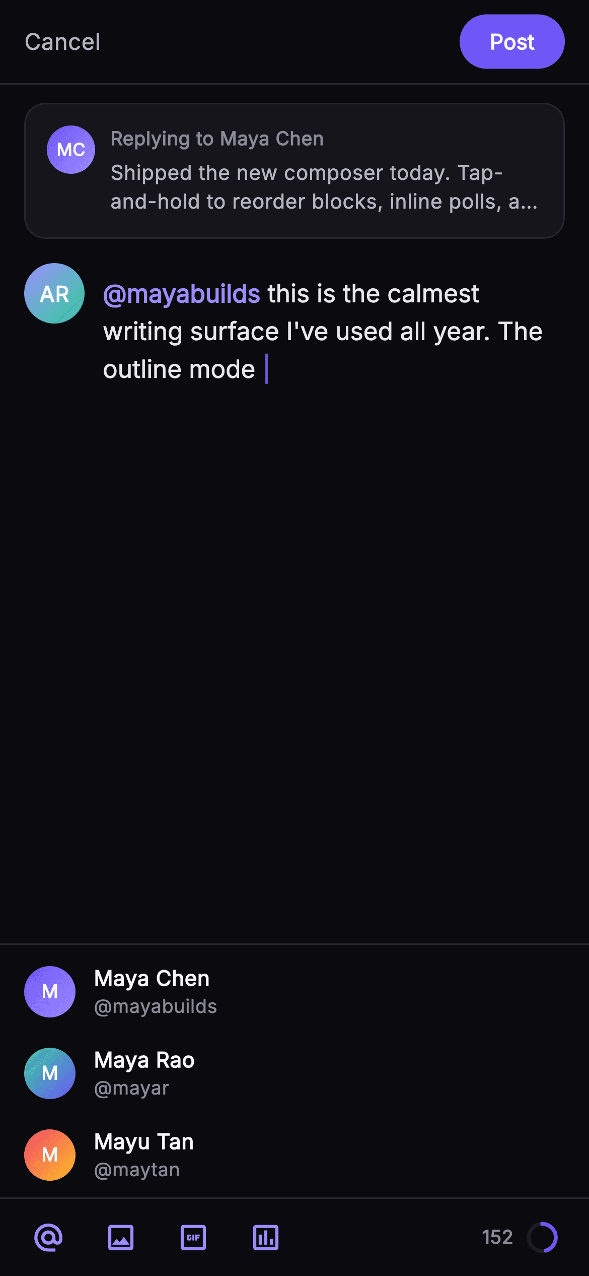
Replying to a comment is a cramped job on a phone: the parent has to stay visible, the draft needs room, an @-mention picker must appear without covering the text, and the character limit has to be glanceable. This tutorial builds the Pulse comment composer in Flutter as a single stateless widget: a `_QuotedParent` card clamped to two lines, a `_DraftText` RichText that colours the `@mayabuilds` run in accent violet, a height-capped `_MentionStrip` of three suggestions, and a `_CounterRing` drawn by `_RingPainter` showing 128 of 280 characters used.
What you'll build
- ✓A 56px `_TopBar` with a plain-text Cancel and a pill-shaped indigo `FilledButton` reading Post
- ✓A `_QuotedParent` card that pins the parent comment above the draft with `maxLines: 2` and ellipsis
- ✓A `_DraftText` RichText that styles the mention run and paints a fake caret with a `|` span in `_brand`
- ✓A `_MentionStrip` capped at 168px whose rows fire `onMention(handle)` through opaque `GestureDetector`s
- ✓A `_CounterRing` whose `_RingPainter` sweeps `6.2831853 * progress` radians from twelve o'clock
Step-by-step build
Create the file
Add a new file at lib/social_post_comment_compose/social_post_comment_compose_screen.dart in your Flutter project.
Register the bundled fonts
No external packages — this is pure Flutter. It does bundle its design font (Inter), so drop the font file into fonts/ and declare it in pubspec.yaml:
flutter:
  fonts:
    - family: Inter
      fonts:
- asset: fonts/Inter-Regular.ttfBuild it, piece by piece
Here's how the screen goes together. Each block below is a real slice of the code with a plain-English explanation — paste them in order, or grab the whole file from the next section.
Four callbacks, a dark palette and the mention fixture
import 'package:flutter/material.dart';

/// Comment Composer — the focused reply-writing state. A Cancel / Post top bar,
/// the quoted parent comment, an author row with the in-progress draft (a
/// highlighted mention chip inline), a live mention-suggestions strip, and a
/// pinned bottom toolbar at fixed height with attachment glyphs and a character
/// counter. Self-contained per CONVENTIONS.md: pure Flutter, bundled Inter font,
/// own dark theme, SafeArea, overflow-proof.
class SocialPostCommentComposeScreen extends StatelessWidget {
  const SocialPostCommentComposeScreen({
    super.key,
    this.onCancel,
    this.onPost,
    this.onMention,
    this.onAttach,
  });

  final VoidCallback? onCancel;
  final VoidCallback? onPost;
  final ValueChanged<String>? onMention;
  final ValueChanged<String>? onAttach;

  static const String _font = 'Inter';
  static const Color _bg = Color(0xFF0B0B0F);
  static const Color _surface = Color(0xFF15151B);
  static const Color _surfaceAlt = Color(0xFF1D1D26);
  static const Color _brand = Color(0xFF6E56F7);
  static const Color _accent = Color(0xFF9B8CFF);
  static const Color _hairline = Color(0xFF26262F);
  static const Color _textHi = Color(0xFFF4F4F7);
  static const Color _textLo = Color(0xFFB5B5C2);
  static const Color _muted = Color(0xFF8A8A99);

  static const List<_Mention> _mentions = <_Mention>[
    _Mention('Maya Chen', 'mayabuilds', 0xFF6E56F7, 0xFF9B8CFF),
    _Mention('Maya Rao', 'mayar', 0xFF34D399, 0xFF6E56F7),
    _Mention('Mayu Tan', 'maytan', 0xFFF4476B, 0xFFFBBF24),
  ];
`SocialPostCommentComposeScreen` is a `StatelessWidget` even though it depicts an editor, because it renders one frozen moment of a draft rather than owning a `TextEditingController`. Everything a host app cares about leaves through four callbacks: `onCancel` and `onPost` are `VoidCallback`s, while `onMention` and `onAttach` are `ValueChanged<String>` so the tapped handle or attachment kind travels with the event. The palette is a near-mono dark set — `_bg` #0B0B0F, `_surface` #15151B, `_surfaceAlt` #1D1D26, `_hairline` #26262F — with two purples split by role: `_brand` #6E56F7 for fills and the caret, `_accent` #9B8CFF for text-level highlights like the mention and the toolbar glyphs. The `_mentions` list is a `static const` of three `_Mention` records whose colours are stored as raw `int`s so the list can stay `const`; `Color(m.colorA)` wraps them later at build time.
The Column that pins a strip and a toolbar above the keyboard
  @override
  Widget build(BuildContext context) {
    return Theme(
      data: ThemeData.dark(useMaterial3: true),
      child: Scaffold(
        backgroundColor: _bg,
        body: SafeArea(
          child: Column(
            children: <Widget>[
              _TopBar(onCancel: onCancel, onPost: onPost),
              Expanded(
                child: ListView(
                  padding: const EdgeInsets.fromLTRB(16, 12, 16, 12),
                  children: <Widget>[
                    const _QuotedParent(),
                    const SizedBox(height: 16),
                    Row(
                      crossAxisAlignment: CrossAxisAlignment.start,
                      children: <Widget>[
                        const _Monogram(
                          initials: 'AR',
                          colorA: Color(0xFF9B8CFF),
                          colorB: Color(0xFF34D399),
                          size: 40,
                        ),
                        const SizedBox(width: 12),
                        Expanded(
                          child: Column(
                            crossAxisAlignment: CrossAxisAlignment.start,
                            children: <Widget>[
                              const SizedBox(height: 6),
                              _DraftText(),
                            ],
                          ),
                        ),
                      ],
                    ),
                  ],
                ),
              ),
              _MentionStrip(
                mentions: _mentions,
                onMention: onMention,
              ),
              _Toolbar(onAttach: onAttach),
            ],
          ),
        ),
      ),
    );
  }
}
`build` forces `ThemeData.dark(useMaterial3: true)` so inherited `IconButton` and `FilledButton` styling matches the hand-picked palette regardless of the host theme. Inside `SafeArea` a `Column` stacks four things: `_TopBar`, an `Expanded` `ListView`, `_MentionStrip`, and `_Toolbar`. Only the `ListView` is `Expanded`, which is the whole trick — the mention strip and toolbar take their natural heights at the bottom and the body absorbs whatever is left, so when a keyboard appears the suggestions sit directly above it. The body holds the `_QuotedParent` card, a 16px gap, then an author `Row` with `crossAxisAlignment.start`: a 40px 'AR' `_Monogram` blended #9B8CFF to #34D399, a 12px gap, and `_DraftText` nudged down 6px so its first line aligns optically with the avatar's centre.
A top bar that ranks Post over Cancel
class _TopBar extends StatelessWidget {
  const _TopBar({this.onCancel, this.onPost});
  final VoidCallback? onCancel;
  final VoidCallback? onPost;

  @override
  Widget build(BuildContext context) {
    return Container(
      height: 56,
      padding: const EdgeInsets.symmetric(horizontal: 16),
      decoration: const BoxDecoration(
        border: Border(
          bottom: BorderSide(color: SocialPostCommentComposeScreen._hairline),
        ),
      ),
      child: Row(
        children: <Widget>[
          GestureDetector(
            onTap: onCancel,
            child: const Text(
              'Cancel',
              style: TextStyle(
                fontFamily: SocialPostCommentComposeScreen._font,
                fontSize: 15,
                fontWeight: FontWeight.w500,
                color: SocialPostCommentComposeScreen._textLo,
              ),
            ),
          ),
          const Spacer(),
          SizedBox(
            height: 36,
            child: FilledButton(
              onPressed: onPost,
              style: FilledButton.styleFrom(
                backgroundColor: SocialPostCommentComposeScreen._brand,
                foregroundColor: Colors.white,
                padding: const EdgeInsets.symmetric(horizontal: 20),
                shape: RoundedRectangleBorder(
                  borderRadius: BorderRadius.circular(18),
                ),
              ),
              child: const Text(
                'Post',
                style: TextStyle(
                  fontFamily: SocialPostCommentComposeScreen._font,
                  fontSize: 14,
                  fontWeight: FontWeight.w700,
                ),
              ),
            ),
          ),
        ],
      ),
    );
  }
}
`_TopBar` is a fixed 56px `Container` with a bottom `_hairline` border and no title — the quoted parent below already says who you are replying to. Cancel is deliberately a bare `Text` inside a `GestureDetector`, 15px `w500` in `_textLo`, not a button: it should be reachable but visually quiet. Post is the opposite — a 36px-tall `FilledButton` filled with `_brand`, white text at 14px `w700`, 20px horizontal padding, and an 18px `borderRadius` that turns it into a full pill. The `Spacer()` between them pushes the two to opposite edges. Ranking one action as a filled pill and the other as plain text tells the reader at a glance which is the commit and which is the escape, without needing a destructive colour on Cancel.
Quoting the parent comment in two lines
class _QuotedParent extends StatelessWidget {
  const _QuotedParent();

  @override
  Widget build(BuildContext context) {
    return Container(
      padding: const EdgeInsets.all(14),
      decoration: BoxDecoration(
        color: SocialPostCommentComposeScreen._surface,
        borderRadius: BorderRadius.circular(14),
        border: Border.all(color: SocialPostCommentComposeScreen._hairline),
      ),
      child: Row(
        crossAxisAlignment: CrossAxisAlignment.start,
        children: <Widget>[
          const _Monogram(
            initials: 'MC',
            colorA: Color(0xFF6E56F7),
            colorB: Color(0xFF9B8CFF),
            size: 32,
          ),
          const SizedBox(width: 10),
          Expanded(
            child: Column(
              crossAxisAlignment: CrossAxisAlignment.start,
              children: <Widget>[
                const Text(
                  'Replying to Maya Chen',
                  style: TextStyle(
                    fontFamily: SocialPostCommentComposeScreen._font,
                    fontSize: 12.5,
                    fontWeight: FontWeight.w600,
                    color: SocialPostCommentComposeScreen._muted,
                  ),
                ),
                const SizedBox(height: 4),
                Text(
                  'Shipped the new composer today. Tap-and-hold to reorder '
                  'blocks, inline polls, and a calmer draft view.',
                  maxLines: 2,
                  overflow: TextOverflow.ellipsis,
                  style: const TextStyle(
                    fontFamily: SocialPostCommentComposeScreen._font,
                    fontSize: 13.5,
                    height: 1.4,
                    color: SocialPostCommentComposeScreen._textLo,
                  ),
                ),
              ],
            ),
          ),
        ],
      ),
    );
  }
}
`_QuotedParent` is a `_surface` card with 14px padding, a 14px radius and a `_hairline` border so it reads as a distinct object rather than part of the draft. It leads with a 32px 'MC' `_Monogram` in the two brand purples, then a `Column` in `Expanded`. The label 'Replying to Maya Chen' is 12.5px `w600` in `_muted`, and the parent body is 13.5px with `height: 1.4`. The important choice is `maxLines: 2` with `TextOverflow.ellipsis`: the quote is context, not content, so a long parent comment must never push the draft off screen. The Row uses `crossAxisAlignment.start` so the avatar stays aligned with the label when the body wraps to its second line.
A RichText draft with a highlighted mention and a painted caret
class _DraftText extends StatelessWidget {
  @override
  Widget build(BuildContext context) {
    return RichText(
      text: const TextSpan(
        style: TextStyle(
          fontFamily: SocialPostCommentComposeScreen._font,
          fontSize: 16.5,
          height: 1.5,
          color: Color(0xFFE7E7ED),
        ),
        children: <InlineSpan>[
          TextSpan(
            text: '@mayabuilds',
            style: TextStyle(
              color: SocialPostCommentComposeScreen._accent,
              fontWeight: FontWeight.w600,
            ),
          ),
          TextSpan(
            text: ' this is the calmest writing surface I\'ve used all year. '
                'The outline mode ',
          ),
          // Painted caret sits after this run in a real editor.
          TextSpan(
            text: '|',
            style: TextStyle(color: SocialPostCommentComposeScreen._brand),
          ),
        ],
      ),
    );
  }
}
`_DraftText` uses a `RichText` with a single `const TextSpan` root that carries the shared style — Inter 16.5px, `height: 1.5`, #E7E7ED — and three child spans. The first, `@mayabuilds`, overrides colour to `_accent` and weight to `w600`, which is how a resolved mention reads as a chip without any extra widget. The second is the plain draft text. The third is a lone `|` painted in `_brand`: as the comment says, a real editor would draw its own caret, so this span stands in for it in the preview. Because the root span is `const`, the whole tree is built once and never rebuilt. Swapping this for a live editor means replacing `RichText` with a `TextField` whose controller builds the same span structure in `buildTextSpan`.
The mention model and a height-capped suggestion strip
class _Mention {
  const _Mention(this.name, this.handle, this.colorA, this.colorB);
  final String name;
  final String handle;
  final int colorA;
  final int colorB;
}

class _MentionStrip extends StatelessWidget {
  const _MentionStrip({required this.mentions, this.onMention});
  final List<_Mention> mentions;
  final ValueChanged<String>? onMention;

  @override
  Widget build(BuildContext context) {
    return Container(
      decoration: const BoxDecoration(
        border: Border(
          top: BorderSide(color: SocialPostCommentComposeScreen._hairline),
        ),
      ),
      constraints: const BoxConstraints(maxHeight: 168),
      child: ListView(
        shrinkWrap: true,
        padding: const EdgeInsets.symmetric(vertical: 4),
        children: <Widget>[
          for (final _Mention m in mentions)
            GestureDetector(
              onTap: () => onMention?.call(m.handle),
              behavior: HitTestBehavior.opaque,
              child: Padding(
                padding: const EdgeInsets.symmetric(horizontal: 16, vertical: 8),
                child: Row(
                  children: <Widget>[
                    _Monogram(
                      initials: m.name.characters.first.toUpperCase(),
                      colorA: Color(m.colorA),
                      colorB: Color(m.colorB),
                      size: 34,
                    ),
                    const SizedBox(width: 12),
                    Expanded(
                      child: Column(
                        crossAxisAlignment: CrossAxisAlignment.start,
                        children: <Widget>[
                          Text(
                            m.name,
                            overflow: TextOverflow.ellipsis,
                            style: const TextStyle(
                              fontFamily: SocialPostCommentComposeScreen._font,
                              fontSize: 14,
                              fontWeight: FontWeight.w600,
                              color: SocialPostCommentComposeScreen._textHi,
                            ),
                          ),
                          Text(
                            '@${m.handle}',
                            style: const TextStyle(
                              fontFamily: SocialPostCommentComposeScreen._font,
                              fontSize: 12.5,
                              color: SocialPostCommentComposeScreen._muted,
                            ),
                          ),
                        ],
                      ),
                    ),
                  ],
                ),
              ),
            ),
        ],
      ),
    );
  }
}
`_Mention` is a tiny `const` value class of name, handle and two colour ints. `_MentionStrip` wraps a `ListView` in a `Container` with `BoxConstraints(maxHeight: 168)` and `shrinkWrap: true`; the combination means three rows take their natural height, but a longer list would stop growing at 168px and scroll instead of squeezing the draft. Each row is a `GestureDetector` with `HitTestBehavior.opaque` so taps on the padding between avatar and text still register, calling `onMention?.call(m.handle)`. The initial is derived with `m.name.characters.first.toUpperCase()` — using `characters` rather than `[0]` keeps this correct for names beginning with a multi-code-unit glyph. Name is 14px `w600` `_textHi` with ellipsis; the handle below is 12.5px `_muted` prefixed with `@` at render time.
Toolbar glyphs and the character-count ring
class _Toolbar extends StatelessWidget {
  const _Toolbar({this.onAttach});
  final ValueChanged<String>? onAttach;

  @override
  Widget build(BuildContext context) {
    return Container(
      height: 52,
      decoration: const BoxDecoration(
        color: SocialPostCommentComposeScreen._bg,
        border: Border(
          top: BorderSide(color: SocialPostCommentComposeScreen._hairline),
        ),
      ),
      padding: const EdgeInsets.symmetric(horizontal: 8),
      child: Row(
        children: <Widget>[
          _ToolIcon(icon: Icons.alternate_email, onTap: () => onAttach?.call('mention')),
          _ToolIcon(icon: Icons.image_outlined, onTap: () => onAttach?.call('image')),
          _ToolIcon(icon: Icons.gif_box_outlined, onTap: () => onAttach?.call('gif')),
          _ToolIcon(icon: Icons.poll_outlined, onTap: () => onAttach?.call('poll')),
          const Spacer(),
          const _CounterRing(used: 128, total: 280),
          const SizedBox(width: 12),
        ],
      ),
    );
  }
}

class _ToolIcon extends StatelessWidget {
  const _ToolIcon({required this.icon, this.onTap});
  final IconData icon;
  final VoidCallback? onTap;

  @override
  Widget build(BuildContext context) {
    return IconButton(
      onPressed: onTap,
      icon: Icon(icon, size: 22, color: SocialPostCommentComposeScreen._accent),
      splashRadius: 20,
    );
  }
}

class _CounterRing extends StatelessWidget {
  const _CounterRing({required this.used, required this.total});
  final int used;
  final int total;

  @override
  Widget build(BuildContext context) {
    return Row(
      children: <Widget>[
        Text(
          '${total - used}',
          style: const TextStyle(
            fontFamily: SocialPostCommentComposeScreen._font,
            fontSize: 12.5,
            fontWeight: FontWeight.w600,
            color: SocialPostCommentComposeScreen._muted,
          ),
        ),
        const SizedBox(width: 8),
        SizedBox(
          width: 22,
          height: 22,
          child: CustomPaint(
            painter: _RingPainter(progress: used / total),
          ),
        ),
      ],
    );
  }
}

class _RingPainter extends CustomPainter {
  _RingPainter({required this.progress});
  final double progress;

  @override
  void paint(Canvas canvas, Size size) {
    final Offset center = size.center(Offset.zero);
    final double radius = size.width / 2 - 2;
    final Rect rect = Rect.fromCircle(center: center, radius: radius);
    canvas.drawCircle(
      center,
      radius,
      Paint()
        ..style = PaintingStyle.stroke
        ..strokeWidth = 2.5
        ..color = SocialPostCommentComposeScreen._surfaceAlt,
    );
    canvas.drawArc(
      rect,
      -1.5708,
      6.2831853 * progress.clamp(0.0, 1.0),
      false,
      Paint()
        ..style = PaintingStyle.stroke
        ..strokeWidth = 2.5
        ..strokeCap = StrokeCap.round
        ..color = SocialPostCommentComposeScreen._brand,
    );
  }

  @override
  bool shouldRepaint(covariant _RingPainter old) => old.progress != progress;
}
`_Toolbar` is a 52px strip painted in `_bg` with a top hairline, holding four `_ToolIcon`s — `alternate_email`, `image_outlined`, `gif_box_outlined`, `poll_outlined` — each an `IconButton` at 22px in `_accent` with `splashRadius: 20`. Every icon routes through the single `onAttach` callback with a string kind, so the host handles 'mention', 'image', 'gif' or 'poll' in one switch. A `Spacer` pushes `_CounterRing(used: 128, total: 280)` to the right: the remaining count `${total - used}` at 12.5px `_muted`, then a 22px `CustomPaint`. `_RingPainter` draws a `_surfaceAlt` track circle at radius `size.width / 2 - 2` (the inset keeps the 2.5px stroke inside the box), then `drawArc` from `-1.5708` radians (twelve o'clock) sweeping `6.2831853 * progress.clamp(0.0, 1.0)` with `StrokeCap.round` in `_brand`. The clamp stops an over-limit draft from wrapping the arc past a full turn, and `shouldRepaint` compares `progress` so the ring only repaints when the count changes.
The gradient monogram avatar used at three sizes
class _Monogram extends StatelessWidget {
  const _Monogram({
    required this.initials,
    required this.colorA,
    required this.colorB,
    this.size = 40,
  });
  final String initials;
  final Color colorA;
  final Color colorB;
  final double size;

  @override
  Widget build(BuildContext context) {
    return Container(
      width: size,
      height: size,
      decoration: BoxDecoration(
        shape: BoxShape.circle,
        gradient: LinearGradient(
          begin: Alignment.topLeft,
          end: Alignment.bottomRight,
          colors: <Color>[colorA, colorB],
        ),
      ),
      child: Center(
        child: Text(
          initials,
          style: TextStyle(
            fontFamily: SocialPostCommentComposeScreen._font,
            fontSize: size * 0.36,
            fontWeight: FontWeight.w700,
            color: Colors.white,
          ),
        ),
      ),
    );
  }
}
`_Monogram` replaces network avatars everywhere on the screen: the 40px author, the 32px parent, and the 34px suggestion rows. It is a circular `Container` with a `LinearGradient` from `topLeft` to `bottomRight` between `colorA` and `colorB`, and the initials centred in white `w700`. The font size is `size * 0.36`, so the same widget scales its lettering proportionally and a two-letter 'AR' at 40px and a single 'M' at 34px both sit comfortably inside the circle. Taking the colours as parameters is what lets each `_Mention` carry its own two-tone identity, and it keeps the screen free of image assets, so the preview renders offline and never shows a broken placeholder.
Full code
The complete, ready-to-paste source. Free to use in your projects — one click copies it all.
import 'package:flutter/material.dart';

/// Comment Composer — the focused reply-writing state. A Cancel / Post top bar,
/// the quoted parent comment, an author row with the in-progress draft (a
/// highlighted mention chip inline), a live mention-suggestions strip, and a
/// pinned bottom toolbar at fixed height with attachment glyphs and a character
/// counter. Self-contained per CONVENTIONS.md: pure Flutter, bundled Inter font,
/// own dark theme, SafeArea, overflow-proof.
class SocialPostCommentComposeScreen extends StatelessWidget {
  const SocialPostCommentComposeScreen({
    super.key,
    this.onCancel,
    this.onPost,
    this.onMention,
    this.onAttach,
  });

  final VoidCallback? onCancel;
  final VoidCallback? onPost;
  final ValueChanged<String>? onMention;
  final ValueChanged<String>? onAttach;

  static const String _font = 'Inter';
  static const Color _bg = Color(0xFF0B0B0F);
  static const Color _surface = Color(0xFF15151B);
  static const Color _surfaceAlt = Color(0xFF1D1D26);
  static const Color _brand = Color(0xFF6E56F7);
  static const Color _accent = Color(0xFF9B8CFF);
  static const Color _hairline = Color(0xFF26262F);
  static const Color _textHi = Color(0xFFF4F4F7);
  static const Color _textLo = Color(0xFFB5B5C2);
  static const Color _muted = Color(0xFF8A8A99);

  static const List<_Mention> _mentions = <_Mention>[
    _Mention('Maya Chen', 'mayabuilds', 0xFF6E56F7, 0xFF9B8CFF),
    _Mention('Maya Rao', 'mayar', 0xFF34D399, 0xFF6E56F7),
    _Mention('Mayu Tan', 'maytan', 0xFFF4476B, 0xFFFBBF24),
  ];

  @override
  Widget build(BuildContext context) {
    return Theme(
      data: ThemeData.dark(useMaterial3: true),
      child: Scaffold(
        backgroundColor: _bg,
        body: SafeArea(
          child: Column(
            children: <Widget>[
              _TopBar(onCancel: onCancel, onPost: onPost),
              Expanded(
                child: ListView(
                  padding: const EdgeInsets.fromLTRB(16, 12, 16, 12),
                  children: <Widget>[
                    const _QuotedParent(),
                    const SizedBox(height: 16),
                    Row(
                      crossAxisAlignment: CrossAxisAlignment.start,
                      children: <Widget>[
                        const _Monogram(
                          initials: 'AR',
                          colorA: Color(0xFF9B8CFF),
                          colorB: Color(0xFF34D399),
                          size: 40,
                        ),
                        const SizedBox(width: 12),
                        Expanded(
                          child: Column(
                            crossAxisAlignment: CrossAxisAlignment.start,
                            children: <Widget>[
                              const SizedBox(height: 6),
                              _DraftText(),
                            ],
                          ),
                        ),
                      ],
                    ),
                  ],
                ),
              ),
              _MentionStrip(
                mentions: _mentions,
                onMention: onMention,
              ),
              _Toolbar(onAttach: onAttach),
            ],
          ),
        ),
      ),
    );
  }
}

class _TopBar extends StatelessWidget {
  const _TopBar({this.onCancel, this.onPost});
  final VoidCallback? onCancel;
  final VoidCallback? onPost;

  @override
  Widget build(BuildContext context) {
    return Container(
      height: 56,
      padding: const EdgeInsets.symmetric(horizontal: 16),
      decoration: const BoxDecoration(
        border: Border(
          bottom: BorderSide(color: SocialPostCommentComposeScreen._hairline),
        ),
      ),
      child: Row(
        children: <Widget>[
          GestureDetector(
            onTap: onCancel,
            child: const Text(
              'Cancel',
              style: TextStyle(
                fontFamily: SocialPostCommentComposeScreen._font,
                fontSize: 15,
                fontWeight: FontWeight.w500,
                color: SocialPostCommentComposeScreen._textLo,
              ),
            ),
          ),
          const Spacer(),
          SizedBox(
            height: 36,
            child: FilledButton(
              onPressed: onPost,
              style: FilledButton.styleFrom(
                backgroundColor: SocialPostCommentComposeScreen._brand,
                foregroundColor: Colors.white,
                padding: const EdgeInsets.symmetric(horizontal: 20),
                shape: RoundedRectangleBorder(
                  borderRadius: BorderRadius.circular(18),
                ),
              ),
              child: const Text(
                'Post',
                style: TextStyle(
                  fontFamily: SocialPostCommentComposeScreen._font,
                  fontSize: 14,
                  fontWeight: FontWeight.w700,
                ),
              ),
            ),
          ),
        ],
      ),
    );
  }
}

class _QuotedParent extends StatelessWidget {
  const _QuotedParent();

  @override
  Widget build(BuildContext context) {
    return Container(
      padding: const EdgeInsets.all(14),
      decoration: BoxDecoration(
        color: SocialPostCommentComposeScreen._surface,
        borderRadius: BorderRadius.circular(14),
        border: Border.all(color: SocialPostCommentComposeScreen._hairline),
      ),
      child: Row(
        crossAxisAlignment: CrossAxisAlignment.start,
        children: <Widget>[
          const _Monogram(
            initials: 'MC',
            colorA: Color(0xFF6E56F7),
            colorB: Color(0xFF9B8CFF),
            size: 32,
          ),
          const SizedBox(width: 10),
          Expanded(
            child: Column(
              crossAxisAlignment: CrossAxisAlignment.start,
              children: <Widget>[
                const Text(
                  'Replying to Maya Chen',
                  style: TextStyle(
                    fontFamily: SocialPostCommentComposeScreen._font,
                    fontSize: 12.5,
                    fontWeight: FontWeight.w600,
                    color: SocialPostCommentComposeScreen._muted,
                  ),
                ),
                const SizedBox(height: 4),
                Text(
                  'Shipped the new composer today. Tap-and-hold to reorder '
                  'blocks, inline polls, and a calmer draft view.',
                  maxLines: 2,
                  overflow: TextOverflow.ellipsis,
                  style: const TextStyle(
                    fontFamily: SocialPostCommentComposeScreen._font,
                    fontSize: 13.5,
                    height: 1.4,
                    color: SocialPostCommentComposeScreen._textLo,
                  ),
                ),
              ],
            ),
          ),
        ],
      ),
    );
  }
}

class _DraftText extends StatelessWidget {
  @override
  Widget build(BuildContext context) {
    return RichText(
      text: const TextSpan(
        style: TextStyle(
          fontFamily: SocialPostCommentComposeScreen._font,
          fontSize: 16.5,
          height: 1.5,
          color: Color(0xFFE7E7ED),
        ),
        children: <InlineSpan>[
          TextSpan(
            text: '@mayabuilds',
            style: TextStyle(
              color: SocialPostCommentComposeScreen._accent,
              fontWeight: FontWeight.w600,
            ),
          ),
          TextSpan(
            text: ' this is the calmest writing surface I\'ve used all year. '
                'The outline mode ',
          ),
          // Painted caret sits after this run in a real editor.
          TextSpan(
            text: '|',
            style: TextStyle(color: SocialPostCommentComposeScreen._brand),
          ),
        ],
      ),
    );
  }
}

class _Mention {
  const _Mention(this.name, this.handle, this.colorA, this.colorB);
  final String name;
  final String handle;
  final int colorA;
  final int colorB;
}

class _MentionStrip extends StatelessWidget {
  const _MentionStrip({required this.mentions, this.onMention});
  final List<_Mention> mentions;
  final ValueChanged<String>? onMention;

  @override
  Widget build(BuildContext context) {
    return Container(
      decoration: const BoxDecoration(
        border: Border(
          top: BorderSide(color: SocialPostCommentComposeScreen._hairline),
        ),
      ),
      constraints: const BoxConstraints(maxHeight: 168),
      child: ListView(
        shrinkWrap: true,
        padding: const EdgeInsets.symmetric(vertical: 4),
        children: <Widget>[
          for (final _Mention m in mentions)
            GestureDetector(
              onTap: () => onMention?.call(m.handle),
              behavior: HitTestBehavior.opaque,
              child: Padding(
                padding: const EdgeInsets.symmetric(horizontal: 16, vertical: 8),
                child: Row(
                  children: <Widget>[
                    _Monogram(
                      initials: m.name.characters.first.toUpperCase(),
                      colorA: Color(m.colorA),
                      colorB: Color(m.colorB),
                      size: 34,
                    ),
                    const SizedBox(width: 12),
                    Expanded(
                      child: Column(
                        crossAxisAlignment: CrossAxisAlignment.start,
                        children: <Widget>[
                          Text(
                            m.name,
                            overflow: TextOverflow.ellipsis,
                            style: const TextStyle(
                              fontFamily: SocialPostCommentComposeScreen._font,
                              fontSize: 14,
                              fontWeight: FontWeight.w600,
                              color: SocialPostCommentComposeScreen._textHi,
                            ),
                          ),
                          Text(
                            '@${m.handle}',
                            style: const TextStyle(
                              fontFamily: SocialPostCommentComposeScreen._font,
                              fontSize: 12.5,
                              color: SocialPostCommentComposeScreen._muted,
                            ),
                          ),
                        ],
                      ),
                    ),
                  ],
                ),
              ),
            ),
        ],
      ),
    );
  }
}

class _Toolbar extends StatelessWidget {
  const _Toolbar({this.onAttach});
  final ValueChanged<String>? onAttach;

  @override
  Widget build(BuildContext context) {
    return Container(
      height: 52,
      decoration: const BoxDecoration(
        color: SocialPostCommentComposeScreen._bg,
        border: Border(
          top: BorderSide(color: SocialPostCommentComposeScreen._hairline),
        ),
      ),
      padding: const EdgeInsets.symmetric(horizontal: 8),
      child: Row(
        children: <Widget>[
          _ToolIcon(icon: Icons.alternate_email, onTap: () => onAttach?.call('mention')),
          _ToolIcon(icon: Icons.image_outlined, onTap: () => onAttach?.call('image')),
          _ToolIcon(icon: Icons.gif_box_outlined, onTap: () => onAttach?.call('gif')),
          _ToolIcon(icon: Icons.poll_outlined, onTap: () => onAttach?.call('poll')),
          const Spacer(),
          const _CounterRing(used: 128, total: 280),
          const SizedBox(width: 12),
        ],
      ),
    );
  }
}

class _ToolIcon extends StatelessWidget {
  const _ToolIcon({required this.icon, this.onTap});
  final IconData icon;
  final VoidCallback? onTap;

  @override
  Widget build(BuildContext context) {
    return IconButton(
      onPressed: onTap,
      icon: Icon(icon, size: 22, color: SocialPostCommentComposeScreen._accent),
      splashRadius: 20,
    );
  }
}

class _CounterRing extends StatelessWidget {
  const _CounterRing({required this.used, required this.total});
  final int used;
  final int total;

  @override
  Widget build(BuildContext context) {
    return Row(
      children: <Widget>[
        Text(
          '${total - used}',
          style: const TextStyle(
            fontFamily: SocialPostCommentComposeScreen._font,
            fontSize: 12.5,
            fontWeight: FontWeight.w600,
            color: SocialPostCommentComposeScreen._muted,
          ),
        ),
        const SizedBox(width: 8),
        SizedBox(
          width: 22,
          height: 22,
          child: CustomPaint(
            painter: _RingPainter(progress: used / total),
          ),
        ),
      ],
    );
  }
}

class _RingPainter extends CustomPainter {
  _RingPainter({required this.progress});
  final double progress;

  @override
  void paint(Canvas canvas, Size size) {
    final Offset center = size.center(Offset.zero);
    final double radius = size.width / 2 - 2;
    final Rect rect = Rect.fromCircle(center: center, radius: radius);
    canvas.drawCircle(
      center,
      radius,
      Paint()
        ..style = PaintingStyle.stroke
        ..strokeWidth = 2.5
        ..color = SocialPostCommentComposeScreen._surfaceAlt,
    );
    canvas.drawArc(
      rect,
      -1.5708,
      6.2831853 * progress.clamp(0.0, 1.0),
      false,
      Paint()
        ..style = PaintingStyle.stroke
        ..strokeWidth = 2.5
        ..strokeCap = StrokeCap.round
        ..color = SocialPostCommentComposeScreen._brand,
    );
  }

  @override
  bool shouldRepaint(covariant _RingPainter old) => old.progress != progress;
}

class _Monogram extends StatelessWidget {
  const _Monogram({
    required this.initials,
    required this.colorA,
    required this.colorB,
    this.size = 40,
  });
  final String initials;
  final Color colorA;
  final Color colorB;
  final double size;

  @override
  Widget build(BuildContext context) {
    return Container(
      width: size,
      height: size,
      decoration: BoxDecoration(
        shape: BoxShape.circle,
        gradient: LinearGradient(
          begin: Alignment.topLeft,
          end: Alignment.bottomRight,
          colors: <Color>[colorA, colorB],
        ),
      ),
      child: Center(
        child: Text(
          initials,
          style: TextStyle(
            fontFamily: SocialPostCommentComposeScreen._font,
            fontSize: size * 0.36,
            fontWeight: FontWeight.w700,
            color: Colors.white,
          ),
        ),
      ),
    );
  }
}
Plus bundled 1 binary asset (fonts/images). The CLI and MCP install those for you automatically.
Two faster ways to add it
Copy-paste works, but you can skip it entirely.
1. FlutterKit CLI
One command drops this screen — and its fonts — straight into your project.
$ flutterkit add social-post-comment-compose2. AI agent (MCP)
Connect FlutterKit's MCP server in Claude or Cursor and just ask your agent to install social-post-comment-compose — it fetches and writes the files for you.
FAQ
Can I use this comment composer in a commercial app?
Yes. FlutterKit screens are free for personal and commercial projects under an MIT-style licence, with no key to enter. Copy the code from this page, run `flutterkit add social-post-comment-compose`, or fetch it through MCP, and ship it.
How do I turn the static draft into a real editable field?
Swap `_DraftText` for a `TextField` driven by a `TextEditingController` subclass that overrides `buildTextSpan` to colour any `@handle` run in `_accent` — the same three-span structure the preview uses. Feed the controller's text length into `_CounterRing(used: ...)` via a `ValueListenableBuilder`, and filter `_mentions` by the token after the last `@` to drive `_MentionStrip`.
Why is the mention strip capped at 168px instead of using Expanded?
Because the draft, not the suggestions, should own the flexible space. `BoxConstraints(maxHeight: 168)` with `shrinkWrap: true` lets three rows sit at natural height while a longer server-fed list scrolls inside the cap, so the strip never pushes the quoted parent and draft out of view above the keyboard.
Does this need any pub packages or fonts?
No pub packages — it is pure Flutter with `CustomPaint` for the ring and gradients for the avatars. It uses the Inter font, which `flutterkit add social-post-comment-compose` bundles and registers in pubspec for you.
Which Flutter version does this need?
Flutter 3.22 or newer is the tested target. The only newer-syntax feature is the `super.key` constructor parameter; on an older SDK expand it to `{Key? key, ...}) : super(key: key)`. There are no `withValues` calls to swap.


