How to Build a Create-or-Import Wallet Screen in Flutter (Full Code + Preview)
Every self-custodial wallet begins with the same fork: generate a fresh recovery phrase or restore one the user already holds. Present the two as equals and newcomers stall at the very first decision. This tutorial builds Aurum's create-or-import step in Flutter — two tappable choice cards on a near-black canvas, a gold Recommended pill nudging first-timers toward creating, plus-and-download glyphs drawn with CustomPainter instead of icon assets, and a pinned footer pairing a stroked padlock with a self-custody reassurance. Everything is pure Flutter, with three callbacks left open for routing.
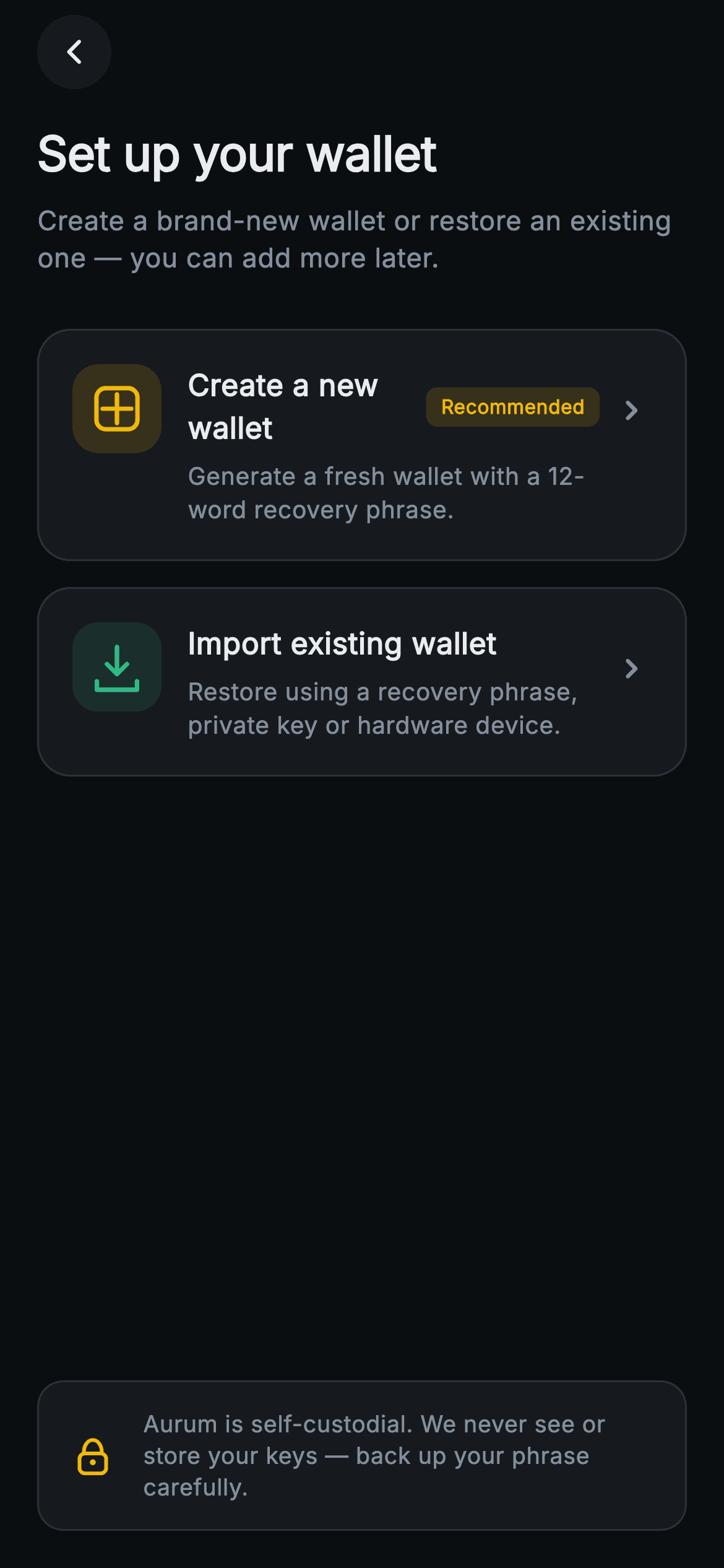
What you'll build
- ✓A reusable _PathCard built on Material + InkWell with a tinted 48px icon chip, optional badge pill, and trailing chevron
- ✓A gold 'Recommended' pill that ranks the create path above import without resizing either card
- ✓Three painted glyphs — a plus-in-a-rounded-square, a download-into-tray arrow, and a stroked padlock — with zero image assets
- ✓A security footer floated to the safe-area bottom by a Spacer, so it pins on tall phones and yields on short ones
- ✓A forced dark exchange theme (gold #F0B90B on #0B0E11) exposing onCreate, onImport and onBack hooks
Step-by-step build
Create the file
Add a new file at lib/web3_onboarding_choose_path/web3_onboarding_choose_path_screen.dart in your Flutter project.
Register the bundled fonts
No external packages — this is pure Flutter. It does bundle its design font (Inter), so drop the font file into fonts/ and declare it in pubspec.yaml:
flutter:
  fonts:
    - family: Inter
      fonts:
- asset: fonts/Inter-Regular.ttfBuild it, piece by piece
Here's how the screen goes together. Each block below is a real slice of the code with a plain-English explanation — paste them in order, or grab the whole file from the next section.
Callbacks and a class-level exchange palette
import 'package:flutter/material.dart';

/// Web3 onboarding — Create or Import. Two large choice cards (new wallet vs
/// import existing) with painted icons and a security note. Self-contained per
/// CONVENTIONS.md: pure Flutter, bundled Inter font, painted icons (no network
/// image), forced dark theme so it renders standalone as a route.
class Web3OnboardingChoosePathScreen extends StatelessWidget {
  const Web3OnboardingChoosePathScreen({
    super.key,
    this.onCreate,
    this.onImport,
    this.onBack,
  });

  final VoidCallback? onCreate;
  final VoidCallback? onImport;
  final VoidCallback? onBack;

  static const String _font = 'Inter';
  static const Color _bg = Color(0xFF0B0E11);
  static const Color _surface = Color(0xFF161A1E);
  static const Color _brand = Color(0xFFF0B90B);
  static const Color _up = Color(0xFF2EBD85);
  static const Color _text = Color(0xFFEAECEF);
  static const Color _muted = Color(0xFF848E9C);
  static const Color _hairline = Color(0xFF2B3139);
The screen is a `StatelessWidget` taking three nullable `VoidCallback`s — `onCreate`, `onImport`, `onBack` — because a fork screen owns no state; it only reports which branch was tapped. The palette lives as `static const` colors on the class (`_bg` #0B0E11, `_surface` #161A1E, gold `_brand` #F0B90B, green `_up` #2EBD85), which lets the private child widgets below reference `Web3OnboardingChoosePathScreen._surface` directly instead of threading a theme extension through four constructors. The two accents are deliberately split by meaning: gold marks the recommended create path and the padlock, green marks import.
Heading, subline, and two unequal choices
  @override
  Widget build(BuildContext context) {
    return Theme(
      data: ThemeData.dark(useMaterial3: true),
      child: Scaffold(
        backgroundColor: _bg,
        body: SafeArea(
          child: Padding(
            padding: const EdgeInsets.fromLTRB(20, 8, 20, 20),
            child: Column(
              crossAxisAlignment: CrossAxisAlignment.stretch,
              children: <Widget>[
                _BackButton(onBack: onBack),
                const SizedBox(height: 16),
                const Text(
                  'Set up your wallet',
                  style: TextStyle(
                    fontFamily: _font,
                    fontSize: 26,
                    fontWeight: FontWeight.w700,
                    letterSpacing: -0.3,
                    color: _text,
                  ),
                ),
                const SizedBox(height: 8),
                const Text(
                  'Create a brand-new wallet or restore an existing one — '
                  'you can add more later.',
                  style: TextStyle(
                    fontFamily: _font,
                    fontSize: 14.5,
                    height: 1.4,
                    color: _muted,
                  ),
                ),
                const SizedBox(height: 28),
                _PathCard(
                  icon: _PathIcon.create,
                  accent: _brand,
                  title: 'Create a new wallet',
                  body:
                      'Generate a fresh wallet with a 12-word recovery phrase.',
                  badge: 'Recommended',
                  onTap: onCreate,
                ),
                const SizedBox(height: 14),
                _PathCard(
                  icon: _PathIcon.import,
                  accent: _up,
                  title: 'Import existing wallet',
                  body: 'Restore using a recovery phrase, private key or '
                      'hardware device.',
                  onTap: onImport,
                ),
`Theme(data: ThemeData.dark(useMaterial3: true))` forces dark mode locally, so the screen renders correctly even inside a light host app. Inside a stretch `Column`, the 26px `w700` heading with `letterSpacing: -0.3` sits over a 14.5px `_muted` subline whose copy ('you can add more later') pre-empts the fear of choosing wrong. The two `_PathCard`s are ranked without touching their size: create gets the `_brand` gold accent plus a `badge: 'Recommended'`, import gets `_up` green and no badge. A 14px `SizedBox` separates them — close enough to read as one decision, apart enough to tap safely.
The self-custody footer, pinned by a Spacer
                const Spacer(),
                Container(
                  padding: const EdgeInsets.all(14),
                  decoration: BoxDecoration(
                    color: _surface,
                    borderRadius: BorderRadius.circular(14),
                    border: Border.all(color: _hairline),
                  ),
                  child: Row(
                    children: <Widget>[
                      SizedBox(
                        width: 30,
                        height: 30,
                        child: CustomPaint(painter: _LockPainter()),
                      ),
                      const SizedBox(width: 12),
                      const Expanded(
                        child: Text(
                          'Aurum is self-custodial. We never see or store your '
                          'keys — back up your phrase carefully.',
                          style: TextStyle(
                            fontFamily: _font,
                            fontSize: 12.5,
                            height: 1.35,
                            color: _muted,
                          ),
                        ),
                      ),
                    ],
                  ),
                ),
              ],
            ),
          ),
        ),
      ),
    );
  }
}
`const Spacer()` between the cards and the footer is what pins the security note to the bottom of the safe area on tall phones while letting everything compress gracefully on short ones. The footer itself is a `_surface` container with a 14px radius and `_hairline` border, holding a 30×30 `CustomPaint(painter: _LockPainter())` beside `Expanded` copy at 12.5px. Wrapping the text in `Expanded` is load-bearing: the reassurance sentence is two lines long and would overflow the `Row` without it.
The _PathCard shell: ink, border and icon chip
enum _PathIcon { create, import }

class _PathCard extends StatelessWidget {
  const _PathCard({
    required this.icon,
    required this.accent,
    required this.title,
    required this.body,
    required this.onTap,
    this.badge,
  });

  final _PathIcon icon;
  final Color accent;
  final String title;
  final String body;
  final VoidCallback? onTap;
  final String? badge;

  @override
  Widget build(BuildContext context) {
    return Material(
      color: Web3OnboardingChoosePathScreen._surface,
      borderRadius: BorderRadius.circular(18),
      child: InkWell(
        borderRadius: BorderRadius.circular(18),
        onTap: onTap,
        child: Container(
          padding: const EdgeInsets.all(18),
          decoration: BoxDecoration(
            borderRadius: BorderRadius.circular(18),
            border: Border.all(color: Web3OnboardingChoosePathScreen._hairline),
          ),
          child: Row(
            crossAxisAlignment: CrossAxisAlignment.start,
            children: <Widget>[
              Container(
                width: 48,
                height: 48,
                decoration: BoxDecoration(
                  color: accent.withValues(alpha: 0.14),
                  borderRadius: BorderRadius.circular(14),
                ),
                child: CustomPaint(painter: _PathIconPainter(icon, accent)),
              ),
A tiny `enum _PathIcon { create, import }` selects the glyph, so the card never takes a widget parameter for its icon. The shell layers `Material` (for the ink surface) under `InkWell` under a bordered `Container`, with `BorderRadius.circular(18)` repeated on all three so the ripple clips to the same rounded shape the border draws — `Material`'s `color` has no border of its own, hence the extra `Container`. The 48×48 icon chip tints itself with `accent.withValues(alpha: 0.14)`, giving each card a gold or green wash that echoes its glyph without a second hard-coded color.
Title row, the Recommended pill, and the chevron
              const SizedBox(width: 14),
              Expanded(
                child: Column(
                  crossAxisAlignment: CrossAxisAlignment.start,
                  children: <Widget>[
                    Row(
                      children: <Widget>[
                        Flexible(
                          child: Text(
                            title,
                            style: const TextStyle(
                              fontFamily: Web3OnboardingChoosePathScreen._font,
                              fontSize: 16,
                              fontWeight: FontWeight.w600,
                              color: Web3OnboardingChoosePathScreen._text,
                            ),
                          ),
                        ),
                        if (badge != null) ...<Widget>[
                          const SizedBox(width: 8),
                          Container(
                            padding: const EdgeInsets.symmetric(
                                horizontal: 8, vertical: 3),
                            decoration: BoxDecoration(
                              color: Web3OnboardingChoosePathScreen._brand
                                  .withValues(alpha: 0.16),
                              borderRadius: BorderRadius.circular(6),
                            ),
                            child: Text(
                              badge!,
                              style: const TextStyle(
                                fontFamily: Web3OnboardingChoosePathScreen._font,
                                fontSize: 10.5,
                                fontWeight: FontWeight.w600,
                                color: Web3OnboardingChoosePathScreen._brand,
                              ),
                            ),
                          ),
                        ],
                      ],
                    ),
                    const SizedBox(height: 5),
                    Text(
                      body,
                      style: const TextStyle(
                        fontFamily: Web3OnboardingChoosePathScreen._font,
                        fontSize: 13,
                        height: 1.35,
                        color: Web3OnboardingChoosePathScreen._muted,
                      ),
                    ),
                  ],
                ),
              ),
              const Padding(
                padding: EdgeInsets.only(top: 14, left: 6),
                child: Icon(Icons.chevron_right_rounded,
                    color: Web3OnboardingChoosePathScreen._muted, size: 22),
              ),
            ],
          ),
        ),
      ),
    );
  }
}
The title sits in a `Flexible` so it truncates before colliding with the badge, and the badge itself appears through a collection-`if` spread — `if (badge != null) ...[SizedBox, Container]` — which inserts the 8px gap only when a pill exists. The pill is `_brand` at `alpha: 0.16` behind 10.5px `w600` gold text with a 6px radius: loud enough to rank the card, small enough not to compete with the 16px title. The trailing `chevron_right_rounded` carries `EdgeInsets.only(top: 14)` so it aligns with the title line rather than centring against the card's variable height, and `crossAxisAlignment.start` on the outer `Row` keeps the icon chip top-aligned when the body wraps to two lines.
One painter, two glyphs: plus and download-tray
class _PathIconPainter extends CustomPainter {
  const _PathIconPainter(this.icon, this.accent);

  final _PathIcon icon;
  final Color accent;

  @override
  void paint(Canvas canvas, Size size) {
    final Offset c = Offset(size.width / 2, size.height / 2);
    final Paint stroke = Paint()
      ..style = PaintingStyle.stroke
      ..strokeWidth = 2.4
      ..strokeCap = StrokeCap.round
      ..strokeJoin = StrokeJoin.round
      ..color = accent;
    final double u = size.width * 0.16;
    if (icon == _PathIcon.create) {
      // Plus inside rounded square.
      final Rect sq = Rect.fromCenter(
          center: c, width: size.width * 0.46, height: size.width * 0.46);
      canvas.drawRRect(
          RRect.fromRectAndRadius(sq, const Radius.circular(5)), stroke);
      canvas.drawLine(Offset(c.dx, c.dy - u), Offset(c.dx, c.dy + u), stroke);
      canvas.drawLine(Offset(c.dx - u, c.dy), Offset(c.dx + u, c.dy), stroke);
    } else {
      // Download arrow into a tray.
      canvas.drawLine(
          Offset(c.dx, c.dy - u * 1.4), Offset(c.dx, c.dy + u * 0.5), stroke);
      final Path head = Path()
        ..moveTo(c.dx - u * 0.7, c.dy - u * 0.2)
        ..lineTo(c.dx, c.dy + u * 0.5)
        ..lineTo(c.dx + u * 0.7, c.dy - u * 0.2);
      canvas.drawPath(head, stroke);
      final Path tray = Path()
        ..moveTo(c.dx - u * 1.4, c.dy + u)
        ..lineTo(c.dx - u * 1.4, c.dy + u * 1.6)
        ..lineTo(c.dx + u * 1.4, c.dy + u * 1.6)
        ..lineTo(c.dx + u * 1.4, c.dy + u);
      canvas.drawPath(tray, stroke);
    }
  }

  @override
  bool shouldRepaint(_PathIconPainter oldDelegate) =>
      oldDelegate.icon != icon || oldDelegate.accent != accent;
}
`_PathIconPainter` shares a single stroke `Paint` — 2.4 width, round caps and joins — and a unit `u = size.width * 0.16` so both glyphs scale with whatever chip box they get. The create glyph is an `RRect` square at 46% of the width with two crossing `drawLine` calls forming the plus. The import glyph is three strokes: a vertical shaft, a chevron `Path` for the arrowhead, and a tray `Path` whose sides stop at `c.dy + u` without closing — leaving the top open is what makes it read as something dropping *into* a tray. `shouldRepaint` compares `icon` and `accent`, so swapping either repaints while everything else stays cached.
The padlock painter and a circular back button
class _LockPainter extends CustomPainter {
  @override
  void paint(Canvas canvas, Size size) {
    final double w = size.width, h = size.height;
    final Paint stroke = Paint()
      ..style = PaintingStyle.stroke
      ..strokeWidth = 2
      ..strokeCap = StrokeCap.round
      ..color = Web3OnboardingChoosePathScreen._brand;
    final Rect body = Rect.fromLTWH(w * 0.26, h * 0.46, w * 0.48, h * 0.36);
    canvas.drawRRect(
        RRect.fromRectAndRadius(body, const Radius.circular(3)), stroke);
    final Rect shackle = Rect.fromLTWH(w * 0.34, h * 0.22, w * 0.32, h * 0.42);
    canvas.drawArc(shackle, 3.1415926, 3.1415926, false, stroke);
    canvas.drawCircle(
        Offset(w / 2, h * 0.62), 1.6, Paint()..color = Web3OnboardingChoosePathScreen._brand);
  }

  @override
  bool shouldRepaint(_LockPainter oldDelegate) => false;
}

class _BackButton extends StatelessWidget {
  const _BackButton({required this.onBack});

  final VoidCallback? onBack;

  @override
  Widget build(BuildContext context) {
    return Align(
      alignment: Alignment.centerLeft,
      child: Material(
        color: Web3OnboardingChoosePathScreen._surface,
        shape: const CircleBorder(),
        child: InkWell(
          customBorder: const CircleBorder(),
          onTap: onBack,
          child: const SizedBox(
            width: 40,
            height: 40,
            child: Icon(Icons.arrow_back_ios_new_rounded,
                size: 16, color: Web3OnboardingChoosePathScreen._text),
          ),
        ),
      ),
    );
  }
}
`_LockPainter` builds the padlock from fractions of its box: a rounded body `Rect` at 48%×36% of the size, a shackle drawn with `drawArc(shackle, 3.1415926, 3.1415926, …)` — start at π, sweep π, i.e. only the top half of the oval — and a 1.6px filled circle as the keyhole at 62% height. Everything is gold `_brand`, tying the security note back to the recommended path, and `shouldRepaint` returns `false` because nothing here is parameterised. `_BackButton` pairs `Material(shape: CircleBorder())` with `InkWell(customBorder: CircleBorder())` so the ripple is round, and a 40×40 `SizedBox` gives the 16px arrow a comfortable tap target.
Full code
The complete, ready-to-paste source. Free to use in your projects — one click copies it all.
import 'package:flutter/material.dart';

/// Web3 onboarding — Create or Import. Two large choice cards (new wallet vs
/// import existing) with painted icons and a security note. Self-contained per
/// CONVENTIONS.md: pure Flutter, bundled Inter font, painted icons (no network
/// image), forced dark theme so it renders standalone as a route.
class Web3OnboardingChoosePathScreen extends StatelessWidget {
  const Web3OnboardingChoosePathScreen({
    super.key,
    this.onCreate,
    this.onImport,
    this.onBack,
  });

  final VoidCallback? onCreate;
  final VoidCallback? onImport;
  final VoidCallback? onBack;

  static const String _font = 'Inter';
  static const Color _bg = Color(0xFF0B0E11);
  static const Color _surface = Color(0xFF161A1E);
  static const Color _brand = Color(0xFFF0B90B);
  static const Color _up = Color(0xFF2EBD85);
  static const Color _text = Color(0xFFEAECEF);
  static const Color _muted = Color(0xFF848E9C);
  static const Color _hairline = Color(0xFF2B3139);

  @override
  Widget build(BuildContext context) {
    return Theme(
      data: ThemeData.dark(useMaterial3: true),
      child: Scaffold(
        backgroundColor: _bg,
        body: SafeArea(
          child: Padding(
            padding: const EdgeInsets.fromLTRB(20, 8, 20, 20),
            child: Column(
              crossAxisAlignment: CrossAxisAlignment.stretch,
              children: <Widget>[
                _BackButton(onBack: onBack),
                const SizedBox(height: 16),
                const Text(
                  'Set up your wallet',
                  style: TextStyle(
                    fontFamily: _font,
                    fontSize: 26,
                    fontWeight: FontWeight.w700,
                    letterSpacing: -0.3,
                    color: _text,
                  ),
                ),
                const SizedBox(height: 8),
                const Text(
                  'Create a brand-new wallet or restore an existing one — '
                  'you can add more later.',
                  style: TextStyle(
                    fontFamily: _font,
                    fontSize: 14.5,
                    height: 1.4,
                    color: _muted,
                  ),
                ),
                const SizedBox(height: 28),
                _PathCard(
                  icon: _PathIcon.create,
                  accent: _brand,
                  title: 'Create a new wallet',
                  body:
                      'Generate a fresh wallet with a 12-word recovery phrase.',
                  badge: 'Recommended',
                  onTap: onCreate,
                ),
                const SizedBox(height: 14),
                _PathCard(
                  icon: _PathIcon.import,
                  accent: _up,
                  title: 'Import existing wallet',
                  body: 'Restore using a recovery phrase, private key or '
                      'hardware device.',
                  onTap: onImport,
                ),
                const Spacer(),
                Container(
                  padding: const EdgeInsets.all(14),
                  decoration: BoxDecoration(
                    color: _surface,
                    borderRadius: BorderRadius.circular(14),
                    border: Border.all(color: _hairline),
                  ),
                  child: Row(
                    children: <Widget>[
                      SizedBox(
                        width: 30,
                        height: 30,
                        child: CustomPaint(painter: _LockPainter()),
                      ),
                      const SizedBox(width: 12),
                      const Expanded(
                        child: Text(
                          'Aurum is self-custodial. We never see or store your '
                          'keys — back up your phrase carefully.',
                          style: TextStyle(
                            fontFamily: _font,
                            fontSize: 12.5,
                            height: 1.35,
                            color: _muted,
                          ),
                        ),
                      ),
                    ],
                  ),
                ),
              ],
            ),
          ),
        ),
      ),
    );
  }
}

enum _PathIcon { create, import }

class _PathCard extends StatelessWidget {
  const _PathCard({
    required this.icon,
    required this.accent,
    required this.title,
    required this.body,
    required this.onTap,
    this.badge,
  });

  final _PathIcon icon;
  final Color accent;
  final String title;
  final String body;
  final VoidCallback? onTap;
  final String? badge;

  @override
  Widget build(BuildContext context) {
    return Material(
      color: Web3OnboardingChoosePathScreen._surface,
      borderRadius: BorderRadius.circular(18),
      child: InkWell(
        borderRadius: BorderRadius.circular(18),
        onTap: onTap,
        child: Container(
          padding: const EdgeInsets.all(18),
          decoration: BoxDecoration(
            borderRadius: BorderRadius.circular(18),
            border: Border.all(color: Web3OnboardingChoosePathScreen._hairline),
          ),
          child: Row(
            crossAxisAlignment: CrossAxisAlignment.start,
            children: <Widget>[
              Container(
                width: 48,
                height: 48,
                decoration: BoxDecoration(
                  color: accent.withValues(alpha: 0.14),
                  borderRadius: BorderRadius.circular(14),
                ),
                child: CustomPaint(painter: _PathIconPainter(icon, accent)),
              ),
              const SizedBox(width: 14),
              Expanded(
                child: Column(
                  crossAxisAlignment: CrossAxisAlignment.start,
                  children: <Widget>[
                    Row(
                      children: <Widget>[
                        Flexible(
                          child: Text(
                            title,
                            style: const TextStyle(
                              fontFamily: Web3OnboardingChoosePathScreen._font,
                              fontSize: 16,
                              fontWeight: FontWeight.w600,
                              color: Web3OnboardingChoosePathScreen._text,
                            ),
                          ),
                        ),
                        if (badge != null) ...<Widget>[
                          const SizedBox(width: 8),
                          Container(
                            padding: const EdgeInsets.symmetric(
                                horizontal: 8, vertical: 3),
                            decoration: BoxDecoration(
                              color: Web3OnboardingChoosePathScreen._brand
                                  .withValues(alpha: 0.16),
                              borderRadius: BorderRadius.circular(6),
                            ),
                            child: Text(
                              badge!,
                              style: const TextStyle(
                                fontFamily: Web3OnboardingChoosePathScreen._font,
                                fontSize: 10.5,
                                fontWeight: FontWeight.w600,
                                color: Web3OnboardingChoosePathScreen._brand,
                              ),
                            ),
                          ),
                        ],
                      ],
                    ),
                    const SizedBox(height: 5),
                    Text(
                      body,
                      style: const TextStyle(
                        fontFamily: Web3OnboardingChoosePathScreen._font,
                        fontSize: 13,
                        height: 1.35,
                        color: Web3OnboardingChoosePathScreen._muted,
                      ),
                    ),
                  ],
                ),
              ),
              const Padding(
                padding: EdgeInsets.only(top: 14, left: 6),
                child: Icon(Icons.chevron_right_rounded,
                    color: Web3OnboardingChoosePathScreen._muted, size: 22),
              ),
            ],
          ),
        ),
      ),
    );
  }
}

class _PathIconPainter extends CustomPainter {
  const _PathIconPainter(this.icon, this.accent);

  final _PathIcon icon;
  final Color accent;

  @override
  void paint(Canvas canvas, Size size) {
    final Offset c = Offset(size.width / 2, size.height / 2);
    final Paint stroke = Paint()
      ..style = PaintingStyle.stroke
      ..strokeWidth = 2.4
      ..strokeCap = StrokeCap.round
      ..strokeJoin = StrokeJoin.round
      ..color = accent;
    final double u = size.width * 0.16;
    if (icon == _PathIcon.create) {
      // Plus inside rounded square.
      final Rect sq = Rect.fromCenter(
          center: c, width: size.width * 0.46, height: size.width * 0.46);
      canvas.drawRRect(
          RRect.fromRectAndRadius(sq, const Radius.circular(5)), stroke);
      canvas.drawLine(Offset(c.dx, c.dy - u), Offset(c.dx, c.dy + u), stroke);
      canvas.drawLine(Offset(c.dx - u, c.dy), Offset(c.dx + u, c.dy), stroke);
    } else {
      // Download arrow into a tray.
      canvas.drawLine(
          Offset(c.dx, c.dy - u * 1.4), Offset(c.dx, c.dy + u * 0.5), stroke);
      final Path head = Path()
        ..moveTo(c.dx - u * 0.7, c.dy - u * 0.2)
        ..lineTo(c.dx, c.dy + u * 0.5)
        ..lineTo(c.dx + u * 0.7, c.dy - u * 0.2);
      canvas.drawPath(head, stroke);
      final Path tray = Path()
        ..moveTo(c.dx - u * 1.4, c.dy + u)
        ..lineTo(c.dx - u * 1.4, c.dy + u * 1.6)
        ..lineTo(c.dx + u * 1.4, c.dy + u * 1.6)
        ..lineTo(c.dx + u * 1.4, c.dy + u);
      canvas.drawPath(tray, stroke);
    }
  }

  @override
  bool shouldRepaint(_PathIconPainter oldDelegate) =>
      oldDelegate.icon != icon || oldDelegate.accent != accent;
}

class _LockPainter extends CustomPainter {
  @override
  void paint(Canvas canvas, Size size) {
    final double w = size.width, h = size.height;
    final Paint stroke = Paint()
      ..style = PaintingStyle.stroke
      ..strokeWidth = 2
      ..strokeCap = StrokeCap.round
      ..color = Web3OnboardingChoosePathScreen._brand;
    final Rect body = Rect.fromLTWH(w * 0.26, h * 0.46, w * 0.48, h * 0.36);
    canvas.drawRRect(
        RRect.fromRectAndRadius(body, const Radius.circular(3)), stroke);
    final Rect shackle = Rect.fromLTWH(w * 0.34, h * 0.22, w * 0.32, h * 0.42);
    canvas.drawArc(shackle, 3.1415926, 3.1415926, false, stroke);
    canvas.drawCircle(
        Offset(w / 2, h * 0.62), 1.6, Paint()..color = Web3OnboardingChoosePathScreen._brand);
  }

  @override
  bool shouldRepaint(_LockPainter oldDelegate) => false;
}

class _BackButton extends StatelessWidget {
  const _BackButton({required this.onBack});

  final VoidCallback? onBack;

  @override
  Widget build(BuildContext context) {
    return Align(
      alignment: Alignment.centerLeft,
      child: Material(
        color: Web3OnboardingChoosePathScreen._surface,
        shape: const CircleBorder(),
        child: InkWell(
          customBorder: const CircleBorder(),
          onTap: onBack,
          child: const SizedBox(
            width: 40,
            height: 40,
            child: Icon(Icons.arrow_back_ios_new_rounded,
                size: 16, color: Web3OnboardingChoosePathScreen._text),
          ),
        ),
      ),
    );
  }
}
Plus bundled 1 binary asset (fonts/images). The CLI and MCP install those for you automatically.
Two faster ways to add it
Copy-paste works, but you can skip it entirely.
1. FlutterKit CLI
One command drops this screen — and its fonts — straight into your project.
$ flutterkit add web3-onboarding-choose-path2. AI agent (MCP)
Connect FlutterKit's MCP server in Claude or Cursor and just ask your agent to install web3-onboarding-choose-path — it fetches and writes the files for you.
FAQ
Is this create-or-import wallet screen free to use commercially?
Yes. FlutterKit screens are free to use, including in commercial apps — you can copy this screen straight into a production wallet onboarding flow with no license fee, sign-up, or attribution required.
What packages and fonts does this screen need?
No third-party packages at all — the only import is `package:flutter/material.dart`, and all three icons are drawn by CustomPainter. The text styles reference the bundled Inter family through the `_font` constant, so declare Inter in your pubspec fonts (or change that one constant to any family you already ship) and everything restyles at once.
Which Flutter version does this need?
Flutter 3.27 or newer, because the icon chip and the Recommended pill use `Color.withValues(alpha: …)`. On an older SDK, replace those two calls with `withOpacity(0.14)` and `withOpacity(0.16)`; the `super.key` constructor needs Dart 2.17+, which any recent stable already includes.
How do I wire onCreate and onImport to real flows?
Pass navigation closures when you construct the screen — typically `onCreate` pushes your seed-phrase generation route and `onImport` pushes a restore flow offering phrase, private key, and hardware options, matching the card copy. Keeping them as nullable `VoidCallback`s means the screen never imports your router: it stays a dumb fork, and the tap targets simply do nothing in a preview.
Can I add a third option, like a watch-only wallet?
Yes — `_PathCard` is already reusable, so add another instance with its own title, body, and accent color below the import card. You would extend `_PathIcon` with a third case and give `_PathIconPainter` one more branch (an eye glyph is a natural fit), then swap the `Spacer` for a `ListView` if three cards plus the footer get tight on small phones.


