How to Build a Product Full Details Screen in Flutter (Full Code + Preview)
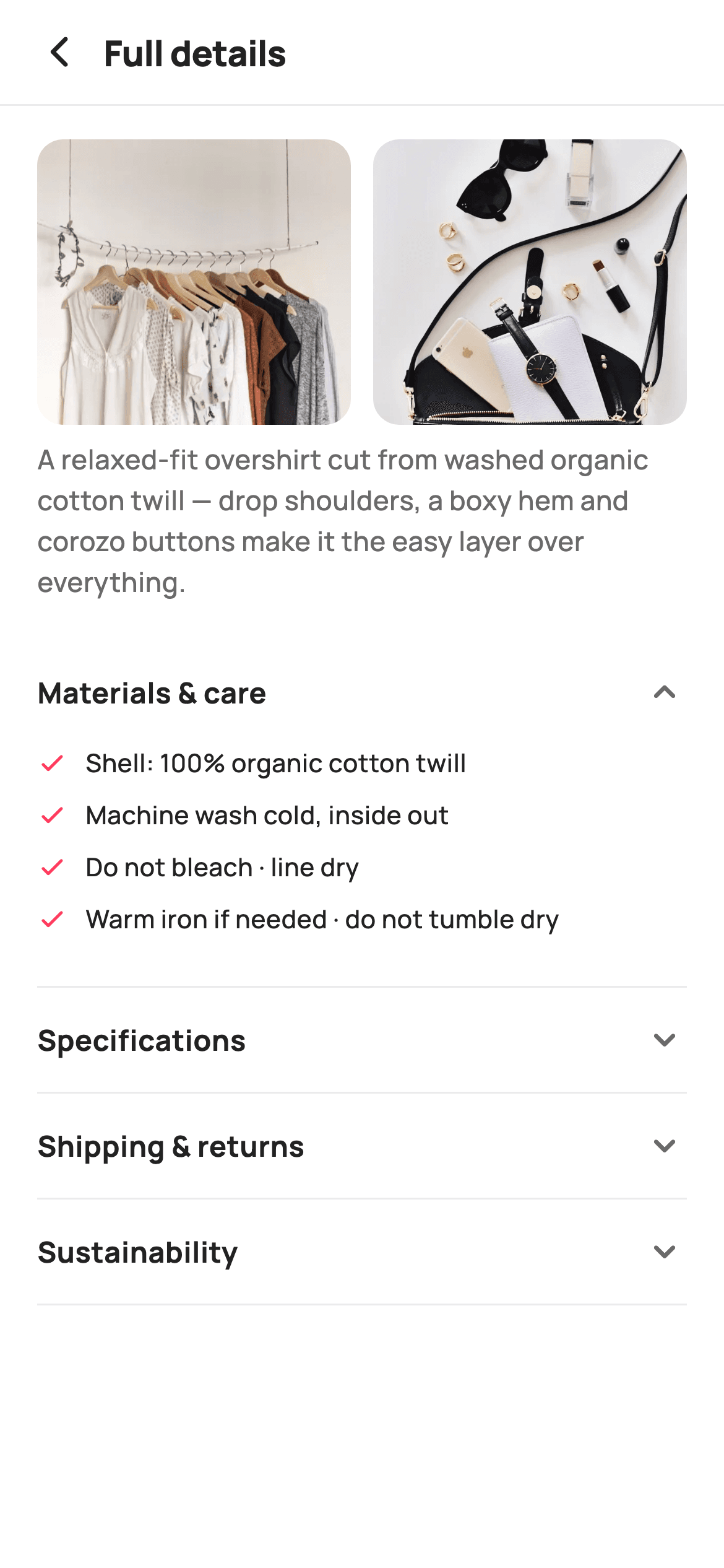
Shoppers who tap through to a garment's full details want one fact — the gsm, the wash rule, the return window — and a wall of paragraphs buries all three. This tutorial builds StyleCart's Full Details screen in Flutter: two fabric close-ups so the cloth is judged before it is read about, a short blurb, then four accordions that open one at a time behind a rotating chevron and a cross-fade, holding a checked care list, a two-column spec table and icon-led shipping rows.
Watch the Flutter UI walkthrough
A short screen recording of Full Details running, if you'd rather see it before you read the code. The written tutorial below covers everything in it.
Can't see the video? Watch it on YouTube.
What you'll build
- ✓A paired fabric close-up strip built from two Expanded AspectRatio tiles
- ✓Single-open accordions driven by one `int _open` index, with tap-to-collapse
- ✓A rotating chevron and AnimatedCrossFade body sharing the same 180ms duration
- ✓A label/value spec table rendered from a `List<List<String>>` with a fixed 88px label column
- ✓Icon-led shipping, returns and worldwide rows sharing one `_shipRow` builder
Step-by-step build
Create the file
Add a new file at lib/ecom_product_description/ecom_product_description_screen.dart in your Flutter project.
Register the bundled fonts
No external packages — this is pure Flutter. It does bundle its design font (Manrope), so drop the font file into fonts/ and declare it in pubspec.yaml:
flutter:
  fonts:
    - family: Manrope
      fonts:
- asset: fonts/Manrope-Regular.ttfBuild it, piece by piece
Here's how the screen goes together. Each block below is a real slice of the code with a plain-English explanation — paste them in order, or grab the whole file from the next section.
State, tokens and the spec sheet as data
import 'package:flutter/material.dart';

/// StyleCart — Full Details.
///
/// The complete product spec sheet: two fabric close-ups, then expandable
/// accordions for materials & care, specifications, shipping & returns and
/// sustainability — one open at a time.
///
/// Self-contained per CONVENTIONS.md: pure Flutter, bundled Manrope, inline
/// Airbnb-style tokens, own light theme + SafeArea, bundled webp. Exposes
/// callbacks only; the registry wires navigation.
class EcomProductDescriptionScreen extends StatefulWidget {
  const EcomProductDescriptionScreen({super.key, this.onBack});

  final VoidCallback? onBack;

  @override
  State<EcomProductDescriptionScreen> createState() =>
      _EcomProductDescriptionScreenState();
}

class _EcomProductDescriptionScreenState
    extends State<EcomProductDescriptionScreen> {
  static const String _font = 'Manrope';
  static const Color _canvas = Color(0xFFFFFFFF);
  static const Color _ink = Color(0xFF222222);
  static const Color _muted = Color(0xFF6A6A6A);
  static const Color _brand = Color(0xFFFF385C);
  static const Color _imageBg = Color(0xFFF5F5F5);
  static const Color _hairline = Color(0xFFEBEBEB);

  static const String _dir =
      'lib/screens/ecommerce/ecom_product_description/images';

  static const List<List<String>> _specs = <List<String>>[
    <String>['Fabric', '100% organic cotton twill, 280 gsm'],
    <String>['Fit', 'Relaxed, drop shoulder'],
    <String>['Closure', 'Corozo button placket'],
    <String>['Origin', 'Ethically made in Portugal'],
    <String>['Model', '183 cm, wearing size M'],
  ];

  int _open = 0;
The widget is a `StatefulWidget` for exactly one reason: `int _open`, the index of the accordion currently expanded. Initialising it to `0` means Materials & care is already open on arrival, so the screen never presents four closed bars and nothing to read. The palette is Airbnb-flavoured — `_ink` #222222 for copy, `_muted` #6A6A6A for secondary lines, `_brand` #FF385C used only for the care checkmarks, and `_hairline` #EBEBEB for every divider. The specification rows live in a `static const List<List<String>>` of label/value pairs rather than hand-written Rows, so adding a spec is one line and the table renders itself.
A fixed header over a scrolling body
  @override
  Widget build(BuildContext context) {
    return Theme(
      data: ThemeData.light(useMaterial3: true),
      child: Scaffold(
        backgroundColor: _canvas,
        body: SafeArea(
          child: Column(
            children: <Widget>[
              _header(),
              const Divider(height: 1, color: _hairline),
              Expanded(
                child: ListView(
                  padding: const EdgeInsets.fromLTRB(20, 18, 20, 28),
                  children: <Widget>[
                    _fabricStrip(),
                    const SizedBox(height: 8),
                    const Text(
                      'A relaxed-fit overshirt cut from washed organic cotton '
                      'twill — drop shoulders, a boxy hem and corozo buttons '
                      'make it the easy layer over everything.',
                      style: TextStyle(
                        fontFamily: _font,
                        fontSize: 14.5,
                        fontWeight: FontWeight.w500,
                        height: 1.5,
                        color: _muted,
                      ),
                    ),
                    const SizedBox(height: 20),
                    _accordion(0, 'Materials & care', _materials()),
                    _accordion(1, 'Specifications', _specTable()),
                    _accordion(2, 'Shipping & returns', _shipping()),
                    _accordion(3, 'Sustainability', _sustain()),
                  ],
                ),
              ),
            ],
          ),
        ),
      ),
    );
  }
`build` wraps everything in a local `Theme` with `ThemeData.light(useMaterial3: true)`, so the screen keeps its white look no matter what theme the host app runs. The Column pins `_header()` and a 1px `Divider` at the top and hands the rest to `Expanded` + `ListView` — the title bar stays put while the accordions scroll. The ListView's `EdgeInsets.fromLTRB(20, 18, 20, 28)` gives a deeper bottom pad than top so the last divider does not sit flush against the home indicator. The blurb is a `const Text` at 14.5px with `height: 1.5`, written as adjacent string literals that Dart concatenates at compile time.
The back-only header row
  Widget _header() {
    return Padding(
      padding: const EdgeInsets.fromLTRB(8, 4, 20, 4),
      child: Row(
        children: <Widget>[
          IconButton(
            onPressed: widget.onBack,
            icon: const Icon(Icons.arrow_back_ios_new_rounded,
                size: 20, color: _ink),
          ),
          const Expanded(
            child: Text(
              'Full details',
              style: TextStyle(
                fontFamily: _font,
                fontSize: 19,
                fontWeight: FontWeight.w800,
                letterSpacing: -0.3,
                color: _ink,
              ),
            ),
          ),
        ],
      ),
    );
  }
The header carries an `IconButton` firing `widget.onBack` and a 19px `w800` title reading 'Full details' — no trailing action, because this screen is a reference page rather than a place to buy from. Its padding is asymmetric, `fromLTRB(8, 4, 20, 4)`: the left is tightened to 8 because an `IconButton` already reserves a 48px hit target and its glyph would otherwise float too far inward, while the right keeps the 20 that matches the list's own margin. Putting the title in `Expanded` lets it left-align next to the arrow instead of centring like a stock `AppBar`.
The paired fabric close-ups
  Widget _fabricStrip() {
    return Row(
      children: <Widget>[
        _fabric('p12.webp'),
        const SizedBox(width: 12),
        _fabric('p13.webp'),
      ],
    );
  }

  Widget _fabric(String asset) {
    return Expanded(
      child: AspectRatio(
        aspectRatio: 1.1,
        child: ClipRRect(
          borderRadius: BorderRadius.circular(14),
          child: Container(
            color: _imageBg,
            child: Image.asset('$_dir/$asset', fit: BoxFit.cover),
          ),
        ),
      ),
    );
  }
`_fabricStrip` is a Row of two `_fabric` tiles separated by a 12px gap, and each tile is `Expanded` so the pair always splits the available width evenly regardless of phone size. `AspectRatio(aspectRatio: 1.1)` makes each image slightly wider than tall — a crop that suits a weave or a button detail better than a square. `ClipRRect` with a 14px radius rounds the photo itself rather than a wrapper, and the `Container(color: _imageBg)` behind it shows #F5F5F5 while the webp decodes, so the strip never flashes white. `BoxFit.cover` fills the box and crops the overflow.
The single-open accordion
  Widget _accordion(int i, String title, Widget body) {
    final bool open = _open == i;
    return Column(
      children: <Widget>[
        GestureDetector(
          onTap: () => setState(() => _open = open ? -1 : i),
          behavior: HitTestBehavior.opaque,
          child: Padding(
            padding: const EdgeInsets.symmetric(vertical: 16),
            child: Row(
              children: <Widget>[
                Expanded(
                  child: Text(
                    title,
                    style: const TextStyle(
                      fontFamily: _font,
                      fontSize: 15.5,
                      fontWeight: FontWeight.w700,
                      color: _ink,
                    ),
                  ),
                ),
                AnimatedRotation(
                  turns: open ? 0.5 : 0,
                  duration: const Duration(milliseconds: 180),
                  child: const Icon(Icons.keyboard_arrow_down_rounded,
                      size: 24, color: _muted),
                ),
              ],
            ),
          ),
        ),
        AnimatedCrossFade(
          firstChild: const SizedBox(width: double.infinity),
          secondChild: Padding(
            padding: const EdgeInsets.only(bottom: 18),
            child: body,
          ),
          crossFadeState:
              open ? CrossFadeState.showSecond : CrossFadeState.showFirst,
          duration: const Duration(milliseconds: 180),
        ),
        const Divider(height: 1, color: _hairline),
      ],
    );
  }
`_accordion` takes an index, a title and a body, and derives `open` from `_open == i`. The tap handler is the whole trick: `setState(() => _open = open ? -1 : i)` sets the index to the tapped row, which implicitly closes every other section, and to `-1` when the open row is tapped again so it can collapse to nothing. `HitTestBehavior.opaque` makes the padded row tappable across its full width, not just on the text. The chevron uses `AnimatedRotation(turns: open ? 0.5 : 0)` — half a turn to point up — and the body an `AnimatedCrossFade`, both at 180ms so the flip and the reveal finish together. The collapsed `firstChild` is a `SizedBox(width: double.infinity)` with no height, which keeps the section full-width during the fade so the divider below does not jitter.
The check-listed care guide
  Widget _materials() {
    const List<String> items = <String>[
      'Shell: 100% organic cotton twill',
      'Machine wash cold, inside out',
      'Do not bleach · line dry',
      'Warm iron if needed · do not tumble dry',
    ];
    return Column(
      crossAxisAlignment: CrossAxisAlignment.start,
      children: items
          .map(
            (String t) => Padding(
              padding: const EdgeInsets.only(bottom: 9),
              child: Row(
                crossAxisAlignment: CrossAxisAlignment.start,
                children: <Widget>[
                  const Padding(
                    padding: EdgeInsets.only(top: 2),
                    child: Icon(Icons.check_rounded, size: 16, color: _brand),
                  ),
                  const SizedBox(width: 10),
                  Expanded(
                    child: Text(
                      t,
                      style: const TextStyle(
                        fontFamily: _font,
                        fontSize: 13.5,
                        fontWeight: FontWeight.w500,
                        height: 1.4,
                        color: _ink,
                      ),
                    ),
                  ),
                ],
              ),
            ),
          )
          .toList(),
    );
  }
`_materials` keeps its four lines in a local `const List<String>` and maps each to a Row. The checkmark is the only place `_brand` coral appears in the body, which quietly marks these as reassurances rather than instructions. `crossAxisAlignment: CrossAxisAlignment.start` with the label in `Expanded` keeps the tick beside the first line when a care rule wraps, and the icon's `EdgeInsets.only(top: 2)` is optical correction — a 16px glyph centres higher than the cap height of 13.5px text, so nudging it down aligns the two visually. Spacing is `bottom: 9` per item rather than separators, and the accordion's own 18px bottom padding absorbs the trailing gap.
The two-column spec table
  Widget _specTable() {
    return Column(
      children: _specs
          .map(
            (List<String> s) => Padding(
              padding: const EdgeInsets.only(bottom: 11),
              child: Row(
                crossAxisAlignment: CrossAxisAlignment.start,
                children: <Widget>[
                  SizedBox(
                    width: 88,
                    child: Text(
                      s[0],
                      style: const TextStyle(
                        fontFamily: _font,
                        fontSize: 13.5,
                        fontWeight: FontWeight.w700,
                        color: _muted,
                      ),
                    ),
                  ),
                  const SizedBox(width: 12),
                  Expanded(
                    child: Text(
                      s[1],
                      style: const TextStyle(
                        fontFamily: _font,
                        fontSize: 13.5,
                        fontWeight: FontWeight.w600,
                        height: 1.35,
                        color: _ink,
                      ),
                    ),
                  ),
                ],
              ),
            ),
          )
          .toList(),
    );
  }
`_specTable` maps the `_specs` pairs into rows where the label sits in a fixed `SizedBox(width: 88)` and the value takes `Expanded`. The fixed width is what makes it read as a table: every value starts on the same vertical line, so 'Fabric', 'Fit' and 'Closure' form a scannable left rail instead of a ragged one. Weight carries the hierarchy rather than colour — the label is `w700` in `_muted`, the value `w600` in `_ink` — so the darker, larger-feeling text is the answer, not the question. `crossAxisAlignment: start` matters for the 280 gsm fabric line, which wraps to two lines against a single-line label.
Shipping rows and the sustainability note
  Widget _shipping() {
    return Column(
      crossAxisAlignment: CrossAxisAlignment.start,
      children: <Widget>[
        _shipRow(Icons.local_shipping_outlined, 'Free standard delivery',
            'Arrives in 3–5 business days. Express available at checkout.'),
        const SizedBox(height: 12),
        _shipRow(Icons.autorenew_rounded, 'Free 30-day returns',
            'Return unworn items with tags for a full refund.'),
        const SizedBox(height: 12),
        _shipRow(Icons.public_rounded, 'Ships worldwide',
            'Duties calculated at checkout for international orders.'),
      ],
    );
  }

  Widget _shipRow(IconData icon, String title, String sub) {
    return Row(
      crossAxisAlignment: CrossAxisAlignment.start,
      children: <Widget>[
        Icon(icon, size: 19, color: _ink),
        const SizedBox(width: 12),
        Expanded(
          child: Column(
            crossAxisAlignment: CrossAxisAlignment.start,
            children: <Widget>[
              Text(
                title,
                style: const TextStyle(
                  fontFamily: _font,
                  fontSize: 13.5,
                  fontWeight: FontWeight.w700,
                  color: _ink,
                ),
              ),
              const SizedBox(height: 2),
              Text(
                sub,
                style: const TextStyle(
                  fontFamily: _font,
                  fontSize: 13,
                  fontWeight: FontWeight.w500,
                  height: 1.4,
                  color: _muted,
                ),
              ),
            ],
          ),
        ),
      ],
    );
  }

  Widget _sustain() {
    return const Text(
      'Made with GOTS-certified organic cotton and low-impact garment dyeing. '
      'Packaged in recycled, plastic-free mailers. StyleCart offsets shipping '
      'emissions on every order.',
      style: TextStyle(
        fontFamily: _font,
        fontSize: 13.5,
        fontWeight: FontWeight.w500,
        height: 1.5,
        color: _ink,
      ),
    );
  }
`_shipping` calls one `_shipRow(icon, title, sub)` builder three times with 12px gaps, so delivery, returns and international duties share identical geometry: a 19px outline icon in `_ink`, 12px of space, then a two-line Column with only 2px between the bold title and its `_muted` explanation. Tight leading is deliberate — the pair must read as one unit rather than two stacked facts. The icons are chosen to be recognisable at a glance, `local_shipping_outlined`, `autorenew_rounded` and `public_rounded`. `_sustain` breaks the pattern with a plain `const Text` at `height: 1.5`, because a sustainability claim is a paragraph to read, not a list to scan.
Full code
The complete, ready-to-paste source. Free to use in your projects — one click copies it all.
import 'package:flutter/material.dart';

/// StyleCart — Full Details.
///
/// The complete product spec sheet: two fabric close-ups, then expandable
/// accordions for materials & care, specifications, shipping & returns and
/// sustainability — one open at a time.
///
/// Self-contained per CONVENTIONS.md: pure Flutter, bundled Manrope, inline
/// Airbnb-style tokens, own light theme + SafeArea, bundled webp. Exposes
/// callbacks only; the registry wires navigation.
class EcomProductDescriptionScreen extends StatefulWidget {
  const EcomProductDescriptionScreen({super.key, this.onBack});

  final VoidCallback? onBack;

  @override
  State<EcomProductDescriptionScreen> createState() =>
      _EcomProductDescriptionScreenState();
}

class _EcomProductDescriptionScreenState
    extends State<EcomProductDescriptionScreen> {
  static const String _font = 'Manrope';
  static const Color _canvas = Color(0xFFFFFFFF);
  static const Color _ink = Color(0xFF222222);
  static const Color _muted = Color(0xFF6A6A6A);
  static const Color _brand = Color(0xFFFF385C);
  static const Color _imageBg = Color(0xFFF5F5F5);
  static const Color _hairline = Color(0xFFEBEBEB);

  static const String _dir =
      'lib/screens/ecommerce/ecom_product_description/images';

  static const List<List<String>> _specs = <List<String>>[
    <String>['Fabric', '100% organic cotton twill, 280 gsm'],
    <String>['Fit', 'Relaxed, drop shoulder'],
    <String>['Closure', 'Corozo button placket'],
    <String>['Origin', 'Ethically made in Portugal'],
    <String>['Model', '183 cm, wearing size M'],
  ];

  int _open = 0;

  @override
  Widget build(BuildContext context) {
    return Theme(
      data: ThemeData.light(useMaterial3: true),
      child: Scaffold(
        backgroundColor: _canvas,
        body: SafeArea(
          child: Column(
            children: <Widget>[
              _header(),
              const Divider(height: 1, color: _hairline),
              Expanded(
                child: ListView(
                  padding: const EdgeInsets.fromLTRB(20, 18, 20, 28),
                  children: <Widget>[
                    _fabricStrip(),
                    const SizedBox(height: 8),
                    const Text(
                      'A relaxed-fit overshirt cut from washed organic cotton '
                      'twill — drop shoulders, a boxy hem and corozo buttons '
                      'make it the easy layer over everything.',
                      style: TextStyle(
                        fontFamily: _font,
                        fontSize: 14.5,
                        fontWeight: FontWeight.w500,
                        height: 1.5,
                        color: _muted,
                      ),
                    ),
                    const SizedBox(height: 20),
                    _accordion(0, 'Materials & care', _materials()),
                    _accordion(1, 'Specifications', _specTable()),
                    _accordion(2, 'Shipping & returns', _shipping()),
                    _accordion(3, 'Sustainability', _sustain()),
                  ],
                ),
              ),
            ],
          ),
        ),
      ),
    );
  }

  Widget _header() {
    return Padding(
      padding: const EdgeInsets.fromLTRB(8, 4, 20, 4),
      child: Row(
        children: <Widget>[
          IconButton(
            onPressed: widget.onBack,
            icon: const Icon(Icons.arrow_back_ios_new_rounded,
                size: 20, color: _ink),
          ),
          const Expanded(
            child: Text(
              'Full details',
              style: TextStyle(
                fontFamily: _font,
                fontSize: 19,
                fontWeight: FontWeight.w800,
                letterSpacing: -0.3,
                color: _ink,
              ),
            ),
          ),
        ],
      ),
    );
  }

  Widget _fabricStrip() {
    return Row(
      children: <Widget>[
        _fabric('p12.webp'),
        const SizedBox(width: 12),
        _fabric('p13.webp'),
      ],
    );
  }

  Widget _fabric(String asset) {
    return Expanded(
      child: AspectRatio(
        aspectRatio: 1.1,
        child: ClipRRect(
          borderRadius: BorderRadius.circular(14),
          child: Container(
            color: _imageBg,
            child: Image.asset('$_dir/$asset', fit: BoxFit.cover),
          ),
        ),
      ),
    );
  }

  Widget _accordion(int i, String title, Widget body) {
    final bool open = _open == i;
    return Column(
      children: <Widget>[
        GestureDetector(
          onTap: () => setState(() => _open = open ? -1 : i),
          behavior: HitTestBehavior.opaque,
          child: Padding(
            padding: const EdgeInsets.symmetric(vertical: 16),
            child: Row(
              children: <Widget>[
                Expanded(
                  child: Text(
                    title,
                    style: const TextStyle(
                      fontFamily: _font,
                      fontSize: 15.5,
                      fontWeight: FontWeight.w700,
                      color: _ink,
                    ),
                  ),
                ),
                AnimatedRotation(
                  turns: open ? 0.5 : 0,
                  duration: const Duration(milliseconds: 180),
                  child: const Icon(Icons.keyboard_arrow_down_rounded,
                      size: 24, color: _muted),
                ),
              ],
            ),
          ),
        ),
        AnimatedCrossFade(
          firstChild: const SizedBox(width: double.infinity),
          secondChild: Padding(
            padding: const EdgeInsets.only(bottom: 18),
            child: body,
          ),
          crossFadeState:
              open ? CrossFadeState.showSecond : CrossFadeState.showFirst,
          duration: const Duration(milliseconds: 180),
        ),
        const Divider(height: 1, color: _hairline),
      ],
    );
  }

  Widget _materials() {
    const List<String> items = <String>[
      'Shell: 100% organic cotton twill',
      'Machine wash cold, inside out',
      'Do not bleach · line dry',
      'Warm iron if needed · do not tumble dry',
    ];
    return Column(
      crossAxisAlignment: CrossAxisAlignment.start,
      children: items
          .map(
            (String t) => Padding(
              padding: const EdgeInsets.only(bottom: 9),
              child: Row(
                crossAxisAlignment: CrossAxisAlignment.start,
                children: <Widget>[
                  const Padding(
                    padding: EdgeInsets.only(top: 2),
                    child: Icon(Icons.check_rounded, size: 16, color: _brand),
                  ),
                  const SizedBox(width: 10),
                  Expanded(
                    child: Text(
                      t,
                      style: const TextStyle(
                        fontFamily: _font,
                        fontSize: 13.5,
                        fontWeight: FontWeight.w500,
                        height: 1.4,
                        color: _ink,
                      ),
                    ),
                  ),
                ],
              ),
            ),
          )
          .toList(),
    );
  }

  Widget _specTable() {
    return Column(
      children: _specs
          .map(
            (List<String> s) => Padding(
              padding: const EdgeInsets.only(bottom: 11),
              child: Row(
                crossAxisAlignment: CrossAxisAlignment.start,
                children: <Widget>[
                  SizedBox(
                    width: 88,
                    child: Text(
                      s[0],
                      style: const TextStyle(
                        fontFamily: _font,
                        fontSize: 13.5,
                        fontWeight: FontWeight.w700,
                        color: _muted,
                      ),
                    ),
                  ),
                  const SizedBox(width: 12),
                  Expanded(
                    child: Text(
                      s[1],
                      style: const TextStyle(
                        fontFamily: _font,
                        fontSize: 13.5,
                        fontWeight: FontWeight.w600,
                        height: 1.35,
                        color: _ink,
                      ),
                    ),
                  ),
                ],
              ),
            ),
          )
          .toList(),
    );
  }

  Widget _shipping() {
    return Column(
      crossAxisAlignment: CrossAxisAlignment.start,
      children: <Widget>[
        _shipRow(Icons.local_shipping_outlined, 'Free standard delivery',
            'Arrives in 3–5 business days. Express available at checkout.'),
        const SizedBox(height: 12),
        _shipRow(Icons.autorenew_rounded, 'Free 30-day returns',
            'Return unworn items with tags for a full refund.'),
        const SizedBox(height: 12),
        _shipRow(Icons.public_rounded, 'Ships worldwide',
            'Duties calculated at checkout for international orders.'),
      ],
    );
  }

  Widget _shipRow(IconData icon, String title, String sub) {
    return Row(
      crossAxisAlignment: CrossAxisAlignment.start,
      children: <Widget>[
        Icon(icon, size: 19, color: _ink),
        const SizedBox(width: 12),
        Expanded(
          child: Column(
            crossAxisAlignment: CrossAxisAlignment.start,
            children: <Widget>[
              Text(
                title,
                style: const TextStyle(
                  fontFamily: _font,
                  fontSize: 13.5,
                  fontWeight: FontWeight.w700,
                  color: _ink,
                ),
              ),
              const SizedBox(height: 2),
              Text(
                sub,
                style: const TextStyle(
                  fontFamily: _font,
                  fontSize: 13,
                  fontWeight: FontWeight.w500,
                  height: 1.4,
                  color: _muted,
                ),
              ),
            ],
          ),
        ),
      ],
    );
  }

  Widget _sustain() {
    return const Text(
      'Made with GOTS-certified organic cotton and low-impact garment dyeing. '
      'Packaged in recycled, plastic-free mailers. StyleCart offsets shipping '
      'emissions on every order.',
      style: TextStyle(
        fontFamily: _font,
        fontSize: 13.5,
        fontWeight: FontWeight.w500,
        height: 1.5,
        color: _ink,
      ),
    );
  }
}
Plus bundled 7 binary assets (fonts/images). The CLI and MCP install those for you automatically.
Two faster ways to add it
Copy-paste works, but you can skip it entirely.
1. FlutterKit CLI
One command drops this screen — and its fonts — straight into your project.
$ flutterkit add ecom-product-description2. AI agent (MCP)
Connect FlutterKit's MCP server in Claude or Cursor and just ask your agent to install ecom-product-description — it fetches and writes the files for you.
FAQ
Can I use this product details screen in a commercial app?
Yes. FlutterKit is free — there is no paid tier, no licence key, no sign-up and no attribution requirement. Copy the Dart from this page, install it with the CLI, or pull it in through MCP, and ship it in a store app.
Do I need any packages or fonts for this screen?
No packages at all — every widget here is `material.dart`, including `AnimatedRotation` and `AnimatedCrossFade`. The typeface is Manrope, declared as a bundled font family in `pubspec.yaml`. The two fabric photos are bundled webp files, so the folder they live in also needs an `assets:` entry, or `Image.asset` will throw at runtime.
How do I let more than one accordion stay open?
Swap the single `int _open` for a `Set<int> _open`, compute `open` as `_open.contains(i)`, and make the tap handler add or remove `i` instead of reassigning. Everything else — the rotation, the cross-fade, the dividers — keeps working, since each section only ever reads its own `open` flag.
Can the fabric tiles load from a URL instead of a bundled asset?
Yes. Replace `Image.asset('$_dir/$asset', ...)` in `_fabric` with `Image.network(url, fit: BoxFit.cover)` and pass the URL down instead of a filename. The `Container(color: _imageBg)` already sits behind the image, so a slow network request shows the grey tile rather than a blank gap while it downloads.
Which Flutter version does this screen need?
Flutter 3.10 or newer is comfortable: the constructor uses the `super.key` super-parameter form and the theme sets `useMaterial3: true`. On an older SDK, expand the constructor to `const EcomProductDescriptionScreen({Key? key, this.onBack}) : super(key: key)`. There is no `Color.withValues` here, so nothing needs downgrading to `withOpacity(...)`.


