How to Build a Receipt & Note Screen for a Fintech App in Flutter (Full Code + Preview)
Right after a card payment, a transaction is just a merchant name and an amount — three weeks later nobody remembers whether that $42.50 at Olivelli was a client lunch or a personal one. This tutorial builds a Revolut-style 'Receipt & note' screen in Flutter: a dashed upload zone painted with a CustomPainter, a four-line note field, five toggleable tag chips, and a Save button that stays muted until the user actually adds something. It is pure Flutter — no packages, no network images — with a forced dark theme and the bundled Inter font.
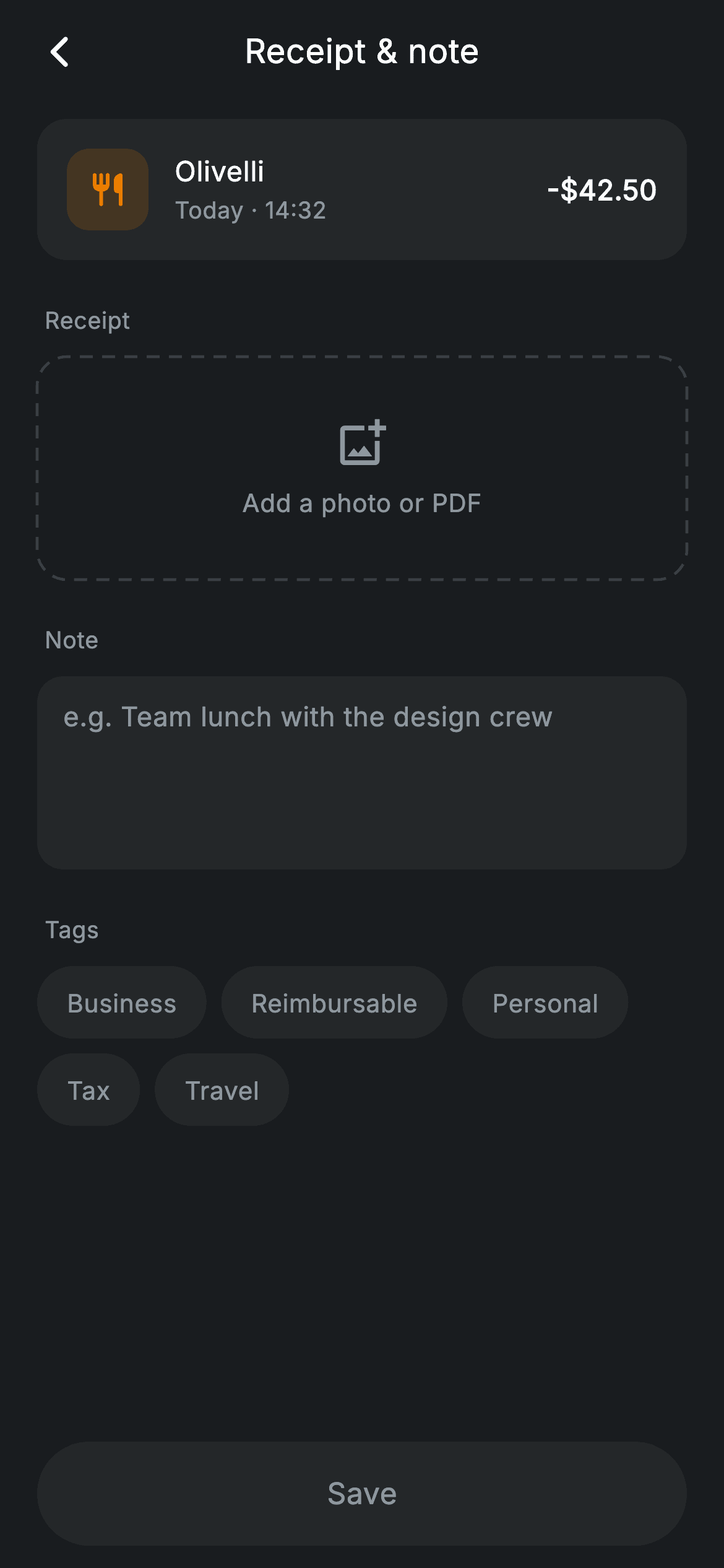
What you'll build
- ✓A dashed 'Add a photo or PDF' upload zone drawn by a CustomPainter, no border package
- ✓An upload state that flips to an attached-file card (receipt_olivelli.pdf with a green check) on tap
- ✓Five tag chips (Business, Reimbursable, Personal, Tax, Travel) toggled through a Set<String>
- ✓A transaction header card with an amber merchant icon tile, timestamp and amount
- ✓A pill Save button whose colour and tap handler both key off one _hasContent getter
Step-by-step build
Create the file
Add a new file at lib/fintech_receipt_note/fintech_receipt_note_screen.dart in your Flutter project.
Register the bundled fonts
No external packages — this is pure Flutter. It does bundle its design font (Inter), so drop the font file into fonts/ and declare it in pubspec.yaml:
flutter:
  fonts:
    - family: Inter
      fonts:
- asset: fonts/Inter-Regular.ttfBuild it, piece by piece
Here's how the screen goes together. Each block below is a real slice of the code with a plain-English explanation — paste them in order, or grab the whole file from the next section.
Three pieces of state and one getter that gates Save
import 'package:flutter/material.dart';

/// Receipt & note — attach a note/receipt to a transaction (Revolut-inspired).
///
/// Self-contained per CONVENTIONS.md: pure Flutter only, the exact design font
/// (Inter) is bundled under `fonts/`, the upload zone is a painted dashed box
/// (no network images), and the screen forces its own dark theme. A note field
/// and selectable tags drive live state; Save enables once there is content.
class FintechReceiptNoteScreen extends StatefulWidget {
  const FintechReceiptNoteScreen({super.key, this.onBack, this.onSave});

  final VoidCallback? onBack;
  final VoidCallback? onSave;

  @override
  State<FintechReceiptNoteScreen> createState() =>
      _FintechReceiptNoteScreenState();
}

class _FintechReceiptNoteScreenState extends State<FintechReceiptNoteScreen> {
  static const String _font = 'Inter';
  static const Color _bg = Color(0xFF191C1F);
  static const Color _surface = Color(0xFF242729);
  static const Color _brand = Color(0xFF494FDF);
  static const Color _amber = Color(0xFFEC7E00);
  static const Color _muted = Color(0xFF8D969E);

  static const List<String> _tags = <String>[
    'Business',
    'Reimbursable',
    'Personal',
    'Tax',
    'Travel',
  ];

  final TextEditingController _note = TextEditingController();
  final Set<String> _selected = <String>{};
  bool _attached = false;

  @override
  void initState() {
    super.initState();
    _note.addListener(() => setState(() {}));
  }

  @override
  void dispose() {
    _note.dispose();
    super.dispose();
  }

  bool get _hasContent =>
      _note.text.trim().isNotEmpty || _selected.isNotEmpty || _attached;
All mutable state is three fields: a `TextEditingController _note`, a `Set<String> _selected` for the tags, and a `bool _attached` for the receipt. `initState` adds `_note.addListener(() => setState(() {}))` so every keystroke rebuilds — that is what lets the Save button react to typing without a `TextField.onChanged` wire-up, and `dispose` releases the controller. The `_hasContent` getter ORs the three together (`_note.text.trim().isNotEmpty || _selected.isNotEmpty || _attached`), trimming the note so a string of spaces does not count as content. The palette is five `static const Color`s — near-black `_bg` (0xFF191C1F), card `_surface`, indigo `_brand` (0xFF494FDF), `_amber` for the merchant icon and `_muted` grey — and the five tag labels live in a `static const List<String>` so copy edits touch one place.
A forced dark scaffold with a pinned Save bar
  @override
  Widget build(BuildContext context) {
    return Theme(
      data: ThemeData.dark(useMaterial3: true),
      child: Scaffold(
        backgroundColor: _bg,
        body: SafeArea(
          child: Column(
            children: <Widget>[
              _buildAppBar(),
              Expanded(
                child: ListView(
                  physics: const BouncingScrollPhysics(),
                  padding: const EdgeInsets.fromLTRB(20, 8, 20, 24),
                  children: <Widget>[
                    _buildTxnHeader(),
                    const SizedBox(height: 24),
                    _label('Receipt'),
                    _buildUpload(),
                    const SizedBox(height: 24),
                    _label('Note'),
                    _buildNoteField(),
                    const SizedBox(height: 24),
                    _label('Tags'),
                    Wrap(
                      spacing: 8,
                      runSpacing: 8,
                      children: <Widget>[
                        for (final String t in _tags)
                          _TagChip(
                            label: t,
                            active: _selected.contains(t),
                            onTap: () => setState(() {
                              if (_selected.contains(t)) {
                                _selected.remove(t);
                              } else {
                                _selected.add(t);
                              }
                            }),
                          ),
                      ],
                    ),
                  ],
                ),
              ),
              _buildSave(),
            ],
          ),
        ),
      ),
    );
  }
The whole tree is wrapped in `Theme(data: ThemeData.dark(useMaterial3: true))`, so the screen stays dark regardless of the host app's theme — text selection handles and ink effects inherit dark defaults for free. The layout is a `Column` of app bar, `Expanded(ListView)` and `_buildSave()`, which pins the Save button below the scroll area instead of letting it scroll away with the form. Inside the `ListView`, each section is a `_label(...)` followed by its widget with 24px gaps, and the tags render through a collection-for of `_TagChip`s in a `Wrap` (8px `spacing` and `runSpacing`) so they reflow onto a second row on narrow phones. Each chip's `onTap` toggles membership in `_selected` — remove if present, add if not — inside `setState`.
A centred title and the transaction being annotated
  Widget _buildAppBar() {
    return Padding(
      padding: const EdgeInsets.fromLTRB(8, 4, 8, 4),
      child: Row(
        children: <Widget>[
          IconButton(
            onPressed: widget.onBack,
            icon: const Icon(Icons.arrow_back_ios_new_rounded,
                size: 20, color: Colors.white),
          ),
          const Expanded(
            child: Text(
              'Receipt & note',
              textAlign: TextAlign.center,
              style: TextStyle(
                fontFamily: _font,
                fontSize: 18,
                fontWeight: FontWeight.w500,
                letterSpacing: 0.24,
                color: Colors.white,
              ),
            ),
          ),
          const SizedBox(width: 48),
        ],
      ),
    );
  }

  Widget _buildTxnHeader() {
    return Container(
      padding: const EdgeInsets.all(16),
      decoration: BoxDecoration(
        color: _surface,
        borderRadius: BorderRadius.circular(16),
      ),
      child: Row(
        children: <Widget>[
          Container(
            width: 44,
            height: 44,
            alignment: Alignment.center,
            decoration: BoxDecoration(
              color: _amber.withValues(alpha: 0.16),
              borderRadius: BorderRadius.circular(12),
            ),
            child: const Icon(Icons.restaurant_rounded, size: 21, color: _amber),
          ),
          const SizedBox(width: 14),
          const Expanded(
            child: Column(
              crossAxisAlignment: CrossAxisAlignment.start,
              children: <Widget>[
                Text(
                  'Olivelli',
                  style: TextStyle(
                    fontFamily: _font,
                    fontSize: 15,
                    fontWeight: FontWeight.w500,
                    letterSpacing: 0.24,
                    color: Colors.white,
                  ),
                ),
                SizedBox(height: 2),
                Text(
                  'Today · 14:32',
                  style: TextStyle(
                    fontFamily: _font,
                    fontSize: 12.5,
                    letterSpacing: 0.24,
                    color: _muted,
                  ),
                ),
              ],
            ),
          ),
          const Text(
            r'-$42.50',
            style: TextStyle(
              fontFamily: _font,
              fontSize: 15,
              fontWeight: FontWeight.w600,
              letterSpacing: 0.24,
              color: Colors.white,
            ),
          ),
        ],
      ),
    );
  }
The app bar is a plain `Row`: back `IconButton`, an `Expanded` centred 'Receipt & note' title, then `const SizedBox(width: 48)` as a counterweight so the title optically centres against the 48px icon button on the left. `_buildTxnHeader` reminds the user which payment they are annotating: a `_surface` card holding a 44px icon tile — `_amber.withValues(alpha: 0.16)` behind a full-`_amber` `Icons.restaurant_rounded`, the standard tinted-tile trick for category icons — then merchant name over a muted 'Today · 14:32' line, and the amount on the right. The amount string is a raw literal, `r'-$42.50'`, because without the `r` prefix Dart would parse `$4` as interpolation.
One tap target, two upload states
  Widget _buildUpload() {
    return GestureDetector(
      onTap: () => setState(() => _attached = !_attached),
      child: CustomPaint(
        painter: _attached ? null : _DashedBorderPainter(),
        child: Container(
          height: 120,
          decoration: _attached
              ? BoxDecoration(
                  color: _surface,
                  borderRadius: BorderRadius.circular(16),
                )
              : null,
          child: Center(
            child: _attached
                ? Row(
                    mainAxisSize: MainAxisSize.min,
                    children: const <Widget>[
                      Icon(Icons.description_rounded,
                          size: 22, color: _brand),
                      SizedBox(width: 10),
                      Text(
                        'receipt_olivelli.pdf',
                        style: TextStyle(
                          fontFamily: _font,
                          fontSize: 14,
                          fontWeight: FontWeight.w500,
                          letterSpacing: 0.24,
                          color: Colors.white,
                        ),
                      ),
                      SizedBox(width: 10),
                      Icon(Icons.check_circle_rounded,
                          size: 18, color: Color(0xFF00A87E)),
                    ],
                  )
                : Column(
                    mainAxisSize: MainAxisSize.min,
                    children: const <Widget>[
                      Icon(Icons.add_photo_alternate_outlined,
                          size: 28, color: _muted),
                      SizedBox(height: 8),
                      Text(
                        'Add a photo or PDF',
                        style: TextStyle(
                          fontFamily: _font,
                          fontSize: 13.5,
                          fontWeight: FontWeight.w500,
                          letterSpacing: 0.24,
                          color: _muted,
                        ),
                      ),
                    ],
                  ),
          ),
        ),
      ),
    );
  }
`_buildUpload` is a single `GestureDetector` whose tap just flips `_attached`, and the same 120px box renders both states. Empty, the `CustomPaint` gets `_DashedBorderPainter` and shows a muted `Icons.add_photo_alternate_outlined` over 'Add a photo or PDF'; attached, the painter becomes `null` and a solid `_surface` `BoxDecoration` with a 16px radius takes over, showing a `_brand` document icon, the filename `receipt_olivelli.pdf` and a green (0xFF00A87E) `check_circle` in a min-size `Row`. Swapping the painter for a decoration — rather than stacking both and hiding one — means the dashed border can never bleed through the filled card.
A borderless note field and the section-label helper
  Widget _buildNoteField() {
    return Container(
      padding: const EdgeInsets.symmetric(horizontal: 14, vertical: 4),
      decoration: BoxDecoration(
        color: _surface,
        borderRadius: BorderRadius.circular(14),
      ),
      child: TextField(
        controller: _note,
        maxLines: 4,
        cursorColor: _brand,
        style: const TextStyle(
          fontFamily: _font,
          fontSize: 14.5,
          height: 1.4,
          letterSpacing: 0.24,
          color: Colors.white,
        ),
        decoration: const InputDecoration(
          border: InputBorder.none,
          hintText: 'e.g. Team lunch with the design crew',
          hintStyle: TextStyle(
            fontFamily: _font,
            fontSize: 14.5,
            letterSpacing: 0.24,
            color: _muted,
          ),
        ),
      ),
    );
  }

  Widget _label(String text) {
    return Padding(
      padding: const EdgeInsets.only(left: 4, bottom: 10),
      child: Text(
        text,
        style: const TextStyle(
          fontFamily: _font,
          fontSize: 12.5,
          fontWeight: FontWeight.w500,
          letterSpacing: 0.24,
          color: _muted,
        ),
      ),
    );
  }
The note input skips Material's own field chrome entirely: `InputBorder.none` removes the underline, and the surrounding `Container` with `_surface` fill and a 14px radius becomes the visible field, matching the cards around it. `maxLines: 4` sizes it for a short sentence like the hint ('e.g. Team lunch with the design crew'), and `cursorColor: _brand` is the only accent inside it. `_label` is a tiny helper returning a 12.5px `w500` muted `Text` with `EdgeInsets.only(left: 4, bottom: 10)`, so 'Receipt', 'Note' and 'Tags' all get identical typography from one function.
A Save button that answers 'did I add anything?'
  Widget _buildSave() {
    return Padding(
      padding: const EdgeInsets.fromLTRB(20, 0, 20, 12),
      child: SizedBox(
        width: double.infinity,
        height: 56,
        child: Material(
          color: _hasContent ? _brand : _surface,
          borderRadius: BorderRadius.circular(9999),
          child: InkWell(
            borderRadius: BorderRadius.circular(9999),
            onTap: _hasContent ? widget.onSave : null,
            child: Center(
              child: Text(
                'Save',
                style: TextStyle(
                  fontFamily: _font,
                  fontSize: 16,
                  fontWeight: FontWeight.w500,
                  letterSpacing: 0.24,
                  color: _hasContent ? Colors.white : _muted,
                ),
              ),
            ),
          ),
        ),
      ),
    );
  }
}
The Save control is a hand-rolled `Material` + `InkWell` pill (`BorderRadius.circular(9999)` on both, so the ripple clips to the rounded shape) inside a full-width 56px `SizedBox`. Everything keys off `_hasContent`: the fill is `_brand` when true and `_surface` when false, the label flips white/`_muted`, and `onTap` becomes `null` so the empty state genuinely does not fire `widget.onSave`. Because it lives outside the `ListView` in the root `Column`, it stays visible while the form scrolls.
The _TagChip component
class _TagChip extends StatelessWidget {
  const _TagChip({required this.label, required this.active, required this.onTap});

  final String label;
  final bool active;
  final VoidCallback onTap;

  @override
  Widget build(BuildContext context) {
    return GestureDetector(
      onTap: onTap,
      child: Container(
        padding: const EdgeInsets.symmetric(horizontal: 16, vertical: 10),
        decoration: BoxDecoration(
          color: active
              ? _FintechReceiptNoteScreenState._brand
              : _FintechReceiptNoteScreenState._surface,
          borderRadius: BorderRadius.circular(9999),
        ),
        child: Text(
          label,
          style: TextStyle(
            fontFamily: _FintechReceiptNoteScreenState._font,
            fontSize: 13.5,
            fontWeight: FontWeight.w500,
            letterSpacing: 0.24,
            color: active
                ? Colors.white
                : _FintechReceiptNoteScreenState._muted,
          ),
        ),
      ),
    );
  }
}
`_TagChip` is a stateless pill taking `label`, `active` and `onTap` — selection state lives in the parent's `Set`, keeping the chip dumb and reusable. Active chips fill with `_brand` and white text; inactive ones sit on `_surface` with `_muted` text, so a selected tag reads at a glance without icons or checkmarks. It reaches into `_FintechReceiptNoteScreenState._brand` for its colours, which is fine here because both classes share one file; lifting the chip into its own file would mean passing the colours in instead.
Painting the dashed border with path metrics
class _DashedBorderPainter extends CustomPainter {
  @override
  void paint(Canvas canvas, Size size) {
    final Paint paint = Paint()
      ..color = const Color(0xFF3A3F45)
      ..strokeWidth = 1.5
      ..style = PaintingStyle.stroke;
    final RRect rrect = RRect.fromRectAndRadius(
      Offset.zero & size,
      const Radius.circular(16),
    );
    final Path path = Path()..addRRect(rrect);
    const double dash = 7;
    const double gap = 5;
    for (final metric in path.computeMetrics()) {
      double dist = 0;
      while (dist < metric.length) {
        final double end = dist + dash;
        canvas.drawPath(
          metric.extractPath(dist, end.clamp(0, metric.length)),
          paint,
        );
        dist = end + gap;
      }
    }
  }

  @override
  bool shouldRepaint(covariant CustomPainter oldDelegate) => false;
}
Flutter has no dashed-border property, so `_DashedBorderPainter` builds one from geometry: an `RRect` the size of the widget with a 16px radius goes into a `Path`, and `computeMetrics()` turns that outline into a measurable curve. A `while` loop walks along it extracting 7px sub-paths (`dash`) separated by 5px gaps, drawing each with a 1.5px grey (0xFF3A3F45) stroke; `end.clamp(0, metric.length)` stops the final dash cleanly at the path's end instead of overshooting the corner. Nothing about the border depends on state, so `shouldRepaint` returns `false` and the painter never redraws unnecessarily.
Full code
The complete, ready-to-paste source. Free to use in your projects — one click copies it all.
import 'package:flutter/material.dart';

/// Receipt & note — attach a note/receipt to a transaction (Revolut-inspired).
///
/// Self-contained per CONVENTIONS.md: pure Flutter only, the exact design font
/// (Inter) is bundled under `fonts/`, the upload zone is a painted dashed box
/// (no network images), and the screen forces its own dark theme. A note field
/// and selectable tags drive live state; Save enables once there is content.
class FintechReceiptNoteScreen extends StatefulWidget {
  const FintechReceiptNoteScreen({super.key, this.onBack, this.onSave});

  final VoidCallback? onBack;
  final VoidCallback? onSave;

  @override
  State<FintechReceiptNoteScreen> createState() =>
      _FintechReceiptNoteScreenState();
}

class _FintechReceiptNoteScreenState extends State<FintechReceiptNoteScreen> {
  static const String _font = 'Inter';
  static const Color _bg = Color(0xFF191C1F);
  static const Color _surface = Color(0xFF242729);
  static const Color _brand = Color(0xFF494FDF);
  static const Color _amber = Color(0xFFEC7E00);
  static const Color _muted = Color(0xFF8D969E);

  static const List<String> _tags = <String>[
    'Business',
    'Reimbursable',
    'Personal',
    'Tax',
    'Travel',
  ];

  final TextEditingController _note = TextEditingController();
  final Set<String> _selected = <String>{};
  bool _attached = false;

  @override
  void initState() {
    super.initState();
    _note.addListener(() => setState(() {}));
  }

  @override
  void dispose() {
    _note.dispose();
    super.dispose();
  }

  bool get _hasContent =>
      _note.text.trim().isNotEmpty || _selected.isNotEmpty || _attached;

  @override
  Widget build(BuildContext context) {
    return Theme(
      data: ThemeData.dark(useMaterial3: true),
      child: Scaffold(
        backgroundColor: _bg,
        body: SafeArea(
          child: Column(
            children: <Widget>[
              _buildAppBar(),
              Expanded(
                child: ListView(
                  physics: const BouncingScrollPhysics(),
                  padding: const EdgeInsets.fromLTRB(20, 8, 20, 24),
                  children: <Widget>[
                    _buildTxnHeader(),
                    const SizedBox(height: 24),
                    _label('Receipt'),
                    _buildUpload(),
                    const SizedBox(height: 24),
                    _label('Note'),
                    _buildNoteField(),
                    const SizedBox(height: 24),
                    _label('Tags'),
                    Wrap(
                      spacing: 8,
                      runSpacing: 8,
                      children: <Widget>[
                        for (final String t in _tags)
                          _TagChip(
                            label: t,
                            active: _selected.contains(t),
                            onTap: () => setState(() {
                              if (_selected.contains(t)) {
                                _selected.remove(t);
                              } else {
                                _selected.add(t);
                              }
                            }),
                          ),
                      ],
                    ),
                  ],
                ),
              ),
              _buildSave(),
            ],
          ),
        ),
      ),
    );
  }

  Widget _buildAppBar() {
    return Padding(
      padding: const EdgeInsets.fromLTRB(8, 4, 8, 4),
      child: Row(
        children: <Widget>[
          IconButton(
            onPressed: widget.onBack,
            icon: const Icon(Icons.arrow_back_ios_new_rounded,
                size: 20, color: Colors.white),
          ),
          const Expanded(
            child: Text(
              'Receipt & note',
              textAlign: TextAlign.center,
              style: TextStyle(
                fontFamily: _font,
                fontSize: 18,
                fontWeight: FontWeight.w500,
                letterSpacing: 0.24,
                color: Colors.white,
              ),
            ),
          ),
          const SizedBox(width: 48),
        ],
      ),
    );
  }

  Widget _buildTxnHeader() {
    return Container(
      padding: const EdgeInsets.all(16),
      decoration: BoxDecoration(
        color: _surface,
        borderRadius: BorderRadius.circular(16),
      ),
      child: Row(
        children: <Widget>[
          Container(
            width: 44,
            height: 44,
            alignment: Alignment.center,
            decoration: BoxDecoration(
              color: _amber.withValues(alpha: 0.16),
              borderRadius: BorderRadius.circular(12),
            ),
            child: const Icon(Icons.restaurant_rounded, size: 21, color: _amber),
          ),
          const SizedBox(width: 14),
          const Expanded(
            child: Column(
              crossAxisAlignment: CrossAxisAlignment.start,
              children: <Widget>[
                Text(
                  'Olivelli',
                  style: TextStyle(
                    fontFamily: _font,
                    fontSize: 15,
                    fontWeight: FontWeight.w500,
                    letterSpacing: 0.24,
                    color: Colors.white,
                  ),
                ),
                SizedBox(height: 2),
                Text(
                  'Today · 14:32',
                  style: TextStyle(
                    fontFamily: _font,
                    fontSize: 12.5,
                    letterSpacing: 0.24,
                    color: _muted,
                  ),
                ),
              ],
            ),
          ),
          const Text(
            r'-$42.50',
            style: TextStyle(
              fontFamily: _font,
              fontSize: 15,
              fontWeight: FontWeight.w600,
              letterSpacing: 0.24,
              color: Colors.white,
            ),
          ),
        ],
      ),
    );
  }

  Widget _buildUpload() {
    return GestureDetector(
      onTap: () => setState(() => _attached = !_attached),
      child: CustomPaint(
        painter: _attached ? null : _DashedBorderPainter(),
        child: Container(
          height: 120,
          decoration: _attached
              ? BoxDecoration(
                  color: _surface,
                  borderRadius: BorderRadius.circular(16),
                )
              : null,
          child: Center(
            child: _attached
                ? Row(
                    mainAxisSize: MainAxisSize.min,
                    children: const <Widget>[
                      Icon(Icons.description_rounded,
                          size: 22, color: _brand),
                      SizedBox(width: 10),
                      Text(
                        'receipt_olivelli.pdf',
                        style: TextStyle(
                          fontFamily: _font,
                          fontSize: 14,
                          fontWeight: FontWeight.w500,
                          letterSpacing: 0.24,
                          color: Colors.white,
                        ),
                      ),
                      SizedBox(width: 10),
                      Icon(Icons.check_circle_rounded,
                          size: 18, color: Color(0xFF00A87E)),
                    ],
                  )
                : Column(
                    mainAxisSize: MainAxisSize.min,
                    children: const <Widget>[
                      Icon(Icons.add_photo_alternate_outlined,
                          size: 28, color: _muted),
                      SizedBox(height: 8),
                      Text(
                        'Add a photo or PDF',
                        style: TextStyle(
                          fontFamily: _font,
                          fontSize: 13.5,
                          fontWeight: FontWeight.w500,
                          letterSpacing: 0.24,
                          color: _muted,
                        ),
                      ),
                    ],
                  ),
          ),
        ),
      ),
    );
  }

  Widget _buildNoteField() {
    return Container(
      padding: const EdgeInsets.symmetric(horizontal: 14, vertical: 4),
      decoration: BoxDecoration(
        color: _surface,
        borderRadius: BorderRadius.circular(14),
      ),
      child: TextField(
        controller: _note,
        maxLines: 4,
        cursorColor: _brand,
        style: const TextStyle(
          fontFamily: _font,
          fontSize: 14.5,
          height: 1.4,
          letterSpacing: 0.24,
          color: Colors.white,
        ),
        decoration: const InputDecoration(
          border: InputBorder.none,
          hintText: 'e.g. Team lunch with the design crew',
          hintStyle: TextStyle(
            fontFamily: _font,
            fontSize: 14.5,
            letterSpacing: 0.24,
            color: _muted,
          ),
        ),
      ),
    );
  }

  Widget _label(String text) {
    return Padding(
      padding: const EdgeInsets.only(left: 4, bottom: 10),
      child: Text(
        text,
        style: const TextStyle(
          fontFamily: _font,
          fontSize: 12.5,
          fontWeight: FontWeight.w500,
          letterSpacing: 0.24,
          color: _muted,
        ),
      ),
    );
  }

  Widget _buildSave() {
    return Padding(
      padding: const EdgeInsets.fromLTRB(20, 0, 20, 12),
      child: SizedBox(
        width: double.infinity,
        height: 56,
        child: Material(
          color: _hasContent ? _brand : _surface,
          borderRadius: BorderRadius.circular(9999),
          child: InkWell(
            borderRadius: BorderRadius.circular(9999),
            onTap: _hasContent ? widget.onSave : null,
            child: Center(
              child: Text(
                'Save',
                style: TextStyle(
                  fontFamily: _font,
                  fontSize: 16,
                  fontWeight: FontWeight.w500,
                  letterSpacing: 0.24,
                  color: _hasContent ? Colors.white : _muted,
                ),
              ),
            ),
          ),
        ),
      ),
    );
  }
}

class _TagChip extends StatelessWidget {
  const _TagChip({required this.label, required this.active, required this.onTap});

  final String label;
  final bool active;
  final VoidCallback onTap;

  @override
  Widget build(BuildContext context) {
    return GestureDetector(
      onTap: onTap,
      child: Container(
        padding: const EdgeInsets.symmetric(horizontal: 16, vertical: 10),
        decoration: BoxDecoration(
          color: active
              ? _FintechReceiptNoteScreenState._brand
              : _FintechReceiptNoteScreenState._surface,
          borderRadius: BorderRadius.circular(9999),
        ),
        child: Text(
          label,
          style: TextStyle(
            fontFamily: _FintechReceiptNoteScreenState._font,
            fontSize: 13.5,
            fontWeight: FontWeight.w500,
            letterSpacing: 0.24,
            color: active
                ? Colors.white
                : _FintechReceiptNoteScreenState._muted,
          ),
        ),
      ),
    );
  }
}

/// Paints a rounded dashed border for the empty upload zone.
class _DashedBorderPainter extends CustomPainter {
  @override
  void paint(Canvas canvas, Size size) {
    final Paint paint = Paint()
      ..color = const Color(0xFF3A3F45)
      ..strokeWidth = 1.5
      ..style = PaintingStyle.stroke;
    final RRect rrect = RRect.fromRectAndRadius(
      Offset.zero & size,
      const Radius.circular(16),
    );
    final Path path = Path()..addRRect(rrect);
    const double dash = 7;
    const double gap = 5;
    for (final metric in path.computeMetrics()) {
      double dist = 0;
      while (dist < metric.length) {
        final double end = dist + dash;
        canvas.drawPath(
          metric.extractPath(dist, end.clamp(0, metric.length)),
          paint,
        );
        dist = end + gap;
      }
    }
  }

  @override
  bool shouldRepaint(covariant CustomPainter oldDelegate) => false;
}
Plus bundled 1 binary asset (fonts/images). The CLI and MCP install those for you automatically.
Two faster ways to add it
Copy-paste works, but you can skip it entirely.
1. FlutterKit CLI
One command drops this screen — and its fonts — straight into your project.
$ flutterkit add fintech-receipt-note2. AI agent (MCP)
Connect FlutterKit's MCP server in Claude or Cursor and just ask your agent to install fintech-receipt-note — it fetches and writes the files for you.
FAQ
Is this receipt and note screen free to use commercially?
Yes. FlutterKit screens are free to use, including in commercial apps — copy the code from this page straight into a production fintech or expense app. No attribution, sign-up or licence fee.
Do I need any packages or fonts for this screen?
No pub packages at all — the only import is `package:flutter/material.dart`, and the dashed border is a hand-written CustomPainter rather than a border package. The design font is Inter, bundled as an asset under `fonts/` and referenced by the `_font` constant, so there is no google_fonts dependency either.
Which Flutter version does this need?
Flutter 3.22 or newer, because the merchant icon tile uses `_amber.withValues(alpha: 0.16)`. On an older SDK, swap that call for `withOpacity(0.16)`; the `super.key` constructor parameter otherwise only requires Dart 2.17 (Flutter 3.0).
How do I wire the upload zone to a real image or file picker?
Replace the `_attached = !_attached` toggle in `_buildUpload`'s `onTap` with a call to `image_picker` or `file_picker`, store the returned file (path and name) in state instead of the bool, and render its real filename where the `receipt_olivelli.pdf` literal sits. Keep `_attached`-style truthiness feeding `_hasContent` so Save still enables when a file lands.
Why does the Save button start disabled, and how does it know when to enable?
Save is gated by the `_hasContent` getter, which is true once the note has non-whitespace text, any tag is selected, or a receipt is attached. The note controller's listener calls `setState` on every keystroke and the tag/upload taps already rebuild, so the button re-evaluates its fill colour and `onTap` (null when empty) on each change — saving a completely blank annotation is impossible.


