How to Build a Fintech Recipient Detail Screen in Flutter (Full Code + Preview)
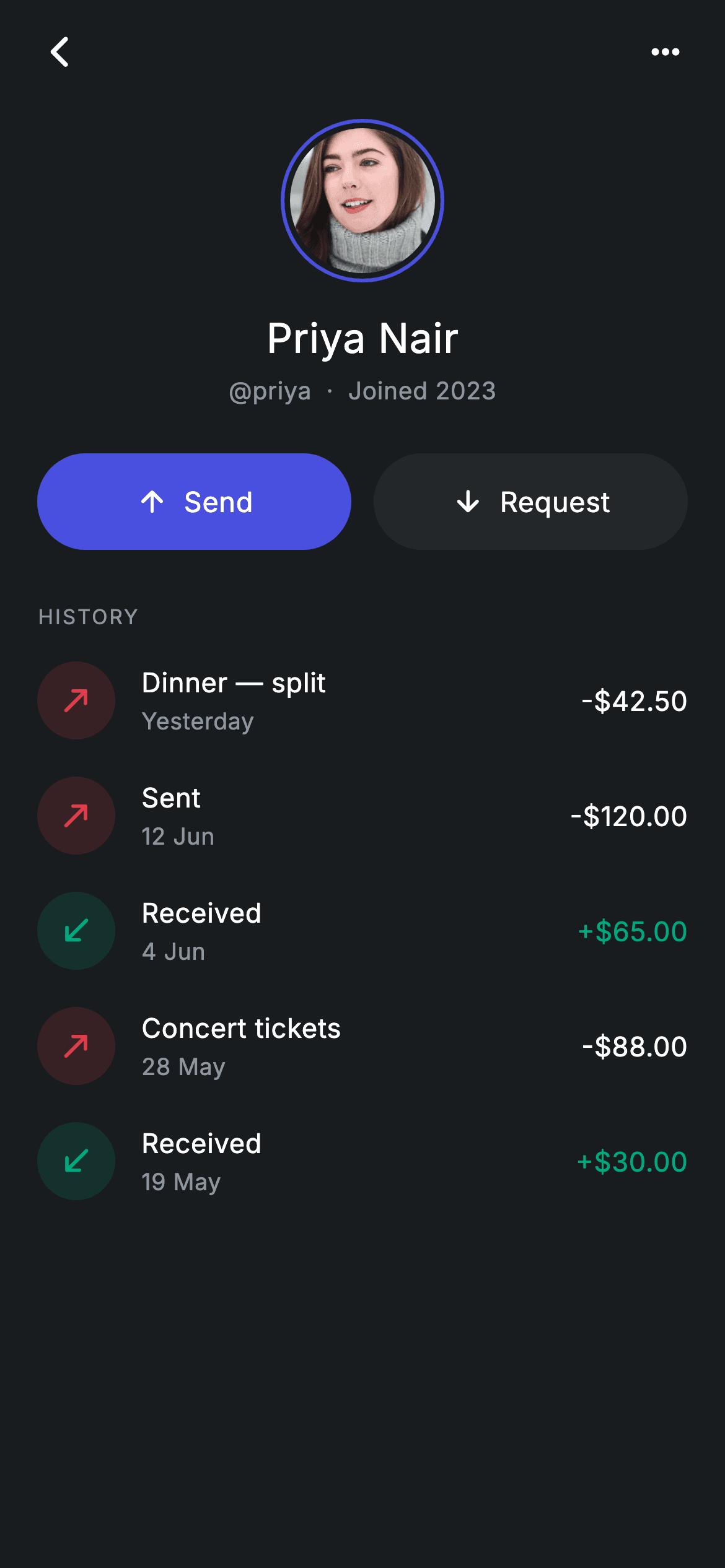
Every money-transfer app needs the screen you land on after tapping a contact: who is this person, how do I pay them, and what have we exchanged before. This tutorial builds a Revolut-style recipient detail screen in Flutter — a brand-ringed avatar over the payee's name and @tag, filled Send and outlined Request pills, and a transaction history where incoming amounts turn teal so direction reads at a glance. It is one self-contained dark-themed file with no packages beyond Flutter itself, wired to your navigation through three callbacks.
What you'll build
- ✓An 88px circular avatar with a 2px indigo ring separated from the photo by a 3px gap, with a solid-colour fallback if the asset is missing
- ✓Paired Send and Request pill buttons built from one widget that toggles between a brand fill and a surface fill
- ✓A transaction history where a directional arrow in a tinted disc and a teal-only incoming amount encode money in versus money out
- ✓A forced dark theme via a local Theme wrapper, so the screen looks identical inside any host app
- ✓Signed amounts rendered by hand from a plain value class, ready to swap for real API data
Step-by-step build
Create the file
Add a new file at lib/fintech_recipient_detail/fintech_recipient_detail_screen.dart in your Flutter project.
Register the bundled fonts
No external packages — this is pure Flutter. It does bundle its design font (Inter), so drop the font file into fonts/ and declare it in pubspec.yaml:
flutter:
  fonts:
    - family: Inter
      fonts:
- asset: fonts/Inter-Regular.ttfBuild it, piece by piece
Here's how the screen goes together. Each block below is a real slice of the code with a plain-English explanation — paste them in order, or grab the whole file from the next section.
Callbacks, a six-colour palette, and history as data
import 'package:flutter/material.dart';

/// Recipient detail — beneficiary profile + transfer history (Revolut-inspired).
///
/// Self-contained per CONVENTIONS.md: pure Flutter only, the exact design font
/// (Inter) is bundled under `fonts/`, the contact photo is a bundled asset, and
/// the screen forces its own dark theme. Send / Request actions and a populated
/// payment history make it read like a real product.
class FintechRecipientDetailScreen extends StatelessWidget {
  const FintechRecipientDetailScreen({
    super.key,
    this.onBack,
    this.onSend,
    this.onRequest,
  });

  final VoidCallback? onBack;
  final VoidCallback? onSend;
  final VoidCallback? onRequest;

  static const String _font = 'Inter';
  static const Color _bg = Color(0xFF191C1F);
  static const Color _surface = Color(0xFF242729);
  static const Color _brand = Color(0xFF494FDF);
  static const Color _teal = Color(0xFF00A87E);
  static const Color _red = Color(0xFFE23B4A);
  static const Color _muted = Color(0xFF8D969E);

  static const List<_Txn> _history = <_Txn>[
    _Txn('Dinner — split', 'Yesterday', -42.50, false),
    _Txn('Sent', '12 Jun', -120.00, false),
    _Txn('Received', '4 Jun', 65.00, true),
    _Txn('Concert tickets', '28 May', -88.00, false),
    _Txn('Received', '19 May', 30.00, true),
  ];
The whole screen is a `StatelessWidget` — a beneficiary profile displays a person and offers exits, so there is nothing to mutate. Its three nullable callbacks (`onBack`, `onSend`, `onRequest`) are the only integration surface. The palette assigns each colour one job: `_brand` indigo (#494FDF) marks the avatar ring and the primary button, `_teal` is reserved for incoming money, `_red` for outgoing icons, and `_muted` grey handles secondary text on the near-black `_bg`. Finally, the five sample transfers live in a `static const List<_Txn> _history`, where each `_Txn` carries a label, a display date, a signed double and an `incoming` flag — keeping demo data out of the widget tree so it is one obvious swap for a real feed.
Forcing dark mode and composing the page
  @override
  Widget build(BuildContext context) {
    return Theme(
      data: ThemeData.dark(useMaterial3: true),
      child: Scaffold(
        backgroundColor: _bg,
        body: SafeArea(
          child: Column(
            children: <Widget>[
              _buildAppBar(context),
              Expanded(
                child: ListView(
                  physics: const BouncingScrollPhysics(),
                  padding: const EdgeInsets.fromLTRB(20, 8, 20, 24),
                  children: <Widget>[
                    _buildHeader(),
                    const SizedBox(height: 24),
                    _buildActions(),
                    const SizedBox(height: 28),
                    _sectionLabel('History'),
                    const SizedBox(height: 6),
                    for (final _Txn t in _history) _TxnRow(txn: t),
                  ],
                ),
              ),
            ],
          ),
        ),
      ),
    );
  }
`build` wraps everything in `Theme(data: ThemeData.dark(useMaterial3: true))`, so the screen keeps its dark look even inside a light-themed host app — the Scaffold then paints `_bg` explicitly on top of that. The layout is a `Column` with the app bar pinned outside an `Expanded` `ListView`, meaning the back button never scrolls away while the profile and history do, with `BouncingScrollPhysics` giving the list an iOS feel. The history rows are emitted by a collection-for — `for (final _Txn t in _history) _TxnRow(txn: t)` — directly inside the children list, which needs no `ListView.builder` for five rows and keeps the header, actions and rows in one linear reading order.
An app bar with no title
  Widget _buildAppBar(BuildContext context) {
    return Padding(
      padding: const EdgeInsets.fromLTRB(8, 4, 8, 4),
      child: Row(
        children: <Widget>[
          IconButton(
            onPressed: onBack,
            icon: const Icon(Icons.arrow_back_ios_new_rounded,
                size: 20, color: Colors.white),
          ),
          const Spacer(),
          IconButton(
            onPressed: () {},
            icon: const Icon(Icons.more_horiz_rounded,
                size: 22, color: Colors.white),
          ),
        ],
      ),
    );
  }
The bar is just a `Row`: a back `IconButton` using `arrow_back_ios_new_rounded`, a `Spacer`, and a `more_horiz_rounded` overflow button. There is deliberately no title text — the recipient's name renders at 22px a few lines below, and repeating it in the bar would say the same thing twice. Only the back button is wired to `onBack`; the overflow gets an empty closure so it stays tappable in a preview, and the 8px horizontal padding lets the icon buttons' built-in touch targets supply the rest of the spacing.
The ringed avatar and identity block
  Widget _buildHeader() {
    return Column(
      children: <Widget>[
        Container(
          width: 88,
          height: 88,
          decoration: const BoxDecoration(
            shape: BoxShape.circle,
            border: Border.fromBorderSide(BorderSide(color: _brand, width: 2)),
          ),
          padding: const EdgeInsets.all(3),
          child: ClipOval(
            child: Image.asset(
              'lib/screens/fintech/fintech_recipient_detail/images/avatar_5.jpg',
              fit: BoxFit.cover,
              errorBuilder: (BuildContext c, Object e, StackTrace? s) =>
                  Container(color: _brand),
            ),
          ),
        ),
        const SizedBox(height: 14),
        const Text(
          'Priya Nair',
          style: TextStyle(
            fontFamily: _font,
            fontSize: 22,
            fontWeight: FontWeight.w500,
            letterSpacing: 0.24,
            color: Colors.white,
          ),
        ),
        const SizedBox(height: 4),
        const Text(
          '@priya  ·  Joined 2023',
          style: TextStyle(
            fontFamily: _font,
            fontSize: 13,
            letterSpacing: 0.24,
            color: _muted,
          ),
        ),
      ],
    );
  }
The avatar is an 88px `Container` whose `BoxDecoration` draws a 2px `_brand` circular border via `Border.fromBorderSide`, with `EdgeInsets.all(3)` of padding before the `ClipOval` photo — that 3px inset is what creates the floating-ring effect instead of a stroke touching the image. `Image.asset` carries an `errorBuilder` that falls back to a solid `_brand` container, so a missing bundled asset degrades to a coloured disc rather than a crash. Below it, 'Priya Nair' at 22px `w500` and the '@priya · Joined 2023' line at 13px `_muted` share the same `letterSpacing: 0.24`, giving the block a single typographic voice with hierarchy carried by size and colour alone.
Send and Request as equals in width, not in weight
  Widget _buildActions() {
    return Row(
      children: <Widget>[
        Expanded(
          child: _ActionButton(
            label: 'Send',
            icon: Icons.arrow_upward_rounded,
            filled: true,
            onTap: onSend,
          ),
        ),
        const SizedBox(width: 12),
        Expanded(
          child: _ActionButton(
            label: 'Request',
            icon: Icons.arrow_downward_rounded,
            filled: false,
            onTap: onRequest,
          ),
        ),
      ],
    );
  }

  Widget _sectionLabel(String text) {
    return Text(
      text.toUpperCase(),
      style: const TextStyle(
        fontFamily: _font,
        fontSize: 11,
        fontWeight: FontWeight.w500,
        letterSpacing: 1.0,
        color: _muted,
      ),
    );
  }
Both actions sit in `Expanded` so they split the row evenly with a 12px gap, but only Send passes `filled: true` — it takes the `_brand` indigo fill because paying a saved recipient is the reason this screen exists, while Request sits on the quieter `_surface` grey. Same size, different emphasis: the layout says both are valid, the colour says which one the product expects. `_sectionLabel` then styles the 'History' heading by calling `text.toUpperCase()` at 11px with `letterSpacing: 1.0` in `_muted`, the classic small-caps treatment that separates sections without stealing attention from the rows below.
Transaction rows that encode direction three ways
class _Txn {
  const _Txn(this.label, this.date, this.amount, this.incoming);

  final String label;
  final String date;
  final double amount;
  final bool incoming;
}

class _TxnRow extends StatelessWidget {
  const _TxnRow({required this.txn});

  final _Txn txn;

  @override
  Widget build(BuildContext context) {
    final bool inc = txn.incoming;
    final Color tint = inc
        ? FintechRecipientDetailScreen._teal
        : FintechRecipientDetailScreen._red;
    return Padding(
      padding: const EdgeInsets.symmetric(vertical: 10),
      child: Row(
        children: <Widget>[
          Container(
            width: 42,
            height: 42,
            decoration: BoxDecoration(
              color: tint.withValues(alpha: 0.15),
              shape: BoxShape.circle,
            ),
            child: Icon(
              inc ? Icons.south_west_rounded : Icons.north_east_rounded,
              size: 20,
              color: tint,
            ),
          ),
          const SizedBox(width: 14),
          Expanded(
            child: Column(
              crossAxisAlignment: CrossAxisAlignment.start,
              children: <Widget>[
                Text(
                  txn.label,
                  style: const TextStyle(
                    fontFamily: FintechRecipientDetailScreen._font,
                    fontSize: 14.5,
                    fontWeight: FontWeight.w500,
                    letterSpacing: 0.24,
                    color: Colors.white,
                  ),
                ),
                const SizedBox(height: 2),
                Text(
                  txn.date,
                  style: const TextStyle(
                    fontFamily: FintechRecipientDetailScreen._font,
                    fontSize: 12.5,
                    letterSpacing: 0.24,
                    color: FintechRecipientDetailScreen._muted,
                  ),
                ),
              ],
            ),
          ),
          Text(
            '${inc ? '+' : '-'}\$${txn.amount.abs().toStringAsFixed(2)}',
            style: TextStyle(
              fontFamily: FintechRecipientDetailScreen._font,
              fontSize: 14.5,
              fontWeight: FontWeight.w500,
              letterSpacing: 0.24,
              color: inc ? FintechRecipientDetailScreen._teal : Colors.white,
            ),
          ),
        ],
      ),
    );
  }
}
`_Txn` is a four-field const value class, and `_TxnRow` derives everything visual from its `incoming` flag: the `tint` resolves to `_teal` or `_red`, painting a 42px disc at `tint.withValues(alpha: 0.15)` behind a full-strength `south_west_rounded` (money arriving) or `north_east_rounded` (money leaving) icon. The amount string is assembled by hand — `'${inc ? '+' : '-'}\$${txn.amount.abs().toStringAsFixed(2)}'` — using `.abs()` because the sign character is chosen explicitly rather than inherited from the stored negative value. Note the asymmetry in the amount colour: incoming turns `_teal` but outgoing stays white, not red. Most rows in a payment history are outgoing, so highlighting only money in keeps the list calm instead of alarming.
One pill button widget for both variants
class _ActionButton extends StatelessWidget {
  const _ActionButton({
    required this.label,
    required this.icon,
    required this.filled,
    this.onTap,
  });

  final String label;
  final IconData icon;
  final bool filled;
  final VoidCallback? onTap;

  @override
  Widget build(BuildContext context) {
    return SizedBox(
      height: 52,
      child: Material(
        color: filled
            ? FintechRecipientDetailScreen._brand
            : FintechRecipientDetailScreen._surface,
        borderRadius: BorderRadius.circular(9999),
        child: InkWell(
          borderRadius: BorderRadius.circular(9999),
          onTap: onTap,
          child: Row(
            mainAxisAlignment: MainAxisAlignment.center,
            children: <Widget>[
              Icon(icon, size: 18, color: Colors.white),
              const SizedBox(width: 8),
              Text(
                label,
                style: const TextStyle(
                  fontFamily: FintechRecipientDetailScreen._font,
                  fontSize: 15,
                  fontWeight: FontWeight.w500,
                  letterSpacing: 0.24,
                  color: Colors.white,
                ),
              ),
            ],
          ),
        ),
      ),
    );
  }
}
`_ActionButton` skips `FilledButton`/`OutlinedButton` in favour of a raw `Material` + `InkWell` pair inside a 52px `SizedBox`, because one widget with a `filled` flag is simpler than styling two Material button classes to match. `BorderRadius.circular(9999)` on both layers gives a true pill and — crucially — keeps the ink ripple clipped to it, which is why the radius appears on the `InkWell` as well as the `Material`. The `filled` flag only switches the background between `_brand` and `_surface`; the 18px icon, 8px gap and 15px `w500` label stay white in both variants, so the pair reads as siblings rather than two unrelated controls.
Full code
The complete, ready-to-paste source. Free to use in your projects — one click copies it all.
import 'package:flutter/material.dart';

/// Recipient detail — beneficiary profile + transfer history (Revolut-inspired).
///
/// Self-contained per CONVENTIONS.md: pure Flutter only, the exact design font
/// (Inter) is bundled under `fonts/`, the contact photo is a bundled asset, and
/// the screen forces its own dark theme. Send / Request actions and a populated
/// payment history make it read like a real product.
class FintechRecipientDetailScreen extends StatelessWidget {
  const FintechRecipientDetailScreen({
    super.key,
    this.onBack,
    this.onSend,
    this.onRequest,
  });

  final VoidCallback? onBack;
  final VoidCallback? onSend;
  final VoidCallback? onRequest;

  static const String _font = 'Inter';
  static const Color _bg = Color(0xFF191C1F);
  static const Color _surface = Color(0xFF242729);
  static const Color _brand = Color(0xFF494FDF);
  static const Color _teal = Color(0xFF00A87E);
  static const Color _red = Color(0xFFE23B4A);
  static const Color _muted = Color(0xFF8D969E);

  static const List<_Txn> _history = <_Txn>[
    _Txn('Dinner — split', 'Yesterday', -42.50, false),
    _Txn('Sent', '12 Jun', -120.00, false),
    _Txn('Received', '4 Jun', 65.00, true),
    _Txn('Concert tickets', '28 May', -88.00, false),
    _Txn('Received', '19 May', 30.00, true),
  ];

  @override
  Widget build(BuildContext context) {
    return Theme(
      data: ThemeData.dark(useMaterial3: true),
      child: Scaffold(
        backgroundColor: _bg,
        body: SafeArea(
          child: Column(
            children: <Widget>[
              _buildAppBar(context),
              Expanded(
                child: ListView(
                  physics: const BouncingScrollPhysics(),
                  padding: const EdgeInsets.fromLTRB(20, 8, 20, 24),
                  children: <Widget>[
                    _buildHeader(),
                    const SizedBox(height: 24),
                    _buildActions(),
                    const SizedBox(height: 28),
                    _sectionLabel('History'),
                    const SizedBox(height: 6),
                    for (final _Txn t in _history) _TxnRow(txn: t),
                  ],
                ),
              ),
            ],
          ),
        ),
      ),
    );
  }

  Widget _buildAppBar(BuildContext context) {
    return Padding(
      padding: const EdgeInsets.fromLTRB(8, 4, 8, 4),
      child: Row(
        children: <Widget>[
          IconButton(
            onPressed: onBack,
            icon: const Icon(Icons.arrow_back_ios_new_rounded,
                size: 20, color: Colors.white),
          ),
          const Spacer(),
          IconButton(
            onPressed: () {},
            icon: const Icon(Icons.more_horiz_rounded,
                size: 22, color: Colors.white),
          ),
        ],
      ),
    );
  }

  Widget _buildHeader() {
    return Column(
      children: <Widget>[
        Container(
          width: 88,
          height: 88,
          decoration: const BoxDecoration(
            shape: BoxShape.circle,
            border: Border.fromBorderSide(BorderSide(color: _brand, width: 2)),
          ),
          padding: const EdgeInsets.all(3),
          child: ClipOval(
            child: Image.asset(
              'lib/screens/fintech/fintech_recipient_detail/images/avatar_5.jpg',
              fit: BoxFit.cover,
              errorBuilder: (BuildContext c, Object e, StackTrace? s) =>
                  Container(color: _brand),
            ),
          ),
        ),
        const SizedBox(height: 14),
        const Text(
          'Priya Nair',
          style: TextStyle(
            fontFamily: _font,
            fontSize: 22,
            fontWeight: FontWeight.w500,
            letterSpacing: 0.24,
            color: Colors.white,
          ),
        ),
        const SizedBox(height: 4),
        const Text(
          '@priya  ·  Joined 2023',
          style: TextStyle(
            fontFamily: _font,
            fontSize: 13,
            letterSpacing: 0.24,
            color: _muted,
          ),
        ),
      ],
    );
  }

  Widget _buildActions() {
    return Row(
      children: <Widget>[
        Expanded(
          child: _ActionButton(
            label: 'Send',
            icon: Icons.arrow_upward_rounded,
            filled: true,
            onTap: onSend,
          ),
        ),
        const SizedBox(width: 12),
        Expanded(
          child: _ActionButton(
            label: 'Request',
            icon: Icons.arrow_downward_rounded,
            filled: false,
            onTap: onRequest,
          ),
        ),
      ],
    );
  }

  Widget _sectionLabel(String text) {
    return Text(
      text.toUpperCase(),
      style: const TextStyle(
        fontFamily: _font,
        fontSize: 11,
        fontWeight: FontWeight.w500,
        letterSpacing: 1.0,
        color: _muted,
      ),
    );
  }
}

class _Txn {
  const _Txn(this.label, this.date, this.amount, this.incoming);

  final String label;
  final String date;
  final double amount;
  final bool incoming;
}

class _TxnRow extends StatelessWidget {
  const _TxnRow({required this.txn});

  final _Txn txn;

  @override
  Widget build(BuildContext context) {
    final bool inc = txn.incoming;
    final Color tint = inc
        ? FintechRecipientDetailScreen._teal
        : FintechRecipientDetailScreen._red;
    return Padding(
      padding: const EdgeInsets.symmetric(vertical: 10),
      child: Row(
        children: <Widget>[
          Container(
            width: 42,
            height: 42,
            decoration: BoxDecoration(
              color: tint.withValues(alpha: 0.15),
              shape: BoxShape.circle,
            ),
            child: Icon(
              inc ? Icons.south_west_rounded : Icons.north_east_rounded,
              size: 20,
              color: tint,
            ),
          ),
          const SizedBox(width: 14),
          Expanded(
            child: Column(
              crossAxisAlignment: CrossAxisAlignment.start,
              children: <Widget>[
                Text(
                  txn.label,
                  style: const TextStyle(
                    fontFamily: FintechRecipientDetailScreen._font,
                    fontSize: 14.5,
                    fontWeight: FontWeight.w500,
                    letterSpacing: 0.24,
                    color: Colors.white,
                  ),
                ),
                const SizedBox(height: 2),
                Text(
                  txn.date,
                  style: const TextStyle(
                    fontFamily: FintechRecipientDetailScreen._font,
                    fontSize: 12.5,
                    letterSpacing: 0.24,
                    color: FintechRecipientDetailScreen._muted,
                  ),
                ),
              ],
            ),
          ),
          Text(
            '${inc ? '+' : '-'}\$${txn.amount.abs().toStringAsFixed(2)}',
            style: TextStyle(
              fontFamily: FintechRecipientDetailScreen._font,
              fontSize: 14.5,
              fontWeight: FontWeight.w500,
              letterSpacing: 0.24,
              color: inc ? FintechRecipientDetailScreen._teal : Colors.white,
            ),
          ),
        ],
      ),
    );
  }
}

class _ActionButton extends StatelessWidget {
  const _ActionButton({
    required this.label,
    required this.icon,
    required this.filled,
    this.onTap,
  });

  final String label;
  final IconData icon;
  final bool filled;
  final VoidCallback? onTap;

  @override
  Widget build(BuildContext context) {
    return SizedBox(
      height: 52,
      child: Material(
        color: filled
            ? FintechRecipientDetailScreen._brand
            : FintechRecipientDetailScreen._surface,
        borderRadius: BorderRadius.circular(9999),
        child: InkWell(
          borderRadius: BorderRadius.circular(9999),
          onTap: onTap,
          child: Row(
            mainAxisAlignment: MainAxisAlignment.center,
            children: <Widget>[
              Icon(icon, size: 18, color: Colors.white),
              const SizedBox(width: 8),
              Text(
                label,
                style: const TextStyle(
                  fontFamily: FintechRecipientDetailScreen._font,
                  fontSize: 15,
                  fontWeight: FontWeight.w500,
                  letterSpacing: 0.24,
                  color: Colors.white,
                ),
              ),
            ],
          ),
        ),
      ),
    );
  }
}
Plus bundled 2 binary assets (fonts/images). The CLI and MCP install those for you automatically.
Two faster ways to add it
Copy-paste works, but you can skip it entirely.
1. FlutterKit CLI
One command drops this screen — and its fonts — straight into your project.
$ flutterkit add fintech-recipient-detail2. AI agent (MCP)
Connect FlutterKit's MCP server in Claude or Cursor and just ask your agent to install fintech-recipient-detail — it fetches and writes the files for you.
FAQ
Is this recipient detail screen free to use in a commercial app?
Yes. FlutterKit screens are free to use, including commercially — you can drop this beneficiary profile into a production banking or wallet app, modify it, and ship it with no attribution or sign-up required.
Does this screen need any packages or fonts?
No packages — it imports only `package:flutter/material.dart`. It expects the Inter font family (referenced as `fontFamily: 'Inter'`) bundled in your app's `fonts/` folder via pubspec, and one bundled avatar image; the `errorBuilder` means the screen still renders with a solid indigo disc if that asset is absent.
Which Flutter version does this require?
Flutter 3.27 or newer, because the transaction-row disc uses `tint.withValues(alpha: 0.15)`. On an older SDK, replace that call with `tint.withOpacity(0.15)`; the constructor also uses super parameters (`super.key`), which need at least Flutter 3.0 / Dart 2.17.
How do I replace the hardcoded history with real transfers?
Promote `_Txn` to a public model (or map your API type onto it), add a `List<_Txn> history` constructor parameter, and pass it where the static `_history` is read in the collection-for inside `build`. Because `_TxnRow` derives its icon, tint and sign entirely from each item's `incoming` flag and amount, no other code changes — for long histories, move the rows into a `ListView.builder`.
Can I load the avatar from the network instead of an asset?
Yes — swap `Image.asset` for `Image.network` inside the `ClipOval` and keep the existing `errorBuilder` as the offline fallback; adding a matching `loadingBuilder` returning the same solid `_brand` container avoids a flash while the photo loads. The 2px ring and 3px inset live on the outer `Container`, so they are unaffected by where the image comes from.


