How to Build an Add Recipient Form Screen in Flutter (Full Code + Preview)
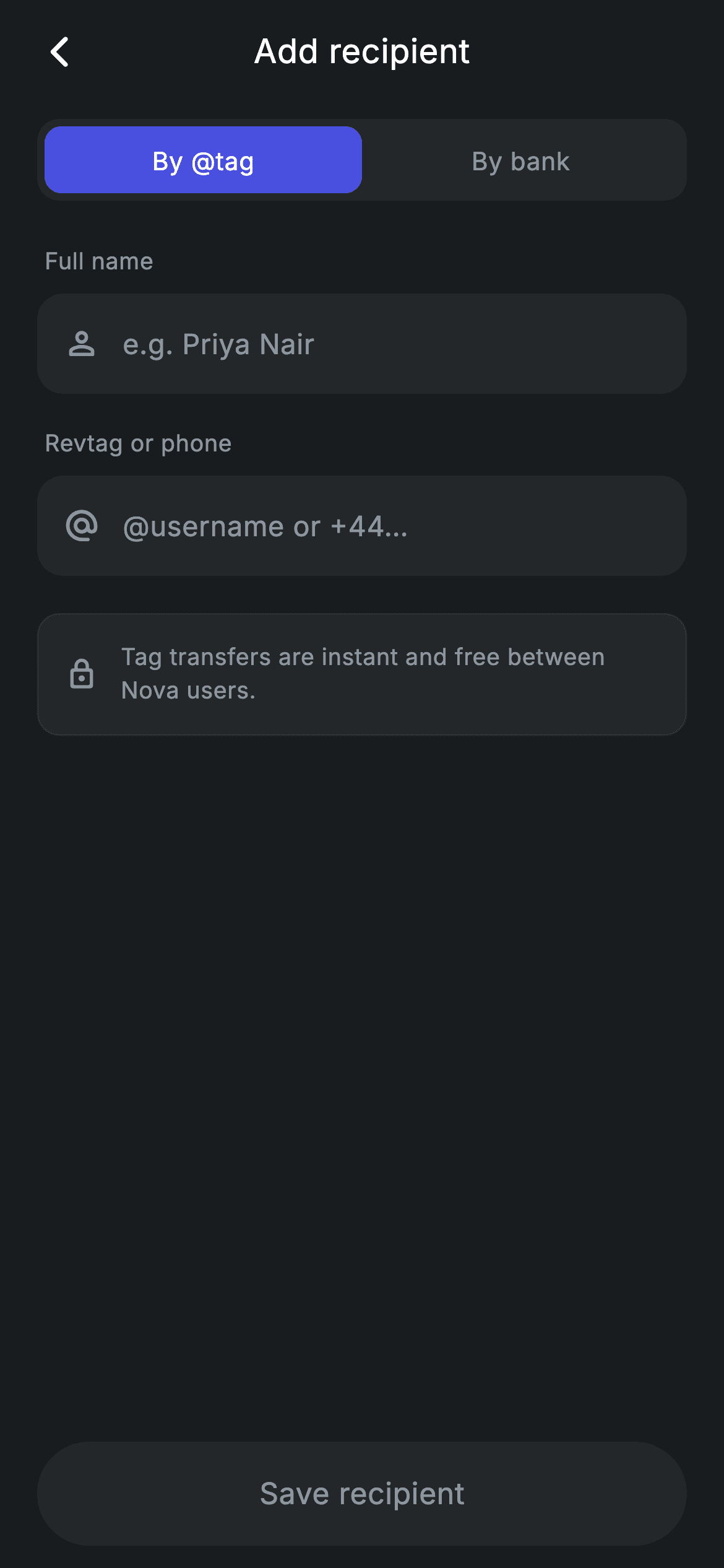
Adding a payee is where a money-transfer app either feels trustworthy or feels like a spreadsheet. This tutorial builds Nova's add-recipient form in Flutter: a two-way segmented control that flips the form between 'By @tag' and 'By bank', a `_detail` field whose label, hint and icon change with that mode, an optional read-only bank field that only exists in bank mode, a lock-icon hint that explains transfer speed, and a pill-shaped 'Save recipient' button driven by a `_valid` getter that listens to both `TextEditingController`s. Pure Flutter, forced dark theme, bundled Inter.
What you'll build
- ✓A segmented control backed by a single `int _mode` where the active tab is a `_brand` (#494FDF) block inside a `_surface` (#242729) track
- ✓A mode-aware detail field whose label, hint and icon swap between Revtag/phone and account number/IBAN without a second widget
- ✓A conditional 'Bank (optional)' read-only field inserted with a collection-if spread only when `_mode == 1`
- ✓A `_valid` getter fed by two controller listeners that turns the Save pill from `_surface` to `_brand` the moment both fields are non-empty
- ✓A reusable `_Field` widget that borrows the parent State's private colour constants for a single source of truth
Step-by-step build
Create the file
Add a new file at lib/fintech_recipient_add/fintech_recipient_add_screen.dart in your Flutter project.
Register the bundled fonts
No external packages — this is pure Flutter. It does bundle its design font (Inter), so drop the font file into fonts/ and declare it in pubspec.yaml:
flutter:
  fonts:
    - family: Inter
      fonts:
- asset: fonts/Inter-Regular.ttfBuild it, piece by piece
Here's how the screen goes together. Each block below is a real slice of the code with a plain-English explanation — paste them in order, or grab the whole file from the next section.
Two controllers, one listener, and a derived validity flag
import 'package:flutter/material.dart';

/// Add recipient — new beneficiary form (Revolut-inspired design system).
///
/// Self-contained per CONVENTIONS.md: pure Flutter only, the exact design font
/// (Inter) is bundled under `fonts/`, no network calls, and the screen forces
/// its own dark theme. A segmented control switches between adding by @tag and
/// by bank account; the Save CTA enables once the required fields are filled.
class FintechRecipientAddScreen extends StatefulWidget {
  const FintechRecipientAddScreen({super.key, this.onBack, this.onSave});

  final VoidCallback? onBack;
  final VoidCallback? onSave;

  @override
  State<FintechRecipientAddScreen> createState() =>
      _FintechRecipientAddScreenState();
}

class _FintechRecipientAddScreenState extends State<FintechRecipientAddScreen> {
  static const String _font = 'Inter';
  static const Color _bg = Color(0xFF191C1F);
  static const Color _surface = Color(0xFF242729);
  static const Color _brand = Color(0xFF494FDF);
  static const Color _muted = Color(0xFF8D969E);
  static const Color _hairline = Color(0xFF2E3235);

  int _mode = 0; // 0 = by tag, 1 = by bank
  final TextEditingController _name = TextEditingController();
  final TextEditingController _detail = TextEditingController();

  @override
  void initState() {
    super.initState();
    _name.addListener(_refresh);
    _detail.addListener(_refresh);
  }

  void _refresh() => setState(() {});

  @override
  void dispose() {
    _name.dispose();
    _detail.dispose();
    super.dispose();
  }

  bool get _valid => _name.text.trim().isNotEmpty && _detail.text.trim().isNotEmpty;
`FintechRecipientAddScreen` takes two optional callbacks, `onBack` and `onSave`, and owns all state itself. The State declares the palette as `static const` colours — `_bg` #191C1F, `_surface` #242729, `_brand` #494FDF, `_muted` #8D969E and a `_hairline` #2E3235 — as statics rather than instance fields so the separate `_Field` class lower in the file can reach them. The interesting piece is validation: instead of wrapping everything in a `Form` with validators, the two `TextEditingController`s each get `addListener(_refresh)` in `initState`, and `_refresh` is simply `setState(() {})`. Every keystroke rebuilds, and the `_valid` getter recomputes `_name.text.trim().isNotEmpty && _detail.text.trim().isNotEmpty` on demand. There is no stored boolean to fall out of sync. `_mode` is a plain `int` (0 = tag, 1 = bank), and both controllers are disposed before `super.dispose()`.
The build tree and the mode-driven field list
  @override
  Widget build(BuildContext context) {
    return Theme(
      data: ThemeData.dark(useMaterial3: true),
      child: Scaffold(
        backgroundColor: _bg,
        body: SafeArea(
          child: Column(
            children: <Widget>[
              _buildAppBar(),
              Expanded(
                child: ListView(
                  physics: const BouncingScrollPhysics(),
                  padding: const EdgeInsets.fromLTRB(20, 8, 20, 24),
                  children: <Widget>[
                    _buildSegmented(),
                    const SizedBox(height: 24),
                    _fieldLabel('Full name'),
                    _Field(
                      controller: _name,
                      hint: 'e.g. Priya Nair',
                      icon: Icons.person_outline_rounded,
                    ),
                    const SizedBox(height: 18),
                    _fieldLabel(_mode == 0 ? 'Revtag or phone' : 'Account number / IBAN'),
                    _Field(
                      controller: _detail,
                      hint: _mode == 0 ? '@username or +44…' : 'GB00 NOVA 0000 0000',
                      icon: _mode == 0
                          ? Icons.alternate_email_rounded
                          : Icons.account_balance_rounded,
                    ),
                    if (_mode == 1) ...<Widget>[
                      const SizedBox(height: 18),
                      _fieldLabel('Bank (optional)'),
                      _Field(
                        controller: TextEditingController(text: 'HSBC UK'),
                        hint: 'Bank name',
                        icon: Icons.business_rounded,
                        readOnly: true,
                      ),
                    ],
                    const SizedBox(height: 20),
                    _buildHint(),
                  ],
                ),
              ),
              _buildSave(),
            ],
          ),
        ),
      ),
    );
  }
The screen wraps itself in `Theme(data: ThemeData.dark(useMaterial3: true))` so the `TextField` cursor, selection handles and ripple pick up dark defaults no matter what the host app uses. The body is a `Column` with the app bar on top, an `Expanded` `ListView` in the middle and `_buildSave()` pinned below — so the Save pill never scrolls away and the keyboard pushes the list rather than the button. Inside the list, `_mode` decides three things for the second field in one place: the label ('Revtag or phone' vs 'Account number / IBAN'), the hint ('@username or +44…' vs 'GB00 NOVA 0000 0000') and the icon (`alternate_email_rounded` vs `account_balance_rounded`). The same `_detail` controller is reused for both modes, so switching tabs keeps whatever the user typed. The bank-name field is added with `if (_mode == 1) ...[...]`, a collection-if spread, and is `readOnly: true` with a throwaway controller preloaded with 'HSBC UK' — it is a display placeholder, not a captured value.
Centred title bar and the segmented track
  Widget _buildAppBar() {
    return Padding(
      padding: const EdgeInsets.fromLTRB(8, 4, 8, 4),
      child: Row(
        children: <Widget>[
          IconButton(
            onPressed: widget.onBack,
            icon: const Icon(Icons.arrow_back_ios_new_rounded,
                size: 20, color: Colors.white),
          ),
          const Expanded(
            child: Text(
              'Add recipient',
              textAlign: TextAlign.center,
              style: TextStyle(
                fontFamily: _font,
                fontSize: 18,
                fontWeight: FontWeight.w500,
                letterSpacing: 0.24,
                color: Colors.white,
              ),
            ),
          ),
          const SizedBox(width: 48),
        ],
      ),
    );
  }

  Widget _buildSegmented() {
    return Container(
      height: 44,
      padding: const EdgeInsets.all(4),
      decoration: BoxDecoration(
        color: _surface,
        borderRadius: BorderRadius.circular(12),
      ),
      child: Row(
        children: <Widget>[
          _segment('By @tag', 0),
          _segment('By bank', 1),
        ],
      ),
    );
  }
`_buildAppBar` is a hand-rolled `Row` rather than an `AppBar`: a back `IconButton` wired to `widget.onBack`, an `Expanded` centred 'Add recipient' title at 18px `w500` with `letterSpacing: 0.24`, and then a `const SizedBox(width: 48)`. That 48px is the exact footprint of a default `IconButton`, so the title is optically centred instead of drifting right by half a button. `_buildSegmented` is a 44px-tall `Container` with `_surface` fill, 12px corners and 4px inner padding holding two `_segment` calls in a `Row`. The 4px padding plus the 9px inner radius on each segment (12 − 4 ≈ 9, rounded concentric corners) is what makes the active tab look like a sliding chip inside a track rather than a coloured rectangle jammed against the edge.
Segments and field labels
  Widget _segment(String label, int index) {
    final bool active = _mode == index;
    return Expanded(
      child: GestureDetector(
        onTap: () => setState(() => _mode = index),
        behavior: HitTestBehavior.opaque,
        child: Container(
          alignment: Alignment.center,
          decoration: BoxDecoration(
            color: active ? _brand : Colors.transparent,
            borderRadius: BorderRadius.circular(9),
          ),
          child: Text(
            label,
            style: TextStyle(
              fontFamily: _font,
              fontSize: 13.5,
              fontWeight: FontWeight.w500,
              letterSpacing: 0.24,
              color: active ? Colors.white : _muted,
            ),
          ),
        ),
      ),
    );
  }

  Widget _fieldLabel(String text) {
    return Padding(
      padding: const EdgeInsets.only(left: 4, bottom: 8),
      child: Text(
        text,
        style: const TextStyle(
          fontFamily: _font,
          fontSize: 12.5,
          fontWeight: FontWeight.w500,
          letterSpacing: 0.24,
          color: _muted,
        ),
      ),
    );
  }
Each `_segment` is an `Expanded` `GestureDetector` with `behavior: HitTestBehavior.opaque`, which matters because the inactive segment has a `Colors.transparent` background — without `opaque`, taps on the empty area around the label would fall through and the tab would only respond on the text itself. Tapping sets `_mode = index` inside `setState`, which cascades into the label, hint, icon, optional bank field and the hint card on the next build. The active state is expressed purely through colour: `_brand` fill with white text versus transparent with `_muted` text, both at 13.5px `w500`. `_fieldLabel` is a small helper rendering 12.5px `_muted` text with `EdgeInsets.only(left: 4, bottom: 8)` — the 4px left nudge lines the label up with the text inside the 14px-radius field below it rather than its outer edge.
The contextual hint card
  Widget _buildHint() {
    return Container(
      padding: const EdgeInsets.all(14),
      decoration: BoxDecoration(
        color: _surface,
        borderRadius: BorderRadius.circular(12),
        border: Border.all(color: _hairline),
      ),
      child: Row(
        children: <Widget>[
          const Icon(Icons.lock_outline_rounded, size: 18, color: _muted),
          const SizedBox(width: 12),
          Expanded(
            child: Text(
              _mode == 0
                  ? 'Tag transfers are instant and free between Nova users.'
                  : 'Bank transfers usually arrive within 1 business day.',
              style: const TextStyle(
                fontFamily: _font,
                fontSize: 12.5,
                height: 1.4,
                letterSpacing: 0.24,
                color: _muted,
              ),
            ),
          ),
        ],
      ),
    );
  }
`_buildHint` is the one piece of copy on the form and it changes with the mode: 'Tag transfers are instant and free between Nova users.' when `_mode == 0`, 'Bank transfers usually arrive within 1 business day.' otherwise. Setting expectations about speed at the moment the user picks a method is what stops the 'where is my money?' support ticket later. Visually it is a `_surface` container with 12px corners and a one-pixel `Border.all(color: _hairline)` — the only bordered element on the screen, which is enough to separate it from the input fields that share the same fill. A `lock_outline_rounded` icon at 18px `_muted` leads, followed by an `Expanded` `Text` at 12.5px with `height: 1.4` so the sentence wraps comfortably on narrow phones instead of overflowing the row.
A Save pill that reflects validity in colour and tap handling
  Widget _buildSave() {
    return Padding(
      padding: const EdgeInsets.fromLTRB(20, 8, 20, 12),
      child: SizedBox(
        width: double.infinity,
        height: 56,
        child: Material(
          color: _valid ? _brand : _surface,
          borderRadius: BorderRadius.circular(9999),
          child: InkWell(
            borderRadius: BorderRadius.circular(9999),
            onTap: _valid ? widget.onSave : null,
            child: Center(
              child: Text(
                'Save recipient',
                style: TextStyle(
                  fontFamily: _font,
                  fontSize: 16,
                  fontWeight: FontWeight.w500,
                  letterSpacing: 0.24,
                  color: _valid ? Colors.white : _muted,
                ),
              ),
            ),
          ),
        ),
      ),
    );
  }
}
`_buildSave` renders a full-width 56px `Material` with `BorderRadius.circular(9999)` — a true pill — and an `InkWell` inside sharing the same radius so the ripple is clipped to the rounded shape. `_valid` is consulted three times: the `Material` colour flips between `_brand` and `_surface`, the label colour between white and `_muted`, and the `onTap` between `widget.onSave` and `null`. Passing `null` is what actually disables the button; `InkWell` with a null handler ignores taps and shows no ripple, so a disabled-looking button is also a non-functional one. Because the controllers trigger a rebuild on every change, the pill turns brand-blue on the exact keystroke that completes the second required field, with no explicit 'enable' call anywhere. The 12px bottom padding sits inside `SafeArea`, so the pill clears the home indicator.
The reusable _Field input
class _Field extends StatelessWidget {
  const _Field({
    required this.controller,
    required this.hint,
    required this.icon,
    this.readOnly = false,
  });

  final TextEditingController controller;
  final String hint;
  final IconData icon;
  final bool readOnly;

  @override
  Widget build(BuildContext context) {
    return Container(
      height: 54,
      padding: const EdgeInsets.symmetric(horizontal: 14),
      decoration: BoxDecoration(
        color: _FintechRecipientAddScreenState._surface,
        borderRadius: BorderRadius.circular(14),
      ),
      child: Row(
        children: <Widget>[
          Icon(icon, size: 20, color: _FintechRecipientAddScreenState._muted),
          const SizedBox(width: 12),
          Expanded(
            child: TextField(
              controller: controller,
              readOnly: readOnly,
              cursorColor: _FintechRecipientAddScreenState._brand,
              style: const TextStyle(
                fontFamily: _FintechRecipientAddScreenState._font,
                fontSize: 15,
                letterSpacing: 0.24,
                color: Colors.white,
              ),
              decoration: InputDecoration(
                isDense: true,
                border: InputBorder.none,
                hintText: hint,
                hintStyle: const TextStyle(
                  fontFamily: _FintechRecipientAddScreenState._font,
                  fontSize: 15,
                  letterSpacing: 0.24,
                  color: _FintechRecipientAddScreenState._muted,
                ),
              ),
            ),
          ),
        ],
      ),
    );
  }
}
`_Field` is a `StatelessWidget` taking a `controller`, `hint`, `icon` and an optional `readOnly` flag. It draws a 54px-tall `_surface` container with 14px corners and 14px horizontal padding, then a `Row` of a 20px `_muted` leading icon, a 12px gap and an `Expanded` `TextField`. The `TextField` strips Material's chrome with `border: InputBorder.none` and `isDense: true`, so the container — not the input — supplies the visible shape, and the text sits vertically centred. Text is 15px white Inter with `letterSpacing: 0.24`, the hint the same size in `_muted`, and `cursorColor` is `_brand` so the caret matches the segmented control. Note the colours are referenced as `_FintechRecipientAddScreenState._surface` and friends — private static members are visible across classes inside one Dart library, which is why the palette was declared `static const` instead of as instance fields.
Full code
The complete, ready-to-paste source. Free to use in your projects — one click copies it all.
import 'package:flutter/material.dart';

/// Add recipient — new beneficiary form (Revolut-inspired design system).
///
/// Self-contained per CONVENTIONS.md: pure Flutter only, the exact design font
/// (Inter) is bundled under `fonts/`, no network calls, and the screen forces
/// its own dark theme. A segmented control switches between adding by @tag and
/// by bank account; the Save CTA enables once the required fields are filled.
class FintechRecipientAddScreen extends StatefulWidget {
  const FintechRecipientAddScreen({super.key, this.onBack, this.onSave});

  final VoidCallback? onBack;
  final VoidCallback? onSave;

  @override
  State<FintechRecipientAddScreen> createState() =>
      _FintechRecipientAddScreenState();
}

class _FintechRecipientAddScreenState extends State<FintechRecipientAddScreen> {
  static const String _font = 'Inter';
  static const Color _bg = Color(0xFF191C1F);
  static const Color _surface = Color(0xFF242729);
  static const Color _brand = Color(0xFF494FDF);
  static const Color _muted = Color(0xFF8D969E);
  static const Color _hairline = Color(0xFF2E3235);

  int _mode = 0; // 0 = by tag, 1 = by bank
  final TextEditingController _name = TextEditingController();
  final TextEditingController _detail = TextEditingController();

  @override
  void initState() {
    super.initState();
    _name.addListener(_refresh);
    _detail.addListener(_refresh);
  }

  void _refresh() => setState(() {});

  @override
  void dispose() {
    _name.dispose();
    _detail.dispose();
    super.dispose();
  }

  bool get _valid => _name.text.trim().isNotEmpty && _detail.text.trim().isNotEmpty;

  @override
  Widget build(BuildContext context) {
    return Theme(
      data: ThemeData.dark(useMaterial3: true),
      child: Scaffold(
        backgroundColor: _bg,
        body: SafeArea(
          child: Column(
            children: <Widget>[
              _buildAppBar(),
              Expanded(
                child: ListView(
                  physics: const BouncingScrollPhysics(),
                  padding: const EdgeInsets.fromLTRB(20, 8, 20, 24),
                  children: <Widget>[
                    _buildSegmented(),
                    const SizedBox(height: 24),
                    _fieldLabel('Full name'),
                    _Field(
                      controller: _name,
                      hint: 'e.g. Priya Nair',
                      icon: Icons.person_outline_rounded,
                    ),
                    const SizedBox(height: 18),
                    _fieldLabel(_mode == 0 ? 'Revtag or phone' : 'Account number / IBAN'),
                    _Field(
                      controller: _detail,
                      hint: _mode == 0 ? '@username or +44…' : 'GB00 NOVA 0000 0000',
                      icon: _mode == 0
                          ? Icons.alternate_email_rounded
                          : Icons.account_balance_rounded,
                    ),
                    if (_mode == 1) ...<Widget>[
                      const SizedBox(height: 18),
                      _fieldLabel('Bank (optional)'),
                      _Field(
                        controller: TextEditingController(text: 'HSBC UK'),
                        hint: 'Bank name',
                        icon: Icons.business_rounded,
                        readOnly: true,
                      ),
                    ],
                    const SizedBox(height: 20),
                    _buildHint(),
                  ],
                ),
              ),
              _buildSave(),
            ],
          ),
        ),
      ),
    );
  }

  Widget _buildAppBar() {
    return Padding(
      padding: const EdgeInsets.fromLTRB(8, 4, 8, 4),
      child: Row(
        children: <Widget>[
          IconButton(
            onPressed: widget.onBack,
            icon: const Icon(Icons.arrow_back_ios_new_rounded,
                size: 20, color: Colors.white),
          ),
          const Expanded(
            child: Text(
              'Add recipient',
              textAlign: TextAlign.center,
              style: TextStyle(
                fontFamily: _font,
                fontSize: 18,
                fontWeight: FontWeight.w500,
                letterSpacing: 0.24,
                color: Colors.white,
              ),
            ),
          ),
          const SizedBox(width: 48),
        ],
      ),
    );
  }

  Widget _buildSegmented() {
    return Container(
      height: 44,
      padding: const EdgeInsets.all(4),
      decoration: BoxDecoration(
        color: _surface,
        borderRadius: BorderRadius.circular(12),
      ),
      child: Row(
        children: <Widget>[
          _segment('By @tag', 0),
          _segment('By bank', 1),
        ],
      ),
    );
  }

  Widget _segment(String label, int index) {
    final bool active = _mode == index;
    return Expanded(
      child: GestureDetector(
        onTap: () => setState(() => _mode = index),
        behavior: HitTestBehavior.opaque,
        child: Container(
          alignment: Alignment.center,
          decoration: BoxDecoration(
            color: active ? _brand : Colors.transparent,
            borderRadius: BorderRadius.circular(9),
          ),
          child: Text(
            label,
            style: TextStyle(
              fontFamily: _font,
              fontSize: 13.5,
              fontWeight: FontWeight.w500,
              letterSpacing: 0.24,
              color: active ? Colors.white : _muted,
            ),
          ),
        ),
      ),
    );
  }

  Widget _fieldLabel(String text) {
    return Padding(
      padding: const EdgeInsets.only(left: 4, bottom: 8),
      child: Text(
        text,
        style: const TextStyle(
          fontFamily: _font,
          fontSize: 12.5,
          fontWeight: FontWeight.w500,
          letterSpacing: 0.24,
          color: _muted,
        ),
      ),
    );
  }

  Widget _buildHint() {
    return Container(
      padding: const EdgeInsets.all(14),
      decoration: BoxDecoration(
        color: _surface,
        borderRadius: BorderRadius.circular(12),
        border: Border.all(color: _hairline),
      ),
      child: Row(
        children: <Widget>[
          const Icon(Icons.lock_outline_rounded, size: 18, color: _muted),
          const SizedBox(width: 12),
          Expanded(
            child: Text(
              _mode == 0
                  ? 'Tag transfers are instant and free between Nova users.'
                  : 'Bank transfers usually arrive within 1 business day.',
              style: const TextStyle(
                fontFamily: _font,
                fontSize: 12.5,
                height: 1.4,
                letterSpacing: 0.24,
                color: _muted,
              ),
            ),
          ),
        ],
      ),
    );
  }

  Widget _buildSave() {
    return Padding(
      padding: const EdgeInsets.fromLTRB(20, 8, 20, 12),
      child: SizedBox(
        width: double.infinity,
        height: 56,
        child: Material(
          color: _valid ? _brand : _surface,
          borderRadius: BorderRadius.circular(9999),
          child: InkWell(
            borderRadius: BorderRadius.circular(9999),
            onTap: _valid ? widget.onSave : null,
            child: Center(
              child: Text(
                'Save recipient',
                style: TextStyle(
                  fontFamily: _font,
                  fontSize: 16,
                  fontWeight: FontWeight.w500,
                  letterSpacing: 0.24,
                  color: _valid ? Colors.white : _muted,
                ),
              ),
            ),
          ),
        ),
      ),
    );
  }
}

class _Field extends StatelessWidget {
  const _Field({
    required this.controller,
    required this.hint,
    required this.icon,
    this.readOnly = false,
  });

  final TextEditingController controller;
  final String hint;
  final IconData icon;
  final bool readOnly;

  @override
  Widget build(BuildContext context) {
    return Container(
      height: 54,
      padding: const EdgeInsets.symmetric(horizontal: 14),
      decoration: BoxDecoration(
        color: _FintechRecipientAddScreenState._surface,
        borderRadius: BorderRadius.circular(14),
      ),
      child: Row(
        children: <Widget>[
          Icon(icon, size: 20, color: _FintechRecipientAddScreenState._muted),
          const SizedBox(width: 12),
          Expanded(
            child: TextField(
              controller: controller,
              readOnly: readOnly,
              cursorColor: _FintechRecipientAddScreenState._brand,
              style: const TextStyle(
                fontFamily: _FintechRecipientAddScreenState._font,
                fontSize: 15,
                letterSpacing: 0.24,
                color: Colors.white,
              ),
              decoration: InputDecoration(
                isDense: true,
                border: InputBorder.none,
                hintText: hint,
                hintStyle: const TextStyle(
                  fontFamily: _FintechRecipientAddScreenState._font,
                  fontSize: 15,
                  letterSpacing: 0.24,
                  color: _FintechRecipientAddScreenState._muted,
                ),
              ),
            ),
          ),
        ],
      ),
    );
  }
}
Plus bundled 1 binary asset (fonts/images). The CLI and MCP install those for you automatically.
Two faster ways to add it
Copy-paste works, but you can skip it entirely.
1. FlutterKit CLI
One command drops this screen — and its fonts — straight into your project.
$ flutterkit add fintech-recipient-add2. AI agent (MCP)
Connect FlutterKit's MCP server in Claude or Cursor and just ask your agent to install fintech-recipient-add — it fetches and writes the files for you.
FAQ
Is the Fintech Add Recipient screen free to use in my own app?
Yes. FlutterKit screens are free for both personal and commercial projects under an MIT-style licence. There is no licence key to enter — run `flutterkit add fintech-recipient-add`, drop the file into your project, and ship it.
Which packages and fonts does this screen depend on?
None from pub.dev — the only import is `package:flutter/material.dart`. The design font is Inter, and `flutterkit add fintech-recipient-add` bundles the font files under `fonts/` and adds the `pubspec.yaml` entry, so the screen renders identically to the preview without a network fetch.
What Flutter version do I need?
The constructor uses the `super.key` super-parameter syntax, so target Flutter 3.22 or newer. There are no `withValues(` calls in this file, so there is nothing else to adjust on older channels; if you must build against an older SDK, expand `super.key` to `Key? key` plus `: super(key: key)`.
Why does the Save button enable without a Form or validators?
Both `TextEditingController`s register `_refresh` as a listener in `initState`, and `_refresh` just calls `setState`. On every rebuild the `_valid` getter checks that both trimmed texts are non-empty, and `_buildSave` reads it to pick the fill colour and to pass either `widget.onSave` or `null` to `InkWell.onTap`. To add real checks — an IBAN checksum or a leading `@` in tag mode — extend `_valid` with a `_mode`-aware condition; nothing else needs to change.
How do I read the bank name the user picked, and why is it read-only?
In this file the 'Bank (optional)' field is a display placeholder: it is created with a fresh `TextEditingController(text: 'HSBC UK')` on every build and `readOnly: true`, so nothing is captured. To make it real, promote that controller to a State field alongside `_name` and `_detail`, drop `readOnly`, and dispose it — or replace `_Field` there with a bank picker that sets the text when the user chooses from a list.


