How to Build a Two-Factor Authentication Code Screen in Flutter (Full Code + Preview)
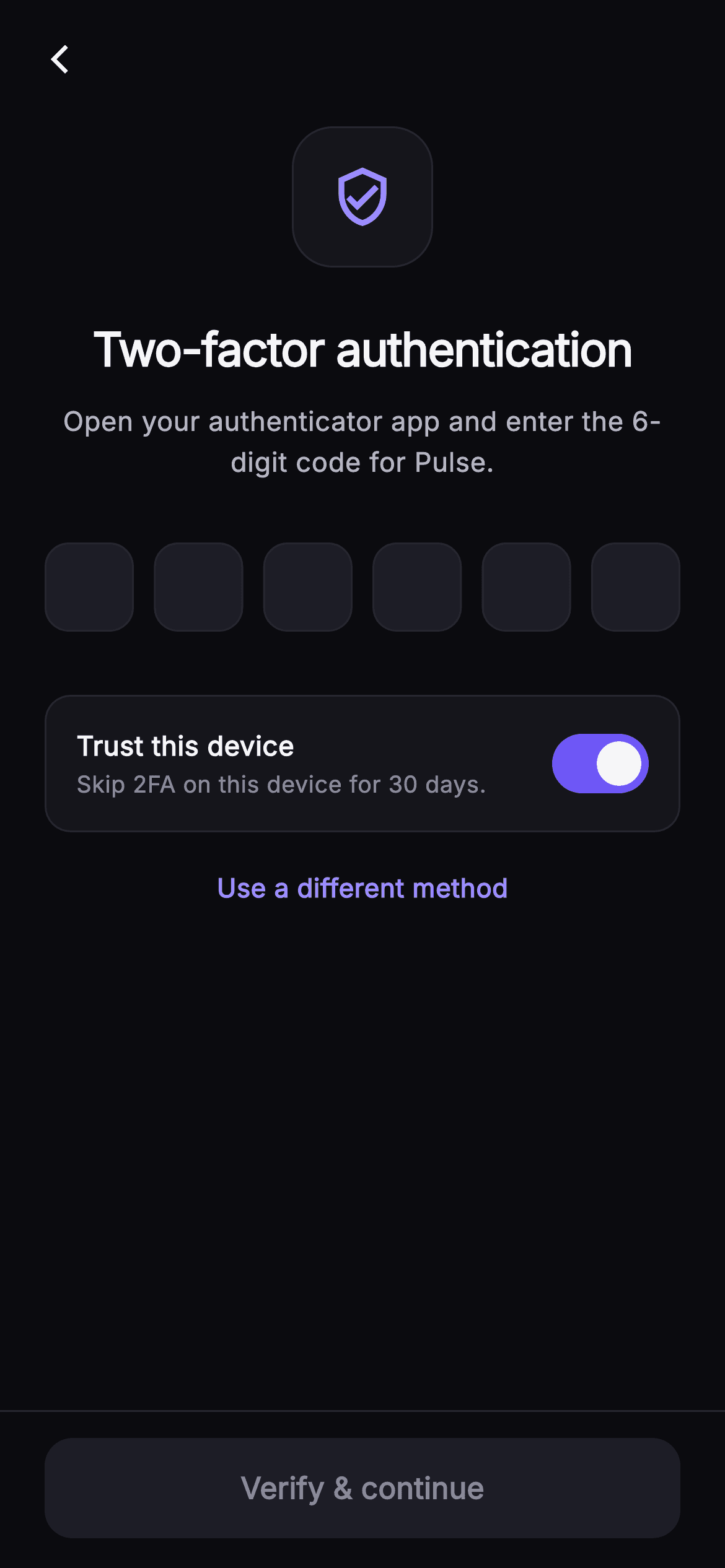
A two-factor prompt sits between a user and the app they already signed in to, so every extra tap costs goodwill. This tutorial builds Pulse's dark two-factor screen in Flutter: a `_ShieldBadge` with a soft indigo glow, six `_CodeBox` fields that auto-advance on typing, step back on delete, and accept a full paste in one go, a `_TrustToggle` card that skips 2FA on this device for 30 days, and a 'Verify & continue' button that stays disabled until the `_complete` getter reports all six digits are present.
Watch the Flutter UI walkthrough
A short screen recording of Pulse · Two-Factor running, if you'd rather see it before you read the code. The written tutorial below covers everything in it.
Can't see the video? Watch it on YouTube.
What you'll build
- ✓A `_ShieldBadge` container whose `BoxShadow` uses a negative `spreadRadius` so the indigo glow hugs the icon instead of flooding the header
- ✓Six `_CodeBox` `TextField`s driven by parallel `_controllers` and `_nodes` lists, with a filled-state border that flips from hairline to `_brand`
- ✓An `_onChanged` handler that splits a pasted code across all six boxes with a digits-only `RegExp` and unfocuses the keyboard
- ✓A `_TrustToggle` card wrapping a Material `Switch` bound to the `_trust` bool
- ✓A pinned bottom bar whose `FilledButton` enables only when `_complete` is true, with explicit disabled colours
Step-by-step build
Create the file
Add a new file at lib/social_auth_2fa/social_auth_2fa_screen.dart in your Flutter project.
Register the bundled fonts
No external packages — this is pure Flutter. It does bundle its design font (Inter), so drop the font file into fonts/ and declare it in pubspec.yaml:
flutter:
  fonts:
    - family: Inter
      fonts:
- asset: fonts/Inter-Regular.ttfBuild it, piece by piece
Here's how the screen goes together. Each block below is a real slice of the code with a plain-English explanation — paste them in order, or grab the whole file from the next section.
Three callbacks and a self-contained dark palette
import 'package:flutter/material.dart';

/// Two-Factor — enter the 6-digit code from an authenticator app to finish
/// signing in. Includes a painted shield badge, a 6-box code entry that
/// auto-advances, a "trust this device for 30 days" toggle, and a switch-method
/// link (use a text message / recovery code instead). Self-contained per
/// CONVENTIONS.md: pure Flutter, bundled Inter font, own dark theme, SafeArea.
class SocialAuth2faScreen extends StatefulWidget {
  const SocialAuth2faScreen({
    super.key,
    this.onBack,
    this.onVerified,
    this.onSwitchMethod,
  });

  final VoidCallback? onBack;
  final VoidCallback? onVerified;
  final VoidCallback? onSwitchMethod;

  static const String _font = 'Inter';
  static const Color _bg = Color(0xFF0B0B0F);
  static const Color _surface = Color(0xFF15151B);
  static const Color _surfaceAlt = Color(0xFF1D1D26);
  static const Color _brand = Color(0xFF6E56F7);
  static const Color _accent = Color(0xFF9B8CFF);
  static const Color _hairline = Color(0xFF26262F);
  static const Color _textHi = Color(0xFFF4F4F7);
  static const Color _textLo = Color(0xFFB5B5C2);
  static const Color _muted = Color(0xFF8A8A99);

  @override
  State<SocialAuth2faScreen> createState() => _SocialAuth2faScreenState();
}
`SocialAuth2faScreen` is a `StatefulWidget` because it owns six text controllers and a toggle, but it still knows nothing about your auth backend: `onBack`, `onVerified` and `onSwitchMethod` are nullable `VoidCallback`s you inject. The palette is declared as `static const` colours on the widget class so the private helper widgets further down can reach them as `SocialAuth2faScreen._brand` without a theme lookup. Note the split between `_brand` (#6E56F7, the indigo used for fills and the filled-box border) and `_accent` (#9B8CFF, a lighter tint reserved for the badge icon, the cursor, the focused border and the switch-method link). Keeping fills and highlights on two shades is what stops the screen from looking like a single flat purple. `_bg` is a near-black #0B0B0F, with `_surface` and `_surfaceAlt` stepping up to #15151B and #1D1D26 for cards and inputs.
Parallel controllers and focus nodes
class _SocialAuth2faScreenState extends State<SocialAuth2faScreen> {
  static const int _len = 6;
  final List<TextEditingController> _controllers =
      List<TextEditingController>.generate(_len, (_) => TextEditingController());
  final List<FocusNode> _nodes =
      List<FocusNode>.generate(_len, (_) => FocusNode());
  bool _trust = true;

  @override
  void dispose() {
    for (final TextEditingController c in _controllers) {
      c.dispose();
    }
    for (final FocusNode n in _nodes) {
      n.dispose();
    }
    super.dispose();
  }

  bool get _complete =>
      _controllers.every((TextEditingController c) => c.text.isNotEmpty);
The state class fixes the code length as `_len = 6` and builds two parallel lists with `List.generate`: one `TextEditingController` and one `FocusNode` per box. Two lists rather than one list of records keeps the index maths trivial — box `i` always reads `_controllers[i]` and `_nodes[i]`. `_trust` defaults to `true`, a deliberate product choice: most users on their own phone want to skip 2FA next time, so the switch starts on and the cautious user turns it off. `dispose` loops both lists because each controller and node holds native resources; forgetting the nodes is a common leak in OTP widgets. The `_complete` getter uses `every` over the controllers so the button and the auto-submit path share one source of truth instead of counting characters in two places.
Auto-advance, backspace and paste in one handler
  void _onChanged(int i, String v) {
    if (v.length > 1) {
      final String digits = v.replaceAll(RegExp(r'[^0-9]'), '');
      for (int k = 0; k < _len; k++) {
        _controllers[k].text = k < digits.length ? digits[k] : '';
      }
      FocusScope.of(context).unfocus();
      setState(() {});
      if (_complete) widget.onVerified?.call();
      return;
    }
    if (v.isNotEmpty && i < _len - 1) {
      _nodes[i + 1].requestFocus();
    } else if (v.isEmpty && i > 0) {
      _nodes[i - 1].requestFocus();
    }
    setState(() {});
    if (_complete) widget.onVerified?.call();
  }
`_onChanged(i, v)` handles three cases. If `v.length > 1` the user pasted a code into a single box: the handler strips non-digits with `RegExp(r'[^0-9]')`, distributes `digits[k]` across all six controllers (blanking any box beyond the pasted length), dismisses the keyboard with `FocusScope.of(context).unfocus()`, and fires `onVerified` immediately if `_complete`. Returning early avoids the focus-shuffle below. Otherwise a single typed digit moves focus forward with `_nodes[i + 1].requestFocus()`, and an empty value — the user pressed backspace — moves focus back to `_nodes[i - 1]`. Both branches guard the ends of the row so the first and last boxes never index out of range. Every path ends with `setState(() {})` because `_CodeBox` reads `controller.text` to pick its border colour, and the parent must rebuild for that to update.
Forced dark theme, back arrow and the scrolling body
  @override
  Widget build(BuildContext context) {
    return Theme(
      data: ThemeData.dark(useMaterial3: true),
      child: Scaffold(
        backgroundColor: SocialAuth2faScreen._bg,
        body: SafeArea(
          child: Column(
            children: <Widget>[
              Padding(
                padding: const EdgeInsets.fromLTRB(8, 8, 8, 0),
                child: Align(
                  alignment: Alignment.centerLeft,
                  child: IconButton(
                    onPressed: widget.onBack,
                    icon: const Icon(Icons.arrow_back_ios_new,
                        size: 18, color: SocialAuth2faScreen._textHi),
                  ),
                ),
              ),
              Expanded(
                child: ListView(
                  padding: const EdgeInsets.fromLTRB(24, 12, 24, 24),
                  children: <Widget>[
                    const Center(child: _ShieldBadge()),
                    const SizedBox(height: 26),
                    const Text(
                      'Two-factor authentication',
                      textAlign: TextAlign.center,
                      style: TextStyle(
                        fontFamily: SocialAuth2faScreen._font,
                        fontSize: 25,
                        fontWeight: FontWeight.w700,
                        letterSpacing: -0.6,
                        color: SocialAuth2faScreen._textHi,
                      ),
                    ),
                    const SizedBox(height: 10),
                    const Text(
                      'Open your authenticator app and enter the 6-digit code for Pulse.',
                      textAlign: TextAlign.center,
                      style: TextStyle(
                        fontFamily: SocialAuth2faScreen._font,
                        fontSize: 14.5,
                        height: 1.5,
                        color: SocialAuth2faScreen._textLo,
                      ),
                    ),
                    const SizedBox(height: 32),
                    Row(
                      mainAxisAlignment: MainAxisAlignment.spaceBetween,
                      children: List<Widget>.generate(_len, (int i) {
                        return _CodeBox(
                          controller: _controllers[i],
                          focusNode: _nodes[i],
                          onChanged: (String v) => _onChanged(i, v),
                        );
                      }),
                    ),
                    const SizedBox(height: 24),
                    _TrustToggle(
                      value: _trust,
                      onChanged: (bool v) => setState(() => _trust = v),
                    ),
                    const SizedBox(height: 20),
                    Center(
                      child: GestureDetector(
                        onTap: widget.onSwitchMethod,
                        child: const Text(
                          'Use a different method',
                          style: TextStyle(
                            fontFamily: SocialAuth2faScreen._font,
                            fontSize: 14,
                            fontWeight: FontWeight.w600,
                            color: SocialAuth2faScreen._accent,
                          ),
                        ),
                      ),
                    ),
                  ],
                ),
              ),
The whole screen is wrapped in `Theme(data: ThemeData.dark(useMaterial3: true))` so the `TextField` and `Switch` pick up dark defaults even if the host app is light. The layout is a `Column` inside `SafeArea`: a slim back `IconButton` row with 8px padding, then an `Expanded` `ListView` so the content scrolls when the keyboard rises over six input boxes. The list centres the `_ShieldBadge`, a 25px `w700` headline with `letterSpacing: -0.6`, and a 14.5px `_textLo` subtitle at `height: 1.5` that names the authenticator app as the source. The six boxes come from `List<Widget>.generate(_len, ...)` inside a `Row` with `MainAxisAlignment.spaceBetween`, so the 48px boxes spread evenly across whatever width remains after the 24px padding. Below sit the `_TrustToggle` bound to `_trust` and a plain `GestureDetector` text link 'Use a different method' in `_accent`, wired to `onSwitchMethod`.
A pinned verify button with honest disabled colours
              Container(
                decoration: const BoxDecoration(
                  color: SocialAuth2faScreen._bg,
                  border: Border(
                      top: BorderSide(color: SocialAuth2faScreen._hairline)),
                ),
                padding: const EdgeInsets.fromLTRB(24, 14, 24, 16),
                child: SizedBox(
                  width: double.infinity,
                  height: 54,
                  child: FilledButton(
                    onPressed: _complete ? widget.onVerified : null,
                    style: FilledButton.styleFrom(
                      backgroundColor: SocialAuth2faScreen._brand,
                      foregroundColor: Colors.white,
                      disabledBackgroundColor: SocialAuth2faScreen._surfaceAlt,
                      disabledForegroundColor: SocialAuth2faScreen._muted,
                      shape: RoundedRectangleBorder(
                        borderRadius: BorderRadius.circular(15),
                      ),
                    ),
                    child: const Text(
                      'Verify & continue',
                      style: TextStyle(
                        fontFamily: SocialAuth2faScreen._font,
                        fontSize: 16,
                        fontWeight: FontWeight.w600,
                      ),
                    ),
                  ),
                ),
              ),
            ],
          ),
        ),
      ),
    );
  }
}
The bottom bar is a `Container` painted in `_bg` with a `Border(top: BorderSide(color: _hairline))`, placed outside the `ListView` so it stays pinned while the body scrolls. Inside, a 54px `FilledButton` is bound to `_complete ? widget.onVerified : null` — passing `null` is what Flutter uses to render the disabled state, so no separate flag is needed. The style sets all four colours explicitly: `_brand` with white text when enabled, `_surfaceAlt` with `_muted` text when disabled. Without `disabledBackgroundColor` Material 3 would apply its own grey overlay, which clashes on a near-black background. The 15px `RoundedRectangleBorder` matches the 13–14px radii used elsewhere. Because `_onChanged` already calls `onVerified` when the sixth digit lands, this button is mainly the fallback for a user who dismisses the keyboard and taps to continue.
The glowing shield badge
class _ShieldBadge extends StatelessWidget {
  const _ShieldBadge();

  @override
  Widget build(BuildContext context) {
    return Container(
      width: 76,
      height: 76,
      decoration: BoxDecoration(
        color: SocialAuth2faScreen._surface,
        borderRadius: BorderRadius.circular(22),
        border: Border.all(color: SocialAuth2faScreen._hairline),
        boxShadow: <BoxShadow>[
          BoxShadow(
            color: SocialAuth2faScreen._brand.withValues(alpha: 0.22),
            blurRadius: 30,
            spreadRadius: -6,
          ),
        ],
      ),
      child: const Icon(Icons.verified_user_outlined,
          size: 34, color: SocialAuth2faScreen._accent),
    );
  }
}
`_ShieldBadge` is a 76×76 `Container` on `_surface` with a 22px radius and a hairline border — a rounded square rather than a circle, which matches the input boxes below. The interesting part is the `BoxShadow`: `_brand.withValues(alpha: 0.22)` with `blurRadius: 30` and `spreadRadius: -6`. A negative spread shrinks the shadow's footprint before the blur is applied, so the glow reads as light leaking out from behind the badge rather than a purple halo bleeding into the headline. The glyph is Material's `Icons.verified_user_outlined` at 34px in `_accent`, so no custom painter or asset is needed for the shield.
One code box with a three-state border
class _CodeBox extends StatelessWidget {
  const _CodeBox({
    required this.controller,
    required this.focusNode,
    required this.onChanged,
  });
  final TextEditingController controller;
  final FocusNode focusNode;
  final ValueChanged<String> onChanged;

  @override
  Widget build(BuildContext context) {
    final bool filled = controller.text.isNotEmpty;
    return SizedBox(
      width: 48,
      height: 58,
      child: TextField(
        controller: controller,
        focusNode: focusNode,
        onChanged: onChanged,
        textAlign: TextAlign.center,
        keyboardType: TextInputType.number,
        cursorColor: SocialAuth2faScreen._accent,
        style: const TextStyle(
          fontFamily: SocialAuth2faScreen._font,
          fontSize: 22,
          fontWeight: FontWeight.w700,
          color: SocialAuth2faScreen._textHi,
        ),
        decoration: InputDecoration(
          counterText: '',
          filled: true,
          fillColor: SocialAuth2faScreen._surfaceAlt,
          contentPadding: EdgeInsets.zero,
          enabledBorder: OutlineInputBorder(
            borderRadius: BorderRadius.circular(13),
            borderSide: BorderSide(
              color: filled
                  ? SocialAuth2faScreen._brand
                  : SocialAuth2faScreen._hairline,
            ),
          ),
          focusedBorder: OutlineInputBorder(
            borderRadius: BorderRadius.circular(13),
            borderSide: const BorderSide(
              color: SocialAuth2faScreen._accent,
              width: 1.6,
            ),
          ),
        ),
      ),
    );
  }
}
`_CodeBox` is a 48×58 `SizedBox` around a `TextField`. It reads `filled = controller.text.isNotEmpty` at build time and uses that to choose the `enabledBorder` colour — `_brand` once a digit is present, `_hairline` while empty — which is why the parent calls `setState` after every change. The `focusedBorder` is a separate `OutlineInputBorder` in `_accent` at `width: 1.6`, so the active box is visibly thicker and lighter than filled-but-idle boxes. `counterText: ''` hides the Material character counter, `contentPadding: EdgeInsets.zero` lets the 22px `w700` digit centre vertically in the short box, and `keyboardType: TextInputType.number` brings up the numeric pad. There is deliberately no `maxLength` or input formatter: leaving the field unrestricted is what allows a multi-character paste to reach `_onChanged`, where it is split across the row.
The trust-this-device card
class _TrustToggle extends StatelessWidget {
  const _TrustToggle({required this.value, required this.onChanged});
  final bool value;
  final ValueChanged<bool> onChanged;

  @override
  Widget build(BuildContext context) {
    return Container(
      padding: const EdgeInsets.fromLTRB(16, 12, 12, 12),
      decoration: BoxDecoration(
        color: SocialAuth2faScreen._surface,
        borderRadius: BorderRadius.circular(14),
        border: Border.all(color: SocialAuth2faScreen._hairline),
      ),
      child: Row(
        children: <Widget>[
          const Expanded(
            child: Column(
              crossAxisAlignment: CrossAxisAlignment.start,
              children: <Widget>[
                Text(
                  'Trust this device',
                  style: TextStyle(
                    fontFamily: SocialAuth2faScreen._font,
                    fontSize: 14.5,
                    fontWeight: FontWeight.w600,
                    color: SocialAuth2faScreen._textHi,
                  ),
                ),
                SizedBox(height: 2),
                Text(
                  "Skip 2FA on this device for 30 days.",
                  style: TextStyle(
                    fontFamily: SocialAuth2faScreen._font,
                    fontSize: 12.5,
                    color: SocialAuth2faScreen._muted,
                  ),
                ),
              ],
            ),
          ),
          Switch(
            value: value,
            onChanged: onChanged,
            activeThumbColor: Colors.white,
            activeTrackColor: SocialAuth2faScreen._brand,
            inactiveThumbColor: SocialAuth2faScreen._muted,
            inactiveTrackColor: SocialAuth2faScreen._surfaceAlt,
          ),
        ],
      ),
    );
  }
}
`_TrustToggle` is a stateless card that takes `value` and `onChanged`, keeping the `_trust` state in the parent where a real implementation would read it when calling the backend. The container uses asymmetric padding `fromLTRB(16, 12, 12, 12)` so the text has a 16px inset while the `Switch`, which carries its own internal margin, sits 12px from the edge. An `Expanded` column holds the 14.5px `w600` title 'Trust this device' and a 12.5px `_muted` line spelling out the consequence — 'Skip 2FA on this device for 30 days' — so the user understands what they are opting into. The `Switch` sets `activeThumbColor` white on an `activeTrackColor` of `_brand`, and `inactiveThumbColor` `_muted` on `inactiveTrackColor` `_surfaceAlt`, overriding Material 3's default track outline colours which otherwise look washed out on the dark surface.
Full code
The complete, ready-to-paste source. Free to use in your projects — one click copies it all.
import 'package:flutter/material.dart';

/// Two-Factor — enter the 6-digit code from an authenticator app to finish
/// signing in. Includes a painted shield badge, a 6-box code entry that
/// auto-advances, a "trust this device for 30 days" toggle, and a switch-method
/// link (use a text message / recovery code instead). Self-contained per
/// CONVENTIONS.md: pure Flutter, bundled Inter font, own dark theme, SafeArea.
class SocialAuth2faScreen extends StatefulWidget {
  const SocialAuth2faScreen({
    super.key,
    this.onBack,
    this.onVerified,
    this.onSwitchMethod,
  });

  final VoidCallback? onBack;
  final VoidCallback? onVerified;
  final VoidCallback? onSwitchMethod;

  static const String _font = 'Inter';
  static const Color _bg = Color(0xFF0B0B0F);
  static const Color _surface = Color(0xFF15151B);
  static const Color _surfaceAlt = Color(0xFF1D1D26);
  static const Color _brand = Color(0xFF6E56F7);
  static const Color _accent = Color(0xFF9B8CFF);
  static const Color _hairline = Color(0xFF26262F);
  static const Color _textHi = Color(0xFFF4F4F7);
  static const Color _textLo = Color(0xFFB5B5C2);
  static const Color _muted = Color(0xFF8A8A99);

  @override
  State<SocialAuth2faScreen> createState() => _SocialAuth2faScreenState();
}

class _SocialAuth2faScreenState extends State<SocialAuth2faScreen> {
  static const int _len = 6;
  final List<TextEditingController> _controllers =
      List<TextEditingController>.generate(_len, (_) => TextEditingController());
  final List<FocusNode> _nodes =
      List<FocusNode>.generate(_len, (_) => FocusNode());
  bool _trust = true;

  @override
  void dispose() {
    for (final TextEditingController c in _controllers) {
      c.dispose();
    }
    for (final FocusNode n in _nodes) {
      n.dispose();
    }
    super.dispose();
  }

  bool get _complete =>
      _controllers.every((TextEditingController c) => c.text.isNotEmpty);

  void _onChanged(int i, String v) {
    if (v.length > 1) {
      final String digits = v.replaceAll(RegExp(r'[^0-9]'), '');
      for (int k = 0; k < _len; k++) {
        _controllers[k].text = k < digits.length ? digits[k] : '';
      }
      FocusScope.of(context).unfocus();
      setState(() {});
      if (_complete) widget.onVerified?.call();
      return;
    }
    if (v.isNotEmpty && i < _len - 1) {
      _nodes[i + 1].requestFocus();
    } else if (v.isEmpty && i > 0) {
      _nodes[i - 1].requestFocus();
    }
    setState(() {});
    if (_complete) widget.onVerified?.call();
  }

  @override
  Widget build(BuildContext context) {
    return Theme(
      data: ThemeData.dark(useMaterial3: true),
      child: Scaffold(
        backgroundColor: SocialAuth2faScreen._bg,
        body: SafeArea(
          child: Column(
            children: <Widget>[
              Padding(
                padding: const EdgeInsets.fromLTRB(8, 8, 8, 0),
                child: Align(
                  alignment: Alignment.centerLeft,
                  child: IconButton(
                    onPressed: widget.onBack,
                    icon: const Icon(Icons.arrow_back_ios_new,
                        size: 18, color: SocialAuth2faScreen._textHi),
                  ),
                ),
              ),
              Expanded(
                child: ListView(
                  padding: const EdgeInsets.fromLTRB(24, 12, 24, 24),
                  children: <Widget>[
                    const Center(child: _ShieldBadge()),
                    const SizedBox(height: 26),
                    const Text(
                      'Two-factor authentication',
                      textAlign: TextAlign.center,
                      style: TextStyle(
                        fontFamily: SocialAuth2faScreen._font,
                        fontSize: 25,
                        fontWeight: FontWeight.w700,
                        letterSpacing: -0.6,
                        color: SocialAuth2faScreen._textHi,
                      ),
                    ),
                    const SizedBox(height: 10),
                    const Text(
                      'Open your authenticator app and enter the 6-digit code for Pulse.',
                      textAlign: TextAlign.center,
                      style: TextStyle(
                        fontFamily: SocialAuth2faScreen._font,
                        fontSize: 14.5,
                        height: 1.5,
                        color: SocialAuth2faScreen._textLo,
                      ),
                    ),
                    const SizedBox(height: 32),
                    Row(
                      mainAxisAlignment: MainAxisAlignment.spaceBetween,
                      children: List<Widget>.generate(_len, (int i) {
                        return _CodeBox(
                          controller: _controllers[i],
                          focusNode: _nodes[i],
                          onChanged: (String v) => _onChanged(i, v),
                        );
                      }),
                    ),
                    const SizedBox(height: 24),
                    _TrustToggle(
                      value: _trust,
                      onChanged: (bool v) => setState(() => _trust = v),
                    ),
                    const SizedBox(height: 20),
                    Center(
                      child: GestureDetector(
                        onTap: widget.onSwitchMethod,
                        child: const Text(
                          'Use a different method',
                          style: TextStyle(
                            fontFamily: SocialAuth2faScreen._font,
                            fontSize: 14,
                            fontWeight: FontWeight.w600,
                            color: SocialAuth2faScreen._accent,
                          ),
                        ),
                      ),
                    ),
                  ],
                ),
              ),
              Container(
                decoration: const BoxDecoration(
                  color: SocialAuth2faScreen._bg,
                  border: Border(
                      top: BorderSide(color: SocialAuth2faScreen._hairline)),
                ),
                padding: const EdgeInsets.fromLTRB(24, 14, 24, 16),
                child: SizedBox(
                  width: double.infinity,
                  height: 54,
                  child: FilledButton(
                    onPressed: _complete ? widget.onVerified : null,
                    style: FilledButton.styleFrom(
                      backgroundColor: SocialAuth2faScreen._brand,
                      foregroundColor: Colors.white,
                      disabledBackgroundColor: SocialAuth2faScreen._surfaceAlt,
                      disabledForegroundColor: SocialAuth2faScreen._muted,
                      shape: RoundedRectangleBorder(
                        borderRadius: BorderRadius.circular(15),
                      ),
                    ),
                    child: const Text(
                      'Verify & continue',
                      style: TextStyle(
                        fontFamily: SocialAuth2faScreen._font,
                        fontSize: 16,
                        fontWeight: FontWeight.w600,
                      ),
                    ),
                  ),
                ),
              ),
            ],
          ),
        ),
      ),
    );
  }
}

class _ShieldBadge extends StatelessWidget {
  const _ShieldBadge();

  @override
  Widget build(BuildContext context) {
    return Container(
      width: 76,
      height: 76,
      decoration: BoxDecoration(
        color: SocialAuth2faScreen._surface,
        borderRadius: BorderRadius.circular(22),
        border: Border.all(color: SocialAuth2faScreen._hairline),
        boxShadow: <BoxShadow>[
          BoxShadow(
            color: SocialAuth2faScreen._brand.withValues(alpha: 0.22),
            blurRadius: 30,
            spreadRadius: -6,
          ),
        ],
      ),
      child: const Icon(Icons.verified_user_outlined,
          size: 34, color: SocialAuth2faScreen._accent),
    );
  }
}

class _CodeBox extends StatelessWidget {
  const _CodeBox({
    required this.controller,
    required this.focusNode,
    required this.onChanged,
  });
  final TextEditingController controller;
  final FocusNode focusNode;
  final ValueChanged<String> onChanged;

  @override
  Widget build(BuildContext context) {
    final bool filled = controller.text.isNotEmpty;
    return SizedBox(
      width: 48,
      height: 58,
      child: TextField(
        controller: controller,
        focusNode: focusNode,
        onChanged: onChanged,
        textAlign: TextAlign.center,
        keyboardType: TextInputType.number,
        cursorColor: SocialAuth2faScreen._accent,
        style: const TextStyle(
          fontFamily: SocialAuth2faScreen._font,
          fontSize: 22,
          fontWeight: FontWeight.w700,
          color: SocialAuth2faScreen._textHi,
        ),
        decoration: InputDecoration(
          counterText: '',
          filled: true,
          fillColor: SocialAuth2faScreen._surfaceAlt,
          contentPadding: EdgeInsets.zero,
          enabledBorder: OutlineInputBorder(
            borderRadius: BorderRadius.circular(13),
            borderSide: BorderSide(
              color: filled
                  ? SocialAuth2faScreen._brand
                  : SocialAuth2faScreen._hairline,
            ),
          ),
          focusedBorder: OutlineInputBorder(
            borderRadius: BorderRadius.circular(13),
            borderSide: const BorderSide(
              color: SocialAuth2faScreen._accent,
              width: 1.6,
            ),
          ),
        ),
      ),
    );
  }
}

class _TrustToggle extends StatelessWidget {
  const _TrustToggle({required this.value, required this.onChanged});
  final bool value;
  final ValueChanged<bool> onChanged;

  @override
  Widget build(BuildContext context) {
    return Container(
      padding: const EdgeInsets.fromLTRB(16, 12, 12, 12),
      decoration: BoxDecoration(
        color: SocialAuth2faScreen._surface,
        borderRadius: BorderRadius.circular(14),
        border: Border.all(color: SocialAuth2faScreen._hairline),
      ),
      child: Row(
        children: <Widget>[
          const Expanded(
            child: Column(
              crossAxisAlignment: CrossAxisAlignment.start,
              children: <Widget>[
                Text(
                  'Trust this device',
                  style: TextStyle(
                    fontFamily: SocialAuth2faScreen._font,
                    fontSize: 14.5,
                    fontWeight: FontWeight.w600,
                    color: SocialAuth2faScreen._textHi,
                  ),
                ),
                SizedBox(height: 2),
                Text(
                  "Skip 2FA on this device for 30 days.",
                  style: TextStyle(
                    fontFamily: SocialAuth2faScreen._font,
                    fontSize: 12.5,
                    color: SocialAuth2faScreen._muted,
                  ),
                ),
              ],
            ),
          ),
          Switch(
            value: value,
            onChanged: onChanged,
            activeThumbColor: Colors.white,
            activeTrackColor: SocialAuth2faScreen._brand,
            inactiveThumbColor: SocialAuth2faScreen._muted,
            inactiveTrackColor: SocialAuth2faScreen._surfaceAlt,
          ),
        ],
      ),
    );
  }
}
Plus bundled 1 binary asset (fonts/images). The CLI and MCP install those for you automatically.
Two faster ways to add it
Copy-paste works, but you can skip it entirely.
1. FlutterKit CLI
One command drops this screen — and its fonts — straight into your project.
$ flutterkit add social-auth-2fa2. AI agent (MCP)
Connect FlutterKit's MCP server in Claude or Cursor and just ask your agent to install social-auth-2fa — it fetches and writes the files for you.
FAQ
Can I use this two-factor screen in a commercial app for free?
Yes. FlutterKit screens are free for personal and commercial projects under an MIT-style licence — there is no key to enter and nothing to activate. Copy the code from this page or run `flutterkit add social-auth-2fa`, drop it into your auth flow, and ship it.
Does it need any pub packages or fonts?
No packages — the file imports only `package:flutter/material.dart`. It does reference the Inter font family, which `flutterkit add social-auth-2fa` bundles and registers in your `pubspec.yaml`. If you copy the code manually, either add Inter yourself or remove the `fontFamily` lines to fall back to the platform font.
Which Flutter version is required?
Flutter 3.22 or newer. The badge shadow uses `_brand.withValues(alpha: 0.22)` and the constructor uses `super.key`. On an older SDK change `withValues(alpha: 0.22)` to `withOpacity(0.22)` and expand the constructor to the `{Key? key, ...}) : super(key: key)` form.
How does pasting a code from an SMS or authenticator fill all six boxes?
The `TextField`s have no `maxLength`, so a paste lands in one box as a multi-character string. `_onChanged` detects `v.length > 1`, strips non-digits with a `RegExp`, writes one character into each of the six controllers, unfocuses the keyboard and calls `onVerified` if all boxes are filled. iOS autofill from Messages works the same way because it inserts the whole code into the focused field.
Where do I actually verify the code and send the trust flag?
In the `onVerified` callback you pass in. The screen fires it automatically when the sixth digit arrives and again from the 'Verify & continue' button. To read the digits and the `_trust` value, either lift the controllers up, or change `onVerified` to a `void Function(String code, bool trustDevice)` and join `_controllers.map((c) => c.text)` before calling it.


