How to Build a Dark Login Screen with a Biometric Shortcut in Flutter (Full Code + Preview)
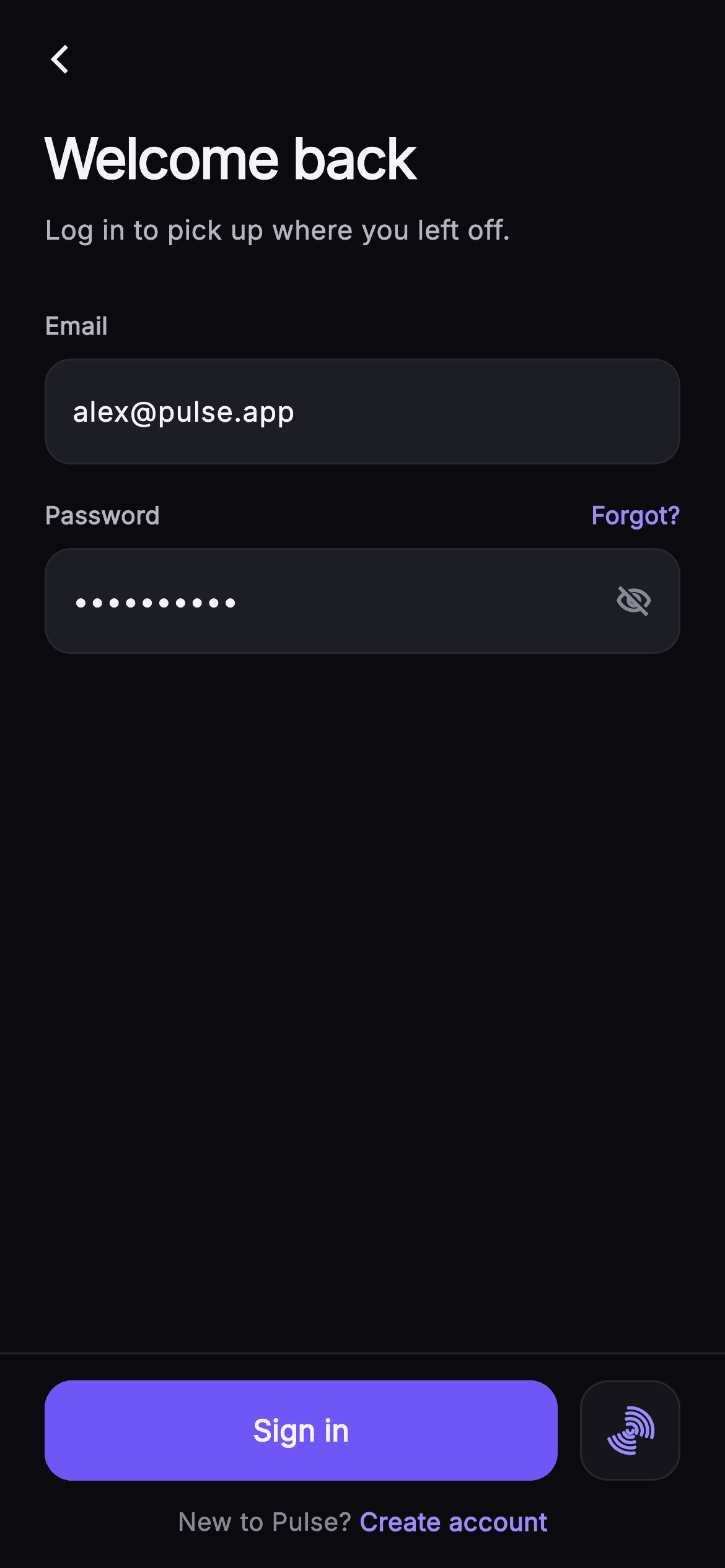
A returning user should be back inside the app in one tap, so a log-in screen has to make the fast path obvious while still handling the slow one gracefully. This tutorial builds Pulse's dark email-and-password sign-in in Flutter: two `_InputRow` fields with a live `_canSubmit` gate, an eye toggle that flips the `_obscure` state, an indigo 'Sign in' `FilledButton` pinned in a `_BottomBar`, and a square biometric button whose fingerprint is stroked on a Canvas by `_FingerprintPainter` instead of loaded from an icon pack.
Watch the Flutter UI walkthrough
A short screen recording of Pulse · Log In running, if you'd rather see it before you read the code. The written tutorial below covers everything in it.
Can't see the video? Watch it on YouTube.
What you'll build
- ✓Two `TextEditingController`s whose listeners drive a `_canSubmit` getter that enables or dims the Sign in button live
- ✓A `_LabeledField` wrapper with a null-aware `?trailingLabel` slot that carries the indigo 'Forgot?' link
- ✓An `_InputRow` container with a collapsed `TextField`, a hairline border and a trailing eye icon toggling `_obscure`
- ✓A pinned `_BottomBar` that ranks a 54px `FilledButton` beside a square `_BiometricButton` and closes with a `Text.rich` sign-up row
- ✓A `_FingerprintPainter` that draws eight offset arcs plus a centre arc to form a fingerprint glyph in pure `drawArc` calls
Step-by-step build
Create the file
Add a new file at lib/social_auth_login/social_auth_login_screen.dart in your Flutter project.
Register the bundled fonts
No external packages — this is pure Flutter. It does bundle its design font (Inter), so drop the font file into fonts/ and declare it in pubspec.yaml:
flutter:
  fonts:
    - family: Inter
      fonts:
- asset: fonts/Inter-Regular.ttfBuild it, piece by piece
Here's how the screen goes together. Each block below is a real slice of the code with a plain-English explanation — paste them in order, or grab the whole file from the next section.
Five callbacks and a Pulse palette
import 'package:flutter/material.dart';

/// Log In — return to Pulse with email + password. Includes a show/hide toggle,
/// a "Forgot?" link, a primary Sign-in CTA in a pinned bottom bar, and a painted
/// biometric (fingerprint) shortcut. Self-contained per CONVENTIONS.md: pure
/// Flutter, bundled Inter font, own dark theme, SafeArea.
class SocialAuthLoginScreen extends StatefulWidget {
  const SocialAuthLoginScreen({
    super.key,
    this.onBack,
    this.onLogin,
    this.onForgot,
    this.onBiometric,
    this.onSignup,
  });

  final VoidCallback? onBack;
  final VoidCallback? onLogin;
  final VoidCallback? onForgot;
  final VoidCallback? onBiometric;
  final VoidCallback? onSignup;

  static const String _font = 'Inter';
  static const Color _bg = Color(0xFF0B0B0F);
  static const Color _surface = Color(0xFF15151B);
  static const Color _surfaceAlt = Color(0xFF1D1D26);
  static const Color _brand = Color(0xFF6E56F7);
  static const Color _accent = Color(0xFF9B8CFF);
  static const Color _hairline = Color(0xFF26262F);
  static const Color _textHi = Color(0xFFF4F4F7);
  static const Color _textLo = Color(0xFFB5B5C2);
  static const Color _muted = Color(0xFF8A8A99);

  @override
  State<SocialAuthLoginScreen> createState() => _SocialAuthLoginScreenState();
}
`SocialAuthLoginScreen` is a `StatefulWidget` exposing five optional `VoidCallback`s — `onBack`, `onLogin`, `onForgot`, `onBiometric`, `onSignup` — so the screen never knows which auth backend sits behind it. Every colour is a `static const` on the widget class rather than a theme lookup: `_bg` #0B0B0F for the canvas, two surfaces (`_surface` #15151B and `_surfaceAlt` #1D1D26) that differ only enough to separate the biometric tile from the input fields, `_brand` #6E56F7 for the one filled button and a lighter `_accent` #9B8CFF for links, the cursor and the fingerprint strokes. Splitting brand from accent is deliberate: the accent is legible as text on the near-black background, while the brand indigo is dark enough to carry white text on a button. Three text greys (`_textHi`, `_textLo`, `_muted`) give the copy a hierarchy without changing font weight.
Controllers, listeners and the submit gate
class _SocialAuthLoginScreenState extends State<SocialAuthLoginScreen> {
  final TextEditingController _email =
      TextEditingController(text: 'alex@pulse.app');
  final TextEditingController _password =
      TextEditingController(text: 'superhuman');
  bool _obscure = true;

  @override
  void initState() {
    super.initState();
    _email.addListener(() => setState(() {}));
    _password.addListener(() => setState(() {}));
  }

  @override
  void dispose() {
    _email.dispose();
    _password.dispose();
    super.dispose();
  }

  bool get _canSubmit =>
      _email.text.trim().isNotEmpty && _password.text.isNotEmpty;
The state owns two `TextEditingController`s prefilled with 'alex@pulse.app' and 'superhuman' so the preview opens in the enabled state. In `initState` each controller gets `addListener(() => setState(() {}))` — a blank rebuild — which is the cheapest way to make the button react to typing without a `Form` or an `onChanged` on every field. `_canSubmit` is a getter, not a stored bool: it reads `_email.text.trim().isNotEmpty && _password.text.isNotEmpty` fresh on every build, so it can never fall out of sync with the controllers. Note the asymmetry: the email is trimmed because trailing spaces are a common paste artefact, but the password is not, since whitespace can legitimately be part of a password. Both controllers are disposed in `dispose` to avoid leaking listeners.
Forced dark theme and the scrolling body
  @override
  Widget build(BuildContext context) {
    return Theme(
      data: ThemeData.dark(useMaterial3: true),
      child: Scaffold(
        backgroundColor: SocialAuthLoginScreen._bg,
        body: SafeArea(
          child: Column(
            children: <Widget>[
              Padding(
                padding: const EdgeInsets.fromLTRB(8, 8, 8, 0),
                child: Row(
                  children: <Widget>[
                    IconButton(
                      onPressed: widget.onBack,
                      icon: const Icon(Icons.arrow_back_ios_new,
                          size: 18, color: SocialAuthLoginScreen._textHi),
                    ),
                  ],
                ),
              ),
              Expanded(
                child: ListView(
                  padding: const EdgeInsets.fromLTRB(24, 8, 24, 24),
                  children: <Widget>[
                    const Text(
                      'Welcome back',
                      style: TextStyle(
                        fontFamily: SocialAuthLoginScreen._font,
                        fontSize: 30,
                        fontWeight: FontWeight.w700,
                        letterSpacing: -0.8,
                        color: SocialAuthLoginScreen._textHi,
                      ),
                    ),
                    const SizedBox(height: 6),
                    const Text(
                      'Log in to pick up where you left off.',
                      style: TextStyle(
                        fontFamily: SocialAuthLoginScreen._font,
                        fontSize: 14.5,
                        color: SocialAuthLoginScreen._textLo,
                      ),
                    ),
                    const SizedBox(height: 32),
`build` wraps everything in `Theme(data: ThemeData.dark(useMaterial3: true))`, so the screen renders dark even inside a light host app — the `TextField` selection handles and `IconButton` ripple inherit dark defaults rather than clashing with the #0B0B0F background. Inside `SafeArea` the layout is a `Column` of three parts: a slim 8px-padded `Row` holding just a back chevron (`arrow_back_ios_new` at 18px, with no title, because the 30px headline a few pixels lower already names the screen), an `Expanded` `ListView` for the form, and the bottom bar. Making the form a `ListView` rather than another `Column` is what keeps it overflow-proof when the keyboard takes half the screen. The 'Welcome back' headline is `w700` with `letterSpacing: -0.8`, the tight tracking that reads as a display size, followed by a 14.5px `_textLo` subtitle and a 32px gap before the first field.
Email, password, Forgot? and the eye toggle
                    _LabeledField(
                      label: 'Email',
                      child: _InputRow(
                        controller: _email,
                        hint: 'you@example.com',
                        keyboardType: TextInputType.emailAddress,
                      ),
                    ),
                    const SizedBox(height: 18),
                    _LabeledField(
                      label: 'Password',
                      trailingLabel: GestureDetector(
                        onTap: widget.onForgot,
                        child: const Text(
                          'Forgot?',
                          style: TextStyle(
                            fontFamily: SocialAuthLoginScreen._font,
                            fontSize: 13,
                            fontWeight: FontWeight.w600,
                            color: SocialAuthLoginScreen._accent,
                          ),
                        ),
                      ),
                      child: _InputRow(
                        controller: _password,
                        hint: 'Your password',
                        obscure: _obscure,
                        trailing: GestureDetector(
                          onTap: () => setState(() => _obscure = !_obscure),
                          child: Icon(
                            _obscure
                                ? Icons.visibility_off_outlined
                                : Icons.visibility_outlined,
                            size: 20,
                            color: SocialAuthLoginScreen._muted,
                          ),
                        ),
                      ),
                    ),
                  ],
                ),
              ),
              _BottomBar(
                enabled: _canSubmit,
                onLogin: widget.onLogin,
                onBiometric: widget.onBiometric,
                onSignup: widget.onSignup,
              ),
            ],
          ),
        ),
      ),
    );
  }
}
Both inputs are `_LabeledField`s wrapping an `_InputRow`. The email row passes `TextInputType.emailAddress` so the keyboard shows the @ key; the password row passes `obscure: _obscure` and two extras. `trailingLabel` is a `GestureDetector` around a 13px `w600` 'Forgot?' in `_accent`, wired to `widget.onForgot` — placing it in the label row instead of under the field keeps the form's vertical rhythm at a constant 18px between blocks. `trailing` is the eye icon: tapping it runs `setState(() => _obscure = !_obscure)` and the icon itself is chosen by that same bool, `visibility_off_outlined` while hidden and `visibility_outlined` while shown, in `_muted` at 20px so it does not compete with the Forgot? link. Finally `_BottomBar` receives `enabled: _canSubmit` and forwards the three remaining callbacks, so the bar stays stateless.
_LabeledField and the null-aware trailing slot
class _LabeledField extends StatelessWidget {
  const _LabeledField({
    required this.label,
    required this.child,
    this.trailingLabel,
  });
  final String label;
  final Widget child;
  final Widget? trailingLabel;

  @override
  Widget build(BuildContext context) {
    return Column(
      crossAxisAlignment: CrossAxisAlignment.start,
      children: <Widget>[
        Row(
          mainAxisAlignment: MainAxisAlignment.spaceBetween,
          children: <Widget>[
            Text(
              label,
              style: const TextStyle(
                fontFamily: SocialAuthLoginScreen._font,
                fontSize: 13,
                fontWeight: FontWeight.w600,
                color: SocialAuthLoginScreen._textLo,
              ),
            ),
            ?trailingLabel,
          ],
        ),
        const SizedBox(height: 8),
        child,
      ],
    );
  }
}
`_LabeledField` is a small `Column` that puts a 13px `w600` `_textLo` label on the left of a `spaceBetween` `Row`, then an 8px gap, then the child input. The interesting line is `?trailingLabel,` inside the row's children — Dart's null-aware collection element. When `trailingLabel` is null (the email field) the element is simply omitted and `spaceBetween` has only one child to place; when it is provided (the password field) the Forgot? link lands flush right without any `if (trailingLabel != null)` guard or a `SizedBox.shrink()` placeholder. This keeps the widget generic: any field can gain a trailing action later by passing a widget, and the label row's height never changes because the label text sets it either way.
_InputRow: a collapsed TextField in a bordered pill
class _InputRow extends StatelessWidget {
  const _InputRow({
    required this.controller,
    this.hint,
    this.obscure = false,
    this.trailing,
    this.keyboardType,
  });
  final TextEditingController controller;
  final String? hint;
  final bool obscure;
  final Widget? trailing;
  final TextInputType? keyboardType;

  @override
  Widget build(BuildContext context) {
    return Container(
      decoration: BoxDecoration(
        color: SocialAuthLoginScreen._surfaceAlt,
        borderRadius: BorderRadius.circular(14),
        border: Border.all(color: SocialAuthLoginScreen._hairline),
      ),
      padding: const EdgeInsets.symmetric(horizontal: 14),
      child: Row(
        children: <Widget>[
          Expanded(
            child: TextField(
              controller: controller,
              obscureText: obscure,
              keyboardType: keyboardType,
              cursorColor: SocialAuthLoginScreen._accent,
              style: const TextStyle(
                fontFamily: SocialAuthLoginScreen._font,
                fontSize: 15,
                fontWeight: FontWeight.w500,
                color: SocialAuthLoginScreen._textHi,
              ),
              decoration: InputDecoration(
                isCollapsed: true,
                contentPadding: const EdgeInsets.symmetric(vertical: 16),
                border: InputBorder.none,
                hintText: hint,
                hintStyle: const TextStyle(
                  fontFamily: SocialAuthLoginScreen._font,
                  fontSize: 15,
                  color: SocialAuthLoginScreen._muted,
                ),
              ),
            ),
          ),
          if (trailing != null) const SizedBox(width: 8),
          ?trailing,
        ],
      ),
    );
  }
}
`_InputRow` deliberately does not use `OutlineInputBorder`. Instead it draws its own `Container` — `_surfaceAlt` fill, `BorderRadius.circular(14)`, a 1px `_hairline` #26262F border, 14px horizontal padding — and drops a naked `TextField` inside with `border: InputBorder.none` and `isCollapsed: true`. Collapsing removes Material's built-in label and helper reservations, so the row's 16px vertical `contentPadding` alone decides the field height and the trailing icon centres exactly. `cursorColor` is set to `_accent` because Material 3's dark default would be a colour-scheme purple that does not match Pulse. The `trailing` slot is optional and, like the label, is spliced in with `?trailing` after a conditional 8px spacer — so the email field ends at its padding while the password field gains the eye icon with no layout change elsewhere.
The pinned bar: Sign in beside a biometric square
class _BottomBar extends StatelessWidget {
  const _BottomBar({
    required this.enabled,
    this.onLogin,
    this.onBiometric,
    this.onSignup,
  });
  final bool enabled;
  final VoidCallback? onLogin;
  final VoidCallback? onBiometric;
  final VoidCallback? onSignup;

  @override
  Widget build(BuildContext context) {
    return Container(
      decoration: const BoxDecoration(
        color: SocialAuthLoginScreen._bg,
        border:
            Border(top: BorderSide(color: SocialAuthLoginScreen._hairline)),
      ),
      padding: const EdgeInsets.fromLTRB(24, 14, 24, 16),
      child: Column(
        mainAxisSize: MainAxisSize.min,
        children: <Widget>[
          Row(
            children: <Widget>[
              Expanded(
                child: SizedBox(
                  height: 54,
                  child: FilledButton(
                    onPressed: enabled ? onLogin : null,
                    style: FilledButton.styleFrom(
                      backgroundColor: SocialAuthLoginScreen._brand,
                      foregroundColor: Colors.white,
                      disabledBackgroundColor:
                          SocialAuthLoginScreen._surfaceAlt,
                      disabledForegroundColor: SocialAuthLoginScreen._muted,
                      shape: RoundedRectangleBorder(
                        borderRadius: BorderRadius.circular(15),
                      ),
                    ),
                    child: const Text(
                      'Sign in',
                      style: TextStyle(
                        fontFamily: SocialAuthLoginScreen._font,
                        fontSize: 16,
                        fontWeight: FontWeight.w600,
                      ),
                    ),
                  ),
                ),
              ),
              const SizedBox(width: 12),
              _BiometricButton(onTap: onBiometric),
            ],
          ),
          const SizedBox(height: 12),
          GestureDetector(
            onTap: onSignup,
            child: Text.rich(
              const TextSpan(
                text: "New to Pulse? ",
                style: TextStyle(
                  fontFamily: SocialAuthLoginScreen._font,
                  fontSize: 13.5,
                  color: SocialAuthLoginScreen._muted,
                ),
                children: <TextSpan>[
                  TextSpan(
                    text: 'Create account',
                    style: TextStyle(
                      color: SocialAuthLoginScreen._accent,
                      fontWeight: FontWeight.w600,
                    ),
                  ),
                ],
              ),
            ),
          ),
        ],
      ),
    );
  }
}
`_BottomBar` is a `Container` on `_bg` with a single top `BorderSide` in `_hairline` — that hairline is what visually pins it under the scrolling form. Its `Column` uses `mainAxisSize.min` so the bar is only as tall as its content. The action row gives the 'Sign in' `FilledButton` all remaining width via `Expanded` at a fixed 54px height; `onPressed: enabled ? onLogin : null` is the entire disabled logic, and the style sets `disabledBackgroundColor: _surfaceAlt` with `disabledForegroundColor: _muted`, so an empty form dims the button to the same grey as the input fields rather than Material's default translucent look. The `_BiometricButton` sits 12px to its right at the same 54px so the two read as one row. Below, a `Text.rich` row — 'New to Pulse? ' in `_muted` with 'Create account' as an `_accent` `w600` span — is wrapped in one `GestureDetector`, so tapping anywhere on the sentence fires `onSignup`.
Painting the fingerprint with drawArc
class _BiometricButton extends StatelessWidget {
  const _BiometricButton({this.onTap});
  final VoidCallback? onTap;

  @override
  Widget build(BuildContext context) {
    return Material(
      color: SocialAuthLoginScreen._surface,
      borderRadius: BorderRadius.circular(15),
      child: InkWell(
        onTap: onTap,
        borderRadius: BorderRadius.circular(15),
        child: Container(
          width: 54,
          height: 54,
          decoration: BoxDecoration(
            borderRadius: BorderRadius.circular(15),
            border: Border.all(color: SocialAuthLoginScreen._hairline),
          ),
          child: const Center(
            child: SizedBox(
              width: 26,
              height: 26,
              child: CustomPaint(painter: _FingerprintPainter()),
            ),
          ),
        ),
      ),
    );
  }
}

class _FingerprintPainter extends CustomPainter {
  const _FingerprintPainter();

  @override
  void paint(Canvas canvas, Size size) {
    final Offset c = size.center(Offset.zero);
    final Paint p = Paint()
      ..style = PaintingStyle.stroke
      ..strokeWidth = 1.8
      ..strokeCap = StrokeCap.round
      ..color = SocialAuthLoginScreen._accent;
    for (int i = 0; i < 4; i++) {
      final double r = size.width * (0.14 + i * 0.11);
      final double sweep = 2.4 - i * 0.15;
      canvas.drawArc(
        Rect.fromCircle(center: c, radius: r),
        -2.0 + i * 0.12,
        sweep,
        false,
        p,
      );
      canvas.drawArc(
        Rect.fromCircle(center: c, radius: r),
        1.1 + i * 0.1,
        sweep * 0.7,
        false,
        p,
      );
    }
    canvas.drawArc(
      Rect.fromCircle(center: c, radius: size.width * 0.06),
      0,
      3.14159,
      false,
      p,
    );
  }

  @override
  bool shouldRepaint(covariant _FingerprintPainter oldDelegate) => false;
}
`_BiometricButton` is a 54x54 `Material` in `_surface` with an `InkWell` clipped to the same 15px radius, so the ripple respects the rounded corners, and a hairline-bordered `Container` holding a 26x26 `CustomPaint`. `_FingerprintPainter` uses one stroke `Paint` at 1.8px with `StrokeCap.round` in `_accent`. It loops four times: radius grows from 14% of width by 11% each ring, the sweep shrinks from 2.4 radians by 0.15 per ring, and the start angle shifts by 0.12 radians per ring so the arcs fan rather than nest concentrically. Each ring draws twice — a long arc starting near -2.0 and a shorter arc (70% sweep) starting near 1.1 — leaving the gaps that make ridges read as a fingerprint instead of a target. A final half-circle at 6% of the width is the core. `shouldRepaint` returns `false` since nothing varies between frames.
Full code
The complete, ready-to-paste source. Free to use in your projects — one click copies it all.
import 'package:flutter/material.dart';

/// Log In — return to Pulse with email + password. Includes a show/hide toggle,
/// a "Forgot?" link, a primary Sign-in CTA in a pinned bottom bar, and a painted
/// biometric (fingerprint) shortcut. Self-contained per CONVENTIONS.md: pure
/// Flutter, bundled Inter font, own dark theme, SafeArea.
class SocialAuthLoginScreen extends StatefulWidget {
  const SocialAuthLoginScreen({
    super.key,
    this.onBack,
    this.onLogin,
    this.onForgot,
    this.onBiometric,
    this.onSignup,
  });

  final VoidCallback? onBack;
  final VoidCallback? onLogin;
  final VoidCallback? onForgot;
  final VoidCallback? onBiometric;
  final VoidCallback? onSignup;

  static const String _font = 'Inter';
  static const Color _bg = Color(0xFF0B0B0F);
  static const Color _surface = Color(0xFF15151B);
  static const Color _surfaceAlt = Color(0xFF1D1D26);
  static const Color _brand = Color(0xFF6E56F7);
  static const Color _accent = Color(0xFF9B8CFF);
  static const Color _hairline = Color(0xFF26262F);
  static const Color _textHi = Color(0xFFF4F4F7);
  static const Color _textLo = Color(0xFFB5B5C2);
  static const Color _muted = Color(0xFF8A8A99);

  @override
  State<SocialAuthLoginScreen> createState() => _SocialAuthLoginScreenState();
}

class _SocialAuthLoginScreenState extends State<SocialAuthLoginScreen> {
  final TextEditingController _email =
      TextEditingController(text: 'alex@pulse.app');
  final TextEditingController _password =
      TextEditingController(text: 'superhuman');
  bool _obscure = true;

  @override
  void initState() {
    super.initState();
    _email.addListener(() => setState(() {}));
    _password.addListener(() => setState(() {}));
  }

  @override
  void dispose() {
    _email.dispose();
    _password.dispose();
    super.dispose();
  }

  bool get _canSubmit =>
      _email.text.trim().isNotEmpty && _password.text.isNotEmpty;

  @override
  Widget build(BuildContext context) {
    return Theme(
      data: ThemeData.dark(useMaterial3: true),
      child: Scaffold(
        backgroundColor: SocialAuthLoginScreen._bg,
        body: SafeArea(
          child: Column(
            children: <Widget>[
              Padding(
                padding: const EdgeInsets.fromLTRB(8, 8, 8, 0),
                child: Row(
                  children: <Widget>[
                    IconButton(
                      onPressed: widget.onBack,
                      icon: const Icon(Icons.arrow_back_ios_new,
                          size: 18, color: SocialAuthLoginScreen._textHi),
                    ),
                  ],
                ),
              ),
              Expanded(
                child: ListView(
                  padding: const EdgeInsets.fromLTRB(24, 8, 24, 24),
                  children: <Widget>[
                    const Text(
                      'Welcome back',
                      style: TextStyle(
                        fontFamily: SocialAuthLoginScreen._font,
                        fontSize: 30,
                        fontWeight: FontWeight.w700,
                        letterSpacing: -0.8,
                        color: SocialAuthLoginScreen._textHi,
                      ),
                    ),
                    const SizedBox(height: 6),
                    const Text(
                      'Log in to pick up where you left off.',
                      style: TextStyle(
                        fontFamily: SocialAuthLoginScreen._font,
                        fontSize: 14.5,
                        color: SocialAuthLoginScreen._textLo,
                      ),
                    ),
                    const SizedBox(height: 32),
                    _LabeledField(
                      label: 'Email',
                      child: _InputRow(
                        controller: _email,
                        hint: 'you@example.com',
                        keyboardType: TextInputType.emailAddress,
                      ),
                    ),
                    const SizedBox(height: 18),
                    _LabeledField(
                      label: 'Password',
                      trailingLabel: GestureDetector(
                        onTap: widget.onForgot,
                        child: const Text(
                          'Forgot?',
                          style: TextStyle(
                            fontFamily: SocialAuthLoginScreen._font,
                            fontSize: 13,
                            fontWeight: FontWeight.w600,
                            color: SocialAuthLoginScreen._accent,
                          ),
                        ),
                      ),
                      child: _InputRow(
                        controller: _password,
                        hint: 'Your password',
                        obscure: _obscure,
                        trailing: GestureDetector(
                          onTap: () => setState(() => _obscure = !_obscure),
                          child: Icon(
                            _obscure
                                ? Icons.visibility_off_outlined
                                : Icons.visibility_outlined,
                            size: 20,
                            color: SocialAuthLoginScreen._muted,
                          ),
                        ),
                      ),
                    ),
                  ],
                ),
              ),
              _BottomBar(
                enabled: _canSubmit,
                onLogin: widget.onLogin,
                onBiometric: widget.onBiometric,
                onSignup: widget.onSignup,
              ),
            ],
          ),
        ),
      ),
    );
  }
}

class _LabeledField extends StatelessWidget {
  const _LabeledField({
    required this.label,
    required this.child,
    this.trailingLabel,
  });
  final String label;
  final Widget child;
  final Widget? trailingLabel;

  @override
  Widget build(BuildContext context) {
    return Column(
      crossAxisAlignment: CrossAxisAlignment.start,
      children: <Widget>[
        Row(
          mainAxisAlignment: MainAxisAlignment.spaceBetween,
          children: <Widget>[
            Text(
              label,
              style: const TextStyle(
                fontFamily: SocialAuthLoginScreen._font,
                fontSize: 13,
                fontWeight: FontWeight.w600,
                color: SocialAuthLoginScreen._textLo,
              ),
            ),
            ?trailingLabel,
          ],
        ),
        const SizedBox(height: 8),
        child,
      ],
    );
  }
}

class _InputRow extends StatelessWidget {
  const _InputRow({
    required this.controller,
    this.hint,
    this.obscure = false,
    this.trailing,
    this.keyboardType,
  });
  final TextEditingController controller;
  final String? hint;
  final bool obscure;
  final Widget? trailing;
  final TextInputType? keyboardType;

  @override
  Widget build(BuildContext context) {
    return Container(
      decoration: BoxDecoration(
        color: SocialAuthLoginScreen._surfaceAlt,
        borderRadius: BorderRadius.circular(14),
        border: Border.all(color: SocialAuthLoginScreen._hairline),
      ),
      padding: const EdgeInsets.symmetric(horizontal: 14),
      child: Row(
        children: <Widget>[
          Expanded(
            child: TextField(
              controller: controller,
              obscureText: obscure,
              keyboardType: keyboardType,
              cursorColor: SocialAuthLoginScreen._accent,
              style: const TextStyle(
                fontFamily: SocialAuthLoginScreen._font,
                fontSize: 15,
                fontWeight: FontWeight.w500,
                color: SocialAuthLoginScreen._textHi,
              ),
              decoration: InputDecoration(
                isCollapsed: true,
                contentPadding: const EdgeInsets.symmetric(vertical: 16),
                border: InputBorder.none,
                hintText: hint,
                hintStyle: const TextStyle(
                  fontFamily: SocialAuthLoginScreen._font,
                  fontSize: 15,
                  color: SocialAuthLoginScreen._muted,
                ),
              ),
            ),
          ),
          if (trailing != null) const SizedBox(width: 8),
          ?trailing,
        ],
      ),
    );
  }
}

class _BottomBar extends StatelessWidget {
  const _BottomBar({
    required this.enabled,
    this.onLogin,
    this.onBiometric,
    this.onSignup,
  });
  final bool enabled;
  final VoidCallback? onLogin;
  final VoidCallback? onBiometric;
  final VoidCallback? onSignup;

  @override
  Widget build(BuildContext context) {
    return Container(
      decoration: const BoxDecoration(
        color: SocialAuthLoginScreen._bg,
        border:
            Border(top: BorderSide(color: SocialAuthLoginScreen._hairline)),
      ),
      padding: const EdgeInsets.fromLTRB(24, 14, 24, 16),
      child: Column(
        mainAxisSize: MainAxisSize.min,
        children: <Widget>[
          Row(
            children: <Widget>[
              Expanded(
                child: SizedBox(
                  height: 54,
                  child: FilledButton(
                    onPressed: enabled ? onLogin : null,
                    style: FilledButton.styleFrom(
                      backgroundColor: SocialAuthLoginScreen._brand,
                      foregroundColor: Colors.white,
                      disabledBackgroundColor:
                          SocialAuthLoginScreen._surfaceAlt,
                      disabledForegroundColor: SocialAuthLoginScreen._muted,
                      shape: RoundedRectangleBorder(
                        borderRadius: BorderRadius.circular(15),
                      ),
                    ),
                    child: const Text(
                      'Sign in',
                      style: TextStyle(
                        fontFamily: SocialAuthLoginScreen._font,
                        fontSize: 16,
                        fontWeight: FontWeight.w600,
                      ),
                    ),
                  ),
                ),
              ),
              const SizedBox(width: 12),
              _BiometricButton(onTap: onBiometric),
            ],
          ),
          const SizedBox(height: 12),
          GestureDetector(
            onTap: onSignup,
            child: Text.rich(
              const TextSpan(
                text: "New to Pulse? ",
                style: TextStyle(
                  fontFamily: SocialAuthLoginScreen._font,
                  fontSize: 13.5,
                  color: SocialAuthLoginScreen._muted,
                ),
                children: <TextSpan>[
                  TextSpan(
                    text: 'Create account',
                    style: TextStyle(
                      color: SocialAuthLoginScreen._accent,
                      fontWeight: FontWeight.w600,
                    ),
                  ),
                ],
              ),
            ),
          ),
        ],
      ),
    );
  }
}

class _BiometricButton extends StatelessWidget {
  const _BiometricButton({this.onTap});
  final VoidCallback? onTap;

  @override
  Widget build(BuildContext context) {
    return Material(
      color: SocialAuthLoginScreen._surface,
      borderRadius: BorderRadius.circular(15),
      child: InkWell(
        onTap: onTap,
        borderRadius: BorderRadius.circular(15),
        child: Container(
          width: 54,
          height: 54,
          decoration: BoxDecoration(
            borderRadius: BorderRadius.circular(15),
            border: Border.all(color: SocialAuthLoginScreen._hairline),
          ),
          child: const Center(
            child: SizedBox(
              width: 26,
              height: 26,
              child: CustomPaint(painter: _FingerprintPainter()),
            ),
          ),
        ),
      ),
    );
  }
}

class _FingerprintPainter extends CustomPainter {
  const _FingerprintPainter();

  @override
  void paint(Canvas canvas, Size size) {
    final Offset c = size.center(Offset.zero);
    final Paint p = Paint()
      ..style = PaintingStyle.stroke
      ..strokeWidth = 1.8
      ..strokeCap = StrokeCap.round
      ..color = SocialAuthLoginScreen._accent;
    for (int i = 0; i < 4; i++) {
      final double r = size.width * (0.14 + i * 0.11);
      final double sweep = 2.4 - i * 0.15;
      canvas.drawArc(
        Rect.fromCircle(center: c, radius: r),
        -2.0 + i * 0.12,
        sweep,
        false,
        p,
      );
      canvas.drawArc(
        Rect.fromCircle(center: c, radius: r),
        1.1 + i * 0.1,
        sweep * 0.7,
        false,
        p,
      );
    }
    canvas.drawArc(
      Rect.fromCircle(center: c, radius: size.width * 0.06),
      0,
      3.14159,
      false,
      p,
    );
  }

  @override
  bool shouldRepaint(covariant _FingerprintPainter oldDelegate) => false;
}
Plus bundled 1 binary asset (fonts/images). The CLI and MCP install those for you automatically.
Two faster ways to add it
Copy-paste works, but you can skip it entirely.
1. FlutterKit CLI
One command drops this screen — and its fonts — straight into your project.
$ flutterkit add social-auth-login2. AI agent (MCP)
Connect FlutterKit's MCP server in Claude or Cursor and just ask your agent to install social-auth-login — it fetches and writes the files for you.
FAQ
Can I use this login screen in a commercial app for free?
Yes. FlutterKit screens are free for personal and commercial projects under an MIT-style licence — copy the code from this page or run `flutterkit add social-auth-login` and ship it. There is no key to enter and no attribution requirement.
Which packages and fonts does the screen depend on?
None from pub.dev — it is pure Flutter with `package:flutter/material.dart` only, and the fingerprint is a `CustomPainter` rather than an icon asset. The only external piece is the Inter font, which `flutterkit add social-auth-login` bundles and registers in `pubspec.yaml` for you.
What Flutter version do I need?
Flutter 3.22 or newer for the `super.key` constructor parameter. The file also uses Dart's null-aware collection element (`?trailingLabel,` and `?trailing,`), which needs Dart 3.8 / Flutter 3.32+. On an older SDK replace each with `if (trailingLabel != null) trailingLabel!,` and expand the constructor to `{Key? key, ...}) : super(key: key)`.
How do I hook the fingerprint button up to real biometrics?
The screen only exposes `onBiometric`. Add `local_auth`, call `LocalAuthentication().authenticate(localizedReason: ...)` inside that callback, and on success run the same navigation you would after `onLogin`. Because the button is painted, you can also hide it by passing a flag when `canCheckBiometrics` returns false.
Why is the Sign in button disabled instead of showing validation errors?
The `_canSubmit` getter only checks that both fields are non-empty; it is a gate, not a validator. Server-side errors such as a wrong password belong in your `onLogin` handler. If you want format checks, add an email regex to `_canSubmit` and surface a helper line under the `_InputRow`, the way the Pulse sign-up screen does.


