How to Build a Social App Re-auth Lock Screen in Flutter (Full Code + Preview)
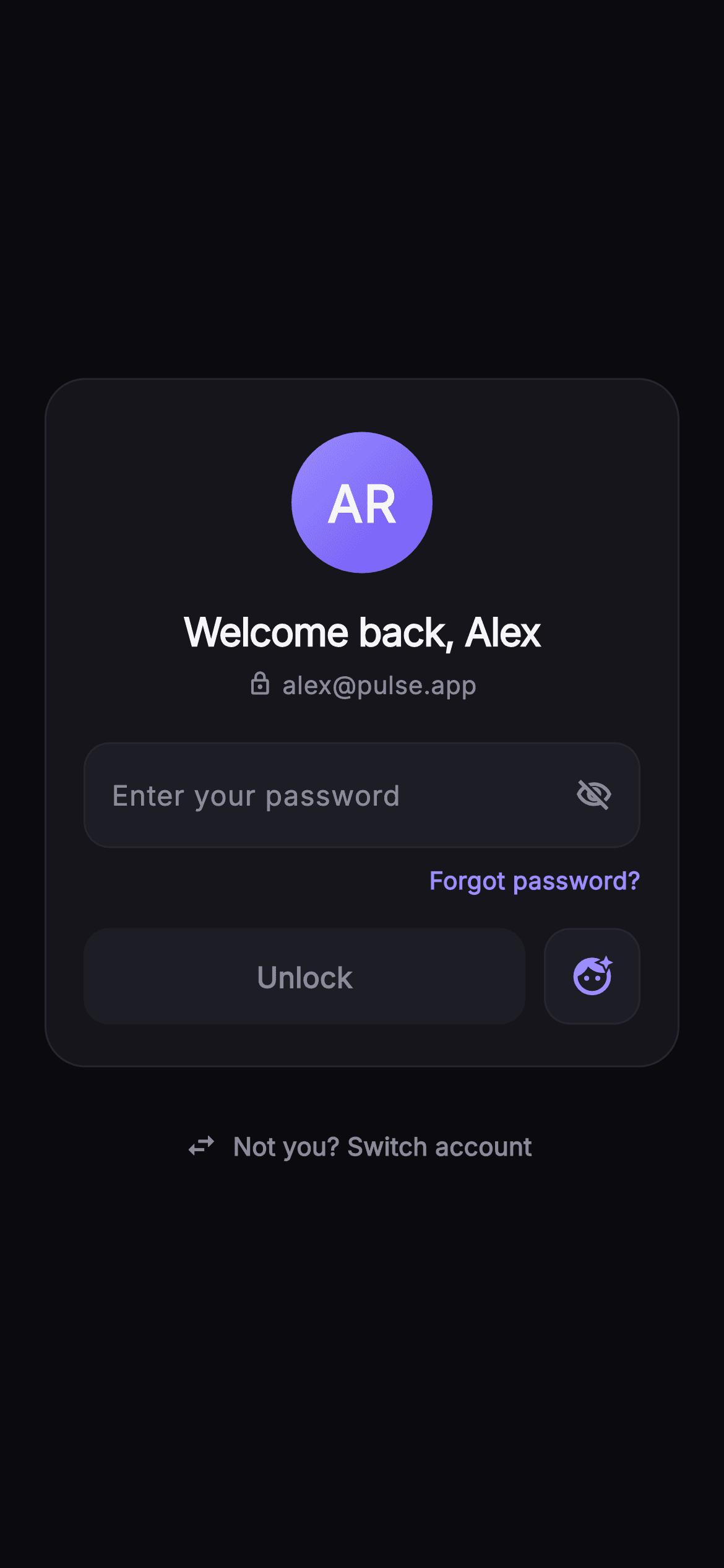
When a session times out, making someone re-type an email they entered weeks ago is friction with no security benefit. This tutorial builds Pulse's welcome-back lock screen in Flutter: a `_MonogramAvatar` that derives initials from the `name` prop and paints them on a violet-to-indigo gradient, a password `TextField` whose eye icon flips an `_obscure` flag, and an Unlock `FilledButton` that stays disabled until a `TextEditingController` listener sees text. You finish with a self-contained, pure-Flutter re-auth card that knows who the user is and only asks for the one thing it needs.
Watch the Flutter UI walkthrough
A short screen recording of Pulse · Welcome Back running, if you'd rather see it before you read the code. The written tutorial below covers everything in it.
Can't see the video? Watch it on YouTube.
What you'll build
- ✓A `_MonogramAvatar` that turns 'Alex Rivera' into 'AR' with a regex-split `_initials` helper and paints it on a gradient circle with a brand-tinted glow
- ✓A password field whose `_obscure` state flips between `visibility_off_outlined` and `visibility_outlined` on tap
- ✓An Unlock `FilledButton` driven by `canUnlock`, enabled only when the `_password` controller holds text
- ✓A square `_FaceIdButton` biometric shortcut sitting beside the primary action rather than competing with it
- ✓A 'Not you? Switch account' `TextButton.icon` outside the card for shared-device handoff
Step-by-step build
Create the file
Add a new file at lib/social_auth_welcome_back/social_auth_welcome_back_screen.dart in your Flutter project.
Register the bundled fonts
No external packages — this is pure Flutter. It does bundle its design font (Inter), so drop the font file into fonts/ and declare it in pubspec.yaml:
flutter:
  fonts:
    - family: Inter
      fonts:
- asset: fonts/Inter-Regular.ttfBuild it, piece by piece
Here's how the screen goes together. Each block below is a real slice of the code with a plain-English explanation — paste them in order, or grab the whole file from the next section.
Props, callbacks and the Pulse dark palette
import 'package:flutter/material.dart';

/// Welcome Back / Re-auth — a session that timed out asks the returning user to
/// confirm their password without re-typing their email. A painted monogram
/// avatar, name + email, a password field with show/hide, an Unlock CTA, a
/// biometric shortcut, "Forgot password?", and a "Not you? Switch account"
/// link. Self-contained per CONVENTIONS.md: pure Flutter, bundled Inter font,
/// own dark theme, SafeArea.
class SocialAuthWelcomeBackScreen extends StatefulWidget {
  const SocialAuthWelcomeBackScreen({
    super.key,
    this.onUnlock,
    this.onForgot,
    this.onBiometric,
    this.onSwitchAccount,
    this.name = 'Alex Rivera',
    this.email = 'alex@pulse.app',
  });

  final VoidCallback? onUnlock;
  final VoidCallback? onForgot;
  final VoidCallback? onBiometric;
  final VoidCallback? onSwitchAccount;
  final String name;
  final String email;

  static const String _font = 'Inter';
  static const Color _bg = Color(0xFF0B0B0F);
  static const Color _surface = Color(0xFF15151B);
  static const Color _surfaceAlt = Color(0xFF1D1D26);
  static const Color _brand = Color(0xFF6E56F7);
  static const Color _accent = Color(0xFF9B8CFF);
  static const Color _hairline = Color(0xFF26262F);
  static const Color _textHi = Color(0xFFF4F4F7);
  static const Color _muted = Color(0xFF8A8A99);

  @override
  State<SocialAuthWelcomeBackScreen> createState() =>
      _SocialAuthWelcomeBackScreenState();
}
The widget is a `StatefulWidget` because one thing on screen changes: whether the password is obscured. Everything else is injected — four `VoidCallback?` hooks (`onUnlock`, `onForgot`, `onBiometric`, `onSwitchAccount`) plus `name` and `email` strings with demo defaults of 'Alex Rivera' and 'alex@pulse.app'. That split matters: the screen never decides what a correct password looks like, it only tells the host app the user pressed Unlock. The palette is declared as `static const` colours on the widget class so the private state and the two helper widgets below can reach them through `SocialAuthWelcomeBackScreen._brand` without a theme lookup. It is a near-mono dark system — `_bg` #0B0B0F, `_surface` #15151B, `_surfaceAlt` #1D1D26, `_hairline` #26262F — with two purples: `_brand` #6E56F7 for the filled action and a lighter `_accent` #9B8CFF for links, cursor and icons, so accents read as clickable without matching the button.
Controller listener and the canUnlock gate
class _SocialAuthWelcomeBackScreenState
    extends State<SocialAuthWelcomeBackScreen> {
  final TextEditingController _password = TextEditingController();
  bool _obscure = true;

  @override
  void initState() {
    super.initState();
    _password.addListener(() => setState(() {}));
  }

  @override
  void dispose() {
    _password.dispose();
    super.dispose();
  }

  @override
  Widget build(BuildContext context) {
    final bool canUnlock = _password.text.isNotEmpty;
    return Theme(
      data: ThemeData.dark(useMaterial3: true),
      child: Scaffold(
        backgroundColor: SocialAuthWelcomeBackScreen._bg,
        body: SafeArea(
          child: Center(
            child: SingleChildScrollView(
              padding: const EdgeInsets.fromLTRB(24, 24, 24, 24),
              child: Column(
                mainAxisSize: MainAxisSize.min,
                children: <Widget>[
State holds a `TextEditingController` and a single `bool _obscure = true`. In `initState` the controller gets a listener that calls `setState(() {})` with an empty body — the point is not to copy the text anywhere but to force a rebuild every keystroke so `canUnlock` is recomputed at the top of `build`. `canUnlock` is simply `_password.text.isNotEmpty`; no length rule, because a re-auth screen should not second-guess a password the server will validate anyway. The tree wraps everything in `Theme(data: ThemeData.dark(useMaterial3: true))` so Material defaults (selection handles, ink, disabled colours) are dark even if the host app is light. `SafeArea` -> `Center` -> `SingleChildScrollView` -> `Column(mainAxisSize: min)` is the standard overflow-proof centring stack: the card sits in the middle on tall phones and scrolls, rather than clips, when the keyboard eats the height.
The card header: monogram, greeting and email row
                  Container(
                    padding: const EdgeInsets.fromLTRB(20, 28, 20, 22),
                    decoration: BoxDecoration(
                      color: SocialAuthWelcomeBackScreen._surface,
                      borderRadius: BorderRadius.circular(22),
                      border: Border.all(
                          color: SocialAuthWelcomeBackScreen._hairline),
                    ),
                    child: Column(
                      children: <Widget>[
                        _MonogramAvatar(
                          initials: _initials(widget.name),
                          size: 76,
                        ),
                        const SizedBox(height: 16),
                        Text(
                          'Welcome back, ${widget.name.split(' ').first}',
                          textAlign: TextAlign.center,
                          style: const TextStyle(
                            fontFamily: SocialAuthWelcomeBackScreen._font,
                            fontSize: 21,
                            fontWeight: FontWeight.w700,
                            letterSpacing: -0.5,
                            color: SocialAuthWelcomeBackScreen._textHi,
                          ),
                        ),
                        const SizedBox(height: 4),
                        Row(
                          mainAxisAlignment: MainAxisAlignment.center,
                          children: <Widget>[
                            const Icon(Icons.lock_outline,
                                size: 14,
                                color: SocialAuthWelcomeBackScreen._muted),
                            const SizedBox(width: 5),
                            Text(
                              widget.email,
                              style: const TextStyle(
                                fontFamily: SocialAuthWelcomeBackScreen._font,
                                fontSize: 13.5,
                                fontWeight: FontWeight.w500,
                                color: SocialAuthWelcomeBackScreen._muted,
                              ),
                            ),
                          ],
                        ),
                        const SizedBox(height: 22),
The card is a `Container` with 22px corners, a `_surface` fill and a one-pixel `_hairline` border, padded asymmetrically (`fromLTRB(20, 28, 20, 22)`) so the avatar has extra breathing room at the top. `_MonogramAvatar` receives `_initials(widget.name)` at 76px. The greeting interpolates `widget.name.split(' ').first`, so a full name still yields 'Welcome back, Alex' — the full name is never shown, which keeps the heading short at 21px, weight 700, with -0.5 letter spacing for the tight display look. Underneath, a centred `Row` pairs a 14px `Icons.lock_outline` with the email at 13.5px in `_muted` #8A8A99. The lock icon is doing copywriting work: it tells the user the email is fixed and not editable on this screen, which is exactly what distinguishes a re-auth screen from a login screen.
Password field with the show/hide toggle
                        Container(
                          decoration: BoxDecoration(
                            color: SocialAuthWelcomeBackScreen._surfaceAlt,
                            borderRadius: BorderRadius.circular(14),
                            border: Border.all(
                                color: SocialAuthWelcomeBackScreen._hairline),
                          ),
                          padding: const EdgeInsets.symmetric(horizontal: 14),
                          child: Row(
                            children: <Widget>[
                              Expanded(
                                child: TextField(
                                  controller: _password,
                                  obscureText: _obscure,
                                  autofocus: false,
                                  cursorColor:
                                      SocialAuthWelcomeBackScreen._accent,
                                  style: const TextStyle(
                                    fontFamily:
                                        SocialAuthWelcomeBackScreen._font,
                                    fontSize: 15,
                                    fontWeight: FontWeight.w500,
                                    color: SocialAuthWelcomeBackScreen._textHi,
                                  ),
                                  decoration: const InputDecoration(
                                    isCollapsed: true,
                                    contentPadding:
                                        EdgeInsets.symmetric(vertical: 16),
                                    border: InputBorder.none,
                                    hintText: 'Enter your password',
                                    hintStyle: TextStyle(
                                      fontFamily:
                                          SocialAuthWelcomeBackScreen._font,
                                      fontSize: 15,
                                      color: SocialAuthWelcomeBackScreen._muted,
                                    ),
                                  ),
                                ),
                              ),
                              GestureDetector(
                                onTap: () =>
                                    setState(() => _obscure = !_obscure),
                                child: Icon(
                                  _obscure
                                      ? Icons.visibility_off_outlined
                                      : Icons.visibility_outlined,
                                  size: 20,
                                  color: SocialAuthWelcomeBackScreen._muted,
                                ),
                              ),
                            ],
                          ),
                        ),
                        const SizedBox(height: 8),
                        Align(
                          alignment: Alignment.centerRight,
                          child: GestureDetector(
                            onTap: widget.onForgot,
                            child: const Text(
                              'Forgot password?',
                              style: TextStyle(
                                fontFamily: SocialAuthWelcomeBackScreen._font,
                                fontSize: 13,
                                fontWeight: FontWeight.w600,
                                color: SocialAuthWelcomeBackScreen._accent,
                              ),
                            ),
                          ),
                        ),
Instead of styling the `TextField` border, the field is wrapped in a `_surfaceAlt` container with 14px corners and a hairline border, and the `InputDecoration` is stripped down with `isCollapsed: true` and `border: InputBorder.none`. That lets the eye icon live inside the same box as a sibling in a `Row` rather than as a `suffixIcon`, which is what gives it consistent 14px horizontal padding on both sides. `obscureText: _obscure` reads the state, and the `GestureDetector` toggles it with `setState(() => _obscure = !_obscure)`; the icon switches between `visibility_off_outlined` when hidden and `visibility_outlined` when revealed. `autofocus` is explicitly false so the keyboard does not pop before the user has read who they are logged in as. `cursorColor` uses `_accent`. Below, an `Align(centerRight)` holds the 'Forgot password?' link, 13px weight 600 in `_accent`, wired to `widget.onForgot`.
Unlock button ranked beside the Face ID shortcut
                        const SizedBox(height: 16),
                        Row(
                          children: <Widget>[
                            Expanded(
                              child: SizedBox(
                                height: 52,
                                child: FilledButton(
                                  onPressed: canUnlock ? widget.onUnlock : null,
                                  style: FilledButton.styleFrom(
                                    backgroundColor:
                                        SocialAuthWelcomeBackScreen._brand,
                                    foregroundColor: Colors.white,
                                    disabledBackgroundColor:
                                        SocialAuthWelcomeBackScreen._surfaceAlt,
                                    disabledForegroundColor:
                                        SocialAuthWelcomeBackScreen._muted,
                                    shape: RoundedRectangleBorder(
                                      borderRadius: BorderRadius.circular(14),
                                    ),
                                  ),
                                  child: const Text(
                                    'Unlock',
                                    style: TextStyle(
                                      fontFamily:
                                          SocialAuthWelcomeBackScreen._font,
                                      fontSize: 15.5,
                                      fontWeight: FontWeight.w600,
                                    ),
                                  ),
                                ),
                              ),
                            ),
                            const SizedBox(width: 10),
                            _FaceIdButton(onTap: widget.onBiometric),
                          ],
                        ),
                      ],
                    ),
                  ),
The action row gives the primary button all the remaining width through `Expanded` at a fixed 52px height, with `_FaceIdButton` as a 52px square after a 10px gap. The two are equal in height but not in width, so the biometric option reads as a shortcut rather than an alternative. `onPressed: canUnlock ? widget.onUnlock : null` is the whole enable/disable mechanism — passing null is what Flutter uses to render a `FilledButton` disabled. The `styleFrom` call sets both states explicitly: `_brand` with white text when enabled, `_surfaceAlt` with `_muted` text when disabled, so the dead button looks like part of the card surface rather than a greyed-out purple. Both the button and the biometric tile share a 14px corner radius, matching the password box above them so the three controls form one visual column.
The switch-account escape hatch
                  const SizedBox(height: 18),
                  TextButton.icon(
                    onPressed: widget.onSwitchAccount,
                    style: TextButton.styleFrom(
                      foregroundColor: SocialAuthWelcomeBackScreen._muted,
                    ),
                    icon: const Icon(Icons.swap_horiz, size: 18),
                    label: const Text(
                      'Not you? Switch account',
                      style: TextStyle(
                        fontFamily: SocialAuthWelcomeBackScreen._font,
                        fontSize: 13.5,
                        fontWeight: FontWeight.w600,
                      ),
                    ),
                  ),
                ],
              ),
            ),
          ),
        ),
      ),
    );
  }

  String _initials(String name) {
    final List<String> parts =
        name.trim().split(RegExp(r'\s+')).where((String s) => s.isNotEmpty).toList();
    if (parts.isEmpty) return '?';
    if (parts.length == 1) return parts.first[0].toUpperCase();
    return (parts.first[0] + parts.last[0]).toUpperCase();
  }
}
'Not you? Switch account' sits 18px below the card as a `TextButton.icon` with `Icons.swap_horiz`, styled in `_muted` so it is discoverable but never competes with Unlock. Placing it outside the card is deliberate: the card is 'this person's' space, and the exit from it belongs at the edge. The `_initials` helper is more defensive than it looks. It trims, splits on `RegExp(r'\s+')` so double spaces do not create empty parts, filters empties anyway, and then returns '?' for an empty name, a single upper-cased letter for a mononym, or first-plus-last initial for anything longer — so 'Mary Anne van der Berg' gives 'MB', not 'MA'. Upper-casing happens last so lowercase input is normalised too.
_MonogramAvatar: gradient circle with a glow
class _MonogramAvatar extends StatelessWidget {
  const _MonogramAvatar({required this.initials, required this.size});
  final String initials;
  final double size;

  @override
  Widget build(BuildContext context) {
    return Container(
      width: size,
      height: size,
      decoration: BoxDecoration(
        shape: BoxShape.circle,
        gradient: const LinearGradient(
          begin: Alignment.topLeft,
          end: Alignment.bottomRight,
          colors: <Color>[
            SocialAuthWelcomeBackScreen._accent,
            SocialAuthWelcomeBackScreen._brand,
          ],
        ),
        boxShadow: <BoxShadow>[
          BoxShadow(
            color: SocialAuthWelcomeBackScreen._brand.withValues(alpha: 0.3),
            blurRadius: 24,
            spreadRadius: -4,
          ),
        ],
      ),
      child: Center(
        child: Text(
          initials,
          style: TextStyle(
            fontFamily: SocialAuthWelcomeBackScreen._font,
            fontSize: size * 0.36,
            fontWeight: FontWeight.w700,
            letterSpacing: 0.5,
            color: Colors.white,
          ),
        ),
      ),
    );
  }
}
The avatar is a plain `Container` — no `CustomPainter` needed. `BoxShape.circle` with a top-left to bottom-right `LinearGradient` from `_accent` to `_brand` gives the light-catching-the-top-corner look. The glow is a `BoxShadow` in `_brand.withValues(alpha: 0.3)` with `blurRadius: 24` and a negative `spreadRadius: -4`; the negative spread pulls the shadow inward before blurring so the halo stays soft and tight around the disc instead of bleeding into a large square smudge. The initials scale with the widget: `fontSize: size * 0.36` means the 76px avatar renders 27px letters, and passing a different `size` keeps the proportion. Weight 700 with 0.5 letter spacing in white stops two heavy capitals from visually merging.
_FaceIdButton: an ink-enabled square tile
class _FaceIdButton extends StatelessWidget {
  const _FaceIdButton({this.onTap});
  final VoidCallback? onTap;

  @override
  Widget build(BuildContext context) {
    return Material(
      color: SocialAuthWelcomeBackScreen._surfaceAlt,
      borderRadius: BorderRadius.circular(14),
      child: InkWell(
        onTap: onTap,
        borderRadius: BorderRadius.circular(14),
        child: Container(
          width: 52,
          height: 52,
          decoration: BoxDecoration(
            borderRadius: BorderRadius.circular(14),
            border: Border.all(color: SocialAuthWelcomeBackScreen._hairline),
          ),
          child: const Icon(Icons.face_retouching_natural,
              size: 24, color: SocialAuthWelcomeBackScreen._accent),
        ),
      ),
    );
  }
}
The biometric tile layers `Material` -> `InkWell` -> `Container` in that order, which is the pattern you need when you want a ripple on a custom-coloured box: `Material` supplies the `_surfaceAlt` fill and clips the ink to a 14px radius, `InkWell` provides the tap feedback on the same radius, and the inner `Container` only draws the hairline border. Painting the border on the innermost widget keeps the ripple underneath it rather than over it. The icon is `Icons.face_retouching_natural` at 24px in `_accent`, chosen because Material has no literal Face ID glyph and this one reads as a face at small sizes. `onTap` forwards straight to `onBiometric`; a null callback simply renders the tile without a ripple, which is a reasonable state on devices with no biometrics enrolled.
Full code
The complete, ready-to-paste source. Free to use in your projects — one click copies it all.
import 'package:flutter/material.dart';
/// Welcome Back / Re-auth — a session that timed out asks the returning user to
/// confirm their password without re-typing their email. A painted monogram
/// avatar, name + email, a password field with show/hide, an Unlock CTA, a
/// biometric shortcut, "Forgot password?", and a "Not you? Switch account"
/// link. Self-contained per CONVENTIONS.md: pure Flutter, bundled Inter font,
/// own dark theme, SafeArea.
class SocialAuthWelcomeBackScreen extends StatefulWidget {
const SocialAuthWelcomeBackScreen({
super.key,
this.onUnlock,
this.onForgot,
this.onBiometric,
this.onSwitchAccount,
this.name = 'Alex Rivera',
this.email = 'alex@pulse.app',
});
final VoidCallback? onUnlock;
final VoidCallback? onForgot;
final VoidCallback? onBiometric;
final VoidCallback? onSwitchAccount;
final String name;
final String email;
static const String _font = 'Inter';
static const Color _bg = Color(0xFF0B0B0F);
static const Color _surface = Color(0xFF15151B);
static const Color _surfaceAlt = Color(0xFF1D1D26);
static const Color _brand = Color(0xFF6E56F7);
static const Color _accent = Color(0xFF9B8CFF);
static const Color _hairline = Color(0xFF26262F);
static const Color _textHi = Color(0xFFF4F4F7);
static const Color _muted = Color(0xFF8A8A99);
@override
State<SocialAuthWelcomeBackScreen> createState() =>
_SocialAuthWelcomeBackScreenState();
}
class _SocialAuthWelcomeBackScreenState
extends State<SocialAuthWelcomeBackScreen> {
final TextEditingController _password = TextEditingController();
bool _obscure = true;
@override
void initState() {
super.initState();
_password.addListener(() => setState(() {}));
}
@override
void dispose() {
_password.dispose();
super.dispose();
}
@override
Widget build(BuildContext context) {
final bool canUnlock = _password.text.isNotEmpty;
return Theme(
data: ThemeData.dark(useMaterial3: true),
child: Scaffold(
backgroundColor: SocialAuthWelcomeBackScreen._bg,
body: SafeArea(
child: Center(
child: SingleChildScrollView(
padding: const EdgeInsets.fromLTRB(24, 24, 24, 24),
child: Column(
mainAxisSize: MainAxisSize.min,
children: <Widget>[
Container(
padding: const EdgeInsets.fromLTRB(20, 28, 20, 22),
decoration: BoxDecoration(
color: SocialAuthWelcomeBackScreen._surface,
borderRadius: BorderRadius.circular(22),
border: Border.all(
color: SocialAuthWelcomeBackScreen._hairline),
),
child: Column(
children: <Widget>[
_MonogramAvatar(
initials: _initials(widget.name),
size: 76,
),
const SizedBox(height: 16),
Text(
'Welcome back, ${widget.name.split(' ').first}',
textAlign: TextAlign.center,
style: const TextStyle(
fontFamily: SocialAuthWelcomeBackScreen._font,
fontSize: 21,
fontWeight: FontWeight.w700,
letterSpacing: -0.5,
color: SocialAuthWelcomeBackScreen._textHi,
),
),
const SizedBox(height: 4),
Row(
mainAxisAlignment: MainAxisAlignment.center,
children: <Widget>[
const Icon(Icons.lock_outline,
size: 14,
color: SocialAuthWelcomeBackScreen._muted),
const SizedBox(width: 5),
Text(
widget.email,
style: const TextStyle(
fontFamily: SocialAuthWelcomeBackScreen._font,
fontSize: 13.5,
fontWeight: FontWeight.w500,
color: SocialAuthWelcomeBackScreen._muted,
),
),
],
),
const SizedBox(height: 22),
Container(
decoration: BoxDecoration(
color: SocialAuthWelcomeBackScreen._surfaceAlt,
borderRadius: BorderRadius.circular(14),
border: Border.all(
color: SocialAuthWelcomeBackScreen._hairline),
),
padding: const EdgeInsets.symmetric(horizontal: 14),
child: Row(
children: <Widget>[
Expanded(
child: TextField(
controller: _password,
obscureText: _obscure,
autofocus: false,
cursorColor:
SocialAuthWelcomeBackScreen._accent,
style: const TextStyle(
fontFamily:
SocialAuthWelcomeBackScreen._font,
fontSize: 15,
fontWeight: FontWeight.w500,
color: SocialAuthWelcomeBackScreen._textHi,
),
decoration: const InputDecoration(
isCollapsed: true,
contentPadding:
EdgeInsets.symmetric(vertical: 16),
border: InputBorder.none,
hintText: 'Enter your password',
hintStyle: TextStyle(
fontFamily:
SocialAuthWelcomeBackScreen._font,
fontSize: 15,
color: SocialAuthWelcomeBackScreen._muted,
),
),
),
),
GestureDetector(
onTap: () =>
setState(() => _obscure = !_obscure),
child: Icon(
_obscure
? Icons.visibility_off_outlined
: Icons.visibility_outlined,
size: 20,
color: SocialAuthWelcomeBackScreen._muted,
),
),
],
),
),
const SizedBox(height: 8),
Align(
alignment: Alignment.centerRight,
child: GestureDetector(
onTap: widget.onForgot,
child: const Text(
'Forgot password?',
style: TextStyle(
fontFamily: SocialAuthWelcomeBackScreen._font,
fontSize: 13,
fontWeight: FontWeight.w600,
color: SocialAuthWelcomeBackScreen._accent,
),
),
),
),
const SizedBox(height: 16),
Row(
children: <Widget>[
Expanded(
child: SizedBox(
height: 52,
child: FilledButton(
onPressed: canUnlock ? widget.onUnlock : null,
style: FilledButton.styleFrom(
backgroundColor:
SocialAuthWelcomeBackScreen._brand,
foregroundColor: Colors.white,
disabledBackgroundColor:
SocialAuthWelcomeBackScreen._surfaceAlt,
disabledForegroundColor:
SocialAuthWelcomeBackScreen._muted,
shape: RoundedRectangleBorder(
borderRadius: BorderRadius.circular(14),
),
),
child: const Text(
'Unlock',
style: TextStyle(
fontFamily:
SocialAuthWelcomeBackScreen._font,
fontSize: 15.5,
fontWeight: FontWeight.w600,
),
),
),
),
),
const SizedBox(width: 10),
_FaceIdButton(onTap: widget.onBiometric),
],
),
],
),
),
const SizedBox(height: 18),
TextButton.icon(
onPressed: widget.onSwitchAccount,
style: TextButton.styleFrom(
foregroundColor: SocialAuthWelcomeBackScreen._muted,
),
icon: const Icon(Icons.swap_horiz, size: 18),
label: const Text(
'Not you? Switch account',
style: TextStyle(
fontFamily: SocialAuthWelcomeBackScreen._font,
fontSize: 13.5,
fontWeight: FontWeight.w600,
),
),
),
],
),
),
),
),
),
);
}
String _initials(String name) {
final List<String> parts =
name.trim().split(RegExp(r'\s+')).where((String s) => s.isNotEmpty).toList();
if (parts.isEmpty) return '?';
if (parts.length == 1) return parts.first[0].toUpperCase();
return (parts.first[0] + parts.last[0]).toUpperCase();
}
}
class _MonogramAvatar extends StatelessWidget {
const _MonogramAvatar({required this.initials, required this.size});
final String initials;
final double size;
@override
Widget build(BuildContext context) {
return Container(
width: size,
height: size,
decoration: BoxDecoration(
shape: BoxShape.circle,
gradient: const LinearGradient(
begin: Alignment.topLeft,
end: Alignment.bottomRight,
colors: <Color>[
SocialAuthWelcomeBackScreen._accent,
SocialAuthWelcomeBackScreen._brand,
],
),
boxShadow: <BoxShadow>[
BoxShadow(
color: SocialAuthWelcomeBackScreen._brand.withValues(alpha: 0.3),
blurRadius: 24,
spreadRadius: -4,
),
],
),
child: Center(
child: Text(
initials,
style: TextStyle(
fontFamily: SocialAuthWelcomeBackScreen._font,
fontSize: size * 0.36,
fontWeight: FontWeight.w700,
letterSpacing: 0.5,
color: Colors.white,
),
),
),
);
}
}
class _FaceIdButton extends StatelessWidget {
const _FaceIdButton({this.onTap});
final VoidCallback? onTap;
@override
Widget build(BuildContext context) {
return Material(
color: SocialAuthWelcomeBackScreen._surfaceAlt,
borderRadius: BorderRadius.circular(14),
child: InkWell(
onTap: onTap,
borderRadius: BorderRadius.circular(14),
child: Container(
width: 52,
height: 52,
decoration: BoxDecoration(
borderRadius: BorderRadius.circular(14),
border: Border.all(color: SocialAuthWelcomeBackScreen._hairline),
),
child: const Icon(Icons.face_retouching_natural,
size: 24, color: SocialAuthWelcomeBackScreen._accent),
),
),
);
}
}
Plus bundled 1 binary asset (fonts/images). The CLI and MCP install those for you automatically.
Two faster ways to add it
Copy-paste works, but you can skip it entirely.
1. FlutterKit CLI
One command drops this screen — and its fonts — straight into your project.
$ flutterkit add social-auth-welcome-back2. AI agent (MCP)
Connect FlutterKit's MCP server in Claude or Cursor and just ask your agent to install social-auth-welcome-back — it fetches and writes the files for you.
FAQ
Can I use this welcome-back screen in a commercial app for free?
Yes. FlutterKit screens are free for personal and commercial projects under an MIT-style licence, with no licence key and no attribution required. Copy the code from this page, run `flutterkit add social-auth-welcome-back`, or pull it through the MCP server and ship it.
Which packages and fonts does it depend on?
None beyond Flutter itself — no pub packages, no `local_auth`, no SVG library. The only asset is the Inter font, which `flutterkit add social-auth-welcome-back` bundles and registers in your pubspec for you. The avatar is a gradient `Container`, not an image.
What Flutter version do I need?
Flutter 3.22 or newer. The constructor uses `super.key` super-parameters and the avatar glow calls `_brand.withValues(alpha: 0.3)`. On an older SDK change that to `withOpacity(0.3)` and rewrite the constructor as `{Key? key, ...} : super(key: key)`.
How do I actually trigger Face ID from the biometric button?
The screen deliberately does not include biometrics — `_FaceIdButton` just forwards its tap to `onBiometric`. Add the `local_auth` package in your app, call `LocalAuthentication().authenticate(...)` inside the callback you pass as `onBiometric`, and navigate on success. Keep the screen itself platform-agnostic so it stays testable without a device.
Why does the greeting show only the first name while the avatar uses two initials?
They come from different helpers on purpose. The heading uses `widget.name.split(' ').first` so 'Welcome back, Alex' stays short at 21px, while `_initials` takes the first and last word so the monogram is 'AR' and stays recognisable for people who share a first name. If you pass a mononym, both collapse to the single name and a single letter.


