How to Build a Link Preview Feed with Painted URL Unfurls in Flutter (Full Code + Preview)
Shared links are the least readable thing in a social feed until they unfurl into a card, and most tutorials reach for a network image the moment they need a thumbnail. This screen builds Pulse's link-post feed without one: `_BannerPainter` paints a gradient banner with diagonal streaks and a centred Material glyph, `_LargeUnfurl` wraps it in a 16:8.4 hero card, and `_CompactUnfurl` shrinks the same painter to a 78px square. You finish with three unfurl variants, a `_DomainRow` favicon chip, an optional `_MetaChip` read-time pill, and `onLink` / `onPost` callbacks ready for a real backend.
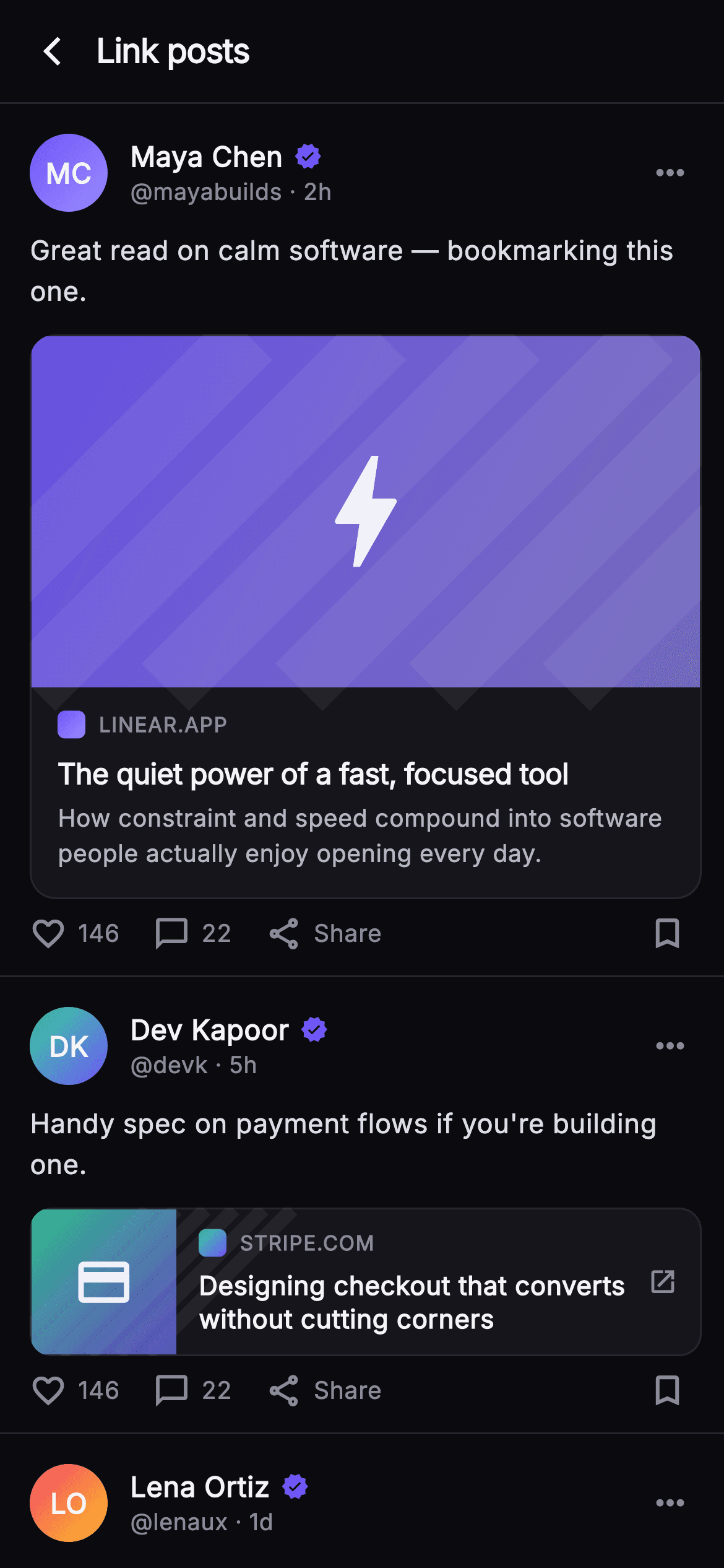
What you'll build
- ✓A `_BannerPainter` that draws a diagonal gradient, six translucent streaks and a Material icon via `TextPainter`, reused at both banner and thumbnail sizes
- ✓A `_LargeUnfurl` hero card using `AspectRatio(16 / 8.4)` with ellipsis-clamped title and description and an optional `_MetaChip`
- ✓A `_CompactUnfurl` row that puts a 78px painted square beside a two-line title and an `open_in_new` affordance
- ✓A `_PostShell` whose `_initials` getter derives monogram letters from the author name and forwards taps to `onPost(id)`
- ✓A `_DomainRow` with a 15px gradient favicon block and an uppercased, letter-spaced domain label
Step-by-step build
Create the file
Add a new file at lib/social_feed_link_preview/social_feed_link_preview_screen.dart in your Flutter project.
Register the bundled fonts
No external packages — this is pure Flutter. It does bundle its design font (Inter), so drop the font file into fonts/ and declare it in pubspec.yaml:
flutter:
  fonts:
    - family: Inter
      fonts:
- asset: fonts/Inter-Regular.ttfBuild it, piece by piece
Here's how the screen goes together. Each block below is a real slice of the code with a plain-English explanation — paste them in order, or grab the whole file from the next section.
Callbacks, palette and a forced dark theme
import 'package:flutter/material.dart';

/// Link Card — feed posts that unfurl a shared URL into a rich preview. Shows
/// three variants: a large hero-banner unfurl, a compact side-thumbnail row, and
/// an article unfurl with a read-time meta chip. All thumbnails and favicons are
/// painted (no network images). Self-contained per CONVENTIONS.md: pure Flutter,
/// bundled Inter font, own dark theme, SafeArea, overflow-proof.
class SocialFeedLinkPreviewScreen extends StatelessWidget {
  const SocialFeedLinkPreviewScreen({
    super.key,
    this.onBack,
    this.onLink,
    this.onPost,
  });

  final VoidCallback? onBack;
  final ValueChanged<String>? onLink;
  final ValueChanged<String>? onPost;

  static const String _font = 'Inter';
  static const Color _bg = Color(0xFF0B0B0F);
  static const Color _surface = Color(0xFF15151B);
  static const Color _brand = Color(0xFF6E56F7);
  static const Color _hairline = Color(0xFF26262F);
  static const Color _textHi = Color(0xFFF4F4F7);
  static const Color _muted = Color(0xFF8A8A99);

  @override
  Widget build(BuildContext context) {
    return Theme(
      data: ThemeData.dark(useMaterial3: true),
      child: Scaffold(
        backgroundColor: _bg,
        body: SafeArea(
`SocialFeedLinkPreviewScreen` is a `StatelessWidget` with three optional callbacks: `onBack`, `onLink` (a `ValueChanged<String>` that receives a domain) and `onPost` (a `ValueChanged<String>` that receives a post id). Nothing in the feed mutates, so no state class is needed — the host app decides what a tap means. The palette is six `static const` colours: `_bg #0B0B0F` and `_surface #15151B` are two near-black greys separated by just enough contrast for a card to read as raised, `_hairline #26262F` draws every divider, `_brand #6E56F7` is Pulse indigo, and `_textHi #F4F4F7` / `_muted #8A8A99` are the two text tiers. `build` wraps the `Scaffold` in `Theme(data: ThemeData.dark(useMaterial3: true))` so the screen stays dark even inside a light host app, then a `SafeArea` and a `Column` hold the top bar and the scrolling list.
Three posts, three unfurl variants
          child: Column(
            children: <Widget>[
              _TopBar(onBack: onBack),
              Expanded(
                child: ListView(
                  padding: EdgeInsets.zero,
                  children: <Widget>[
                    _PostShell(
                      id: 'l1',
                      name: 'Maya Chen',
                      handle: 'mayabuilds',
                      time: '2h',
                      colorA: 0xFF6E56F7,
                      colorB: 0xFF9B8CFF,
                      body: 'Great read on calm software — bookmarking this one.',
                      onPost: onPost,
                      preview: _LargeUnfurl(
                        domain: 'linear.app',
                        title: 'The quiet power of a fast, focused tool',
                        desc:
                            'How constraint and speed compound into software '
                            'people actually enjoy opening every day.',
                        colorA: 0xFF6E56F7,
                        colorB: 0xFF9B8CFF,
                        icon: Icons.bolt,
                        onTap: () => onLink?.call('linear.app'),
                      ),
                    ),
                    _PostShell(
                      id: 'l2',
                      name: 'Dev Kapoor',
                      handle: 'devk',
                      time: '5h',
                      colorA: 0xFF34D399,
                      colorB: 0xFF6E56F7,
                      body: 'Handy spec on payment flows if you\'re building one.',
                      onPost: onPost,
                      preview: _CompactUnfurl(
                        domain: 'stripe.com',
                        title:
                            'Designing checkout that converts without cutting '
                            'corners',
                        colorA: 0xFF34D399,
                        colorB: 0xFF6E56F7,
                        icon: Icons.credit_card,
                        onTap: () => onLink?.call('stripe.com'),
                      ),
                    ),
                    _PostShell(
                      id: 'l3',
                      name: 'Lena Ortiz',
                      handle: 'lenaux',
                      time: '1d',
                      colorA: 0xFFF4476B,
                      colorB: 0xFFFBBF24,
                      body: 'Loved this piece on design tokens at scale.',
                      onPost: onPost,
                      preview: _LargeUnfurl(
                        domain: 'figma.com',
                        title: 'Tokens, themes, and the end of the redline',
                        desc:
                            'A practical look at keeping design and code in sync '
                            'when both move fast.',
                        colorA: 0xFFF4476B,
                        colorB: 0xFFFBBF24,
                        icon: Icons.hexagon_outlined,
                        meta: 'Article · 6 min read',
                        onTap: () => onLink?.call('figma.com'),
                      ),
                    ),
                    const SizedBox(height: 24),
                  ],
                ),
              ),
            ],
          ),
        ),
      ),
    );
  }
}
The feed is a plain `ListView` with `padding: EdgeInsets.zero` (the `_PostShell` rows carry their own padding and hairline) holding three hand-written posts. Each `_PostShell` receives a pair of ARGB ints, `colorA` and `colorB`, that flow into both the author's `_Monogram` and the link's painted banner, so the avatar and the preview share one gradient — the post reads as a single visual unit. Post `l1` uses `_LargeUnfurl` with an indigo-to-lavender gradient and `Icons.bolt`; post `l2` switches to `_CompactUnfurl` in green-to-indigo with `Icons.credit_card`; post `l3` is another `_LargeUnfurl` in coral-to-amber, and is the only one to pass `meta: 'Article · 6 min read'`, which switches on the `_MetaChip`. Every `onTap` calls `onLink?.call(domain)` with the bare domain string, and a trailing `SizedBox(height: 24)` stops the last action bar sitting flush against the bottom edge.
A 56px top bar with a single hairline
class _TopBar extends StatelessWidget {
  const _TopBar({this.onBack});
  final VoidCallback? onBack;

  @override
  Widget build(BuildContext context) {
    return Container(
      height: 56,
      padding: const EdgeInsets.only(left: 4, right: 20),
      decoration: const BoxDecoration(
        border: Border(
          bottom: BorderSide(color: SocialFeedLinkPreviewScreen._hairline),
        ),
      ),
      child: Row(
        children: <Widget>[
          IconButton(
            onPressed: onBack,
            icon: const Icon(Icons.arrow_back_ios_new,
                size: 18, color: SocialFeedLinkPreviewScreen._textHi),
          ),
          const Text(
            'Link posts',
            style: TextStyle(
              fontFamily: SocialFeedLinkPreviewScreen._font,
              fontSize: 18,
              fontWeight: FontWeight.w700,
              letterSpacing: -0.4,
              color: SocialFeedLinkPreviewScreen._textHi,
            ),
          ),
        ],
      ),
    );
  }
}
`_TopBar` is a fixed-height 56px `Container` whose `BoxDecoration` draws only a bottom `BorderSide` in `_hairline` — no elevation, no `AppBar`, so it costs nothing to lay out and never picks up Material's scroll-tint behaviour. The padding is asymmetric, `left: 4, right: 20`, because the `IconButton` already carries its own 48px hit target and would look indented if the bar added a full 16px on that side. The back glyph is `Icons.arrow_back_ios_new` at 18px in `_textHi`, and the title 'Link posts' is 18px `w700` with `letterSpacing: -0.4`, the same tight tracking used on headline text elsewhere in the Pulse screens. The row has no trailing actions, which keeps this a focused sub-screen rather than a home tab.
The post shell and its initials getter
class _PostShell extends StatelessWidget {
  const _PostShell({
    required this.id,
    required this.name,
    required this.handle,
    required this.time,
    required this.colorA,
    required this.colorB,
    required this.body,
    required this.preview,
    this.onPost,
  });
  final String id;
  final String name;
  final String handle;
  final String time;
  final int colorA;
  final int colorB;
  final String body;
  final Widget preview;
  final ValueChanged<String>? onPost;

  String get _initials {
    final List<String> p = name.trim().split(RegExp(r'\s+'));
    if (p.length == 1) return p.first.characters.first.toUpperCase();
    return (p.first[0] + p.last[0]).toUpperCase();
  }

  @override
  Widget build(BuildContext context) {
    return GestureDetector(
      onTap: () => onPost?.call(id),
      behavior: HitTestBehavior.opaque,
      child: Container(
        padding: const EdgeInsets.fromLTRB(16, 16, 12, 12),
        decoration: const BoxDecoration(
          border: Border(
            bottom: BorderSide(color: SocialFeedLinkPreviewScreen._hairline),
          ),
        ),
        child: Column(
          crossAxisAlignment: CrossAxisAlignment.start,
          children: <Widget>[
            Row(
              children: <Widget>[
                _Monogram(
                  initials: _initials,
                  colorA: Color(colorA),
                  colorB: Color(colorB),
                ),
                const SizedBox(width: 12),
                Expanded(
                  child: Column(
                    crossAxisAlignment: CrossAxisAlignment.start,
                    children: <Widget>[
                      Row(
                        children: <Widget>[
                          Flexible(
                            child: Text(
                              name,
                              overflow: TextOverflow.ellipsis,
                              style: const TextStyle(
                                fontFamily: SocialFeedLinkPreviewScreen._font,
                                fontSize: 15,
                                fontWeight: FontWeight.w700,
                                color: SocialFeedLinkPreviewScreen._textHi,
                              ),
                            ),
                          ),
                          const SizedBox(width: 6),
                          const Icon(Icons.verified,
                              size: 15,
                              color: SocialFeedLinkPreviewScreen._brand),
                        ],
                      ),
                      Text(
                        '@$handle · $time',
                        style: const TextStyle(
                          fontFamily: SocialFeedLinkPreviewScreen._font,
                          fontSize: 12.5,
                          color: SocialFeedLinkPreviewScreen._muted,
                        ),
                      ),
                    ],
                  ),
                ),
                const Icon(Icons.more_horiz,
                    color: SocialFeedLinkPreviewScreen._muted, size: 22),
                const SizedBox(width: 6),
              ],
            ),
            const SizedBox(height: 10),
            Text(
              body,
              style: const TextStyle(
                fontFamily: SocialFeedLinkPreviewScreen._font,
                fontSize: 14.5,
                height: 1.5,
                color: Color(0xFFDDDDE6),
              ),
            ),
            const SizedBox(height: 12),
            preview,
            const SizedBox(height: 8),
            const _ActionBar(),
          ],
        ),
      ),
    );
  }
}
`_PostShell` is the frame every post shares, taking the `preview` as an injected `Widget` so the shell never knows which unfurl variant it holds. The `_initials` getter splits `name` on `RegExp(r'\s+')`, returns the first character for a single-word name, and otherwise concatenates the first letter of the first and last words and upper-cases them — so 'Maya Chen' becomes 'MC' with no hard-coded initials in the data. The whole card sits in a `GestureDetector` with `HitTestBehavior.opaque`, which makes the blank padding tappable too, firing `onPost?.call(id)`. Inside, a header `Row` places the 42px `_Monogram`, then an `Expanded` column with the name in `Flexible` + `TextOverflow.ellipsis` beside a 15px `Icons.verified` in `_brand`, and the `'@$handle · $time'` line at 12.5px muted. The caption is 14.5px with `height: 1.5` in a slightly dimmed `#DDDDE6`, then the preview and a `const _ActionBar()`.
The large hero unfurl and its optional meta chip
class _LargeUnfurl extends StatelessWidget {
  const _LargeUnfurl({
    required this.domain,
    required this.title,
    required this.desc,
    required this.colorA,
    required this.colorB,
    required this.icon,
    this.meta,
    this.onTap,
  });
  final String domain;
  final String title;
  final String desc;
  final int colorA;
  final int colorB;
  final IconData icon;
  final String? meta;
  final VoidCallback? onTap;

  @override
  Widget build(BuildContext context) {
    return GestureDetector(
      onTap: onTap,
      child: Container(
        clipBehavior: Clip.antiAlias,
        decoration: BoxDecoration(
          color: SocialFeedLinkPreviewScreen._surface,
          borderRadius: BorderRadius.circular(14),
          border: Border.all(color: SocialFeedLinkPreviewScreen._hairline),
        ),
        child: Column(
          crossAxisAlignment: CrossAxisAlignment.start,
          children: <Widget>[
            AspectRatio(
              aspectRatio: 16 / 8.4,
              child: CustomPaint(
                painter: _BannerPainter(Color(colorA), Color(colorB), icon),
                child: const SizedBox.expand(),
              ),
            ),
            Padding(
              padding: const EdgeInsets.fromLTRB(14, 12, 14, 14),
              child: Column(
                crossAxisAlignment: CrossAxisAlignment.start,
                children: <Widget>[
                  _DomainRow(domain: domain, colorA: colorA, colorB: colorB),
                  const SizedBox(height: 8),
                  Text(
                    title,
                    maxLines: 2,
                    overflow: TextOverflow.ellipsis,
                    style: const TextStyle(
                      fontFamily: SocialFeedLinkPreviewScreen._font,
                      fontSize: 15.5,
                      fontWeight: FontWeight.w700,
                      height: 1.3,
                      letterSpacing: -0.2,
                      color: SocialFeedLinkPreviewScreen._textHi,
                    ),
                  ),
                  const SizedBox(height: 5),
                  Text(
                    desc,
                    maxLines: 2,
                    overflow: TextOverflow.ellipsis,
                    style: const TextStyle(
                      fontFamily: SocialFeedLinkPreviewScreen._font,
                      fontSize: 13,
                      height: 1.45,
                      color: Color(0xFFB5B5C2),
                    ),
                  ),
                  if (meta != null) ...<Widget>[
                    const SizedBox(height: 10),
                    _MetaChip(label: meta!),
                  ],
                ],
              ),
            ),
          ],
        ),
      ),
    );
  }
}
`_LargeUnfurl` is the classic Twitter-style card: a `Container` with `clipBehavior: Clip.antiAlias`, a 14px radius and a `_hairline` border, so the painted banner is clipped to the rounded corners without a separate `ClipRRect`. The banner is an `AspectRatio(aspectRatio: 16 / 8.4)` — a touch taller than 16:9 — wrapping a `CustomPaint` whose child is `SizedBox.expand()`, which forces the painter to fill whatever width the feed gives it. Below, `EdgeInsets.fromLTRB(14, 12, 14, 14)` frames a `_DomainRow`, a 15.5px `w700` title and a 13px `#B5B5C2` description, both hard-clamped to `maxLines: 2` with ellipsis so a long Open Graph title can never grow the card. The `if (meta != null) ...[]` spread appends a 10px gap and a `_MetaChip` only when the caller supplies a label, which is why just the figma.com post shows 'Article · 6 min read'.
The compact side-thumbnail row
class _CompactUnfurl extends StatelessWidget {
  const _CompactUnfurl({
    required this.domain,
    required this.title,
    required this.colorA,
    required this.colorB,
    required this.icon,
    this.onTap,
  });
  final String domain;
  final String title;
  final int colorA;
  final int colorB;
  final IconData icon;
  final VoidCallback? onTap;

  @override
  Widget build(BuildContext context) {
    return GestureDetector(
      onTap: onTap,
      child: Container(
        clipBehavior: Clip.antiAlias,
        decoration: BoxDecoration(
          color: SocialFeedLinkPreviewScreen._surface,
          borderRadius: BorderRadius.circular(12),
          border: Border.all(color: SocialFeedLinkPreviewScreen._hairline),
        ),
        child: Row(
          children: <Widget>[
            SizedBox(
              width: 78,
              height: 78,
              child: CustomPaint(
                painter: _BannerPainter(Color(colorA), Color(colorB), icon),
              ),
            ),
            Expanded(
              child: Padding(
                padding: const EdgeInsets.fromLTRB(12, 10, 10, 10),
                child: Column(
                  crossAxisAlignment: CrossAxisAlignment.start,
                  mainAxisAlignment: MainAxisAlignment.center,
                  children: <Widget>[
                    _DomainRow(domain: domain, colorA: colorA, colorB: colorB),
                    const SizedBox(height: 6),
                    Text(
                      title,
                      maxLines: 2,
                      overflow: TextOverflow.ellipsis,
                      style: const TextStyle(
                        fontFamily: SocialFeedLinkPreviewScreen._font,
                        fontSize: 14,
                        fontWeight: FontWeight.w600,
                        height: 1.3,
                        color: SocialFeedLinkPreviewScreen._textHi,
                      ),
                    ),
                  ],
                ),
              ),
            ),
            const Padding(
              padding: EdgeInsets.only(right: 12),
              child: Icon(Icons.open_in_new,
                  size: 16, color: SocialFeedLinkPreviewScreen._muted),
            ),
          ],
        ),
      ),
    );
  }
}
`_CompactUnfurl` is the same idea turned sideways for links that do not deserve a hero. The outer `Container` matches the large card's surface and hairline but drops to a 12px radius, and its child is a `Row` rather than a `Column`. The thumbnail is a fixed 78×78 `SizedBox` around a `CustomPaint` using the very same `_BannerPainter` — because the painter sizes its glyph from `size.shortestSide`, the icon scales down automatically. The text column is `Expanded` with `mainAxisAlignment: MainAxisAlignment.center` so a one-line title sits vertically centred against the square, and the title drops to 14px `w600` since there is no description to balance it. A trailing `Icons.open_in_new` at 16px in `_muted` with 12px right padding tells the reader this leaves the app, an affordance the large card does not need because its banner already reads as a link.
Domain row, meta chip and the action bar
class _DomainRow extends StatelessWidget {
  const _DomainRow({
    required this.domain,
    required this.colorA,
    required this.colorB,
  });
  final String domain;
  final int colorA;
  final int colorB;

  @override
  Widget build(BuildContext context) {
    return Row(
      children: <Widget>[
        Container(
          width: 15,
          height: 15,
          decoration: BoxDecoration(
            borderRadius: BorderRadius.circular(4),
            gradient: LinearGradient(
              begin: Alignment.topLeft,
              end: Alignment.bottomRight,
              colors: <Color>[Color(colorA), Color(colorB)],
            ),
          ),
        ),
        const SizedBox(width: 7),
        Flexible(
          child: Text(
            domain.toUpperCase(),
            overflow: TextOverflow.ellipsis,
            style: const TextStyle(
              fontFamily: SocialFeedLinkPreviewScreen._font,
              fontSize: 11,
              fontWeight: FontWeight.w600,
              letterSpacing: 0.6,
              color: SocialFeedLinkPreviewScreen._muted,
            ),
          ),
        ),
      ],
    );
  }
}

class _MetaChip extends StatelessWidget {
  const _MetaChip({required this.label});
  final String label;

  @override
  Widget build(BuildContext context) {
    return Container(
      padding: const EdgeInsets.symmetric(horizontal: 10, vertical: 5),
      decoration: BoxDecoration(
        color: SocialFeedLinkPreviewScreen._brand.withValues(alpha: 0.14),
        borderRadius: BorderRadius.circular(20),
      ),
      child: Text(
        label,
        style: const TextStyle(
          fontFamily: SocialFeedLinkPreviewScreen._font,
          fontSize: 11.5,
          fontWeight: FontWeight.w700,
          color: SocialFeedLinkPreviewScreen._brand,
        ),
      ),
    );
  }
}

class _ActionBar extends StatelessWidget {
  const _ActionBar();

  @override
  Widget build(BuildContext context) {
    return const Row(
      children: <Widget>[
        _Action(icon: Icons.favorite_border, label: '146'),
        SizedBox(width: 18),
        _Action(icon: Icons.chat_bubble_outline, label: '22'),
        SizedBox(width: 18),
        _Action(icon: Icons.share_outlined, label: 'Share'),
        Spacer(),
        Icon(Icons.bookmark_border,
            size: 21, color: SocialFeedLinkPreviewScreen._muted),
        SizedBox(width: 8),
      ],
    );
  }
}

class _Action extends StatelessWidget {
  const _Action({required this.icon, required this.label});
  final IconData icon;
  final String label;

  @override
  Widget build(BuildContext context) {
    return Row(
      children: <Widget>[
        Icon(icon, size: 20, color: SocialFeedLinkPreviewScreen._muted),
        const SizedBox(width: 6),
        Text(
          label,
          style: const TextStyle(
            fontFamily: SocialFeedLinkPreviewScreen._font,
            fontSize: 13,
            fontWeight: FontWeight.w500,
            color: SocialFeedLinkPreviewScreen._muted,
          ),
        ),
      ],
    );
  }
}
`_DomainRow` fakes a favicon with a 15px `Container` whose `BoxDecoration` carries a 4px radius and a `LinearGradient` from `colorA` to `colorB` — the same pair as the banner, so the chip looks like it belongs to the site. The domain text is rendered with `domain.toUpperCase()` at 11px `w600` and `letterSpacing: 0.6`, the small-caps treatment that makes 'LINEAR.APP' read as a label rather than a sentence, and it sits in `Flexible` so a long hostname ellipsises instead of overflowing. `_MetaChip` is a pill at `_brand.withValues(alpha: 0.14)` with 20px radius and 11.5px `w700` text in full `_brand`, the same tinted-background-plus-solid-text pattern used for badges across the Pulse set. `_ActionBar` is entirely `const`: three `_Action` icon-plus-label pairs (146 likes, 22 comments, Share) separated by 18px gaps, a `Spacer`, and a lone 21px bookmark icon pushed to the right.
The monogram avatar and the banner painter
class _Monogram extends StatelessWidget {
  const _Monogram({
    required this.initials,
    required this.colorA,
    required this.colorB,
  });
  final String initials;
  final Color colorA;
  final Color colorB;

  @override
  Widget build(BuildContext context) {
    return Container(
      width: 42,
      height: 42,
      decoration: BoxDecoration(
        shape: BoxShape.circle,
        gradient: LinearGradient(
          begin: Alignment.topLeft,
          end: Alignment.bottomRight,
          colors: <Color>[colorA, colorB],
        ),
      ),
      child: Center(
        child: Text(
          initials,
          style: const TextStyle(
            fontFamily: SocialFeedLinkPreviewScreen._font,
            fontSize: 15,
            fontWeight: FontWeight.w700,
            color: Colors.white,
          ),
        ),
      ),
    );
  }
}

class _BannerPainter extends CustomPainter {
  _BannerPainter(this.colorA, this.colorB, this.icon);
  final Color colorA;
  final Color colorB;
  final IconData icon;

  @override
  void paint(Canvas canvas, Size size) {
    final Rect rect = Offset.zero & size;
    canvas.drawRect(
      rect,
      Paint()
        ..shader = LinearGradient(
          begin: Alignment.topLeft,
          end: Alignment.bottomRight,
          colors: <Color>[
            colorA.withValues(alpha: 0.9),
            colorB.withValues(alpha: 0.7),
          ],
        ).createShader(rect),
    );
    final Paint streak = Paint()
      ..color = Colors.white.withValues(alpha: 0.06)
      ..style = PaintingStyle.stroke
      ..strokeWidth = size.width * 0.10;
    for (int i = -1; i < 5; i++) {
      final double x = size.width * (0.2 * i);
      canvas.drawLine(Offset(x, size.height), Offset(x + size.height, 0), streak);
    }
    // Painted glyph badge centered.
    final TextPainter tp = TextPainter(
      text: TextSpan(
        text: String.fromCharCode(icon.codePoint),
        style: TextStyle(
          fontSize: size.shortestSide * 0.42,
          fontFamily: icon.fontFamily,
          package: icon.fontPackage,
          color: Colors.white.withValues(alpha: 0.9),
        ),
      ),
      textDirection: TextDirection.ltr,
    )..layout();
    tp.paint(
      canvas,
      Offset(
        (size.width - tp.width) / 2,
        (size.height - tp.height) / 2,
      ),
    );
  }

  @override
  bool shouldRepaint(covariant _BannerPainter old) =>
      old.colorA != colorA || old.colorB != colorB || old.icon != icon;
}
`_Monogram` is a 42px circle with a top-left-to-bottom-right gradient and the initials centred in 15px `w700` white. `_BannerPainter` does the real work. It first fills the whole `rect` with a `LinearGradient` shader from `colorA` at 90% alpha to `colorB` at 70%, so the banner is slightly softer than the avatar. A `streak` paint at `Colors.white.withValues(alpha: 0.06)`, stroke width `size.width * 0.10`, draws six diagonal lines in a `for (int i = -1; i < 5; i++)` loop: each starts at `x = width * 0.2 * i` on the bottom edge and ends at `x + height` on the top edge, giving 45-degree bands a fifth of the width apart; `i = -1` covers the bottom-left corner. Finally the icon is drawn as text: `String.fromCharCode(icon.codePoint)` in a `TextPainter` with `fontFamily: icon.fontFamily` and `package: icon.fontPackage`, sized at `shortestSide * 0.42` and painted at the exact centre. `shouldRepaint` compares both colours and the icon, so a rebuild with identical data skips the paint.
Full code
The complete, ready-to-paste source. Free to use in your projects — one click copies it all.
import 'package:flutter/material.dart';
/// Link Card — feed posts that unfurl a shared URL into a rich preview. Shows
/// three variants: a large hero-banner unfurl, a compact side-thumbnail row, and
/// an article unfurl with a read-time meta chip. All thumbnails and favicons are
/// painted (no network images). Self-contained per CONVENTIONS.md: pure Flutter,
/// bundled Inter font, own dark theme, SafeArea, overflow-proof.
class SocialFeedLinkPreviewScreen extends StatelessWidget {
const SocialFeedLinkPreviewScreen({
super.key,
this.onBack,
this.onLink,
this.onPost,
});
final VoidCallback? onBack;
final ValueChanged<String>? onLink;
final ValueChanged<String>? onPost;
static const String _font = 'Inter';
static const Color _bg = Color(0xFF0B0B0F);
static const Color _surface = Color(0xFF15151B);
static const Color _brand = Color(0xFF6E56F7);
static const Color _hairline = Color(0xFF26262F);
static const Color _textHi = Color(0xFFF4F4F7);
static const Color _muted = Color(0xFF8A8A99);
@override
Widget build(BuildContext context) {
return Theme(
data: ThemeData.dark(useMaterial3: true),
child: Scaffold(
backgroundColor: _bg,
body: SafeArea(
child: Column(
children: <Widget>[
_TopBar(onBack: onBack),
Expanded(
child: ListView(
padding: EdgeInsets.zero,
children: <Widget>[
_PostShell(
id: 'l1',
name: 'Maya Chen',
handle: 'mayabuilds',
time: '2h',
colorA: 0xFF6E56F7,
colorB: 0xFF9B8CFF,
body: 'Great read on calm software — bookmarking this one.',
onPost: onPost,
preview: _LargeUnfurl(
domain: 'linear.app',
title: 'The quiet power of a fast, focused tool',
desc:
'How constraint and speed compound into software '
'people actually enjoy opening every day.',
colorA: 0xFF6E56F7,
colorB: 0xFF9B8CFF,
icon: Icons.bolt,
onTap: () => onLink?.call('linear.app'),
),
),
_PostShell(
id: 'l2',
name: 'Dev Kapoor',
handle: 'devk',
time: '5h',
colorA: 0xFF34D399,
colorB: 0xFF6E56F7,
body: 'Handy spec on payment flows if you\'re building one.',
onPost: onPost,
preview: _CompactUnfurl(
domain: 'stripe.com',
title:
'Designing checkout that converts without cutting '
'corners',
colorA: 0xFF34D399,
colorB: 0xFF6E56F7,
icon: Icons.credit_card,
onTap: () => onLink?.call('stripe.com'),
),
),
_PostShell(
id: 'l3',
name: 'Lena Ortiz',
handle: 'lenaux',
time: '1d',
colorA: 0xFFF4476B,
colorB: 0xFFFBBF24,
body: 'Loved this piece on design tokens at scale.',
onPost: onPost,
preview: _LargeUnfurl(
domain: 'figma.com',
title: 'Tokens, themes, and the end of the redline',
desc:
'A practical look at keeping design and code in sync '
'when both move fast.',
colorA: 0xFFF4476B,
colorB: 0xFFFBBF24,
icon: Icons.hexagon_outlined,
meta: 'Article · 6 min read',
onTap: () => onLink?.call('figma.com'),
),
),
const SizedBox(height: 24),
],
),
),
],
),
),
),
);
}
}
class _TopBar extends StatelessWidget {
const _TopBar({this.onBack});
final VoidCallback? onBack;
@override
Widget build(BuildContext context) {
return Container(
height: 56,
padding: const EdgeInsets.only(left: 4, right: 20),
decoration: const BoxDecoration(
border: Border(
bottom: BorderSide(color: SocialFeedLinkPreviewScreen._hairline),
),
),
child: Row(
children: <Widget>[
IconButton(
onPressed: onBack,
icon: const Icon(Icons.arrow_back_ios_new,
size: 18, color: SocialFeedLinkPreviewScreen._textHi),
),
const Text(
'Link posts',
style: TextStyle(
fontFamily: SocialFeedLinkPreviewScreen._font,
fontSize: 18,
fontWeight: FontWeight.w700,
letterSpacing: -0.4,
color: SocialFeedLinkPreviewScreen._textHi,
),
),
],
),
);
}
}
class _PostShell extends StatelessWidget {
const _PostShell({
required this.id,
required this.name,
required this.handle,
required this.time,
required this.colorA,
required this.colorB,
required this.body,
required this.preview,
this.onPost,
});
final String id;
final String name;
final String handle;
final String time;
final int colorA;
final int colorB;
final String body;
final Widget preview;
final ValueChanged<String>? onPost;
String get _initials {
final List<String> p = name.trim().split(RegExp(r'\s+'));
if (p.length == 1) return p.first.characters.first.toUpperCase();
return (p.first[0] + p.last[0]).toUpperCase();
}
@override
Widget build(BuildContext context) {
return GestureDetector(
onTap: () => onPost?.call(id),
behavior: HitTestBehavior.opaque,
child: Container(
padding: const EdgeInsets.fromLTRB(16, 16, 12, 12),
decoration: const BoxDecoration(
border: Border(
bottom: BorderSide(color: SocialFeedLinkPreviewScreen._hairline),
),
),
child: Column(
crossAxisAlignment: CrossAxisAlignment.start,
children: <Widget>[
Row(
children: <Widget>[
_Monogram(
initials: _initials,
colorA: Color(colorA),
colorB: Color(colorB),
),
const SizedBox(width: 12),
Expanded(
child: Column(
crossAxisAlignment: CrossAxisAlignment.start,
children: <Widget>[
Row(
children: <Widget>[
Flexible(
child: Text(
name,
overflow: TextOverflow.ellipsis,
style: const TextStyle(
fontFamily: SocialFeedLinkPreviewScreen._font,
fontSize: 15,
fontWeight: FontWeight.w700,
color: SocialFeedLinkPreviewScreen._textHi,
),
),
),
const SizedBox(width: 6),
const Icon(Icons.verified,
size: 15,
color: SocialFeedLinkPreviewScreen._brand),
],
),
Text(
'@$handle · $time',
style: const TextStyle(
fontFamily: SocialFeedLinkPreviewScreen._font,
fontSize: 12.5,
color: SocialFeedLinkPreviewScreen._muted,
),
),
],
),
),
const Icon(Icons.more_horiz,
color: SocialFeedLinkPreviewScreen._muted, size: 22),
const SizedBox(width: 6),
],
),
const SizedBox(height: 10),
Text(
body,
style: const TextStyle(
fontFamily: SocialFeedLinkPreviewScreen._font,
fontSize: 14.5,
height: 1.5,
color: Color(0xFFDDDDE6),
),
),
const SizedBox(height: 12),
preview,
const SizedBox(height: 8),
const _ActionBar(),
],
),
),
);
}
}
class _LargeUnfurl extends StatelessWidget {
const _LargeUnfurl({
required this.domain,
required this.title,
required this.desc,
required this.colorA,
required this.colorB,
required this.icon,
this.meta,
this.onTap,
});
final String domain;
final String title;
final String desc;
final int colorA;
final int colorB;
final IconData icon;
final String? meta;
final VoidCallback? onTap;
@override
Widget build(BuildContext context) {
return GestureDetector(
onTap: onTap,
child: Container(
clipBehavior: Clip.antiAlias,
decoration: BoxDecoration(
color: SocialFeedLinkPreviewScreen._surface,
borderRadius: BorderRadius.circular(14),
border: Border.all(color: SocialFeedLinkPreviewScreen._hairline),
),
child: Column(
crossAxisAlignment: CrossAxisAlignment.start,
children: <Widget>[
AspectRatio(
aspectRatio: 16 / 8.4,
child: CustomPaint(
painter: _BannerPainter(Color(colorA), Color(colorB), icon),
child: const SizedBox.expand(),
),
),
Padding(
padding: const EdgeInsets.fromLTRB(14, 12, 14, 14),
child: Column(
crossAxisAlignment: CrossAxisAlignment.start,
children: <Widget>[
_DomainRow(domain: domain, colorA: colorA, colorB: colorB),
const SizedBox(height: 8),
Text(
title,
maxLines: 2,
overflow: TextOverflow.ellipsis,
style: const TextStyle(
fontFamily: SocialFeedLinkPreviewScreen._font,
fontSize: 15.5,
fontWeight: FontWeight.w700,
height: 1.3,
letterSpacing: -0.2,
color: SocialFeedLinkPreviewScreen._textHi,
),
),
const SizedBox(height: 5),
Text(
desc,
maxLines: 2,
overflow: TextOverflow.ellipsis,
style: const TextStyle(
fontFamily: SocialFeedLinkPreviewScreen._font,
fontSize: 13,
height: 1.45,
color: Color(0xFFB5B5C2),
),
),
if (meta != null) ...<Widget>[
const SizedBox(height: 10),
_MetaChip(label: meta!),
],
],
),
),
],
),
),
);
}
}
class _CompactUnfurl extends StatelessWidget {
const _CompactUnfurl({
required this.domain,
required this.title,
required this.colorA,
required this.colorB,
required this.icon,
this.onTap,
});
final String domain;
final String title;
final int colorA;
final int colorB;
final IconData icon;
final VoidCallback? onTap;
@override
Widget build(BuildContext context) {
return GestureDetector(
onTap: onTap,
child: Container(
clipBehavior: Clip.antiAlias,
decoration: BoxDecoration(
color: SocialFeedLinkPreviewScreen._surface,
borderRadius: BorderRadius.circular(12),
border: Border.all(color: SocialFeedLinkPreviewScreen._hairline),
),
child: Row(
children: <Widget>[
SizedBox(
width: 78,
height: 78,
child: CustomPaint(
painter: _BannerPainter(Color(colorA), Color(colorB), icon),
),
),
Expanded(
child: Padding(
padding: const EdgeInsets.fromLTRB(12, 10, 10, 10),
child: Column(
crossAxisAlignment: CrossAxisAlignment.start,
mainAxisAlignment: MainAxisAlignment.center,
children: <Widget>[
_DomainRow(domain: domain, colorA: colorA, colorB: colorB),
const SizedBox(height: 6),
Text(
title,
maxLines: 2,
overflow: TextOverflow.ellipsis,
style: const TextStyle(
fontFamily: SocialFeedLinkPreviewScreen._font,
fontSize: 14,
fontWeight: FontWeight.w600,
height: 1.3,
color: SocialFeedLinkPreviewScreen._textHi,
),
),
],
),
),
),
const Padding(
padding: EdgeInsets.only(right: 12),
child: Icon(Icons.open_in_new,
size: 16, color: SocialFeedLinkPreviewScreen._muted),
),
],
),
),
);
}
}
class _DomainRow extends StatelessWidget {
const _DomainRow({
required this.domain,
required this.colorA,
required this.colorB,
});
final String domain;
final int colorA;
final int colorB;
@override
Widget build(BuildContext context) {
return Row(
children: <Widget>[
Container(
width: 15,
height: 15,
decoration: BoxDecoration(
borderRadius: BorderRadius.circular(4),
gradient: LinearGradient(
begin: Alignment.topLeft,
end: Alignment.bottomRight,
colors: <Color>[Color(colorA), Color(colorB)],
),
),
),
const SizedBox(width: 7),
Flexible(
child: Text(
domain.toUpperCase(),
overflow: TextOverflow.ellipsis,
style: const TextStyle(
fontFamily: SocialFeedLinkPreviewScreen._font,
fontSize: 11,
fontWeight: FontWeight.w600,
letterSpacing: 0.6,
color: SocialFeedLinkPreviewScreen._muted,
),
),
),
],
);
}
}
class _MetaChip extends StatelessWidget {
const _MetaChip({required this.label});
final String label;
@override
Widget build(BuildContext context) {
return Container(
padding: const EdgeInsets.symmetric(horizontal: 10, vertical: 5),
decoration: BoxDecoration(
color: SocialFeedLinkPreviewScreen._brand.withValues(alpha: 0.14),
borderRadius: BorderRadius.circular(20),
),
child: Text(
label,
style: const TextStyle(
fontFamily: SocialFeedLinkPreviewScreen._font,
fontSize: 11.5,
fontWeight: FontWeight.w700,
color: SocialFeedLinkPreviewScreen._brand,
),
),
);
}
}
class _ActionBar extends StatelessWidget {
const _ActionBar();
@override
Widget build(BuildContext context) {
return const Row(
children: <Widget>[
_Action(icon: Icons.favorite_border, label: '146'),
SizedBox(width: 18),
_Action(icon: Icons.chat_bubble_outline, label: '22'),
SizedBox(width: 18),
_Action(icon: Icons.share_outlined, label: 'Share'),
Spacer(),
Icon(Icons.bookmark_border,
size: 21, color: SocialFeedLinkPreviewScreen._muted),
SizedBox(width: 8),
],
);
}
}
class _Action extends StatelessWidget {
const _Action({required this.icon, required this.label});
final IconData icon;
final String label;
@override
Widget build(BuildContext context) {
return Row(
children: <Widget>[
Icon(icon, size: 20, color: SocialFeedLinkPreviewScreen._muted),
const SizedBox(width: 6),
Text(
label,
style: const TextStyle(
fontFamily: SocialFeedLinkPreviewScreen._font,
fontSize: 13,
fontWeight: FontWeight.w500,
color: SocialFeedLinkPreviewScreen._muted,
),
),
],
);
}
}
class _Monogram extends StatelessWidget {
const _Monogram({
required this.initials,
required this.colorA,
required this.colorB,
});
final String initials;
final Color colorA;
final Color colorB;
@override
Widget build(BuildContext context) {
return Container(
width: 42,
height: 42,
decoration: BoxDecoration(
shape: BoxShape.circle,
gradient: LinearGradient(
begin: Alignment.topLeft,
end: Alignment.bottomRight,
colors: <Color>[colorA, colorB],
),
),
child: Center(
child: Text(
initials,
style: const TextStyle(
fontFamily: SocialFeedLinkPreviewScreen._font,
fontSize: 15,
fontWeight: FontWeight.w700,
color: Colors.white,
),
),
),
);
}
}
class _BannerPainter extends CustomPainter {
_BannerPainter(this.colorA, this.colorB, this.icon);
final Color colorA;
final Color colorB;
final IconData icon;
@override
void paint(Canvas canvas, Size size) {
final Rect rect = Offset.zero & size;
canvas.drawRect(
rect,
Paint()
..shader = LinearGradient(
begin: Alignment.topLeft,
end: Alignment.bottomRight,
colors: <Color>[
colorA.withValues(alpha: 0.9),
colorB.withValues(alpha: 0.7),
],
).createShader(rect),
);
final Paint streak = Paint()
..color = Colors.white.withValues(alpha: 0.06)
..style = PaintingStyle.stroke
..strokeWidth = size.width * 0.10;
for (int i = -1; i < 5; i++) {
final double x = size.width * (0.2 * i);
canvas.drawLine(Offset(x, size.height), Offset(x + size.height, 0), streak);
}
// Painted glyph badge centered.
final TextPainter tp = TextPainter(
text: TextSpan(
text: String.fromCharCode(icon.codePoint),
style: TextStyle(
fontSize: size.shortestSide * 0.42,
fontFamily: icon.fontFamily,
package: icon.fontPackage,
color: Colors.white.withValues(alpha: 0.9),
),
),
textDirection: TextDirection.ltr,
)..layout();
tp.paint(
canvas,
Offset(
(size.width - tp.width) / 2,
(size.height - tp.height) / 2,
),
);
}
@override
bool shouldRepaint(covariant _BannerPainter old) =>
old.colorA != colorA || old.colorB != colorB || old.icon != icon;
}
Plus bundled 1 binary asset (fonts/images). The CLI and MCP install those for you automatically.
Two faster ways to add it
Copy-paste works, but you can skip it entirely.
1. FlutterKit CLI
One command drops this screen — and its fonts — straight into your project.
$ flutterkit add social-feed-link-preview2. AI agent (MCP)
Connect FlutterKit's MCP server in Claude or Cursor and just ask your agent to install social-feed-link-preview — it fetches and writes the files for you.
FAQ
Can I use this link preview feed in a commercial app for free?
Yes. FlutterKit screens are free for personal and commercial projects under an MIT-style licence. Copy the code from this page or run `flutterkit add social-feed-link-preview`, ship it, and keep the code — no key, no attribution.
Does it depend on any pub packages or fonts?
No packages — the file imports only `package:flutter/material.dart`, and every thumbnail and favicon is painted with `CustomPainter` or a gradient `BoxDecoration`. The one asset is the Inter font, which `flutterkit add social-feed-link-preview` bundles and registers in your pubspec for you.
How do I feed real Open Graph data into the cards?
Fetch the page's `og:title`, `og:description` and `og:site_name` on your server and pass them straight into `_LargeUnfurl` or `_CompactUnfurl`. To show the real `og:image`, replace the `CustomPaint` in the banner slot with an `Image.network` inside the same `AspectRatio` or 78px `SizedBox`, and keep `_BannerPainter` as the fallback when a page has no image.
Why is the icon drawn with a TextPainter instead of an Icon widget?
Because `_BannerPainter` runs inside `paint()`, where there is no widget tree. Material icons are glyphs in the `MaterialIcons` font, so `String.fromCharCode(icon.codePoint)` with `icon.fontFamily` and `icon.fontPackage` renders the same glyph on the canvas, and sizing it from `size.shortestSide * 0.42` keeps it proportional in both the wide banner and the 78px square.
Which Flutter version does this need?
Flutter 3.22 or newer — the constructor uses the `super.key` super-parameter and the painter and meta chip call `Color.withValues(alpha: ...)`. On an older SDK, replace each `withValues(alpha: x)` with `withOpacity(x)` and expand the constructor to `{Key? key, ...}) : super(key: key)`.


