How to Build a Stories Rail Screen in Flutter (Full Code + Preview)
A stories strip squeezed into the top of a feed hides most of what your friends posted today. This tutorial builds Pulse's dedicated Stories screen in Flutter: a 112px horizontal rail led by an 'Add story' tile whose dashed indigo ring is drawn by `_DashedRingPainter`, followed by avatars wrapped in a `SweepGradient` unseen ring or a grey seen ring from `_RingAvatarPainter`. Below a hairline divider, a RECENT UPDATES list repeats the same people as full rows with handles, timestamps and a 7px unseen dot. Everything is pure Flutter, no images, and every tap is a nullable callback.
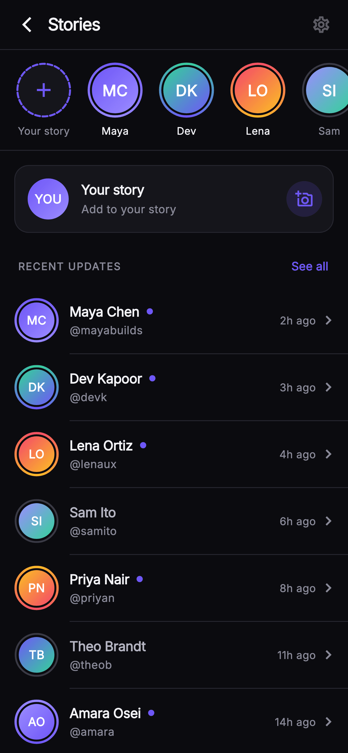
What you'll build
- ✓A horizontal `ListView.separated` rail with a leading add tile that reports `-1` through the same `onStory` callback as real stories
- ✓`_RingAvatarPainter`, which strokes a `SweepGradient` ring rotated by `-math.pi / 2` for unseen stories and a `#3A3A46` grey ring for seen ones
- ✓`_DashedRingPainter`, a 22-segment dashed ring built from `drawArc` calls with a 34% gap fraction
- ✓A `_RingAvatar` widget that reuses one `_Story` model at two sizes (62px in the rail, 50px in the list) and computes initials from the name
- ✓An `_UpdateRow` list whose name colour, unseen dot and indented dividers all derive from the `unseen` flag
Step-by-step build
Create the file
Add a new file at lib/social_feed_stories_rail/social_feed_stories_rail_screen.dart in your Flutter project.
Register the bundled fonts
No external packages — this is pure Flutter. It does bundle its design font (Inter), so drop the font file into fonts/ and declare it in pubspec.yaml:
flutter:
  fonts:
    - family: Inter
      fonts:
- asset: fonts/Inter-Regular.ttfBuild it, piece by piece
Here's how the screen goes together. Each block below is a real slice of the code with a plain-English explanation — paste them in order, or grab the whole file from the next section.
Callbacks, palette and the story data
import 'dart:math' as math;

import 'package:flutter/material.dart';

/// Stories Rail Detail — a dedicated Pulse screen that expands the stories
/// experience into a full horizontal tray plus a scrolling list of recent
/// story updates. The tray leads with an "Add story" tile, then painted
/// gradient unseen-rings and muted seen-rings around gradient monogram
/// avatars. Below, a "RECENT UPDATES" section lists per-person updates with
/// handles, timestamps and unseen indicators, led by a bordered "Add to your
/// story" card. Every action is a nullable callback so the gallery registry
/// wires navigation. Self-contained per CONVENTIONS.md: pure Flutter, bundled
/// Inter font, own dark theme, SafeArea, fully overflow-proof.
///
/// slug: social-feed-stories-rail
class SocialFeedStoriesRailScreen extends StatelessWidget {
  const SocialFeedStoriesRailScreen({
    super.key,
    this.onBack,
    this.onSettings,
    this.onStory,
    this.onAddStory,
    this.onSeeAll,
  });

  final VoidCallback? onBack;
  final VoidCallback? onSettings;

  /// A story ring/update tap (index into the story list).
  final ValueChanged<int>? onStory;
  final VoidCallback? onAddStory;
  final VoidCallback? onSeeAll;

  static const String _font = 'Inter';
  static const Color _bg = Color(0xFF0B0B0F);
  static const Color _surface = Color(0xFF15151B);
  static const Color _brand = Color(0xFF6E56F7);
  static const Color _hairline = Color(0xFF26262F);
  static const Color _textHi = Color(0xFFF4F4F7);
  static const Color _textLo = Color(0xFFB5B5C2);
  static const Color _muted = Color(0xFF8A8A99);

  static const List<_Story> _stories = <_Story>[
    _Story('Maya Chen', 'mayabuilds', '2h ago', 0xFF6E56F7, 0xFF9B8CFF,
        unseen: true),
    _Story('Dev Kapoor', 'devk', '3h ago', 0xFF34D399, 0xFF6E56F7,
        unseen: true),
    _Story('Lena Ortiz', 'lenaux', '4h ago', 0xFFF4476B, 0xFFFBBF24,
        unseen: true),
    _Story('Sam Ito', 'samito', '6h ago', 0xFF9B8CFF, 0xFF34D399,
        unseen: false),
    _Story('Priya Nair', 'priyan', '8h ago', 0xFFFBBF24, 0xFFF4476B,
        unseen: true),
    _Story('Theo Brandt', 'theob', '11h ago', 0xFF6E56F7, 0xFF34D399,
        unseen: false),
    _Story('Amara Osei', 'amara', '14h ago', 0xFF9B8CFF, 0xFF6E56F7,
        unseen: true),
    _Story('Kai Fisher', 'kaifisher', '19h ago', 0xFFF4476B, 0xFF9B8CFF,
        unseen: false),
  ];
`SocialFeedStoriesRailScreen` is a `StatelessWidget` because nothing on this screen mutates locally — seen/unseen state comes from the data, and every interaction leaves through a nullable callback: `onBack`, `onSettings`, `onAddStory`, `onSeeAll`, and `onStory`, which is a `ValueChanged<int>` carrying the index into the story list rather than a plain `VoidCallback`. The palette is the Pulse near-mono dark set: `_bg` `#0B0B0F`, `_surface` `#15151B`, `_hairline` `#26262F`, with a single indigo `_brand` `#6E56F7` and three text tiers (`_textHi`, `_textLo`, `_muted`). The eight `_Story` records hold two colour ints, `colorA` and `colorB`, instead of image URLs — those two colours drive both the avatar gradient and the ring sweep, so each person gets a consistent identity with zero network assets. Note the mix of `unseen: true` and `false` so both ring styles render in the preview.
Forcing a dark theme and composing the column
  @override
  Widget build(BuildContext context) {
    return Theme(
      data: ThemeData.dark(useMaterial3: true),
      child: Scaffold(
        backgroundColor: _bg,
        body: SafeArea(
          bottom: false,
          child: Column(
            children: <Widget>[
              _TopBar(onBack: onBack, onSettings: onSettings),
              _StoriesRail(stories: _stories, onTap: onStory),
              const Divider(height: 1, color: _hairline),
              Expanded(
                child: ListView(
                  padding: const EdgeInsets.only(bottom: 28),
                  children: <Widget>[
                    _AddYourStoryCard(onTap: onAddStory),
                    _SectionHeader(onSeeAll: onSeeAll),
                    for (int i = 0; i < _stories.length - 1; i++) ...<Widget>[
                      _UpdateRow(
                        story: _stories[i],
                        onTap: () => onStory?.call(i),
                      ),
                      if (i < _stories.length - 2)
                        const Divider(
                          height: 1,
                          thickness: 1,
                          indent: 78,
                          color: _hairline,
                        ),
                    ],
                  ],
                ),
              ),
            ],
          ),
        ),
      ),
    );
  }
}
`build` wraps the `Scaffold` in `Theme(data: ThemeData.dark(useMaterial3: true))` so the `IconButton` ripples, `TextButton` and `Divider` pick up dark defaults even if the host app is light. `SafeArea(bottom: false)` protects the top bar from the notch but lets the list run under the home indicator, with `EdgeInsets.only(bottom: 28)` on the `ListView` providing the breathing room instead. The layout is a `Column`: `_TopBar`, the fixed-height `_StoriesRail`, a 1px hairline `Divider`, then an `Expanded` `ListView`. The list loop runs `i < _stories.length - 1`, so seven of the eight people appear as rows, and the inner `if (i < _stories.length - 2)` stops a divider being drawn after the final row. Each `_UpdateRow` gets `() => onStory?.call(i)`, so tapping a row and tapping the same avatar in the rail fire the identical callback with the identical index. Dividers use `indent: 78` — 16px padding plus the 50px avatar plus the 12px gap — so the line starts under the text, not the avatar.
Top bar, story model and the horizontal rail
// ── top bar ──────────────────────────────────────────────────────────────────
class _TopBar extends StatelessWidget {
  const _TopBar({this.onBack, this.onSettings});
  final VoidCallback? onBack;
  final VoidCallback? onSettings;

  @override
  Widget build(BuildContext context) {
    return Container(
      height: 56,
      padding: const EdgeInsets.symmetric(horizontal: 6),
      decoration: const BoxDecoration(
        color: SocialFeedStoriesRailScreen._bg,
        border: Border(
          bottom: BorderSide(color: SocialFeedStoriesRailScreen._hairline),
        ),
      ),
      child: Row(
        children: <Widget>[
          IconButton(
            onPressed: onBack,
            icon: const Icon(Icons.arrow_back_ios_new, size: 20),
            color: SocialFeedStoriesRailScreen._textHi,
            splashRadius: 22,
          ),
          const Expanded(
            child: Text(
              'Stories',
              style: TextStyle(
                fontFamily: SocialFeedStoriesRailScreen._font,
                fontSize: 19,
                fontWeight: FontWeight.w800,
                letterSpacing: -0.6,
                color: SocialFeedStoriesRailScreen._textHi,
              ),
            ),
          ),
          IconButton(
            onPressed: onSettings,
            icon: const Icon(Icons.settings_outlined, size: 22),
            color: SocialFeedStoriesRailScreen._textHi,
            splashRadius: 22,
          ),
        ],
      ),
    );
  }
}

// ── stories rail ─────────────────────────────────────────────────────────────
class _Story {
  const _Story(
    this.name,
    this.handle,
    this.time,
    this.colorA,
    this.colorB, {
    required this.unseen,
  });
  final String name;
  final String handle;
  final String time;
  final int colorA;
  final int colorB;
  final bool unseen;
}

class _StoriesRail extends StatelessWidget {
  const _StoriesRail({required this.stories, this.onTap});
  final List<_Story> stories;
  final ValueChanged<int>? onTap;

  @override
  Widget build(BuildContext context) {
    return SizedBox(
      height: 112,
      child: ListView.separated(
        scrollDirection: Axis.horizontal,
        padding: const EdgeInsets.fromLTRB(16, 14, 16, 12),
        itemCount: stories.length + 1,
        separatorBuilder: (BuildContext context, int _) =>
            const SizedBox(width: 14),
        itemBuilder: (BuildContext context, int i) {
          if (i == 0) {
            return _AddStoryTile(onTap: onTap);
          }
          final _Story s = stories[i - 1];
          return _StoryItem(story: s, onTap: () => onTap?.call(i - 1));
        },
      ),
    );
  }
}
`_TopBar` is a fixed 56px `Container` with only 6px horizontal padding, because the `IconButton`s carry their own 48px tap targets; its bottom edge is a `Border(bottom: BorderSide(color: _hairline))` rather than a separate `Divider`. The 'Stories' title sits at 19px `w800` with `letterSpacing: -0.6` inside `Expanded`, claiming all space between the 20px back chevron and the 22px settings gear (sized differently to balance the denser chevron glyph). `_Story` is a plain const class with a named `required this.unseen`, forcing the seen state to be spelled out at every call site. `_StoriesRail` is a `SizedBox(height: 112)` around a horizontal `ListView.separated`; the fixed height lets it sit inside the parent `Column` without an unbounded-height error. `itemCount` is `stories.length + 1` and index 0 is special-cased to `_AddStoryTile`, so the add tile scrolls with the rail rather than being pinned. The `i - 1` offset appears twice, once to read `stories[i - 1]` and once in `onTap?.call(i - 1)`, so the index the callback reports matches the data list rather than rail positions. Separators are constant 14px `SizedBox`es.
The add tile and a story tile
class _AddStoryTile extends StatelessWidget {
  const _AddStoryTile({this.onTap});
  final ValueChanged<int>? onTap;

  @override
  Widget build(BuildContext context) {
    return GestureDetector(
      onTap: () => onTap?.call(-1),
      behavior: HitTestBehavior.opaque,
      child: SizedBox(
        width: 66,
        child: Column(
          children: <Widget>[
            SizedBox(
              width: 62,
              height: 62,
              child: CustomPaint(
                painter: _DashedRingPainter(),
                child: const Center(
                  child: Icon(
                    Icons.add,
                    color: SocialFeedStoriesRailScreen._brand,
                    size: 26,
                  ),
                ),
              ),
            ),
            const SizedBox(height: 7),
            const Text(
              'Your story',
              maxLines: 1,
              overflow: TextOverflow.ellipsis,
              style: TextStyle(
                fontFamily: SocialFeedStoriesRailScreen._font,
                fontSize: 11.5,
                color: SocialFeedStoriesRailScreen._muted,
              ),
            ),
          ],
        ),
      ),
    );
  }
}

class _StoryItem extends StatelessWidget {
  const _StoryItem({required this.story, this.onTap});
  final _Story story;
  final VoidCallback? onTap;

  @override
  Widget build(BuildContext context) {
    return GestureDetector(
      onTap: onTap,
      behavior: HitTestBehavior.opaque,
      child: SizedBox(
        width: 66,
        child: Column(
          children: <Widget>[
            _RingAvatar(story: story, size: 62),
            const SizedBox(height: 7),
            Text(
              story.name.split(' ').first,
              maxLines: 1,
              overflow: TextOverflow.ellipsis,
              style: TextStyle(
                fontFamily: SocialFeedStoriesRailScreen._font,
                fontSize: 11.5,
                color: story.unseen
                    ? SocialFeedStoriesRailScreen._textHi
                    : SocialFeedStoriesRailScreen._muted,
              ),
            ),
          ],
        ),
      ),
    );
  }
}
Both tiles are 66px wide `Column`s inside a `GestureDetector` with `HitTestBehavior.opaque`, so the gap between the ring and the caption is tappable rather than falling through to the list. `_AddStoryTile` takes the same `ValueChanged<int>?` as real stories and reports `-1`, so a host app can route 'new story' through the single `onStory` handler without a second parameter — the registry's `onAddStory` is reserved for the larger card below. Its 62px `CustomPaint` uses `_DashedRingPainter` with a centred 26px indigo `Icons.add`. `_StoryItem` swaps in `_RingAvatar(size: 62)` and shows only `story.name.split(' ').first`, because a 66px tile has room for one name, with `maxLines: 1` and ellipsis as a guard for long first names. The caption colour flips with `story.unseen`: `_textHi` for unseen, `_muted` for seen, which is the same visual convention Instagram uses so users read it without thinking.
One ring avatar, two sizes
/// A gradient sweep (unseen) / grey (seen) ring around a gradient monogram.
class _RingAvatar extends StatelessWidget {
  const _RingAvatar({required this.story, required this.size});
  final _Story story;
  final double size;

  String get _initials {
    final List<String> p = story.name.trim().split(RegExp(r'\s+'));
    if (p.length == 1) return p.first.characters.first.toUpperCase();
    return (p.first[0] + p.last[0]).toUpperCase();
  }

  @override
  Widget build(BuildContext context) {
    final double inner = size - 10;
    return SizedBox(
      width: size,
      height: size,
      child: CustomPaint(
        painter: _RingAvatarPainter(
          colorA: Color(story.colorA),
          colorB: Color(story.colorB),
          unseen: story.unseen,
        ),
        child: Center(
          child: Container(
            width: inner,
            height: inner,
            decoration: BoxDecoration(
              shape: BoxShape.circle,
              gradient: LinearGradient(
                begin: Alignment.topLeft,
                end: Alignment.bottomRight,
                colors: <Color>[Color(story.colorA), Color(story.colorB)],
              ),
            ),
            child: Center(
              child: Text(
                _initials,
                style: TextStyle(
                  fontFamily: SocialFeedStoriesRailScreen._font,
                  fontSize: inner * 0.33,
                  fontWeight: FontWeight.w700,
                  color: Colors.white,
                ),
              ),
            ),
          ),
        ),
      ),
    );
  }
}
`_RingAvatar` is the piece that makes the rail and the update list feel like the same people. It takes a `size` and derives `inner = size - 10`, leaving a 5px gutter on each side for the painted ring and a gap between ring and disc. The `_initials` getter splits the name on `RegExp(r'\s+')`, so double spaces don't produce an empty part, and uses `characters.first` for the single-name case so a name starting with a multi-code-unit glyph doesn't get split mid-grapheme; two-part names take the first letter of the first and last parts. The `CustomPaint` layers `_RingAvatarPainter` behind a `Center`ed circular `Container` carrying a top-left to bottom-right `LinearGradient` from `colorA` to `colorB`. The initials are `inner * 0.33` in size, so text scales with the avatar rather than being hard-coded — at 62px the inner disc is 52px and the letters about 17px; at 50px they drop to roughly 13px automatically.
The 'Add to your story' card
// ── add-to-your-story card ───────────────────────────────────────────────────
class _AddYourStoryCard extends StatelessWidget {
  const _AddYourStoryCard({this.onTap});
  final VoidCallback? onTap;

  @override
  Widget build(BuildContext context) {
    return Padding(
      padding: const EdgeInsets.fromLTRB(16, 16, 16, 8),
      child: GestureDetector(
        onTap: onTap,
        behavior: HitTestBehavior.opaque,
        child: Container(
          padding: const EdgeInsets.fromLTRB(14, 14, 12, 14),
          decoration: BoxDecoration(
            color: SocialFeedStoriesRailScreen._surface,
            borderRadius: BorderRadius.circular(16),
            border: Border.all(color: SocialFeedStoriesRailScreen._hairline),
          ),
          child: Row(
            children: <Widget>[
              const _Monogram(
                initials: 'YOU',
                colorA: Color(0xFF6E56F7),
                colorB: Color(0xFF9B8CFF),
                size: 46,
              ),
              const SizedBox(width: 14),
              const Expanded(
                child: Column(
                  crossAxisAlignment: CrossAxisAlignment.start,
                  children: <Widget>[
                    Text(
                      'Your story',
                      maxLines: 1,
                      overflow: TextOverflow.ellipsis,
                      style: TextStyle(
                        fontFamily: SocialFeedStoriesRailScreen._font,
                        fontSize: 15,
                        fontWeight: FontWeight.w700,
                        letterSpacing: -0.2,
                        color: SocialFeedStoriesRailScreen._textHi,
                      ),
                    ),
                    SizedBox(height: 3),
                    Text(
                      'Add to your story',
                      maxLines: 1,
                      overflow: TextOverflow.ellipsis,
                      style: TextStyle(
                        fontFamily: SocialFeedStoriesRailScreen._font,
                        fontSize: 12.5,
                        color: SocialFeedStoriesRailScreen._muted,
                      ),
                    ),
                  ],
                ),
              ),
              Container(
                width: 40,
                height: 40,
                decoration: BoxDecoration(
                  color: SocialFeedStoriesRailScreen._brand
                      .withValues(alpha: 0.16),
                  shape: BoxShape.circle,
                ),
                child: const Icon(
                  Icons.add_a_photo_outlined,
                  color: SocialFeedStoriesRailScreen._brand,
                  size: 20,
                ),
              ),
            ],
          ),
        ),
      ),
    );
  }
}
`_AddYourStoryCard` is the first item in the scrolling list and the only bordered card on the screen, which visually promotes it above the flat rows beneath. It uses `_surface` `#15151B` with a 16px radius and a `_hairline` border, and padding of `fromLTRB(14, 14, 12, 14)` — the right side is 2px tighter because the 40px icon circle already carries visual weight. The leading avatar is a `_Monogram` with hard-coded 'YOU' initials in the brand gradient `#6E56F7` to `#9B8CFF`, which distinguishes the user from the friends' avatars without needing a profile photo. Two text lines, 'Your story' at 15px `w700` and 'Add to your story' at 12.5px muted, sit in an `Expanded` `Column` so long translations ellipsise instead of overflowing. The trailing `Icons.add_a_photo_outlined` sits in a circle tinted `_brand.withValues(alpha: 0.16)`, the two-layer accent pattern — soft tinted disc, saturated glyph — used across the Pulse kit.
Section header and the update rows
// ── section header ───────────────────────────────────────────────────────────
class _SectionHeader extends StatelessWidget {
  const _SectionHeader({this.onSeeAll});
  final VoidCallback? onSeeAll;

  @override
  Widget build(BuildContext context) {
    return Padding(
      padding: const EdgeInsets.fromLTRB(20, 14, 12, 8),
      child: Row(
        children: <Widget>[
          const Expanded(
            child: Text(
              'RECENT UPDATES',
              maxLines: 1,
              overflow: TextOverflow.ellipsis,
              style: TextStyle(
                fontFamily: SocialFeedStoriesRailScreen._font,
                fontSize: 11.5,
                fontWeight: FontWeight.w700,
                letterSpacing: 1.0,
                color: SocialFeedStoriesRailScreen._muted,
              ),
            ),
          ),
          TextButton(
            onPressed: onSeeAll,
            style: TextButton.styleFrom(
              minimumSize: Size.zero,
              padding: const EdgeInsets.symmetric(horizontal: 10, vertical: 6),
              tapTargetSize: MaterialTapTargetSize.shrinkWrap,
            ),
            child: const Text(
              'See all',
              style: TextStyle(
                fontFamily: SocialFeedStoriesRailScreen._font,
                fontSize: 13,
                fontWeight: FontWeight.w600,
                color: SocialFeedStoriesRailScreen._brand,
              ),
            ),
          ),
        ],
      ),
    );
  }
}

// ── update row ───────────────────────────────────────────────────────────────
class _UpdateRow extends StatelessWidget {
  const _UpdateRow({required this.story, this.onTap});
  final _Story story;
  final VoidCallback? onTap;

  @override
  Widget build(BuildContext context) {
    return GestureDetector(
      onTap: onTap,
      behavior: HitTestBehavior.opaque,
      child: Padding(
        padding: const EdgeInsets.fromLTRB(16, 12, 12, 12),
        child: Row(
          children: <Widget>[
            _RingAvatar(story: story, size: 50),
            const SizedBox(width: 12),
            Expanded(
              child: Column(
                crossAxisAlignment: CrossAxisAlignment.start,
                children: <Widget>[
                  Row(
                    children: <Widget>[
                      Flexible(
                        child: Text(
                          story.name,
                          maxLines: 1,
                          overflow: TextOverflow.ellipsis,
                          style: TextStyle(
                            fontFamily: SocialFeedStoriesRailScreen._font,
                            fontSize: 15,
                            fontWeight: FontWeight.w600,
                            letterSpacing: -0.2,
                            color: story.unseen
                                ? SocialFeedStoriesRailScreen._textHi
                                : SocialFeedStoriesRailScreen._textLo,
                          ),
                        ),
                      ),
                      if (story.unseen) ...<Widget>[
                        const SizedBox(width: 8),
                        Container(
                          width: 7,
                          height: 7,
                          decoration: const BoxDecoration(
                            color: SocialFeedStoriesRailScreen._brand,
                            shape: BoxShape.circle,
                          ),
                        ),
                      ],
                    ],
                  ),
                  const SizedBox(height: 2),
                  Text(
                    '@${story.handle}',
                    maxLines: 1,
                    overflow: TextOverflow.ellipsis,
                    style: const TextStyle(
                      fontFamily: SocialFeedStoriesRailScreen._font,
                      fontSize: 12.5,
                      color: SocialFeedStoriesRailScreen._muted,
                    ),
                  ),
                ],
              ),
            ),
            const SizedBox(width: 10),
            Text(
              story.time,
              style: const TextStyle(
                fontFamily: SocialFeedStoriesRailScreen._font,
                fontSize: 12,
                color: SocialFeedStoriesRailScreen._muted,
              ),
            ),
            const SizedBox(width: 4),
            const Icon(
              Icons.chevron_right,
              size: 20,
              color: SocialFeedStoriesRailScreen._muted,
            ),
          ],
        ),
      ),
    );
  }
}
`_SectionHeader` sets 'RECENT UPDATES' at 11.5px `w700` with `letterSpacing: 1.0`, the uppercase-tracked eyebrow style, next to a 'See all' `TextButton`. The button overrides `minimumSize: Size.zero`, `tapTargetSize: MaterialTapTargetSize.shrinkWrap` and a 10×6 padding, because Material's default 48px minimum would push the header row to almost twice its intended height. `_UpdateRow` reuses `_RingAvatar` at 50px next to a name/handle column and a trailing timestamp plus chevron. The name is wrapped in `Flexible` inside a `Row`, so it shrinks to make room for the 7px indigo unseen dot that follows it, rather than pushing the dot off screen for a long name; the dot and its 8px spacer only render inside `if (story.unseen)`. The name colour steps down from `_textHi` to `_textLo` for seen stories, a lighter demotion than the rail's `_muted`, because a list row still needs to be readable at a glance.
The monogram and the two painters
// ── monogram avatar ──────────────────────────────────────────────────────────
class _Monogram extends StatelessWidget {
  const _Monogram({
    required this.initials,
    required this.colorA,
    required this.colorB,
    this.size = 42,
  });
  final String initials;
  final Color colorA;
  final Color colorB;
  final double size;

  @override
  Widget build(BuildContext context) {
    return Container(
      width: size,
      height: size,
      decoration: BoxDecoration(
        shape: BoxShape.circle,
        gradient: LinearGradient(
          begin: Alignment.topLeft,
          end: Alignment.bottomRight,
          colors: <Color>[colorA, colorB],
        ),
      ),
      child: Center(
        child: Text(
          initials,
          style: TextStyle(
            fontFamily: SocialFeedStoriesRailScreen._font,
            fontSize: size * 0.3,
            fontWeight: FontWeight.w700,
            color: Colors.white,
          ),
        ),
      ),
    );
  }
}

// ── painters ─────────────────────────────────────────────────────────────────
class _RingAvatarPainter extends CustomPainter {
  _RingAvatarPainter({
    required this.colorA,
    required this.colorB,
    required this.unseen,
  });
  final Color colorA;
  final Color colorB;
  final bool unseen;

  @override
  void paint(Canvas canvas, Size size) {
    final Offset center = size.center(Offset.zero);
    final double radius = size.width / 2 - 1.5;
    if (unseen) {
      canvas.drawCircle(
        center,
        radius,
        Paint()
          ..style = PaintingStyle.stroke
          ..strokeWidth = 2.6
          ..shader = SweepGradient(
            colors: <Color>[colorA, colorB, colorA],
            transform: const GradientRotation(-math.pi / 2),
          ).createShader(Rect.fromCircle(center: center, radius: radius)),
      );
    } else {
      canvas.drawCircle(
        center,
        radius,
        Paint()
          ..style = PaintingStyle.stroke
          ..strokeWidth = 2.0
          ..color = const Color(0xFF3A3A46),
      );
    }
  }

  @override
  bool shouldRepaint(covariant _RingAvatarPainter old) =>
      old.unseen != unseen || old.colorA != colorA || old.colorB != colorB;
}

/// A dashed-look brand ring used for the "Add story" tile.
class _DashedRingPainter extends CustomPainter {
  @override
  void paint(Canvas canvas, Size size) {
    final Offset center = size.center(Offset.zero);
    final double radius = size.width / 2 - 1.5;

    // Filled surface disc.
    canvas.drawCircle(
      center,
      radius,
      Paint()..color = const Color(0xFF15151B),
    );

    // Dashed brand ring.
    final Paint dash = Paint()
      ..style = PaintingStyle.stroke
      ..strokeWidth = 2.2
      ..strokeCap = StrokeCap.round
      ..color = const Color(0xFF6E56F7);
    const int segments = 22;
    const double gap = 0.34; // fraction of each segment left empty
    final double step = (2 * math.pi) / segments;
    for (int i = 0; i < segments; i++) {
      final double start = i * step;
      canvas.drawArc(
        Rect.fromCircle(center: center, radius: radius),
        start,
        step * (1 - gap),
        false,
        dash,
      );
    }
  }

  @override
  bool shouldRepaint(covariant CustomPainter oldDelegate) => false;
}
`_Monogram` is the standalone version of the avatar disc — a gradient circle with initials at `size * 0.3` — used only by the 'YOU' card. `_RingAvatarPainter` computes `radius = size.width / 2 - 1.5` so the 2.6px stroke doesn't clip at the edges. For unseen it builds a `SweepGradient` with `[colorA, colorB, colorA]` so the ring's start and end colours match and there is no visible seam, and rotates it by `GradientRotation(-math.pi / 2)` so the sweep begins at twelve o'clock instead of three. Seen rings are a thinner 2.0px `#3A3A46` stroke. `shouldRepaint` compares `unseen` and both colours, so scrolling doesn't repaint unchanged rings. `_DashedRingPainter` first fills a `#15151B` disc, then loops 22 times drawing arcs of `step * (1 - gap)` where `gap = 0.34`, leaving a third of each segment empty; `StrokeCap.round` softens the dash ends. It never repaints because it has no inputs.
Full code
The complete, ready-to-paste source. Free to use in your projects — one click copies it all.
import 'dart:math' as math;
import 'package:flutter/material.dart';
/// Stories Rail Detail — a dedicated Pulse screen that expands the stories
/// experience into a full horizontal tray plus a scrolling list of recent
/// story updates. The tray leads with an "Add story" tile, then painted
/// gradient unseen-rings and muted seen-rings around gradient monogram
/// avatars. Below, a "RECENT UPDATES" section lists per-person updates with
/// handles, timestamps and unseen indicators, led by a bordered "Add to your
/// story" card. Every action is a nullable callback so the gallery registry
/// wires navigation. Self-contained per CONVENTIONS.md: pure Flutter, bundled
/// Inter font, own dark theme, SafeArea, fully overflow-proof.
///
/// slug: social-feed-stories-rail
class SocialFeedStoriesRailScreen extends StatelessWidget {
const SocialFeedStoriesRailScreen({
super.key,
this.onBack,
this.onSettings,
this.onStory,
this.onAddStory,
this.onSeeAll,
});
final VoidCallback? onBack;
final VoidCallback? onSettings;
/// A story ring/update tap (index into the story list).
final ValueChanged<int>? onStory;
final VoidCallback? onAddStory;
final VoidCallback? onSeeAll;
static const String _font = 'Inter';
static const Color _bg = Color(0xFF0B0B0F);
static const Color _surface = Color(0xFF15151B);
static const Color _brand = Color(0xFF6E56F7);
static const Color _hairline = Color(0xFF26262F);
static const Color _textHi = Color(0xFFF4F4F7);
static const Color _textLo = Color(0xFFB5B5C2);
static const Color _muted = Color(0xFF8A8A99);
static const List<_Story> _stories = <_Story>[
_Story('Maya Chen', 'mayabuilds', '2h ago', 0xFF6E56F7, 0xFF9B8CFF,
unseen: true),
_Story('Dev Kapoor', 'devk', '3h ago', 0xFF34D399, 0xFF6E56F7,
unseen: true),
_Story('Lena Ortiz', 'lenaux', '4h ago', 0xFFF4476B, 0xFFFBBF24,
unseen: true),
_Story('Sam Ito', 'samito', '6h ago', 0xFF9B8CFF, 0xFF34D399,
unseen: false),
_Story('Priya Nair', 'priyan', '8h ago', 0xFFFBBF24, 0xFFF4476B,
unseen: true),
_Story('Theo Brandt', 'theob', '11h ago', 0xFF6E56F7, 0xFF34D399,
unseen: false),
_Story('Amara Osei', 'amara', '14h ago', 0xFF9B8CFF, 0xFF6E56F7,
unseen: true),
_Story('Kai Fisher', 'kaifisher', '19h ago', 0xFFF4476B, 0xFF9B8CFF,
unseen: false),
];
@override
Widget build(BuildContext context) {
return Theme(
data: ThemeData.dark(useMaterial3: true),
child: Scaffold(
backgroundColor: _bg,
body: SafeArea(
bottom: false,
child: Column(
children: <Widget>[
_TopBar(onBack: onBack, onSettings: onSettings),
_StoriesRail(stories: _stories, onTap: onStory),
const Divider(height: 1, color: _hairline),
Expanded(
child: ListView(
padding: const EdgeInsets.only(bottom: 28),
children: <Widget>[
_AddYourStoryCard(onTap: onAddStory),
_SectionHeader(onSeeAll: onSeeAll),
for (int i = 0; i < _stories.length - 1; i++) ...<Widget>[
_UpdateRow(
story: _stories[i],
onTap: () => onStory?.call(i),
),
if (i < _stories.length - 2)
const Divider(
height: 1,
thickness: 1,
indent: 78,
color: _hairline,
),
],
],
),
),
],
),
),
),
);
}
}
// ── top bar ──────────────────────────────────────────────────────────────────
class _TopBar extends StatelessWidget {
const _TopBar({this.onBack, this.onSettings});
final VoidCallback? onBack;
final VoidCallback? onSettings;
@override
Widget build(BuildContext context) {
return Container(
height: 56,
padding: const EdgeInsets.symmetric(horizontal: 6),
decoration: const BoxDecoration(
color: SocialFeedStoriesRailScreen._bg,
border: Border(
bottom: BorderSide(color: SocialFeedStoriesRailScreen._hairline),
),
),
child: Row(
children: <Widget>[
IconButton(
onPressed: onBack,
icon: const Icon(Icons.arrow_back_ios_new, size: 20),
color: SocialFeedStoriesRailScreen._textHi,
splashRadius: 22,
),
const Expanded(
child: Text(
'Stories',
style: TextStyle(
fontFamily: SocialFeedStoriesRailScreen._font,
fontSize: 19,
fontWeight: FontWeight.w800,
letterSpacing: -0.6,
color: SocialFeedStoriesRailScreen._textHi,
),
),
),
IconButton(
onPressed: onSettings,
icon: const Icon(Icons.settings_outlined, size: 22),
color: SocialFeedStoriesRailScreen._textHi,
splashRadius: 22,
),
],
),
);
}
}
// ── stories rail ─────────────────────────────────────────────────────────────
class _Story {
const _Story(
this.name,
this.handle,
this.time,
this.colorA,
this.colorB, {
required this.unseen,
});
final String name;
final String handle;
final String time;
final int colorA;
final int colorB;
final bool unseen;
}
class _StoriesRail extends StatelessWidget {
const _StoriesRail({required this.stories, this.onTap});
final List<_Story> stories;
final ValueChanged<int>? onTap;
@override
Widget build(BuildContext context) {
return SizedBox(
height: 112,
child: ListView.separated(
scrollDirection: Axis.horizontal,
padding: const EdgeInsets.fromLTRB(16, 14, 16, 12),
itemCount: stories.length + 1,
separatorBuilder: (BuildContext context, int _) =>
const SizedBox(width: 14),
itemBuilder: (BuildContext context, int i) {
if (i == 0) {
return _AddStoryTile(onTap: onTap);
}
final _Story s = stories[i - 1];
return _StoryItem(story: s, onTap: () => onTap?.call(i - 1));
},
),
);
}
}
class _AddStoryTile extends StatelessWidget {
const _AddStoryTile({this.onTap});
final ValueChanged<int>? onTap;
@override
Widget build(BuildContext context) {
return GestureDetector(
onTap: () => onTap?.call(-1),
behavior: HitTestBehavior.opaque,
child: SizedBox(
width: 66,
child: Column(
children: <Widget>[
SizedBox(
width: 62,
height: 62,
child: CustomPaint(
painter: _DashedRingPainter(),
child: const Center(
child: Icon(
Icons.add,
color: SocialFeedStoriesRailScreen._brand,
size: 26,
),
),
),
),
const SizedBox(height: 7),
const Text(
'Your story',
maxLines: 1,
overflow: TextOverflow.ellipsis,
style: TextStyle(
fontFamily: SocialFeedStoriesRailScreen._font,
fontSize: 11.5,
color: SocialFeedStoriesRailScreen._muted,
),
),
],
),
),
);
}
}
class _StoryItem extends StatelessWidget {
const _StoryItem({required this.story, this.onTap});
final _Story story;
final VoidCallback? onTap;
@override
Widget build(BuildContext context) {
return GestureDetector(
onTap: onTap,
behavior: HitTestBehavior.opaque,
child: SizedBox(
width: 66,
child: Column(
children: <Widget>[
_RingAvatar(story: story, size: 62),
const SizedBox(height: 7),
Text(
story.name.split(' ').first,
maxLines: 1,
overflow: TextOverflow.ellipsis,
style: TextStyle(
fontFamily: SocialFeedStoriesRailScreen._font,
fontSize: 11.5,
color: story.unseen
? SocialFeedStoriesRailScreen._textHi
: SocialFeedStoriesRailScreen._muted,
),
),
],
),
),
);
}
}
/// A gradient sweep (unseen) / grey (seen) ring around a gradient monogram.
class _RingAvatar extends StatelessWidget {
const _RingAvatar({required this.story, required this.size});
final _Story story;
final double size;
String get _initials {
final List<String> p = story.name.trim().split(RegExp(r'\s+'));
if (p.length == 1) return p.first.characters.first.toUpperCase();
return (p.first[0] + p.last[0]).toUpperCase();
}
@override
Widget build(BuildContext context) {
final double inner = size - 10;
return SizedBox(
width: size,
height: size,
child: CustomPaint(
painter: _RingAvatarPainter(
colorA: Color(story.colorA),
colorB: Color(story.colorB),
unseen: story.unseen,
),
child: Center(
child: Container(
width: inner,
height: inner,
decoration: BoxDecoration(
shape: BoxShape.circle,
gradient: LinearGradient(
begin: Alignment.topLeft,
end: Alignment.bottomRight,
colors: <Color>[Color(story.colorA), Color(story.colorB)],
),
),
child: Center(
child: Text(
_initials,
style: TextStyle(
fontFamily: SocialFeedStoriesRailScreen._font,
fontSize: inner * 0.33,
fontWeight: FontWeight.w700,
color: Colors.white,
),
),
),
),
),
),
);
}
}
// ── add-to-your-story card ───────────────────────────────────────────────────
class _AddYourStoryCard extends StatelessWidget {
const _AddYourStoryCard({this.onTap});
final VoidCallback? onTap;
@override
Widget build(BuildContext context) {
return Padding(
padding: const EdgeInsets.fromLTRB(16, 16, 16, 8),
child: GestureDetector(
onTap: onTap,
behavior: HitTestBehavior.opaque,
child: Container(
padding: const EdgeInsets.fromLTRB(14, 14, 12, 14),
decoration: BoxDecoration(
color: SocialFeedStoriesRailScreen._surface,
borderRadius: BorderRadius.circular(16),
border: Border.all(color: SocialFeedStoriesRailScreen._hairline),
),
child: Row(
children: <Widget>[
const _Monogram(
initials: 'YOU',
colorA: Color(0xFF6E56F7),
colorB: Color(0xFF9B8CFF),
size: 46,
),
const SizedBox(width: 14),
const Expanded(
child: Column(
crossAxisAlignment: CrossAxisAlignment.start,
children: <Widget>[
Text(
'Your story',
maxLines: 1,
overflow: TextOverflow.ellipsis,
style: TextStyle(
fontFamily: SocialFeedStoriesRailScreen._font,
fontSize: 15,
fontWeight: FontWeight.w700,
letterSpacing: -0.2,
color: SocialFeedStoriesRailScreen._textHi,
),
),
SizedBox(height: 3),
Text(
'Add to your story',
maxLines: 1,
overflow: TextOverflow.ellipsis,
style: TextStyle(
fontFamily: SocialFeedStoriesRailScreen._font,
fontSize: 12.5,
color: SocialFeedStoriesRailScreen._muted,
),
),
],
),
),
Container(
width: 40,
height: 40,
decoration: BoxDecoration(
color: SocialFeedStoriesRailScreen._brand
.withValues(alpha: 0.16),
shape: BoxShape.circle,
),
child: const Icon(
Icons.add_a_photo_outlined,
color: SocialFeedStoriesRailScreen._brand,
size: 20,
),
),
],
),
),
),
);
}
}
// ── section header ───────────────────────────────────────────────────────────
class _SectionHeader extends StatelessWidget {
const _SectionHeader({this.onSeeAll});
final VoidCallback? onSeeAll;
@override
Widget build(BuildContext context) {
return Padding(
padding: const EdgeInsets.fromLTRB(20, 14, 12, 8),
child: Row(
children: <Widget>[
const Expanded(
child: Text(
'RECENT UPDATES',
maxLines: 1,
overflow: TextOverflow.ellipsis,
style: TextStyle(
fontFamily: SocialFeedStoriesRailScreen._font,
fontSize: 11.5,
fontWeight: FontWeight.w700,
letterSpacing: 1.0,
color: SocialFeedStoriesRailScreen._muted,
),
),
),
TextButton(
onPressed: onSeeAll,
style: TextButton.styleFrom(
minimumSize: Size.zero,
padding: const EdgeInsets.symmetric(horizontal: 10, vertical: 6),
tapTargetSize: MaterialTapTargetSize.shrinkWrap,
),
child: const Text(
'See all',
style: TextStyle(
fontFamily: SocialFeedStoriesRailScreen._font,
fontSize: 13,
fontWeight: FontWeight.w600,
color: SocialFeedStoriesRailScreen._brand,
),
),
),
],
),
);
}
}
// ── update row ───────────────────────────────────────────────────────────────
class _UpdateRow extends StatelessWidget {
const _UpdateRow({required this.story, this.onTap});
final _Story story;
final VoidCallback? onTap;
@override
Widget build(BuildContext context) {
return GestureDetector(
onTap: onTap,
behavior: HitTestBehavior.opaque,
child: Padding(
padding: const EdgeInsets.fromLTRB(16, 12, 12, 12),
child: Row(
children: <Widget>[
_RingAvatar(story: story, size: 50),
const SizedBox(width: 12),
Expanded(
child: Column(
crossAxisAlignment: CrossAxisAlignment.start,
children: <Widget>[
Row(
children: <Widget>[
Flexible(
child: Text(
story.name,
maxLines: 1,
overflow: TextOverflow.ellipsis,
style: TextStyle(
fontFamily: SocialFeedStoriesRailScreen._font,
fontSize: 15,
fontWeight: FontWeight.w600,
letterSpacing: -0.2,
color: story.unseen
? SocialFeedStoriesRailScreen._textHi
: SocialFeedStoriesRailScreen._textLo,
),
),
),
if (story.unseen) ...<Widget>[
const SizedBox(width: 8),
Container(
width: 7,
height: 7,
decoration: const BoxDecoration(
color: SocialFeedStoriesRailScreen._brand,
shape: BoxShape.circle,
),
),
],
],
),
const SizedBox(height: 2),
Text(
'@${story.handle}',
maxLines: 1,
overflow: TextOverflow.ellipsis,
style: const TextStyle(
fontFamily: SocialFeedStoriesRailScreen._font,
fontSize: 12.5,
color: SocialFeedStoriesRailScreen._muted,
),
),
],
),
),
const SizedBox(width: 10),
Text(
story.time,
style: const TextStyle(
fontFamily: SocialFeedStoriesRailScreen._font,
fontSize: 12,
color: SocialFeedStoriesRailScreen._muted,
),
),
const SizedBox(width: 4),
const Icon(
Icons.chevron_right,
size: 20,
color: SocialFeedStoriesRailScreen._muted,
),
],
),
),
);
}
}
// ── monogram avatar ──────────────────────────────────────────────────────────
class _Monogram extends StatelessWidget {
const _Monogram({
required this.initials,
required this.colorA,
required this.colorB,
this.size = 42,
});
final String initials;
final Color colorA;
final Color colorB;
final double size;
@override
Widget build(BuildContext context) {
return Container(
width: size,
height: size,
decoration: BoxDecoration(
shape: BoxShape.circle,
gradient: LinearGradient(
begin: Alignment.topLeft,
end: Alignment.bottomRight,
colors: <Color>[colorA, colorB],
),
),
child: Center(
child: Text(
initials,
style: TextStyle(
fontFamily: SocialFeedStoriesRailScreen._font,
fontSize: size * 0.3,
fontWeight: FontWeight.w700,
color: Colors.white,
),
),
),
);
}
}
// ── painters ─────────────────────────────────────────────────────────────────
class _RingAvatarPainter extends CustomPainter {
_RingAvatarPainter({
required this.colorA,
required this.colorB,
required this.unseen,
});
final Color colorA;
final Color colorB;
final bool unseen;
@override
void paint(Canvas canvas, Size size) {
final Offset center = size.center(Offset.zero);
final double radius = size.width / 2 - 1.5;
if (unseen) {
canvas.drawCircle(
center,
radius,
Paint()
..style = PaintingStyle.stroke
..strokeWidth = 2.6
..shader = SweepGradient(
colors: <Color>[colorA, colorB, colorA],
transform: const GradientRotation(-math.pi / 2),
).createShader(Rect.fromCircle(center: center, radius: radius)),
);
} else {
canvas.drawCircle(
center,
radius,
Paint()
..style = PaintingStyle.stroke
..strokeWidth = 2.0
..color = const Color(0xFF3A3A46),
);
}
}
@override
bool shouldRepaint(covariant _RingAvatarPainter old) =>
old.unseen != unseen || old.colorA != colorA || old.colorB != colorB;
}
/// A dashed-look brand ring used for the "Add story" tile.
class _DashedRingPainter extends CustomPainter {
@override
void paint(Canvas canvas, Size size) {
final Offset center = size.center(Offset.zero);
final double radius = size.width / 2 - 1.5;
// Filled surface disc.
canvas.drawCircle(
center,
radius,
Paint()..color = const Color(0xFF15151B),
);
// Dashed brand ring.
final Paint dash = Paint()
..style = PaintingStyle.stroke
..strokeWidth = 2.2
..strokeCap = StrokeCap.round
..color = const Color(0xFF6E56F7);
const int segments = 22;
const double gap = 0.34; // fraction of each segment left empty
final double step = (2 * math.pi) / segments;
for (int i = 0; i < segments; i++) {
final double start = i * step;
canvas.drawArc(
Rect.fromCircle(center: center, radius: radius),
start,
step * (1 - gap),
false,
dash,
);
}
}
@override
bool shouldRepaint(covariant CustomPainter oldDelegate) => false;
}
Plus bundled 1 binary asset (fonts/images). The CLI and MCP install those for you automatically.
Two faster ways to add it
Copy-paste works, but you can skip it entirely.
1. FlutterKit CLI
One command drops this screen — and its fonts — straight into your project.
$ flutterkit add social-feed-stories-rail2. AI agent (MCP)
Connect FlutterKit's MCP server in Claude or Cursor and just ask your agent to install social-feed-stories-rail — it fetches and writes the files for you.
FAQ
Can I use this stories screen in a commercial app?
Yes. FlutterKit screens are free for personal and commercial projects under MIT-style terms. There is no licence key or attribution requirement — run `flutterkit add social-feed-stories-rail`, or copy the Dart above into your project, and ship it.
Does the screen need any pub packages or fonts?
No packages — it imports only `dart:math` and `package:flutter/material.dart`. The only asset is the Inter font, which `flutterkit add social-feed-stories-rail` bundles and registers in your pubspec. If you paste the code manually, either add Inter yourself or delete the `fontFamily` lines to fall back to the system font.
Which Flutter version does this need?
Flutter 3.22 or newer, because of `super.key` in the constructor and `_brand.withValues(alpha: 0.16)` on the add-a-photo circle. On an older 3.x SDK, change `withValues(alpha: 0.16)` to `withOpacity(0.16)` and replace `super.key` with `Key? key` plus `super(key: key)`.
How do I load real stories from a server instead of the static list?
The screen reads everything from `_stories`, a `static const List<_Story>`. Convert it to a constructor parameter (`final List<_Story> stories`) and pass it from your state layer, mapping each API record to `_Story(name, handle, time, colorA, colorB, unseen: ...)`. Both `_StoriesRail` and the update loop already take the list as input, so no other code changes. For profile photos, swap the gradient `Container` inside `_RingAvatar` for a `ClipOval` with your image while keeping the painter behind it.
Why does tapping the 'Add story' tile call `onStory(-1)` instead of `onAddStory`?
The rail is built from one `ValueChanged<int>` so every tile is handled uniformly, and `-1` is the sentinel for 'not a story index'. The bigger 'Add to your story' card below uses the dedicated `onAddStory`. If you prefer one handler, pass the same function to both and treat a negative index as the create action.


