How to Build a Find Friends Contacts Sync Screen in Flutter (Full Code + Preview)
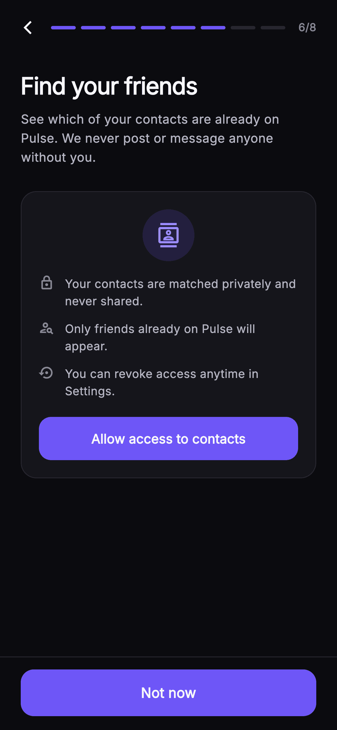
Asking for the contacts permission cold is the fastest way to get a permanent 'Don't allow'. This tutorial builds Pulse's Find Friends onboarding step in Flutter: a priming card with three `_PermissionPoint` privacy rows and an 'Allow access to contacts' button, which a single `_granted` flag swaps for a `ListView.separated` of matched friends. Each `_ContactRow` pairs an initials `_Monogram` with a `_PillButton` that toggles Add/Added through an `_added` Set, or reads Invite for contacts not yet on Pulse.
What you'll build
- ✓A two-state screen where one `bool _granted` swaps a permission explainer for a contacts list and relabels the footer from 'Not now' to 'Continue'
- ✓A priming card with three `_PermissionPoint` rows and a filled 'Allow access to contacts' button that flips the state
- ✓A `ListView.separated` whose index 0 is a green check header counting matched contacts with a `where` filter
- ✓A `_PillButton` that reads Add, Added or Invite depending on `onPulse` and membership in an `_added` Set of names
- ✓A `_Monogram` avatar that derives initials from any name with a regex split and scales its font to `size * 0.36`
Step-by-step build
Create the file
Add a new file at lib/social_setup_contacts/social_setup_contacts_screen.dart in your Flutter project.
Register the bundled fonts
No external packages — this is pure Flutter. It does bundle its design font (Inter), so drop the font file into fonts/ and declare it in pubspec.yaml:
flutter:
  fonts:
    - family: Inter
      fonts:
- asset: fonts/Inter-Regular.ttfBuild it, piece by piece
Here's how the screen goes together. Each block below is a real slice of the code with a plain-English explanation — paste them in order, or grab the whole file from the next section.
A two-callback widget and a purple-on-black palette
import 'package:flutter/material.dart';

/// Find Friends — sixth step of Pulse profile setup. Two inline states: a
/// contacts-permission explainer card (privacy note + Allow access), and, once
/// granted, a list of matched friends already on Pulse with Add toggles plus an
/// invite row for contacts who aren’t. Step progress tops the screen; the pinned
/// CTA continues the flow. Self-contained per CONVENTIONS.md: pure Flutter,
/// bundled Inter font, own dark theme, SafeArea.
class SocialSetupContactsScreen extends StatefulWidget {
  const SocialSetupContactsScreen({
    super.key,
    this.onBack,
    this.onContinue,
  });

  final VoidCallback? onBack;
  final VoidCallback? onContinue;

  static const String _font = 'Inter';
  static const Color _bg = Color(0xFF0B0B0F);
  static const Color _surface = Color(0xFF15151B);
  static const Color _surfaceAlt = Color(0xFF1D1D26);
  static const Color _brand = Color(0xFF6E56F7);
  static const Color _accent = Color(0xFF9B8CFF);
  static const Color _success = Color(0xFF34D399);
  static const Color _hairline = Color(0xFF26262F);
  static const Color _textHi = Color(0xFFF4F4F7);
  static const Color _textLo = Color(0xFFB5B5C2);
  static const Color _muted = Color(0xFF8A8A99);

  @override
  State<SocialSetupContactsScreen> createState() =>
      _SocialSetupContactsScreenState();
}

class _Contact {
  const _Contact(this.name, this.handleOrPhone, this.onPulse, this.color);
  final String name;
  final String handleOrPhone;
  final bool onPulse;
  final Color color;
}
The screen is a `StatefulWidget` — unlike most onboarding steps, this one has a real state transition — but it exposes only `onBack` and `onContinue`; the permission decision itself is internal. Ten `static const Color`s live on the widget class so the private helper widgets below can reach them as `SocialSetupContactsScreen._brand` without a theme lookup. `_bg` #0B0B0F, `_surface` #15151B and `_surfaceAlt` #1D1D26 are three near-black steps that give cards and pills depth without visible borders doing all the work; `_brand` #6E56F7 is reserved for the two filled buttons and the progress bar, `_accent` #9B8CFF for the icon inside the badge, and `_success` #34D399 appears once, on the matched-count check. The tiny `_Contact` class holds `name`, `handleOrPhone`, `onPulse` and a `color` — the last is per-person so monograms differ, and `handleOrPhone` is a single string because the row decides at render time whether to prefix an `@`.
Fixture contacts and the one flag that drives everything
class _SocialSetupContactsScreenState extends State<SocialSetupContactsScreen> {
  bool _granted = false;

  static const List<_Contact> _contacts = <_Contact>[
    _Contact('Nina Park', 'ninap', true, Color(0xFF9B8CFF)),
    _Contact('Diego Alvarez', 'diego.a', true, Color(0xFF34D399)),
    _Contact('Emma Wells', 'emmawells', true, Color(0xFFF4476B)),
    _Contact('Tom Becker', '+1 (555) 019 4420', false, Color(0xFF38BDF8)),
    _Contact('Grace Liu', 'graceliu', true, Color(0xFFFBBF24)),
    _Contact('Ravi Shah', '+1 (555) 077 8810', false, Color(0xFFEC4899)),
  ];

  final Set<String> _added = <String>{};

  @override
  Widget build(BuildContext context) {
    return Theme(
      data: ThemeData.dark(useMaterial3: true),
      child: Scaffold(
        backgroundColor: SocialSetupContactsScreen._bg,
        body: SafeArea(
          child: Column(
            children: <Widget>[
              _SetupHeader(step: 6, total: 8, onBack: widget.onBack),
              Expanded(
                child: _granted ? _buildList() : _buildPermission(),
              ),
              _SetupFooter(
                label: _granted ? 'Continue' : 'Not now',
                onContinue: widget.onContinue,
              ),
            ],
          ),
        ),
      ),
    );
  }
State is two fields: `bool _granted`, which starts false, and a `Set<String> _added` keyed by contact name. The six `_Contact` fixtures deliberately mix four `onPulse: true` entries carrying handles with two `false` entries carrying phone numbers like '+1 (555) 019 4420' — that split is what lets the list demonstrate both the Add toggle and the Invite row. `build` forces `ThemeData.dark(useMaterial3: true)` on its own `Theme` so the screen renders the same dropped into a light app. The `Column` is header, `Expanded` body, footer, and the body is a plain ternary: `_granted ? _buildList() : _buildPermission()`. The footer label is a second ternary on the same flag — 'Not now' while asking, 'Continue' once granted — so declining is always available as the pinned CTA rather than a small skip link, and both routes call the same `widget.onContinue`.
The permission priming card
  Widget _buildPermission() {
    return ListView(
      padding: const EdgeInsets.fromLTRB(24, 20, 24, 24),
      children: <Widget>[
        const Text(
          'Find your friends',
          style: TextStyle(
            fontFamily: SocialSetupContactsScreen._font,
            fontSize: 27,
            fontWeight: FontWeight.w700,
            letterSpacing: -0.7,
            color: SocialSetupContactsScreen._textHi,
          ),
        ),
        const SizedBox(height: 8),
        const Text(
          'See which of your contacts are already on Pulse. We never post or message anyone without you.',
          style: TextStyle(
            fontFamily: SocialSetupContactsScreen._font,
            fontSize: 14.5,
            height: 1.5,
            color: SocialSetupContactsScreen._textLo,
          ),
        ),
        const SizedBox(height: 28),
        Container(
          padding: const EdgeInsets.all(20),
          decoration: BoxDecoration(
            color: SocialSetupContactsScreen._surface,
            borderRadius: BorderRadius.circular(18),
            border: Border.all(color: SocialSetupContactsScreen._hairline),
          ),
          child: Column(
            children: <Widget>[
              Container(
                width: 60,
                height: 60,
                decoration: BoxDecoration(
                  shape: BoxShape.circle,
                  color: SocialSetupContactsScreen._brand.withValues(alpha: 0.16),
                ),
                child: const Icon(Icons.contacts_outlined,
                    size: 28, color: SocialSetupContactsScreen._accent),
              ),
              const SizedBox(height: 16),
              const _PermissionPoint(
                icon: Icons.lock_outline,
                text: 'Your contacts are matched privately and never shared.',
              ),
              const SizedBox(height: 12),
              const _PermissionPoint(
                icon: Icons.person_search_outlined,
                text: 'Only friends already on Pulse will appear.',
              ),
              const SizedBox(height: 12),
              const _PermissionPoint(
                icon: Icons.settings_backup_restore,
                text: 'You can revoke access anytime in Settings.',
              ),
              const SizedBox(height: 20),
              SizedBox(
                width: double.infinity,
                height: 50,
                child: FilledButton(
                  onPressed: () => setState(() => _granted = true),
                  style: FilledButton.styleFrom(
                    backgroundColor: SocialSetupContactsScreen._brand,
                    foregroundColor: Colors.white,
                    shape: RoundedRectangleBorder(
                      borderRadius: BorderRadius.circular(14),
                    ),
                  ),
                  child: const Text(
                    'Allow access to contacts',
                    style: TextStyle(
                      fontFamily: SocialSetupContactsScreen._font,
                      fontSize: 15,
                      fontWeight: FontWeight.w600,
                    ),
                  ),
                ),
              ),
            ],
          ),
        ),
      ],
    );
  }
`_buildPermission` is a `ListView` with 24px side padding so the card scrolls on short phones. The 27px `w700` title uses `letterSpacing: -0.7`, and the subtitle makes the promise up front: 'We never post or message anyone without you.' The card is a `_surface` container with an 18px radius and a `_hairline` #26262F border. Its badge is a 60px circle filled with `_brand.withValues(alpha: 0.16)` holding a 28px `Icons.contacts_outlined` in `_accent` — a tinted disc reads calmer than a solid purple one. Three `_PermissionPoint` rows follow with 12px gaps, each pairing an icon (lock, person_search, settings_backup_restore) with one reassurance. The 50px `FilledButton` is styled directly with `_brand` and a 14px `RoundedRectangleBorder`, and its `onPressed` is just `setState(() => _granted = true)`. This is a priming screen: the OS dialog would be requested from that callback, and only after the user has already said yes here.
The matched-friends list with a count header at index 0
  Widget _buildList() {
    final int matched = _contacts.where((_Contact c) => c.onPulse).length;
    return ListView.separated(
      padding: const EdgeInsets.fromLTRB(24, 20, 24, 24),
      itemCount: _contacts.length + 1,
      separatorBuilder: (BuildContext context, int i) =>
          const SizedBox(height: 12),
      itemBuilder: (BuildContext context, int i) {
        if (i == 0) {
          return Padding(
            padding: const EdgeInsets.only(bottom: 4),
            child: Row(
              children: <Widget>[
                const Icon(Icons.check_circle,
                    size: 17, color: SocialSetupContactsScreen._success),
                const SizedBox(width: 6),
                Text(
                  '$matched friends found on Pulse',
                  style: const TextStyle(
                    fontFamily: SocialSetupContactsScreen._font,
                    fontSize: 13.5,
                    fontWeight: FontWeight.w600,
                    color: SocialSetupContactsScreen._textLo,
                  ),
                ),
              ],
            ),
          );
        }
        final _Contact c = _contacts[i - 1];
        final bool added = _added.contains(c.name);
        return _ContactRow(
          contact: c,
          added: added,
          onToggle: () => setState(() {
            if (added) {
              _added.remove(c.name);
            } else {
              _added.add(c.name);
            }
          }),
        );
      },
    );
  }
}
`_buildList` first computes `matched` with `_contacts.where((c) => c.onPulse).length`, which is 4 for the fixtures, and interpolates it into '$matched friends found on Pulse'. The list is a `ListView.separated` with `itemCount: _contacts.length + 1`; index 0 returns the header row — a 17px `Icons.check_circle` in `_success` beside 13.5px `w600` text — and every other index reads `_contacts[i - 1]`. Putting the header inside the list rather than above it means it scrolls away with the rows and still gets the 12px `SizedBox` separator for free. Per row, `added` is `_added.contains(c.name)`, and `onToggle` wraps a `setState` that removes or adds the name. Keying the set by name is fine for fixtures; with real data you would key by a contact ID so two people with the same name do not toggle together.
`_PermissionPoint` and `_ContactRow`
class _PermissionPoint extends StatelessWidget {
  const _PermissionPoint({required this.icon, required this.text});
  final IconData icon;
  final String text;

  @override
  Widget build(BuildContext context) {
    return Row(
      crossAxisAlignment: CrossAxisAlignment.start,
      children: <Widget>[
        Icon(icon, size: 18, color: SocialSetupContactsScreen._muted),
        const SizedBox(width: 12),
        Expanded(
          child: Text(
            text,
            style: const TextStyle(
              fontFamily: SocialSetupContactsScreen._font,
              fontSize: 13.5,
              height: 1.45,
              color: SocialSetupContactsScreen._textLo,
            ),
          ),
        ),
      ],
    );
  }
}

class _ContactRow extends StatelessWidget {
  const _ContactRow({
    required this.contact,
    required this.added,
    this.onToggle,
  });
  final _Contact contact;
  final bool added;
  final VoidCallback? onToggle;

  @override
  Widget build(BuildContext context) {
    return Container(
      padding: const EdgeInsets.all(12),
      decoration: BoxDecoration(
        color: SocialSetupContactsScreen._surface,
        borderRadius: BorderRadius.circular(16),
        border: Border.all(color: SocialSetupContactsScreen._hairline),
      ),
      child: Row(
        children: <Widget>[
          _Monogram(name: contact.name, color: contact.color, size: 44),
          const SizedBox(width: 12),
          Expanded(
            child: Column(
              crossAxisAlignment: CrossAxisAlignment.start,
              children: <Widget>[
                Text(
                  contact.name,
                  overflow: TextOverflow.ellipsis,
                  style: const TextStyle(
                    fontFamily: SocialSetupContactsScreen._font,
                    fontSize: 15,
                    fontWeight: FontWeight.w600,
                    color: SocialSetupContactsScreen._textHi,
                  ),
                ),
                const SizedBox(height: 2),
                Text(
                  contact.onPulse ? '@${contact.handleOrPhone}' : contact.handleOrPhone,
                  overflow: TextOverflow.ellipsis,
                  style: const TextStyle(
                    fontFamily: SocialSetupContactsScreen._font,
                    fontSize: 12.5,
                    color: SocialSetupContactsScreen._muted,
                  ),
                ),
              ],
            ),
          ),
          const SizedBox(width: 10),
          if (contact.onPulse)
            _PillButton(
              label: added ? 'Added' : 'Add',
              filled: !added,
              onTap: onToggle,
            )
          else
            _PillButton(label: 'Invite', filled: false, onTap: onToggle),
        ],
      ),
    );
  }
}
`_PermissionPoint` is a `Row` with `crossAxisAlignment.start` so an 18px `_muted` icon stays pinned to the first line when the 13.5px text wraps at `height: 1.45`; the text sits in `Expanded` to take the remaining width. `_ContactRow` is a 12px-padded `_surface` card with a 16px radius — slightly tighter than the 18px permission card — holding a 44px `_Monogram`, then an `Expanded` column with the name at 15px `w600` and a 12.5px `_muted` secondary line. That line is `contact.onPulse ? '@${contact.handleOrPhone}' : contact.handleOrPhone`, so members show '@ninap' while off-app contacts show their phone number. Both texts carry `TextOverflow.ellipsis`. The trailing widget is an `if/else` in the children list: members get a `_PillButton` labelled `added ? 'Added' : 'Add'` with `filled: !added`, so the pill goes from solid purple to a quiet outline once added; non-members always get an unfilled 'Invite'.
The pill button and the initials monogram
class _PillButton extends StatelessWidget {
  const _PillButton({
    required this.label,
    required this.filled,
    this.onTap,
  });
  final String label;
  final bool filled;
  final VoidCallback? onTap;

  @override
  Widget build(BuildContext context) {
    return Material(
      color: filled
          ? SocialSetupContactsScreen._brand
          : SocialSetupContactsScreen._surfaceAlt,
      borderRadius: BorderRadius.circular(11),
      child: InkWell(
        onTap: onTap,
        borderRadius: BorderRadius.circular(11),
        child: Container(
          padding: const EdgeInsets.symmetric(horizontal: 16, vertical: 9),
          decoration: BoxDecoration(
            borderRadius: BorderRadius.circular(11),
            border: Border.all(
              color: filled
                  ? SocialSetupContactsScreen._brand
                  : SocialSetupContactsScreen._hairline,
            ),
          ),
          child: Text(
            label,
            style: TextStyle(
              fontFamily: SocialSetupContactsScreen._font,
              fontSize: 13.5,
              fontWeight: FontWeight.w600,
              color: filled ? Colors.white : SocialSetupContactsScreen._textLo,
            ),
          ),
        ),
      ),
    );
  }
}

class _Monogram extends StatelessWidget {
  const _Monogram({required this.name, required this.color, required this.size});
  final String name;
  final Color color;
  final double size;

  String get _initials {
    final List<String> parts = name
        .trim()
        .split(RegExp(r'\s+'))
        .where((String s) => s.isNotEmpty)
        .toList();
    if (parts.isEmpty) return '?';
    if (parts.length == 1) return parts.first[0].toUpperCase();
    return (parts.first[0] + parts.last[0]).toUpperCase();
  }

  @override
  Widget build(BuildContext context) {
    return Container(
      width: size,
      height: size,
      decoration: BoxDecoration(
        shape: BoxShape.circle,
        color: color.withValues(alpha: 0.18),
        border: Border.all(color: color.withValues(alpha: 0.5)),
      ),
      child: Center(
        child: Text(
          _initials,
          style: TextStyle(
            fontFamily: SocialSetupContactsScreen._font,
            fontSize: size * 0.36,
            fontWeight: FontWeight.w700,
            color: color,
          ),
        ),
      ),
    );
  }
}
`_PillButton` puts a `Material` under the `InkWell` so the ripple clips to the 11px radius; the fill is `_brand` when `filled` and `_surfaceAlt` otherwise, and the inner `Container` border matches — `_brand` on `_brand` for the solid state, `_hairline` for the outline — so both states are the same height and never shift the row. Text is 13.5px `w600`, white when filled, `_textLo` otherwise. `_Monogram` computes its initials in a getter: trim, split on `RegExp(r'\s+')`, drop empties, then return '?' for nothing, the single initial for one word, or first-plus-last uppercased. 'Diego Alvarez' becomes 'DA'. The circle uses the contact's colour at `withValues(alpha: 0.18)` with a `0.5`-alpha border of the same colour and the full colour for the letters, and `fontSize: size * 0.36` keeps the initials proportional if you reuse the widget at a different size.
Shared step header and pinned footer
class _SetupHeader extends StatelessWidget {
  const _SetupHeader({required this.step, required this.total, this.onBack});
  final int step;
  final int total;
  final VoidCallback? onBack;

  @override
  Widget build(BuildContext context) {
    return Padding(
      padding: const EdgeInsets.fromLTRB(8, 8, 24, 4),
      child: Row(
        children: <Widget>[
          IconButton(
            onPressed: onBack,
            icon: const Icon(Icons.arrow_back_ios_new,
                size: 18, color: SocialSetupContactsScreen._textHi),
          ),
          Expanded(
            child: Row(
              children: List<Widget>.generate(total, (int i) {
                return Expanded(
                  child: Container(
                    height: 4,
                    margin: const EdgeInsets.symmetric(horizontal: 3),
                    decoration: BoxDecoration(
                      borderRadius: BorderRadius.circular(2),
                      color: i < step
                          ? SocialSetupContactsScreen._brand
                          : SocialSetupContactsScreen._hairline,
                    ),
                  ),
                );
              }),
            ),
          ),
          const SizedBox(width: 12),
          Text(
            '$step/$total',
            style: const TextStyle(
              fontFamily: SocialSetupContactsScreen._font,
              fontSize: 12.5,
              fontWeight: FontWeight.w600,
              color: SocialSetupContactsScreen._muted,
            ),
          ),
        ],
      ),
    );
  }
}

class _SetupFooter extends StatelessWidget {
  const _SetupFooter({required this.label, this.onContinue});
  final String label;
  final VoidCallback? onContinue;

  @override
  Widget build(BuildContext context) {
    return Container(
      decoration: const BoxDecoration(
        color: SocialSetupContactsScreen._bg,
        border:
            Border(top: BorderSide(color: SocialSetupContactsScreen._hairline)),
      ),
      padding: const EdgeInsets.fromLTRB(24, 14, 24, 16),
      child: SizedBox(
        width: double.infinity,
        height: 54,
        child: FilledButton(
          onPressed: onContinue,
          style: FilledButton.styleFrom(
            backgroundColor: SocialSetupContactsScreen._brand,
            foregroundColor: Colors.white,
            shape: RoundedRectangleBorder(
              borderRadius: BorderRadius.circular(15),
            ),
          ),
          child: Text(
            label,
            style: const TextStyle(
              fontFamily: SocialSetupContactsScreen._font,
              fontSize: 16,
              fontWeight: FontWeight.w600,
            ),
          ),
        ),
      ),
    );
  }
}
`_SetupHeader` takes `step` and `total` as ints and builds the progress bar with `List.generate(total, ...)` — eight `Expanded` containers 4px tall with 3px horizontal margins, coloured `_brand` when `i < step` and `_hairline` otherwise, so six of eight fill for this screen. The row is padded `fromLTRB(8, 8, 24, 4)` because the leading `IconButton` carries its own touch padding; the 12.5px '$step/$total' counter closes the row in `_muted`. `_SetupFooter` is a `_bg`-coloured container with only a top `BorderSide` in `_hairline`, so the divider is visible but the footer blends into the canvas. It holds one 54px full-width `FilledButton` at a 15px radius whose `label` is passed in — that is how the parent swaps 'Not now' for 'Continue' without the footer knowing anything about permission state.
Full code
The complete, ready-to-paste source. Free to use in your projects — one click copies it all.
import 'package:flutter/material.dart';

/// Find Friends — sixth step of Pulse profile setup. Two inline states: a
/// contacts-permission explainer card (privacy note + Allow access), and, once
/// granted, a list of matched friends already on Pulse with Add toggles plus an
/// invite row for contacts who aren’t. Step progress tops the screen; the pinned
/// CTA continues the flow. Self-contained per CONVENTIONS.md: pure Flutter,
/// bundled Inter font, own dark theme, SafeArea.
class SocialSetupContactsScreen extends StatefulWidget {
  const SocialSetupContactsScreen({
    super.key,
    this.onBack,
    this.onContinue,
  });

  final VoidCallback? onBack;
  final VoidCallback? onContinue;

  static const String _font = 'Inter';
  static const Color _bg = Color(0xFF0B0B0F);
  static const Color _surface = Color(0xFF15151B);
  static const Color _surfaceAlt = Color(0xFF1D1D26);
  static const Color _brand = Color(0xFF6E56F7);
  static const Color _accent = Color(0xFF9B8CFF);
  static const Color _success = Color(0xFF34D399);
  static const Color _hairline = Color(0xFF26262F);
  static const Color _textHi = Color(0xFFF4F4F7);
  static const Color _textLo = Color(0xFFB5B5C2);
  static const Color _muted = Color(0xFF8A8A99);

  @override
  State<SocialSetupContactsScreen> createState() =>
      _SocialSetupContactsScreenState();
}

class _Contact {
  const _Contact(this.name, this.handleOrPhone, this.onPulse, this.color);
  final String name;
  final String handleOrPhone;
  final bool onPulse;
  final Color color;
}

class _SocialSetupContactsScreenState extends State<SocialSetupContactsScreen> {
  bool _granted = false;

  static const List<_Contact> _contacts = <_Contact>[
    _Contact('Nina Park', 'ninap', true, Color(0xFF9B8CFF)),
    _Contact('Diego Alvarez', 'diego.a', true, Color(0xFF34D399)),
    _Contact('Emma Wells', 'emmawells', true, Color(0xFFF4476B)),
    _Contact('Tom Becker', '+1 (555) 019 4420', false, Color(0xFF38BDF8)),
    _Contact('Grace Liu', 'graceliu', true, Color(0xFFFBBF24)),
    _Contact('Ravi Shah', '+1 (555) 077 8810', false, Color(0xFFEC4899)),
  ];

  final Set<String> _added = <String>{};

  @override
  Widget build(BuildContext context) {
    return Theme(
      data: ThemeData.dark(useMaterial3: true),
      child: Scaffold(
        backgroundColor: SocialSetupContactsScreen._bg,
        body: SafeArea(
          child: Column(
            children: <Widget>[
              _SetupHeader(step: 6, total: 8, onBack: widget.onBack),
              Expanded(
                child: _granted ? _buildList() : _buildPermission(),
              ),
              _SetupFooter(
                label: _granted ? 'Continue' : 'Not now',
                onContinue: widget.onContinue,
              ),
            ],
          ),
        ),
      ),
    );
  }

  Widget _buildPermission() {
    return ListView(
      padding: const EdgeInsets.fromLTRB(24, 20, 24, 24),
      children: <Widget>[
        const Text(
          'Find your friends',
          style: TextStyle(
            fontFamily: SocialSetupContactsScreen._font,
            fontSize: 27,
            fontWeight: FontWeight.w700,
            letterSpacing: -0.7,
            color: SocialSetupContactsScreen._textHi,
          ),
        ),
        const SizedBox(height: 8),
        const Text(
          'See which of your contacts are already on Pulse. We never post or message anyone without you.',
          style: TextStyle(
            fontFamily: SocialSetupContactsScreen._font,
            fontSize: 14.5,
            height: 1.5,
            color: SocialSetupContactsScreen._textLo,
          ),
        ),
        const SizedBox(height: 28),
        Container(
          padding: const EdgeInsets.all(20),
          decoration: BoxDecoration(
            color: SocialSetupContactsScreen._surface,
            borderRadius: BorderRadius.circular(18),
            border: Border.all(color: SocialSetupContactsScreen._hairline),
          ),
          child: Column(
            children: <Widget>[
              Container(
                width: 60,
                height: 60,
                decoration: BoxDecoration(
                  shape: BoxShape.circle,
                  color: SocialSetupContactsScreen._brand.withValues(alpha: 0.16),
                ),
                child: const Icon(Icons.contacts_outlined,
                    size: 28, color: SocialSetupContactsScreen._accent),
              ),
              const SizedBox(height: 16),
              const _PermissionPoint(
                icon: Icons.lock_outline,
                text: 'Your contacts are matched privately and never shared.',
              ),
              const SizedBox(height: 12),
              const _PermissionPoint(
                icon: Icons.person_search_outlined,
                text: 'Only friends already on Pulse will appear.',
              ),
              const SizedBox(height: 12),
              const _PermissionPoint(
                icon: Icons.settings_backup_restore,
                text: 'You can revoke access anytime in Settings.',
              ),
              const SizedBox(height: 20),
              SizedBox(
                width: double.infinity,
                height: 50,
                child: FilledButton(
                  onPressed: () => setState(() => _granted = true),
                  style: FilledButton.styleFrom(
                    backgroundColor: SocialSetupContactsScreen._brand,
                    foregroundColor: Colors.white,
                    shape: RoundedRectangleBorder(
                      borderRadius: BorderRadius.circular(14),
                    ),
                  ),
                  child: const Text(
                    'Allow access to contacts',
                    style: TextStyle(
                      fontFamily: SocialSetupContactsScreen._font,
                      fontSize: 15,
                      fontWeight: FontWeight.w600,
                    ),
                  ),
                ),
              ),
            ],
          ),
        ),
      ],
    );
  }

  Widget _buildList() {
    final int matched = _contacts.where((_Contact c) => c.onPulse).length;
    return ListView.separated(
      padding: const EdgeInsets.fromLTRB(24, 20, 24, 24),
      itemCount: _contacts.length + 1,
      separatorBuilder: (BuildContext context, int i) =>
          const SizedBox(height: 12),
      itemBuilder: (BuildContext context, int i) {
        if (i == 0) {
          return Padding(
            padding: const EdgeInsets.only(bottom: 4),
            child: Row(
              children: <Widget>[
                const Icon(Icons.check_circle,
                    size: 17, color: SocialSetupContactsScreen._success),
                const SizedBox(width: 6),
                Text(
                  '$matched friends found on Pulse',
                  style: const TextStyle(
                    fontFamily: SocialSetupContactsScreen._font,
                    fontSize: 13.5,
                    fontWeight: FontWeight.w600,
                    color: SocialSetupContactsScreen._textLo,
                  ),
                ),
              ],
            ),
          );
        }
        final _Contact c = _contacts[i - 1];
        final bool added = _added.contains(c.name);
        return _ContactRow(
          contact: c,
          added: added,
          onToggle: () => setState(() {
            if (added) {
              _added.remove(c.name);
            } else {
              _added.add(c.name);
            }
          }),
        );
      },
    );
  }
}

class _PermissionPoint extends StatelessWidget {
  const _PermissionPoint({required this.icon, required this.text});
  final IconData icon;
  final String text;

  @override
  Widget build(BuildContext context) {
    return Row(
      crossAxisAlignment: CrossAxisAlignment.start,
      children: <Widget>[
        Icon(icon, size: 18, color: SocialSetupContactsScreen._muted),
        const SizedBox(width: 12),
        Expanded(
          child: Text(
            text,
            style: const TextStyle(
              fontFamily: SocialSetupContactsScreen._font,
              fontSize: 13.5,
              height: 1.45,
              color: SocialSetupContactsScreen._textLo,
            ),
          ),
        ),
      ],
    );
  }
}

class _ContactRow extends StatelessWidget {
  const _ContactRow({
    required this.contact,
    required this.added,
    this.onToggle,
  });
  final _Contact contact;
  final bool added;
  final VoidCallback? onToggle;

  @override
  Widget build(BuildContext context) {
    return Container(
      padding: const EdgeInsets.all(12),
      decoration: BoxDecoration(
        color: SocialSetupContactsScreen._surface,
        borderRadius: BorderRadius.circular(16),
        border: Border.all(color: SocialSetupContactsScreen._hairline),
      ),
      child: Row(
        children: <Widget>[
          _Monogram(name: contact.name, color: contact.color, size: 44),
          const SizedBox(width: 12),
          Expanded(
            child: Column(
              crossAxisAlignment: CrossAxisAlignment.start,
              children: <Widget>[
                Text(
                  contact.name,
                  overflow: TextOverflow.ellipsis,
                  style: const TextStyle(
                    fontFamily: SocialSetupContactsScreen._font,
                    fontSize: 15,
                    fontWeight: FontWeight.w600,
                    color: SocialSetupContactsScreen._textHi,
                  ),
                ),
                const SizedBox(height: 2),
                Text(
                  contact.onPulse ? '@${contact.handleOrPhone}' : contact.handleOrPhone,
                  overflow: TextOverflow.ellipsis,
                  style: const TextStyle(
                    fontFamily: SocialSetupContactsScreen._font,
                    fontSize: 12.5,
                    color: SocialSetupContactsScreen._muted,
                  ),
                ),
              ],
            ),
          ),
          const SizedBox(width: 10),
          if (contact.onPulse)
            _PillButton(
              label: added ? 'Added' : 'Add',
              filled: !added,
              onTap: onToggle,
            )
          else
            _PillButton(label: 'Invite', filled: false, onTap: onToggle),
        ],
      ),
    );
  }
}

class _PillButton extends StatelessWidget {
  const _PillButton({
    required this.label,
    required this.filled,
    this.onTap,
  });
  final String label;
  final bool filled;
  final VoidCallback? onTap;

  @override
  Widget build(BuildContext context) {
    return Material(
      color: filled
          ? SocialSetupContactsScreen._brand
          : SocialSetupContactsScreen._surfaceAlt,
      borderRadius: BorderRadius.circular(11),
      child: InkWell(
        onTap: onTap,
        borderRadius: BorderRadius.circular(11),
        child: Container(
          padding: const EdgeInsets.symmetric(horizontal: 16, vertical: 9),
          decoration: BoxDecoration(
            borderRadius: BorderRadius.circular(11),
            border: Border.all(
              color: filled
                  ? SocialSetupContactsScreen._brand
                  : SocialSetupContactsScreen._hairline,
            ),
          ),
          child: Text(
            label,
            style: TextStyle(
              fontFamily: SocialSetupContactsScreen._font,
              fontSize: 13.5,
              fontWeight: FontWeight.w600,
              color: filled ? Colors.white : SocialSetupContactsScreen._textLo,
            ),
          ),
        ),
      ),
    );
  }
}

class _Monogram extends StatelessWidget {
  const _Monogram({required this.name, required this.color, required this.size});
  final String name;
  final Color color;
  final double size;

  String get _initials {
    final List<String> parts = name
        .trim()
        .split(RegExp(r'\s+'))
        .where((String s) => s.isNotEmpty)
        .toList();
    if (parts.isEmpty) return '?';
    if (parts.length == 1) return parts.first[0].toUpperCase();
    return (parts.first[0] + parts.last[0]).toUpperCase();
  }

  @override
  Widget build(BuildContext context) {
    return Container(
      width: size,
      height: size,
      decoration: BoxDecoration(
        shape: BoxShape.circle,
        color: color.withValues(alpha: 0.18),
        border: Border.all(color: color.withValues(alpha: 0.5)),
      ),
      child: Center(
        child: Text(
          _initials,
          style: TextStyle(
            fontFamily: SocialSetupContactsScreen._font,
            fontSize: size * 0.36,
            fontWeight: FontWeight.w700,
            color: color,
          ),
        ),
      ),
    );
  }
}

class _SetupHeader extends StatelessWidget {
  const _SetupHeader({required this.step, required this.total, this.onBack});
  final int step;
  final int total;
  final VoidCallback? onBack;

  @override
  Widget build(BuildContext context) {
    return Padding(
      padding: const EdgeInsets.fromLTRB(8, 8, 24, 4),
      child: Row(
        children: <Widget>[
          IconButton(
            onPressed: onBack,
            icon: const Icon(Icons.arrow_back_ios_new,
                size: 18, color: SocialSetupContactsScreen._textHi),
          ),
          Expanded(
            child: Row(
              children: List<Widget>.generate(total, (int i) {
                return Expanded(
                  child: Container(
                    height: 4,
                    margin: const EdgeInsets.symmetric(horizontal: 3),
                    decoration: BoxDecoration(
                      borderRadius: BorderRadius.circular(2),
                      color: i < step
                          ? SocialSetupContactsScreen._brand
                          : SocialSetupContactsScreen._hairline,
                    ),
                  ),
                );
              }),
            ),
          ),
          const SizedBox(width: 12),
          Text(
            '$step/$total',
            style: const TextStyle(
              fontFamily: SocialSetupContactsScreen._font,
              fontSize: 12.5,
              fontWeight: FontWeight.w600,
              color: SocialSetupContactsScreen._muted,
            ),
          ),
        ],
      ),
    );
  }
}

class _SetupFooter extends StatelessWidget {
  const _SetupFooter({required this.label, this.onContinue});
  final String label;
  final VoidCallback? onContinue;

  @override
  Widget build(BuildContext context) {
    return Container(
      decoration: const BoxDecoration(
        color: SocialSetupContactsScreen._bg,
        border:
            Border(top: BorderSide(color: SocialSetupContactsScreen._hairline)),
      ),
      padding: const EdgeInsets.fromLTRB(24, 14, 24, 16),
      child: SizedBox(
        width: double.infinity,
        height: 54,
        child: FilledButton(
          onPressed: onContinue,
          style: FilledButton.styleFrom(
            backgroundColor: SocialSetupContactsScreen._brand,
            foregroundColor: Colors.white,
            shape: RoundedRectangleBorder(
              borderRadius: BorderRadius.circular(15),
            ),
          ),
          child: Text(
            label,
            style: const TextStyle(
              fontFamily: SocialSetupContactsScreen._font,
              fontSize: 16,
              fontWeight: FontWeight.w600,
            ),
          ),
        ),
      ),
    );
  }
}
Plus bundled 1 binary asset (fonts/images). The CLI and MCP install those for you automatically.
Two faster ways to add it
Copy-paste works, but you can skip it entirely.
1. FlutterKit CLI
One command drops this screen — and its fonts — straight into your project.
$ flutterkit add social-setup-contacts2. AI agent (MCP)
Connect FlutterKit's MCP server in Claude or Cursor and just ask your agent to install social-setup-contacts — it fetches and writes the files for you.
FAQ
Can I use this Find Friends screen in a commercial app?
Yes. FlutterKit screens are free for personal and commercial projects under an MIT-style licence — no key, no attribution, no sign-up. Copy the Dart from this page or run `flutterkit add social-setup-contacts` and ship it.
Does it need any pub packages or fonts?
No packages — it is pure Flutter and imports only `package:flutter/material.dart`. The only asset is the Inter font, which `flutterkit add social-setup-contacts` bundles and registers in your pubspec; if you copy the file by hand, add Inter yourself or drop the `fontFamily` lines to fall back to the system font.
Which Flutter version does this need?
Flutter 3.22 or newer, because the badge and `_Monogram` use `Color.withValues(alpha: ...)` and the constructor uses `super.key`. On an older SDK replace each `withValues(alpha: x)` with `withOpacity(x)` and expand the constructor to `{Key? key, ...} : super(key: key)`.
How do I request the real contacts permission and load actual matches?
Keep the priming card as is and change the Allow button's `onPressed`: call your permission plugin there, and only set `_granted = true` when it returns granted. Then replace the `static const _contacts` fixture with a list your matching service returns, mapping each result to `_Contact` with `onPulse` set from whether the server found an account. Nothing in `_buildList` needs to change.
Why does the footer say 'Not now' instead of a small skip link?
Because declining is a legitimate outcome, not a failure. Making 'Not now' the full-width pinned CTA gives users an obvious, non-guilty way past the permission ask, and since both labels call the same `onContinue` the flow advances either way. Once `_granted` flips, the same button relabels to 'Continue'.


