How to Build a Pick Your Interests Onboarding Screen in Flutter (Full Code + Preview)
A cold-start feed shows nothing worth scrolling, so social apps ask new users to pick topics before the first post loads. This tutorial builds Pulse's fourth onboarding step in Flutter: a `Wrap` of 18 colour-coded `_TopicPill` widgets that swap a painted category dot for a check when chosen, a `Set<String> _selected` that enforces a three-topic minimum, a live '2 of 3 selected' hint that turns green at the threshold, and a pinned `_SetupFooter` whose button reads 'Pick 1 more' until it can say 'Continue'.
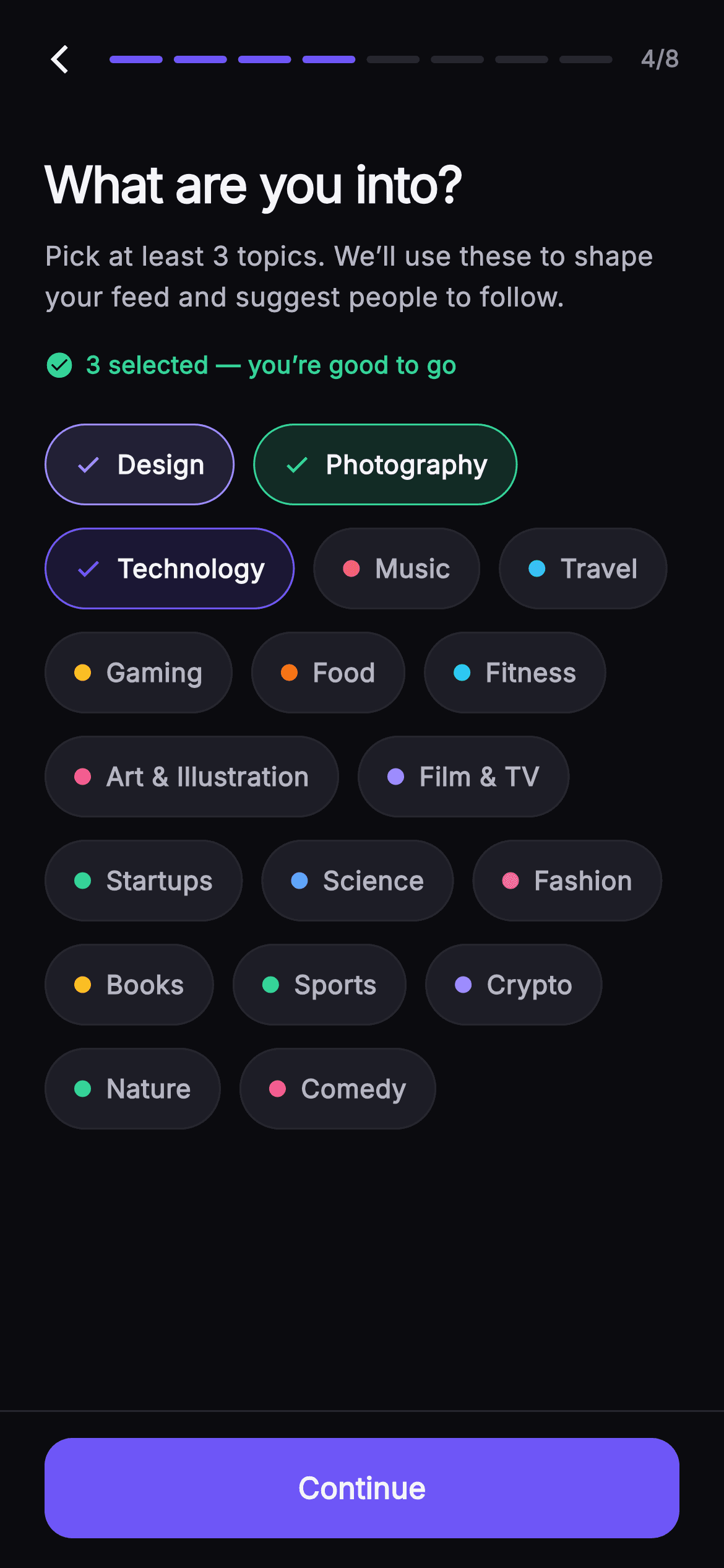
What you'll build
- ✓A `_Topic` data class and an 18-entry `static const` list pairing each label with its own hex colour
- ✓A `_TopicPill` whose fill goes to `topic.color.withValues(alpha: 0.16)` and whose 9px dot becomes a check icon when selected
- ✓A `Set<String> _selected` toggled inside `setState`, with `enough = count >= _minPick` driving every dependent widget
- ✓A `_SetupHeader` with an 8-segment progress bar built by `List<Widget>.generate` and a `4/8` counter
- ✓A `_SetupFooter` `FilledButton` that stays disabled and counts down 'Pick N more' until three topics are chosen
Step-by-step build
Create the file
Add a new file at lib/social_setup_interests/social_setup_interests_screen.dart in your Flutter project.
Register the bundled fonts
No external packages — this is pure Flutter. It does bundle its design font (Inter), so drop the font file into fonts/ and declare it in pubspec.yaml:
flutter:
  fonts:
    - family: Inter
      fonts:
- asset: fonts/Inter-Regular.ttfBuild it, piece by piece
Here's how the screen goes together. Each block below is a real slice of the code with a plain-English explanation — paste them in order, or grab the whole file from the next section.
The widget shell and its private palette
import 'package:flutter/material.dart';

/// Pick Interests — fourth step of Pulse profile setup. A wrap of selectable
/// topic pills (each with a painted category dot and a check when chosen) feeds
/// the recommendation engine; the user must pick at least three, tracked by a
/// live progress hint. Step progress tops the screen; Continue is pinned at
/// fixed height and unlocks at the minimum. Self-contained per CONVENTIONS.md:
/// pure Flutter, bundled Inter font, own dark theme, SafeArea.
class SocialSetupInterestsScreen extends StatefulWidget {
  const SocialSetupInterestsScreen({
    super.key,
    this.onBack,
    this.onContinue,
  });

  final VoidCallback? onBack;
  final VoidCallback? onContinue;

  static const String _font = 'Inter';
  static const Color _bg = Color(0xFF0B0B0F);
  static const Color _surfaceAlt = Color(0xFF1D1D26);
  static const Color _brand = Color(0xFF6E56F7);
  static const Color _success = Color(0xFF34D399);
  static const Color _hairline = Color(0xFF26262F);
  static const Color _textHi = Color(0xFFF4F4F7);
  static const Color _textLo = Color(0xFFB5B5C2);
  static const Color _muted = Color(0xFF8A8A99);

  @override
  State<SocialSetupInterestsScreen> createState() =>
      _SocialSetupInterestsScreenState();
}

class _Topic {
  const _Topic(this.label, this.color);
  final String label;
  final Color color;
}
`SocialSetupInterestsScreen` is a `StatefulWidget` because the chosen topics must live somewhere and redraw the pills, the hint and the footer together. It takes only `onBack` and `onContinue` — there is no skip callback, which is a product decision: interests feed the recommendation engine, so this step is mandatory. Eight `static const Color`s live on the widget class rather than in a theme, so the nested `_TopicPill`, `_SetupHeader` and `_SetupFooter` reach them as `SocialSetupInterestsScreen._bg` without a `BuildContext`. `_bg` is a near-black `#0B0B0F`, `_surfaceAlt` (`#1D1D26`) is the resting pill fill, `_hairline` (`#26262F`) is the resting border, and `_success` (`#34D399`) is reserved for the moment the minimum is reached. `_Topic` is a two-field const class — label plus colour — so each pill can carry its own accent instead of sharing the brand indigo.
Eighteen topics and a three-item minimum
class _SocialSetupInterestsScreenState
    extends State<SocialSetupInterestsScreen> {
  static const int _minPick = 3;

  static const List<_Topic> _topics = <_Topic>[
    _Topic('Design', Color(0xFF9B8CFF)),
    _Topic('Photography', Color(0xFF34D399)),
    _Topic('Technology', Color(0xFF6E56F7)),
    _Topic('Music', Color(0xFFF4476B)),
    _Topic('Travel', Color(0xFF38BDF8)),
    _Topic('Gaming', Color(0xFFFBBF24)),
    _Topic('Food', Color(0xFFF97316)),
    _Topic('Fitness', Color(0xFF22D3EE)),
    _Topic('Art & Illustration', Color(0xFFEC4899)),
    _Topic('Film & TV', Color(0xFFA78BFA)),
    _Topic('Startups', Color(0xFF34D399)),
    _Topic('Science', Color(0xFF60A5FA)),
    _Topic('Fashion', Color(0xFFF472B6)),
    _Topic('Books', Color(0xFFFBBF24)),
    _Topic('Sports', Color(0xFF4ADE80)),
    _Topic('Crypto', Color(0xFF9B8CFF)),
    _Topic('Nature', Color(0xFF34D399)),
    _Topic('Comedy', Color(0xFFFB7185)),
  ];

  final Set<String> _selected = <String>{'Design', 'Technology', 'Photography'};
The state class fixes `_minPick = 3` as a `static const int` so it appears in the subtitle, the hint and the footer maths from one source. `_topics` is a `static const List<_Topic>` of 18 entries; several share a colour (Startups, Nature and Photography are all `#34D399`, Design and Crypto both `#9B8CFF`) — the colours signal a loose category grouping rather than being unique per topic. `_selected` is a `Set<String>` keyed by label, not an index list or a `List<bool>`, because membership tests and toggles are the only operations needed and `Set.contains` reads cleanly inside the pill builder. It is initialised with three labels — Design, Technology, Photography — so the preview opens already at the threshold; clearing the initialiser gives a real first-run state with the button disabled.
Deriving `enough` once and forcing a dark theme
  @override
  Widget build(BuildContext context) {
    final int count = _selected.length;
    final bool enough = count >= _minPick;
    return Theme(
      data: ThemeData.dark(useMaterial3: true),
      child: Scaffold(
        backgroundColor: SocialSetupInterestsScreen._bg,
        body: SafeArea(
          child: Column(
            children: <Widget>[
              _SetupHeader(step: 4, total: 8, onBack: widget.onBack),
              Expanded(
                child: ListView(
                  padding: const EdgeInsets.fromLTRB(24, 20, 24, 24),
                  children: <Widget>[
                    const Text(
                      'What are you into?',
                      style: TextStyle(
                        fontFamily: SocialSetupInterestsScreen._font,
                        fontSize: 27,
                        fontWeight: FontWeight.w700,
                        letterSpacing: -0.7,
                        color: SocialSetupInterestsScreen._textHi,
                      ),
                    ),
                    const SizedBox(height: 8),
                    Text.rich(
                      TextSpan(
                        text: 'Pick at least $_minPick topics. We’ll use these '
                            'to shape your feed and suggest people to follow.',
                        style: const TextStyle(
                          fontFamily: SocialSetupInterestsScreen._font,
                          fontSize: 14.5,
                          height: 1.5,
                          color: SocialSetupInterestsScreen._textLo,
                        ),
                      ),
                    ),
                    const SizedBox(height: 16),
`build` computes `count` and `enough` at the top, so every widget below reads the same two values instead of re-checking `_selected.length` in three places. The whole screen is wrapped in `Theme(data: ThemeData.dark(useMaterial3: true))` so the `IconButton` ripple, the `FilledButton` states and `InkWell` splashes all pick up dark defaults regardless of the host app's theme. Layout is a `Column` of header, `Expanded` `ListView`, footer — the `ListView` is what makes 18 pills safe on a short phone, and its `EdgeInsets.fromLTRB(24, 20, 24, 24)` padding sets the horizontal gutter. The 27px `w700` title with `letterSpacing: -0.7` matches the other Pulse setup steps, and the subtitle interpolates `$_minPick` so the copy can never disagree with the enforced minimum.
The live progress hint
                    Row(
                      children: <Widget>[
                        Icon(
                          enough
                              ? Icons.check_circle
                              : Icons.radio_button_unchecked,
                          size: 16,
                          color: enough
                              ? SocialSetupInterestsScreen._success
                              : SocialSetupInterestsScreen._muted,
                        ),
                        const SizedBox(width: 6),
                        Text(
                          enough
                              ? '$count selected — you’re good to go'
                              : '$count of $_minPick selected',
                          style: TextStyle(
                            fontFamily: SocialSetupInterestsScreen._font,
                            fontSize: 13,
                            fontWeight: FontWeight.w600,
                            color: enough
                                ? SocialSetupInterestsScreen._success
                                : SocialSetupInterestsScreen._muted,
                          ),
                        ),
                      ],
                    ),
                    const SizedBox(height: 22),
Between the subtitle and the pills sits a small `Row` that is the screen's feedback loop. The icon flips between `Icons.radio_button_unchecked` and `Icons.check_circle` at 16px, and the text between `'$count of $_minPick selected'` and `'$count selected — you’re good to go'`. Both the icon and the text colour switch from `_muted` (`#8A8A99`) to `_success` (`#34D399`) on the same `enough` boolean, so the hint reads as one unit changing state rather than two independent widgets. This is the only place the green success colour appears above the fold, which is why it lands — everything else on the screen is indigo, grey or a topic colour. Because it is a plain `Text` rebuilt by `setState`, there is no animation; the swap is instant, which suits a counter.
Building the pill wrap and toggling the set
                    Wrap(
                      spacing: 10,
                      runSpacing: 12,
                      children: _topics.map((_Topic t) {
                        final bool sel = _selected.contains(t.label);
                        return _TopicPill(
                          topic: t,
                          selected: sel,
                          onTap: () => setState(() {
                            if (sel) {
                              _selected.remove(t.label);
                            } else {
                              _selected.add(t.label);
                            }
                          }),
                        );
                      }).toList(),
                    ),
                  ],
                ),
              ),
              _SetupFooter(
                enabled: enough,
                count: count,
                onContinue: widget.onContinue,
              ),
            ],
          ),
        ),
      ),
    );
  }
}
The pills are laid out with `Wrap(spacing: 10, runSpacing: 12)` rather than a grid, because labels range from 'Art' to 'Art & Illustration' and a `Wrap` lets each pill hug its text and flow to the next line naturally. `_topics.map` produces a `_TopicPill` per entry, computing `sel = _selected.contains(t.label)` once and using it both for the `selected` flag and inside the `onTap` closure, which either removes or adds the label and calls `setState`. There is no upper cap on selections and no guard against deselecting below three — the footer simply disables again, which is a gentler pattern than blocking the tap. The footer receives `enabled: enough` and `count`, keeping it a dumb stateless widget that knows nothing about the set itself.
The `_TopicPill` widget
class _TopicPill extends StatelessWidget {
  const _TopicPill({
    required this.topic,
    required this.selected,
    this.onTap,
  });
  final _Topic topic;
  final bool selected;
  final VoidCallback? onTap;

  @override
  Widget build(BuildContext context) {
    return Material(
      color: selected
          ? topic.color.withValues(alpha: 0.16)
          : SocialSetupInterestsScreen._surfaceAlt,
      borderRadius: BorderRadius.circular(22),
      child: InkWell(
        onTap: onTap,
        borderRadius: BorderRadius.circular(22),
        child: AnimatedContainer(
          duration: const Duration(milliseconds: 160),
          padding: const EdgeInsets.symmetric(horizontal: 15, vertical: 11),
          decoration: BoxDecoration(
            borderRadius: BorderRadius.circular(22),
            border: Border.all(
              color: selected
                  ? topic.color
                  : SocialSetupInterestsScreen._hairline,
            ),
          ),
          child: Row(
            mainAxisSize: MainAxisSize.min,
            children: <Widget>[
              if (selected)
                Icon(Icons.check, size: 15, color: topic.color)
              else
                Container(
                  width: 9,
                  height: 9,
                  decoration:
                      BoxDecoration(shape: BoxShape.circle, color: topic.color),
                ),
              const SizedBox(width: 8),
              Text(
                topic.label,
                style: TextStyle(
                  fontFamily: SocialSetupInterestsScreen._font,
                  fontSize: 14,
                  fontWeight: FontWeight.w600,
                  color: selected
                      ? SocialSetupInterestsScreen._textHi
                      : SocialSetupInterestsScreen._textLo,
                ),
              ),
            ],
          ),
        ),
      ),
    );
  }
}
Each pill is a `Material` wrapping an `InkWell`, both with `BorderRadius.circular(22)` so the ripple is clipped to the capsule. The `Material` colour is the interesting part: selected pills use `topic.color.withValues(alpha: 0.16)`, a 16% tint of that topic's own colour, while unselected ones use the flat `_surfaceAlt`. Inside, an `AnimatedContainer` with a 160ms duration animates the `Border.all` colour from `_hairline` to full `topic.color`, so the outline fades in even though the fill snaps. The leading glyph is an `if/else` in the children list — a 9px circle `Container` in the topic colour when idle, a 15px `Icons.check` in the same colour when selected — so the accent hue is present in both states and only its shape changes. Label text steps from `_textLo` to `_textHi` on selection, at 14px `w600`.
Header with an eight-segment progress bar
class _SetupHeader extends StatelessWidget {
  const _SetupHeader({required this.step, required this.total, this.onBack});
  final int step;
  final int total;
  final VoidCallback? onBack;

  @override
  Widget build(BuildContext context) {
    return Padding(
      padding: const EdgeInsets.fromLTRB(8, 8, 24, 4),
      child: Row(
        children: <Widget>[
          IconButton(
            onPressed: onBack,
            icon: const Icon(Icons.arrow_back_ios_new,
                size: 18, color: SocialSetupInterestsScreen._textHi),
          ),
          Expanded(
            child: Row(
              children: List<Widget>.generate(total, (int i) {
                return Expanded(
                  child: Container(
                    height: 4,
                    margin: const EdgeInsets.symmetric(horizontal: 3),
                    decoration: BoxDecoration(
                      borderRadius: BorderRadius.circular(2),
                      color: i < step
                          ? SocialSetupInterestsScreen._brand
                          : SocialSetupInterestsScreen._hairline,
                    ),
                  ),
                );
              }),
            ),
          ),
          const SizedBox(width: 12),
          Text(
            '$step/$total',
            style: const TextStyle(
              fontFamily: SocialSetupInterestsScreen._font,
              fontSize: 12.5,
              fontWeight: FontWeight.w600,
              color: SocialSetupInterestsScreen._muted,
            ),
          ),
        ],
      ),
    );
  }
}
`_SetupHeader` takes `step` and `total` and draws the bar with `List<Widget>.generate(total, ...)`, each segment an `Expanded` `Container` 4px tall with a 3px horizontal margin and a 2px corner radius. Segment `i` fills with `_brand` indigo when `i < step`, so passing `step: 4` fills the first four of eight — the caller in `build` hardcodes `4, 8`, which is what makes this file the fourth screen in the Pulse flow. The row's padding is `fromLTRB(8, 8, 24, 4)`: 8px on the left because the `IconButton` carries its own touch padding, 24px on the right to align the `'$step/$total'` counter with the body gutter. The back arrow is `Icons.arrow_back_ios_new` at 18px wired straight to `onBack`, and the `4/8` label sits in 12.5px `_muted` text so it reads as metadata.
A footer button that counts down
class _SetupFooter extends StatelessWidget {
  const _SetupFooter({
    required this.enabled,
    required this.count,
    this.onContinue,
  });
  final bool enabled;
  final int count;
  final VoidCallback? onContinue;

  @override
  Widget build(BuildContext context) {
    return Container(
      decoration: const BoxDecoration(
        color: SocialSetupInterestsScreen._bg,
        border: Border(
            top: BorderSide(color: SocialSetupInterestsScreen._hairline)),
      ),
      padding: const EdgeInsets.fromLTRB(24, 14, 24, 16),
      child: SizedBox(
        width: double.infinity,
        height: 54,
        child: FilledButton(
          onPressed: enabled ? onContinue : null,
          style: FilledButton.styleFrom(
            backgroundColor: SocialSetupInterestsScreen._brand,
            foregroundColor: Colors.white,
            disabledBackgroundColor: SocialSetupInterestsScreen._surfaceAlt,
            disabledForegroundColor: SocialSetupInterestsScreen._muted,
            shape: RoundedRectangleBorder(
              borderRadius: BorderRadius.circular(15),
            ),
          ),
          child: Text(
            enabled ? 'Continue' : 'Pick ${3 - count} more',
            style: const TextStyle(
              fontFamily: SocialSetupInterestsScreen._font,
              fontSize: 16,
              fontWeight: FontWeight.w600,
            ),
          ),
        ),
      ),
    );
  }
}
`_SetupFooter` is a `Container` painted in `_bg` with a `_hairline` top border, so it visually separates from the scrolling list while the pills slide under it. The `FilledButton` is fixed at `height: 54` and full width via `SizedBox(width: double.infinity)`. Its `onPressed` is `enabled ? onContinue : null`, and passing `null` is what triggers Material's disabled styling — here overridden to `disabledBackgroundColor: _surfaceAlt` and `disabledForegroundColor: _muted` so the disabled state matches the resting pill look instead of Material's default grey. The label is the nicest touch: `enabled ? 'Continue' : 'Pick ${3 - count} more'`, which tells the user exactly how many taps remain. Note it uses the literal `3` rather than `_minPick`; if you change the minimum, update this string too.
Full code
The complete, ready-to-paste source. Free to use in your projects — one click copies it all.
import 'package:flutter/material.dart';

/// Pick Interests — fourth step of Pulse profile setup. A wrap of selectable
/// topic pills (each with a painted category dot and a check when chosen) feeds
/// the recommendation engine; the user must pick at least three, tracked by a
/// live progress hint. Step progress tops the screen; Continue is pinned at
/// fixed height and unlocks at the minimum. Self-contained per CONVENTIONS.md:
/// pure Flutter, bundled Inter font, own dark theme, SafeArea.
class SocialSetupInterestsScreen extends StatefulWidget {
  const SocialSetupInterestsScreen({
    super.key,
    this.onBack,
    this.onContinue,
  });

  final VoidCallback? onBack;
  final VoidCallback? onContinue;

  static const String _font = 'Inter';
  static const Color _bg = Color(0xFF0B0B0F);
  static const Color _surfaceAlt = Color(0xFF1D1D26);
  static const Color _brand = Color(0xFF6E56F7);
  static const Color _success = Color(0xFF34D399);
  static const Color _hairline = Color(0xFF26262F);
  static const Color _textHi = Color(0xFFF4F4F7);
  static const Color _textLo = Color(0xFFB5B5C2);
  static const Color _muted = Color(0xFF8A8A99);

  @override
  State<SocialSetupInterestsScreen> createState() =>
      _SocialSetupInterestsScreenState();
}

class _Topic {
  const _Topic(this.label, this.color);
  final String label;
  final Color color;
}

class _SocialSetupInterestsScreenState
    extends State<SocialSetupInterestsScreen> {
  static const int _minPick = 3;

  static const List<_Topic> _topics = <_Topic>[
    _Topic('Design', Color(0xFF9B8CFF)),
    _Topic('Photography', Color(0xFF34D399)),
    _Topic('Technology', Color(0xFF6E56F7)),
    _Topic('Music', Color(0xFFF4476B)),
    _Topic('Travel', Color(0xFF38BDF8)),
    _Topic('Gaming', Color(0xFFFBBF24)),
    _Topic('Food', Color(0xFFF97316)),
    _Topic('Fitness', Color(0xFF22D3EE)),
    _Topic('Art & Illustration', Color(0xFFEC4899)),
    _Topic('Film & TV', Color(0xFFA78BFA)),
    _Topic('Startups', Color(0xFF34D399)),
    _Topic('Science', Color(0xFF60A5FA)),
    _Topic('Fashion', Color(0xFFF472B6)),
    _Topic('Books', Color(0xFFFBBF24)),
    _Topic('Sports', Color(0xFF4ADE80)),
    _Topic('Crypto', Color(0xFF9B8CFF)),
    _Topic('Nature', Color(0xFF34D399)),
    _Topic('Comedy', Color(0xFFFB7185)),
  ];

  final Set<String> _selected = <String>{'Design', 'Technology', 'Photography'};

  @override
  Widget build(BuildContext context) {
    final int count = _selected.length;
    final bool enough = count >= _minPick;
    return Theme(
      data: ThemeData.dark(useMaterial3: true),
      child: Scaffold(
        backgroundColor: SocialSetupInterestsScreen._bg,
        body: SafeArea(
          child: Column(
            children: <Widget>[
              _SetupHeader(step: 4, total: 8, onBack: widget.onBack),
              Expanded(
                child: ListView(
                  padding: const EdgeInsets.fromLTRB(24, 20, 24, 24),
                  children: <Widget>[
                    const Text(
                      'What are you into?',
                      style: TextStyle(
                        fontFamily: SocialSetupInterestsScreen._font,
                        fontSize: 27,
                        fontWeight: FontWeight.w700,
                        letterSpacing: -0.7,
                        color: SocialSetupInterestsScreen._textHi,
                      ),
                    ),
                    const SizedBox(height: 8),
                    Text.rich(
                      TextSpan(
                        text: 'Pick at least $_minPick topics. We’ll use these '
                            'to shape your feed and suggest people to follow.',
                        style: const TextStyle(
                          fontFamily: SocialSetupInterestsScreen._font,
                          fontSize: 14.5,
                          height: 1.5,
                          color: SocialSetupInterestsScreen._textLo,
                        ),
                      ),
                    ),
                    const SizedBox(height: 16),
                    Row(
                      children: <Widget>[
                        Icon(
                          enough
                              ? Icons.check_circle
                              : Icons.radio_button_unchecked,
                          size: 16,
                          color: enough
                              ? SocialSetupInterestsScreen._success
                              : SocialSetupInterestsScreen._muted,
                        ),
                        const SizedBox(width: 6),
                        Text(
                          enough
                              ? '$count selected — you’re good to go'
                              : '$count of $_minPick selected',
                          style: TextStyle(
                            fontFamily: SocialSetupInterestsScreen._font,
                            fontSize: 13,
                            fontWeight: FontWeight.w600,
                            color: enough
                                ? SocialSetupInterestsScreen._success
                                : SocialSetupInterestsScreen._muted,
                          ),
                        ),
                      ],
                    ),
                    const SizedBox(height: 22),
                    Wrap(
                      spacing: 10,
                      runSpacing: 12,
                      children: _topics.map((_Topic t) {
                        final bool sel = _selected.contains(t.label);
                        return _TopicPill(
                          topic: t,
                          selected: sel,
                          onTap: () => setState(() {
                            if (sel) {
                              _selected.remove(t.label);
                            } else {
                              _selected.add(t.label);
                            }
                          }),
                        );
                      }).toList(),
                    ),
                  ],
                ),
              ),
              _SetupFooter(
                enabled: enough,
                count: count,
                onContinue: widget.onContinue,
              ),
            ],
          ),
        ),
      ),
    );
  }
}

class _TopicPill extends StatelessWidget {
  const _TopicPill({
    required this.topic,
    required this.selected,
    this.onTap,
  });
  final _Topic topic;
  final bool selected;
  final VoidCallback? onTap;

  @override
  Widget build(BuildContext context) {
    return Material(
      color: selected
          ? topic.color.withValues(alpha: 0.16)
          : SocialSetupInterestsScreen._surfaceAlt,
      borderRadius: BorderRadius.circular(22),
      child: InkWell(
        onTap: onTap,
        borderRadius: BorderRadius.circular(22),
        child: AnimatedContainer(
          duration: const Duration(milliseconds: 160),
          padding: const EdgeInsets.symmetric(horizontal: 15, vertical: 11),
          decoration: BoxDecoration(
            borderRadius: BorderRadius.circular(22),
            border: Border.all(
              color: selected
                  ? topic.color
                  : SocialSetupInterestsScreen._hairline,
            ),
          ),
          child: Row(
            mainAxisSize: MainAxisSize.min,
            children: <Widget>[
              if (selected)
                Icon(Icons.check, size: 15, color: topic.color)
              else
                Container(
                  width: 9,
                  height: 9,
                  decoration:
                      BoxDecoration(shape: BoxShape.circle, color: topic.color),
                ),
              const SizedBox(width: 8),
              Text(
                topic.label,
                style: TextStyle(
                  fontFamily: SocialSetupInterestsScreen._font,
                  fontSize: 14,
                  fontWeight: FontWeight.w600,
                  color: selected
                      ? SocialSetupInterestsScreen._textHi
                      : SocialSetupInterestsScreen._textLo,
                ),
              ),
            ],
          ),
        ),
      ),
    );
  }
}

class _SetupHeader extends StatelessWidget {
  const _SetupHeader({required this.step, required this.total, this.onBack});
  final int step;
  final int total;
  final VoidCallback? onBack;

  @override
  Widget build(BuildContext context) {
    return Padding(
      padding: const EdgeInsets.fromLTRB(8, 8, 24, 4),
      child: Row(
        children: <Widget>[
          IconButton(
            onPressed: onBack,
            icon: const Icon(Icons.arrow_back_ios_new,
                size: 18, color: SocialSetupInterestsScreen._textHi),
          ),
          Expanded(
            child: Row(
              children: List<Widget>.generate(total, (int i) {
                return Expanded(
                  child: Container(
                    height: 4,
                    margin: const EdgeInsets.symmetric(horizontal: 3),
                    decoration: BoxDecoration(
                      borderRadius: BorderRadius.circular(2),
                      color: i < step
                          ? SocialSetupInterestsScreen._brand
                          : SocialSetupInterestsScreen._hairline,
                    ),
                  ),
                );
              }),
            ),
          ),
          const SizedBox(width: 12),
          Text(
            '$step/$total',
            style: const TextStyle(
              fontFamily: SocialSetupInterestsScreen._font,
              fontSize: 12.5,
              fontWeight: FontWeight.w600,
              color: SocialSetupInterestsScreen._muted,
            ),
          ),
        ],
      ),
    );
  }
}

class _SetupFooter extends StatelessWidget {
  const _SetupFooter({
    required this.enabled,
    required this.count,
    this.onContinue,
  });
  final bool enabled;
  final int count;
  final VoidCallback? onContinue;

  @override
  Widget build(BuildContext context) {
    return Container(
      decoration: const BoxDecoration(
        color: SocialSetupInterestsScreen._bg,
        border: Border(
            top: BorderSide(color: SocialSetupInterestsScreen._hairline)),
      ),
      padding: const EdgeInsets.fromLTRB(24, 14, 24, 16),
      child: SizedBox(
        width: double.infinity,
        height: 54,
        child: FilledButton(
          onPressed: enabled ? onContinue : null,
          style: FilledButton.styleFrom(
            backgroundColor: SocialSetupInterestsScreen._brand,
            foregroundColor: Colors.white,
            disabledBackgroundColor: SocialSetupInterestsScreen._surfaceAlt,
            disabledForegroundColor: SocialSetupInterestsScreen._muted,
            shape: RoundedRectangleBorder(
              borderRadius: BorderRadius.circular(15),
            ),
          ),
          child: Text(
            enabled ? 'Continue' : 'Pick ${3 - count} more',
            style: const TextStyle(
              fontFamily: SocialSetupInterestsScreen._font,
              fontSize: 16,
              fontWeight: FontWeight.w600,
            ),
          ),
        ),
      ),
    );
  }
}
Plus bundled 1 binary asset (fonts/images). The CLI and MCP install those for you automatically.
Two faster ways to add it
Copy-paste works, but you can skip it entirely.
1. FlutterKit CLI
One command drops this screen — and its fonts — straight into your project.
$ flutterkit add social-setup-interests2. AI agent (MCP)
Connect FlutterKit's MCP server in Claude or Cursor and just ask your agent to install social-setup-interests — it fetches and writes the files for you.
FAQ
Can I use this interests picker in a commercial app?
Yes. Every FlutterKit screen is free for personal and commercial projects under MIT-style terms — no licence key, no attribution. Copy the code from this page, run `flutterkit add social-setup-interests`, or pull it over MCP, and ship it.
Does it depend on any pub packages or font downloads?
No packages — it is pure Flutter using `Material`, `InkWell`, `AnimatedContainer`, `Wrap` and `FilledButton`. The only asset is the Inter font, which `flutterkit add social-setup-interests` bundles and registers in `pubspec.yaml` for you.
How do I load the topic list from my server and read back the selection?
Turn `_topics` into a constructor parameter (`List<_Topic>` or a public equivalent) and drop the `static const`, then change `onContinue` from a `VoidCallback` to `ValueChanged<Set<String>>` and call `widget.onContinue?.call(_selected)` from the footer. The pills key on `label`, so as long as labels are unique the rest of the file works unchanged.
Why does the pill fill snap but the border animate?
The fill colour lives on the outer `Material` (so the ripple is tinted correctly), which is not an animated widget, while the border lives on the inner `AnimatedContainer` with a 160ms duration. If you want the fill to fade too, move the `color` into the `AnimatedContainer`'s `BoxDecoration` and set the `Material` colour to transparent.
Which Flutter version is required?
Flutter 3.22 or newer, because the pill fill uses `topic.color.withValues(alpha: 0.16)` and the constructor uses `super.key`. On an older 3.x SDK, swap that call for `withOpacity(0.16)` and rewrite the constructor as `{Key? key, ...} : super(key: key)`.


