How to Build a Suggested Follows Onboarding Screen in Flutter (Full Code + Preview)
A brand-new social account has an empty feed, and an empty feed is where most sign-ups quietly die. This tutorial builds Pulse's fifth onboarding step in Flutter: a list of seven recommended accounts, each with a `_Monogram` avatar that derives initials from the name, a follower count, a reason line like '3 mutual follows', and a `_FollowButton` that flips between solid indigo and a muted outline. A single `Set<String>` of handles drives every row, the 'Follow all' / 'Clear' shortcut, and a pinned footer that reads 'Skip for now' or 'Continue · Following N'. Pure Flutter, no packages.
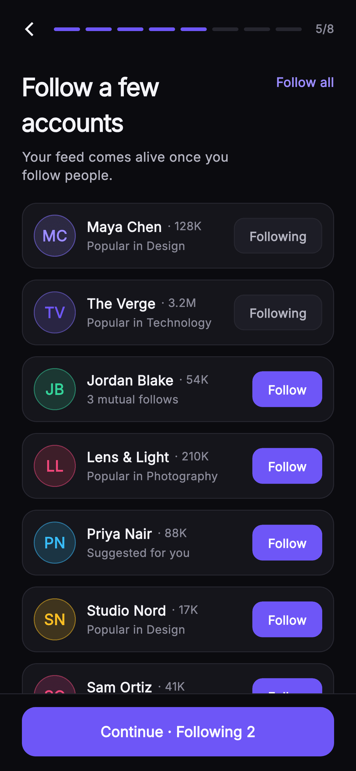
What you'll build
- ✓A `Set<String>`-backed `_following` state where per-row taps, 'Follow all' and the footer count can never disagree
- ✓A `_Monogram` circle that computes initials with a `RegExp(r'\s+')` split and tints itself with each account's accent colour at 18% fill and 50% border
- ✓A `_FollowButton` pill that swaps `Material` colour, border and text colour between 'Follow' and 'Following' in one ternary set
- ✓A `_SetupHeader` whose eight-segment progress bar is generated with `List<Widget>.generate` and filled up to `step`
- ✓A `_SetupFooter` `FilledButton` whose label changes from 'Skip for now' at zero to 'Continue · Following N' as the count grows
Step-by-step build
Create the file
Add a new file at lib/social_setup_follow/social_setup_follow_screen.dart in your Flutter project.
Register the bundled fonts
No external packages — this is pure Flutter. It does bundle its design font (Inter), so drop the font file into fonts/ and declare it in pubspec.yaml:
flutter:
  fonts:
    - family: Inter
      fonts:
- asset: fonts/Inter-Regular.ttfBuild it, piece by piece
Here's how the screen goes together. Each block below is a real slice of the code with a plain-English explanation — paste them in order, or grab the whole file from the next section.
The screen shell, its palette and the account model
import 'package:flutter/material.dart';

/// Suggested Follows — fifth step of Pulse profile setup. A list of recommended
/// accounts (painted monogram avatar, name, handle, follower count, and the
/// reason they’re suggested) each carry a Follow / Following toggle, and a
/// "Follow all" shortcut sits up top. The pinned CTA reflects how many the user
/// has followed. Self-contained per CONVENTIONS.md: pure Flutter, bundled Inter
/// font, own dark theme, SafeArea.
class SocialSetupFollowScreen extends StatefulWidget {
  const SocialSetupFollowScreen({
    super.key,
    this.onBack,
    this.onContinue,
  });

  final VoidCallback? onBack;
  final VoidCallback? onContinue;

  static const String _font = 'Inter';
  static const Color _bg = Color(0xFF0B0B0F);
  static const Color _surface = Color(0xFF15151B);
  static const Color _surfaceAlt = Color(0xFF1D1D26);
  static const Color _brand = Color(0xFF6E56F7);
  static const Color _accent = Color(0xFF9B8CFF);
  static const Color _hairline = Color(0xFF26262F);
  static const Color _textHi = Color(0xFFF4F4F7);
  static const Color _textLo = Color(0xFFB5B5C2);
  static const Color _muted = Color(0xFF8A8A99);

  @override
  State<SocialSetupFollowScreen> createState() =>
      _SocialSetupFollowScreenState();
}

class _Account {
  const _Account(this.name, this.handle, this.followers, this.reason, this.color);
  final String name;
  final String handle;
  final String followers;
  final String reason;
  final Color color;
}
`SocialSetupFollowScreen` is a `StatefulWidget` because, unlike a static onboarding page, it has to remember which accounts the user has tapped. It takes only two callbacks, `onBack` and `onContinue`, so the flow controller outside decides where step 5 of 8 goes next. Nine colour constants define a near-monochrome dark palette: `_bg` #0B0B0F, two surfaces (#15151B and #1D1D26), a #26262F `_hairline`, and three text tiers from #F4F4F7 down to #8A8A99. The only saturated colours are `_brand` #6E56F7 and the lighter `_accent` #9B8CFF, which is why the Follow pills and progress bar read as the focal points. `_Account` is a tiny immutable model with `name`, `handle`, `followers`, `reason` and a per-account `Color`; storing the colour on the model, rather than deriving it, is what lets each monogram carry its own tint.
Seven seeded accounts and a Set of followed handles
class _SocialSetupFollowScreenState extends State<SocialSetupFollowScreen> {
  static const List<_Account> _accounts = <_Account>[
    _Account('Maya Chen', 'mayadraws', '128K', 'Popular in Design',
        Color(0xFF9B8CFF)),
    _Account('The Verge', 'verge', '3.2M', 'Popular in Technology',
        Color(0xFF6E56F7)),
    _Account('Jordan Blake', 'jblake', '54K', '3 mutual follows',
        Color(0xFF34D399)),
    _Account('Lens & Light', 'lenslight', '210K', 'Popular in Photography',
        Color(0xFFF4476B)),
    _Account('Priya Nair', 'priyacodes', '88K', 'Suggested for you',
        Color(0xFF38BDF8)),
    _Account('Studio Nord', 'studionord', '17K', 'Popular in Design',
        Color(0xFFFBBF24)),
    _Account('Sam Ortiz', 'samshoots', '41K', '5 mutual follows',
        Color(0xFFEC4899)),
  ];

  late final Set<String> _following = <String>{'mayadraws', 'verge'};
The suggestions are a `static const List<_Account>` of seven entries with varied follower strings ('128K', '3.2M', '17K') and reasons that mix topic popularity ('Popular in Design') with social proof ('3 mutual follows', '5 mutual follows'). Each carries a distinct accent — mint #34D399, rose #F4476B, sky #38BDF8, amber #FBBF24, pink #EC4899 — so the column of avatars does not look like a single-colour list. The crucial line is `late final Set<String> _following = <String>{'mayadraws', 'verge'}`: state is a Set of handles, not a list of booleans indexed by position. Two accounts start pre-followed so the footer already reads 'Continue · Following 2' on first paint. Because a Set has no duplicates and `contains` is O(1), every row, the header shortcut and the footer can all ask the same object the same question without any bookkeeping.
Forcing a dark theme, the title row and the Follow all / Clear toggle
  @override
  Widget build(BuildContext context) {
    return Theme(
      data: ThemeData.dark(useMaterial3: true),
      child: Scaffold(
        backgroundColor: SocialSetupFollowScreen._bg,
        body: SafeArea(
          child: Column(
            children: <Widget>[
              _SetupHeader(step: 5, total: 8, onBack: widget.onBack),
              Padding(
                padding: const EdgeInsets.fromLTRB(24, 16, 24, 4),
                child: Row(
                  crossAxisAlignment: CrossAxisAlignment.start,
                  children: <Widget>[
                    const Expanded(
                      child: Column(
                        crossAxisAlignment: CrossAxisAlignment.start,
                        children: <Widget>[
                          Text(
                            'Follow a few accounts',
                            style: TextStyle(
                              fontFamily: SocialSetupFollowScreen._font,
                              fontSize: 27,
                              fontWeight: FontWeight.w700,
                              letterSpacing: -0.7,
                              color: SocialSetupFollowScreen._textHi,
                            ),
                          ),
                          SizedBox(height: 8),
                          Text(
                            'Your feed comes alive once you follow people.',
                            style: TextStyle(
                              fontFamily: SocialSetupFollowScreen._font,
                              fontSize: 14.5,
                              height: 1.4,
                              color: SocialSetupFollowScreen._textLo,
                            ),
                          ),
                        ],
                      ),
                    ),
                    const SizedBox(width: 12),
                    GestureDetector(
                      onTap: () => setState(() {
                        if (_following.length == _accounts.length) {
                          _following.clear();
                        } else {
                          _following.addAll(
                              _accounts.map((_Account a) => a.handle));
                        }
                      }),
                      child: Padding(
                        padding: const EdgeInsets.only(top: 4),
                        child: Text(
                          _following.length == _accounts.length
                              ? 'Clear'
                              : 'Follow all',
                          style: const TextStyle(
                            fontFamily: SocialSetupFollowScreen._font,
                            fontSize: 14,
                            fontWeight: FontWeight.w600,
                            color: SocialSetupFollowScreen._accent,
                          ),
                        ),
                      ),
                    ),
                  ],
                ),
              ),
`build` wraps everything in `Theme(data: ThemeData.dark(useMaterial3: true))` so the screen ignores whatever light theme the host app uses, then lays out header, title, list and footer in a `Column` inside `SafeArea`. The title 'Follow a few accounts' is 27px, weight 700, with `letterSpacing: -0.7` to tighten the large glyphs, above a 14.5px `_textLo` subtitle. To its right, a `GestureDetector` around plain text acts as the bulk shortcut. Its `onTap` checks `_following.length == _accounts.length`: if everyone is followed it calls `_following.clear()`, otherwise `addAll(_accounts.map((a) => a.handle))`. The same comparison picks the label, so the text reads 'Follow all' until the last account is followed and then flips to 'Clear'. There is no separate `_allFollowed` boolean to keep in sync; the Set's length is the truth.
The account list and per-row toggling
              Expanded(
                child: ListView.separated(
                  padding: const EdgeInsets.fromLTRB(24, 16, 24, 24),
                  itemCount: _accounts.length,
                  separatorBuilder: (BuildContext context, int i) =>
                      const SizedBox(height: 12),
                  itemBuilder: (BuildContext context, int i) {
                    final _Account a = _accounts[i];
                    final bool following = _following.contains(a.handle);
                    return _AccountRow(
                      account: a,
                      following: following,
                      onToggle: () => setState(() {
                        if (following) {
                          _following.remove(a.handle);
                        } else {
                          _following.add(a.handle);
                        }
                      }),
                    );
                  },
                ),
              ),
              _SetupFooter(
                count: _following.length,
                onContinue: widget.onContinue,
              ),
            ],
          ),
        ),
      ),
    );
  }
}
The list is a `ListView.separated` inside `Expanded`, so it takes whatever height remains between title and footer and scrolls independently. `separatorBuilder` returns a 12px `SizedBox`, which is cleaner than giving each card a bottom margin because the last card gets no trailing gap. In `itemBuilder`, `final bool following = _following.contains(a.handle)` is computed once per row and passed down along with the `_Account`. The `onToggle` closure captures that boolean: if the row was already followed it calls `_following.remove(a.handle)`, otherwise `add`. Both branches run inside `setState`, so the rebuild also refreshes the header shortcut label and the footer count. Finally `_SetupFooter` receives `count: _following.length`, meaning the CTA never stores its own number, it just reads the Set on every build.
The account card: monogram, name, follower count and reason
class _AccountRow extends StatelessWidget {
  const _AccountRow({
    required this.account,
    required this.following,
    this.onToggle,
  });
  final _Account account;
  final bool following;
  final VoidCallback? onToggle;

  @override
  Widget build(BuildContext context) {
    return Container(
      padding: const EdgeInsets.all(12),
      decoration: BoxDecoration(
        color: SocialSetupFollowScreen._surface,
        borderRadius: BorderRadius.circular(16),
        border: Border.all(color: SocialSetupFollowScreen._hairline),
      ),
      child: Row(
        children: <Widget>[
          _Monogram(name: account.name, color: account.color, size: 46),
          const SizedBox(width: 12),
          Expanded(
            child: Column(
              crossAxisAlignment: CrossAxisAlignment.start,
              children: <Widget>[
                Row(
                  children: <Widget>[
                    Flexible(
                      child: Text(
                        account.name,
                        overflow: TextOverflow.ellipsis,
                        style: const TextStyle(
                          fontFamily: SocialSetupFollowScreen._font,
                          fontSize: 15,
                          fontWeight: FontWeight.w600,
                          color: SocialSetupFollowScreen._textHi,
                        ),
                      ),
                    ),
                    const SizedBox(width: 6),
                    Text(
                      '· ${account.followers}',
                      style: const TextStyle(
                        fontFamily: SocialSetupFollowScreen._font,
                        fontSize: 12.5,
                        fontWeight: FontWeight.w500,
                        color: SocialSetupFollowScreen._muted,
                      ),
                    ),
                  ],
                ),
                const SizedBox(height: 2),
                Text(
                  account.reason,
                  style: const TextStyle(
                    fontFamily: SocialSetupFollowScreen._font,
                    fontSize: 12.5,
                    color: SocialSetupFollowScreen._muted,
                  ),
                ),
              ],
            ),
          ),
          const SizedBox(width: 10),
          _FollowButton(following: following, onTap: onToggle),
        ],
      ),
    );
  }
}
`_AccountRow` is a stateless card with 12px padding, `_surface` fill, 16px radius and a `_hairline` border, so it separates from the #0B0B0F background by a single tint step rather than a shadow. A `Row` places a 46px `_Monogram` on the left, then an `Expanded` text column, then the follow pill. The name row is worth studying: the name is wrapped in `Flexible` with `overflow: TextOverflow.ellipsis`, while the `'· ${account.followers}'` text sits outside it unconstrained. That means a long name like 'Lens & Light' truncates but the follower count is never pushed off the card. Name is 15px weight 600 in `_textHi`; both the follower count and the reason line drop to 12.5px `_muted`, with only a 2px gap between the name row and the reason, so the card reads as one headline and one quiet caption.
One button, two states: the Follow / Following pill
class _FollowButton extends StatelessWidget {
  const _FollowButton({required this.following, this.onTap});
  final bool following;
  final VoidCallback? onTap;

  @override
  Widget build(BuildContext context) {
    return Material(
      color: following
          ? SocialSetupFollowScreen._surfaceAlt
          : SocialSetupFollowScreen._brand,
      borderRadius: BorderRadius.circular(11),
      child: InkWell(
        onTap: onTap,
        borderRadius: BorderRadius.circular(11),
        child: Container(
          padding: const EdgeInsets.symmetric(horizontal: 16, vertical: 9),
          decoration: BoxDecoration(
            borderRadius: BorderRadius.circular(11),
            border: Border.all(
              color: following
                  ? SocialSetupFollowScreen._hairline
                  : SocialSetupFollowScreen._brand,
            ),
          ),
          child: Text(
            following ? 'Following' : 'Follow',
            style: TextStyle(
              fontFamily: SocialSetupFollowScreen._font,
              fontSize: 13.5,
              fontWeight: FontWeight.w600,
              color: following ? SocialSetupFollowScreen._textLo : Colors.white,
            ),
          ),
        ),
      ),
    );
  }
}
`_FollowButton` uses `Material` plus `InkWell` rather than a `TextButton` so it gets a ripple clipped to an 11px radius while keeping full control of colour. Every visual property is a ternary on `following`: the `Material` colour is `_brand` indigo when not followed and `_surfaceAlt` #1D1D26 when followed; the `Border.all` colour matches `_brand` in the first case and drops to `_hairline` in the second; the label swaps 'Follow' for 'Following'; and the text goes from `Colors.white` to `_textLo`. The result is that the un-followed state is the loud, filled action and the followed state visually recedes into the card, inviting the eye to the next un-followed row. Padding is 16px by 9px with 13.5px weight-600 text, small enough that seven pills stacked in a column do not compete with the footer CTA.
Monogram avatars from initials, no image assets
class _Monogram extends StatelessWidget {
  const _Monogram({required this.name, required this.color, required this.size});
  final String name;
  final Color color;
  final double size;

  String get _initials {
    final List<String> parts = name
        .trim()
        .split(RegExp(r'\s+'))
        .where((String s) => s.isNotEmpty)
        .toList();
    if (parts.isEmpty) return '?';
    if (parts.length == 1) return parts.first[0].toUpperCase();
    return (parts.first[0] + parts.last[0]).toUpperCase();
  }

  @override
  Widget build(BuildContext context) {
    return Container(
      width: size,
      height: size,
      decoration: BoxDecoration(
        shape: BoxShape.circle,
        color: color.withValues(alpha: 0.18),
        border: Border.all(color: color.withValues(alpha: 0.5)),
      ),
      child: Center(
        child: Text(
          _initials,
          style: TextStyle(
            fontFamily: SocialSetupFollowScreen._font,
            fontSize: size * 0.36,
            fontWeight: FontWeight.w700,
            color: color,
          ),
        ),
      ),
    );
  }
}
`_Monogram` replaces network avatars with a computed one, which is why the screen has zero image dependencies. The `_initials` getter trims the name, splits on `RegExp(r'\s+')`, filters empty parts, and returns '?' for an empty string, the single upper-cased first letter for a one-word name, or first-plus-last initials otherwise — so 'The Verge' becomes 'TV' and 'Lens & Light' becomes 'LL'. The circle is a `BoxShape.circle` container whose fill is the account colour at `withValues(alpha: 0.18)` and whose 1px border is the same colour at 0.5 alpha, with the letters drawn in the fully opaque colour. Font size is `size * 0.36`, so the same widget scales correctly if you pass 32 or 64 instead of 46. Three alpha levels of one hue give each avatar depth without a gradient or shadow.
Progress header and the count-aware footer CTA
class _SetupHeader extends StatelessWidget {
  const _SetupHeader({required this.step, required this.total, this.onBack});
  final int step;
  final int total;
  final VoidCallback? onBack;

  @override
  Widget build(BuildContext context) {
    return Padding(
      padding: const EdgeInsets.fromLTRB(8, 8, 24, 4),
      child: Row(
        children: <Widget>[
          IconButton(
            onPressed: onBack,
            icon: const Icon(Icons.arrow_back_ios_new,
                size: 18, color: SocialSetupFollowScreen._textHi),
          ),
          Expanded(
            child: Row(
              children: List<Widget>.generate(total, (int i) {
                return Expanded(
                  child: Container(
                    height: 4,
                    margin: const EdgeInsets.symmetric(horizontal: 3),
                    decoration: BoxDecoration(
                      borderRadius: BorderRadius.circular(2),
                      color: i < step
                          ? SocialSetupFollowScreen._brand
                          : SocialSetupFollowScreen._hairline,
                    ),
                  ),
                );
              }),
            ),
          ),
          const SizedBox(width: 12),
          Text(
            '$step/$total',
            style: const TextStyle(
              fontFamily: SocialSetupFollowScreen._font,
              fontSize: 12.5,
              fontWeight: FontWeight.w600,
              color: SocialSetupFollowScreen._muted,
            ),
          ),
        ],
      ),
    );
  }
}

class _SetupFooter extends StatelessWidget {
  const _SetupFooter({required this.count, this.onContinue});
  final int count;
  final VoidCallback? onContinue;

  @override
  Widget build(BuildContext context) {
    return Container(
      decoration: const BoxDecoration(
        color: SocialSetupFollowScreen._bg,
        border:
            Border(top: BorderSide(color: SocialSetupFollowScreen._hairline)),
      ),
      padding: const EdgeInsets.fromLTRB(24, 14, 24, 16),
      child: SizedBox(
        width: double.infinity,
        height: 54,
        child: FilledButton(
          onPressed: onContinue,
          style: FilledButton.styleFrom(
            backgroundColor: SocialSetupFollowScreen._brand,
            foregroundColor: Colors.white,
            shape: RoundedRectangleBorder(
              borderRadius: BorderRadius.circular(15),
            ),
          ),
          child: Text(
            count == 0 ? 'Skip for now' : 'Continue · Following $count',
            style: const TextStyle(
              fontFamily: SocialSetupFollowScreen._font,
              fontSize: 16,
              fontWeight: FontWeight.w600,
            ),
          ),
        ),
      ),
    );
  }
}
`_SetupHeader` puts a back `IconButton` (an 18px `arrow_back_ios_new`) beside a progress bar built from `List<Widget>.generate(total, ...)`: each segment is an `Expanded` 4px-tall container with 3px horizontal margins, coloured `_brand` when `i < step` and `_hairline` otherwise, so passing `step: 5, total: 8` lights exactly five of eight bars. A '5/8' label in 12.5px `_muted` confirms it numerically. `_SetupFooter` pins a 54px full-width `FilledButton` under a top hairline, with `_brand` background and a 15px rounded shape. Its label is the screen's honesty check: `count == 0 ? 'Skip for now' : 'Continue · Following $count'`. A user who followed nobody is offered a skip rather than a misleading 'Continue', and one who followed people sees the number they chose, so the CTA doubles as a live summary of the Set above it.
Full code
The complete, ready-to-paste source. Free to use in your projects — one click copies it all.
import 'package:flutter/material.dart';

/// Suggested Follows — fifth step of Pulse profile setup. A list of recommended
/// accounts (painted monogram avatar, name, handle, follower count, and the
/// reason they’re suggested) each carry a Follow / Following toggle, and a
/// "Follow all" shortcut sits up top. The pinned CTA reflects how many the user
/// has followed. Self-contained per CONVENTIONS.md: pure Flutter, bundled Inter
/// font, own dark theme, SafeArea.
class SocialSetupFollowScreen extends StatefulWidget {
  const SocialSetupFollowScreen({
    super.key,
    this.onBack,
    this.onContinue,
  });

  final VoidCallback? onBack;
  final VoidCallback? onContinue;

  static const String _font = 'Inter';
  static const Color _bg = Color(0xFF0B0B0F);
  static const Color _surface = Color(0xFF15151B);
  static const Color _surfaceAlt = Color(0xFF1D1D26);
  static const Color _brand = Color(0xFF6E56F7);
  static const Color _accent = Color(0xFF9B8CFF);
  static const Color _hairline = Color(0xFF26262F);
  static const Color _textHi = Color(0xFFF4F4F7);
  static const Color _textLo = Color(0xFFB5B5C2);
  static const Color _muted = Color(0xFF8A8A99);

  @override
  State<SocialSetupFollowScreen> createState() =>
      _SocialSetupFollowScreenState();
}

class _Account {
  const _Account(this.name, this.handle, this.followers, this.reason, this.color);
  final String name;
  final String handle;
  final String followers;
  final String reason;
  final Color color;
}

class _SocialSetupFollowScreenState extends State<SocialSetupFollowScreen> {
  static const List<_Account> _accounts = <_Account>[
    _Account('Maya Chen', 'mayadraws', '128K', 'Popular in Design',
        Color(0xFF9B8CFF)),
    _Account('The Verge', 'verge', '3.2M', 'Popular in Technology',
        Color(0xFF6E56F7)),
    _Account('Jordan Blake', 'jblake', '54K', '3 mutual follows',
        Color(0xFF34D399)),
    _Account('Lens & Light', 'lenslight', '210K', 'Popular in Photography',
        Color(0xFFF4476B)),
    _Account('Priya Nair', 'priyacodes', '88K', 'Suggested for you',
        Color(0xFF38BDF8)),
    _Account('Studio Nord', 'studionord', '17K', 'Popular in Design',
        Color(0xFFFBBF24)),
    _Account('Sam Ortiz', 'samshoots', '41K', '5 mutual follows',
        Color(0xFFEC4899)),
  ];

  late final Set<String> _following = <String>{'mayadraws', 'verge'};

  @override
  Widget build(BuildContext context) {
    return Theme(
      data: ThemeData.dark(useMaterial3: true),
      child: Scaffold(
        backgroundColor: SocialSetupFollowScreen._bg,
        body: SafeArea(
          child: Column(
            children: <Widget>[
              _SetupHeader(step: 5, total: 8, onBack: widget.onBack),
              Padding(
                padding: const EdgeInsets.fromLTRB(24, 16, 24, 4),
                child: Row(
                  crossAxisAlignment: CrossAxisAlignment.start,
                  children: <Widget>[
                    const Expanded(
                      child: Column(
                        crossAxisAlignment: CrossAxisAlignment.start,
                        children: <Widget>[
                          Text(
                            'Follow a few accounts',
                            style: TextStyle(
                              fontFamily: SocialSetupFollowScreen._font,
                              fontSize: 27,
                              fontWeight: FontWeight.w700,
                              letterSpacing: -0.7,
                              color: SocialSetupFollowScreen._textHi,
                            ),
                          ),
                          SizedBox(height: 8),
                          Text(
                            'Your feed comes alive once you follow people.',
                            style: TextStyle(
                              fontFamily: SocialSetupFollowScreen._font,
                              fontSize: 14.5,
                              height: 1.4,
                              color: SocialSetupFollowScreen._textLo,
                            ),
                          ),
                        ],
                      ),
                    ),
                    const SizedBox(width: 12),
                    GestureDetector(
                      onTap: () => setState(() {
                        if (_following.length == _accounts.length) {
                          _following.clear();
                        } else {
                          _following.addAll(
                              _accounts.map((_Account a) => a.handle));
                        }
                      }),
                      child: Padding(
                        padding: const EdgeInsets.only(top: 4),
                        child: Text(
                          _following.length == _accounts.length
                              ? 'Clear'
                              : 'Follow all',
                          style: const TextStyle(
                            fontFamily: SocialSetupFollowScreen._font,
                            fontSize: 14,
                            fontWeight: FontWeight.w600,
                            color: SocialSetupFollowScreen._accent,
                          ),
                        ),
                      ),
                    ),
                  ],
                ),
              ),
              Expanded(
                child: ListView.separated(
                  padding: const EdgeInsets.fromLTRB(24, 16, 24, 24),
                  itemCount: _accounts.length,
                  separatorBuilder: (BuildContext context, int i) =>
                      const SizedBox(height: 12),
                  itemBuilder: (BuildContext context, int i) {
                    final _Account a = _accounts[i];
                    final bool following = _following.contains(a.handle);
                    return _AccountRow(
                      account: a,
                      following: following,
                      onToggle: () => setState(() {
                        if (following) {
                          _following.remove(a.handle);
                        } else {
                          _following.add(a.handle);
                        }
                      }),
                    );
                  },
                ),
              ),
              _SetupFooter(
                count: _following.length,
                onContinue: widget.onContinue,
              ),
            ],
          ),
        ),
      ),
    );
  }
}

class _AccountRow extends StatelessWidget {
  const _AccountRow({
    required this.account,
    required this.following,
    this.onToggle,
  });
  final _Account account;
  final bool following;
  final VoidCallback? onToggle;

  @override
  Widget build(BuildContext context) {
    return Container(
      padding: const EdgeInsets.all(12),
      decoration: BoxDecoration(
        color: SocialSetupFollowScreen._surface,
        borderRadius: BorderRadius.circular(16),
        border: Border.all(color: SocialSetupFollowScreen._hairline),
      ),
      child: Row(
        children: <Widget>[
          _Monogram(name: account.name, color: account.color, size: 46),
          const SizedBox(width: 12),
          Expanded(
            child: Column(
              crossAxisAlignment: CrossAxisAlignment.start,
              children: <Widget>[
                Row(
                  children: <Widget>[
                    Flexible(
                      child: Text(
                        account.name,
                        overflow: TextOverflow.ellipsis,
                        style: const TextStyle(
                          fontFamily: SocialSetupFollowScreen._font,
                          fontSize: 15,
                          fontWeight: FontWeight.w600,
                          color: SocialSetupFollowScreen._textHi,
                        ),
                      ),
                    ),
                    const SizedBox(width: 6),
                    Text(
                      '· ${account.followers}',
                      style: const TextStyle(
                        fontFamily: SocialSetupFollowScreen._font,
                        fontSize: 12.5,
                        fontWeight: FontWeight.w500,
                        color: SocialSetupFollowScreen._muted,
                      ),
                    ),
                  ],
                ),
                const SizedBox(height: 2),
                Text(
                  account.reason,
                  style: const TextStyle(
                    fontFamily: SocialSetupFollowScreen._font,
                    fontSize: 12.5,
                    color: SocialSetupFollowScreen._muted,
                  ),
                ),
              ],
            ),
          ),
          const SizedBox(width: 10),
          _FollowButton(following: following, onTap: onToggle),
        ],
      ),
    );
  }
}

class _FollowButton extends StatelessWidget {
  const _FollowButton({required this.following, this.onTap});
  final bool following;
  final VoidCallback? onTap;

  @override
  Widget build(BuildContext context) {
    return Material(
      color: following
          ? SocialSetupFollowScreen._surfaceAlt
          : SocialSetupFollowScreen._brand,
      borderRadius: BorderRadius.circular(11),
      child: InkWell(
        onTap: onTap,
        borderRadius: BorderRadius.circular(11),
        child: Container(
          padding: const EdgeInsets.symmetric(horizontal: 16, vertical: 9),
          decoration: BoxDecoration(
            borderRadius: BorderRadius.circular(11),
            border: Border.all(
              color: following
                  ? SocialSetupFollowScreen._hairline
                  : SocialSetupFollowScreen._brand,
            ),
          ),
          child: Text(
            following ? 'Following' : 'Follow',
            style: TextStyle(
              fontFamily: SocialSetupFollowScreen._font,
              fontSize: 13.5,
              fontWeight: FontWeight.w600,
              color: following ? SocialSetupFollowScreen._textLo : Colors.white,
            ),
          ),
        ),
      ),
    );
  }
}

class _Monogram extends StatelessWidget {
  const _Monogram({required this.name, required this.color, required this.size});
  final String name;
  final Color color;
  final double size;

  String get _initials {
    final List<String> parts = name
        .trim()
        .split(RegExp(r'\s+'))
        .where((String s) => s.isNotEmpty)
        .toList();
    if (parts.isEmpty) return '?';
    if (parts.length == 1) return parts.first[0].toUpperCase();
    return (parts.first[0] + parts.last[0]).toUpperCase();
  }

  @override
  Widget build(BuildContext context) {
    return Container(
      width: size,
      height: size,
      decoration: BoxDecoration(
        shape: BoxShape.circle,
        color: color.withValues(alpha: 0.18),
        border: Border.all(color: color.withValues(alpha: 0.5)),
      ),
      child: Center(
        child: Text(
          _initials,
          style: TextStyle(
            fontFamily: SocialSetupFollowScreen._font,
            fontSize: size * 0.36,
            fontWeight: FontWeight.w700,
            color: color,
          ),
        ),
      ),
    );
  }
}

class _SetupHeader extends StatelessWidget {
  const _SetupHeader({required this.step, required this.total, this.onBack});
  final int step;
  final int total;
  final VoidCallback? onBack;

  @override
  Widget build(BuildContext context) {
    return Padding(
      padding: const EdgeInsets.fromLTRB(8, 8, 24, 4),
      child: Row(
        children: <Widget>[
          IconButton(
            onPressed: onBack,
            icon: const Icon(Icons.arrow_back_ios_new,
                size: 18, color: SocialSetupFollowScreen._textHi),
          ),
          Expanded(
            child: Row(
              children: List<Widget>.generate(total, (int i) {
                return Expanded(
                  child: Container(
                    height: 4,
                    margin: const EdgeInsets.symmetric(horizontal: 3),
                    decoration: BoxDecoration(
                      borderRadius: BorderRadius.circular(2),
                      color: i < step
                          ? SocialSetupFollowScreen._brand
                          : SocialSetupFollowScreen._hairline,
                    ),
                  ),
                );
              }),
            ),
          ),
          const SizedBox(width: 12),
          Text(
            '$step/$total',
            style: const TextStyle(
              fontFamily: SocialSetupFollowScreen._font,
              fontSize: 12.5,
              fontWeight: FontWeight.w600,
              color: SocialSetupFollowScreen._muted,
            ),
          ),
        ],
      ),
    );
  }
}

class _SetupFooter extends StatelessWidget {
  const _SetupFooter({required this.count, this.onContinue});
  final int count;
  final VoidCallback? onContinue;

  @override
  Widget build(BuildContext context) {
    return Container(
      decoration: const BoxDecoration(
        color: SocialSetupFollowScreen._bg,
        border:
            Border(top: BorderSide(color: SocialSetupFollowScreen._hairline)),
      ),
      padding: const EdgeInsets.fromLTRB(24, 14, 24, 16),
      child: SizedBox(
        width: double.infinity,
        height: 54,
        child: FilledButton(
          onPressed: onContinue,
          style: FilledButton.styleFrom(
            backgroundColor: SocialSetupFollowScreen._brand,
            foregroundColor: Colors.white,
            shape: RoundedRectangleBorder(
              borderRadius: BorderRadius.circular(15),
            ),
          ),
          child: Text(
            count == 0 ? 'Skip for now' : 'Continue · Following $count',
            style: const TextStyle(
              fontFamily: SocialSetupFollowScreen._font,
              fontSize: 16,
              fontWeight: FontWeight.w600,
            ),
          ),
        ),
      ),
    );
  }
}
Plus bundled 1 binary asset (fonts/images). The CLI and MCP install those for you automatically.
Two faster ways to add it
Copy-paste works, but you can skip it entirely.
1. FlutterKit CLI
One command drops this screen — and its fonts — straight into your project.
$ flutterkit add social-setup-follow2. AI agent (MCP)
Connect FlutterKit's MCP server in Claude or Cursor and just ask your agent to install social-setup-follow — it fetches and writes the files for you.
FAQ
Can I use this suggested follows screen in a commercial app?
Yes. FlutterKit screens are free for personal and commercial projects under an MIT-style licence. There is no licence key to enter; run `flutterkit add social-setup-follow`, drop `SocialSetupFollowScreen` into your onboarding flow, and ship it.
How do I load the suggested accounts from my API instead of the hard-coded list?
Replace the `static const List<_Account> _accounts` with a field populated from your response, mapping each record to `_Account(name, handle, followers, reason, color)`. Keep `_following` as a `Set<String>` of handles so the per-row toggle, the 'Follow all' / 'Clear' shortcut and the footer count keep working unchanged. When the user taps Continue, `_following` is exactly the set of handles to send to your follow endpoint.
Why does the header button say 'Clear' sometimes?
The label is a ternary on `_following.length == _accounts.length`. While at least one account is unfollowed it reads 'Follow all' and tapping calls `addAll` with every handle; once every account is followed the same comparison is true, the text becomes 'Clear', and tapping calls `_following.clear()`. Because the check reads the Set directly, tapping individual rows also updates the header label automatically.
Do I need any packages, fonts or image assets?
No pub packages: the file imports only `package:flutter/material.dart`. Avatars are `_Monogram` circles computed from initials, so there are no image URLs or asset files. The Inter font is used throughout, and `flutterkit add social-setup-follow` bundles it and registers it in your pubspec for you.
Which Flutter version does this need?
Flutter 3.22 or newer, because the monogram uses `color.withValues(alpha: 0.18)` and the constructors use `super.key`. On an older 3.x SDK, change each `withValues(alpha: x)` to `withOpacity(x)` and the rest of the file compiles as is.


