How to Build a Notification Opt-In Onboarding Screen in Flutter (Full Code + Preview)
Firing the OS push prompt cold gets you a 'Don't allow' most of the time, and there is no second chance. This tutorial builds step 7 of Pulse's profile setup in Flutter: a pre-permission screen where the user picks which alerts they want before the system dialog ever appears. You get an eight-segment `_SetupHeader` progress bar, a hairline-bordered card of five `_NotifRow` toggles driven by a `const List<_NotifType>` and a `List<bool> _enabled`, a themed Material `Switch` in brand indigo, and a pinned 54px 'Turn on notifications' `FilledButton`.
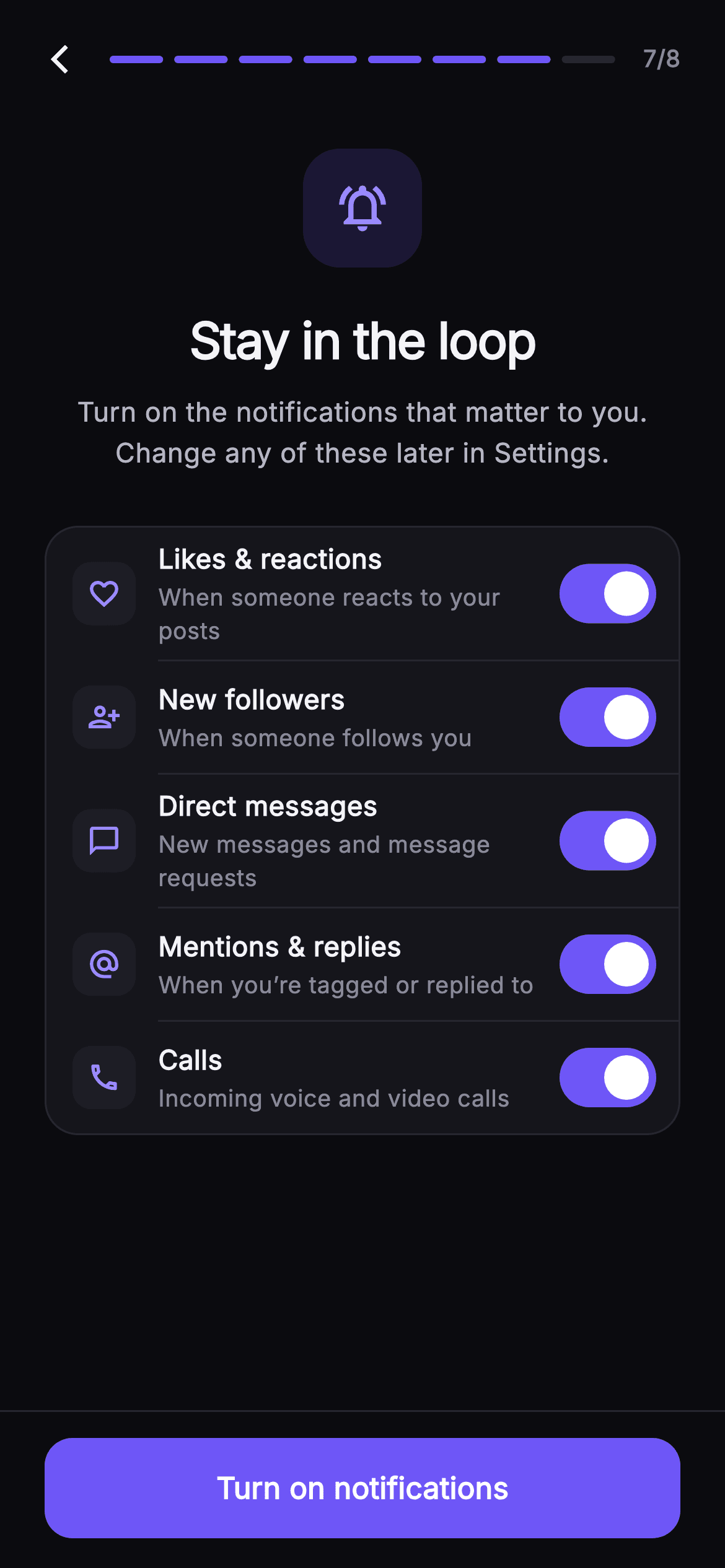
What you'll build
- ✓A `_SetupHeader` that generates an eight-segment progress bar and fills the first `step` segments in `#6E56F7`
- ✓A typed `_NotifType` model list paired with a parallel `List<bool> _enabled` so every toggle flips independently via `setState`
- ✓A `_NotifRow` with a 34px icon tile, title/subtitle column and a `Switch` themed white-on-indigo when on, muted-on-`#1D1D26` when off
- ✓Indented 1px `Divider`s inserted between rows but skipped after the last one so the card's 18px radius stays clean
- ✓A pinned `_SetupFooter` with a fixed-height 54px `FilledButton` that sits outside the scrolling `ListView`
Step-by-step build
Create the file
Add a new file at lib/social_setup_notifications/social_setup_notifications_screen.dart in your Flutter project.
Register the bundled fonts
No external packages — this is pure Flutter. It does bundle its design font (Inter), so drop the font file into fonts/ and declare it in pubspec.yaml:
flutter:
  fonts:
    - family: Inter
      fonts:
- asset: fonts/Inter-Regular.ttfBuild it, piece by piece
Here's how the screen goes together. Each block below is a real slice of the code with a plain-English explanation — paste them in order, or grab the whole file from the next section.
Callbacks, a near-mono dark palette and the notification model
import 'package:flutter/material.dart';

/// Stay Updated — seventh step of Pulse profile setup. A push-permission
/// explainer with a painted bell badge, then a card of per-type toggle rows
/// (likes, follows, direct messages, mentions, calls) so the user chooses what
/// pings them. Step progress tops the screen; Continue is pinned at fixed
/// height. Self-contained per CONVENTIONS.md: pure Flutter, bundled Inter font,
/// own dark theme, SafeArea.
class SocialSetupNotificationsScreen extends StatefulWidget {
  const SocialSetupNotificationsScreen({
    super.key,
    this.onBack,
    this.onContinue,
  });

  final VoidCallback? onBack;
  final VoidCallback? onContinue;

  static const String _font = 'Inter';
  static const Color _bg = Color(0xFF0B0B0F);
  static const Color _surface = Color(0xFF15151B);
  static const Color _surfaceAlt = Color(0xFF1D1D26);
  static const Color _brand = Color(0xFF6E56F7);
  static const Color _accent = Color(0xFF9B8CFF);
  static const Color _hairline = Color(0xFF26262F);
  static const Color _textHi = Color(0xFFF4F4F7);
  static const Color _textLo = Color(0xFFB5B5C2);
  static const Color _muted = Color(0xFF8A8A99);

  @override
  State<SocialSetupNotificationsScreen> createState() =>
      _SocialSetupNotificationsScreenState();
}

class _NotifType {
  const _NotifType(this.icon, this.title, this.subtitle);
  final IconData icon;
  final String title;
  final String subtitle;
}
`SocialSetupNotificationsScreen` is a `StatefulWidget` taking only `onBack` and `onContinue` — the screen owns its toggle state but hands navigation back to whoever embeds it. Ten `static const Color`s define the theme: `_bg` `#0B0B0F` is almost black, `_surface` `#15151B` and `_surfaceAlt` `#1D1D26` are two barely-lighter steps for cards and tiles, and `_hairline` `#26262F` draws every border. There are two purples on purpose: `_brand` `#6E56F7` is used for fills (progress segments, switch track, the button) while the lighter `_accent` `#9B8CFF` is used for icons on dark tiles, where the saturated brand colour would lose contrast. `_NotifType` is a three-field `const` class — `icon`, `title`, `subtitle` — small enough that rows can be data rather than hand-built widgets.
Five notification types and a parallel bool list
class _SocialSetupNotificationsScreenState
    extends State<SocialSetupNotificationsScreen> {
  static const List<_NotifType> _types = <_NotifType>[
    _NotifType(Icons.favorite_border, 'Likes & reactions',
        'When someone reacts to your posts'),
    _NotifType(Icons.person_add_alt, 'New followers',
        'When someone follows you'),
    _NotifType(Icons.chat_bubble_outline, 'Direct messages',
        'New messages and message requests'),
    _NotifType(Icons.alternate_email, 'Mentions & replies',
        'When you’re tagged or replied to'),
    _NotifType(Icons.call_outlined, 'Calls',
        'Incoming voice and video calls'),
  ];

  final List<bool> _enabled = <bool>[true, true, true, true, true];
The State class holds `_types` as a `static const List<_NotifType>` of five entries — Likes & reactions, New followers, Direct messages, Mentions & replies, Calls — each with a Material outline icon such as `Icons.alternate_email` for mentions and `Icons.call_outlined` for calls. Toggle state lives separately in `final List<bool> _enabled = [true, true, true, true, true]`: the list itself is final but its elements are mutable, so `_enabled[i] = v` works without reassigning the field. Keeping the model `const` and the state in a parallel list means adding a sixth notification type is one new `_NotifType` plus one more `true`, and nothing about the row builder changes. Every switch starts on, which is the opt-out framing that maximises what the user keeps.
Forced dark theme, header/body/footer column and the bell badge
  @override
  Widget build(BuildContext context) {
    return Theme(
      data: ThemeData.dark(useMaterial3: true),
      child: Scaffold(
        backgroundColor: SocialSetupNotificationsScreen._bg,
        body: SafeArea(
          child: Column(
            children: <Widget>[
              _SetupHeader(step: 7, total: 8, onBack: widget.onBack),
              Expanded(
                child: ListView(
                  padding: const EdgeInsets.fromLTRB(24, 20, 24, 24),
                  children: <Widget>[
                    Center(
                      child: Container(
                        width: 64,
                        height: 64,
                        decoration: BoxDecoration(
                          color: SocialSetupNotificationsScreen._brand
                              .withValues(alpha: 0.16),
                          borderRadius: BorderRadius.circular(20),
                        ),
                        child: const Icon(Icons.notifications_active_outlined,
                            size: 30,
                            color: SocialSetupNotificationsScreen._accent),
                      ),
                    ),
                    const SizedBox(height: 20),
                    const Text(
                      'Stay in the loop',
                      textAlign: TextAlign.center,
                      style: TextStyle(
                        fontFamily: SocialSetupNotificationsScreen._font,
                        fontSize: 27,
                        fontWeight: FontWeight.w700,
                        letterSpacing: -0.7,
                        color: SocialSetupNotificationsScreen._textHi,
                      ),
                    ),
                    const SizedBox(height: 8),
                    const Text(
                      'Turn on the notifications that matter to you. Change any of these later in Settings.',
                      textAlign: TextAlign.center,
                      style: TextStyle(
                        fontFamily: SocialSetupNotificationsScreen._font,
                        fontSize: 14.5,
                        height: 1.5,
                        color: SocialSetupNotificationsScreen._textLo,
                      ),
                    ),
                    const SizedBox(height: 28),
`build` wraps everything in `Theme(data: ThemeData.dark(useMaterial3: true))` so the `Switch` and `Divider` pick up Material 3 dark defaults regardless of the host app's theme, and the `Scaffold` overrides the background with `_bg`. Inside `SafeArea` a `Column` stacks `_SetupHeader(step: 7, total: 8)`, an `Expanded` `ListView` and `_SetupFooter` — only the middle scrolls, so the progress bar and button never move. The badge is not a painter: it is a 64×64 `Container` tinted `_brand.withValues(alpha: 0.16)` with a 20px radius, holding a 30px `Icons.notifications_active_outlined` in `_accent`. The 27px `w700` headline uses `letterSpacing: -0.7` to tighten Inter at display size, and the 14.5px subhead at `height: 1.5` explicitly promises the choice can be changed later in Settings, which lowers the stakes of the decision.
Generating the toggle card with dividers between rows only
                    Container(
                      decoration: BoxDecoration(
                        color: SocialSetupNotificationsScreen._surface,
                        borderRadius: BorderRadius.circular(18),
                        border: Border.all(
                            color: SocialSetupNotificationsScreen._hairline),
                      ),
                      child: Column(
                        children: List<Widget>.generate(_types.length, (int i) {
                          return Column(
                            children: <Widget>[
                              _NotifRow(
                                type: _types[i],
                                value: _enabled[i],
                                onChanged: (bool v) =>
                                    setState(() => _enabled[i] = v),
                              ),
                              if (i != _types.length - 1)
                                const Divider(
                                  height: 1,
                                  indent: 60,
                                  color:
                                      SocialSetupNotificationsScreen._hairline,
                                ),
                            ],
                          );
                        }),
                      ),
                    ),
                  ],
                ),
              ),
              _SetupFooter(onContinue: widget.onContinue),
            ],
          ),
        ),
      ),
    );
  }
}
The card is a `Container` in `_surface` with an 18px radius and a `_hairline` border. Its `Column` children come from `List<Widget>.generate(_types.length, ...)`, where each iteration returns a nested `Column` of a `_NotifRow` plus a conditional `Divider`. The guard `if (i != _types.length - 1)` skips the divider after the final row so no line collides with the rounded bottom edge. The `Divider` has `height: 1` — the default 16 would add invisible padding — and `indent: 60`, which is the 14px row padding plus the 34px icon tile plus the 12px gap, so the line starts exactly under the text column rather than the icons. Each row receives `value: _enabled[i]` and an `onChanged` closure that calls `setState(() => _enabled[i] = v)`; the closure captures `i`, so all five rows share one handler shape but write to their own slot.
The _NotifRow: icon tile, two-line label and a themed Switch
class _NotifRow extends StatelessWidget {
  const _NotifRow({
    required this.type,
    required this.value,
    required this.onChanged,
  });
  final _NotifType type;
  final bool value;
  final ValueChanged<bool> onChanged;

  @override
  Widget build(BuildContext context) {
    return Padding(
      padding: const EdgeInsets.fromLTRB(14, 6, 8, 6),
      child: Row(
        children: <Widget>[
          Container(
            width: 34,
            height: 34,
            decoration: BoxDecoration(
              color: SocialSetupNotificationsScreen._surfaceAlt,
              borderRadius: BorderRadius.circular(10),
            ),
            child: Icon(type.icon,
                size: 18, color: SocialSetupNotificationsScreen._accent),
          ),
          const SizedBox(width: 12),
          Expanded(
            child: Column(
              crossAxisAlignment: CrossAxisAlignment.start,
              children: <Widget>[
                Text(
                  type.title,
                  style: const TextStyle(
                    fontFamily: SocialSetupNotificationsScreen._font,
                    fontSize: 14.5,
                    fontWeight: FontWeight.w600,
                    color: SocialSetupNotificationsScreen._textHi,
                  ),
                ),
                const SizedBox(height: 2),
                Text(
                  type.subtitle,
                  style: const TextStyle(
                    fontFamily: SocialSetupNotificationsScreen._font,
                    fontSize: 12.5,
                    color: SocialSetupNotificationsScreen._muted,
                  ),
                ),
              ],
            ),
          ),
          const SizedBox(width: 8),
          Switch(
            value: value,
            onChanged: onChanged,
            activeThumbColor: Colors.white,
            activeTrackColor: SocialSetupNotificationsScreen._brand,
            inactiveThumbColor: SocialSetupNotificationsScreen._muted,
            inactiveTrackColor: SocialSetupNotificationsScreen._surfaceAlt,
          ),
        ],
      ),
    );
  }
}
`_NotifRow` is stateless — it receives `type`, `value` and `onChanged` and renders whatever it is given, which is why the parent can rebuild it safely on every toggle. Padding is asymmetric, `fromLTRB(14, 6, 8, 6)`: the right side is tighter because a Material `Switch` carries its own internal hit-area margin. The leading tile is a 34px `_surfaceAlt` box with a 10px radius and an 18px `_accent` icon, sitting one shade above the card so it reads as raised without a border. The `Expanded` text column puts the 14.5px `w600` title in `_textHi` over a 12.5px subtitle in `_muted`, separated by just 2px. The `Switch` is themed with four colours: `activeThumbColor: Colors.white` on `activeTrackColor: _brand`, and `inactiveThumbColor: _muted` on `inactiveTrackColor: _surfaceAlt`, so an off toggle nearly disappears into the card and an on toggle is the brightest thing in the row.
The eight-segment progress header
class _SetupHeader extends StatelessWidget {
  const _SetupHeader({required this.step, required this.total, this.onBack});
  final int step;
  final int total;
  final VoidCallback? onBack;

  @override
  Widget build(BuildContext context) {
    return Padding(
      padding: const EdgeInsets.fromLTRB(8, 8, 24, 4),
      child: Row(
        children: <Widget>[
          IconButton(
            onPressed: onBack,
            icon: const Icon(Icons.arrow_back_ios_new,
                size: 18, color: SocialSetupNotificationsScreen._textHi),
          ),
          Expanded(
            child: Row(
              children: List<Widget>.generate(total, (int i) {
                return Expanded(
                  child: Container(
                    height: 4,
                    margin: const EdgeInsets.symmetric(horizontal: 3),
                    decoration: BoxDecoration(
                      borderRadius: BorderRadius.circular(2),
                      color: i < step
                          ? SocialSetupNotificationsScreen._brand
                          : SocialSetupNotificationsScreen._hairline,
                    ),
                  ),
                );
              }),
            ),
          ),
          const SizedBox(width: 12),
          Text(
            '$step/$total',
            style: const TextStyle(
              fontFamily: SocialSetupNotificationsScreen._font,
              fontSize: 12.5,
              fontWeight: FontWeight.w600,
              color: SocialSetupNotificationsScreen._muted,
            ),
          ),
        ],
      ),
    );
  }
}
`_SetupHeader` takes `step`, `total` and `onBack`. Its `Row` starts with an `IconButton` using `Icons.arrow_back_ios_new` at 18px, then an `Expanded` inner `Row` that `List<Widget>.generate`s `total` segments. Each segment is itself `Expanded`, a 4px-tall `Container` with a 2px radius and 3px horizontal margin, coloured `_brand` when `i < step` and `_hairline` otherwise — so with `step: 7` the first seven segments light up and the eighth stays dark. Because segments are `Expanded` rather than fixed-width, the bar fills whatever width remains between the back button and the counter on any phone. The trailing `'$step/$total'` text at 12.5px `w600` in `_muted` gives a literal count for anyone who does not want to count segments. Outer padding is `fromLTRB(8, 8, 24, 4)`: 8px on the left because `IconButton` already pads itself, 24px on the right to align with the body's content edge.
A pinned footer with a fixed-height Continue button
class _SetupFooter extends StatelessWidget {
  const _SetupFooter({this.onContinue});
  final VoidCallback? onContinue;

  @override
  Widget build(BuildContext context) {
    return Container(
      decoration: const BoxDecoration(
        color: SocialSetupNotificationsScreen._bg,
        border: Border(
            top: BorderSide(color: SocialSetupNotificationsScreen._hairline)),
      ),
      padding: const EdgeInsets.fromLTRB(24, 14, 24, 16),
      child: SizedBox(
        width: double.infinity,
        height: 54,
        child: FilledButton(
          onPressed: onContinue,
          style: FilledButton.styleFrom(
            backgroundColor: SocialSetupNotificationsScreen._brand,
            foregroundColor: Colors.white,
            shape: RoundedRectangleBorder(
              borderRadius: BorderRadius.circular(15),
            ),
          ),
          child: const Text(
            'Turn on notifications',
            style: TextStyle(
              fontFamily: SocialSetupNotificationsScreen._font,
              fontSize: 16,
              fontWeight: FontWeight.w600,
            ),
          ),
        ),
      ),
    );
  }
}
`_SetupFooter` is a `Container` painted in `_bg` with a `_hairline` top border, which visually separates it from list content scrolling underneath. Padding `fromLTRB(24, 14, 24, 16)` matches the body's 24px gutters. Inside, a `SizedBox` at `width: double.infinity, height: 54` fixes the `FilledButton` size so it does not grow with the label or shrink under the default Material minimum. `FilledButton.styleFrom` sets `backgroundColor: _brand`, white foreground and a 15px `RoundedRectangleBorder` — slightly tighter than the card's 18px so the button reads as a control rather than another panel. The label is 'Turn on notifications' rather than 'Continue': it tells the user that tapping will trigger the real OS prompt, which is the whole point of a pre-permission screen. `onPressed` is passed straight through to `onContinue`, so a null callback disables the button.
Full code
The complete, ready-to-paste source. Free to use in your projects — one click copies it all.
import 'package:flutter/material.dart';

/// Stay Updated — seventh step of Pulse profile setup. A push-permission
/// explainer with a painted bell badge, then a card of per-type toggle rows
/// (likes, follows, direct messages, mentions, calls) so the user chooses what
/// pings them. Step progress tops the screen; Continue is pinned at fixed
/// height. Self-contained per CONVENTIONS.md: pure Flutter, bundled Inter font,
/// own dark theme, SafeArea.
class SocialSetupNotificationsScreen extends StatefulWidget {
  const SocialSetupNotificationsScreen({
    super.key,
    this.onBack,
    this.onContinue,
  });

  final VoidCallback? onBack;
  final VoidCallback? onContinue;

  static const String _font = 'Inter';
  static const Color _bg = Color(0xFF0B0B0F);
  static const Color _surface = Color(0xFF15151B);
  static const Color _surfaceAlt = Color(0xFF1D1D26);
  static const Color _brand = Color(0xFF6E56F7);
  static const Color _accent = Color(0xFF9B8CFF);
  static const Color _hairline = Color(0xFF26262F);
  static const Color _textHi = Color(0xFFF4F4F7);
  static const Color _textLo = Color(0xFFB5B5C2);
  static const Color _muted = Color(0xFF8A8A99);

  @override
  State<SocialSetupNotificationsScreen> createState() =>
      _SocialSetupNotificationsScreenState();
}

class _NotifType {
  const _NotifType(this.icon, this.title, this.subtitle);
  final IconData icon;
  final String title;
  final String subtitle;
}

class _SocialSetupNotificationsScreenState
    extends State<SocialSetupNotificationsScreen> {
  static const List<_NotifType> _types = <_NotifType>[
    _NotifType(Icons.favorite_border, 'Likes & reactions',
        'When someone reacts to your posts'),
    _NotifType(Icons.person_add_alt, 'New followers',
        'When someone follows you'),
    _NotifType(Icons.chat_bubble_outline, 'Direct messages',
        'New messages and message requests'),
    _NotifType(Icons.alternate_email, 'Mentions & replies',
        'When you’re tagged or replied to'),
    _NotifType(Icons.call_outlined, 'Calls',
        'Incoming voice and video calls'),
  ];

  final List<bool> _enabled = <bool>[true, true, true, true, true];

  @override
  Widget build(BuildContext context) {
    return Theme(
      data: ThemeData.dark(useMaterial3: true),
      child: Scaffold(
        backgroundColor: SocialSetupNotificationsScreen._bg,
        body: SafeArea(
          child: Column(
            children: <Widget>[
              _SetupHeader(step: 7, total: 8, onBack: widget.onBack),
              Expanded(
                child: ListView(
                  padding: const EdgeInsets.fromLTRB(24, 20, 24, 24),
                  children: <Widget>[
                    Center(
                      child: Container(
                        width: 64,
                        height: 64,
                        decoration: BoxDecoration(
                          color: SocialSetupNotificationsScreen._brand
                              .withValues(alpha: 0.16),
                          borderRadius: BorderRadius.circular(20),
                        ),
                        child: const Icon(Icons.notifications_active_outlined,
                            size: 30,
                            color: SocialSetupNotificationsScreen._accent),
                      ),
                    ),
                    const SizedBox(height: 20),
                    const Text(
                      'Stay in the loop',
                      textAlign: TextAlign.center,
                      style: TextStyle(
                        fontFamily: SocialSetupNotificationsScreen._font,
                        fontSize: 27,
                        fontWeight: FontWeight.w700,
                        letterSpacing: -0.7,
                        color: SocialSetupNotificationsScreen._textHi,
                      ),
                    ),
                    const SizedBox(height: 8),
                    const Text(
                      'Turn on the notifications that matter to you. Change any of these later in Settings.',
                      textAlign: TextAlign.center,
                      style: TextStyle(
                        fontFamily: SocialSetupNotificationsScreen._font,
                        fontSize: 14.5,
                        height: 1.5,
                        color: SocialSetupNotificationsScreen._textLo,
                      ),
                    ),
                    const SizedBox(height: 28),
                    Container(
                      decoration: BoxDecoration(
                        color: SocialSetupNotificationsScreen._surface,
                        borderRadius: BorderRadius.circular(18),
                        border: Border.all(
                            color: SocialSetupNotificationsScreen._hairline),
                      ),
                      child: Column(
                        children: List<Widget>.generate(_types.length, (int i) {
                          return Column(
                            children: <Widget>[
                              _NotifRow(
                                type: _types[i],
                                value: _enabled[i],
                                onChanged: (bool v) =>
                                    setState(() => _enabled[i] = v),
                              ),
                              if (i != _types.length - 1)
                                const Divider(
                                  height: 1,
                                  indent: 60,
                                  color:
                                      SocialSetupNotificationsScreen._hairline,
                                ),
                            ],
                          );
                        }),
                      ),
                    ),
                  ],
                ),
              ),
              _SetupFooter(onContinue: widget.onContinue),
            ],
          ),
        ),
      ),
    );
  }
}

class _NotifRow extends StatelessWidget {
  const _NotifRow({
    required this.type,
    required this.value,
    required this.onChanged,
  });
  final _NotifType type;
  final bool value;
  final ValueChanged<bool> onChanged;

  @override
  Widget build(BuildContext context) {
    return Padding(
      padding: const EdgeInsets.fromLTRB(14, 6, 8, 6),
      child: Row(
        children: <Widget>[
          Container(
            width: 34,
            height: 34,
            decoration: BoxDecoration(
              color: SocialSetupNotificationsScreen._surfaceAlt,
              borderRadius: BorderRadius.circular(10),
            ),
            child: Icon(type.icon,
                size: 18, color: SocialSetupNotificationsScreen._accent),
          ),
          const SizedBox(width: 12),
          Expanded(
            child: Column(
              crossAxisAlignment: CrossAxisAlignment.start,
              children: <Widget>[
                Text(
                  type.title,
                  style: const TextStyle(
                    fontFamily: SocialSetupNotificationsScreen._font,
                    fontSize: 14.5,
                    fontWeight: FontWeight.w600,
                    color: SocialSetupNotificationsScreen._textHi,
                  ),
                ),
                const SizedBox(height: 2),
                Text(
                  type.subtitle,
                  style: const TextStyle(
                    fontFamily: SocialSetupNotificationsScreen._font,
                    fontSize: 12.5,
                    color: SocialSetupNotificationsScreen._muted,
                  ),
                ),
              ],
            ),
          ),
          const SizedBox(width: 8),
          Switch(
            value: value,
            onChanged: onChanged,
            activeThumbColor: Colors.white,
            activeTrackColor: SocialSetupNotificationsScreen._brand,
            inactiveThumbColor: SocialSetupNotificationsScreen._muted,
            inactiveTrackColor: SocialSetupNotificationsScreen._surfaceAlt,
          ),
        ],
      ),
    );
  }
}

class _SetupHeader extends StatelessWidget {
  const _SetupHeader({required this.step, required this.total, this.onBack});
  final int step;
  final int total;
  final VoidCallback? onBack;

  @override
  Widget build(BuildContext context) {
    return Padding(
      padding: const EdgeInsets.fromLTRB(8, 8, 24, 4),
      child: Row(
        children: <Widget>[
          IconButton(
            onPressed: onBack,
            icon: const Icon(Icons.arrow_back_ios_new,
                size: 18, color: SocialSetupNotificationsScreen._textHi),
          ),
          Expanded(
            child: Row(
              children: List<Widget>.generate(total, (int i) {
                return Expanded(
                  child: Container(
                    height: 4,
                    margin: const EdgeInsets.symmetric(horizontal: 3),
                    decoration: BoxDecoration(
                      borderRadius: BorderRadius.circular(2),
                      color: i < step
                          ? SocialSetupNotificationsScreen._brand
                          : SocialSetupNotificationsScreen._hairline,
                    ),
                  ),
                );
              }),
            ),
          ),
          const SizedBox(width: 12),
          Text(
            '$step/$total',
            style: const TextStyle(
              fontFamily: SocialSetupNotificationsScreen._font,
              fontSize: 12.5,
              fontWeight: FontWeight.w600,
              color: SocialSetupNotificationsScreen._muted,
            ),
          ),
        ],
      ),
    );
  }
}

class _SetupFooter extends StatelessWidget {
  const _SetupFooter({this.onContinue});
  final VoidCallback? onContinue;

  @override
  Widget build(BuildContext context) {
    return Container(
      decoration: const BoxDecoration(
        color: SocialSetupNotificationsScreen._bg,
        border: Border(
            top: BorderSide(color: SocialSetupNotificationsScreen._hairline)),
      ),
      padding: const EdgeInsets.fromLTRB(24, 14, 24, 16),
      child: SizedBox(
        width: double.infinity,
        height: 54,
        child: FilledButton(
          onPressed: onContinue,
          style: FilledButton.styleFrom(
            backgroundColor: SocialSetupNotificationsScreen._brand,
            foregroundColor: Colors.white,
            shape: RoundedRectangleBorder(
              borderRadius: BorderRadius.circular(15),
            ),
          ),
          child: const Text(
            'Turn on notifications',
            style: TextStyle(
              fontFamily: SocialSetupNotificationsScreen._font,
              fontSize: 16,
              fontWeight: FontWeight.w600,
            ),
          ),
        ),
      ),
    );
  }
}
Plus bundled 1 binary asset (fonts/images). The CLI and MCP install those for you automatically.
Two faster ways to add it
Copy-paste works, but you can skip it entirely.
1. FlutterKit CLI
One command drops this screen — and its fonts — straight into your project.
$ flutterkit add social-setup-notifications2. AI agent (MCP)
Connect FlutterKit's MCP server in Claude or Cursor and just ask your agent to install social-setup-notifications — it fetches and writes the files for you.
FAQ
Can I use this notification opt-in screen in a commercial app?
Yes. FlutterKit screens are free for personal and commercial projects under an MIT-style licence. There is no key to enter and no attribution requirement — copy the code from this page or run `flutterkit add social-setup-notifications` and ship it.
Which packages and fonts does this screen depend on?
None from pub.dev — it is pure Flutter using `material.dart` only. The one asset is the Inter font, which `flutterkit add social-setup-notifications` bundles and registers in `pubspec.yaml` for you. If you copy the file by hand, add Inter yourself or drop the `fontFamily` lines to fall back to the platform font.
What Flutter version is required?
Flutter 3.22 or newer, because the bell badge tints with `_brand.withValues(alpha: 0.16)`, the constructor uses `super.key`, and the `Switch` uses `activeThumbColor`. On an older SDK swap `withValues(alpha: 0.16)` for `withOpacity(0.16)`, rename `activeThumbColor` to `activeColor`, and expand the constructor to `{Key? key, ...} : super(key: key)`.
How do I get the chosen toggles out of the screen when the user taps Continue?
`_enabled` is private to the State, so the simplest change is to make `onContinue` a `ValueChanged<List<bool>>` (or a `Map<String, bool>` keyed by title) and call `widget.onContinue?.call(List.of(_enabled))` from the footer. Then request the OS permission in the parent and only subscribe to the topics whose bool is true.
Why is the Divider indented by 60 and not full width?
The indent equals the row's 14px left padding plus the 34px icon tile plus the 12px gap, so each line begins exactly under the title text. That aligns the dividers with the labels instead of slicing through the icon column, which is how iOS-style grouped lists draw separators. The guard `if (i != _types.length - 1)` also skips the divider after the last row so nothing touches the card's rounded bottom.


