How to Build a Fintech Budget Detail Screen in Flutter (Full Code + Preview)
Seeing '$412 spent' means nothing without a limit next to it — budgets only work when spend and headroom sit on the same screen. This tutorial builds a Revolut-style monthly budget detail in Flutter: a custom-painted 270° gauge showing $1,110 against a $1,500 limit, a stat row for money left, days remaining and a daily safe-to-spend figure, and four category sub-budgets whose progress bars flip to red when a category runs over. Everything is pure Flutter — one CustomPainter, a LinearProgressIndicator per row, no charting package, no network.
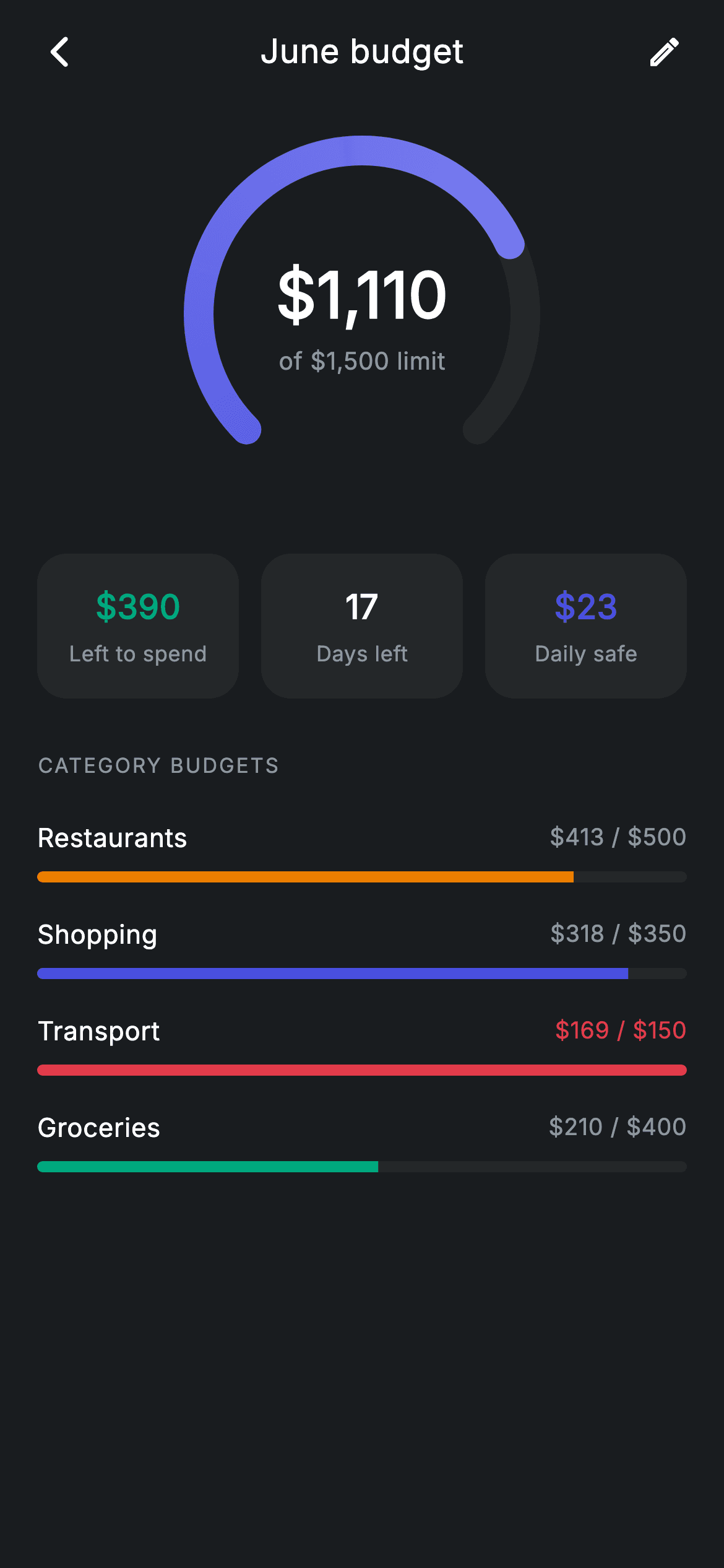
What you'll build
- ✓A 270° arc gauge painted with a rounded sweep-gradient stroke over a dark track
- ✓A centred spend readout ('$1,110 of $1,500 limit') stacked inside the gauge
- ✓A three-card stat row for 'Left to spend', 'Days left' and 'Daily safe'
- ✓Category sub-budget rows driven by a tiny const data class, each with its own tinted progress bar
- ✓Over-limit handling that recolours a category's bar and amount red the moment spend passes its cap
Step-by-step build
Create the file
Add a new file at lib/fintech_budget_detail/fintech_budget_detail_screen.dart in your Flutter project.
Register the bundled fonts
No external packages — this is pure Flutter. It does bundle its design font (Inter), so drop the font file into fonts/ and declare it in pubspec.yaml:
flutter:
  fonts:
    - family: Inter
      fonts:
- asset: fonts/Inter-Regular.ttfBuild it, piece by piece
Here's how the screen goes together. Each block below is a real slice of the code with a plain-English explanation — paste them in order, or grab the whole file from the next section.
Palette, callbacks, and budgets as const data
import 'package:flutter/material.dart';

/// Budget detail — progress against a monthly budget (Revolut-inspired design).
///
/// Self-contained per CONVENTIONS.md: pure Flutter only, the exact design font
/// (Inter) is bundled under `fonts/`, the progress gauge is custom-painted (no
/// charting package, no network), and the screen forces its own dark theme. Per
/// category sub-budgets show their own progress bars.
class FintechBudgetDetailScreen extends StatelessWidget {
  const FintechBudgetDetailScreen({
    super.key,
    this.onBack,
    this.onEdit,
  });

  final VoidCallback? onBack;
  final VoidCallback? onEdit;

  static const String _font = 'Inter';
  static const Color _bg = Color(0xFF191C1F);
  static const Color _surface = Color(0xFF242729);
  static const Color _brand = Color(0xFF494FDF);
  static const Color _teal = Color(0xFF00A87E);
  static const Color _amber = Color(0xFFEC7E00);
  static const Color _red = Color(0xFFE23B4A);
  static const Color _muted = Color(0xFF8D969E);

  static const List<_Sub> _subs = <_Sub>[
    _Sub('Restaurants', 412.80, 500, _amber),
    _Sub('Shopping', 318.40, 350, _brand),
    _Sub('Transport', 168.90, 150, _red),
    _Sub('Groceries', 210.00, 400, _teal),
  ];
`FintechBudgetDetailScreen` is a `StatelessWidget` taking only `onBack` and `onEdit` — the screen displays a computed month, so there is nothing to mutate locally. Seven static colour constants define the dark palette: `_bg` at `0xFF191C1F`, a slightly lighter `_surface` for cards and the gauge track, the indigo `_brand` `0xFF494FDF`, plus `_teal`, `_amber` and `_red` used as semantic tints. The four sub-budgets live in a `static const List<_Sub>`, each holding a name, spent amount, limit and tint — note `_Sub('Transport', 168.90, 150, _red)` is deliberately over its limit so the over-budget path is visible in the preview.
Forcing a dark theme and laying out the scroll
  @override
  Widget build(BuildContext context) {
    return Theme(
      data: ThemeData.dark(useMaterial3: true),
      child: Scaffold(
        backgroundColor: _bg,
        body: SafeArea(
          child: Column(
            children: <Widget>[
              _buildAppBar(),
              Expanded(
                child: ListView(
                  physics: const BouncingScrollPhysics(),
                  padding: const EdgeInsets.fromLTRB(20, 8, 20, 24),
                  children: <Widget>[
                    _buildGauge(),
                    const SizedBox(height: 24),
                    _buildStats(),
                    const SizedBox(height: 28),
                    _sectionLabel('Category budgets'),
                    const SizedBox(height: 12),
                    for (final _Sub s in _subs) _SubRow(sub: s),
                  ],
                ),
              ),
            ],
          ),
        ),
      ),
    );
  }
`build` wraps the `Scaffold` in `Theme(data: ThemeData.dark(useMaterial3: true))`, so the screen stays dark no matter what the host app's theme is — important for a drop-in component. Inside `SafeArea`, a `Column` pins `_buildAppBar()` at the top while an `Expanded` `ListView` with `BouncingScrollPhysics` scrolls the gauge, stats and category section. The category rows are emitted with a collection-for — `for (final _Sub s in _subs) _SubRow(sub: s)` — so adding a fifth budget means adding one line to the `_subs` list, not new widget code.
A minimal app bar built from a Row
  Widget _buildAppBar() {
    return Padding(
      padding: const EdgeInsets.fromLTRB(8, 4, 8, 4),
      child: Row(
        children: <Widget>[
          IconButton(
            onPressed: onBack,
            icon: const Icon(Icons.arrow_back_ios_new_rounded,
                size: 20, color: Colors.white),
          ),
          const Expanded(
            child: Text(
              'June budget',
              textAlign: TextAlign.center,
              style: TextStyle(
                fontFamily: _font,
                fontSize: 18,
                fontWeight: FontWeight.w500,
                letterSpacing: 0.24,
                color: Colors.white,
              ),
            ),
          ),
          IconButton(
            onPressed: onEdit,
            icon: const Icon(Icons.edit_outlined, size: 20, color: Colors.white),
          ),
        ],
      ),
    );
  }
The header skips `AppBar` entirely: a `Padding` around a `Row` holds a back `IconButton`, an `Expanded` centred 'June budget' title, and an edit `IconButton`. Because the title is `Expanded` with `textAlign: TextAlign.center` and the two icon buttons are the same size, the text lands optically centred without any `Stack` tricks. Both icons are 20px and pure white, and the title sits at 18px `w500` with the file's house `letterSpacing: 0.24` — every text style in this screen carries that same tracking for a consistent typographic voice.
Stacking the readout inside the gauge
  Widget _buildGauge() {
    return SizedBox(
      height: 210,
      child: Center(
        child: SizedBox(
          width: 200,
          height: 200,
          child: Stack(
            alignment: Alignment.center,
            children: <Widget>[
              CustomPaint(
                size: const Size(200, 200),
                painter: _GaugePainter(progress: 0.74),
              ),
              Column(
                mainAxisSize: MainAxisSize.min,
                children: const <Widget>[
                  Text(
                    r'$1,110',
                    style: TextStyle(
                      fontFamily: _font,
                      fontSize: 34,
                      fontWeight: FontWeight.w600,
                      letterSpacing: 0.24,
                      color: Colors.white,
                    ),
                  ),
                  SizedBox(height: 2),
                  Text(
                    r'of $1,500 limit',
                    style: TextStyle(
                      fontFamily: _font,
                      fontSize: 13,
                      letterSpacing: 0.24,
                      color: _muted,
                    ),
                  ),
                ],
              ),
            ],
          ),
        ),
      ),
    );
  }
`_buildGauge` centres a fixed 200×200 `Stack` inside a 210px-tall band: a `CustomPaint` running `_GaugePainter(progress: 0.74)` behind, and a `Column` with the numbers in front. Layering text over the painter with `Alignment.center` is much simpler than making the painter draw its own text. The `$1,110` figure is 34px `w600` white while `of $1,500 limit` drops to 13px `_muted`, so the eye reads the amount first and the context second. Both strings are raw literals (`r'$1,110'`) — the `r` prefix stops Dart treating `$` as interpolation.
The three-stat summary row
  Widget _buildStats() {
    return Row(
      children: <Widget>[
        Expanded(child: _stat(r'$390', 'Left to spend', _teal)),
        const SizedBox(width: 12),
        Expanded(child: _stat('17', 'Days left', Colors.white)),
        const SizedBox(width: 12),
        Expanded(child: _stat(r'$23', 'Daily safe', _brand)),
      ],
    );
  }

  Widget _stat(String value, String label, Color color) {
    return Container(
      padding: const EdgeInsets.symmetric(vertical: 16),
      decoration: BoxDecoration(
        color: _surface,
        borderRadius: BorderRadius.circular(16),
      ),
      child: Column(
        children: <Widget>[
          Text(
            value,
            style: TextStyle(
              fontFamily: _font,
              fontSize: 18,
              fontWeight: FontWeight.w600,
              letterSpacing: 0.24,
              color: color,
            ),
          ),
          const SizedBox(height: 4),
          Text(
            label,
            style: const TextStyle(
              fontFamily: _font,
              fontSize: 11.5,
              letterSpacing: 0.24,
              color: _muted,
            ),
          ),
        ],
      ),
    );
  }
`_buildStats` puts three `Expanded` cards in a `Row` with 12px gaps, all built by one `_stat(value, label, color)` helper so the cards can never drift apart in style. The value colour is semantic: '$390' left to spend is `_teal` (good news), '17' days is plain white (neutral fact), and the '$23' daily safe figure is `_brand` indigo, tying it to the gauge's fill colour since both express the same budget. Each card is just a `_surface` `Container` with a 16px radius and vertical padding — no border, letting the background contrast do the separation.
Section label and the _Sub value class
  Widget _sectionLabel(String text) {
    return Text(
      text.toUpperCase(),
      style: const TextStyle(
        fontFamily: _font,
        fontSize: 11,
        fontWeight: FontWeight.w500,
        letterSpacing: 1.0,
        color: _muted,
      ),
    );
  }
}

class _Sub {
  const _Sub(this.name, this.spent, this.limit, this.tint);
  final String name;
  final double spent;
  final double limit;
  final Color tint;
}
`_sectionLabel` uppercases its text and sets 11px `w500` with `letterSpacing: 1.0` in `_muted` — the wide tracking is what makes a tiny all-caps label read as a section heading rather than shouting. `_Sub` is a four-field const class (`name`, `spent`, `limit`, `tint`) with no methods; keeping the maths out of the model and in the row widget means the same class could later be filled from an API response unchanged.
Sub-budget rows that flag overspend
class _SubRow extends StatelessWidget {
  const _SubRow({required this.sub});

  final _Sub sub;

  @override
  Widget build(BuildContext context) {
    final double frac = (sub.spent / sub.limit).clamp(0, 1);
    final bool over = sub.spent > sub.limit;
    final Color barColor =
        over ? FintechBudgetDetailScreen._red : sub.tint;
    return Padding(
      padding: const EdgeInsets.symmetric(vertical: 9),
      child: Column(
        children: <Widget>[
          Row(
            children: <Widget>[
              Text(
                sub.name,
                style: const TextStyle(
                  fontFamily: FintechBudgetDetailScreen._font,
                  fontSize: 14,
                  fontWeight: FontWeight.w500,
                  letterSpacing: 0.24,
                  color: Colors.white,
                ),
              ),
              const Spacer(),
              Text(
                '\$${sub.spent.toStringAsFixed(0)} / \$${sub.limit.toStringAsFixed(0)}',
                style: TextStyle(
                  fontFamily: FintechBudgetDetailScreen._font,
                  fontSize: 12.5,
                  fontWeight: FontWeight.w500,
                  letterSpacing: 0.24,
                  color: over
                      ? FintechBudgetDetailScreen._red
                      : FintechBudgetDetailScreen._muted,
                ),
              ),
            ],
          ),
          const SizedBox(height: 8),
          ClipRRect(
            borderRadius: BorderRadius.circular(9999),
            child: LinearProgressIndicator(
              value: frac,
              minHeight: 6,
              backgroundColor: FintechBudgetDetailScreen._surface,
              valueColor: AlwaysStoppedAnimation<Color>(barColor),
            ),
          ),
        ],
      ),
    );
  }
}
`_SubRow` derives everything from its `_Sub`: `frac` is `(sub.spent / sub.limit).clamp(0, 1)` so an overspent bar fills completely instead of overflowing, and `over` compares spend to limit separately so the state survives the clamp. When `over` is true both the bar and the '$169 / $150' amount switch to `_red`, overriding the category's own tint — Transport demonstrates this. The bar itself is a `LinearProgressIndicator` at `minHeight: 6` with the track set to `_surface`, wrapped in a `ClipRRect` with radius 9999 because the indicator has no rounding of its own. Amounts are formatted with `toStringAsFixed(0)` — whole dollars only, matching the compact 12.5px trailing text.
Painting the 270° gauge
/// Paints a 270° arc gauge with a rounded progress sweep over a track.
class _GaugePainter extends CustomPainter {
  _GaugePainter({required this.progress});

  final double progress;

  static const double _start = 2.3562; // 135°
  static const double _full = 4.7124; // 270°

  @override
  void paint(Canvas canvas, Size size) {
    final Offset center = size.center(Offset.zero);
    final double radius = size.width / 2 - 12;
    final Rect rect = Rect.fromCircle(center: center, radius: radius);

    final Paint track = Paint()
      ..color = const Color(0xFF242729)
      ..style = PaintingStyle.stroke
      ..strokeWidth = 16
      ..strokeCap = StrokeCap.round;
    canvas.drawArc(rect, _start, _full, false, track);

    final Paint fill = Paint()
      ..shader = const SweepGradient(
        colors: <Color>[Color(0xFF494FDF), Color(0xFF7C80F0)],
      ).createShader(rect)
      ..style = PaintingStyle.stroke
      ..strokeWidth = 16
      ..strokeCap = StrokeCap.round;
    canvas.drawArc(rect, _start, _full * progress.clamp(0, 1), false, fill);
  }

  @override
  bool shouldRepaint(covariant _GaugePainter oldDelegate) =>
      oldDelegate.progress != progress;
}
`_GaugePainter` draws two arcs on the same `Rect.fromCircle`, whose radius is `size.width / 2 - 12` — the 12px inset keeps the 16px round-capped stroke from clipping at the edges. The constants `_start = 2.3562` (135°) and `_full = 4.7124` (270°) open the arc downward, leaving a symmetric gap at the bottom where a full circle would feel closed. The track paints in flat `0xFF242729`; the fill reuses the same geometry but swaps in a `SweepGradient` shader from `0xFF494FDF` to a lighter `0xFF7C80F0`, sweeping only `_full * progress.clamp(0, 1)` radians. `shouldRepaint` compares `progress`, so the painter only redraws when the value actually changes.
Full code
The complete, ready-to-paste source. Free to use in your projects — one click copies it all.
import 'package:flutter/material.dart';

/// Budget detail — progress against a monthly budget (Revolut-inspired design).
///
/// Self-contained per CONVENTIONS.md: pure Flutter only, the exact design font
/// (Inter) is bundled under `fonts/`, the progress gauge is custom-painted (no
/// charting package, no network), and the screen forces its own dark theme. Per
/// category sub-budgets show their own progress bars.
class FintechBudgetDetailScreen extends StatelessWidget {
  const FintechBudgetDetailScreen({
    super.key,
    this.onBack,
    this.onEdit,
  });

  final VoidCallback? onBack;
  final VoidCallback? onEdit;

  static const String _font = 'Inter';
  static const Color _bg = Color(0xFF191C1F);
  static const Color _surface = Color(0xFF242729);
  static const Color _brand = Color(0xFF494FDF);
  static const Color _teal = Color(0xFF00A87E);
  static const Color _amber = Color(0xFFEC7E00);
  static const Color _red = Color(0xFFE23B4A);
  static const Color _muted = Color(0xFF8D969E);

  static const List<_Sub> _subs = <_Sub>[
    _Sub('Restaurants', 412.80, 500, _amber),
    _Sub('Shopping', 318.40, 350, _brand),
    _Sub('Transport', 168.90, 150, _red),
    _Sub('Groceries', 210.00, 400, _teal),
  ];

  @override
  Widget build(BuildContext context) {
    return Theme(
      data: ThemeData.dark(useMaterial3: true),
      child: Scaffold(
        backgroundColor: _bg,
        body: SafeArea(
          child: Column(
            children: <Widget>[
              _buildAppBar(),
              Expanded(
                child: ListView(
                  physics: const BouncingScrollPhysics(),
                  padding: const EdgeInsets.fromLTRB(20, 8, 20, 24),
                  children: <Widget>[
                    _buildGauge(),
                    const SizedBox(height: 24),
                    _buildStats(),
                    const SizedBox(height: 28),
                    _sectionLabel('Category budgets'),
                    const SizedBox(height: 12),
                    for (final _Sub s in _subs) _SubRow(sub: s),
                  ],
                ),
              ),
            ],
          ),
        ),
      ),
    );
  }

  Widget _buildAppBar() {
    return Padding(
      padding: const EdgeInsets.fromLTRB(8, 4, 8, 4),
      child: Row(
        children: <Widget>[
          IconButton(
            onPressed: onBack,
            icon: const Icon(Icons.arrow_back_ios_new_rounded,
                size: 20, color: Colors.white),
          ),
          const Expanded(
            child: Text(
              'June budget',
              textAlign: TextAlign.center,
              style: TextStyle(
                fontFamily: _font,
                fontSize: 18,
                fontWeight: FontWeight.w500,
                letterSpacing: 0.24,
                color: Colors.white,
              ),
            ),
          ),
          IconButton(
            onPressed: onEdit,
            icon: const Icon(Icons.edit_outlined, size: 20, color: Colors.white),
          ),
        ],
      ),
    );
  }

  Widget _buildGauge() {
    return SizedBox(
      height: 210,
      child: Center(
        child: SizedBox(
          width: 200,
          height: 200,
          child: Stack(
            alignment: Alignment.center,
            children: <Widget>[
              CustomPaint(
                size: const Size(200, 200),
                painter: _GaugePainter(progress: 0.74),
              ),
              Column(
                mainAxisSize: MainAxisSize.min,
                children: const <Widget>[
                  Text(
                    r'$1,110',
                    style: TextStyle(
                      fontFamily: _font,
                      fontSize: 34,
                      fontWeight: FontWeight.w600,
                      letterSpacing: 0.24,
                      color: Colors.white,
                    ),
                  ),
                  SizedBox(height: 2),
                  Text(
                    r'of $1,500 limit',
                    style: TextStyle(
                      fontFamily: _font,
                      fontSize: 13,
                      letterSpacing: 0.24,
                      color: _muted,
                    ),
                  ),
                ],
              ),
            ],
          ),
        ),
      ),
    );
  }

  Widget _buildStats() {
    return Row(
      children: <Widget>[
        Expanded(child: _stat(r'$390', 'Left to spend', _teal)),
        const SizedBox(width: 12),
        Expanded(child: _stat('17', 'Days left', Colors.white)),
        const SizedBox(width: 12),
        Expanded(child: _stat(r'$23', 'Daily safe', _brand)),
      ],
    );
  }

  Widget _stat(String value, String label, Color color) {
    return Container(
      padding: const EdgeInsets.symmetric(vertical: 16),
      decoration: BoxDecoration(
        color: _surface,
        borderRadius: BorderRadius.circular(16),
      ),
      child: Column(
        children: <Widget>[
          Text(
            value,
            style: TextStyle(
              fontFamily: _font,
              fontSize: 18,
              fontWeight: FontWeight.w600,
              letterSpacing: 0.24,
              color: color,
            ),
          ),
          const SizedBox(height: 4),
          Text(
            label,
            style: const TextStyle(
              fontFamily: _font,
              fontSize: 11.5,
              letterSpacing: 0.24,
              color: _muted,
            ),
          ),
        ],
      ),
    );
  }

  Widget _sectionLabel(String text) {
    return Text(
      text.toUpperCase(),
      style: const TextStyle(
        fontFamily: _font,
        fontSize: 11,
        fontWeight: FontWeight.w500,
        letterSpacing: 1.0,
        color: _muted,
      ),
    );
  }
}

class _Sub {
  const _Sub(this.name, this.spent, this.limit, this.tint);
  final String name;
  final double spent;
  final double limit;
  final Color tint;
}

class _SubRow extends StatelessWidget {
  const _SubRow({required this.sub});

  final _Sub sub;

  @override
  Widget build(BuildContext context) {
    final double frac = (sub.spent / sub.limit).clamp(0, 1);
    final bool over = sub.spent > sub.limit;
    final Color barColor =
        over ? FintechBudgetDetailScreen._red : sub.tint;
    return Padding(
      padding: const EdgeInsets.symmetric(vertical: 9),
      child: Column(
        children: <Widget>[
          Row(
            children: <Widget>[
              Text(
                sub.name,
                style: const TextStyle(
                  fontFamily: FintechBudgetDetailScreen._font,
                  fontSize: 14,
                  fontWeight: FontWeight.w500,
                  letterSpacing: 0.24,
                  color: Colors.white,
                ),
              ),
              const Spacer(),
              Text(
                '\$${sub.spent.toStringAsFixed(0)} / \$${sub.limit.toStringAsFixed(0)}',
                style: TextStyle(
                  fontFamily: FintechBudgetDetailScreen._font,
                  fontSize: 12.5,
                  fontWeight: FontWeight.w500,
                  letterSpacing: 0.24,
                  color: over
                      ? FintechBudgetDetailScreen._red
                      : FintechBudgetDetailScreen._muted,
                ),
              ),
            ],
          ),
          const SizedBox(height: 8),
          ClipRRect(
            borderRadius: BorderRadius.circular(9999),
            child: LinearProgressIndicator(
              value: frac,
              minHeight: 6,
              backgroundColor: FintechBudgetDetailScreen._surface,
              valueColor: AlwaysStoppedAnimation<Color>(barColor),
            ),
          ),
        ],
      ),
    );
  }
}

/// Paints a 270° arc gauge with a rounded progress sweep over a track.
class _GaugePainter extends CustomPainter {
  _GaugePainter({required this.progress});

  final double progress;

  static const double _start = 2.3562; // 135°
  static const double _full = 4.7124; // 270°

  @override
  void paint(Canvas canvas, Size size) {
    final Offset center = size.center(Offset.zero);
    final double radius = size.width / 2 - 12;
    final Rect rect = Rect.fromCircle(center: center, radius: radius);

    final Paint track = Paint()
      ..color = const Color(0xFF242729)
      ..style = PaintingStyle.stroke
      ..strokeWidth = 16
      ..strokeCap = StrokeCap.round;
    canvas.drawArc(rect, _start, _full, false, track);

    final Paint fill = Paint()
      ..shader = const SweepGradient(
        colors: <Color>[Color(0xFF494FDF), Color(0xFF7C80F0)],
      ).createShader(rect)
      ..style = PaintingStyle.stroke
      ..strokeWidth = 16
      ..strokeCap = StrokeCap.round;
    canvas.drawArc(rect, _start, _full * progress.clamp(0, 1), false, fill);
  }

  @override
  bool shouldRepaint(covariant _GaugePainter oldDelegate) =>
      oldDelegate.progress != progress;
}
Plus bundled 1 binary asset (fonts/images). The CLI and MCP install those for you automatically.
Two faster ways to add it
Copy-paste works, but you can skip it entirely.
1. FlutterKit CLI
One command drops this screen — and its fonts — straight into your project.
$ flutterkit add fintech-budget-detail2. AI agent (MCP)
Connect FlutterKit's MCP server in Claude or Cursor and just ask your agent to install fintech-budget-detail — it fetches and writes the files for you.
FAQ
Is this budget detail screen free to use commercially?
Yes. FlutterKit screens are free to use, including in commercial apps — copy the code from this page or install it with `flutterkit add fintech-budget-detail`, ship it in a paid fintech product, and no attribution or sign-up is required.
Do I need any packages or fonts for this screen?
No pub packages at all — the gauge is a hand-written `CustomPainter` and the bars are stock `LinearProgressIndicator`s. The only asset is the Inter font, which ships bundled with the screen under `fonts/` and is referenced via the `_font` constant, so there is no google_fonts dependency and no network fetch.
Which Flutter version does this need?
Flutter 3.0 or newer. The constructor uses super parameters (`super.key`), which need Dart 2.17, and the theme is built with `ThemeData.dark(useMaterial3: true)`. There is no `Color.withValues` in this file, so nothing here requires the 3.22+ colour API.
How do I drive the gauge and stats from real budget data?
Add `spent`, `limit` and a `DateTime` for the period end to the constructor, then compute `progress` as `spent / limit` for `_GaugePainter`, 'Left to spend' as `limit - spent`, 'Days left' from the date, and 'Daily safe' as the remainder divided by days left. Replace the raw `r'$1,110'` literals with interpolated strings — once you interpolate, drop the `r` prefix. Feed `_subs` from your category totals; `_SubRow` already handles the over-limit case.
Can I change the gauge's sweep, thickness or colours?
Yes — `_start` and `_full` are radians, so a half-circle gauge is `_start: 3.1416, _full: 3.1416`; keep `_start` equal to π plus half of the bottom gap for symmetry. Stroke weight is the two `strokeWidth: 16` values (change both, and revisit the `- 12` radius inset if you go much thicker), and the fill colours live in the `SweepGradient` list.


